How Do I Color Match Paint: Perfect Matching Techniques Explained
You can color-match paint reliably by bringing a clean swatch or sample to the counter, testing it under natural and artificial light, and using a spectrophotometer or color chips to get a formula. Note the finish, substrate, and undertones, then make small painted swatches and test them on-site at different times of day. Sand and prime touch-up areas, blend with feathering strokes, and record formulas and batch numbers so future matches stay consistent—keep going to learn practical tips and troubleshooting.
Quick, Reliable Paint-Matching Checklist
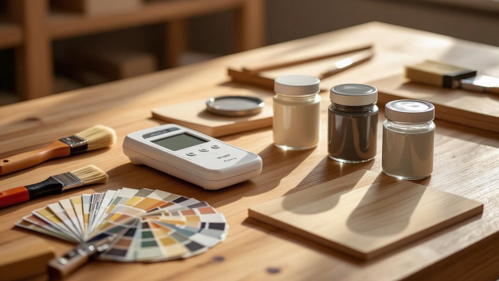
When you’re matching paint, follow a compact checklist to save time and avoid guesswork.
Inspect light at different times, clean the sample, and note finish and substrate.
Use a spectrophotometer or chips, record brand and formula, and test small swatches.
Consider color psychology and current color trends, then allow samples to cure before final approval to guarantee accuracy.
Which Color-Matching Problem Are You Solving?
Which specific color-matching problem are you trying to solve—touch-up, full-room repaint, matching trim to wall, or coordinating across different materials?
Decide goal first, since color perception and color context shift techniques.
Use color theory and the color wheel for harmony, consider color psychology and color trends for mood, and apply measured color blending when merging surfaces to guarantee consistent results across materials.
Understand Undertones and Why They Matter
Because undertones quietly change how a color reads in different lights and alongside other surfaces, you need to identify them before committing to paint. You’ll use color theory and the color wheel to spot warm tones or cool tones, create color harmony, and apply paint layering to test for color fading. Consider color psychology when matching mood.
| Test | Result |
|---|---|
| Sample | Observe |
| Adjacent | Compare |
| Layer | Blend |
| Time | Fade |
How Light and Sheen Change Perceived Color
If you hold a paint sample under different lights and at different angles, you’ll see the color shift—sometimes subtly, sometimes dramatically—because both light source and sheen alter how your eye reads pigments.
You’ll notice light perception changes with ambient influences and lighting angles; sheen effects and surface texture create color illusions.
Use color psychology and visual context to predict how tones behave in real rooms.
Read, Pick, and Compare Paint Color Chips
Start by pulling several paint chips and holding them together at eye level so you can read their subtle differences in hue, value, and undertone; you’ll notice how a single swatch can look warm or cool depending on its neighbors and your viewing angle.
Then compare chips under natural and artificial light, apply paint color psychology to mood goals, and use clear color selection strategies to narrow choices.
Choose the Best Chip Samples to Test
Start by picking chip samples that look right under neutral lighting so you’re not fooled by warm or cool bulbs.
Place several nearby on the wall and compare multiple shades side by side to spot subtle differences.
Test the ones that read best in that light before committing.
Pick Neutral Lighting Samples
When you pick chip samples, choose neutral lighting so the colors you see stay true to how they’ll look in daily use; daylight-balanced, full-spectrum bulbs or natural light at midday give the most reliable view.
You should test chips against neutral color palettes, moving them around the room to assess lighting impact at different angles and times.
Trust what consistent, even light reveals.
Compare Multiple Shades
Why test more than one chip? You’ll see shade dynamics, color theory, and visual perception play out differently.
Compare samples to judge color harmony, aesthetic impact, and psychological effects under environmental influences and texture interaction.
Account for brand variations and color trends.
Try:
- Morning light
- Midday light
- Evening light
- With finish samples
Use Peel-and-Stick Swatches for On-Site Testing
When you test peel-and-stick swatches, try them on the wall where they’ll be seen and check them in natural light at different times of day.
Peel carefully from a corner and press firmly to avoid bubbles or misalignment.
Move a swatch to adjacent areas if you want to compare how placement changes the perceived color.
Test Swatches In Natural Light
Because lighting changes color perception, bring peel-and-stick swatches onto the site and apply them to different walls and surfaces to see how each hue reads in real light.
Use natural light and test swatches to note sunlight effects and daylight comparison across rooms.
Check shade variations and ambient conditions; consider outdoor testing for true tone.
- Morning
- Noon
- Evening
- Overcast
Peel Swatch Placement Tips
Wondering where to stick those peel-and-stick swatches for the clearest read on color? You’ll test peel placement on different surfaces, check swatch adhesion, and view swatches at various times. Place them near trim, mid-wall, and shadowed corners to judge hue shifts.
| Location | Light | Surface |
|---|---|---|
| Near window | Bright | Smooth |
| Mid-wall | Diffuse | Matte |
| Corner | Shadow | Textured |
Create Accurate Painted Swatches at Home
Start by picking two to three candidate paint colors and gathering consistent materials—primer, your chosen paint, a small roller or brush, and identical sample boards or pieces of drywall—so you can compare truly apples to apples.
Use DIY swatch creation and paint application techniques to guarantee fidelity. Follow steps:
- Prime boards evenly.
- Apply two coats.
- Label each sample.
- View in three lights.
Verify Matches With Sample Pots Before Buying
After you’ve created and compared swatches, take your top picks to the store and get sample pots so you can test full-size patches on your actual walls. You’ll use sample pot techniques to apply patches, observe at different times, and use color verification methods to confirm match under varied light. Record results, note undertones, then decide.
| Sample | Time | Light |
|---|---|---|
| A | Morning | Warm |
| B | Noon | Neutral |
| C | Evening | Cool |
| D | Mixed | Artificial |
| E | Final | Comparison |
Photograph Color for Remote Matching
When you photograph a paint sample for remote matching, set up even, neutral lighting to avoid color shifts.
Make sure your camera or phone uses the correct white balance and lock it if possible, and include a standardized color reference or gray card in the frame.
Doing this lets the matcher accurately interpret your colors without guesswork.
Proper Lighting Setup
Although you can shoot a sample with any camera, you’ll get accurate color matches only if you control the light: use a neutral, consistent light source (daylight-balanced 5000–6500K or a calibrated LED) and eliminate mixed lighting that shifts hues.
Follow these steps to manage lighting sources and color perception:
- Use natural light when possible.
- Prefer calibrated artificial lighting.
- Control ambient light and light intensity.
- Minimize reflective surfaces.
Camera White Balance
Controlling your light gives you a consistent starting point, but your camera still needs to interpret that light correctly — that’s where white balance comes in.
You’ll adjust camera settings and color temperature to match lighting conditions during image capture, using photography techniques like digital calibration, lens filters, and exposure adjustments.
Calibrate before shooting so remote matching reflects true paint hues.
Include Color Reference
A consistent color reference in every photo makes remote paint matching reliable, so always include a standardized target—like a gray card, color checker, or Pantone swatch—near the surface you’re photographing.
- Photograph reference under native light.
- Include scale and orientation.
- Note lighting and camera settings.
- Use reference for color theory checks and color psychology context when choosing matching hues.
Use Smartphone Apps and Digital Color Tools
When you need a quick, reliable color match, smartphone apps and digital tools put powerful scanning and palette-building capabilities in your pocket.
You’ll use smartphone capabilities and color matching apps with user friendly interfaces to scan swatches, explore a color wheel, and test paint selection via augmented reality previews.
These digital tools help you compose accurate palettes and maintain color harmony across rooms.
When to Use a Colorimeter or Scanner
If your smartphone’s camera or an app’s AR preview doesn’t quite nail a nuanced shade, reach for a colorimeter or handheld scanner to get objective readings.
You’ll rely on colorimeter benefits and scanner accuracy when digital tools fail. Consider:
- Complex lighting and color perception issues
- Subtle undertones and color theory needs
- Professional services for precision
- Technology advancements improving matching techniques
What to Tell the Paint Counter for a Match
Want a perfect match? Tell the paint counter the room, substrate, and lighting conditions, plus any existing color terminology like LRV or undertones.
Bring a clean sample or swatch for scanning. Specify the desired paint finishes, sheen level, and planned use (interior/exterior).
Ask for a test pot and note batch number for consistency on future touch-ups.
Prep the Surface for an Invisible Paint Touch-Up
1 simple prep step can make the difference between a visible patch and a seamless repair: clean, sand, and prime the area so the new paint bonds and matches the surrounding sheen.
Follow these steps for surface preparation and touch up techniques:
- Remove debris and grease for surface compatibility.
- Sand for texture matching.
- Prime to guarantee paint application.
- Inspect edges for edge blending, color consistency, finish uniformity and invisible repairs.
Feather and Blend Touch-Ups Like a Pro
Once you’ve prepped the area, feathering and blending are the steps that make the repair vanish; use thin, overlapping strokes and progressively lighter pressure as you work outward to match texture and sheen with the surrounding paint.
You’ll apply feather techniques and blend methods using proper touch up tools, layering techniques, blending edges for color consistency, repair strategies, touch up tips, and subtle finishing touches.
Match Trim and Baseboards to Wall Paint
Start by deciding how closely you want the trim and baseboards to match the wall — exact matches create a seamless, modern look, while slightly contrasting trim can frame a room and hide scuffs.
Use these steps:
- Note trim styles and architectural details.
- Choose baseboard finishes and paint textures.
- Test color contrast against wall patterns and accent colors.
- Guarantee overall design cohesion.
Match Aged or Sun-Faded Paint Reliably
You’ll first assess sun-fade patterns to see how exposure has altered hue and sheen across the surface.
Test small hidden areas to confirm a match before committing, since faded paint can mislead visual judgment.
If needed, blend with blending coats to gradually bridge the old finish and your new batch for a seamless repair.
Assess Sun-Fade Patterns
When matching aged or sun-faded paint, begin by studying the fade pattern across the entire surface—look for directional bleaching, edge contrast, and spotty degradation that reveal how sunlight and weather interacted with the original color.
You’ll assess sun exposure, color fading, light impact, texture effects, seasonal changes, surface differences, paint aging, and color depth.
- Map fade zones
- Note angles
- Compare textures
- Record history
Test Small Hidden Areas
Choose several small, hidden spots—behind trim, inside cabinets, or beneath hardware—and test there so you can see the true aged color without disturbing the visible finish.
When you test hidden areas, assess texture and evaluate sheen, check compatibility with existing layers, note patches and inspect edges, consider finishes, measure coverage, observe drying times, and test adhesion to confirm a reliable match.
Blend With Transitional Coats
After testing hidden spots and confirming base tones, start blending with connecting coats to bridge the aged or sun-faded area to the surrounding finish.
Use linking techniques and gradual glazing so you can match sheen and depth.
Apply thin coats, feather edges, and step back often to evaluate.
- Thin coats
- Feather edges
- Glaze layers
- Evaluate often
Recreate Discontinued or Custom Colors
If a paint formula’s been discontinued or you want a one-off custom shade, you can still get a precise match by combining color analysis, tint adjustments, and sample testing. You’ll use color blending techniques and consult historical color palettes for reference. Test small batches, record formulas, and tweak until matching.
| Step | Tool | Outcome |
|---|---|---|
| Analyze | Spectrophotometer | Base |
| Blend | Tinting cups | Match |
| Test | Sample boards | Verify |
| Record | Notebook | Repeat |
Adjust Formulas for Undertone and Opacity
Having nailed the base match, you’ll next refine undertone and opacity to make the color read correctly in real conditions.
- Test undertone variations on panels under actual light.
- Use precise mixing techniques to shift warmth or coolness.
- Adjusting opacity with tints or extenders alters coverage and color depth.
- Re-evaluate samples after drying; tweak small increments until the perceived match is perfect.
Choose the Right Sheen for a Seamless Match
When matching paint, you’ll want to select a sheen that mirrors the original surface—flat for walls, satin or semi-gloss for trim and cabinets.
Think about how light hits the area, since higher sheens reflect more and can highlight imperfections or color differences.
Test a small patch under the room’s lighting to confirm the sheen reads the same as the surrounding finish.
Match Sheen To Surface
Most surfaces show more than just color—you’ll also notice how glossy or flat they look, so matching sheen is key to making repairs disappear.
You’ll assess sheen types and surface textures, comparing sheen finishes and gloss levels. Consider finish durability and matte options in a sheen comparison that accounts for reflective properties.
- Match texture
- Test small
- Blend edges
- Cure fully
Consider Light Reflection
You’ve matched sheen and texture, but light reflection can still betray a repair.
Check how the light source hits the area at different times; natural and artificial lighting reveal mismatches.
Match not just sheen but how finish reflects under the room’s color temperature.
Test small patches, view from multiple angles, and adjust sheen or glaze until reflections blend seamlessly with surrounding paint.
Paint Brands: How and Why They Differ
Although many paints look similar on the shelf, brands differ in formulation, quality control, and pigment load, and those differences matter when you’re matching colors precisely.
You should weigh brand formulations and pigment quality against finish durability, color consistency, product availability, and customer preferences.
- Formulation impact
- Pigment strength
- Durability trade-offs
- Availability limits
Evaluate Your Match Under Different Lights
Check your sample in morning light to see how true the color reads in daylight.
Then view it under your home’s artificial lighting to spot shifts from warm or cool bulbs.
Finally, compare it in dim conditions to verify it still looks right when the lights are low.
Inspect In Morning Light
Wondering how your paint really looks once the sun’s up? You’ll want to inspect in morning ambiance under soft, natural illumination to see true undertones.
Follow these steps:
- View swatches at sunrise.
- Stand across the room.
- Note shifts in hue and warmth.
- Compare adjacent surfaces.
Record observations and delay final decisions until a few consecutive mornings match your expectations.
Check Under Artificial Lighting
How does your chosen color behave when the sun goes down?
Check under artificial sources to judge lighting effects on color perception. Notice light temperature shifts and how paint finish alters visual impact.
Compare hue variation across bulbs to guarantee color consistency in living spaces. Test warm and cool LEDs, incandescents, and fluorescents to verify the chosen tone reads true under everyday artificial lighting.
Compare In Dim Conditions
When the lights are low, take samples into dim conditions to see whether the color keeps its character or shifts into something unintended.
Use dim lighting techniques and note color perception variations. Try these checks:
- View at dusk.
- View under a shaded lamp.
- Step back and squint.
- Compare adjacent finishes.
Decide if the match stays true before committing.
Troubleshoot Common Paint-Match Failures
Although you followed the steps, paint matches can still fail for a few common reasons, and you’ll want to check them methodically. Inspect paint formulation, color fading, application techniques, surface preparation, environmental factors, color perception, lighting conditions, sheen variations, paint layering, and color mixing.
| Cause | Fix |
|---|---|
| Fading | Repaint with UV-resistant |
| Sheen mismatch | Use correct sheen |
| Layer issues | Strip and recoat |
| Lighting | Test under real light |
Estimate Cost and Time for a Match Project
Now that you’ve diagnosed common paint-match failures, it’s time to estimate what a proper match will cost and how long it will take so you can plan the job.
Now that failures are diagnosed, estimate costs and timelines so you can plan a proper paint-match job.
Do a quick cost estimation and set a realistic project timeline:
- Materials: paint, tint, primer.
- Tools: sprayer, tester cards.
- Time: prep, drying, touch-ups.
- Contingency: 10–20% buffer for surprises.
When to Call a Professional Color Matcher
If your color needs are complex, like matching aged finishes or large swaths for a remodel, you should hire a professional color matcher.
Expect to weigh the match fee against the value of a flawless result and ask about pricing upfront.
Look for pros with verified samples, good reviews, and certification from major paint brands.
When To Hire
When a color mismatch could ruin the look or value of your project, call a professional color matcher—especially for large walls, cabinetry, or exterior jobs where consistency matters across lots or panels.
You’ll get a paint consultation and guidance from a color expert.
Consider hiring when:
- You need perfect batch matching.
- Lighting complicates color.
- Multiple surfaces require uniformity.
- Restoration or historic accuracy matters.
Cost Considerations
Hiring a professional color matcher makes sense in the situations above, but you’ll also want to weigh the cost against the value you’ll get. You should compare budget constraints, material costs, time investment, and quality considerations to decide.
| Option | Cost | Benefit |
|---|---|---|
| DIY | Low | Control |
| Pro | High | Precision |
| Hybrid | Mid | Balance |
Finding Qualified Pros
Wondering whether to call in a pro? You should when color shifts persist, walls need large blends, or time’s tight.
Focus on finding local experts and evaluating credentials before hiring.
Steps to follow:
- Inspect past work.
- Check certifications.
- Request color-matching demos.
- Compare quotes and guarantees.
Hire someone who communicates clearly and guarantees results.
Document Formulas and Sample Locations
Start by listing each matched formula clearly—include the base paint code, tint percentages, and any additives—so you can recreate the color exactly later.
You should keep precise formula documentation with date, batch, and source.
Label physical swatches with sample location and photo.
Store digital copies in one folder and note where each sample lives, so you or a pro can match it later.
Maintain Paint to Avoid Future Mismatches
Because paint changes over time, you’ll want to keep a small reserve of the matched batch and store it properly so future touch-ups stay consistent.
Use these paint preservation strategies to guarantee future color consistency:
- Label can with formula, date, and location.
- Seal lid tightly and store cool, dark.
- Stir before use; strain if needed.
- Rotate stock every few years.
Frequently Asked Questions
How Do Paint Additives Affect Long-Term Color Stability?
Additives like UV stabilizers, antioxidants, and dispersants influence long-term color retention; you’ll choose additive types to counteract stability factors such as sunlight, humidity, and pigment migration, so colors last longer with proper selection and testing.
Can Wallpaper or Textured Surfaces Alter Perceived Paint Matches?
Like a veil, wallpaper and textured surfaces will change color perception; you’ll see shifts in hue and lightness as surface texture scatters light, so matches may read differently and you’ll need test swatches under real lighting.
Is VOC Level Matching Important for Health or Compliance?
Yes — you should care: VOC regulations matter for health impacts and compliance standards, so you’ll follow safety measures, reduce indoor pollution, avoid fines, and protect occupants by choosing low‑VOC paints and documenting compliance.
How Do Seasonal Humidity Changes Impact Paint Drying Color?
Seasonal humidity changes affect paint color by altering drying time and sheen, so you’ll see slight tint shifts or uneven gloss; higher humidity slows drying time, increasing potential for color variation, while low humidity speeds curing and stabilizes tone.
Can Mold or Staining Beneath Paint Cause Apparent Color Mismatch?
Yes — mold effects can darken and texture paint, and staining impact can bleed through topcoats; you’ll see discoloration, shadowing, and uneven sheen, so you’ll remediate, prime, and isolate before repainting for true match.
Conclusion
You’ve got the checklist, the tools, and the eye—now it’s on you. Tackle the right problem, test chips in the light you live with, note undertones, and keep records. Start small: sample, compare, tweak. If it still feels off, call the pro before you repaint the whole room. Do this, and next time a color betrays you, you’ll know exactly where to look—and exactly what to do.