What Color Paint Hides Wall Imperfections Best?
You’ll hide most wall imperfections by choosing mid-tone, warm neutrals or soft, low-contrast colors like greige, muted taupe, sage, or dusty blue; these steady mid-value hues reduce shadows and visual focus on bumps. Pair them with a flat, matte, or eggshell finish to scatter light and mask texture—avoid stark white and high-gloss or very dark paints that spotlight flaws. Keep testing swatches in your lighting, and keep going to learn practical finishes, prep, and application tips.
Quick Answer: Best Paint Colors to Hide Wall Imperfections
Start with mid-tone, warm neutrals like greige, tan, or muted taupe—they mask shadows and texture better than stark whites or very dark hues.
You’ll also favor soft, low-contrast colors—sage, dusty blue, warm gray—that reduce visual focus on bumps.
Consider color psychology: warmer neutrals feel cozy, cooler muted tones calm attention, both diverting eyes from flaws.
Use warm neutrals for coziness or cool muted tones for calm—both help distract from surface flaws.
Matte or low-sheen sheens help hide imperfections by minimizing reflections, so pair color choices with appropriate finish.
Avoid high-contrast trim or bold accent walls near damaged areas.
Ultimately, pick balanced, mid-value hues that steady texture perception and soften flaws.
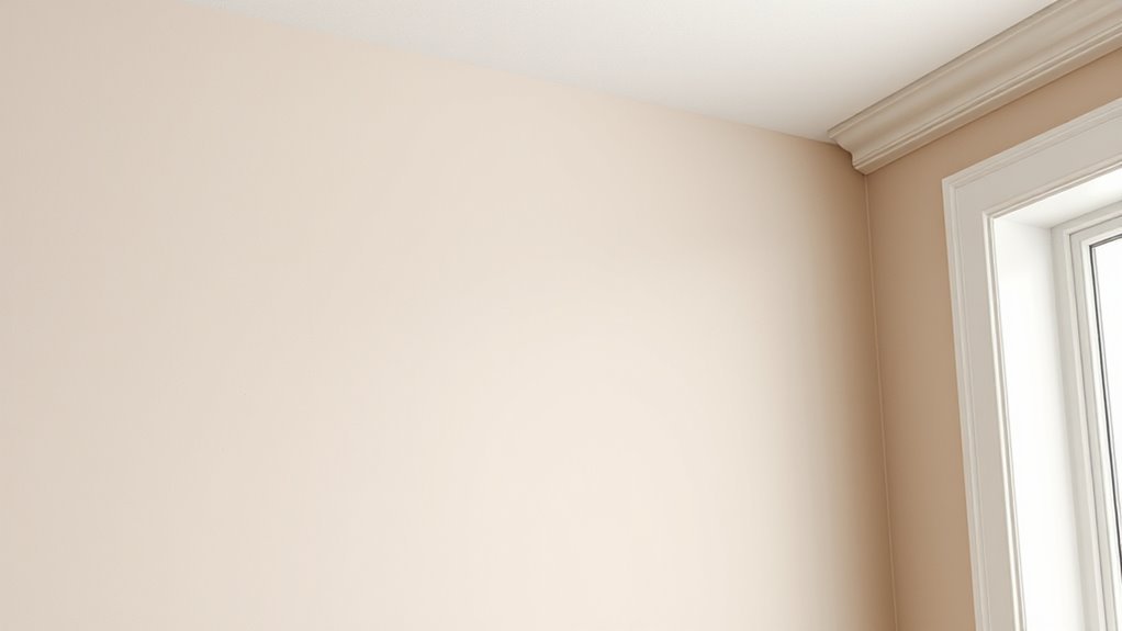
How Paint Finish Affects Visible Flaws
When you’re choosing paint, finish matters as much as color because sheen changes how light plays across the wall and consequently how visible bumps, dents, and texture become.
You’ll want a quick finish comparison to match room use and the paint texture of your walls. Consider these effects so you can minimize eye-catching flaws.
- High-gloss highlights imperfections by reflecting light sharply.
- Semi-gloss is durable but still reveals uneven spots.
- Satin offers a balance of slight sheen and forgiveness.
- Eggshell softens flaws more than glossy options while remaining washable.
Why Flat and Matte Finishes Hide Blemishes Best
After comparing sheens, you’ll notice flat and matte finishes scatter light rather than reflect it, so surface irregularities get masked instead of highlighted.
You’ll see dents, patches, and texture blend because diffuse reflection reduces glare that outlines flaws. Choose flat paint benefits when you want the most forgiving surface in low-traffic rooms; it minimizes shine and visually smooths walls.
Matte finish advantages give similar results with slightly better washability, so you can clean gently without reintroducing sheen.
Both finishes hide imperfections by softening contrast and shadow, letting color dominate appearance rather than every bump or brushstroke.
When Eggshell Is a Practical Compromise
If you want a middle ground between flat and satin, eggshell offers just enough sheen to reflect light without spotlighting texture.
It helps conceal minor surface flaws while being easier to wipe than a flat finish. You’ll also find touch-ups and routine maintenance more forgiving with eggshell, making it a practical choice for lived-in spaces.
Balance Between Sheen And Texture
Although a high-gloss finish will highlight texture and a flat finish will hide it, eggshell gives you a practical middle ground: it softens imperfections better than satin while still cleaning up easier than flat, so you get both modest concealment and reasonable durability.
You’ll aim for sheen balance and texture harmony by choosing eggshell where minor irregularities exist but maintenance matters.
Consider these practical tips:
- Use eggshell in living areas to reduce glare and mask shallow bumps.
- Pair with soft, neutral colors to enhance concealment.
- Avoid bright whites that reveal texture.
- Test a small patch before committing.
Concealing Minor Surface Flaws
Eggshell gives you a practical balance between hide-and-clean, but when you’re dealing with shallow dents, hairline cracks, or light orange peel, you’ll want to use a few targeted techniques to make those flaws fade into the background.
Sand and feather-fill imperfections, then prime to level sheen differences so light won’t spotlight unevenness.
Choose mid-tones and muted hues—their color psychology softens contrast and helps irregularities recede.
Roll with a nap that matches wall texture to avoid stipple mismatches; a light mist coat can blend edges.
Inspect under natural and artificial light to confirm texture perception is even before final coats.
Practical Maintenance And Touch-Ups
When you choose eggshell as a practical compromise, plan a simple maintenance routine to keep small scuffs and stains from becoming eyesores. You’ll appreciate eggshell’s balance of low sheen and concealment, but you’ll still need regular paint maintenance and quick touch up techniques.
- Keep a small mixed-can of the exact batch for fast repairs.
- Clean marks gently with a mild detergent before touching up.
- Use a soft brush or small roller to blend patched areas.
- Schedule a light inspection every few months to catch spots early.
These steps help preserve appearance without frequent full repaints.
Why Satin and Semi-Gloss Highlight Bumps
Because satin and semi-gloss finishes reflect more light than flat paints, they’ll make bumps, seams, and texture variations in your walls more noticeable.
You’ll see this because satin finishes and semi-gloss effects create smoother, shinier surfaces that emphasize paint texture and alter surface visibility.
When you roll or brush, minor ridges, drywall joints, and skim-coat imperfections throw tiny highlights and shadows.
If you want a durable, washable finish, you’ll accept that trade-off; otherwise, choose flatter sheens to mask flaws.
Prep matters: skim, sand, and prime to reduce visibility before applying any higher-sheen paint.
How Lighting Changes Color Visibility
Satin and semi-gloss finishes will make bumps pop under certain light, and that same interplay of finish and illumination determines how you’ll perceive color.
You notice color perception shifts when light intensity or angle changes; shadows exaggerate texture, while soft, even light mutes flaws. Adjust lighting and paint together to minimize visibility.
Light and angle alter color and texture: shadows deepen bumps, while soft, even light hides imperfections.
- Use diffused fixtures to lower harsh shadows and reduce apparent bumps.
- Choose mid-tone, low-sheen paints so color stays consistent across light levels.
- Avoid direct spotlights that increase contrast and reveal imperfections.
- Test samples in various light intensity settings before committing.
Natural Light: How Time of Day Exposes Texture
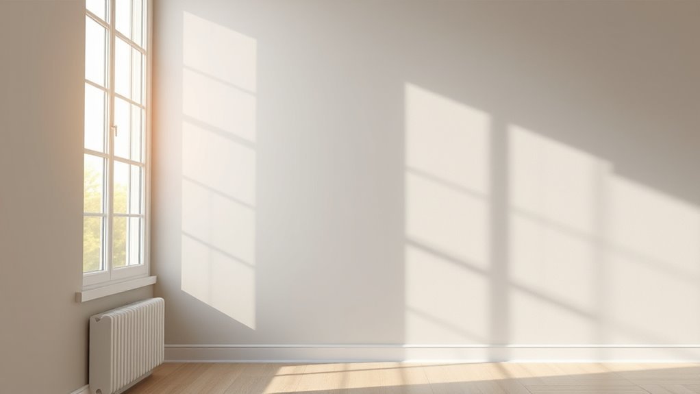
As daylight shifts from morning coolness to midday brightness and on to warm evening tones, you’ll see wall texture change—low-angle morning and evening light skims across surfaces and exaggerates bumps and ridges, while overhead midday sun softens shadows and hides minor flaws. You’ll notice natural light driving texture exposure across time variations: low light intensity increases shadow effects, high intensity flattens them. Daylight changes alter color perception and the illumination impact on paint choice. Imagine this simple guide:
| Time of Day | Effect on Texture |
|---|---|
| Morning | Long shadows, pronounced texture |
| Midday | Soft shadows, muted texture |
| Evening | Warm light, highlighted imperfection |
Directional Artificial Light and Spotlights: What to Watch For
When you point a spotlight or a directional fixture at a wall, it casts sharp shadows that make every scratch, seam, and bump stand out. So position lights to skim surfaces only when you want texture to show.
You’ll notice lighting intensity and shadow patterns reveal flaws; choose bulb type and color temperature carefully. Manage fixture placement and angle variation to control highlights. Use light diffusion or indirect ceiling effects to soften contrasts when hiding imperfections.
- Balance lighting intensity with diffusion.
- Test fixture placement across times.
- Vary angle variation, avoid grazing light.
- Match bulb type and color temperature.
Why Mid-Tone Colors Mask Texture Better Than Extremes
Because mid-tone paints sit between light and dark extremes, they reduce the contrast that makes bumps and seams jump out, so your eye sees surface as more even.
You’ll notice mid-tone balance softens shadows without flattening depth, so imperfections don’t cast stark lines. When you pick a mid-tone, you moderate highlights and shadows, improving texture perception across varied lighting.
That doesn’t hide gouges, but it minimizes attention to minor flaws. Choose a shade that complements room light and furnishings so the mid tone does its work; wrong undertone or sheen can still reveal irregularities.
How Warm Neutrals Hide Bumps and Nail Pops
If you pick warm neutrals, they’ll soften the look of bumps and nail pops by blending shadows and highlights into a gentler, less contrasting field.
You’ll notice how warm neutrals reduce eye-catching edges so wall imperfections read as subtle texture instead of defects.
Choose mid-tones with slight yellow or beige undertones; they warm perceived depth and conceal flaws better than stark whites.
Consider these paint options to make imperfections less obvious:
- Beige mid-tones for even warmth.
- Greige for subtle neutrality.
- Soft taupe to mask tiny shadows.
- Warm off-white to blur small bumps and nail pops.
How Cool Neutrals Soften Shadows and Conceal Rough Spots
Although cooler tones can seem crisp, they actually soften shadows and make rough patches read as gentle texture rather than harsh defects. You’ll find cool neutrals reduce contrast where light absorption varies, using hue impact to blur edges and encourage texture blending. That shadow softening helps subtle contrasts look intentional, creating visual harmony without adding color warmth. Choose muted blue-grays or pale greiges with low sheen; they minimize glare and mask minor irregularities. Consider this quick reference:
| Effect | Benefit | Tip |
|---|---|---|
| Light absorption | Less glare | Low sheen finish |
| Hue impact | Blends edges | Cooler undertones |
| Texture blending | Masks bumps | Soft lighting |
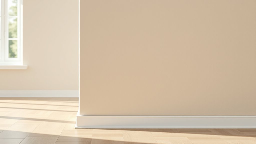
Why Greige Is a Top Choice for Uneven Walls
Cool neutrals like the blue-grays mentioned earlier set the stage, but greige often works even better on uneven walls.
You’ll notice greige versatility: it blends warm and cool undertones so bumps and shadows read softer. Greige warmth prevents stark contrasts, while greige textures interact subtly with light to hide imperfections.
Greige’s blend of warm and cool undertones softens bumps and shadows, letting textures and light gently disguise imperfections.
Consider greige moods and greige psychology—calming, balanced tones distract from flaws. Follow current greige trends for modern spaces, and use smart greige pairings to maintain cohesion.
Practical greige applications include matte finishes and layered lighting to minimize texture visibility and make walls appear smoother.
- Choose matte sheens
- Layer lighting
- Test swatches
- Coordinate trim
Muted Greens and Blues That Conceal Flaws in Living Spaces
You’ll find that soft sage camouflages minor bumps and scratches by blending warm undertones with a matte finish.
Dusty teal adds depth to a room, drawing the eye to color instead of texture.
Together they make living spaces look smoother without harsh contrast.
Soft Sage Camouflage
Soft sage tones blend muted greens and blue-greens to mask minor wall imperfections while keeping rooms feeling calm and fresh.
You’ll appreciate soft sage benefits: its low contrast hides bumps and uneven texture, and color psychology links it to balance and restoration.
Choose eggshell or matte sheens to reduce glare and emphasize concealment. Pair with warm neutrals for a cohesive look that won’t highlight flaws.
Test samples under different light to confirm effect.
- Use matte finishes for less reflection.
- Pick mid-tones to avoid stark contrasts.
- Add soft lighting to soften shadows.
- Validate on whole wall before committing.
Dusty Teal Depth
If you liked soft sage, dusty teal offers a deeper option that still masks minor wall flaws while adding more drama.
You’ll appreciate dusty teal appeal when light softens edges and uneven textures—its muted blue-green tones distract the eye without shouting. Choose a matte or low-sheen finish to further minimize bumps and shadowing.
In rooms where you want calm but character, dusty teal balances warmth and depth; it complements wood and brass while reducing glare.
Consider color psychology: teal evokes stability and creativity, so your space feels composed and interesting while imperfections quietly recede.
When Darker Paints Hide Stains but Reveal Texture
While darker paints do a great job masking stains and discoloration, they tend to spotlight surface texture—bumps, ridges, and brush marks become more obvious under low-light and side lighting.
You’ll notice darker shades increase texture contrast, so choose wisely when covering marks. Treat or sand heavily textured walls first, or accept the look as intentional depth.
Consider finish and lighting to control visibility.
- Matte hides minor flaws but can still show raised texture.
- Eggshell balances concealment and washability.
- Satin reflects enough light to soften bumps.
- Flat minimizes sheen but can reveal shadows from ridges.
When Very Light Paints Make Imperfections More Visible
When you use very light paint, more light bounces off the surface and can make bumps and dents show up.
Pale colors tend to highlight texture, so imperfections that looked minor before suddenly stand out. Even small shadows from uneven areas become more noticeable against a bright wall.
How Light Reflects Imperfections
Because very light paints reflect more light, they can highlight every bump, seam, and texture on your walls.
You’ll notice glare that casts tiny shadows, making flaws stand out. Use light reflection techniques to predict where shine will emphasize problem areas, and consider wall imperfection psychology: viewers focus on contrasts and specular highlights.
To manage perception, control lighting and finish choices.
- Position lamps to minimize grazing light.
- Choose lower-sheen paints to reduce specular highlights.
- Inspect walls at different times to spot reflective flaws.
- Repair or texture strategically to break uniform reflections.
Pale Paint Highlights Texture
Although pale paints can brighten a room, they also reveal every bump, seam, and uneven patch by reflecting more light back to your eye. When you choose a pale palette, you’re trading luminosity for increased texture accentuation; tiny imperfections that disappear under midtones will stand out.
You’ll notice drywall ridges, skim-coat flaws, and subtle brush marks more readily, especially with satin or eggshell sheens. To use pale tones effectively, prep meticulously: sand, prime, and skim where needed, or accept the tactile look as intentional.
That way your light rooms can feel clean instead of accidentally highlighted.
Shadows Emphasize Wall Flaws
If you stand back in a sunlit room, you’ll see how very light paint turns tiny surface irregularities into tiny shadows that read as flaws. You notice shadow play along bumps, seams, and brush marks, and your flaw perception sharpens.
Choose a warmer mid-tone to soften contrasts, or add matte finish to reduce specular highlights. Consider these simple tactics:
- Use mid-tone paint to minimize shadow play.
- Pick matte or low-sheen finishes to dull reflections.
- Add soft ambient lighting to reduce directional shadows.
- Prep surfaces—skim or sand—to lower flaw perception before painting.
How to Evaluate Your Room Before Choosing Color and Finish
Wondering how to spot the issues paint needs to hide? You’ll do a quick surface evaluation: check for cracks, dents, texture, and previous patching.
Note lighting—natural and artificial—and where shadows fall.
Consider color psychology: warmer hues cozy up a room while cooler tones recede; pick a mood before picking a shade.
Measure gloss preferences: matte hides flaws better, satin offers washability with mild sheen.
Think about furniture, trim, and ceiling contrasts so colors flow.
Jot priorities—durability, maintenance, and visual smoothness—then choose a finish and palette that matches those needs.
Simple Wall Tests to See How Color Hides Flaws
Before you commit to a full paint job, run a few quick, practical tests on the wall to see how different colors and sheens handle imperfections. You’ll get fast feedback with simple color testing and careful wall evaluation.
Try these steps:
- Paint three small swatches (light, medium, dark) in the same spot and inspect at different times of day.
- Apply glossy, satin, and matte samples side-by-side to see how sheen highlights texture.
- Step back and view from typical angles and distances you use the room.
- Photograph samples with flash and natural light to compare how flaws read in images.
Use results to choose colors confidently.
How to Pick Paint Undertones That Minimize Shadows
When you’re choosing undertones, focus on hues that neutralize the way light casts shadows on your walls: warm undertones (soft creams, buttery yellows) can lift shadowed areas, while cool undertones (pale blues, grays) tend to deepen them, so pick the one that counteracts the room’s natural lighting and finish. Assess direction and intensity of light, test large swatches, and view them at different times. For paint undertone selection, prefer warm neutrals in north-facing rooms and cooler neutrals in sunny rooms for effective shadow minimization.
| Room light | Suggested undertone |
|---|---|
| North | Warm neutral |
| South | Cool neutral |
| Low light | Warm neutral |
Trim and Accent Color Tactics to Draw Eyes Away From Flaws
You can use bold trim contrasts to frame walls and pull attention away from imperfections.
Pair that with strategic accent placement—like a gallery wall or a standout piece of furniture—to guide the eye where you want it.
Small, deliberate pops of color will keep focus off blemishes without overwhelming the room.
Bold Trim Contrasts
A sharp strip of contrasting trim can redirect attention from uneven walls by creating clear, intentional lines that read as design choices rather than defects.
You’ll use bold color psychology and contrasting trim techniques to make edges pop, steering focus to geometry instead of texture. Choose high-contrast hues for baseboards, door frames, or window casings to frame sightlines.
Keep trim crisp and well-painted so it reads as deliberate.
- Use dark trim against light walls for sharp definition.
- Try glossy finishes to catch light and distract.
- Match trim to focal furniture for cohesion.
- Keep trim width consistent for a polished look.
Strategic Accent Placement
Following bold trim contrasts, strategic accent placement uses targeted pops of color to steer attention away from wall flaws and toward intentional focal points.
You’ll position accents where eyes naturally land: entryways, mantels, and gallery walls.
Use accent wall strategies to break large, imperfect expanses into perceived segments, minimizing visible blemishes.
Rely on color psychology to choose hues that attract attention—warm tones advance, cool tones recede—so you can either mask or highlight areas as needed.
Combine narrow painted bands, door frames, or built-in niches to create deliberate visual interest, guiding sightlines and making imperfections feel purposeful rather than distracting.
Using Patterns and Stripes to Camouflage Damage
Stripes and patterned paint schemes can disguise dents, cracks, and uneven texture by drawing the eye along deliberate lines and shapes instead of toward flaws.
You’ll use pattern techniques and stripe designs as visual distraction, applying paint illusions and texture play to break up problem areas. Color layering and pattern mixing add depth, while simple design tricks steer focus.
Try these approaches:
- Wide horizontal stripes to elongate and mask bumps.
- Subtle vertical pinstripes for height and diversion.
- Geometric panels that interrupt concentrated damage.
- Faded ombré blending to soften shifts and conceal unevenness.
When Wallpaper or Textured Paint Is a Better Option
If paint color and patterns aren’t hiding bumps and uneven plaster, you might consider textured paint to optically mask surface irregularities without major repairs.
Wallpaper also gives you pattern and thickness that can cover flaws and adds durability for high-traffic areas.
Both options let you address imperfections more practically than repeated sanding and repainting.
Optically Masking Textures
When small dents, uneven patches, or joint lines are too noticeable for a smooth paint finish, consider wallpaper or textured paint to optically mask those flaws; they add deliberate pattern and depth that distract the eye and make imperfections less obvious.
You’ll use texture perception and color psychology together: texture breaks up shadows, while chosen hues steer attention. Pick finishes and patterns that create uniform visual noise so defects blend in.
Examples to try:
- Subtle grasscloth for organic variation.
- Vinyl with low sheen for durability.
- Knockdown or orange peel textured paint.
- Geometric wallpaper for controlled focal points.
Practical Wallpaper Benefits
Textured finishes can hide a lot, but wallpaper often gives you more predictable coverage and style control, especially on badly damaged or uneven walls.
You’ll find various wallpaper types—from heavy-duty vinyl to grasscloth—that mask flaws while boosting aesthetic appeal. Consider durability factors like moisture resistance and abrasion when choosing materials.
Think about installation ease: peel-and-stick styles save time, while pasted options can be trickier but longer-lasting.
Design versatility lets you match patterns to room scale and lighting.
For upkeep, follow simple maintenance tips—gentle cleaning and prompt repairs—to keep imperfections concealed and finishes lasting.
Quick Surface Prep Tips That Reduce Need for Repairs
A few focused prep steps can save you hours of sanding and filling later: use simple surface preparation techniques and quick repair solutions to make imperfections less obvious before painting.
Do these four fast tasks:
- Clean walls thoroughly with mild detergent to remove grime and oils.
- Pop and fill small nail holes with spackling, then smooth with a putty knife.
- Lightly sand rough spots and feather edges to blend repairs.
- Remove flaking paint and caulk gaps around trim to prevent shadows.
These steps cut major repairs, help paint lay flatter, and save time without heavy restoration.
How Priming and Tinted Primer Improve Coverage on Damaged Walls
Before you paint, prime the wall to seal stains and create a uniform surface so your topcoat goes on smoother.
Choose a tinted primer that matches your new paint to cut the number of finish coats needed and hide patched or discolored areas.
That simple step makes imperfections less visible and saves time and paint.
Prime Before Painting
When walls show stains, patches, or uneven porosity, priming stabilizes the surface and helps paint cover flaws more evenly. You’ll get truer color and smoother finish when you choose appropriate priming techniques and primer types, especially on repaired or porous drywall.
Apply primer to seal stains, even porosity, and create a uniform base so topcoat hides imperfections better.
- Clean and sand repairs so primer bonds.
- Spot-prime patched areas before whole-wall priming.
- Use high-build primers on textured or damaged spots.
- Follow manufacturer dry times to avoid flashing and poor coverage.
Use Tinted Primer
If you want your topcoat to hide repaired or heavily stained areas with fewer coats, use a tinted primer that’s matched to your final paint color. You’ll cut visible seams, stains, and texture differences because tinted primer benefits include improved adhesion and color blocking that reduces soak-in and flashing.
When you’re choosing undertones, match the primer to the depth and hue of your topcoat so the first finish layer needs fewer passes. Apply primer evenly, sand lightly after curing, and spot-tint problem areas.
That way you save time, paint, and frustration while getting a more uniform result.
Application Techniques That Help Hide Imperfections
1 simple change to your painting approach can make flaws vanish: focus on how you apply the paint. You’ll use texture techniques and coverage strategies to disguise dents and minor bumps. Work deliberately, keep edges wet, and build thin layers.
- Apply paint in consistent strokes to avoid lap marks and uneven sheen.
- Use light cross-hatching to blend repaired spots into surrounding texture.
- Feather edges with a dry brush to reduce visible shifts.
- Add a second coat only after the first cures to boost uniform coverage.
These tactics hide imperfections without changing color choices.
Best Rollers and Nap Lengths for a Smoother Look
Choose the right roller material—synthetic for latex, natural for oil—to get even coverage that masks flaws.
Match nap length to your wall texture (short naps for smooth walls, longer naps for textured surfaces) and use consistent pressure.
Roll in overlapping passes and finish with a light, unidirectional tip-off for the smoothest result.
Roller Material Choice
Picking the right roller and nap length makes a bigger difference than most people expect when you’re trying to minimize wall imperfections. You’ll choose roller materials and roller types based on surface and finish.
Prioritize roller quality and a trusted roller brand for consistent roller texture and even roller application. Consider roller width for coverage and maneuverability.
- Natural vs synthetic: match to paint base and desired tooth.
- Dense foam: smooth finish, hides little.
- Microfiber: balances texture and paint-holding.
- Knit/short nap: durable, reduces stipple.
Test combos on scrap before committing.
Nap Length Guide
A short, medium, or long nap can make or break how well your roller hides wall flaws, so match nap length to surface texture and paint sheen.
Choose short naps (1/4″) for smooth walls and high-sheen paints to minimize stipple; medium naps (3/8″–1/2″) suit lightly textured drywall and common eggshells for balanced coverage; long naps (3/4″–1″) reach into deeper texture and matte finishes, filling valleys to reduce visible imperfections.
A nap length comparison helps you weigh coverage versus texture replication.
Also consider fabric texture of the roller—synthetic for latex, natural blends for oil—to optimize finish and hiding power.
Application Technique Tips
Start by matching your roller and nap to the wall and paint so you’ll minimize texture and hide flaws: use 1/4″ naps with smooth walls and high-sheen paints for a sleek finish, 3/8″–1/2″ naps for lightly textured drywall and eggshells to balance coverage and smoothness, and 3/4″–1″ naps when you need to work paint into deeper texture or matte finishes to fill low spots.
Then focus on technique: keep a wet edge, use long, even strokes, and avoid overworking. Consider spray technique for uniform coverage and thoughtful brush selection for corners.
- Load roller evenly
- Maintain wet edge
- Blend cut-ins quickly
- Feather overlaps
Cost-Effective Paint Brands Known for Forgiving Coverage
Several budget-friendly paint brands give you forgiving coverage without sacrificing finish, so you can hide small wall flaws without overspending.
You’ll find affordable brands like Behr, Glidden, and Valspar that balance pigment and fill to minimize visible imperfections. Look for paints labeled “high hide” or “touch-up friendly”; they usually contain higher solids and flatten minor texture differences.
Choose eggshell or satin sheens to reflect less light, and pick products with good warranty and easy application so you won’t need multiple coats.
Test samples on your walls to confirm coverage and color before committing to a full purchase.
When to Skim-Coat vs. Paint Over Flaws (Hiring a Pro)
If your walls show widespread texture issues, deep gouges, or uneven drywall joints, you’ll usually need a skim-coat rather than a simple repaint; a skim-coat evens the surface and prevents flaws from telegraphing through finish coats.
You’ll weigh skim coat advantages against time and cost, and decide whether hiring professionals makes sense.
- Assess severity: small chips paint over, widespread flaws need skim-coat.
- Budget: pros charge for labor but guarantee smooth long-term results.
- Time: DIY skim-coating demands skill and curing time you mightn’t have.
- Finish goals: high-sheen paints reveal flaws; pro skim-coat yields flawless appearance.
Room-by-Room Color Picks to Hide Common Blemishes
For your living room, you’ll want warm neutrals and soft grays that mask texture without stealing light.
In bathrooms, pick mildew-resistant finishes in cool, muted tones like slate or sea-glass that hide stains and discoloration.
Next, we’ll match specific shades to common blemishes in each space.
Living Room Choices
Looking to make your living room look smooth and polished without major repairs? You can use color psychology and thoughtful color combinations to create a cozy atmosphere while minimizing blemishes.
Choose mid-tone, warm neutrals that tame wall texture and control light reflection. Prioritize paint durability for high-traffic areas and match choices to room functionality and design harmony.
Consider style trends and seasonal changes when swapping accents.
- Matte mid-tones hide imperfections well.
- Warm grays blend with varied texture.
- Soft taupes resist glare and scuffs.
- Accent with deeper hues for contrast and depth.
Bathroom-Friendly Shades
Bathrooms demand paint that hides common blemishes like water stains, uneven drywall, and scuff marks while standing up to humidity and frequent cleaning.
You should pick mid-tone, warm neutrals—greige, soft taupe, or muted sage—that mask shadows and patchy texture without showing water marks. Satin or semi-gloss finishes reflect light to minimize flaws and tolerate scrubbing, so choose moisture resistant paints labeled for bathrooms.
For small spaces, pale warm grays expand the room without revealing imperfections; larger baths can handle deeper muted blues or greens that camouflage stains.
Coordinate with bathroom color schemes for cohesive, low-maintenance results.
How to Maintain Painted Walls So Flaws Stay Hidden
Once you’ve chosen a paint that minimizes imperfections, keep it looking that way by cleaning and touching up strategically—regular dusting, gentle spot-cleaning, and prompt repairs prevent small flaws from becoming obvious.
You’ll want a maintenance schedule with regular inspections to catch issues early. Use mild wall cleaning and specific cleaning tips to avoid abrasion.
Apply protective coatings or matte wall treatments where traffic is high to extend paint durability. Practice simple touch up techniques for minor repairs so patches blend.
Preventive measures—like furniture pads and humidity control—reduce damage and keep surfaces smooth and forgiving.
- Inspect monthly
- Clean gently weekly
- Touch up promptly
- Recoat as needed
Top Mistakes That Make Wall Flaws More Noticeable
If you ignore lighting, texture, and finish choices, even the best paint job will make flaws stand out.
You often skip proper wall preparation, then blame color trends or finish. Harsh lighting effects reveal bumps if you don’t control sources or layer soft lighting.
Choosing high-sheen paint for damaged walls worsens texture perception. Relying on trendy hues without design cohesion creates visual distractions that draw eyes to imperfections.
High-sheen paint magnifies wall flaws; trendy, unfocused colors only draw attention to imperfections.
Neglecting paint durability invites scuffs that accentuate flaws. Ignore color psychology and you’ll pick tones that highlight, not hide.
Be deliberate: prep, match finish, and consider light to minimize noticeability.
Quick Decision Checklist for Choosing Color and Finish
Checklist in hand, you’ll make faster, smarter choices about paint color and finish by focusing on five essentials: assess lighting and surface condition, pick a finish that masks texture, choose a hue that conceals blemishes and suits the room’s mood, test samples under real light, and factor in durability for the space’s traffic.
- Inspect surface: note bumps, cracks, and where light reveals flaws.
- Match finish types: matte or eggshell hides texture better than satin or gloss.
- Use color psychology: select muted, mid-tone hues that soften contrast.
- Sample and live with swatches for several days before committing.
Tools and Apps to Visualize Paint on Uneven Walls
When you want to see how a color handles nooks, bumps, and shadowed areas before buying a gallon, use visualization tools and apps that simulate texture, lighting, and finish so you can preview results on uneven walls.
You’ll load photos or use augmented reality to test virtual painting live, compare color rendering across finishes, and generate image mock ups for different angles.
Choose paint apps or design software with texture analysis to reveal how highlights and shadows interact with imperfections.
Save comparisons, tweak saturation or gloss, and make confident choices without guessing how tones mask or emphasize flaws.
Further Reading and Product Links for Fixing Flawed Walls
Because a little prep can make paint perform, start your research with trusted how-tos, product reviews, and manufacturer guides that focus on patching, skim-coating, and priming uneven surfaces.
You’ll want resources that explain wall repair steps, recommended tools, and which paint types work best over repaired areas.
Check reputable DIY sites, trade forums, and brand tech sheets for durability and sheen advice.
Compare reviews and warranty notes before buying.
- Manufacturer technical data sheets for primers and fillers
- Step-by-step skim-coat tutorials with before/after photos
- Independent product review roundups for fillers and primers
- Forum threads on real-world wall repair experiences
Frequently Asked Questions
Can Textured Paint Cover Hairline Cracks Without Repairs?
Yes — you can often cover hairline cracks without repairs by using textured finishes; you’ll rely on careful paint application to build texture that hides flaws, but larger cracks still need patching before you paint.
Do Acoustical or Soundproof Panels Hide Wall Imperfections?
Yes — you can hide imperfections with panels, and you’ll enjoy improved acoustical panel benefits while testing soundproofing effectiveness; they cover blemishes, absorb noise, and boost aesthetics, though true soundproofing often needs added mass and sealing.
Will Darker Ceilings Make Uneven Walls Less Obvious?
Yes — you’ll find darker shades on the ceiling reduce ceiling-to-wall contrast, which can make uneven walls less obvious. You’ll want careful lighting and matte finishes so shadows don’t emphasize texture or flaws.
Are Washable Paints Better at Concealing Stains Long-Term?
Picture a glossy tile next to matte plaster: you’ll prefer washable finishes for everyday messes, but don’t assume infinite protection — stain resistance helps, yet frequent cleaning and prompt treatment preserve appearance much better long-term.
How Soon After Painting Can I Safely Touch up Imperfections?
You can safely touch up imperfections after paint drying feels dry to the touch—usually 2–6 hours for latex, longer for oil. Use careful touch up techniques: feather edges, match sheen, and apply thin layers to blend.
Conclusion
When you want your walls to look their best without calling attention to every little character mark, choose softer, muted hues and a low-sheen finish — they’ll gently whisper flaws away. Matte or flat paints do the quiet work; eggshell offers a practical middle ground. Avoid shiny finishes and harsh contrasts, and mind prep and lighting. With subtle color choices and the right finish, you’ll present a more polished, understated backdrop that flatters the space without dramatizing imperfections.