What Color Should I Paint My Living Room Walls?
Pick a color based on how you use the room, the light it gets, and your furniture so the shade feels right from every seat. For relaxing, lean cool or neutral tones; for lively spaces, add warm or vivid accents. Test swatches at different times and under your actual bulbs, match undertones to fabrics, and use lighter paints to open small rooms or darker hues to cozy large ones. Keep going to get practical testing and buying tips.
A 3‑Step Method to Pick a Living‑Room Paint Color
Start with three clear steps you’ll follow: assess the room’s light and function, choose a coordinating palette, and test samples on the walls.
First, note how you use the space—relaxing, entertaining, working—and pick hues that suit those activities. Apply color psychology: warm tones energize, cool tones calm, neutrals anchor.
Note how the room’s purpose—rest, socializing, or work—and choose warm, cool, or neutral tones accordingly.
Next, build a palette that ties furniture and flooring together, adding an accent for contrast. Consider seasonal trends lightly—don’t chase fads, but borrow palettes you love from seasons.
Finally, paint large swatches, observe at different times, and choose the shade that consistently feels right to you.
How Natural Light Affects Paint Colors?
Think about how the direction your windows face will change a paint color’s warmth and intensity.
Notice that colors look different at morning, midday, and evening as the light shifts.
Also consider window size—larger windows boost saturation and reveal true undertones more than smaller ones.
Directional Light Impact
Which direction does your room face and how does light move through it during the day? You’ll use light direction to predict color perception: north-facing rooms get cooler, softer tones; south-facing bring warmer, brighter hues.
Consider room orientation and light intensity when choosing finishes—matte hides imperfections, satin enhances wall textures.
Shadow effects sculpt mood, so test swatches at different spots to see depth and contrast.
Account for seasonal changes that shift warmth and angle, affecting perceived saturation.
Balance these factors for color harmony with furniture and flooring, and pick samples to confirm how natural light truly alters a paint choice.
Time-Of-Day Shifts
Because sunlight shifts so much over the day, the same paint can look like different colors from morning to evening.
So you should evaluate swatches at multiple times; morning light tends to be cool and crisp, midday is bright and neutral, and late afternoon casts warm, golden tones that deepen saturation.
Test swatches on different walls and observe them during morning light, midday, and as evening shadows lengthen.
Note how neutrals lean blue or yellow, and how saturated hues seem richer or muted.
Photograph swatches at consistent angles to compare, then live with the pick for a week before deciding.
Window Size Influence
Although window size doesn’t change the pigment, it controls how much natural light hits your walls and consequently how a color reads. Smaller windows make hues look deeper and cooler while large windows brighten and warm them.
You should assess window placement and surrounding views before picking wall color. Consider how light shifts across the day and whether you want contrast or softness. Test swatches on multiple walls. Balance artificial lighting to compensate.
Think about furniture scale and flooring tones when choosing saturation.
- Small windows: richer, moodier tones.
- Large windows: lighter, airier shades.
- Mixed sizes: versatile, layered palettes.
How Artificial Lighting Changes Paint Appearance?
When you switch on artificial lights, paint can shift in temperature, depth, and saturation, so pick samples and view them under the bulbs you’ll actually use.
You’ll notice lighting temperature alters warmth or coolness; soft warm bulbs make cool paints feel muted, while daylight LEDs can reveal blue or green undertones.
Color perception also changes with brightness and fixture position—shadows deepen hues, central fixtures wash them out.
Try samples on different walls and check them at evening hours.
Also test bulbs of varying CRI; higher CRI shows truer colors.
Make decisions based on the combination you’ll live with daily.
Match Paint to Room Size and Ceiling Height
If your room feels cramped or the ceiling sits low, choose lighter, cooler paints to visually open the space; conversely, rich or darker tones can cozy up a tall, roomy area without overwhelming it.
Use color psychology and spatial perception to guide choices: lighter hues reflect light and recede, darker hues absorb light and advance.
Consider these targeted strategies:
- Opt for pale cool tones to expand width and height visually.
- Use mid-tones on ceilings slightly lighter than walls to lift the room.
- Apply darker accent walls only when balance keeps proportions intact.
You’ll control mood and perceived size with deliberate paint choices.
Coordinate Paint With Your Furniture
Once you’ve used paint to shape the room’s proportions, let your furniture guide the palette so everything feels intentional. Consider furniture color and fabric patterns first; they’ll dictate accents and accessory colors. Use color psychology to set mood—calm for lounging, vibrant for social rooms—while respecting room function. Balance style influence with personal preferences: modern upholstery suits cool neutrals, vintage pieces pair with warm tones. Create texture contrast between walls and textiles to avoid flatness. Account for seasonal changes by swapping cushions. Aim for design cohesion where each element echoes another without matching exactly.
| Element | Tip |
|---|---|
| Fabrics | Coordinate patterns with solid wall tones |
| Accessories | Pull accent hues from furniture |
How Flooring Type Affects Wall Color
Because your floor sets the room’s visual base, you’ll want wall color that complements its tone and texture.
Consider flooring contrast and texture harmony when choosing paint so surfaces read as intentional, not competing. Light floors call for richer walls or soft neutrals to anchor the space.
Dark floors often pair with warm or pale colors to lift the room. Tile and stone favor cool, muted paints; wood invites either warm or cool hues depending on grain.
- Match undertones for subtle cohesion.
- Use contrast to define zones.
- Prioritize texture harmony for tactile balance.
Choose Colors to Set a Cozy, Calm, or Energetic Mood
If you want a cozy living room, choose warm neutrals like taupe, caramel, or soft greiges to make the space feel inviting.
For a calm atmosphere, lean toward soft blues and muted greens that soothe and expand the room.
Add bright accents—think sunny yellows or coral—to inject energy without overwhelming the base color.
Warm Neutrals For Coziness
Warm neutrals—think honey beige, soft taupe, and muted terracotta—create an instantly cozy living room without overwhelming your senses.
You’ll feel grounded choosing these hues because they reflect warmth and work with natural light. Add cozy textures and layered lighting to emphasize depth: a plush rug, woven throws, and dimmable lamps soften the space.
Use the palette to highlight furniture and artwork rather than compete with them. Consider these approaches:
- Anchor with a deeper taupe on one wall for intimacy.
- Paint trim a warm off-white to brighten edges.
- Introduce muted terracotta accents for subtle energy.
Soft Blues For Calm
Switching from cozy neutrals, soft blues offer a calm, restorative backdrop that helps you unwind without feeling cold. You’ll create a serene atmosphere by choosing muted sky or powder blues that reflect light gently. Pair with warm wood and textured throws to keep things inviting. Use deeper blue on an accent wall to anchor seating without overpowering the room. Keep art and metals simple so the room maintains soothing vibes. Below is a quick guide to combos and effects.
| Tone | Effect |
|---|---|
| Powder Blue | Airy, restful |
| Dusty Blue | Warm, grounded |
| Sky Blue | Bright, open |
| Slate Blue | Cozy, sophisticated |
Bright Accents For Energy
Add a pop of color to energize the room by introducing bright accents—think cushions, an area rug, or a single painted wall—to set a cozy, calm, or lively mood without repainting the whole space.
You’ll choose vibrant hues and playful patterns to shift energy without overwhelming. Balance bold pieces with neutral furniture, and repeat an accent color in small doses to create cohesion.
Consider scale, texture, and placement so accents feel intentional. Decide what feeling you want and use accents to achieve it:
- Cozy: warm ochre throws
- Calm: coral one-wall accent
- Energetic: lime pillows and art
Best Neutral Living‑Room Paint Colors
Neutral paint gives your living room a timeless backdrop that adapts to changing décor and lighting, so you can style boldly without repainting every season.
Choose greige, soft taupe, warm white, or muted sage to leverage neutral color psychology: they calm, widen sightlines, and support focal pieces.
Test samples at different times to see undertones shift with daylight and lamps.
Pair neutrals with timeless color combinations—navy, charcoal, brass, or natural wood—for contrast that endures.
Finish with a satin or eggshell sheen for durability.
You’ll create a flexible, elegant canvas that grows with your tastes.
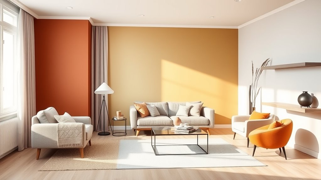
Warm Palettes That Make Rooms Feel Cozy
When you want your living room to feel like a warm embrace, choose a palette of terracotta, deep ochre, burnt sienna, and rich cocoa—these hues create immediate intimacy without overwhelming the space.
Choose terracotta, deep ochre, burnt sienna, and cocoa for a cozy, intimate living room atmosphere.
You’ll layer color with cozy textures and warm accessories to build depth: walls stay grounded while textiles and art shift mood. Think about lighting to deepen tones and keep contrast soft.
Focus on three simple moves to make the palette sing:
- Add tactile throws and rugs to invite touch.
- Use mixed-metal lamps and frames for subtle shine.
- Anchor seating with a deeper accent wall.
Cool Palettes That Open Small Living Rooms
If you want a room that feels larger, try pale blue walls to reflect light and calm the space.
Pair soft gray undertones to keep the look sophisticated without cooling it too much.
Add minty green accents for a fresh pop that ties the palette together.
Pale Blue Walls
- Natural wood: warmth against coolness.
- White trim: crisp, expanded sightlines.
- Muted metallics: subtle sparkle without contrast.
Use pale blue combinations to keep the room cohesive.
Soft Gray Undertones
Although cool, soft gray undertones can seem austere on paper, they actually expand a small living room by reflecting light and calming the eye.
You’ll find soft gray provides a neutral backdrop that feels modern without sterility. Pair it with warm textiles, layered rugs, and wood accents to create a cozy atmosphere that still reads airy.
Choose grays with subtle blue or green hints to suit natural light; north-facing rooms benefit from warmer grays.
Keep trim crisp white and limit high-contrast patterns to avoid visual clutter.
With thoughtful lighting and texture, gray opens space while inviting comfort.
Minty Green Accents
Pairing soft gray with minty green accents keeps the calm, airy feel while adding a fresh, uplifting note that visually expands a small living room.
You’ll use minty green psychology to calm nerves and stimulate clarity without overwhelming the space. Choose textiles, trim, or a single accent wall to test minty green pairings before committing.
Balance is key: keep large surfaces neutral and let minty touches breathe. Consider scale, light, and texture so accents read intentional rather than playful.
Practical tips:
- Accent pillows and throws
- Trim, shelves, or a small wall
- Plants and art frames
Bold Accent Wall Ideas and Placement
When you want to make a strong visual statement, a bold accent wall can anchor the room and showcase your personality without overwhelming the space.
Choose bold color combinations that complement existing furnishings and finish choices. Place the accent wall where it naturally draws the eye: behind the sofa, fireplace, or a media console.
Consider scale—a single wall reads crisp, while partial panels or vertical stripes add height. Test swatches in different light and step back to evaluate impact.
Keep surrounding walls neutral to let the accent pop, and balance textures and art so the feature feels intentional, not accidental.
Use Undertones to Avoid Color Surprises
Check the paint in different lights to identify the true undertones that can shift a color from warm to cool.
You’ll want to test paint swatches on your walls, not just hold chips, so you can see how they read at various times of day.
This simple routine helps you avoid color surprises when the room gets morning sun, evening glow, or artificial light.
Identify True Undertones
Want to be sure the paint you pick looks the same in your room as it does in the store? Identify true undertones so color psychology and undertone analysis guide your choice.
Look at swatches in natural and artificial light to see cool or warm hints that affect emotional response and mood influences. Consider color harmony with existing furniture and finishes for aesthetic balance.
Steps to confirm undertones:
- View against white to reveal subtle warmth or coolness.
- Compare next to wood, metal, and fabric to judge harmony.
- Observe at different times to note shifting undertones and reactions.
Test Paint Swatches
Now that you’ve identified undertones, it’s time to test paint swatches in the real space so you don’t get stuck with an unexpected hue.
Grab several large swatches and tape them to different walls, then live with them for a few days. Observe how each swatch application reads next to trim, furniture, and textiles.
Mix and match to test color combinations—pair warm and cool options, or neighbor shades—for cohesion. Photograph the swatches at different times and note which ones feel right.
Trust what consistently pleases you; swatch testing catches surprises before you commit to a full paint job.
Consider Lighting Effects
Lighting dramatically shifts how a color reads, so study your swatches under every light your room uses—morning daylight, afternoon sun, overcast skies, and all artificial fixtures—to see undertones reveal themselves.
You’ll catch warm or cool hints that change mood and affect color harmony with furniture and flooring. Note lighting temperature from bulbs and windows; match swatches to desired atmosphere. Check corners and high/low walls.
Then:
- Observe swatches at different times for undertone shifts.
- Compare swatches beside textiles and finishes to test color harmony.
- Choose the shade that stays pleasing under your room’s real lighting.
Choose the Right Paint Sheen (Look + Durability)
Sheen affects both how your living room looks and how it wears over time, so pick one that matches your style and traffic level. You’ll choose from sheen types like flat, eggshell, satin, semi-gloss, and gloss; each reflects light differently and changes perceived color intensity.
Consider durability factors: higher sheen resists scuffs and cleans easier, ideal for high-traffic spaces, while lower sheen hides imperfections on textured or older walls.
Match sheen to room use—flat or eggshell for low-traffic, satin or semi-gloss near entryways or trim.
Always balance appearance with practicality for lasting satisfaction.
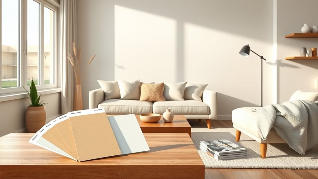
Test Living‑Room Paint Samples Efficiently
How will the color actually look in your living room? Start small: buy sample pots and paint 12-inch squares on different walls. Don’t guess—observe edges and how color meets trim.
- Paint adjacent squares to test color combinations and see shifts.
- Label each swatch with brand, shade, and finish so you can compare finishes quickly.
- Live with samples for a few days to note wear and practicality.
Take photos from seating height and note how furniture interacts with each swatch.
Photograph swatches from seating height to see how natural light and furniture colors truly interact with the paint.
Prioritize real-life context over online images—this efficient routine helps you choose confidently and avoid costly repainting.
Evaluate Paint at Different Times of Day
Want to know how a shade will feel from dawn to dusk? Bring painted samples into the room and observe them across real conditions.
In morning light you’ll notice coolness or warmth reveal undertones; take photos and notes.
Midday sun can wash or amplify color, so check how saturation shifts.
As day wanes, watch evening shadows deepen tones and change mood; dimmer bulbs may alter perception further.
Live with each sample for a couple of days, at different times, and with your usual window treatments in place.
Choose the shade that reads best throughout your actual day.
Pick Trim, Ceiling, and Molding Colors
After you’ve lived with paint samples through the day, it’s time to decide what color to use on trim, ceilings, and moldings—they frame the walls and can make or break the overall look.
Choose trim color combinations that support your wall tone: classic crisp white for contrast, tonal trim for subtlety, or a bold shade for drama.
Pick trim colors that echo your walls: crisp white for contrast, matching tones for subtlety, or a bold hue for drama
Consider ceiling paint options: bright white to lift, soft off-white to warm, or a pale tint of the wall for cohesion.
Think about sheen, light reflection, and molding profiles.
Test small areas to confirm harmony before committing.
Rules for Combining Two Wall Colors
When you pair two wall colors, pick one dominant hue to anchor the room and another to complement it.
Keep warm and cool tones balanced so the space feels cohesive, not jarring.
Use a unifying accent—like trim, a rug, or pillows—to tie both colors together.
Choose A Dominant Hue
If you’re pairing two wall colors, pick one dominant hue to anchor the room and guide all other choices. Choose dominant hues that reflect the mood you want; color psychology helps explain why blues calm and yellows energize. Let the dominant hue cover the largest surface and set trim, accent, and furniture decisions.
- Decide function: relaxation or activity.
- Test large swatches under daylight and evening light.
- Coordinate saturation: muted with bold, or both soft.
Trust the dominant hue to simplify contrasts and repeat it in textiles so the space feels intentional and cohesive.
Balance Warm And Cool
Because warm and cool tones influence mood so differently, you’ll want to balance them deliberately to keep the room feeling unified rather than split, using one to anchor and the other to highlight.
Start by choosing a dominant temperature for large surfaces—walls or sofa—so your color harmony reads cohesive. Use the contrasting temperature on a smaller scale: a feature wall, trim, or built-ins.
Keep saturation similar so neither color fights for attention. Test samples under your lighting to confirm temperature balance throughout the day.
Adjust proportions—more warm for coziness, more cool for calm—until the room feels intentional.
Use A Unifying Accent
To keep those warm-and-cool choices from feeling disjointed, pick a unifying accent that ties both colors together and repeat it sparingly across the room.
You’ll use accent color psychology to guide mood—choose one hue that bridges temperature and repeats in textiles, art, and small furniture. That creates cohesive design elements without overwhelming the palette.
Consider these focused steps:
- Pick a single accent with emotional intent (calm, energetic, neutral).
- Repeat it in three places to anchor sightlines.
- Vary scale and texture so the accent reads unified, not monotonous.
Use Color to Highlight Architectural Features
When you want certain details to stand out, use paint strategically to draw the eye to moldings, built-ins, window frames, or an ornate fireplace.
You can paint trim a crisp white against warm walls to make highlighted features pop, or choose a deeper tone for architectural accents to create contrast and depth.
Keep ceilings and large surfaces neutral so the accents read clearly.
Test small swatches to see how light shifts color, and use satin or semi-gloss on trim for durability and definition.
Let intentional color choices celebrate structure rather than compete with furniture or artwork.
Color Planning for Open‑Plan Living Areas
Highlighting trim and built-ins sets the tone for how color will read across a connected space, so you’ll want a clear plan for open‑plan living areas where multiple functions share one visual field.
Highlight trim and built-ins to guide color flow across open-plan spaces where multiple functions coexist.
In open concept design you balance cohesion and distinction: pick a unifying palette, then vary value and finish to define zones. Aim for color harmony so shifts feel intentional.
- Use one dominant hue for flow.
- Shift tones or textures to mark dining, lounge, work.
- Repeat accent color to tie corners together.
Test samples in full daylight and evening before committing.
Selecting Colors for Rooms With Lots of Art
If your room holds a lot of art, start with a neutral wall foundation so your pieces take center stage.
Then pick an accent color that echoes tones in key artworks to create cohesion without competing.
Finally, consider lighting and finish—matte walls reduce glare while directional lighting brings out texture and color.
Neutral Wall Foundations
Think of a neutral wall as the frame for your collection: choose tones that let artwork take center stage while providing enough warmth or coolness to unify the room. You’ll use neutral color psychology to support mood without competing with pieces; timeless neutral trends favor grays, warm beiges, and soft whites that complement varied palettes.
Pick undertones to echo key works, keep sheen low to avoid glare, and test large swatches under evening and daylight.
Consider:
- Undertone matching for cohesion.
- Contrast level to define art edges.
- Light reflection to preserve color fidelity.
These choices create a calm, flexible backdrop.
Accent Color Strategy
Why not let accent colors act like stage lights for your art—drawing attention without stealing the show? You’ll pick accents that echo dominant hues in your pieces, using color theory to create balance.
Pull a secondary tone from a painting and repeat it in pillows, trim, or a single chair to reinforce accent harmony. Keep most walls neutral so artwork remains focal; use accents sparingly to frame, not compete.
Test swatches beside each artwork to confirm contrasts enhance rather than clash. This deliberate restraint helps your collection read cohesively across the room while letting individual pieces shine.
Lighting And Finish
After you’ve settled on accent placements that spotlight your art, turn attention to how lighting and paint finish shape what people actually see.
You’ll choose colors differently under varied lighting types and when considering finish options. Match cooler lamps with warmer wall tones to preserve skin and canvas hues.
Matte hides glare and won’t compete; eggshell adds subtle sheen and cleans easier; satin reflects more and can brighten a gallery wall.
Consider direction, intensity, and color temperature of fixtures so paintings read true. Test swatches at different times and with task, ambient, and accent lighting before committing to a hue.
Try Paint Trends Without Full Commitment
If you’re curious about a trending hue but don’t want to commit walls to it, there are low-risk ways to test the look first.
Create sample boards with swatches, fabric, and photos to explore color psychology and seasonal trends. Apply test patches in multiple light conditions to see true tones.
Assemble swatches, fabrics, and photos; test paint patches in varied light to gauge true tones and seasonal moods
Build mood boards online for paint combinations and accent ideas before buying gallons. Try removable wallpaper, a single accent wall, or painted furniture to trial texture variations without overhaul.
Live with options for a few weeks, note how colors affect your mood, then decide confidently.
Common Color Mistakes and Quick Fixes
When you pick a color, small missteps—wrong undertones, too-dark samples, or ignoring light—can quickly make a room feel off; the good news is most mistakes have simple fixes you can do in an afternoon.
You’ll learn to correct issues fast using color psychology and addressing common misconceptions.
Try these steps:
- Test larger swatches in different light to reveal undertones and adjust hue.
- Lighten heavy shades with a lighter trim or accent wall to restore balance.
- Use temperature-contrasting accessories to shift perceived warmth or coolness without repainting.
Budget‑Smart Paint Choices: Where to Splurge
Because paint quality affects both look and longevity, you should splurge selectively—invest in good-quality paint for high-traffic walls, trim, and ceilings that need durable finish and true color, while saving on accent walls or less-used rooms with more affordable brands or samples. Choose satin or semi-gloss for trim and washable walls, and consider eco friendly options with low VOCs for indoor air quality. Use affordable finishes where scuffs are minimal. Compare coverage and touch-up ease to decide.
| Area | Where to splurge | Where to save |
|---|---|---|
| Trim | High | N/A |
| Walls | High-traffic | Accent walls |
Quick Checklist: Buying Paint and Prepping Walls
Start by making a short checklist so you don’t overlook essentials: pick your color and finish, measure the room to estimate paint quantity, read product coverage and sheen recommendations, and gather tools like rollers, brushes, drop cloths, tape, and a quality primer.
You’ll also compare paint brands for warranty and VOCs, and confirm surface needs. Tight wall preparation saves time and improves finish.
Follow three priorities to stay focused:
- Clean and repair: wash, fill holes, sand smooth.
- Prime high-porosity areas and patched spots.
- Protect floors and trim, tape precisely before cutting in.
Buy a bit extra for touch-ups.
What to Do Next: Samples, Painters, and Timeline
Before you commit, test small samples on different walls and view them at multiple times of day so you know how light and furnishings affect the color.
Next, note how each swatch’s paint finish alters depth and sheen; matte hides flaws, satin adds softness, gloss highlights trim.
Consider color psychology—warm tones energize, cool tones calm—and pick samples that match your desired mood.
Schedule painters once you settle on color and finish: get three quotes, check references, confirm timeline and prep needs.
Plan for two coats plus drying and furniture return; build in a buffer for touch-ups.
Frequently Asked Questions
How Long Does Paint Odor Linger After Painting the Living Room?
Paint odor typically lingers 2–7 days, though low-VOC paints cut that. You should ventilate aggressively: open windows, run fans, use air purifiers. Ventilation tips include cross-ventilation and keeping HVAC filters clean.
Can I Paint Over Wallpaper Without Removing It First?
Yes — you can often paint over wallpaper, but it depends on wallpaper types and condition; you’ll need to secure seams, prime for paint adhesion, and use water-resistant primer or remove loose paper for a durable, smooth finish.
How Do I Protect Walls From Kids and Pets?
By and large, you’ll want durable wall protection strategies: use washable kid friendly materials, corner guards, high-impact paint, wainscoting, and removable wall panels. You’ll set boundaries, reinforce spots, and make cleanup a breeze.
What Are Eco-Friendly or Low-Voc Paint Options?
You can choose certified eco friendly brands like Benjamin Moore Natura, Sherwin-Williams Harmony, or Clare; they’re low-odor, safer for kids and pets, and low VOC benefits include improved indoor air quality, quicker drying, and reduced chemical exposure.
Can I Paint Textured or Popcorn Ceilings Instead of Replacing?
Yes — you can paint textured or popcorn ceilings instead of replacing them. You’ll use textured ceiling techniques like dry brushing or stippling, and explore popcorn ceiling alternatives such as skim coating or acoustic-safe paints for smoother results.
Conclusion
Now you’ve got a clear 3-step approach and practical tips to pick a living-room paint color that works with light, size, furniture, and budget. Don’t let choice paralysis slow you down — try samples, view them at different times, and live with swatches before committing. Hire pros for big jobs or tackle small rooms yourself. With a little patience and a plan, you’ll nail the color and have your space feeling like home in no time.