What Color Should I Paint My Bedroom Walls
Pick a bedroom paint color based on how you want to feel: choose soft blues or muted greens for calm and sleep, warm yellows or corals to energize mornings, or deeper, saturated tones for coziness and intimacy. Match undertones with your flooring and textiles, test large swatches in morning and evening light, and pick finishes that suit traffic and cleaning needs. Try a neutral base with personal accent colors, and keep going to see practical steps and examples.
How to Use This Guide to Pick a Bedroom Color
Before you start swatches or shopping, decide what you want your bedroom to do for you: help you sleep, energize mornings, or double as a workspace. Use this guide to match those goals to color symbolism—cool blues calm, warm yellows energize, greens balance.
Decide what your bedroom should do—calm with cool blues, energize with warm yellows, or balance with greens.
Consider natural light, room size, and existing textiles when narrowing choices. Test samples on different walls and observe at morning and night.
Also factor paint durability for high-traffic areas and choose finishes that clean well without losing color depth.
Follow sections in order: inspiration, testing, and final selection to make a confident choice.
Quick Checklist: Pick a Bedroom Color in 5 Steps
When you need to decide fast, follow these five clear steps to pick a bedroom color that fits your goals and space.
1) Measure light and size—natural light shifts color; test samples on different walls.
2) Review furniture and flooring so tones coordinate, using basic color theory to balance warm and cool.
3) Choose a primary hue, then pick one accent and one neutral for trim.
4) Select finish with paint durability in mind—high-traffic rooms need tougher sheens.
5) Test small areas, live with samples for a few days, then commit when it feels right.
Decide the Mood You Want in Your Bedroom
Because your bedroom sets the tone for rest and routine, decide the mood you want before picking specific colors; do you want a calm, restorative retreat, an energizing wake-up space, or a cozy cocoon for reading and intimacy? Choose a color palette that supports that intent. Cool blues and muted greens promote relaxation and mood enhancement. Warm yellows or coral energize mornings. Deep, soft tones create intimacy. Use the table to match goals and feelings.
| Mood | Palette Example | Effect |
|---|---|---|
| Calm | Pale blue/green | Restful |
| Energize | Soft yellow | Bright |
| Cozy | Deep plum | Intimate |
How Natural Light Changes Paint Color
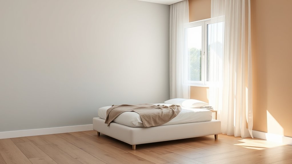
Although light shifts throughout the day, it dramatically changes how paint reads on your walls, so check swatches at different times before committing. You’ll notice cool morning light can mute warm tones while afternoon sun warms neutrals, altering color symbolism and the mood you meant to create.
Position samples where the bed and dresser sit and observe them under sunrise, midday, and dusk. Also consider how limited light might hide imperfections, affecting perceived paint durability and maintenance needs.
If natural light is weak, choose slightly brighter or higher-sheen finishes to keep colors true without overpainting later.
Match Paint to Room Size: Make Small Rooms Feel Bigger
How do you make a cramped bedroom feel larger without remodeling? Use light, warm neutrals and cool pastels to leverage color psychology: pale blues and soft creams reflect light and open sightlines. Keep ceilings lighter than walls, paint trims in subtle contrast, and choose semi-gloss for areas needing cleaning—paint durability matters where you touch surfaces. Position mirrors to multiply light, and carry the same hue through connected spaces for continuity.
| Element | Effect |
|---|---|
| Pale walls | Expand space |
| Lighter ceiling | Height illusion |
| Subtle trim | Defined edges |
| Mirrors | Reflect light |
| Durable finish | Lasting look |
Choose Paint That Complements Your Flooring and Trim
When picking a wall color, start by looking at your flooring and trim so the room feels cohesive rather than pasted together. Note undertones in wood, tile, or carpet and pick a hue that harmonizes—warm floors suit warm paints, cool floors suit cool tones.
Consider trim finish: glossy white reads differently than matte cream. Test swatches near baseboards and doorframes to see how wall texture affects perception.
Choose a paint formula with appropriate paint durability for traffic and cleaning needs. Small samples painted on different surfaces will reveal true contrast and help you finalize a balanced, unified palette.
Pair Wall Color With Furniture and Textiles
Look at the undertones in your fabrics and pick wall paint with similar warm or cool hints so everything reads as one cohesive scheme.
If your bedding or curtains are patterned, use the dominant color for walls and pull accents from secondary hues to keep the room balanced.
Don’t be afraid to let a patterned textile set the mood while the paint provides a calming backdrop.
Match Undertones With Fabrics
Because fabrics carry warm or cool undertones just like paint, you’ll get the most cohesive look when you pair wall color with the dominant undertone in your furniture and textiles.
Consider color symbolism—warm tones feel cozy, cool tones feel calm—and check fabric undertones against paint swatches in natural light.
Match the undertone, not the exact hue, to keep contrast subtle and unified.
Quick checklist to follow:
- Test swatches beside upholstery.
- Use a neutral with a shared undertone.
- Swap small textiles to preview change.
- Trust daylight for true color comparison.
Balance Pattern And Color
If your room already has bold patterns—on rugs, curtains, or bedding—let the walls play a supporting role by choosing a color that picks up a secondary shade or a neutral from those patterns. You’ll create color harmony by echoing tones without competing.
For patterned furniture, pull a subtle tint from upholstery for an accent wall or trim, keeping the main walls calmer. Test swatches near textiles to check light shifts.
Aim for pattern balance: mix large-scale prints with solid areas and small motifs so the eye rests. That way your walls unify the space while letting textiles and furniture shine.
Use Color Psychology to Support Sleep and Relaxation
When you choose bedroom paint with sleep-friendly psychology in mind, you’re not just picking a hue—you’re shaping how your room calms your mind and body. Use color symbolism and emotional impact to guide choices that promote rest. Consider paint that soothes rather than stimulates, and pair it with muted accessories.
- Pick tones that lower arousal and ease breathing.
- Avoid high-contrast, attention-grabbing shades near your bed.
- Test samples under evening light to gauge calmness.
- Use a consistent, limited palette to reduce visual noise.
You’ll sleep better when your walls quietly support relaxation.
Choose Warm or Cool Tones: When Each Works
Think about whether you want your bedroom to feel cozy or serene.
Warm tones like terracotta and soft golds create comfort and intimacy.
Cool tones such as pale blues and muted greens promote calm and restfulness.
Warm Tones For Comfort
Although cool colors can feel tranquil, warm tones bring immediate comfort and a sense of intimacy to a bedroom. You’ll choose hues that wrap you in coziness—terracotta, honey, blush, or golden beige—each carrying color symbolism and shaped by cultural influences that affect how you perceive warmth.
Think about mood, natural light, and furniture finishes so the room feels inviting without overwhelming. Consider these practical uses:
- Accent wall for focus and depth.
- Soft matte for subtle warmth.
- Trim in a lighter warm shade to frame.
- Fabrics and lighting to amplify tone.
Pick what makes you feel at home.
Cool Tones For Calm
If you want a bedroom that feels peaceful and restorative, cool tones deliver a calm backdrop that helps you unwind and sleep. You’ll choose blues, greens, or soft grays to lower visual stimulation and create a soothing atmosphere. Think of color therapy: these hues can slow your breathing and ease stress, so pick shades that resonate with you.
Balance cool walls with warm textiles to avoid chilliness. Also consider paint durability—matt finishes hide imperfections while washable options hold up to cleaning. Test samples at different times of day, then commit to the shade that consistently helps you relax.
Timeless Neutral Wall Colors to Try
When you want a backdrop that stays stylish through trends and seasons, timeless neutrals are the safest choice; they create a calm, flexible canvas that lets furniture and art take center stage. You’ll choose neutrals for longevity, mindful of color symbolism and cultural perceptions that affect mood and meaning.
Try these reliable options:
- Warm beige — cozy, versatile for wood tones.
- Soft gray — modern, pairs with bold accents.
- Greige — balances warm and cool undertones.
- Creamy white — brightens without starkness.
Pick a finish and test swatches in different light before committing to a full room.
Calming Blue Shades for Better Rest
You can create a soothing bedroom by choosing soft, muted blues that calm the mind without feeling chilly.
For a cozier, more restorative space, consider deeper “sleep” blues that promote relaxation and reduce visual stimulation.
Pair either shade with warm accents and layered lighting to keep the room inviting.
Soft Muted Blues
Because soft, muted blues slow your breathing and quiet the mind, they make an ideal backdrop for sleep-focused bedrooms. You’ll find these tones balance Color symbolism—tranquility, trust—with practical paint durability for long-lasting, low-maintenance walls.
Choose warmer muted blues if you want a cozier feel; cooler ones feel more airy. Pair with warm neutrals and soft linens to avoid sterility.
- Pick a low-sheen finish for easy cleaning.
- Test samples under evening light.
- Add textured throws to soften the space.
- Keep contrast low to promote relaxation.
These choices help you rest without feeling cold or clinical.
Deep Sleep Blues
If you want a bedroom that cues deep rest, reach for rich, calming blues—think navy, indigo, or stormy slate—that absorb light and hush the room without feeling heavy. You’ll create a cocooned atmosphere that leverages color symbolism tied to tranquility and trust, helping your mind downshift at night.
Balance deep walls with lighter bedding and warm wood to avoid gloom. Choose a finish mindful of paint durability—matte hides imperfections while satin cleans easier—so your sleep sanctuary stays pristine.
Test samples at different times to verify the hue reads as soothing rather than somber in your specific light.
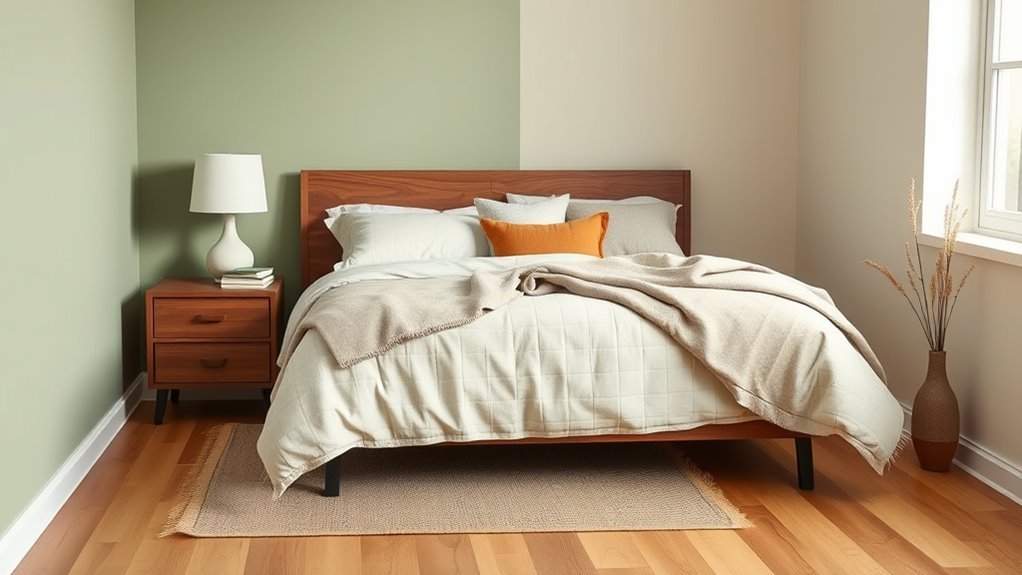
Soothing Greens for a Natural Bedroom
When you want a bedroom that feels calm and grounded, soothing greens bring nature’s balance indoors with effortless style. You’ll choose muted sage, soft moss, or pale celadon to calm the mind.
Prefer eco friendly paint to keep air fresh and health risks low. Use color mixing techniques to tweak undertones so walls complement wood, linen, and plants.
Consider these steps:
- Pick a base green that feels restful.
- Test samples across different light.
- Adjust with small tints or grays for warmth/coolness.
- Finish with matte or eggshell for a cozy, natural look.
Cozy Warm Neutrals and Earth-Tone Tans
Choose a soft taupe foundation to create a calm, cozy base that lets other elements shine. Add layered warm textures—think wool throws, suede pillows, and wood tones—to build depth and comfort.
Tie the room together with complementary accent hues like terracotta, muted olive, or warm ochre for a cohesive, inviting feel.
Soft Taupe Foundations
Although it leans quietly between beige and gray, soft taupe gives your bedroom a warm, grounded backdrop that works with both cool and warm accents. You’ll find it adaptable: it softens sunlight, boosts cozy evenings, and pairs with vivid art.
Consider color contrast when selecting trim or bedding to keep the room lively. Pay attention to paint textures to add subtle depth without heavy patterning.
Try these simple ideas:
- White trim for crisp definition.
- Deep navy accent for drama.
- Natural wood furniture to warm the space.
- Muted green plants for a fresh touch.
Layered Warm Textures
If you want a bedroom that feels enveloping without feeling heavy, layer warm neutrals and earth-tone tans to build depth through texture rather than bold color. You’ll combine matte paint with woven throws, plush rugs, and linen curtains to create layered textures that feel tactile and lived-in.
Keep furniture finishes in light wood or muted bronze so surfaces harmonize. Introduce warm accents sparingly—a leather pillow, a terracotta vase—to punctuate without dominating.
Stick to a restrained palette, vary fabric weights, and let natural light reveal subtle shifts. The result is cozy, calm, and sophisticated without relying on bright hues.
Complementary Accent Hues
To enhance that layered, tactile warmth, introduce complementary accent hues drawn from cozy warm neutrals and earth-tone tans. You’ll create calm, grounded spaces by pairing soft beige, ochre, clay, and caramel with richer main walls.
Consider color symbolism—beige for balance, ochre for optimism—to set mood. Choose finishes that boost paint durability in high-touch areas. Use these accents sparingly to highlight textiles, trim, or a single feature wall.
- Soft beige for serenity
- Ochre for warmth
- Clay for depth
- Caramel for richness
Keep contrasts gentle so your room feels cohesive and inviting.
Moody Jewel Tones for Drama and Depth
When you want a bedroom that feels both intimate and theatrical, moody jewel tones deliver instant drama and depth. You’ll choose sapphire, emerald, or amethyst to harness color symbolism and mood enhancement, creating a cocooned retreat. Pair rich walls with brass, velvet, and matte black for contrast. Use lighting layers to prevent heaviness and scale patterns sparingly so depth reads intentional. Test swatches at different times, then commit to one dominant tone with lighter accents.
| Tone | Effect | Pairing |
|---|---|---|
| Sapphire | Calming intensity | Brass |
| Emerald | Lush warmth | Velvet |
| Amethyst | Soothing depth | Black |
Soft Pastels for a Light, Airy Feel
If you want a light, airy bedroom, pick soft pastel hues like pale blush, mint, or powder blue to set a gentle tone.
Balance those colors with warm or cool neutrals—think off-white trim, light oak furniture, or soft gray accents—to keep the room grounded.
Pay attention to natural and artificial light, since pastels shift with brightness and will change the room’s mood throughout the day.
Soft Pastel Palette Choices
Although soft pastels look delicate, they can instantly make your bedroom feel bright, calm, and open. Pale blues, blush pinks, mint greens, and warm creams bounce light around the room without overwhelming it.
You’ll choose shades based on mood and function, considering color symbolism and cultural influences that shape meaning. Test samples on different walls and observe them at morning and evening light. Think about trim and textiles to coordinate depth.
- Pale blue — serene, great for sleep.
- Blush pink — cozy, romantic.
- Mint green — invigorating, restorative.
- Warm cream — versatile, welcoming.
Balancing With Neutrals
Because soft pastels read as delicate, pairing them with neutrals helps anchor the room and keeps the palette feeling fresh rather than fussy. You’ll balance pastels by using balancing neutrals—think warm beiges, soft greys, or creamy whites—to give depth without overpowering color.
Use neutral accents in textiles, trim, and furniture to create cohesion and let pastel walls remain the focal point. Keep contrast subtle: a slightly darker neutral rug or headboard grounds the bed, while light curtains maintain airiness.
Experiment with small swatches and adjust saturation until the neutrals support, not compete, with your chosen pastel hue.
Light And Mood Effects
When you paint bedroom walls in soft pastels, natural and artificial light will gently amplify their airy quality, making the room feel larger and calmer. You’ll notice how color harmony unfolds as sunlight shifts, while mood lighting at night deepens softness.
Choose tones with similar undertones for cohesive progressions and add contrast using textiles or trim. Consider these practical effects:
- Morning sun intensifies cool pastels, boosting alertness.
- Warm lamps make pinks and peaches cozier for winding down.
- Sheer curtains diffuse harsh rays, preserving gentleness.
- Accent pieces anchor the palette without overpowering serenity.
Bedroom Accent Wall Ideas That Actually Work
If you want a quick way to give your bedroom personality, an accent wall does the trick—choosing the right wall, color, and finish makes the rest of the room feel intentional without overcommitting. Pick the wall behind your bed or a focal architectural feature.
Use a bold solid, textured paint, or artistic murals for statement impact. Consider scale, lighting, and how furnishings contrast.
If you prefer subtlety, try a tonal shade or thin stripes. Coordinate with fabrics and rugs so the accent feels integrated.
You can also tie the accent into ceiling treatments elsewhere, but keep edges crisp and deliberate.
Picking Trim and Ceiling Colors With Your Wall Paint
When you pick a wall color, think about how your trim will frame it—classic white brightens, while a contrasting trim adds definition.
For ceilings, you can keep them crisp white to lift the room or use a soft tint of your wall color to make the space feel cozier.
Try small swatches to see how trim and ceiling choices change the overall mood before committing.
Trim Color Coordination
Although trim and ceiling colors often seem like afterthoughts, they shape how your wall paint reads and how the room feels. You’ll use trim accents to frame windows, doors, and baseboards, creating clear lines that lift your scheme.
Consider color contrast carefully: a crisp white makes hues pop, while a muted trim softens the shift. Think about sheen—higher gloss adds definition.
Match trim to architectural style and hardware finishes. Test samples at different times of day.
Maintain cohesion across rooms for flow. Choose trims that support your wall color rather than compete, and keep decisions consistent.
Ceiling Color Choices
Because the ceiling sits above everything, its color can subtly change how your walls read and how spacious the room feels, so pick it with intention.
You’ll usually choose white or a light tint to bounce light and visually raise low ceiling height, while a darker shade can cozy a tall room.
Match trim and ceiling undertones to avoid clashes; warm walls pair with warm whites.
Use a flat finish to hide imperfections, but consider semi-gloss for better paint durability in humid areas.
Test swatches under evening and morning light, then commit once the samples read right in your space.
Two-Tone Walls and Color-Blocking Options for Bedrooms
If you want a bold yet balanced look, two-tone walls and color-blocking let you pair contrasting or complementary hues to define zones, add depth, and highlight architectural features without overwhelming the room. You’ll balance color harmony with intentional contrast, considering lighting effects to keep tones true.
Two-tone walls and color-blocking create bold, balanced spaces—define zones, add depth, and highlight features without overwhelming.
Choose a dominant neutral and an accent, or split hues horizontally, vertically, or with geometric shapes.
Tips:
- Use a darker base and lighter top to raise ceilings.
- Create a focal wall behind the bed with a bold block.
- Match trim to one tone for cohesion.
- Test swaps in different light throughout the day.
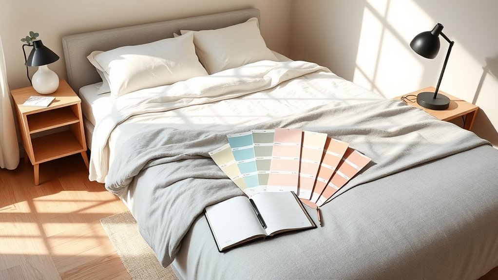
How to Test Paint Samples on Your Wall Correctly
When you’re deciding on a bedroom color, testing samples on the actual wall is essential to see how light and surrounding elements change the hue throughout the day. Apply 4″ x 4″ swatches or paint 2×2 foot panels; label each with brand and finish so you can judge paint texture and sheen. Observe near furniture and trim to judge color psychology effects on mood. Note drying time and edge bleeding. Use peelable tape for neat samples and photograph panels for reference.
| Sample ID | Finish | Notes |
|---|---|---|
| A | Matte | Soft, muted |
| B | Eggshell | Slight sheen |
| C | Satin | Warm glow |
Lighting Experiments: View Paint at Different Times
Try your samples in the morning to see how cool, indirect light pulls out blues and grays.
Check them again at midday when strong sun can wash colors brighter or reveal true undertones.
Finally, view the swatches under your evening lamps so you know how artificial light warms or mutes the paint.
Morning Light Differences
Because morning light is colder and clearer than afternoon sun, colors often look bluer and less saturated at that hour, so you should check paint samples early to see how they read at the start of your day.
Morning sunlight and light temperature shift hues; you’ll notice cooler tones and softer contrasts. Test samples on different walls before deciding. Observe for at least an hour.
- Place large swatches where you wake.
- Photograph samples without flash.
- Note how whites shift toward blue.
- Compare adjacent colors in natural light.
Make choices based on how the room feels at dawn.
Midday Sun Effects
As the sun climbs to its highest point, midday light floods rooms with strong, neutral illumination that reveals a paint’s true color and saturation. So view samples at this hour to judge how tones will read during your busiest daytime hours.
You’ll notice Sunlight reflection intensifies hues and shows undertones you missed in morning shadow. Hold larger swatches on different walls to see how flat versus glossy finishes bounce light.
Pay attention to Color fading risks on sun-exposed walls and consider UV-resistant paints or window treatments if you want long-lasting vibrancy. Test over several days for consistency.
Evening Artificial Tones
When daylight fades and you rely on lamps and overhead fixtures, artificial light will change how paint reads—warm bulbs will soften and deepen colors while cool LEDs can make them appear flatter or slightly greenish.
You should test samples at night to judge mood, contrast, and Color symbolism under artificial lighting. Note how hues shift and how you feel in the space, then adjust accordingly.
Try these simple experiments:
- View swatches under a warm table lamp.
- Compare with cool LED overhead lighting.
- Check with dimmed fixtures for evening ambiance.
- Observe at different times to confirm consistency.
Which Paint Sheen Is Best for Bedrooms?
Curious which paint sheen will give your bedroom the right look and durability? You’ll choose between flat, eggshell, satin, and semi-gloss.
Flat hides imperfections and supports restful color symbolism like muted blues, but it’s less washable.
Eggshell balances a soft, cozy finish with improved paint durability for moderate traffic.
Satin offers subtle luster, resists scuffs, and suits active bedrooms.
Semi-gloss is highly durable and easy to clean—best for trim, doors, or moisture-prone areas rather than whole walls.
Match sheen to room function: prioritize flat or eggshell for calm, satin where durability matters, and reserve semi-gloss for accents.
How Paint Undertones Affect Matching With Decor
Pay attention to a paint’s undertone—warm creams, cool grays, or soft greens will change how the room feels.
You’ll match those undertones to textiles like rugs, bedding, and curtains so colors read as intentional rather than clashing.
Try swatches next to your fabrics in different lights to make sure everything harmonizes.
Identifying Undertone Hues
Because undertones can quietly change how a color reads in your room, you’ll want to identify them before you commit to a paint—undertones are the subtle hints of warm (yellow, pink, red) or cool (blue, green, violet) that sit beneath the main hue and shift how it pairs with furniture, flooring, and fabrics.
Use color psychology and undertone identification to guide choices: test swatches on different walls, view them at various times, and observe near key pieces.
Steps to identify undertones:
- Tape large swatches to the wall.
- Check in morning and evening light.
- Compare with wood and metal finishes.
- Note skin-flattering warmth.
Coordinating With Textiles
Now that you’ve identified the undertones in your walls, consider how those subtle hues will play with the textiles you bring into the room. You’ll match or contrast deliberately: warm undertones pair with earthy throws and accent pillows to amplify comfort, while cool undertones suit crisp linens and metallic accents for calm.
Think about color symbolism—greens suggest renewal, blues promote rest—so pick textiles that reinforce the mood you want. Use Textile patterns to introduce rhythm: stripes for structure, florals for softness, geometrics for energy.
Test swatches together under your room’s light before committing to guarantee cohesive, intentional decor.
Make Paint Choices Work With Wood, Metal, and Fabric
When you pick a wall color, think about how it will play with the room’s wood, metal, and fabric—these materials set tone and texture more than you might expect. You’ll use color blending to unify finishes and achieve mood enhancement through contrast or harmony.
Consider surface warmth, sheen, and pattern scale so nothing fights for attention.
- Match warm woods with warm neutrals for cohesion.
- Use cool grays or blues to offset shiny metals.
- Let patterned fabrics pick the accent hue.
- Test swatches near furniture and window light before committing.
Build a Restful Palette for Shared or Couples’ Bedrooms
When you share a bedroom, you’ll need to make color compromises that respect both tastes without clashing. Start by identifying one calming base tone you both like.
Then layer in accents that reflect each person’s preference. That way you create a unified, restful mood that feels balanced for both of you.
Shared Color Compromises
If you and your partner have different color tastes, start by listing what each of you finds calming and why. Then look for overlaps or complementary options you can both live with. Use color theory to balance warm and cool preferences, and choose finishes that emphasize paint durability for high-traffic zones.
Agree on a primary neutral, then add accents you each claim. Test samples on different walls and lighting before committing.
- Pick a soothing neutral base
- Swap small accent pieces first
- Compromise on one bold wall max
- Choose durable finishes for longevity
Communicate, test, and commit together.
Harmonizing Individual Preferences
Although you might bring different color instincts to the room, you can create a unified, restful palette by identifying shared calming elements—think undertones, lightness, and texture—and building from a neutral anchor that suits both of you.
Start by listing each of your personal preferences and circle overlaps like cool undertones or muted saturation. Use that overlap to select a primary wall color, then add complementary accents that respect individual tastes without clashing.
Focus on color harmony through consistent undertones and varied textures. Test samples in your light, discuss adjustments, and commit to a small, balanced palette you both enjoy.
Creating Unified Mood
Because you share the room, start by agreeing on the mood you both want—calm, cozy, airy, or intimate—and let that guide your palette choices. Discuss color symbolism and cultural color meanings you each respond to, then pick a base, accent, and texture plan.
Consider these steps:
- Choose a soothing base (soft blue, warm beige, muted green).
- Add one accent color for energy or romance.
- Use neutrals and fabric textures to balance extremes.
- Test samples at different times of day and on large swatches.
Compromise on tones, prioritize restful lighting, and commit to a palette you both can relax in.
Kid-Friendly Bedroom Colors That Grow With Them
When you pick a color that balances playfulness and calm, the room will feel fresh now and adaptable as your child grows. Choose muted tones—soft sage, warm gray, or dusty blue—that support changing interests and pair easily with evolving decor.
Use accent walls or removable decals to add current personality without repainting. Coordinate with nursery themes when they’re little, then swap textiles and artwork as tastes shift.
Opt for durable paint finish options like eggshell for easy cleaning and a satin touch for trim. Keep the palette limited to two or three colors to guarantee long-term cohesion and flexibility.
Design a Guest Bedroom Color Scheme for Broad Appeal
For a guest bedroom you’ll want a neutral base—soft grays, warm beiges, or muted greiges—that feels calming and flexible.
Then pick one or two accent colors (think navy, sage, or dusty rose) for pillows, art, or a throw to add personality without overwhelming guests.
Finally, consider lighting and paint finish—warmer bulbs and an eggshell or satin finish will make the room feel inviting and easy to maintain.
Neutral Base Colors
Although you want the room to feel welcoming to anyone who stays, choosing a neutral base gives you the safest canvas for a guest bedroom that appeals to many tastes. Pick warm beiges, soft grays, or creamy whites to support varied decor and respect color psychology—calm neutrals reduce stress and feel timeless.
Consider paint durability for high-traffic stays; washable finishes keep maintenance easy. Balance light reflectance to make the space feel larger.
Use this simple checklist to decide:
- Test swatches at different times of day
- Choose washable finish
- Match undertones to flooring
- Keep trim slightly lighter
Accent Color Options
Because accents set the mood without overwhelming the room, pick one or two hues that complement your neutral base and repeat them in pillows, art, and a throw to create cohesion.
Choose colors with clear color symbolism—soft blue for calm, warm terracotta for comfort, or muted green for balance—to appeal widely. Consider cultural associations that might affect guests’ responses; some tones carry different meanings across backgrounds, so favor universally positive shades.
Use saturated accents sparingly to avoid visual fatigue. Test swatches in daylight and evening, then anchor your scheme with a consistent accent palette for a welcoming, adaptable guest bedroom.
Lighting And Finish
When you plan lighting and finish, think about how light transforms color at different times of day and choose sheens that support that effect. You’ll layer light: ambient, task, accent, and natural to show true undertones and follow current color trends without surprises.
Pick matte for cozy walls, eggshell for easy cleaning, satin for trim, and semi-gloss where moisture or wear needs attention—balancing aesthetic with paint durability. Consider bulbs’ temperature and dimmers to tweak mood.
Test swatches at morning and evening light. Coordinate finish choices so the scheme reads cohesive, guest-friendly, and resilient.
- Test swatches
- Layer lighting
- Match sheen to use
- Prioritize durability
Rental-Friendly Paint Options and Temporary Solutions
If you’re renting but want to refresh your bedroom, plenty of paint and nonpermanent options let you personalize without risking your deposit. Choose low-VOC or eco friendly options for minimal odor and easy cleanup; they’re better for landlords and your health.
Peel-and-stick wallpaper or removable fabric panels give bold looks and allow texture enhancement without sanding. Temporary wall decals and washi tape create patterns you can remove later.
Consider accenting with renter-safe samples or peelable chalkboard paint for function that’s reversible. Always test a small area, follow landlord rules, and keep original paint for touch-ups when you move.
Coordinate Bedding and Curtains With Your Wall Color
Once you’ve settled on renter-friendly wall finishes, coordinate bedding and curtains to unite the room’s look and mood. Use color theory to decide whether you want harmony or contrast; match textures to your chosen paint finishes so light behaves consistently. Consider scale and pattern to avoid visual clutter.
- Pick a dominant accent from the wall color for bedding.
- Use curtains in a softer shade or complementary hue for balance.
- Add a patterned throw that ties both colors together.
- Keep metallics and neutrals consistent to maintain cohesion and calm.
Use Rugs and Art to Balance Bold Wall Paint
How can you soften or anchor a bold wall without repainting? Use rug patterns to ground the room; choose colors that echo the wall but add neutral threads to calm intensity.
Place a large area rug under the bed to define the space, or layer smaller rugs for interest. For art placement, hang pieces at eye level and balance scale with furniture—group smaller frames or choose one oversized canvas to offset vivid paint.
Mix textures and muted tones in frames and mats to reduce visual noise. Together, rugs and art create cohesion, tempering bold color while keeping the room intentional and lively.
Layer Texture When Using Monochrome Walls
Rugs and art can tame a bold wall, but to keep a monochrome scheme from feeling flat you’ll want to layer texture throughout the room.
Rugs and art soften a bold wall; layer varied textures to keep a monochrome scheme lively and tactile.
You’ll create Monochrome depth by varying materials, scales, and finishes so the single hue reads rich and intentional. Focus on tactile contrasts that catch light and invite touch.
- Linen bedding for soft contrast
- Woven throws to add pattern without new color
- Matte and gloss finishes for subtle highlights
- Wood or rattan furniture to introduce warmth
Layer texture deliberately, repeat elements, and keep the palette unified.
Seasonal Color Tweaks Without Repainting
While you’re not repainting, you can still refresh a room each season by swapping accents, textiles, and light—small changes that shift the mood without touching the walls. You’ll use seasonal decor and Minimalist palettes to pivot vibes: warm throws and amber lamps in fall, crisp linens and cool ceramics in summer. Rotate rugs, pillows, and artwork; change bulb warmth and curtain fabric. A simple table helps you plan.
| Season | Texture | Light |
|---|---|---|
| Spring | Linen | Soft daylight |
| Winter | Wool | Warm glow |
These edits keep your room feeling current without repainting.
Common Color Mistakes That Throw a Bedroom Off
If you rely only on trendy hues or match everything too literally, your bedroom will feel off—stark, cramped, or chaotic—because color affects perception more than you think. You should balance intentions with scale and light.
Common mistakes undermine Color combinations and Mood enhancement goals:
- Picking a bold shade without sampling it at different times.
- Matching furniture exactly to wall paint, creating flatness.
- Ignoring undertones that clash with flooring or textiles.
- Using too many competing accents, breaking visual rest.
Choose contrast, test swatches, and limit competing hues so your space supports sleep and calm.
How to Recover From a Paint Color You Regret
When a color leaves you unsettled, don’t panic—you can fix it without gutting the room. Assess why it bothers you: too bright, too murky, or clashes with light. Test temporary tweaks—new lamps, bedding, or curtains—to shift mood before repainting.
Use color therapy principles: introduce small accents in calming hues to rebalance the space. If repainting’s necessary, pick a sample area and let it sit through different daylight.
Choose high-quality paint for better coverage and paint durability so fewer coats hide the old shade. Plan progressions gradually to avoid remorse and preserve your room’s harmony.
Budget-Friendly Ways to Change Color Impact
Because you don’t have to repaint the whole room to change its mood, small, inexpensive updates can make a big difference. You can refresh without a full overhaul by focusing on accents, textiles, and finishes that respond to current color trends while respecting paint durability.
Try these quick tactics to adjust impact:
- Swap bedding and curtains for bolder or softer hues.
- Add removable wallpaper or decals to one wall.
- Refinish trim or doors with a contrasting durable paint.
- Use throw pillows, rugs, and lamps to shift perceived temperature.
These moves cost little, let you test trends, and preserve long-lasting surfaces.
When to Hire a Color Consultant or Designer
Though you can handle many color choices yourself, bring in a color consultant or designer when decisions affect long-term value, complex lighting, or multiple connected spaces. You’ll hire help if outdoor lighting alters perceived hues, if paint durability matters for high-traffic walls, or if you need cohesive flow between rooms. A pro saves costly mistakes, matches finishes to function, and advises on undertones you might miss.
| Situation | Benefit | When to Call |
|---|---|---|
| Complex lighting | Accurate color fit | Before buying |
| Open-plan rooms | Cohesive palette | During planning |
| High-traffic | Durable finish | Pre-painting |
| Historic home | Period-correct | Early design |
Top Paint Brands and Signature Bedroom Shades
If you want reliable color options and consistent results, start by exploring leading paint brands, since each offers signature shades and proprietary formulas that affect finish, coverage, and durability. You’ll find classic neutrals and bold accents tailored for bedrooms, and knowing brand undertones helps you avoid color myths.
Consider:
- Brand A — known for cozy grays and washable finishes.
- Brand B — soft pastels with rich pigmentation.
- Brand C — deep blues and superior paint durability.
- Brand D — warm neutrals and easy blending.
Test samples on your wall at different times of day before committing.
Low-VOC and Eco-Friendly Paint Options
If you’re aiming for healthier indoor air, look for low-VOC paint brands that meet strict emissions standards.
You’ll also want to think about natural pigment choices like iron oxides or plant-based dyes, which reduce synthetic chemicals without sacrificing color depth.
Comparing labels and sample swatches will help you pick a shade that’s both eco-friendly and exactly what you want.
Low-VOC Paint Brands
When you’re choosing paint for your bedroom, low-VOC and eco-friendly brands let you prioritize indoor air quality without sacrificing color or finish. You’ll find reliable options that pair well with vintage furniture and won’t highlight uneven ceiling textures.
Consider these trusted lines:
- Benjamin Moore Natura – smooth coverage, wide palette.
- Sherwin-Williams Harmony – odor-reducing, durable finish.
- Farrow & Ball Modern Emulsion – rich pigments, washable.
- Behr Premium Plus Zero – budget-friendly, low odor.
Test samples on your walls to see true tones in your light. Look for third-party certifications and check drying times before buying.
Natural Pigment Choices
Although natural pigments come from minerals, plants, and earths, they offer surprisingly vivid, long-lasting colors without harsh chemicals, so you can keep indoor air quality high while achieving the exact mood you want. You’ll find clay reds, ochres, and plant-based greens that align with color psychology—calming greens, warm ambers, and soft neutrals. Choose low-VOC binders and certified eco brands to preserve pigment integrity. Test swatches in morning and evening light. Consider durability, coverage, and maintenance. Below’s a quick comparison to guide selections:
| Pigment Type | Mood | Best Use |
|---|---|---|
| Clay/Ochre | Warmth | Accent wall |
| Plant | Calm | Whole room |
| Mineral | Neutrality | Trim/ceiling |
Prep and Priming Tips for True Color Payoff
Before you open cans, clear the room and fix any surface flaws so the paint sits on a smooth, clean base. You want true color payoff, so strip loose finish, sand glossy areas, and wipe dust. Use a stain-blocking primer on repairs and a tinted primer to reduce coats. Primers also boost paint durability and help color psychology choices read as meant under your lighting. Follow these quick steps:
Clear the room, fix surface flaws, and prime—stain-blocking or tinted—to ensure true color payoff and lasting finish.
- Patch holes and sand glossy spots.
- Clean surfaces with degreaser.
- Apply primer suited to substrate and tint if needed.
- Let primer cure fully before painting.
Timing Your Paint Project: Schedule and Disruption
If you want a smooth project, plan paint days around your daily routine and the room’s ventilation so you’re not living in a damp, smelly workspace. Pick times with low humidity and when you can leave windows open for drying; that protects paint durability and limits disruption. Schedule sanding and priming when you can vacate the room briefly. Don’t buy into color myths that rush choices—test swatches on different days. Use short sessions: paint trim one day, walls the next.
| Task | Best Timing |
|---|---|
| Sanding | Morning |
| Priming | Afternoon |
| Painting | Dry day |
| Drying | 24–48 hrs |
Small, Cheap Tweaks That Change How Paint Reads
When you tweak small elements—lighting, trim color, or even the finish—you can make the same paint look totally different, so focus on cheap changes that yield big shifts. You’ll see immediate impact without repainting.
Consider updated bulbs, switch plate swaps, and satin instead of flat for better paint durability. Keep color trends in mind, but trust how light and texture read in your room.
- Replace bulbs with warmer/cooler LEDs.
- Paint trim a crisp white or deep contrast.
- Swap lampshades to change diffusion.
- Use a satin or eggshell touch-up for easy cleaning.
Real Bedroom Before/After Color Case Studies
Although every room reacts differently to light and layout, these real before-and-after bedroom color case studies show how targeted choices transform spaces without major renovations. You’ll see how color symbolism shifted moods, while paint durability ensured lasting results. Below are quick snapshots to inspire practical swaps you can make.
| Before | After |
|---|---|
| Dull beige, cramped | Soft blue, airy |
| Bright pink, busy | Muted mauve, calm |
| Yellow, harsh | Warm gray, cozy |
| Pale green, cold | Deep teal, intimate |
| Scuffed white, flat | Eggshell cream, polished |
Use these examples to test samples, note lighting, and choose finishes that balance mood and longevity.
Final Checklist: Steps to Finalize Your Bedroom Paint
As you wrap up your bedroom paint project, run through a concise checklist to confirm color, finish, and durability meet your goals and tidy up for a lasting result.
- Inspect color in morning and evening light; consider color psychology effects on mood.
- Check finish consistency (matte/satin/eggshell) for durability and cleanability.
- Test touch-ups on hidden spots; confirm seamless blending and no sheen differences.
- Arrange furniture for furniture harmony with the new walls; protect legs and avoid scuffs.
Clean tools, label leftover cans with date and room, and note paint mix for future touch-ups.
Quick 15-Minute Decision Guide to Pick a Color
If you’ve only got 15 minutes, focus on three quick checkpoints: pick a dominant mood (calm, cozy, energizing), match that mood to a basic hue family (blues/greens for calm, warm neutrals for cozy, yellows/reds for energy), and test a small swatch on the wall to view it in both natural and artificial light.
Quickly consider color symbolism to verify the hue supports your desired atmosphere.
Assess paint durability—choose finishes and formulas suited to traffic and cleaning needs.
Stand back, observe at different times, and decide whether the tone, finish, and longevity align with your lifestyle before committing.
Frequently Asked Questions
How Do I Choose a Paint Color That Hides Scuffs and Stains?
Pick mid-tone, warm neutrals and textured sheens; they hide marks. You’ll choose durability tips like satin or semi-gloss, and stain resistant finishes for easy cleaning. Test samples under your lighting before committing.
Will My Ceiling Color Affect Perceived Room Height?
Yes — Ceiling color impact is real: you’ll make a room feel taller with a light or matching ceiling, and lower with a darker contrast. Use pale, reflective shades to boost Room height perception and openness.
Can Wallpaper Be Combined With Painted Walls Effectively?
Yes—you can combine wallpaper with painted walls; think of wallpaper patterns as a storyteller and paint textures as the quiet stage, so you’ll balance scale, contrast, and focal placement to create harmony and visual interest throughout the room.
What Color Should I Paint Closets and Built-In Shelving?
Paint closets and built-ins a coordinating shade that complements main walls; you’ll use color coordination to unify spaces while adding a contrasting trim or textured finish so texture contrast highlights shelves and creates intentional depth.
How Do Pet-Friendly Considerations Change Color or Finish Choices?
Imagine a soft chorus: you’ll choose pet safe paints and stain resistant finishes to protect surfaces; pick darker, warm tones to hide fur, satin or semi-gloss for cleanability, and durable formulations to withstand claws and accidents.
Conclusion
You’ve learned how light, size, and mood shape paint choice, so trust practical tests over trendy theories. Try swatches at different times, tweak small details, and use neutrals or accents to guide emotion. If a color feels wrong in real light, change it—don’t stick to an idea just because it sounds good on paper. Use the quick checklist, make a fast sample wall, and pick what honestly looks and feels right to you.