How to Paint Test Colors on Wall Before Final Paint
You should test paint colors directly on your wall by preparing a clean, patched, primed 2×2-foot panel, then apply two to three thin, even coats and label each swatch with the paint name and finish; place panels where light changes through the day, view them close and from a distance, photograph them at different times, and note warmth, undertone, sheen, and how imperfections show—follow these steps and you’ll get reliable results, with more practical tips ahead.
Start: What a Good On‑Wall Paint Test Looks Like
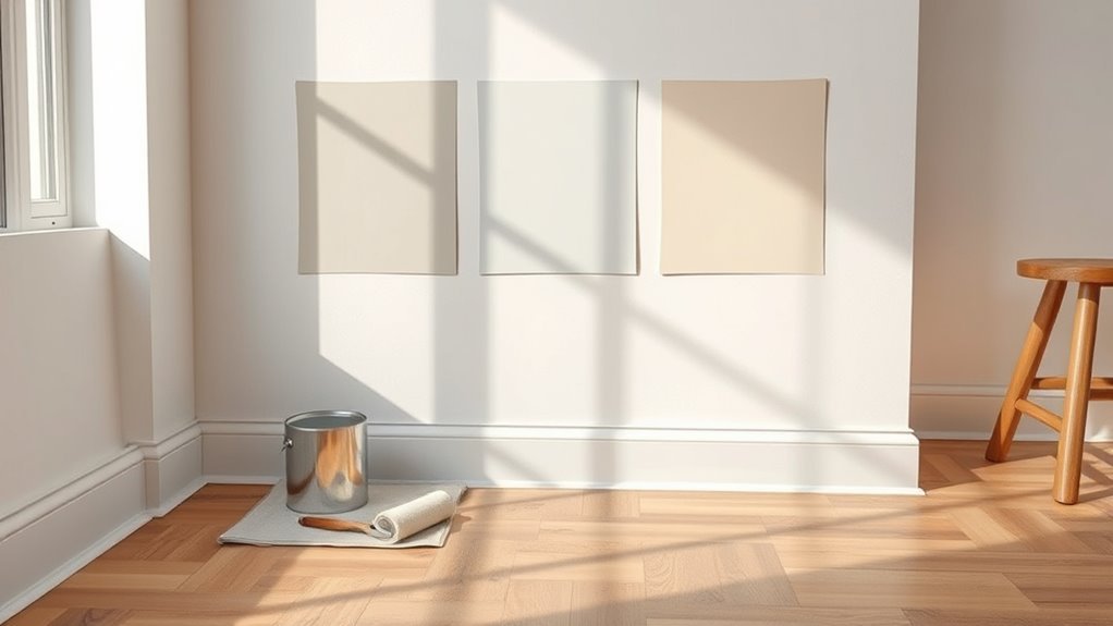
When you test paint on the wall, you want clear, reliable results—so apply chips large enough to judge value and undertone. Place them where light hits differently, and label each swatch with the paint name and finish.
You’ll evaluate how color psychology shifts mood across morning, noon, and evening light, noting warmth, coolness, and contrast. Check paint texture for sheen differences and how surface imperfections show.
Stand back and up close to see overall effect and detail. Take photos at different times, jot impressions, and compare swatches side by side before deciding on a final direction.
How To Paint A 2×2 Foot Sample Panel For Accurate Results
Pick a well-lit, representative spot for your 2×2 foot panel so the sample reflects how the color will look across the room.
Prepare the wall by cleaning, patching, and priming any uneven areas so the paint adheres and reads true.
Apply two to three thin, even coats, letting each dry fully before the next for accurate results.
Choose The Right Spot
Although the spot seems small, you want a location that represents how the wall looks under normal lighting and traffic. Pick a 2×2 foot area where natural and artificial light mix, since color psychology and paint finish interact differently in bright vs dim zones. Avoid corners or hidden spots. Place samples at eye level and near furniture to see real-world effects.
- Choose a central area that sees daily light changes
- Test near windows and away from direct sunlight
- Avoid high-traffic scuffs and heat sources
- Put one sample where shadows fall regularly
You’ll get reliable, usable results.
Prepare The Wall Surface
Before you paint, clean and prep the 2×2 foot area so the sample shows the true color and finish. Remove dust, grease, and loose flakes with a mild detergent and a damp cloth, then let it fully dry.
Sand any glossy spots lightly to match surrounding wall texture, and fill small holes with spackle, smoothing flush.
Prime bare or repaired sections so the sample sits on the same base as the rest of the wall.
Vent the room to reduce paint fumes while you work, and use a respirator if ventilation’s limited.
Tape edges for a neat, controlled panel.
Apply Multiple Coats
When you start painting the 2×2-foot sample, apply thin, even coats and let each one dry completely before adding the next so the color and sheen build accurately. You’ll see how coatings alter hue and finish; that helps assess color psychology in the actual room light.
Check the paint manufacturer’s recommended dry times and recoat instructions to avoid tackiness or texture changes. Paint three to four thin coats rather than one heavy coat for true coverage.
Inspect from different angles and at different times of day to evaluate depth and sheen.
- Use a high-quality brush or mini-roller
- Follow dry time exactly
- Note manufacturer tint and batch
- Compare under natural and artificial light
Why You Should Test Paint Colors On The Wall Before Committing
Because light, texture, and surrounding colors change how paint looks, testing swatches on your wall lets you see the true result before you commit. You’ll observe hues shift through the day, revealing warm or cool undertones that photos hide. Testing helps you judge finish, coverage, and how a shade interacts with trim and furnishings.
Consider color psychology—how a tone affects mood—and confirm it aligns with your intent. Compare swatches from different paint manufacturer lines; formulations and pigments vary. By sampling on the actual surface, you avoid costly repainting and pick a color you’ll genuinely enjoy living with.
Rooms That Most Need On‑Wall Paint Tests (Kitchen, Bedroom, Foyer)
You’ll want to test colors in rooms where lighting and color shift are most obvious, since natural and artificial light can change a hue throughout the day.
In the kitchen, also consider cooking stains and splatter that can affect finish choice and maintenance.
For bedrooms and foyers, focus on how a color influences sleep mood and warmth or the welcome guests feel.
Lighting And Color Shift
Although paint can look great on a swatch, lighting will change how it reads on your walls, so test swatches where the room’s light is strongest and where shadows fall. You’ll see shifts between morning, midday, and evening; color psychology reacts differently under cool kitchen LEDs, warm bedroom lamps, or foyer lighting fixtures.
Apply large patches near windows, under sconces, and by cabinets. Live with samples for a few days to notice undertones and mood changes.
- Test near natural light and artificial light
- Compare swatches under each fixture
- Observe at different times of day
- Consider how mood shifts with color
Cooking Stains And Splatter
When you’re testing paint for kitchens or other high-traffic areas, think about how grease, sauces, and splatter will interact with color and finish—these messes can darken, stain, or highlight undertones in ways a swatch won’t show.
Test patches near cooking zones and behind counters to see how cooking stains age on different sheens. You’ll want to try a satin or semi-gloss for easier splatter cleanup, but check how the sheen changes perceived color under task lighting.
Apply real-world messes—olive oil, tomato sauce—let them sit, then clean. That reveals practical durability and maintenance needs before you commit.
Sleep Mood And Warmth
Cooking messes show how a finish handles wear, but bedrooms and other restful spaces demand you test for mood and warmth as well. You’ll paint small patches in the bedroom, foyer, and kitchen to judge color under morning, afternoon, and evening light.
Consider how tones affect your sleep environment and whether they support mood enhancement. Observe for several days, from bright to lamp-lit hours, noting warmth, contrast, and how colors calm or energize you.
- Test near the bed and on opposite walls
- Compare samples under different lamps
- Note emotional reaction at night
- Consider trim and bedding coordination
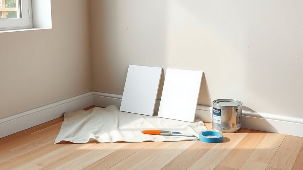
Tools And Materials You Need For Reliable Paint Color Testing
Before you put any paint on the wall, gather a few essential tools and materials so your color tests give accurate results. You’ll need sample pots from brands whose paint manufacturer reputation you trust, plus swatch chips for reference and notes on color psychology to track emotional impact.
Grab painter’s tape, disposable brushes or mini rollers, a mixing stick, a drop cloth, and a utility knife for clean edges. Use a level or ruler to mark consistent swatch sizes and a small step ladder for higher spots.
Keep a notebook and camera to record lighting conditions and your reactions.
Pick Sample Pot Sizes And Finishes For Your Test Swatches
As you decide how much paint to buy for your swatches, choose sample pot sizes that match the scope of testing you’ll do—small 4 oz pots work for single small patches. 8–16 oz covers larger swatches or multiple walls. Quart cans are best if you plan to roll full-door or accent areas.
Pick finishes that reflect final use: flat for ceilings, eggshell or satin for walls, semi-gloss for trim. Consider color psychology when testing in different light and how paint durability affects appearance over time. Test enough area to judge sheen and wear.
Choose finishes for each surface—flat for ceilings, eggshell or satin for walls, semi-gloss for trim—test enough to assess color, sheen, and wear.
- Match pot size to test area
- Try intended finish
- Note light’s effect on color
- Check for scuffs and longevity
How To Prep Your Wall For A Clean, Realistic Test Surface
If you want your swatches to show true color and texture, prep the wall so paint adheres and light reads it correctly. Start by cleaning with mild detergent to remove dust, grease, and residues that skew color psychology cues.
Sand glossy spots lightly for adhesion, then wipe with a damp cloth and let the surface dry.
Fill holes and smooth with spackle; sand and dust off after it dries.
Tape edges where you don’t want paint.
Work in a ventilated area to minimize paint odor and help accurate drying.
A flat, clean surface gives realistic swatches for confident choices.
Painting A Single Large Swatch Versus Multiple Small Patches
You’ll want to weigh painting one large swatch against several small patches based on how visible and true the color will read. A single large swatch gives you a clearer sense of coverage and how the hue looks across light and shadow.
While multiple small patches let you compare several shades and undertones at once. Consider room lighting and viewing distance to decide which method will give you the most accurate sense of the final color.
Single Large Swatch Pros
While a single large swatch takes up more wall space than several small patches, it gives you a true sense of how the color behaves across lighting, texture, and viewing angles. You’ll notice shifts in tone through the day, see how texture affects sheen, and judge emotional impact—use color psychology to test mood and flow. Apply consistent strokes, label the brand and formula for paint brand comparison, and stand back to evaluate.
- View from multiple distances and angles
- Observe in morning, afternoon, and artificial light
- Note how finishes highlight walls’ imperfections
- Record brand, sheen, and mix details
Multiple Small Patch Benefits
When you test several small patches instead of one big swatch, you get to compare multiple shades, sheens, and brands side-by-side without dedicating a huge wall area to any single option.
You can assess how each hue affects mood through color psychology, noticing which tones feel calming, energizing, or neutral.
Small patches let you mix finishes and evaluate durability in high-traffic spots.
They reduce wasted paint and let you isolate samples if a tester shows unexpected paint toxicity or odor, so you can remove just that tiny patch.
Visibility And Color Accuracy
If you want to judge true color and coverage, a single large swatch makes subtle undertones and finish differences easier to see from a distance, while multiple small patches can hide how a paint will read across an entire wall. You’ll notice how light shifts and Color psychology influences mood across a broad area, and you’ll spot flaws during paint drying that tiny samples mask.
A large swatch reveals sheen, depth, and interaction with room lighting. Use small patches only for quick comparisons, not final decisions.
- Observe at different times of day
- Check from multiple angles
- Note texture and sheen
- Record drying stages
How To Tape Off Large Panels For Side‑By‑Side Paint Comparison
Because you want a clear side-by-side comparison, start by marking out large, equally sized panels with a level and pencil so your samples line up precisely. Then apply painter’s tape along those lines, pressing firmly to seal edges and prevent bleeding.
Tape overlapping corners and remove loose bits so paint texture stays true. Work from top to bottom, smoothing tape with your thumb. Label each panel and note lighting and color psychology impressions nearby.
Use high-quality tape and wait the recommended time before removing to avoid peeling. Clean edges with a utility knife if needed, and step back to reassess before proceeding.
When Peel‑And‑Stick Swatches Work Best And When They Don’t
Although they’re convenient, peel-and-stick swatches aren’t a one-size-fits-all solution; they work best when you need quick, low-commitment color checks on smooth, neutral backgrounds.
Peel-and-stick swatches are handy for quick, low-commitment color checks—best on smooth, neutral surfaces.
But they fall short for textured walls, changing light, or close-up evaluation of finish and undertones.
You’ll reach for peel-stick swatches when you want instant visual feedback, portability, and easy removal.
They help with preliminary Color matching across rooms, but don’t trust them for final decisions where sheen, depth, or ambient light matter.
Use them as a first filter, then test with larger painted samples before committing.
- Quick visual comparison
- Temporary, non-damaging
- Poor for textured surfaces
- Misleading in varied light
How To Use Sample Pots To Paint A 2×2 Foot Test Panel (Step‑By‑Step)
Before you open the sample pot, prep a clean, dry 2×2 foot patch by lightly sanding and wiping away dust so the paint adheres properly.
Apply the sample in even strokes, covering the area completely and letting it dry between coats.
Once it’s fully dry, observe the color at different times of day and from various angles to judge the true effect.
Prepare The Wall
To get accurate results, start by cleaning and smoothing the area where you’ll paint the 2×2 foot test panel. Remove dust, wash greasy spots, sand imperfections, and repair holes so color psychology and paint texture show true.
- Wipe with mild detergent, rinse, dry
- Sand glossy or rough patches smooth
- Fill dents with spackle, sand flush
- Apply painter’s tape to define the 2×2 area
This prep ensures the sample pot’s finish behaves like your future full coat.
Apply And Observe
When you’re ready, paint the 2×2 foot panel in even, overlapping strokes so the sample shows true color and finish. Work top to bottom and let each coat dry fully.
Stand back and view the panel at different times—morning, midday, and evening—to note how light shifts hue and interacts with paint texture.
Touch the dry surface to feel sheen and thickness.
Consider color psychology: observe how the tone affects mood and perceived room size.
Compare adjacent samples and note any undertones.
Record observations and photos, then decide if you need another coat, a different sheen, or a new color choice.
Testing Vertical Stripes To Compare Undertones
If you’re comparing undertones, paint narrow vertical stripes of each color side by side so you can see how they read against one another and against the wall’s light. You’ll notice subtle shifts as daylight moves; historical techniques and cultural influences can help you interpret warm or cool leanings.
Keep stripes about 3–4 inches wide and use a single coat for true undertone visibility.
- Position stripes near corners and windows for varied lighting.
- Label each stripe with brand and code.
- Observe at morning, midday, and evening.
- Step back and view from different angles to confirm consistency.
Creating A Taped Grid To Evaluate Several Paint Colors At Once
Although it takes a little prep, taping a grid on your wall lets you compare multiple paint samples at once and see how they interact across different lights and viewing distances. Start by measuring equal rectangles, use painter’s tape to create crisp edges, and label each square with brand, shade, and sheen.
Paint each cell with a distinct color, keeping brush strokes consistent. Observe how color psychology shifts mood across adjacent swatches and note which hues feel calming or energizing in morning and evening light.
Also assess paint durability by testing finish resistance after drying. Remove tape cleanly to evaluate true edges.
How Many Coats To Apply On Your Test Patches
Start with one coat to see the true undertone and how the color plays with your light.
Apply a second coat as the standard to judge opacity and evenness.
If you want the finished look, add a third coat to confirm final coverage and depth.
One Coat Observation
When you lay down your test patches, begin by applying a single, even coat so you can assess the paint’s true coverage, sheen, and color shift. You’ll judge how the hue reacts to light, gauge initial opacity, and note texture without masking surface flaws. One coat helps reveal undertones important for color psychology and gives a first impression of paint durability before committing.
Wait for full drying, then inspect at different times of day. Try these quick checks:
- Observe in morning, noon, and evening light
- Touch for tackiness and film strength
- Compare against adjacent finishes
- Note undertones and mood impacts
Two Coats Standard
Because most paints are formulated to show their true color and opacity after a second pass, you should apply two coats on each test patch. The first coat reveals coverage issues and undertones; the second evens texture, deepens hue, and lets you assess color psychology in the actual room light.
Two coats also let you judge finish and early paint durability without overcommitting. Use the same technique and drying time you’d use for the full job, and label patches with brand, sheen, and date.
If two coats still hide flaws, you’ll know to adjust primer or choose another sample before proceeding.
Three Coats Finality
If you want the most accurate sense of a paint’s final appearance and durability, apply three coats to at least one test patch. You’ll see true color depth, how light affects color psychology in the space, and whether paint texture evens out or highlights flaws. Three coats reveal hiding power, sheen consistency, and long-term wear.
- Check color shift under morning, noon, and evening light
- Feel paint texture after drying to judge finish preference
- Inspect for streaks, thin spots, or uneven absorption
- Note emotional effect; does the hue support the room’s meant mood
When To Use Primer Under Test Swatches
Although you can sometimes test paint directly on your wall, you’ll want to use primer under test swatches whenever the surface is porous, patched, stained, or a dramatically different color than your sample. Primer creates a consistent base that shows the true hue and finish of the paint.
Use primer when you want reliable comparisons of tones influenced by color psychology or when referencing historical color trends for authenticity. Apply thin, even patches, let them dry fully, then paint your swatches.
Primer prevents bleed-through, evens absorption, and helps you evaluate sheen and saturation without surface interference.
How Natural Light Shifts Paint Color Throughout The Day
Pay attention to how your test swatches look in morning light, because the warm, golden tones can make colors read richer and more yellow.
As the day progresses and light cools, you’ll see those same swatches shift toward bluer, muted tones.
Check your samples at both times to pick a color that works for the whole day.
Morning Warmth Effects
Because morning light has a warm, low-angle quality, it can push cool or neutral paints toward yellow or peach tones, so you should check swatches early if you want a true sense of their daytime appearance.
You’ll notice morning glow and dawn ambiance make whites and grays read warmer; test three large patches near windows and observe for at least 30 minutes. Take photos and revisit later to compare.
Consider how furniture and textiles will interact with that soft warmth.
- Place swatches where morning hits directly
- Observe at peak morning for 30+ minutes
- Photograph under natural light
- Note surrounding materials
Evening Cool Shifts
As morning light warms your swatches, evening brings the opposite effect: low, indirect light and a bluer sky cast make paints read cooler and can pull out blue or green undertones. When you check samples at dusk, you’ll notice tones flatten and shift toward slate or sage, so avoid deciding solely on daytime views.
Observe panels under artificial light after the night sky appears to compare. Use the evening calm to spot undertones that could clash with furnishings. Photograph samples at different times, note changes, and wait several evenings before committing—this guarantees your final paint behaves as you expect in varied light.
How To Evaluate Paint Color Under Artificial Lighting
When you judge paint under artificial light, check it at the same times and with the same fixtures you’ll use every day so the color you see is the color you’ll live with. You’ll notice shifts as bulbs warm up and during paint drying, so observe samples over several hours.
Consider color psychology—warm light can feel cozy, cool light more alert. Test multiple positions and heights to catch variations.
Consider color psychology—warm tones feel cozy, cool ones more alert. Test colors from different spots and heights.
- View patches from where you’ll sit and stand
- Turn lights on and off to note contrast
- Inspect after paint drying for true depth
- Compare with nearby furnishings and finishes
Using Color‑Correct Bulbs To Simulate Daylight
When testing paint, pick daylight-balanced bulbs (around 5000–6500K) so the color reads like natural light.
Position the fixtures to mimic real daylight direction and avoid harsh shadows or hotspots.
Check the bulb’s temperature number and match it across all lamps for consistent results.
Choose Daylight-Balanced Bulbs
If you want paint samples to look like they’ll in most homes, swap your regular bulbs for daylight‑balanced, color‑correct LED bulbs before evaluating swatches. You’ll see truer hues, which helps with color psychology decisions and guarantees you judge finishes that affect perceived paint durability.
Pick bulbs labeled 5000K–6500K with CRI 90+ to mimic natural light. Replace bulbs in the room where you’ll live with the color, leave them on while testing, and avoid mixed lighting sources.
- Choose LEDs 5000K–6500K
- Aim for CRI 90 or higher
- Use same bulbs throughout
- Test for at least an hour
Position Lights For Accuracy
Because light angle and distance change how paint looks, you should position your daylight‑balanced bulbs to mimic natural sources in the room. Place fixtures where windows cast light—overhead for general illumination and side lamps to reveal texture.
Keep bulbs at similar heights and distances from each test patch so ambient light stays consistent across samples. Move lights to simulate morning and evening angles, observing how color shifts affect mood and color psychology.
Avoid mixing warm lamps that skew perception. Check colors from typical standing and seated viewpoints, note differences, and record positions so final painting relies on accurate, repeatable lighting.
Match Bulb Temperature Numbers
To get paint colors to read true, match the bulbs’ color temperature numbers to daylight—look for 5000K to 6500K for cool, neutral daylight and about 4000K for a slightly warmer natural feel.
You’ll want bulbs labeled for accurate color matching so your test swatches behave like they’ll in real life. Compare samples under the chosen bulb temperature, and change bulbs if a shade shifts.
Record the bulb specs so you replicate conditions later.
- Use 5000K–6500K for bright daylight simulation
- Try 4000K for warmer natural light
- Pick bulbs with high CRI for true color
- Note bulb temperature and brand
How To Test Colors Near Windows And In Shaded Corners
When you test paint near windows and in shaded corners, observe samples at different times of day so you can see how natural and reflected light change their appearance.
Place three same-size swatches: one beside the window, one in a shaded corner, one mid-wall. Note hue shifts, undertones, and how color psychology affects mood—warmer tones feel inviting in shade, cooler tones calm sunlit areas.
Check paint texture and finish; glossy sheens reflect light differently than matte, altering perceived color.
Photograph samples under each condition, jot observations, and live with them 48 hours before deciding.
Checking Paint Color Consistency Across Adjoining Rooms
After checking samples by windows and in corners, step into the adjoining rooms to see how your chosen color reads across connected spaces. You’ll notice subtle shifts from different light and finishes; consider color psychology to guarantee mood flows between rooms.
Check the consistency of tone and saturation, and feel the paint texture—matte vs. eggshell reflects light differently.
- View samples at multiple times of day to catch shifts.
- Compare edges where rooms meet for visible contrast.
- Test with furniture and artwork in place to judge harmony.
- Note how trim and ceiling colors affect perceived continuity.
How Open‑Concept Layouts Change Perceived Paint Color
Because open-concept spaces let multiple areas share the same sightlines, the paint you pick in one zone will instantly affect how adjacent zones read—so you’ll want to evaluate color across the whole floor plan, not just on isolated walls.
You’ll test swatches in sequence, observe progressions at different times, and note how light shifts color perception.
Consider color psychology: warm tones can unify and energize, cool tones expand and calm.
Also factor paint durability in high-traffic connectors; finishes matter as much as hue.
Walk the layout, photograph samples from various angles, and choose a palette that flows cohesively.
How To Test Paint With Existing Trim And Baseboards
When you test paint near existing trim and baseboards, paint a strip right up against the edge so you can see how the color plays off the trim.
Protect the trim with low‑tack painter’s tape and a small brush to keep clean lines.
If the trim’s finish is different (glossy vs. matte), test both edges to judge contrast accurately.
Test Next To Trim
If your room already has painted trim and baseboards, testing paint next to them helps you see how new wall colors interact with the existing accents—so bring a few swatches and apply them in narrow strips right up against the trim. You’ll judge trim contrast and color harmony best this way.
Watch samples at different times of day, step back for distance, and compare warm versus cool undertones. Keep edges clean so you evaluate true relationships without taped protection.
- Test multiple values
- Observe in morning and evening
- View from several distances
- Note undertones against trim
Protect And Tape Trim
Before you lay down swatches, protect the trim and baseboards with painter’s tape and a thin foam or paper barrier so your test patches show only the wall color, not accidental smudges or bleed-through. You’ll tape tightly along edges, press down to seal, and cover baseboards with rosin paper. Keep samples a few inches from wallpaper patterns and watch how colors meet ceiling textures. Remove tape carefully after paint dries to avoid peeling. Use small foam brushes for neat patches. Refer to the quick-guide below for placement and tools.
| Placement | Tool |
|---|---|
| Edge near trim | Angled brush |
| Baseboard cover | Paper/foam |
How To See How Wall Color Pairs With Flooring
Although lighting and undertones matter, the simplest way to judge how a paint color pairs with your flooring is to test them together in the room where they’ll live. Roll or brush generous swatches near baseboards and let them cure; view at different times and from various angles. Consider color psychology for mood and consult the paint manufacturer’s swatch notes for undertone clues.
Compare against flooring undertones and finish. Take photos for reference.
- Place samples beside the wall and on the floor edge
- Check in morning, afternoon, and artificial light
- Step back and assess overall harmony
- Note contrast and reflectance levels
How To Test Paint Against Furniture And Textiles
When you test paint against your furniture and textiles, place generous swatches next to upholstered pieces, wood finishes, and rugs so you can judge how hues interact at real scale; observe in morning and evening light, and with lamps on. Consider color psychology to match mood—calming, energizing, or neutral—and check paint manufacturer samples for accurate finish and sheen. Note how patterns read against solids and whether undertones clash. Use the table below to record quick observations and decisions.
| Item | Observation |
|---|---|
| Sofa | |
| Rug | |
| Wood finish |
How To Test Accent Walls Versus Whole‑Room Paint
Decide where an accent wall will sit before you test colors, since placement near windows or focal furniture changes the effect.
Try your swatches on both the chosen accent wall and a main wall to compare how the color reads across the room.
Check those patches at different times of day so you see how whole-room lighting alters the contrast and mood.
Accent Wall Placement
Curious how an accent wall will change the room’s feel compared with painting the whole space? You’ll place tests where focal points naturally form: behind the bed, a fireplace, or the main seating. Try small swatches and step back at different times. Contrast textured vintage patterns against smooth whole-wall finishes, or test bold outdoor murals on one panel before committing.
Consider traffic flow, sightlines, and furniture arrangement.
- Test near primary seating to gauge impact
- Try opposite windows to compare light effects
- Place swatches at eye level and floor level
- Evaluate with existing decor and art
Whole‑Room Lighting
How will lighting change the feel of a single accent wall versus painting the whole room? You’ll notice directional light highlights an accent wall’s color psychology differently than an all-over hue.
Test swatches under morning, midday, and evening light to see shifts in warmth, mood, and perceived size. Check under artificial fixtures and lamps too.
Observe how paint texture catches shadows—matte soaks light, eggshell and satin reflect more. Walk the room from multiple angles and note where mood changes feel intentional or jarring.
Use notes and photos to compare; then decide whether one wall or the whole room achieves the atmosphere you want.
Using Small Furniture Or Fabric Samples As Color Anchors
When you tack a small pillow, throw, or lamp next to a painted patch, you’ll see how the color behaves with the textures and tones you actually plan to use; fabric and furniture samples act as instant anchors that reveal undertones and contrast. You’ll judge harmony, spot clashes, and assess scale before committing.
Consider color psychology to guarantee mood fits purpose, and remember strong paint fumes may linger—test with windows open. Rotate samples through daytime and evening light to note shifts. Use real items to preview the room’s feel and avoid surprises when you finish.
- Place samples near focal pieces
- Compare against flooring
- Test under different lights
- Note maintenance and texture effects
How To Identify Warm, Cool, And Neutral Paint Undertones
Look for subtle hints in the paint—tiny flecks of yellow, pink, or blue can reveal its undertone.
Compare the color next to your warm anchors (wood, brass) and cool anchors (metal, gray fabric) to see which side it leans toward.
Finally, view your test patches in different lights—daylight and evening artificial light—to confirm whether the undertone reads warm, cool, or neutral.
Identify Undertone Hints
Because undertones change how a color reads in your room, you’ll want to spot warm, cool, and neutral hints before you commit—warm hints lean yellow, peach, or red; cool hints show blue, green, or violet; neutrals sit between and can read slightly warm or cool depending on light and adjacent colors.
When you test swatches, look for subtle shifts that reveal the paint formulation and consider color psychology—warm feels cozy, cool feels calming, neutral feels balanced.
Use these quick checks to decide:
- View swatch at different times of day
- Compare against white and off-white samples
- Hold near wood and fabric tones
- Look from varying distances
Compare Warm Vs Cold
Although undertones can be subtle, you can quickly tell warm, cool, and neutral paints apart by observing how they interact with light and nearby colors.
Warm hues lean yellow, orange, or red, making spaces feel cozy; cool tones shift toward blue, green, or violet, creating calm. Neutrals balance both.
When you compare warm vs cold, note how each changes perceptions: warm advances surfaces, cool recedes them.
Use color psychology to steer mood, and consider historical trends that favored warm palettes in traditional rooms and cool ones in modernist designs.
Trust your eye and test swatches side by side.
Test With Lighting
When you test paint on the wall, observe it at different times and under each light source in the room—daylight, artificial warm bulbs, and cool LEDs—so you can spot undertones that shift with lighting. You’ll notice warm undertones glow under incandescent light, cool ones tighten with blue LEDs, and neutrals read differently in shade.
Consider color psychology and the paint manufacturer’s recommendations, but trust your eye. Test large swatches, view from different angles, and photograph them at various times.
- Test at noon and dusk
- Use the bulbs you’ll keep
- Compare against trim and floor
- Note mood shifts in photos
Avoiding Common Undertone Clashes With Cabinetry And Counters
If your cabinets or counters already have strong undertones, your test swatches can look very different next to them, so you’ll want to evaluate colors in direct adjacency. Place several large swatches beside cabinetry and countertops at eye level, observe in morning and evening light, and note how undertones shift.
Consider color psychology—warm undertones feel cozy with wood tones, cool undertones calm stone or stainless. Don’t ignore finishes; gloss reflects differently.
If you’re sensitive to paint toxicity, ventilate and use low‑VOC samples. Pick the swatch that harmonizes across times of day and with existing materials before committing.
How To Test For Color Fading And Long‑Term Durability
Because paint reacts to sunlight, humidity, and wear in different ways, you’ll want to test samples for fading and durability before committing to a full coat. Apply several 12×12-inch swatches in sun and shade, note how color psychology shifts as light changes, and record observations over weeks.
Test 12×12 swatches in sun and shade, log changes over weeks, and check fading and durability.
Consider paint chemical composition—pigment type and UV inhibitors affect longevity. Simulate wear with gentle abrasion and moisture exposure. Track results and pick the most stable option.
- Place swatches on different walls and near windows
- Log daily photos and notes for two weeks
- Rub lightly to test scuff resistance
- Mist to check water resilience
How Gloss Level Affects Perceived Paint Color And Wear
Notice how gloss changes color perception—higher sheen makes hues look brighter and more saturated, while flat finishes mute them.
You’ll also find that sheen influences durability: glossier paints resist scuffs and clean more easily than matte options.
Test both sheens on your wall so you can compare appearance and wear before committing.
Gloss Changes Color Perception
When you change a paint’s gloss level, its color and how it shows wear can shift noticeably. You’ll notice gloss perception alters light reflection: higher gloss makes hues pop and appear richer, lower gloss mutes tones.
Color perception depends on viewing angle and light; glossy finishes reveal imperfections and scuffs more, while flatter finishes hide them. Test samples at different glosses to pick the right look.
- Paint a small swatch in high gloss and inspect at different times.
- Compare a matte swatch beside it under the same light.
- Note fingerprints and scuffs on each finish.
- Decide by both color perception and wear visibility.
Sheen Influences Durability
If you pick a higher-sheen paint, you’ll get a tougher, easier-to-clean surface that also makes color look deeper and highlights imperfections. When you test swatches, note how sheen properties change reflectance and shadow, altering perceived tone.
Higher gloss masks scuffs and resists stains, while flatter finishes hide texture and forgive flaws but absorb marks. Consider durability factors like traffic, cleaning frequency, and wall condition before choosing sheen.
Apply small panels of each sheen to the same spot, live with them for a few days, and inspect under morning and evening light. That hands-on check reveals the best balance of look and longevity.
Photographing Test Patches Correctly For Later Review
Because lighting and camera settings can change how colors read, you’ll want to photograph your test patches carefully so you can compare them later with confidence. Frame each patch straight on, include a neutral gray card for reference, and shoot at several times of day to capture mood lighting and how color psychology shifts perception.
Use consistent camera settings and avoid filters. Keep files organized with labels and timestamps.
- Use RAW when possible for accurate data
- Turn off HDR and automatic scene modes
- Photograph from the same distance and angle each time
- Record the camera and room lighting details alongside images
How To Critique Photos To Avoid Camera Color Bias
When you review photos of your test patches, check the white balance first to make sure colors aren’t skewed by your camera or lighting.
Compare shots taken under the same natural and artificial lighting so you can spot shifts caused by different conditions.
Also inspect your camera’s profile and any applied color corrections to confirm the file represents the paint accurately.
Check White Balance
Although your eye trusts the room’s color, a camera won’t—so always check the photo’s white balance before judging paint samples. You’ll want accurate color calibration so the swatches in photos match what you see.
Use your camera or phone settings to set white balance manually or select a neutral reference (white/gray card) in the frame. Review images on a neutral display, and retake if tones look off. Don’t rely on automatic corrections.
- Shoot a photo with a gray card visible
- Use manual white balance or preset for lighting
- Compare raw files when possible
- Note camera color calibration settings
Compare Lighting Conditions
Now that you’ve checked white balance, look at how different light sources change the way paint reads in photos. You’ll compare daylight, warm incandescent, and cool fluorescent shots to spot shifts in hue, saturation, and value.
Photograph your test patches at multiple times and under each fixture, then view images side-by-side on the same monitor. Note how historical palettes appear warmer or cooler depending on light, and consider cultural influences that shape expectations for color warmth.
Trust what you see across conditions, not a single snap. This method helps you avoid camera bias and choose the final paint with confidence.
Inspect Camera Profiles
Before you trust photos of your test patches, check the camera profile used to capture and process them so you know what color shifts might be baked in. You’ll avoid misleading casts by understanding camera calibration and the applied color profile.
Shoot RAW when possible, note the profile (sRGB, Adobe RGB, or custom), and keep consistent white balance.
Compare a neutral gray card in-frame to detect shifts, and use simple edits only to evaluate true pigment.
Calibrate your monitor too so what you see is accurate, then rephotograph if colors still appear off.
- Shoot RAW and include a gray card
- Note camera calibration settings
- Compare sRGB vs Adobe RGB renderings
- Calibrate your monitor before judging
Getting Second Opinions Without Influencing Your Choice
When you ask for feedback on paint samples, frame the request so people describe what they actually see and feel instead of telling you what to choose. Say, “Tell me what this color makes you notice about the room” or “How does this shade feel in this lighting?”
Then limit reviewers to observations: light, contrast, mood, and any reactions tied to color psychology rather than preferences. Ask them to note if they detect paint odor or lingering scent that affects perception.
Collect responses anonymously or in writing, avoid leading comments, and compare objective notes to your own impressions before deciding.
How To Run A Timed Comparison: Morning, Noon, Evening
To see how a paint sample truly behaves, test it at three key times—morning, noon, and evening—so you catch shifts in hue, saturation, and shadow as the light changes. You’ll note how color psychology alters mood across the day and how paint texture affects sheen and depth. Record observations, photos, and feelings at each checkpoint. Be consistent with angles and camera settings so comparisons are fair.
Test paint samples morning, noon, and evening—photograph consistently, note mood, warmth, and how texture shifts with light.
- Test the same patch at sunrise, midday, and dusk
- Photograph under natural light and with room lights on
- Note emotional response and perceived warmth/coolness
- Check how texture shows highlights and shadows
How To Interpret Small Differences Between Similar Shades
Although the differences between similar shades can seem tiny, they change how a room feels and reads, so you should learn to spot and evaluate those subtleties deliberately. Look at samples at different distances and angles, note undertones, and consider how light shifts warmth or coolness. Use color theory to judge contrast, saturation, and harmony. Check paint formulation for matte vs. eggshell effects. Record reactions and objective notes.
| Test Focus | What to Watch |
|---|---|
| Undertone | Green, blue, yellow hints |
| Light Response | Shifts across dayparts |
| Finish Impact | Depth, glare, perceived color |
Narrowing Choices From Many Samples To A Final Shortlist
You’ve scanned samples up close and at arm’s length, logged undertones, and watched how light alters each swatch; now it’s time to narrow the field. Stand back, imagine the room’s function, and apply color psychology to rule out shades that clash with mood goals.
Note how each sample reads at different times, and consider paint finish — matte hides flaws, satin reflects more light. Keep these quick criteria to whittle options:
See swatches in morning and night, and pick a finish—matte for flaw-masking, satin for subtle light.
- Remove any swatch that disrupts desired mood or feels off with furnishings.
- Prioritize shades that work morning and evening.
- Favor finishes suited to the room’s wear.
- Limit to three finalists.
When To Order Larger Test Cans Or Professional Samples
Once you’ve narrowed your shortlist to two or three contenders, order larger test cans or pro-quality samples so you can see how each color performs on a full wall and with your chosen finish.
Test larger swatches in different light and at different times; this reveals undertones and how color psychology affects mood in that room.
Choose samples from trusted paint branding to guarantee consistency with the final product and to access manufacturer finish options.
Buy enough to cover a 4×4-foot area or more, so texture and sheen are apparent.
Take notes and photos, then live with the samples for several days before deciding.
How To Test Trim And Ceiling Colors With Your Wall Test
Now that you’ve got wall samples on the big scale, include trim and ceiling options in the same test so you can judge how they interact. Test small trim panels and a ceiling swatch adjacent to each wall sample, noting how light shifts tones. Use basic artistic techniques—layering, edge definition—to see contrast and harmony.
Consider historical color trends for trim-ceiling pairings if you want period accuracy or fresh twists. Take photos at different times, label swatches, and live with them a few days.
Think about historical trim and ceiling pairings for authentic or unexpected looks; photograph and live with samples over several days.
- Paint trim samples on foam board
- Swatch ceiling in a corner
- Observe under daylight and artificial light
- Photograph from standing height
Checking Transition Areas And Sightlines Before Final Paint
Before you commit to the final coat, walk the routes people will take and study the sightlines where rooms meet so you can spot abrupt color shifts or awkward contrasts. Check progressions at doorways, hallways, and open plans at different times of day.
Move furniture into place and view from typical angles to maintain cohesive flow. Consider color psychology—how hues read from adjacent spaces affects mood and perceived size.
Note how light hits each wall and whether differences in wall texture change saturation. If a test patch looks jarring from a distance, adjust hue, value, or trim placement before painting.
How To Test On Textured Walls And Uneven Surfaces
When testing paint on textured or uneven walls, start small and work methodically so you can see how color and texture interact at different distances and lighting. You’ll want to assess finish sheen, shadowing, and how textured surfaces hide or highlight flaws.
Test near corners, trim, and areas with uneven patching so you know if additional smoothing or a different sheen’s needed. Use removable samples and observe at various times of day.
- Apply a 12×12″ swatch with a brush and a roller
- Label each sample with time and coat number
- Inspect from 3, 6, and 12 feet
- Note touch-up methods needed
Troubleshooting Common Test Patch Problems (Bleeding, Streaks)
Textured and uneven surfaces can hide problems that only show up once paint goes on, so you’ll want to know how to manage bleeding and streaks before you commit to a full coat.
Textured, uneven surfaces often hide issues that only appear after painting—test and address bleeding and streaks first
If colors bleed, check primer compatibility and follow paint manufacturer labels for substrate prep.
Thin coats reduce streaks; use a high-quality roller and consistent pressure.
Let test patches fully cure—wet patches mask true hue and affect color psychology impressions.
If a patch still flashes or shows lap marks, sand lightly, re-prime, and retest with the same application method to guarantee accurate final results.
How To Remove Test Paint Without Damaging The Wall
If a test patch doesn’t suit you, remove it carefully to avoid harming the wall—start by testing the gentlest method (soft soap and water) on a small area and work up to stronger options only if needed. You’ll consider how color psychology influenced your choice but prioritize wall integrity and paint formulation when removing patches. Follow these steps to avoid damage and residue:
- Gently scrub with a soft sponge and mild detergent, rinse, dry.
- Use a citrus-based cleaner for stubborn latex, spot-test first.
- For oil-based traces, use mineral spirits sparingly with ventilation.
- Lightly sand and touch up primer before repainting.
Budget‑Friendly Test Methods For Renters And Temporary Spaces
You’ve learned how to remove test patches without damaging the wall, so now let’s look at inexpensive ways to try colors in rentals or temporary spaces.
Use peel-and-stick sample sheets or removable wallpaper swatches to see hues at different times of day.
Paint small sections on poster board or foam core—move them around to test light and color psychology effects.
Try countertop paint samples in inconspicuous areas or on trim to assess paint durability.
Use clamps or command hooks to hang swatches.
Keep notes on lighting, mood, and wear to choose a renter-friendly, confident final color.
When To Hire A Pro For Color Consultation Or Mockups
When a space has complex lighting, challenging architecture, or you’re committing to expensive, permanent finishes, hire a pro for color consultation or mockups—an expert will save you time and costly mistakes by recommending coordinated palettes, creating realistic renderings, and producing full‑scale mockups that show how colors behave throughout the day.
For complex lighting, architecture, or costly finishes, hire a color consultant to test, render, and mock up before committing.
You’ll get guidance on color psychology, suitable paint finish, and how hues interact with materials. A consultant helps prioritize tests, interprets results, and provides digital or physical mockups you can live with before buying.
Consider hiring when stakes, scope, or uncertainty are high.
- Complex lighting analysis
- Architectural challenges
- High‑cost finishes
- Unclear color psychology impacts
Final Decision Checklist Before Buying Full Paint Cans
After testing samples and getting expert input where needed, you’ll want a short checklist to confirm your choice before buying full paint cans.
Check the color at different times—morning, noon, and evening—to see how light shifts its mood.
Consider color psychology: does the shade support the room’s purpose and your emotional goals?
Verify finish, coverage, and whether touch-ups blend.
Confirm exact formula and batch number to avoid mismatch.
Evaluate VOC levels and choose eco friendly paints if indoor air quality matters.
Calculate required quantity with a small buffer, and compare prices and return policies before purchasing.
Recording Results And Labeling Samples For Future Reference
Although the testing phase feels like the end, record-keeping now prevents costly mistakes later. You’ll want clear notes about lighting, time of day, and how each hue reads in the room.
Add the paint manufacturer labels and batch numbers to avoid color shifts when you reorder.
Note any emotional reactions tied to color psychology so the final choice matches mood goals.
Photograph samples from the same angle and distance for consistency.
- Sample location and time of day
- Paint manufacturer labels and batch code
- Your color psychology notes (mood, warmth)
- Photo filename and shot details
Frequently Asked Questions
Can Test Patches Damage Wallpaper or Require Special Prep?
Yes — test patches can damage wallpaper if you’re not careful. You’ll protect wallpaper adhesion by doing proper surface preparation: clean gently, use removable test methods, low-tack tape, and avoid heavy primers or aggressive scraping.
How Do Paint Samples Interact With Glossy or Semi-Gloss Trim Nearby?
Glossy or semi-gloss trim reflects light more, so your paint samples’ color reflection will shift near trim; use matching paint sheen for touch-ups, tape edges, and view samples under varied light to avoid misleading contrasts.
Can Odors From Fresh Paint Affect Color Perception During Testing?
Can odors from fresh paint affect color perception during testing? You’ll notice odor perception can distract you, so don’t rely on initial impressions; wait for fumes to fade for true color accuracy, and reassess under neutral light.
Should I Test Ceiling Paint Color on a Wall Before Buying?
Yes — you should test ceiling paint color on a wall to check ceiling paint compatibility and see how wall texture impact alters appearance; you’ll catch unexpected undertones, finish differences, and guarantee harmony before buying cans.
How Long Should I Wait After Testing Before Making a Final Decision?
Think of it like watching a sunrise: wait 48–72 hours before deciding. You’ll see color consistency under varied lighting conditions, and you’ll catch drying shifts, undertones, and real-room effects before committing to the final paint.
Conclusion
Like Dorothy needing her ruby slippers, you’ll find the right hue by trying it on the wall. Test generously, view samples at different times, and note how light, furniture, and mood change the color’s story. If a swatch feels off, don’t cling to it—move on. Treat each sample like a small experiment: record, label, and live with it briefly. With careful testing, you’ll choose a paint that truly feels like home.