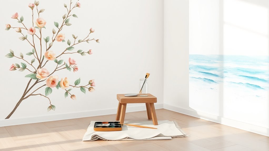
How to Paint Watercolor on Walls (Art Style Guide)
You can create translucent, watercolor-style murals by prepping and priming a smooth, cured wall, transferring your scaled sketch, then layering dilute, transparent washes from light to dark. Work top-to-bottom, control water and brush load to avoid blooms, feather edges while wet, and let each glaze dry before adding depth. Use breathable, matte sealers and UV-stable varnish for protection. Follow the full guide and you’ll pick up detailed techniques, troubleshooting, and finishing tips to refine your murals.
What You’ll Be Able to Paint After This Guide
By the end of this guide, you’ll confidently paint soft, translucent washes on vertical surfaces and combine them with sharper details to make murals that feel like watercolor on paper.
You’ll create atmospheric gradients, floral motifs, loose landscapes, and delicate portraits scaled to walls, mastering Color blending to shift hues smoothly and maintain luminosity.
You’ll layer glazes for depth, use diluted pigments to suggest distance, and apply controlled edges for focal points.
You’ll also explore Texture effects—subtle sponging, splattering, and drybrush—to mimic paper grain without overpowering washes.
These skills let you translate watercolor sensibilities into durable mural work.
Quick-Start Workflow: From Prep to Final Coat
When you’re ready to move from idea to finished wall, follow a streamlined workflow that starts with surface prep and ends with a protective final coat—each step set to preserve the watercolor look while ensuring durability.
First, clean and sand to even wall texture, patch imperfections, and prime for absorption.
Prepare the surface: clean, sand smooth, repair flaws, and prime for optimal paint absorption.
Sketch composition lightly, test color mixing on a scrap board, and plan diluted washes.
Work top-to-bottom, layering transparent glazes, letting each dry to assess value.
Blend edges with water or dry brush for softness.
Seal with a matte, UV-stable protective coat that maintains translucency without yellowing.
Who This Guide Is For and What It Covers
Although you might be drawn to watercolor for its soft, layered look, this guide is aimed at people who want that effect on interior walls—home DIYers, muralists, and professional painters adapting watercolor techniques to large surfaces. You’ll get practical steps, material lists, and tips that link Historical techniques to modern paint mediums, plus guidance on color psychology for mood and harmony. Whether you’re experimenting or executing commissions, you’ll learn washes, glazing, and edge control suited to walls. Use the quick-reference table below to match project type with focus and expected skill progression.
| Project Type | Focus |
|---|---|
| DIY Accent | Basics, color choices |
| Mural | Scale, layering |
| Pro Work | Durability, finishes |
Choosing the Right Wall Surface for Watercolor Effects
If you want watercolor effects to read clearly on a wall, start by picking a surface that accepts thin, translucent layers without bleeding or flaking. Choose smoother surfaces for finer detail and subtle gradients; heavy stipple or popcorn textures will interrupt washes and create unwanted granulation.
Test small areas to gauge paint absorption—too porous, and washes sink and dull; too sealed, and pigments sit on top and may peel. Consider primed or lightly sanded panels for controlled absorption.
You’ll also factor in existing finishes: glossy paints need deglossing, while matte finishes often provide better tooth for translucent applications.
Preparing Drywall, Plaster, and Cement for Translucent Washes
Because drywall, plaster, and cement each absorb and hold moisture differently, you’ll prep them to create a consistent, slightly toothy surface that accepts thin, translucent washes without blotching or peeling.
Start by cleaning dust and efflorescence, then repair cracks and sand high spots to unify Drywall textures. Lightly abrade smooth plaster or cement with fine grit to improve paint adhesion. Remove loose material and vacuum residues.
Feather joint compound seams so washes flow evenly. Test a small wash to confirm absorption and adjust surface tooth by scuffing or filling. Let everything fully cure before applying any watercolor-style wash.
Primers and Sealers That Mimic Watercolor Paper Absorbency
Now that the substrate is cleaned, repaired, and tested for absorption, choose a primer or sealer that recreates the slightly toothy, absorbent feel of watercolor paper so your washes sit and spread predictably.
You’ll look for acrylic-based watercolor primers designed to accept dilute pigment without beading; apply thin, even coats and sand lightly between layers for subtle tooth.
For sealing techniques, use a breathable, matte sealer that won’t block absorption or cause blooms; test in a corner.
Sealers with micro-porous formulas preserve edge behavior and layering.
Always test full-scale samples to confirm interaction with your chosen washes.
Watercolor-Style Paints Versus Diluted Acrylics: Which to Use
When you decide between watercolor-style paints and heavily diluted acrylics, weigh how each handles pigment, edge behavior, and longevity. You’ll choose watercolor-style for true translucency, softer granulation, and gentle color blending that mimics paper.
Diluted acrylics give stronger adhesion and faster curing, letting you layer sooner and get crisper edges when needed. Match your choice to surface absorbency and expected wear: pick acrylics in high-traffic areas.
Practice brush techniques for both—watercolor brushes for washes, synthetic flats or rounds for acrylics—to control bloom, feathering, and texture.
Test small samples on the primed wall before committing.
How to Mix Custom Glazes for Wall-Scale Watercolor
When you mix custom glazes for a wall-scale watercolor, start by testing pigment concentrations so you know how transparent or saturated each color will read at large scale.
Then adjust binder ratios—more binder increases adhesion and sheen, less keeps the glaze sheer and more watercolor-like.
Keep a consistent mixing log so you can reproduce the exact effect across the whole wall.
Choosing Pigment Concentrations
Although wall-scale watercolor shares techniques with paper painting, mixing glazes for a large vertical surface demands different thinking about pigment concentration and transparency.
You’ll test small panels to find how pigments layer, noting color blending outcomes and pigment stability over drying cycles. Start with a low-pigment wash to retain luminosity, then incrementally increase pigment for areas needing opacity or saturation.
Keep records: ratios, water volume, and drying appearance. Use more transparent pigments to build subtle depth; reserve higher concentrations for edges and focal points.
Always evaluate under the room’s light to ensure consistent appearance from various distances and angles.
Adjusting Binder Ratios
Because wall-scale watercolor sits vertical and dries differently than paper, you’ll need to rethink binder strength to control flow, adhesion, and sheen. You mix acrylic or gum arabic into pigments to increase tack and slow run, testing small swatches on primed drywall.
Start with low binder ratios—more water than binder—for washes, then incrementally raise binder for glazes that won’t drip. Note how binder affects color blending: higher binder preserves edges and saturation; lower binder yields softer merges.
Record recipes (percent water:binder:pigment). Adjust for humidity and surface texture, and sand or reseal when desired sheen or durability needs boosting.
Brushes and Tools for Watercolor Murals and Large Washes
If you want smooth, even washes that scale up to walls, choose brushes and tools that hold a lot of water and release it predictably; large round brushes, wide flat washes, soft synthetic mops, and quality sponges will be your main allies. You’ll prioritize Brush care and Tool ergonomics to work longer and cleaner. Rotate sizes for control: big for mass, medium for edges, small for touch-ups. Clean and reshape after each session, store upright, and replace worn heads.
| Tool | Best Use |
|---|---|
| Mop brush | Large uniform washes |
| Sponge | Texture, lift, blending |
| Flat wash | Edges, broad strokes |
Selecting Palettes and Color Harmonies for Luminous Murals
After you’ve chosen brushes and tools that let you layer and blend smoothly on a large scale, you’ll pick a palette that makes those washes sing. You’ll consider color psychology to set mood—cool blues calm, warm ambers energize—then test how mixes read wet and dry.
Limit your core hues for cohesion, then add subtle accents for contrast. Embrace palette diversity by including muted neutrals, midtones, and a few saturated pigments so light seems to glow through layers.
Swatch full-value ranges on primed wall sections, note transparency and staining, and refine choices before committing to the final mural.
Scale a Sketch to Wall Size Without Distortion
When you move from paper to wall, measure and map before you mark: establish a reference grid on your sketch and a proportionate grid on the wall, then transfer key intersections and focal points so your composition scales accurately without distortion. You’ll check proportions with simple ratios, mark baselines, and note how Wall textures affect edge clarity.
Measure, map, grid, transfer key intersections, and check ratios—mark baselines while noting texture for accurate large-scale composition.
Keep notes on scaled element sizes to preserve perspective and avoid stretching. Consider how Color blending will read at larger scale and adjust tonal transitions. Work methodically, stepping back often to confirm relationships and correct any cumulative errors.
- Calculate scale ratios precisely.
- Mark anchor points.
- Re-evaluate sightlines.
Sketch Transfer Methods: Grid, Projector, and Pounce
You’ll choose a transfer method based on wall texture, scale, and how precise you need the drawing to be.
Using a grid lets you plot proportions steadily.
A projector traces full-scale lines quickly.
Pounce works well on textured or irregular surfaces.
I’ll walk you through when and how to use each so you can pick the right one for your mural.
Grid Transfer Technique
If precise proportions matter to your mural, the grid transfer technique is a reliable way to scale a sketch accurately onto a wall. You draw matching grids on reference and wall, then copy square-by-square, keeping composition true. This method helps plan color blending and lets you note brush techniques per area before painting. It’s low-tech, portable, and forgiving; you can adjust proportions in individual squares.
Use light pencil or chalk so watercolor washes won’t smear outlines. Measure once, mark consistently, and work methodically to maintain scale across large surfaces.
- Prep grids accurately.
- Transfer square details.
- Erase or soften lines before washes.
Projector And Pounce
Although grid work is steady, you can speed up large-scale transfers with a projector or the old-fashioned pounce method; both let you reproduce a sketch quickly while keeping line quality and placement intact. You’ll project a digital sketch onto the wall for fast, accurate outlines, then refine edges and plan Color blending and Texture techniques. For pounce, prick the drawing, dust charcoal, and tap through holes for a soft guide. Choose projector for precision, pounce for charming imperfection. Visualize stages below.
| Light | Holes | Marks |
|---|---|---|
| Sharp | Even | Crisp |
| Soft | Random | Diffuse |
| Bright | Dense | Bold |
| Dim | Sparse | Subtle |
Plan Composition: Value Maps and Color Tests
When planning your mural, start with a value map to lock down light, shadow, and focal strength before you pick colors. This groundwork keeps your composition readable from a distance and prevents color choices from undermining your design. Sketch values in grayscale, then test small washes to guarantee contrasts read at viewing distance.
Use color theory to select harmonies, then try mixes at mural-scale on scrap board. Consider brush selection for edge control during tests.
- Map major values first to set hierarchy.
- Swatch diluted pigments to check transparency and staining.
- Photograph tests under desired lighting to confirm choices.
Set Up Scaffolding and Safe Work Zones
Before you start painting, position scaffolding so it gives you stable, level access to the wall without blocking light or important sightlines. Check ground firmness, brace stands, and keep platforms clear of tools to prevent trips.
Then mark a safety perimeter with tape or cones to keep bystanders out of falling-object zones.
Scaffolding Placement Tips
Because proper placement makes the difference between a smooth job and a safety hazard, set up your scaffolding on level, compact ground and align platforms so you can reach work areas without overreaching or leaning. You’ll prioritize scaffolding safety by planning platform spacing relative to wall height considerations, keeping access points clear, and verifying guardrails and toe boards.
Position base plates or wheels to prevent drift, and place ladders where progression won’t disrupt painting flow. Check loads against manufacturer limits before adding materials.
- Center scaffold for even access.
- Stagger levels to avoid shadowing.
- Maintain clear egress paths.
Establishing Safety Perimeter
If you’re setting up scaffolding, mark and secure a clear safety perimeter to keep workers and passersby out of harm’s way. Use bright tape, cones, and signage to define the zone, and keep tools, paint, and ladders inside it.
Check footing and anchor points before anyone climbs.
Brief your team on safety awareness, access routes, and emergency procedures so everyone knows their role.
Regularly inspect barriers and adjust for changing conditions like wind or pedestrian flow.
Enforce the perimeter strictly—no exceptions.
Effective hazard prevention protects your crew, preserves your mural work, and keeps the public safe.
Controlling Moisture: Humidity, Drying Times, and Ventilation
When you paint watercolor on walls, controlling moisture is the foundation of a successful finish. You’ll manage humidity control, drying acceleration, and ventilation to prevent runs, mold, or uneven pigments.
Balance room humidity around 40–50% and monitor with a hygrometer. Use fans or a dehumidifier for steady drying acceleration without blasting paint. Open windows for fresh air when outdoor conditions suit you, and avoid direct heat that can cause edge hardening.
Plan sessions in stages, letting thin washes set fully before next coats. Proper moisture management keeps your wall watercolor stable, predictable, and visually clean.
- Measure humidity
- Use controlled airflow
- Schedule drying times
Wet-on-Wet Wall Technique for Soft Blends
How do you get those soft, flowing shifts on a wall without streaks? You prep a slightly damp surface, load diluted pigments, and use gentle, sweeping Brush techniques to let colors mingle. Focus on Color blending by working wet-to-wet quickly, keeping edges soft and avoiding overworking. Tilt the wall or mist lightly to encourage natural diffusion. Layer transparently while maintaining overall moisture. Clean brushes often to prevent muddy tones. Practice on test panels to gauge drying behavior and pigment flow. Use this quick reference:
| Step | Action | Tip |
|---|---|---|
| 1 | Prep damp wall | Even moisture |
| 2 | Load brush | Thin washes |
| 3 | Sweep strokes | Soft edges |
| 4 | Adjust flow | Mist lightly |
Wet-on-Dry Technique for Crisp Edges and Controlled Layers
Before you start wet-on-dry, make sure the wall surface is clean, primed, and fully dry so paint layers sit sharply instead of bleeding.
Plan your layering order from background to foreground, letting each layer dry completely before adding the next to maintain crisp edges.
With the right prep and sequence, you’ll control edges and build depth precisely.
Surface Preparation
Although you’ll want a clean, dry base, proper surface preparation for wet-on-dry watercolor on walls focuses on sealing and smoothing so each crisp edge and layered wash behaves predictably. You’ll prime and sand to control absorbency, minimizing blotches that ruin color blending and respecting existing surface textures.
Use a clear or tinted acrylic primer for consistent tooth; sand between coats for evenness. Test small patches to confirm edge behavior before committing.
- Seal with a low-absorbency primer.
- Sand to uniform smoothness, preserving subtle texture.
- Test swatches for edge crispness and color blending.
Layering Order
With your wall sealed and smoothed, you’ll build color in deliberate, dry layers so each edge stays sharp and each wash sits where you want it.
Work from light to dark: lay a translucent base, let it dry fully, then add successive tones to deepen form without disturbing lower layers.
Use soft brushes for even washes and stiffer brushes to control edges.
For controlled color blending, overlap marginally and work quickly where edges should feather.
Experiment with texture techniques—dry brushing or glazing—to introduce grain or pattern between layers.
Step back often, adjust opacity, and preserve crisp shift throughout.
Building Translucent Layers Without Muddiness
When you glaze thin washes over dried paint, you can deepen color and add luminosity without turning tones muddy; the key is controlling pigment load, drying times, and the water-to-pigment ratio so each layer remains transparent and clean. You’ll avoid color bleeding by letting each wash fully cure, using small pigment loads, and testing granulation effects on scrap.
Work from light to dark, preserve highlights with lifting or masking, and favor glazing over scumbling.
Work light to dark; protect highlights with lifting or masking, and choose glazing rather than scumbling.
- Mix weak washes; build slowly.
- Respect drying times; monitor humidity.
- Use lift tests to prevent trapped grime.
Practice restraint and observe each layer.
Managing Drips, Runs, and Gravity on Vertical Surfaces
If you paint on vertical surfaces, gravity will be your constant collaborator, so learn to predict and control drips rather than fight them. You’ll monitor gravity effects by testing pigment load and dilution on scrap board before committing to the wall.
Work from top down, limit water per stroke, and use narrower brushes for detailed areas to reduce runs. When a drip starts, catch it with a clean brush or gently tilt a sponge to guide it into a deliberate mark.
Apply quick blotting to lift excess without smearing. Let layers dry fully; plan composition around inevitable trails for intentional texture.
Creating Watercolor Gradients and Seamless Color Transitions
Because progressions read as either intentional or tentative, you’ll plan each gradient to guide the eye smoothly across the wall. You’ll mix washes with consistent dilution, work wet‑into‑wet for soft shifts, and use a large flat brush to pull colors together. Practice Color blending on scrap drywall to judge drying times and edge softness. Control water flow to avoid hard lines, and layer translucent glazes for depth.
Plan each gradient to guide the eye: mix consistent washes, work wet‑into‑wet, feather edges, and layer translucent glazes.
- Start with diluted base wash, extend while wet.
- Feather edges with clean damp brush for seamless joins.
- Build subtle shifts with thin, overlapping Gradient techniques.
Using Salt, Splatter, and Lifts for Texture on Walls
Although watercolor on walls often reads as smooth washes, you can introduce lively texture by sprinkling salt for starburst effects, flicking pigment for organic splatter, and lifting wet paint with a clean, damp brush or sponge to reveal highlights.
You’ll work wet-on-wet for salt textures: scatter coarse or fine salt, let crystals absorb pigment, then brush away when dry to expose delicate stars.
For splatter effects, load a stiff brush, tap or snap to control droplet size and direction, practicing off-wall first.
To lift, blot or scrub gently while paint’s damp to reclaim light areas, then seal with clear matte varnish.
Edge Control: Soft Fades, Hard Edges, and Lost-and-Found Lines
When you paint watercolor on walls, controlling edges will make your shapes read clearly or melt into atmosphere. Use soft fade techniques — like feathering with clean water or glazing — when you want gentle gradations.
Switch to hard edge strategies — such as masking or working into still-wet crisp lines — for defined forms. We’ll also look at lost-and-found lines, where you let edges disappear and reappear to suggest depth without overworking detail.
Soft Fade Techniques
If you want edges that read softly against a wall without losing form, master three related approaches: soft fades, hard edges, and lost-and-found lines. You’ll focus here on soft fades—use controlled water, color blending, and subtle pigment layering to ease shifts.
Work wet-into-wet for seamless halos, then lift gently with a clean brush to refine shape. Temper contrast so forms remain readable. Practice gradients and timing; humidity changes drying. Use soft brushes and diluted glazes to build depth without hard lines.
- Wet-into-wet gradients for smooth shifts
- Lifting to suggest form without edges
- Glazed layers for controlled depth
Hard Edge Strategies
Because hard edges define form against a flat plane, you’ll need sharp control of water, pigment, and brush to make them read cleanly without looking pasted on. You’ll load a small round or dagger brush with denser pigment, cut crisply against a dry or barely damp area, and resist overworking.
Use masking for absolute Edge definition, or lift wet halos to create lost-and-found lines that suggest depth. Alternate hard edges with soft fades nearby so your Color blending feels intentional.
Test strokes on scrap wall, adjust dilution and brush angle, and step back frequently to judge overall clarity.
Translating Delicate Paper Details to Mural Scale
As you scale a delicate watercolor study up to a mural, you’ll need to rethink edges, textures, and negative space so the subtle marks read from a distance without losing their original charm. You’ll translate paper texture into wall treatments, simulate color bleeding with layered glazes, and simplify tiny gestural strokes into readable shapes. Use tools and blends that mimic soak and lift on plaster, preserving translucency.
Scale subtle watercolor marks into mural-sized gestures—translate paper texture, simulate bleeding with glazes, and simplify strokes for distance.
- Map: enlarge focal strokes, drop excessive tiny detail.
- Texture: add ground or faux tooth to suggest paper texture.
- Bleeding: plan controlled washes to emulate color bleeding.
Working With Natural Light and Viewing Distance
When you place a mural in a space, natural light and typical viewing distances will decide how those delicate watercolor effects read—bright, angled daylight will flatten washes, while soft, indirect light preserves translucency and subtle gradients.
You’ll evaluate windows, skylights, and time-of-day shifts to plan pigment density and glazing.
Account for natural shadows from architecture and furniture that will alter perceived contrast.
From close-up details to distant vistas, adjust edge softness and color saturation for common viewing angles so washes resolve correctly.
Test small sections under actual light and at typical distances before committing to full-scale application.
Fixing Common Issues: Streaks, Bloom, and Backruns
You’ll first learn how to spot what’s causing streaks so you can correct technique or adjust your mix.
Then you’ll get practical tips to prevent blooms by controlling moisture and paper saturation.
Finally, you’ll see how to stop and fix backruns with proper tilt, timing, and blending tools.
Identifying Streak Causes
Although streaks can look like a simple surface flaw, they usually signal a specific problem in mixing, application, or drying; identifying the cause lets you choose the right fix. You’ll assess Streak causes fast by examining pigment load, water balance, and Wall texture. Check for uneven dilution, heavy pigment deposits, or brushing marks.
Feel the surface—rough or smooth walls absorb differently. Note drying speed and airflow. Then match corrective steps: adjust dilution, change brush technique, or prep the wall.
- Uneven pigment or water ratio
- Inconsistent brush strokes or overlap
- Texture causing irregular absorption
Preventing Blooms & Backruns
Streaks often point to mixing, application, or drying issues, but blooms and backruns come from sudden differences in wetness that pull pigment and binder into puddles. To prevent them, control surface moisture: work wet-on-damp uniformly, not wet-on-wet next to dry patches.
Load brushes evenly and blot excess water. Use dilute washes for subtle color blending, then layer only after surfaces mat. Tilt walls minimally; avoid puddles forming at edges.
For intentional texture effects, introduce controlled droplets or resist areas, not accidental spills. If a backrun appears, lift pigment immediately with a clean, damp sponge and rework while damp.
Color Correction and Saving Overworked Areas
When colors start muddying or a wash looks too dense, step back and assess the pigments before adding more water or paint; you’ll save time and keep the wall from getting overworked.
You’ll use Color blending to subtly shift hues and avoid streaks.
For Overwork correction, lift pigment with a damp sponge, blotting gently, then tone with a gloved fingertip or soft brush.
If staining persists, glaze a thin complementary wash to neutralize it. Follow controlled drying times to prevent repeats.
- Lift: damp sponge, blot, repeat lightly.
- Neutralize: thin complementary glaze.
- Rebuild: delicate, gradual washes.
Integrating Mixed Media: Metallics, Inks, and Pastels on Walls
Curious how metallics, inks, and pastels can lift a watercolor mural without overpowering it? You’ll layer subtly: apply watercolor washes first, let them dry, then add metallic accents sparingly to catch light and define highlights.
Use waterproof inks for crisp line work or controlled ink textures that add depth and contrast. Soft pastels work well for gentle smudged blending; fix them lightly with a removable spray until you decide final sealing.
Test combinations on a scrap wall panel to check adhesion and color shift. Balance is key—use each medium to complement the watercolor, not dominate it.
Protecting Your Mural: Varnishes and UV Protection
Because your mural will face light, dust, and touch, sealing it’s essential to preserve color and surface integrity. You’ll choose a finish that adds UV protection and resists grime without altering watercolor translucency. Check varnish compatibility with underlying pigments and fixatives; test a small area.
Apply thin, even coats, allowing full drying between layers, and work in dust-free conditions.
Apply thin, even coats, let each layer fully dry, and work only in dust-free conditions.
- Use a UV-resistant spray for gentle, even coverage.
- Prefer reversible, conservation-grade varnishes when longevity matters.
- Test varnish compatibility and color shift on a scrap before committing.
When and How to Use a Final Clear Coat Without Dulling Color
You’ve already chosen a UV-resistant, reversible varnish and tested it—now you’ll decide if and how to add a final clear coat that protects without flattening the watercolor’s luminosity.
Consider surface and intent: if Wall priming was thorough and pigments sit atop a stable ground, a satin or gloss clear coat can seal without muting.
Apply thin, even passes, keeping brush direction consistent and avoiding overwork.
Use products compatible with Acrylic layering to prevent clouding or tackiness.
Test on a sample area, wait full cure, then judge sheen and color depth.
Skip coating if tests show noticeable dulling.
Maintenance Tips to Keep Watercolor Walls Looking Fresh
Although watercolor on walls can feel delicate, regular gentle care keeps pigments bright and the surface stable. You should dust lightly, avoid abrasive cleaners, and address spills immediately.
You’ll protect color theory choices and preserve subtle washes by minimizing moisture and friction. Monitor wall texture for flaking or dirt buildup, and test any cleaner on a hidden patch.
- Blot spills promptly with a soft cloth and distilled water.
- Dust weekly with a microfiber duster, avoiding scrubbing that alters texture.
- Revisit faded areas seasonally; touch up with matching washes, blending edges to respect original color theory.
Budgeting Time and Materials for a Wall Watercolor Project
Start by blocking out realistic time slots for prepping, painting, and drying so you can schedule sessions without rushing.
Tally materials—paints, primers, sealers, brushes, and masking supplies—and get price estimates for each item.
Together, those time and cost estimates will help you set a firm, manageable budget for the project.
Estimate Time Blocks
How long will the project take from prep to final touch-ups? You’ll break work into clear blocks: surface prep and priming, sketching and initial washes, then detailing and sealant.
Estimate realistic durations and include short breaks to let washes dry; Color blending benefits from patience, and Brush techniques demand focused practice. Schedule longer sessions for large gradients, shorter ones for accents.
Track actual times to refine future estimates. Use a simple timer and checklist so you don’t rush wet layers.
Finally, plan a buffer day for corrections and final touch-ups to avoid last-minute stress and guarantee consistent results.
Materials Cost Breakdown
Now that you’ve mapped out time blocks and drying windows, it’s time to itemize the materials and their costs so you can match budget to schedule. List paints (tubes, pans), diluted glaze mediums, brushes (sizes), primers, sealers, masking supplies, drop cloths, and scaffolding or ladder rental.
Price items by unit, expected lifespan, and replacement frequency.
Factor in test patches to assess Color theory choices on your chosen Wall texture—smooth, plaster, or brick—since absorption affects coverage.
Sum labor hours at your rate, add contingency (10–15%), and prioritize purchases that save time or prevent rework to keep costs realistic.
Scale-Up Tips for Commercial or High-Traffic Spaces
Because commercial walls get more wear, you’ll need to rethink materials, workflow, and maintenance before scaling a watercolor mural to a high-traffic space. You’ll choose durable substrates, sealants, and fast, repeatable color blending and brush techniques that hold up under cleaning.
Plan staging so sections dry without traffic interruption. Train assistants on consistent washes, edge control, and touch-up protocols. Budget extra for protective coatings and periodic maintenance.
- Standardize mixes and documentation for quick color matching.
- Use larger brushes and rollers for broad washes, fine brushes for details.
- Schedule regular inspections and touch-up windows.
Adapting Watercolor Murals for Exterior Walls
When adapting a watercolor mural for exterior walls, you’ll start by thoroughly preparing the surface—cleaning, repairing cracks, and applying a suitable primer.
You’ll choose weatherproofing techniques like UV-resistant sealers and breathable exterior varnishes to protect pigments from sun and moisture.
Finally, plan a long-term maintenance schedule for touch-ups and resealing so the mural stays vibrant over time.
Surface Preparation Steps
Although watercolor on exterior walls demands different treatment than an indoor piece, you can adapt mural techniques by preparing the surface to resist moisture, UV, and dirt. Clean, prime, and test adhesion before painting.
You’ll focus on surface uniformity so Color blending stays predictable and Texture creation reads like watercolor rather than raw masonry. Follow these practical steps:
- Power-wash, repair cracks, and sand to a smooth, stable substrate.
- Apply breathable masonry primer, then a thin leveling coat for consistent absorbency.
- Test paints and washes on a small patch to confirm blending, adhesion, and desired texture.
Weatherproofing Techniques
If you want a watercolor mural to survive outdoors, you’ll need a weatherproofing plan that shields pigments without killing the delicate, translucent effects you’re after. You’ll pick breathable sealers, UV-resistant varnishes, and flexible primers to balance protection and washability. Apply thin layers, test samples, and avoid glossy films that flatten washes. Consider overhangs and proper drainage to reduce direct exposure. These weatherproofing techniques increase outdoor durability while keeping watercolor’s softness.
| Step | Purpose |
|---|---|
| Breathable sealer | Protects from moisture |
| UV varnish | Prevents fading |
| Flexible primer | Adapts to movement |
| Thin layers | Preserve translucence |
| Test patch | Confirms compatibility |
Long-Term Maintenance
After sealing and UV-proofing your mural, plan a simple maintenance routine that keeps those delicate washes looking fresh for years. You’ll inspect, clean, and touch up to preserve color blending and surface durability.
Check quarterly for dirt, mold, or cracking; document changes with photos.
Clean gently with a soft brush and mild, pH-neutral soap; avoid pressure washing.
For blurring or faded washes, retouch with compatible pigments and re-seal only repaired areas.
In harsh climates, increase inspections.
Budget for professional conservation every few years to address substrate issues and guarantee your exterior watercolor mural endures vibrantly.
- Quarterly inspections
- Gentle cleaning
- Targeted retouching
Sourcing Eco-Friendly and Low-VOC Supplies
When you’re painting watercolor-style murals indoors, choosing eco-friendly, low-VOC paints and supplies protects both your health and the environment. Look for labeled eco friendly pigments from reputable brands and verify third-party certifications.
Choose low-odor, water-based binders and avoid solvents.
Opt for low-odor, water-based binders and steer clear of solvents for safer indoor murals.
For brushes and rollers, pick durable, cruelty-free options to reduce waste.
Test samples on scrapboard to ensure colorfastness before committing.
Seal with certified non toxic sealers designed for interior art to lock in pigments without off-gassing.
Keep receipts and MSDS sheets for each product, and dispose of leftovers through hazardous-waste programs to minimize environmental impact.
Step-by-Step Project: Small Abstract Wash Mural
Now that you’ve chosen eco-friendly, low-VOC materials, it’s time to paint a small abstract wash mural that highlights those choices. Prepare the wall, test diluted pigments, and plan composition with color psychology in mind—soft blues calm, warm ambers energize.
Work wet-on-wet for gradients, lift edges with a damp brush, and step back to judge mural lighting effects.
- Sketch loose shapes, tape edges for crisp borders.
- Mix washes from light to dark; blend at seams.
- Seal with a breathable, low-VOC varnish once dry, preserving hue and finish.
Step-by-Step Project: Botanical Watercolor Wall
You’ll start by gathering materials and prepping the wall to guarantee your paints behave predictably.
Then you’ll build the botanical forms with layered washes, letting each layer dry for depth and translucency.
Finally, you’ll add finishing touches—crisp edges, highlights, and a protective seal—to make the mural last.
Materials And Prep
Before you pick up a brush, gather paints, brushes, masking materials, and surface primers so the project goes smoothly; having everything ready saves time and prevents mistakes mid-wall.
You’ll prep the wall by cleaning, sanding lightly, and applying a primer suited for diluted paints.
Select pigment-rich watercolor or acrylic-wash paints, a palette for mixing, and various brush sizes—rounds for details and flats for soft washes.
Practice color blending and brush techniques on paper before touching the wall.
Tape edges and protect floors.
Final checks: lighting, sketch placement, and a damp rag for quick corrections.
- Test swatches
- Mask edges
- Tools ready
Layering And Washes
How do you build depth without muddying colors? Start with light, even washes to map shapes and establish value. Let each wash dry fully; patience prevents unwanted mixing. Practice water control: load your brush with diluted pigment for soft edges, and drier strokes for texture.
Layer progressively darker tones, allowing previous layers to show through for luminous effects. Use color blending while layers are still slightly damp to create gentle gradations, but avoid overworking areas.
For botanical details, switch to small brushes and minimal water so edges stay crisp. Step back often to judge overall harmony and adjust accordingly.
Finishing Touches
With your layers settled and details defined, it’s time to bring the botanical mural to a polished finish. You step back, evaluate progressions, and refine color blending where edges need softening. Use varied brush techniques to lighten highlights, sharpen veins, and add speckled texture sparingly. Seal decisions with a steady hand.
- Soften progressions: glaze thin washes to unify hues.
- Define accents: use small round brushes for crisp edges and vein work.
- Protect surface: apply a clear, breathable sealer once paint fully cures.
You’ll preserve luminosity and guarantee the mural endures.
Troubleshooting Checklist for Finishing-Day Emergencies
When a finishing-day problem pops up, you need a clear, prioritized checklist to fix it fast and keep the paintwork intact. You check for wet spots, smudges, color blending issues, or unintended texture effects, then act: blot, feather, retouch, or seal. Stay calm and keep tools ready.
| Problem | Immediate Fix | Preventive Tip |
|---|---|---|
| Smudge | Blot with paper, let dry | Use barrier spray |
| Haloed blend | Feather edges with damp brush | Test gradients first |
| Texture lift | Reapply thin glaze | Avoid overworking |
| Drips | Smooth with damp sponge | Tilt and drip-catch |
How to Document and Photograph Your Watercolor Mural
Because a mural’s photographed record can outlive the paint, you’ll want clean, accurate images that show color, scale, and detail. Use a tripod, shoot at golden hour or diffuse light, and bracket exposures so Color blending reads true. Photograph close-ups of Texture techniques and brushstrokes, plus wider context shots to show placement.
Because murals outlast paint, photograph true color, scale, and texture: tripod, soft light, exposure bracketing, close-ups and context.
- Capture overall scale with a person or object for reference.
- Shoot perpendicular to the wall for undistorted dimensions; stitch panoramas if needed.
- Take high-resolution detail frames, RAW if possible, and note lighting and camera settings for reproducibility.
Next Projects: Evolving a Mural Into a Series
When you’re ready to expand one mural into a series, start by defining clear design cohesion strategies—consistent palette, recurring motifs, and shared scale keep separate walls feeling connected.
Plan the series with a map of potential sites, timelines, and how each piece will evolve the theme while standing on its own.
You’ll save time and strengthen impact by sketching variations and sequencing projects before you paint.
Design Cohesion Strategies
As you expand a single mural into a series, focus on a few consistent design anchors—palette, motif, scale, or texture—to unite separate pieces while allowing each wall to breathe on its own.
You’ll maintain cohesion through shared Color blending approaches and repeatable Brush techniques, while varying composition and focal points.
Use landmarks that echo across walls so viewers connect pieces without feeling monotony.
- Repeat a motif subtly to link sites.
- Keep a restrained palette; shift accents per wall.
- Vary scale and negative space to create rhythm and independent interest.
Series Expansion Planning
Ready to grow your mural into a cohesive series? You’ll map themes, refine color theory choices, and plan mural framing so each piece reads as part of a whole. Start by sketching variations that share palette anchors and compositional rhythms. Set practical goals: timeline, materials, site permissions. Coordinate scale so adjacent works dialogue across spaces. Test progressions with mockups and swatches, noting edge treatments and viewer sightlines. Promote continuity with recurring motifs and consistent varnish or sealant. Use the table to clarify stages and responsibilities.
| Stage | Focus |
|---|---|
| Concept | Theme, motifs |
| Production | Materials, schedule |
| Installation | Framing, placement |
Frequently Asked Questions
Can Watercolor Walls Be Safely Cleaned With Household Cleaners?
Yes—you can clean watercolor walls cautiously. You’ll use gentle cleaning methods like mild soap, soft cloths, and spot testing because paint durability varies; avoid harsh cleaners or scrubbing to prevent fading, lifting, or surface damage.
Will Watercolor Wall Techniques Work Over Wallpaper?
About 60% of failures come from poor surface prep, so no — you shouldn’t assume success. You’ll need to test wallpaper adhesion and paint compatibility first, or remove wallpaper to guarantee durable, true watercolor effects.
Can Pets or Children Damage or Stain Watercolor Walls Easily?
Yes — you’ll still face risks: pets can cause pet scratches and kids can scuff or spill, and watercolor finishes offer limited stain resistance unless sealed; you should apply a protective clear coat to prevent damage.
How Do I Remove or Repaint Over an Unwanted Watercolor Mural?
You can remove a watercolor mural with gentle removal techniques like solvent testing, mild stripping gels, or sanding; then use repainting methods — prime the wall, apply uniform base coats, and recreate or fully repaint for a fresh finish.
Are There Fire-Safety or Building-Code Concerns for Mural Materials?
You might worry it’s overkill, but yes — you’ll need to take into account fire safety and building regulations: use flame-retardant primers/coatings, certified paints, and follow local codes for materials and installation; check permits and documentation before painting.
Conclusion
You’ve learned to coax watercolor breath onto a wall, turning blank plaster into a sky or a forest — a ribbon of memory stretched across your room. Treat the wall like paper and your brush like a compass: each translucent wash is a step toward a collected map of feeling. Keep experimenting; every faded edge and pooled pigment becomes a bookmark in your home’s story, proof that small, careful acts change whole rooms into places that hold you.