How to Tell What Color Paint Is on the Wall
You can quickly identify wall paint by taking a small, clean chip or photo in neutral midday light, then comparing it to paint-store swatches or using a color-matching app or spectrophotometer for numeric values; always verify matches with physical samples under the room’s lighting and note sheen and wear. Test 4×4‑inch swatches on the wall and observe them at different times of day. Keep labeled samples and photos for reference if you want step‑by‑step guidance on testing and matching.
Who This Guide Is For and What You’ll Learn
Whether you’re planning a touch-up, matching a sample for a new piece of furniture, or just curious about the exact shade in a rented room, this guide is for homeowners, renters, DIYers, and anyone who needs a reliable way to identify wall paint.
You’ll learn practical steps to sample, compare, and verify hues using tools and apps, plus tips for tricky lighting.
You’ll also get brief context on color psychology to pick tones that suit mood and function, and a nod to historical paint trends so you recognize vintage palettes.
Quick Answer: Identify Wall Paint Color Fast
If you need the color fast, grab a paint chip and compare it directly to the wall in natural light.
You can also snap a photo and use a color-matching app to get an instant close match.
Between a physical chip and an app, you’ll usually find a usable result in minutes.
Use A Paint Chip
When you need a quick match, take a paint chip from a home center and hold it against the wall in natural light to compare tones and undertones. Pick several chips—one slightly lighter, one darker—to see how shadow and sheen shift perception.
Move them around the room; note warm or cool biases so your chosen chip aligns with color psychology and the mood you want. If you’re restoring an older room, consult historical palettes to maintain authenticity.
Once you find a close match, bring the chip to the store for a tinting sample or to confirm the manufacturer’s exact formula.
Try A Color App
Although lighting can trick your eye, a color-matching app lets you identify wall paint fast by snapping a photo and comparing it to a huge database of manufacturer shades. You’ll get a close match, hex codes, and brand names so you can buy samples or coordinate décor based on color psychology.
Apps also note finish and suggest formulas, which helps assess paint durability for high-traffic areas. Use these tips:
- Calibrate by photographing a white card in the same light.
- Cross-check the app’s result with a physical swatch.
- Test a small painted sample to confirm before buying.
Checklist: Three Steps for a Fast Match
Before you start sampling or calling a pro, run through this three-step checklist to get a fast, reliable paint match: clean a small section, compare it under natural light, and take a chip or digital photo to the paint store.
First, clean a discreet area so dirt or sheen won’t skew hue or reveal hidden primers; paint durability concerns matter if you’ll scrub the surface.
Second, view the color at different times to account for daylight shifts and consider how color psychology affects room mood.
Third, cut a tiny chip or snap a high-quality photo and bring it to the retailer for matching.
Prepare the Wall for Accurate Color Reading
Since surface condition changes how color reads, start by removing dust, grease, and any loose paint so you get an honest sample. Clean a small area with mild detergent, rinse, and let it fully dry; lingering moisture and paint odor can fool your senses.
Sand any glossy spots gently to match surrounding wall texture, then wipe again. If paint flakes, scrape to sound layers and feather edges so your sample sits flat.
- Clean and dry the area.
- Sand glossy or uneven patches.
- Remove flaky paint and feather edges.
Now test a small swatch on that prepared surface.
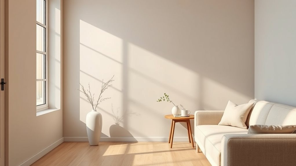
Use Natural Daylight to Reveal True Paint Color
Check the paint in natural light around midday when the sun is strongest, because colors look most accurate then.
Hold neutral samples—white, gray, or beige—next to the wall to spot subtle undertones. You’ll see how the true hue shifts without artificial lighting skewing your judgment.
Check Color at Midday
Want the truest sense of how paint will look all day? Check color at midday when natural light is strongest so hues read accurately. Midday light helps you assess undertones, how color psychology affects mood, and whether finish highlights imperfections that could impact paint durability.
- Observe walls between 11am–2pm for consistent, neutral daylight.
- Move around the room to see shifting warmth and shadow interactions.
- View paint with and without furnishings to judge emotional effect and maintenance needs.
Make notes and photos at midday; they give a reliable baseline before testing samples under other lighting.
Compare With Neutral Samples
How do you know a hue isn’t being skewed by surrounding colors? Place neutral samples beside the wall in natural daylight to reveal the true tone. You’ll see undertones shift; that’s essential for color psychology and interior design choices. Use white, light gray, and warm beige swatches to compare value and warmth. Observe at midday, and from different angles, noting how shadows change perception. Trust what appears consistent across samples. If a neutral reads cool or warm next to the wall, the wall’s apparent color is influenced by nearby hues—adjust your palette or lighting accordingly.
| White | Light Gray | Warm Beige |
|---|---|---|
| Sample A | Sample B | Sample C |
Best Times of Day to View Paint Color
When should you look at paint swatches to be sure the color’s what you expect? You should check them at consistent times so color psychology and paint durability concerns match reality.
View swatches against the wall in natural light, then note how warmth shifts across the day.
- Morning — cooler, bluer light reveals undertones and helps predict calming moods.
- Midday — bright, neutral light shows true saturation and helps assess paint durability for wear visibility.
- Evening — warm, low light reveals cozy tones and how the color reads under softer conditions.
Record observations to choose confidently.
Test Paint Under LED, Incandescent, and Fluorescent Light
Test your paint under LED, incandescent, and fluorescent bulbs to see how the hue shifts with each light source. Look for warm or cool casts that can push a color toward yellow, pink, or blue.
Compare the same swatch side-by-side under each bulb before you commit.
Observe Color Shifts
Because light changes how paint looks, you’ll want to view your swatch under different bulbs to see the true color. Pay attention to subtle shifts; warm incandescents boost reds and yellows, while cool LEDs emphasize blues and greens. Consider color psychology—mood alters with hue—and remember paint durability won’t affect shade but influences finish over time.
- Inspect at midday with cool daylight for baseline perception.
- Check under warm incandescent to gauge cozy, intimate tones.
- Test fluorescent/LED in the evening to reveal clinical or modern casts.
Record observations so you pick a color that behaves as you expect.
Compare Under Bulbs
Curious how the same paint can feel cozy one moment and stark the next? When you compare under bulbs, test a painted swatch beneath LED, incandescent, and fluorescent light.
LEDs tend to render colors cooler and more consistent; incandescents warm tones, boosting reds and golds; fluorescents can introduce greenish or flat casts.
Move the swatch between fixtures at different times to see shifts tied to historical palettes and cultural influences on color preference.
Note how warmth, hue, and saturation change, then choose the bulb that complements your paint.
Record observations and photos for reliable, repeatable decisions.
How Surface Sheen Changes Perceived Paint Color
When light hits a wall, the paint’s sheen changes how you see its color. You’ll notice surface gloss shifts highlights and shadow, altering color perception even with the same pigment.
When light strikes a wall, the paint’s sheen shifts highlights and shadows, changing how the same pigment reads.
Higher gloss reflects more, making hues appear brighter and cooler; matte scatters light, softening and deepening tones.
Consider these quick checks:
- Test a glossy sample next to a matte swatch to compare reflection.
- Observe at different angles—gloss shows more specular highlights that alter perceived hue.
- View under the room’s usual lighting; sheen interacts with bulbs to change apparent saturation.
Use these steps to judge true color.
How Age and Fading Alter Paint Color
Over time you’ll notice paint can shift from sun exposure, breaking down pigments and softening the original hue.
Chemical breakdown of binders and pigments can yellow or dull the color, while surface wear and stains make patches look uneven.
Keep these factors in mind when you try to identify the wall’s true, original shade.
Sunlight-Induced Color Shift
Although paint can look vibrant the day it’s applied, prolonged sunlight alters pigments and binders so colors fade, yellow, or shift in warmth over time. You’ll notice how UV exposure tests paint durability and subtly changes mood cues tied to color psychology, so inspect walls at different times.
Check areas near windows and shaded corners to compare shifts.
- Compare morning versus afternoon light to spot warming or fading.
- Look for yellowing on whites and loss of saturation on brights.
- Photograph samples over months to document gradual sunlight-induced color shift.
Chemical Breakdown Effects
Because chemicals in paint keep changing after they dry, age and breakdown can noticeably alter a wall’s color over time. You’ll see gradual dulling, yellowing, or loss of depth as chemical reactions slowly modify binders and additives.
Exposure to oxygen, humidity, and mild heat speeds those reactions, so colors drift even without direct sunlight. Pigment stability matters: some pigments resist change, others fade or shift hue.
When you inspect an older wall, compare painted areas hidden by furniture or trim to exposed zones to judge true original tone. Note that cleaning and repainting choices should account for this altered baseline.
Surface Wear And Stains
When you touch, rub, or walk past a painted wall every day, the surface slowly loses pigment and sheen where wear concentrates, and stains from hands, spills, or airborne grime settle into the porous binder. You’ll notice color shift where light hits less and where oils embed; Surface deterioration dulls hues and exaggerates contrast.
Inspect corners, baseboards, and high-traffic zones to map aging. Consider gentle Stain removal tests before repainting to reveal original tones.
- Clean a small patch with mild detergent.
- Lightly abrade an inconspicuous spot to check pigment depth.
- Compare cleaned vs. uncleaned areas.
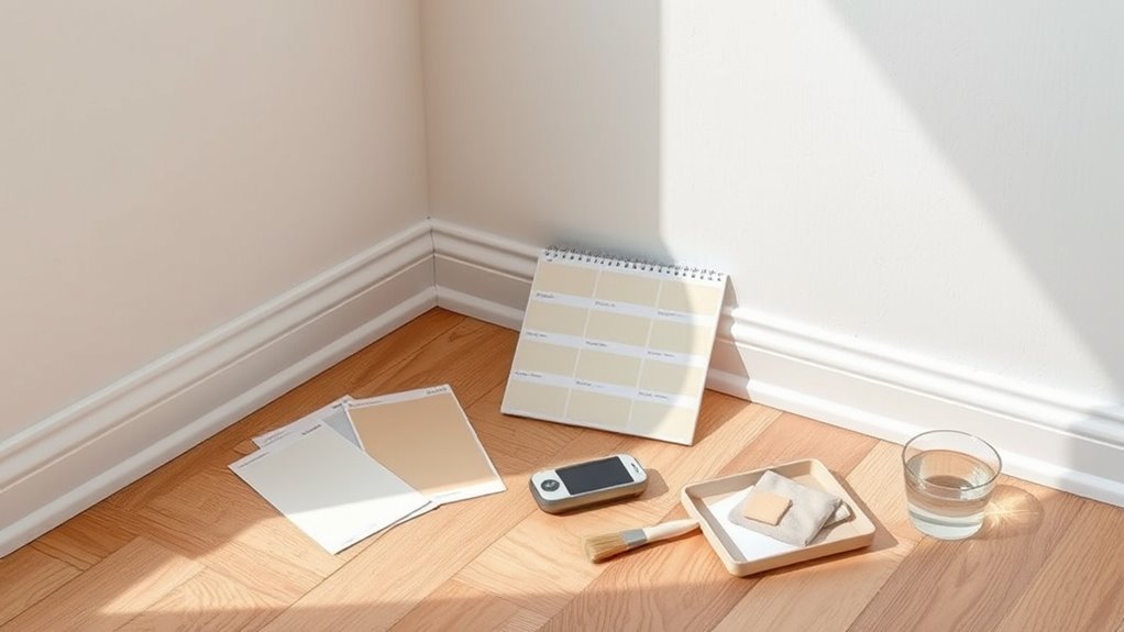
Take a Clean Paint Chip Safely
Before you cut, make sure the area is safe and free of hazards so you can take a clean paint chip without spreading dust or debris. You’ll wear gloves and a mask, lay down paper, and choose an inconspicuous spot. Take a small, intact flake or gently score a corner—keeping edges whole helps with color matching and preserves finish details that show color psychology and paint durability. Seal the chip in a zip bag and label location and date. Transport it flat to the store or lab for matching.
| Item | Tool | Tip |
|---|---|---|
| Safety | Gloves | Prevent oils |
| Containment | Paper | Catch debris |
| Storage | Bag | Avoid bends |
| Labeling | Marker | Note spot |
| Transport | Flatbox | Preserve edge |
Cut and Remove a Small Paint Sample When Needed
If you need a sample larger than a chip for lab testing or to expose underlying layers, cut a small square—about 1 inch—through the paint and slightly into the substrate so the layers stay intact.
Work slowly with a sharp utility knife, score perimeter lines, then pry gently with a thin putty knife. Keep edges clean to preserve color consistency and avoid contaminating layers for accurate matching and sample preservation.
Bag the sample in a sealed plastic vial or wrap in polyethylene. Label location and orientation. Send to the lab promptly or store flat, away from sunlight, heat, and moisture.
- Score neatly
- Pry gently
- Seal and label
Remove Paint Samples Without Damaging Drywall
When you remove a paint sample, work slowly and use the right tools so you don’t gouge the drywall. You can lift tiny chips with a utility knife or paint scraper and stop as soon as you hit bare surface.
Afterward, patch the spot with lightweight spackle, sand smooth, and wipe away dust for a clean finish.
Safe Paint Sample Removal
Although you’ll want to preserve the drywall, you can still remove paint samples cleanly by using gentle tools and a steady hand. Start by scoring the paint edge, soften with a damp sponge if it’s water-based, then lift small sections with a putty knife held at a shallow angle to avoid gouging the surface.
You’ll learn about color psychology and paint durability as you test samples. Work slowly, keep scraps labeled, and avoid metal scrapers on softened drywall.
Use these steps:
- Score, soften, and pry small flakes.
- Sand very lightly if needed.
- Store samples flat and labeled.
Patch And Clean-Up
Now that you’ve removed paint samples carefully, finish by patching and cleaning the area so the drywall looks undisturbed. Gently sand edges, wipe dust with a damp cloth, and apply lightweight spackle in thin layers, letting each dry before sanding smooth.
Match texture with a small joint knife or textured spray. Prime patched spots to guarantee even absorption, then repaint with the original shade or a tested swatch.
Consider color psychology when evaluating how repaired areas affect mood and flow. Use paint with good paint durability for touch-ups to resist scuffs and maintain a seamless appearance over time.
Photograph Wall Paint for Accurate Comparison
Before you compare paint chips or upload swatches, photograph the wall under consistent, even lighting so you capture its true color. You’ll want images that reflect actual Color perception, since ambient light and shadows trick your eye. Photographing also documents finish and helps assess Paint durability signs like scuffs or fading.
Use a neutral reference (white card) and steady framing. Then:
- Position the reference card next to the wall and fill the frame evenly.
- Take multiple shots from different angles without moving the light source.
- Save images in highest-quality format and label them with room and time for later comparison.
Camera and Phone Settings to Avoid Color Shifts
When you shoot the wall, set your camera or phone so it records true colors. Turn off filters, choose RAW if available, lock white balance to match ambient light, and lower saturation to prevent shifts that hide subtle tones tied to color psychology. Use neutral exposure and avoid flash that flattens texture and obscures paint durability cues. Stabilize the device and photograph perpendicular to the wall.
| Setting | Why it matters |
|---|---|
| White balance locked | Prevents warm/cool shifts |
| RAW format | Preserves true hue and detail |
| No filters/flash | Maintains texture and finish |
Best Smartphone Apps to ID Paint Color
When you use apps to ID paint color, check how accurate their color matching really is so you don’t end up with the wrong shade.
You’ll also want to test them under different lighting and angles to see how much readings shift.
Finally, compare core features like built-in calibration, swatch libraries, and export options to pick the app that fits your needs.
Color Matching Accuracy
If you’re relying on a smartphone app to identify a paint color, expect useful guidance but not perfect precision—camera sensors, lighting, and finish all influence the result. You’ll still get a close match that helps with Color psychology choices and evaluating paint texture, but apps translate pixels, not perception. Verify swatches before buying.
- Check multiple app matches to spot consistent tones.
- Compare sampled swatches to physical chips under neutral light.
- Ask for manufacturer cross-references or formula codes to ensure repeatable results.
Treat app results as starting points, then confirm with real-world samples.
Lighting And Angles
Because light and angle change how a phone camera reads color, you’ll want to control both to get the most reliable app match. Position yourself so light hits the wall evenly; avoid harsh shadows, mixed light sources, and reflections that skew hue and saturation.
Hold your phone perpendicular to the surface to prevent glare and color shifts from oblique angles. Use consistent, neutral lighting—daylight or a full-spectrum bulb—so the app reads true tones relevant to color psychology and mood.
Take multiple shots from the same distance and angle for comparison; note finish expectations since sheen affects perceived paint durability.
App Features Comparison
Although apps vary in features and accuracy, you’ll want one that combines precise color sampling, white-balance calibration, and an easy way to compare manufacturer-matched swatches.
You’ll also want tools that note finish and simulate room lighting so you can judge Color psychology effects and consider paint durability for high-traffic areas.
Evaluate apps by these essentials:
- Real-time sampling with calibration and saved swatches.
- Manufacturer matches plus AR preview to test in your space.
- Metadata export: RGB/HEX, finish, recommended primers, and durability ratings.
Pick an app that balances accuracy, usability, and manufacturer integration for reliable results.
Use a Colorimeter or Spectrophotometer at Home
When you want a precise read on your wall color, a handheld colorimeter or spectrophotometer gives you objective results in seconds; these devices measure the paint’s color values so you can match or reproduce it accurately. You’ll place the device on a clean, flat area, follow calibration prompts, and record readings as numerical values or swatches.
That lets you compare with color theory models and pick complementary shades confidently. Portable meters also reveal subtle fades that affect paint durability choices. Expect minor variation from glossy vs. matte finishes; take multiple readings and average them for the most reliable match.
When and How to Bring a Sample to a Paint Store
If the color on your wall is tricky to match or you want the most accurate repurchase, take a physical sample to the paint store—ideally a 2×2 inch chip cut from a hidden corner or a peeled scrap of paint rather than a photo.
Bring the sample when lighting varies or before buying lots, since stores can compare it to swatches and advise on Color psychology for room feel and on paint durability for use.
Do:
- Clean and label the chip with room and finish.
- Bring photos of the space for context.
- Ask about recommended finishes and durability options.
What Paint Stores Check When Matching Color
When you bring a sample, the store will often scan it with a spectrophotometer to get an objective color reading.
They’ll also hold it up to printed swatches and painted samples so you can compare the tone and finish by eye.
Together those checks help them match the color more accurately.
Spectrophotometer Color Reading
Because accurate color matching hinges on precise measurement, paint stores often use a spectrophotometer to read the exact wavelengths reflected by your wall, not just the color your eyes perceive. You’ll get an objective readout of hue, value, and chroma so the formula matches under standard light.
This matters for color psychology and paint durability decisions, since undertones affect mood and formulation affects longevity. The device reduces guesswork and records readings you can save.
- Captures spectral data across wavelengths.
- Converts to paint formulas for various brands.
- Stores readings for future touch-ups.
Visual Swatch Comparison
Although a spectrophotometer gives a technical baseline, paint-store staff still rely on visual swatch comparison to confirm how a color actually looks in your space. You’ll hold printed swatches against the wall under different lighting to judge hue, value, and undertones.
Staff check how the sample interacts with room light, furnishings, and your emotional goals—Color psychology matters when you want warmth or calm. They’ll also discuss finish and paint durability for high-traffic areas, since sheen affects perceived color and longevity.
Trust your eyes, request multiple samples, and live with them for a few days before committing.
How to Read and Use Paint Chips and Swatches
If you want to match or choose a wall color accurately, start by learning how paint chips and swatches are organized and what each label means. You’ll check hue family, value (lightness), and chroma (saturation) to narrow options. Consider color psychology for mood and test samples under your light.
Note finish codes—sheen affects appearance and hints at paint durability. Use swatches in different spots and view at different times.
- Compare chips against the wall in natural and artificial light.
- Tape swatches up and live with them for days.
- Photograph swatches for reference.
Read Paint Codes and Formula Labels
Check the can or touch-up pot for the paint code—it’s usually stamped on the label or printed near the barcode so you can match the exact shade.
Learn to read formula labels (pigment types, tint amounts, and base) so you know how the color was mixed and whether you need a specific base or tinting strength.
Then cross-reference the code and color name with the manufacturer’s database or a store to confirm any variations between names and actual formulas.
Paint Code Location
Where do you find the exact paint code on your wall? You’ll often spot a small sticker or label on the back of a door, inside a closet, or on the baseboard—places painters check when matching color psychology to a room’s mood or evaluating paint durability. Check these common locations:
- Behind doors or door frames where painters hide labels.
- Inside closets or cabinets where touch-up cans were stored.
- On baseboards, window jambs, or nearby trim for maintenance notes.
If you find a swatch or a chip with numbers, photograph it and bring it to a paint store for verification.
Understanding Formula Labels
How do you actually read those tiny numbers and letters on a paint can or swatch? You’ll see a formula code: a mix of letters and digits that tells you the exact recipe—base, tint strengths, and pigment sequence. Read left to right: manufacturer prefix, color family, then tint amounts. Match the code when buying extra or checking consistency; don’t rely on names alone.
Note that paint manufacturer variations affect lightfastness and gloss, so carry a sample to evaluate color psychology in your space. Keep a photo of the label for reference and record the batch number for future touch-ups.
Cross-Referencing Color Names
Although paint names can be helpful shorthand, you’ll want to cross-reference the actual formula codes and labels to be sure you’re getting the same color, since names often vary between brands and collections. Check the numeric or alphanumeric formula stamped on the can, compare manufacturer swatches, and note sheen and base—small differences affect color and paint durability.
Also consider color psychology for the room’s purpose; the same name can feel different under varied light or finish. Use these steps:
- Match formula codes across brands and collections.
- Verify sheen/base and batch numbers.
- Test a sample on the wall.
Identify Undertones: Warm, Cool, Neutral
When you look closely at a paint color, notice the undertone—the subtle hint of warmth, coolness, or neutrality that changes how the shade reads in different light. You’ll test samples under morning, midday, and evening light to spot red, yellow, blue, or gray tints.
Warm undertones feel energetic and can impact color psychology by making spaces cozier. Cool undertones calm and expand rooms. Neutral undertones balance other elements.
Record observations and photograph samples for reference. Consider that finish affects perceived hue and that strong pigments may mask undertones but don’t alter inherent paint durability.
Match Trim and Accents to Existing Wall Paint
Because trim and accents frame the room, you want them to either complement or deliberately contrast the wall color so the whole space feels intentional. You’ll use color psychology to decide mood: crisp white for freshness, deep charcoal for drama, or a muted hue for calm. Match sheen and finish to highlight details, and test swatches near natural light.
If you’re updating, consider paint recycling for touch-ups to avoid waste and maintain consistency. Try these simple approaches to guide choices:
- Complement: pick a softer tone from the wall’s undertone.
- Contrast: choose a bolder, higher-contrast shade.
- Cohesive: repeat an accent color elsewhere.
Match Textured or Faux-Finish Painted Walls
If your walls have texture or a faux finish, matching paint takes a bit more care than flat surfaces—trim strategies and color choices still matter, but surface character changes how light and pigment read.
You’ll start with texture analysis: photograph in natural light, feel the profile, and note sheen variations. Bring samples to replicate depth and shadow; match base color first, then layer glazes if needed.
For faux finish techniques, practice on panels to mimic strokes, sponging, or ragging before committing. Test strips on the actual wall, evaluate at different times of day, and adjust glaze strength until it blends.
Working With Historic or Custom-Mixed Paints
Although historic and custom-mixed paints can be tricky, you can reliably match and preserve them by combining careful analysis with the right tools. You’ll document layers, note sheen, and photograph colors under consistent light.
For genuine Historical preservation, sample cross-sections reveal original pigments and ground. Work with a conservator or trusted lab for accurate identification and aging considerations.
For Custom blending, bring chips and precise notes to a colorist who’ll recreate the formula. Don’t assume modern equivalents will behave the same.
- Analyze layers and sheen.
- Use lab or conservator help.
- Provide samples and precise notes.
Test Small Paint Samples on the Wall Correctly
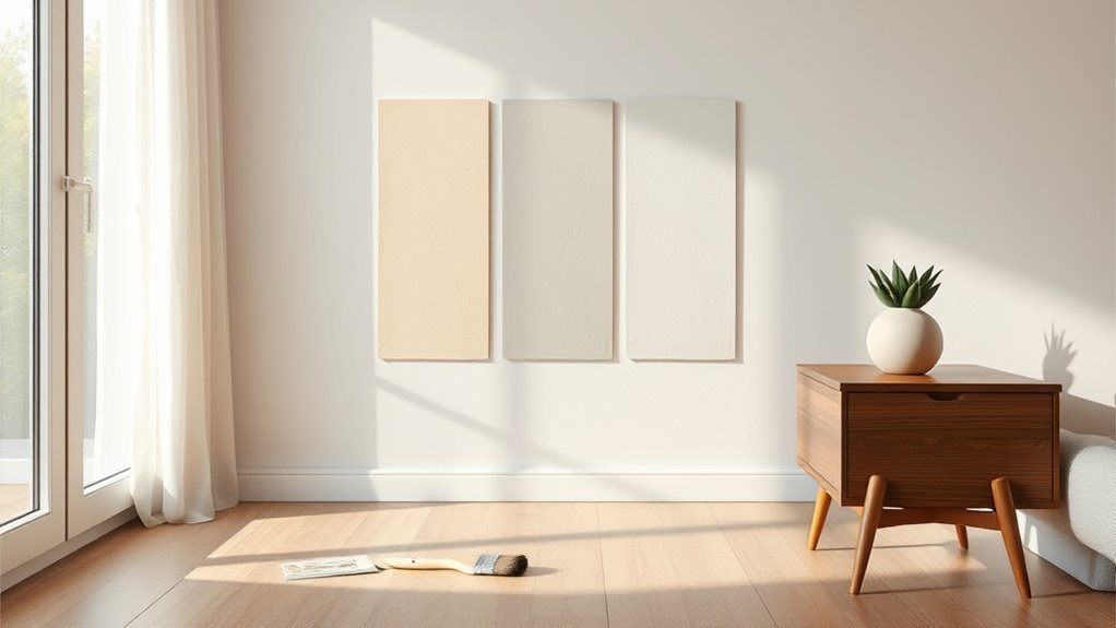
Before you commit to a full repaint, test small paint samples directly on the wall so you can judge color, sheen, and undertones in the room’s actual light. Apply three 4×4-inch swatches—primer, sample mixed to your formula, and the matched color—placing them at eye level and near corners.
Live with them for several days to see shifts from morning to evening. Note how color psychology affects mood in the space; a hue that calms on paper might energize in sunlight.
Also assess paint durability by scuffing lightly and checking adhesion after drying. Record results before ordering larger quantities.
Compare Matched Samples Under All Lighting Conditions
When you compare matched paint samples, check them under every light the room gets—natural morning and afternoon sun, midday glare, evening lamp light, and any overhead or accent fixtures—so you see how the color shifts and which undertones dominate. You’ll notice warmth, coolness, and contrast changes that affect mood and Color psychology; note which option supports the atmosphere you want.
Compare paint samples in all light—morning, midday, evening, and fixtures—to see shifting undertones and mood effects.
Also inspect surface texture for signs of wear to judge paint durability. Test each sample at eye level and from different distances.
- Observe at multiple times of day.
- Use lamps with bulbs you’ll keep.
- Photograph for comparison.
Spot vs. Whole-Wall Color Variations: What They Mean
If a small patch of paint looks off while the rest of the wall reads fine, don’t assume the whole room needs repainting—you’re likely seeing a spot variation rather than a whole-wall color shift.
You should inspect for surface differences: patches, repairs, or residue can alter color perception without changing the base paint. Check multiple angles and lighting; a tiny gloss change or uneven primer can catch light differently.
Contrast that with paint aging, which gradually alters large areas’ hue and saturation. If only a localized area appears different, treat it as a spot issue before concluding the entire wall changed.
Troubleshoot Common Mismatches and Why They Happen
Spot issues often point to local causes, but mismatches can also come from broader, fixable problems you should know how to spot. You’ll want to check lighting, surface prep, and formulation before blaming the swatch.
Color perception shifts with bulbs and shadows; view samples at different times. Paint chemistry differences between batches, sheen, or primer can alter finish even with the same code. Troubleshoot methodically so you don’t repeat mistakes.
Check samples under varied lighting—bulbs, shadows, primer, sheen, and batch chemistry can all change color perception.
- Inspect lighting and view angles.
- Test adjacent primer and sheen effects.
- Compare batch codes and sample strips.
Follow this order to isolate the real cause.
When Repainting Is a Better Option Than Matching
Because small touch-ups can draw more attention than they fix, you’ll often get better results by repainting the whole wall instead of trying to match a patch.
Repainting makes sense when aging, fading, or sheen differences betray matched spots, or when color psychology matters—subtle hue shifts can change a room’s mood.
If the existing paint shows wear, stains, or reduced paint durability, a fresh coat restores finish and performance.
You’ll also avoid repeated touch-ups that never quite disappear.
Choose a compatible primer and methodically repaint the entire wall for consistent color, texture, and longevity.
Cost and Time Trade-Offs: DIY vs. Pro Color Matching
When you weigh DIY vs. hiring a pro for color matching, think about both upfront cost and the time you’ll invest. You can save money doing samples and scanning chips yourself, but you’ll spend evenings adjusting swatches.
Pros charge for expertise and faster, more reliable matches, which saves mistakes and honors color psychology impacts in living spaces. Consider paint durability too—pros often specify formulas that last.
Choose DIY if budget and time allow experiments; hire a pro if you need speed, consistency, and fewer retries.
- DIY: low cost, high time
- Pro: higher cost, low time
- Hybrid: sample then consult
Checklist Before Buying Matched Paint for Touch-Ups
Before you buy matched paint for touch-ups, check the color under natural light so what you see is what you’ll get.
Also confirm the sheen matches the existing finish — flat, eggshell, satin, or gloss will reflect differently.
Take a small sample of the matched paint home to compare before committing.
Measure Under Natural Light
If you want a reliable color match for touch-ups, always check the wall under natural light first. You’ll see true undertones that artificial bulbs hide, and you’ll notice how color psychology shifts perception by time of day.
Historical palettes reveal how aging affects pigments, so inspect areas near windows and shaded corners to compare.
- Observe mid-morning and late afternoon to catch warm and cool light.
- Hold a neutral white card beside the wall to spot subtle undertones.
- Photograph the area in RAW or highest quality for later comparison.
Make notes and test samples before buying.
Check Paint Finish Match
You’ve confirmed the color under natural light; now check the paint’s finish so your touch-up blends in. Feel the wall and note sheen—flat hides flaws, gloss shows permanence. Match finish to preserve color psychology and paint durability. Ask for the original sheen (eggshell, satin, semi-gloss). Test a small patch and let it dry before judging. If you can’t match sheen, consider repainting the whole panel.
| Finish Type | Appearance | Best Use |
|---|---|---|
| Flat | Matte, low | Ceilings, low-traffic |
| Satin | Soft sheen | Living areas |
| Semi-gloss | Shiny | Trim, high-traffic |
Tips for a Seamless Touch-Up or Repaint
Once you match the color, prep the area so your touch-up blends invisibly: clean the wall, sand glossy spots, and feather the edges of old paint so the new coat sits flush. You’ll consider color psychology to keep tones consistent with room mood and note regional paint trends that affect pigment choices.
Once color’s matched, prep, sand, and feather edges so touch-ups blend seamlessly with the room’s mood and trends.
Work in even light and use thin layers to avoid texture mismatch. Follow these quick steps to finish properly:
- Wipe, sand, and prime small repairs.
- Apply thin coats, feathering outward with a small roller.
- Let full cure, then inspect under varying light before declaring done.
Store and Label Paint Chips and Leftover Samples
When you finish a project, organize and label every chip and leftover can so future touch-ups are quick and exact. Store chips flat in a labeled envelope with room name, date, and paint formula; tuck a tiny sample of the finish to show sheen and paint durability.
Keep small cans sealed, note brand and batch numbers, and write mixing ratios if you altered color. Group samples by room or mood—this helps link choices to color psychology when redecorating.
Store in a cool, dry spot away from sunlight. A tidy, labeled stash guarantees time savings and ensures accurate color matching later.
Common Mistakes That Ruin Color-Matching Attempts
If you skip simple checks—like testing paint under actual room light or noting the finish—you’ll waste time chasing a false match. You’ll also ignore how color psychology affects perception: warm tones feel cozier, cool ones recede. Avoid these common pitfalls so your repaint reflects intent and paint durability.
- Relying on a single chip – light, finish, and surrounding colors change what you see.
- Comparing under store fluorescents – don’t let artificial light mislead your eye.
- Ignoring surface condition – stains or texture alter appearance and shortchange paint durability.
Be methodical and you’ll save effort.
Next Steps: Order Swatches, Test, Then Commit
You’ve avoided the common traps, so now act: order several paint swatches that match the closest chips you’ve found, then test them in the room before committing. Tape swatches to different walls and observe them at multiple times of day; light shifts color dramatically.
Live with samples for at least a week, note how color psychology affects mood in each light. If historical paint formulas matter, compare sheen and undertone—older pigments age differently.
Once a swatch consistently pleases you, pick a reputable brand, request a small sample can, paint a larger patch, and only then place your full order.
Frequently Asked Questions
What if the Paint Has Lead—How Do I Test for It Safely?
You should assume hazard and use lead paint testing kits or hire certified pros for safe testing methods; don’t sand or scrape, wear proper PPE, seal and ventilate the area, and follow local disposal and abatement regulations.
Can Wallpaper Residue Affect Color Matching Accuracy?
I’m answering now: yes, wallpaper residue can skew color matching accuracy. I once compared swatches after stripping sticky paste; that residue interference fooled scanners. You’ll need thorough cleaning to avoid Wallpaper residue and mismatched paint.
Will Humidity or Recent Renovations Change Paint Readings?
Yes — humidity and recent renovations can skew readings: you’ll get altered paint absorption and reflected tones, and ambient lighting will change perceived color. Wait for stable conditions, remove residue, and retest under consistent light.
How Should I Store Leftover Mixed Paint Long-Term?
Placing leftover paint in a mason jar like it’s 1920s alchemy, you’ll seal the can tightly, store upright in a cool, dry place away from sunlight, label it for Paint storage to guarantee Color preservation.
Can Pets, Smoke, or Cooking Permanently Alter Wall Color?
Yes — pets, smoke, and cooking can permanently alter wall color: pet stains soak into finish, smoke damage leaves yellowish residue, and absorbed cooking grease causes discoloration, so you’ll need cleaning, priming, or repainting to restore surfaces.
Conclusion
Now you know how to pin down your wall’s paint color: prep the surface, check in natural daylight, use chips or a color meter, and test before you commit. You’ll avoid the common slip-ups—like matching under incandescent bulbs or skipping primer—and store leftovers with clear labels. Take the next step: order swatches, try them on, then repaint or touch up confidently. Don’t panic if it feels like decoding Morse code; you’ve got this.