How to Visualize Exterior Paint Colors Easily
You can visualize exterior paint colors easily by testing large swatches on-site, photographing them at morning, midday, and dusk, and using a paint‑visualizer or AR app to swap palettes on your house photo. Start with the dominant siding, then add trim and accent samples, and view them against roof, driveway, and landscaping. Take consistent photos from key angles and gather neighbor feedback. Follow a quick mockup and test routine, and you’ll find clearer options as you explore further.
Quick 3‑Step Workflow to Pick Exterior Paint
When you’re ready to choose an exterior color scheme, follow a simple 3‑step workflow that keeps decisions practical and fast: narrow your options, test them in context, and finalize with durable samples.
First, narrow by purpose: use color psychology to decide mood—calm neutrals, energetic accents—and limit to three coordinated tones.
Second, test on-site: paint large swatches, view at different times, and photograph under real light to confirm contrasts and trim balance.
Third, finalize with durable samples and check against historical palettes if your home’s era matters.
Commit to one scheme and schedule painting for consistent results.
Pick a Color Strategy That Matches Your Home’s Style
Because your home’s architectural style sets expectations for proportion, trim, and detail, your color strategy should reinforce those features rather than fight them.
Let your home’s architectural style guide your color choices—reinforce proportions, trim, and details rather than oppose them.
Look at period cues: Craftsman, Victorian, mid‑century, or modern each suit different tones. Use historical palettes to honor original character or deliberately modernize with contemporary contrasts.
Consider color psychology—warm neutrals feel welcoming, cool grays read sleek, saturated accents convey energy.
Balance main field, trim, and focal accents so shapes read clearly. Test small areas in natural light and pick options that enhance architectural lines, materials, and neighborhood context without overpowering the design.
Choose Which Surfaces to Test First (Siding, Trim, Accents)
Start by testing your dominant siding color since it covers the largest visual area and sets the overall tone.
Then try a contrasting trim shade to see how it frames windows, doors, and eaves.
Finally, sample accent areas like shutters or the front door to tie the whole scheme together.
Start With Dominant Siding
Before you swatch anything, identify the dominant siding—the largest surface area will set the home’s overall tone. Then test colors there first, followed by trim and accent areas to see how they interact. Focus on siding because it anchors curb appeal and guides your palette choices.
Consider color psychology—warm neutrals feel welcoming, cool grays read modern—and study historical palettes for context on period-appropriate hues. Apply large swatches to different elevations and observe at multiple times of day. Photograph samples against landscaping and neighboring homes.
That method helps you choose a cohesive primary color before committing to secondary or accent decisions.
Paint Trim For Contrast
When you’ve settled on a siding color, paint the trim next to lock in the contrast and clarify the home’s lines—you’ll see immediately how window casings, eaves, doors, and railings change the overall feel. You’ll test how contrast alters curb appeal and use color psychology to influence warmth, formality, or freshness.
Historical palettes guide classic trim choices if you want period accuracy. Select trim surfaces that frame views and wear well.
- Window casings — highlight sightlines and proportions.
- Eaves and fascia — define roofline and silhouette.
- Railings and porch posts — anchor entry and scale.
Test Accent Areas
As you narrow your palette, decide which surfaces to test first so you get the clearest sense of how colors will read on the whole house. Start with large, visible planes like siding to judge overall tone.
Then paint trim samples to check contrast and shadow behavior. Add accent areas—doors, shutters, eaves—so you see focal pops and how color psychology influences curb appeal.
Test historical palettes where appropriate to respect architectural style, but try modern accents too. Observe samples at different times and distances, photograph them, and note reactions.
Your targeted sampling saves time and prevents costly mistakes.
Take Consistent Exterior Photos for Accurate Testing
Although lighting and angle can change how a color reads, you can get reliable test photos by using the same settings and positions each time. Stand in the same spot, use manual exposure if possible, and note time of day so Historical influences on neighborhood palettes and Cultural trends don’t skew your comparison.
Frame the whole elevation, include a neutral reference like a white card, and avoid shadows or rain. Keep camera height consistent and record lens focal length. Review shots on a calibrated screen before deciding. Repeat tests after a few days to confirm consistency.
- Mark positions.
- Use reference card.
- Log settings.
Create Simple Digital Mockups With Paint‑Visualizer Apps
If you want a quick, low‑risk way to see color choices on your house, use a paint‑visualizer app to create simple digital mockups—these tools let you upload photos, mask areas, and swap palettes in seconds so you can compare options without scraping a single chip. You’ll test hues, consider color psychology for mood, and preview contrast and trim. Check labels for paint durability recommendations while you mockup. Use the mockup to shortlist samples, then test physically. Visualize combinations with a simple table:
| Area | Example |
|---|---|
| Siding | Soft gray |
| Trim | Crisp white |
| Door | Deep teal |
| Accent | Warm taupe |
Use AR Tools to View Colors in Real Time
When you point an AR app at your house, it overlays paint colors in real time so you can walk around, change hues, and see how light and angles affect appearance instantly. You’ll use augmented reality for precise color visualization, matching samples to trim, roof, and landscaping.
Move closer to inspect texture and watch shadows shift across tones. Tap to adjust saturation or try warmer or cooler variants, then save favorites. Use these quick checks to trust choices before buying samples.
- Test colors under different skies.
- Inspect shifts between surfaces.
- Save looks for later comparison.
Compare Multiple Color Options Side‑By‑Side on Screen

You can upload multiple photos side‑by‑side to see how different colors look on the same angles and details.
Match hues and brightness accurately using eyedropper tools or color codes so comparisons are fair.
Save each version so you can revisit, annotate, and pick the best option later.
Upload Photos Side‑By‑Side
Before committing to a single shade, upload multiple photos and place them side-by-side so you can compare how different colors read together on the same façade. This lets you spot contrasts, harmonies, and how light and shadow affect each option at a glance.
You’ll test palettes quickly, considering color psychology and historical palettes to see mood and period fit. Use consistent exposure and crop, then:
- Label each image with paint codes and notes.
- Toggle between daytime and evening shots to judge shifts.
- Zoom to inspect trim, shadows, and texture interactions before deciding.
Match Colors Accurately
Although accurate matching takes careful attention, you can compare several color options side‑by‑side on screen to see true relationships and spot subtle shifts in hue, value, and saturation. Use calibrated monitors, neutral lighting, and zoomed-in swatches to judge edges and undertones. Note how Color psychology changes perception—warm tones feel inviting, cool ones recede. Reference historical palettes for context when matching period homes. Keep notes on contrast ratios and neighboring materials. The table below helps you organize quick comparisons.
| Option | Notes |
|---|---|
| Swatch A | Warm, low saturation |
| Swatch B | Cool, higher value |
| Swatch C | Neutral, balanced |
| Swatch D | Accent, saturated |
Save And Compare Versions
Start by saving distinct versions of your exterior paint mockups so you can flip between them quickly and spot differences at a glance. You’ll want labeled files for each palette, noting color codes, color psychology notes, and estimated paint durability. Use side‑by‑side comparisons on screen to judge contrast, trim balance, and curb appeal under different lighting. Consider creating sets for seasonal light and weather exposure.
- Save originals with metadata: codes, finish, durability estimates.
- Export scaled views: full elevation, close trim, shadowed light.
- Compare snapshots in a grid to evaluate emotional effect and longevity.
Print and Arrange Real Paint Swatches for Scale
Once you’ve narrowed your favorite hues, print actual-size swatches on heavy paper and cut them out so you can test proportions and placement against the house. You’ll evaluate color psychology—how tones feel in sun and shade—and choose a paint finish that suits texture and maintenance. Tape swatches to siding, trim areas, and doors, moving them to judge balance. Photograph combos at different times of day. Use the table below to plan placements and notes.
| Area | Notes |
|---|---|
| Siding | Large impact; view from street |
| Trim | Defines edges; crisp contrast |
| Door | Accent focal point |
| Porch | Shadowed; consider durability |
Make an Exterior Paint Color Palette: Trim, Siding, Accents
When you assemble your exterior palette, pick a dominant siding color first, then choose trim and accent hues that support it. Trim should clarify edges with a crisper or lighter tone, while accents can be bolder to draw the eye to doors, shutters, or architectural features.
Use color psychology to set mood—calming neutrals, energetic brights—and consult historical palettes for period-appropriate combinations.
Balance contrast so trim defines forms without overwhelming siding. Test small samples in sunlight.
Prioritize harmony: one dominant, one supportive trim, one accent. Keep finishes consistent for cohesion.
- Siding
- Trim
- Accent
Detect and Compare Undertones in Different Lights
Because light shifts throughout the day, you’ll want to view paint samples in morning, midday, and evening to spot undertones that change with color temperature and angle. You’ll note how warm or cool hints affect mood and Color psychology, so test colors against trim and surroundings. Use consistent viewing spots, photograph each time, and compare notes. Lighting variability reveals hidden greens, pinks, or grays that alter curb appeal.
| Time | Observed Undertone | Mood |
|---|---|---|
| Morning | Cool pink | Calm |
| Midday | True tone | Neutral |
| Evening | Warm amber | Cozy |
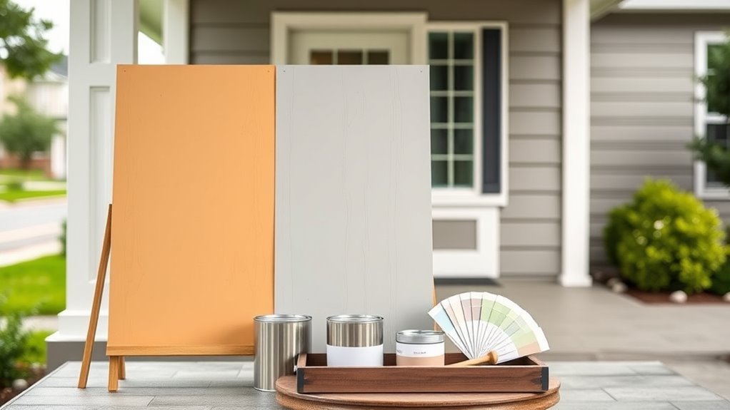
Test Paint Samples on Vertical Boards, Not Paper
Paint samples stick to vertical boards the way they’ll sit on your house, so you’ll see how light and shadow actually affect the color.
Mount a few boards and paint large swaths rather than little chips so you can judge tone, sheen, and undertones at different times of day.
Walk around them from various angles to observe the color in real context before you commit.
Paint On Vertical Boards
If you want an accurate sense of how a color will read on your house, apply samples to vertical boards rather than to paper or flat swatches. You’ll see real light, shadow, and texture interaction.
Paint on several boards, hang them where the siding will be viewed, and rotate positions to compare. Consider color psychology and historical influences to choose hues that suit the style and mood of your home. Test at different times of day and in various weather to avoid surprises.
- Paint full-height boards for true falloff.
- Use the actual paint finish.
- Label and photograph results.
Observe Colors In Context
When you want to know how a color will actually look on your house, test it on vertical boards hung where the siding will be seen; this lets you watch how light, shadow, and texture change the hue throughout the day. You’ll compare true tones, note how Color psychology affects curb appeal, and consider Historical influences on palette choices. Move boards to sunny and shaded spots, photograph at different times, and record reactions. Use the table below to track observations and decide confidently.
| Time | Light | Reaction |
|---|---|---|
| Morning | Cool | Preferred |
| Noon | Bright | Harsh |
| Evening | Warm | Flattering |
| Overcast | Muted | Neutral |
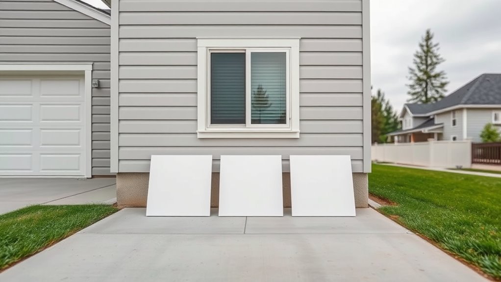
Place Sample Boards Around the Yard at Multiple Angles
Because light changes around your house, set sample boards at several spots and angles so you can see how each color behaves in different conditions.
Place boards near garden accents and by walkways to judge how paint complements plantings and landscape integration.
Rotate boards to mimic wall orientation and note reflections from glass or metal.
Move them closer to focal points like the front door and driveway to evaluate curb appeal.
- North- and south-facing positions
- Near trees and open lawn
- Adjacent to hardscape and garden accents
Check Samples at Morning, Midday, and Evening
Although light shifts throughout the day, you’ll get the clearest sense of a paint’s true character by checking samples in the morning, at midday, and again in the evening. Go outside at those times with the same sample boards you placed earlier, and note how hue, saturation, and warmth change.
Morning light can reveal cool undertones, midday shows true chroma, and evening brings out depth and shadow. Record impressions and photos so you don’t rely on memory.
Consider color psychology—how shifts affect mood—and factor in paint durability under varying sun exposure. Those observations help you choose a color that looks right all day.
Evaluate Color With Roof, Driveway, and Landscaping
When choosing a paint color, make sure it coordinates with your roof’s tone so the overall look feels intentional.
You’ll also want enough contrast with the driveway finish to prevent the house from blending into the ground.
Consider nearby landscaping colors and textures to keep the palette balanced and cohesive.
Coordinate With Roof Tone
As you evaluate paint samples, look at them alongside your roof, driveway, and landscaping to see how tones interact in natural light. You’ll want a roof-tone strategy that respects color psychology and echoes historical palettes if appropriate, so choices feel intentional. Test swatches at morning and evening light to confirm warmth or coolness against shingles. Consider reflections from paving and greenery that shift perceived hue.
- Match undertones: warm roof with warm paint, cool with cool.
- Use a mid-tone body color to bridge roof and trim.
- Sample small areas before committing.
Contrast With Driveway Finish
Roof tone sets the upper palette, but your driveway finish will anchor the house and affect perceived contrast—so check how paint samples read against concrete, asphalt, pavers, or gravel. You’ll want to test swatches in daylight, noting how driveway contrast shifts warm or cool paints. Position samples near edges and at the garage to judge scale and flow. Aim for color harmony between siding, trim, and the driveway surface so transitions feel intentional, not jarring.
| Driveway Type | Contrast Tip |
|---|---|
| Concrete | Try mid-tones to avoid glare |
| Asphalt | Use lighter trims for balance |
| Pavers | Pick a hue that echoes patterns |
| Gravel | Test for shifting tones in sun |
See How Shadows and Texture Change Perceived Color
Although sunlight makes a color look one way, shadows and surface texture can change that perception dramatically, so you should evaluate paint samples in different lighting and against the actual siding or brick.
You’ll notice shadow effects deepen hues at different times, while texture influence—rough lap, smooth stucco, or brick—breaks light and alters gloss. Move samples, view from angles, and photograph at dawn and dusk. Consider how shadows shift with landscaping and roof overhangs.
Compare how sheen reads on textured versus smooth surfaces to avoid surprises.
- Test at multiple times
- Photograph angles
- Note sheen on texture
Use Neutral Trim or Stone as an Anchor for Bold Choices
Noting how shadows and texture shift color, you can steady a bold exterior by pairing it with neutral trim or stone that anchors the look. You’ll balance vivid siding with neutral accents and natural textures, letting trim, eaves, and a stone base ground energetic hues. Choose warm or cool neutrals to complement undertones, and use texture to add depth without competing. Imagine how you’ll feel arriving at a home that’s bold yet composed.
| Mood | Material | Effect |
|---|---|---|
| Calm | Limestone | Soothing anchor |
| Confident | Dark trim | Sharp contrast |
| Warm | Wood grain | Inviting depth |
Create Temporary Mockups With Peel‑and‑Stick or Fabric
When you want a realistic sense of how a color will read on your house, apply peel‑and‑stick samples or drape fabric swatches directly on siding and trim; they let you test scale, undertone shifts in different light, and how textures interact without committing. Try daylight and evening checks, step back to judge balance, and note how color psychology influences mood—warm tones feel inviting, cool ones calm. You can reference historical palettes for period accuracy or modern contrast. Use temporary mockups to refine choices before painting.
- Test multiple sizes and placements
- Photograph for comparison
- Live with samples for days
Assess Curb Appeal From the Street and Nearby Vantage Points
Because curb appeal is how neighbors and buyers first read your home, step back and evaluate the whole composition from street level and nearby vantage points before you commit to a color scheme. Walk the sidewalk, park across the street, and view from common corners to judge silhouette, contrast, and scale.
Look for landscape harmony—how trim, siding, and plantings interact—so colors don’t clash with dominant foliage or hardscape. Consider roof tone and surrounding homes for neighborhood compatibility without copying.
Note how light changes throughout the day and photograph key views. Make sure your chosen palette reads well from realistic distances and angles.
Ask for Feedback: What to Ask Neighbors and Pros
After you’ve judged how the palette reads from the street, get other eyes on it—neighbors and paint pros can catch issues you might miss. Ask for Neighborhood opinions and Professional recommendations to balance personal taste with practical insight.
Give clear context: show photos at different times and say what you want—modern, classic, subtle. Ask specific, actionable questions so feedback helps.
- Which color reads best from the sidewalk and why?
- Do these combos fit neighborhood character or clash?
- Any durability, sheen, or prep tips pros recommend?
Weigh input, but make the final call that fits your home.
Common Color Mistakes That Work Indoors but Fail Outside
Don’t assume what looks good inside will work outside—flat paint can read lifeless in sunlight, and tiny samples often mislead you about the true shade.
You’ll also want to watch trim contrast, since a too-bold trim can overpower the whole facade. Test larger swatches in different light and view the trim color in context before committing.
Flat Paint Looks Dull
If you choose a flat (matte) finish for your home’s exterior, you’ll quickly notice it looks lifeless and absorbs light in a way that hides architectural detail. You want curb appeal, so avoid flat paint on siding and trim where contrast matters.
A dull finish can flatten textures, muddy colors in shadows, and make maintenance harder since stains cling. Instead, test sheens that reflect enough light to show depth without glare.
Consider these quick checks:
- View the color at noon and dusk.
- Inspect from the street and close up.
- Spray a bit of water to see how stains behave.
Small Samples Mislead
Because tiny chips or a paint strip can look perfect under indoor lighting, you can get fooled when that same shade goes on your house. When you rely on small samples, natural light, weather, and scale shift perception; a cozy taupe can read flat or washed on siding.
Consider color psychology—how sunlight intensifies warmth or coolness—before committing. Test larger, painted panels in different daylight and evening conditions to see true impact.
Also remember paint durability: finishes weather, fade, or reveal undertones over time. Don’t decide from a swatch; observe full-size samples to avoid costly mistakes.
Trim Contrast Overpowers
When you boost trim contrast too high for the exterior, those crisp accents that worked inside can dominate the whole façade and make the house look disjointed. You’ll notice harsh edges, lost architectural balance, and a visual split between trim and field color.
Use color psychology to gauge how bold contrasts read from the curb, and study historical palettes for proportions that feel rooted rather than jarring.
Try these quick checks:
- Step back and view at street distance to judge dominance.
- Test large swatches together at different times of day.
- Reduce trim saturation or widen field-to-trim ratio for cohesion.
Budgeting & Maintenance: Finish, Primer, Fading, and Touch‑Ups
Although choosing a color grabs most of the attention, budgeting for finish, primer, and future touch-ups will determine how long that color looks fresh and costs you over time. You’ll balance color psychology with paint durability when picking sheen and grade. Higher-quality primer and fade-resistant topcoats raise upfront cost but cut repaint frequency. Track expected lifespan, prep needs, and touch-up ease so maintenance fits your budget. Use this quick reference to compare choices and plan expenses.
| Item | Cost Impact | Maintenance |
|---|---|---|
| Primer | Medium | Improves adhesion |
| Satin finish | Low | Hides flaws |
| Semi-gloss | High | Easy wash |
| UV-resistant topcoat | High | Prevents fading |
Final 5‑Step Decision Checklist
If you want to lock in a confident exterior color choice, follow this concise five-step checklist that balances aesthetics, durability, and cost.
Start by testing samples in different light, then assess how Color psychology supports your desired mood—calm, energetic, or neutral.
Check nearby homes for harmony and confirm trim contrasts.
Factor in paint durability for your climate and pick a finish that resists fading and mildew.
Finally, compare quotes, warranties, and maintenance plans to avoid surprises.
- Verify samples in morning and evening.
- Match mood and neighborhood context.
- Confirm durability, finish, and budget.
Frequently Asked Questions
Can Exterior Paint Colors Affect My Home’s Resale Value?
Yes — your exterior paint choices can affect resale value: you’ll use color psychology to evoke warmth or trust, boosting curb appeal; neutral, well-coordinated palettes appeal broadly, while bold, unusual colors may limit buyer interest.
How Do Local HOA Rules Influence Color Choice and Approval?
HOA regulations shape what you can pick, and you’ll need to follow the Color approval process closely; submit samples, forms, and timelines, expect revisions, and don’t assume informal approval will replace formal, documented consent.
Can Vegetation and Seasonal Blooms Alter Perceived Color Tones?
Yes — plant influence and seasonal shifts can change perceived tones; you’ll see colors warm with autumn leaves, cool beside evergreens, and shift under spring blooms, so you’ll sample paint at multiple seasons and light conditions.
Are There Eco-Friendly or Low-Voc Exterior Paint Options?
You’ll find kinder alternatives: eco friendly paints and low VOC options reduce toxins and odors, letting your home breathe easier. You’ll choose water-based acrylics, mineral lime washes, or natural oils that balance durability with greener chemistry.
How Long Should I Wait Between Sample Application and Final Painting?
Wait about 24–72 hours after color sample testing so paint drying time is complete and you can assess true color, adhesion, and finish; longer in cool or humid conditions, and before final painting guarantee surface is fully dry.
Conclusion
Think of choosing exterior paint like dressing your house for a season: you’re picking fabrics, trims, and accessories that must brave sun, rain, and neighborly glances. Follow your quick workflow, test siding, trim, and accents, shoot consistent photos, and mock up colors. Ask for honest feedback, avoid indoor-only choices, and plan for finish and upkeep. With this checklist, you’ll outfit your home confidently—ready for compliments and the weather alike.