Should You Paint Trim Same Color as Walls?
You can paint trim the same color as the walls when you want a modern, seamless look that makes small rooms feel larger and calms busy spaces. Matching trim hides scuffs and keeps attention on texture instead of ornament, while contrasting trim preserves classic molding and adds definition. Consider room size, lighting, ceiling height, and finish sheen before deciding. Keep samples handy and test under real light—you’ll find practical tips and room examples if you keep going.
Should Trim Match the Wall Color? A Quick Decision Guide
Wondering whether trim should match your wall color? You’ll weigh aesthetics, architecture, and room function.
If you want a seamless, modern feel, matching trim minimizes contrast and highlights texture choices; if trim textures are pronounced, matching can unify rather than compete.
For classic or detailed moldings, contrasting trim preserves definition.
Consider color psychology: matching tones create calm continuity, while contrast adds energy or formality.
Also factor in lighting, room size, and furniture—matching can enlarge a space, contrast can frame elements.
Decide by prioritizing mood and architectural features rather than following trends blindly.
Quick Checklist: Decide Whether to Paint Trim the Same as Walls
Think about room size first—painted trim that matches walls can make a small space feel larger, while contrasting trim can add definition in big rooms.
Consider your home’s architectural style, since traditional trim often reads better in a crisp contrast and modern spaces can handle a seamless, same-color look.
Also weigh maintenance: same-color trim hides scuffs less but simplifies touch-ups and creates a cleaner, cohesive appearance.
Room Size Impact
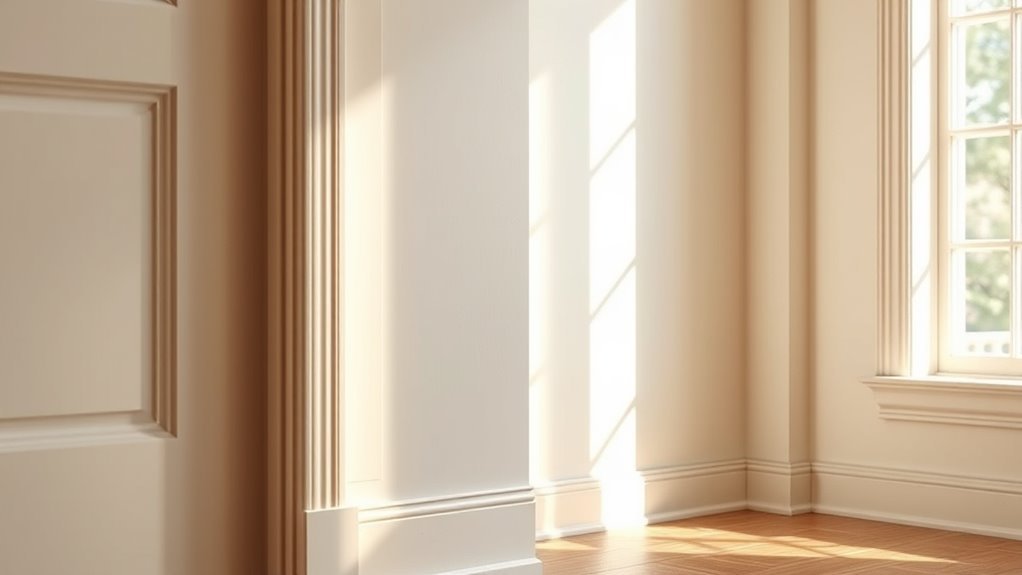
If your room feels small or cramped, painting the trim the same color as the walls can visually expand the space by creating a seamless, uninterrupted plane. Conversely, in larger rooms, contrasting trim can add definition and architectural interest without overwhelming the scale.
You’ll use trim color psychology to influence perception: matching trim reduces edges, so sightlines flow and rooms feel airier, while contrast frames furnishings and highlights proportions.
Consider ceiling height, window placement, and natural light—low ceilings benefit from unified color, tall rooms tolerate bold trim.
Test samples at different times of day to guarantee visual harmony before committing.
Architectural Style Match
1 quick way to decide is to match your trim strategy to the home’s architectural style: traditional and colonial homes usually call for contrasting, crisp trim to showcase moldings and symmetry, while modern, minimalist, and mid-century spaces often benefit from same-color trim to keep lines clean and uninterrupted.
Consider architectural harmony: contrasting trim emphasizes period details and creates focal points, while matching trim simplifies profiles and supports minimalist geometry.
For cohesive results, aim for style consistency throughout the house—pick one approach per floor or architectural zone. That keeps changes natural and visually intentional without confusing the eye.
Practical Maintenance Considerations
Beyond matching style, you should weigh everyday upkeep when choosing trim color—same-color trim can hide scuffs and reduce the number of paint types you juggled, while contrasting trim often shows wear sooner and needs more frequent touch-ups. You’ll consider trim durability and practical cleaning techniques: glossy paints resist marks, matte hides imperfections. Pick finishes for traffic levels, and keep a small touch-up kit handy. Use gentle cleaners to avoid stripping finish. Below is a quick comparison to visualize typical maintenance needs.
| Feature | Maintenance |
|---|---|
| Same-color trim | Fewer visible scuffs |
| Contrasting trim | More frequent touch-ups |
| Finish choice | Affects cleaning techniques and trim durability |
How Room Size and Ceiling Height Change the Effect
In smaller rooms with low ceilings, painting trim the same color as the walls can make the space feel taller and less cluttered.
In large rooms or spaces with high ceilings, matching trim can soften scale but you might prefer contrast to define architectural details.
Think about whether you want the room to feel expansive and seamless or more structured and layered.
Small Rooms, Low Ceilings
Wondering whether to paint trim the same color as walls in a small room or one with low ceilings? You can use unified trim to create visual harmony and apply color psychology to make the space feel larger and calmer. Muted, warm tones recede; cool, pale hues expand. Keep contrast minimal to avoid chopping the room; use a slightly lighter sheen on trim for subtle definition without breaking flow. See quick visual cues below:
| Same Color Trim | High Contrast Trim |
|---|---|
| Seamless, airy feel | Defined edges, smaller look |
| Expands space visually | Adds architectural punch |
Large Rooms, High Ceilings
If small rooms benefit from unified trim to visually open the space, large rooms and high ceilings give you more freedom to play with contrast and detail.
You can use trim to anchor proportions, emphasize moldings, or create focal points without shrinking the room. Consider how color psychology affects mood across expansive walls and how visual harmony keeps the scheme cohesive.
- Use contrasting trim to define architectural features and add drama.
- Choose softer tonal shifts for understated elegance and flow.
- Paint bold trim selectively to highlight doors, windows, or coffered ceilings.
Balance contrast and cohesion for a polished, intentional result.
How Trim Color Changes Perceived Architectural Detail and Height
Because trim frames your walls, its color directly shifts how you notice architectural details and room height. Choosing a matching or contrasting trim will either blur or emphasize moldings, window casings, and cornices.
You can use matching trim to blend details into the wall plane, simplifying architectural perception and creating subtle, cohesive rooms. Or pick a contrasting trim to draw the eye to profiles, joints, and silhouettes, which reinforces ornament and edge.
For ceilings, darker trim can lower perceived height, while lighter or continuous trim produces height illusions that make ceilings seem taller and spaces feel airier.
When Matching Trim Creates a Modern, Seamless Look
Want a cleaner, more contemporary interior? You’ll achieve modern aesthetics by painting trim the same color as walls, simplifying lines and reducing visual clutter. Matching trim fosters visual continuity, making rooms feel larger and calmer.
Consider these quick benefits:
- seamless shifts that emphasize architecture over ornamentation
- easier color coordination across open-plan spaces
- minimal upkeep since touch-ups blend invisibly
You’ll want matte or eggshell finishes to avoid glare that breaks the unified surface.
Keep moldings simple; heavy profiles still read as traditional. When you prefer subtlety and cohesion, same-color trim delivers a refined, modern look without fuss.
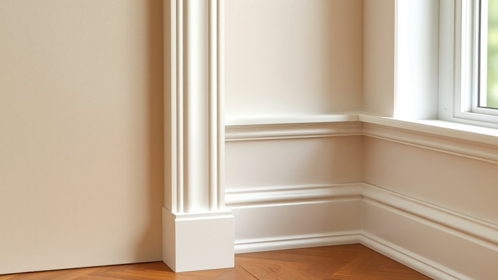
When Contrasting Trim Highlights Classic Molding and Depth
When you want to celebrate traditional details, contrasting trim draws the eye to cornices, wainscoting, and picture rails so those profiles actually read as part of the design.
You’ll use contrasting colors to outline moldings, making shadows and curves more pronounced. That approach emphasizes craftsmanship and creates deliberate hierarchy between wall field and ornament.
Choose a trim tone that complements the wall but stands apart enough to add visual interest without overpowering the room.
In rooms with layered furnishings or patterned wallpaper, highlighted trim anchors the composition, guiding sightlines and reinforcing period character while keeping the overall scheme cohesive.
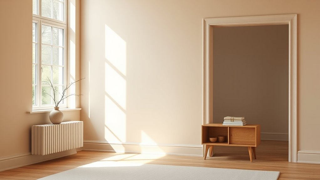
Which Wall Colors Work Best With Same‑Color Trim
If you prefer a seamless, airy look, painting light neutrals and trim the same color keeps rooms feeling open and understated.
You can also go bold — matching trim to a saturated wall color makes the finish feel intentional and modern rather than an afterthought.
Think about natural light and room size, since pale tones expand spaces while deep hues can cozy them when trim blends in.
Light Neutrals And Trim
Because light neutrals create a calm, cohesive backdrop, they’re the easiest wall colors to pair with same‑color trim without losing definition or depth.
You’ll find modern light neutral trends favor warm beiges, soft greiges, and airy off‑whites that blend trim and walls subtly while maintaining contrast through sheen and shadow.
Consider trim color psychology when choosing shades: subtle warmth feels inviting, cool neutrals seem crisp, and creamy tones read traditional.
- Use different sheens to separate planes
- Add texture or molding for depth
- Test paint in varied light before committing
Keep finishes consistent for a polished, understated look.
Bold Colors With Trim
Which bold wall colors work best with same‑color trim depends on the room’s purpose and how much drama you want to create.
You can choose jewel tones—deep teal, emerald, or sapphire—with matching trim for a cohesive, enveloping effect.
Consider bold color combinations like aubergine with plum trim for intimacy, or ochre with rust trim for warmth.
Use trim color psychology to guide mood: darker matching trim grounds a space; lighter matching trim feels airy even within bold hues.
Test samples at different times of day, and keep finishes consistent so texture, not contrast, defines the room’s character.
Choosing the Exact Trim Shade So Surfaces Don’t Look Flat
When you want walls and trim to read as a cohesive surface without looking washed out, pick a trim shade with just enough contrast to define edges and reflect light differently than the wall.
Choose a trim tone with subtle contrast to define edges and reflect light differently than the wall.
You’ll consider trim texture and color harmony to avoid a flat look. Test samples under room light and stand back; subtle shifts matter.
Use these quick checks:
- View paint chips against flooring and furniture at different times of day.
- Apply a small painted swatch on trim, not just a card, to judge sheen and depth.
- Compare matte wall paint to a glossier trim to catch highlights.
Use Undertones So Matched Trim Won’t Clash
After you’ve narrowed trim and wall shades so they read as one surface, check their undertones to make sure they don’t fight each other.
You’ll look for warm or cool hints in both samples; even identical-looking neutrals can lean pink, green, yellow, or blue. Match undertones to maintain color harmony so the trim feels deliberately unified, not accidental.
Test small sections with your chosen paint techniques—sample swatches, adjacent brush strokes, and viewing at different angles—to confirm the pairing.
If undertones clash, tweak the trim tint slightly warmer or cooler until the pair reads cohesive across daylight and indoor lighting.
Matching Trim in Rooms With Strong Natural or Artificial Light
If your room gets intense sunlight or strong artificial light, you’ll notice trims read lighter or warmer than they look in dimmer spaces.
Pay attention to light intensity because it can wash out subtle contrasts or reveal undertones you didn’t expect.
Also consider color temperature—cool daylight and warm bulbs will shift how matched your trim and walls appear.
Light Intensity Effects
Because bright sunlight and strong artificial lighting change how color reads, you’ll want to test trim and wall paints under the room’s actual light before committing.
Light intensity alters light reflection and shifts color perception, so samples can look different at high noon or under bright fixtures. Hold swatches on trim profiles and observe throughout the day.
Consider these quick checks:
- Inspect swatches at peak daylight and after dark.
- View from multiple angles to catch glare and shadow.
- Photograph samples with the room’s lighting to compare objectively.
Choose paint after these tests to guarantee trim complements walls in every lighting condition.
Color Temperature Impact
How will the room’s color temperature affect your trim-versus-wall decision? When daylight floods a space, cool light makes blues and greens pop and can render warm neutrals muted; warm incandescent or LED light deepens yellows and reds.
You should consider color psychology: cooler light reads as calm, warmer light feels cozy. Matching trim to walls in cool-lit rooms can enhance minimalism; in warm-lit spaces, a contrasting trim can add crisp definition.
Test paint samples at different times and under artificial sources. Choose trim that preserves visual harmony with both the mood you want and the lighting you’ll actually use.
Trim Sheen When Matching Trim to Walls
When you match trim to walls, the sheen you choose matters almost as much as the color because it controls light reflection, hides (or reveals) imperfections, and affects perceived depth. Opting for a flatter sheen blends trim into the wall while a glossier finish makes it read as a distinct architectural element.
Sheen matters nearly as much as color—flatter trims blend in, glossier finishes highlight architectural detail and depth.
You’ll balance trim contrast and trim durability when choosing sheen: flat minimizes contrast but shows scuffs; semi-gloss cleans easier and accents profiles.
Consider these quick points to decide what fits your room:
- Flat or eggshell for seamless, modern looks.
- Satin for moderate durability and softness.
- Semi-gloss for high durability and definition.
Baseboards, Casings, and Door Trim: When to Match and When Not To
If you want your room to feel cohesive and modern, match baseboards, casings, and door trim to the wall color so they recede and let other elements stand out.
But if you’d like architectural details to pop, paint them a contrasting shade or a brighter sheen to highlight profiles and resist scuffs.
Decide based on trim styles and color psychology: simple, minimal trim benefits from blending, while ornate profiles reward contrast.
Consider scale, light, and furniture—dark floors with pale walls often suit matched trim for continuity, while historic homes use contrast to emphasize craftsmanship.
Test samples before committing.
Open‑Plan vs Separate Rooms: How to Handle Matched Trim
Wondering whether to match trim across an open-plan space or treat each zone separately? You want color flow and visual unity, but also definition between areas. Consider how sightlines and lighting connect rooms, then decide.
- Match trim in open plans to reinforce color flow and make spaces feel larger.
- In distinct rooms, you can vary trim to give each area personality while keeping overall visual unity.
- Use subtle contrast where needed to delineate function without disrupting cohesion.
Trust your eye: prioritize seamless shifts in open layouts and purposeful contrast in separate rooms for a balanced, intentional result.
Mixing Matched Trim With Accent Trim or Moulding
Because matched trim keeps your rooms cohesive, you can confidently introduce accent trim or moulding as a deliberate contrast that highlights architectural details without overwhelming the space.
Matched trim keeps rooms cohesive, letting a single accent moulding highlight architecture without overpowering the space.
You’ll pick one focal element — a mantel, doorframe, or ceiling moulding — and paint it in an accent color combinations scheme that complements walls and furnishings.
Keep most trim matched to maintain flow, then use the accent sparingly to create rhythm.
Consider texture contrast by choosing glossy or stained finishes against matte walls to catch light and add depth.
Test samples in different lighting so the combination reads intentional rather than accidental.
How Same‑Color Trim Affects Resale: Buyer Expectations and Staging Tips
When you stage a home with same‑color trim, buyers may see a modern, cohesive look or worry it hides architectural detail depending on current expectations.
Market trends have shifted toward clean, minimal palettes, so matching trim can make spaces feel larger and move quickly for buyers who prefer that style.
Consider highlighting moulding with lighting or subtle accents if you think your target market still values contrast.
Buyer Expectations Shifts
If buyers in your market are leaning toward modern, minimalist finishes, painting trim the same color as the walls can actually boost perceived value by creating clean, flowing lines and making rooms feel larger.
Conversely, in neighborhoods where traditional details sell homes, same‑color trim might make spaces look oversimplified and underfinished.
You should track buyer preferences and local design trends so you can align finishes with market expectations.
Consider these practical pivots:
- Use same‑color trim in listings targeting contemporary buyers to emphasize openness.
- Keep contrast in heritage areas to showcase craftsmanship.
- Test with photos to see which approach attracts more interest.
Staging And Perception
Although buyers often notice trim only subconsciously, painting it the same color as the walls changes how they read a room—making spaces feel larger and less fussy or, in some cases, stripping away perceived detail and craftsmanship.
You’ll want staging strategies that guide perception shifts toward spaciousness without erasing character: add contrasting hardware, textured rugs, and layered lighting to restore focal points.
For period homes, preserve a few accent trims or use subtle gloss differences to hint at craftsmanship.
When prepping for showings, test photos and virtual staging to guarantee buyers interpret the unified trim as intentional modernity, not unfinished detail.
Tips for Painting Trim the Same Color : Tools and Prep
Gather the right tools and prep your surfaces carefully to get a seamless look when painting trim the same color as the walls. You’ll need steady painting techniques and an eye for color psychology to guarantee edges read clean and the room feels cohesive.
Prep matters: clean, sand lightly, and prime if needed. Use quality brushes and angled sash brushes for control.
Prep well: clean, lightly sand, and prime when necessary. Use quality and angled sash brushes for precise control.
- High-quality angled brush, small foam roller, painter’s tape
- Sandpaper, tack cloth, stain-blocking primer
- Drop cloths, ladder, good lighting
Work in thin coats, feather edges, and remove tape before full cure for crisp lines.
Common Painting Mistakes When Matching Trim to Walls
You’ve done the prep and picked the right tools, but a few common mistakes can still undo a flawless same-color trim job.
Don’t assume indoor light won’t shift paint; swatches look different at dawn and night, affecting color psychology and mood.
Avoid skimping on primer—uneven sheen betrays the wall-trim match.
Don’t rush edging; sloppy lines break visual harmony.
Skipping test patches on varied wall areas leads to surprises around windows and corners.
Using different sheens between wall and trim creates contrast even if the hue’s identical.
Finally, don’t ignore furniture placement when judging the final effect.
Maintenance and Touch‑Up Strategies for Same‑Color Trim
1 smart maintenance routine will keep same‑color trim looking seamless with your walls for years, and it starts with regular, light inspections to catch scuffs, chips, or sheen differences early.
You’ll want simple maintenance tips and practical touch up techniques so repairs stay invisible. Keep a small kit with matched paint, angled brush, mild cleaner, and fine sandpaper. When touching up, feather edges and work in good light to match sheen.
- Clean spots gently before painting
- Use thin coats and let full dry time
- Note paint batch and finish for future repairs
Check yearly and act promptly.
Room Examples: Living Room, Kitchen, Bedroom, Bathroom
Which rooms work best with same‑color trim depends on function and light, so think about how each space gets used.
In living rooms, matched trim suits modern living room styles by creating a calm backdrop for art and furniture.
In kitchens, embracing subtle same‑tone trim aligns with current kitchen trends, helping busy surfaces feel cohesive.
In kitchens, subtle same‑tone trim follows today’s trends, calming busy surfaces and unifying countertops, cabinets, and tile
For bedrooms, matching trim lets you emphasize soothing bedroom colors without distraction, ideal for restful schemes.
In bathrooms, coordinated trim complements bathroom accents and tile choices, making small spaces feel larger.
Use the approach selectively based on traffic, moisture, and your desired visual continuity.
Design Pairings: Flooring, Doors, and Hardware With Matched Trim
When you match trim to the walls, consider how floors, doors, and hardware will either blend in or provide the contrast that defines a room’s character.
You’ll want design cohesion, so assess flooring options first: light wood or tile brightens, dark planks ground.
Match door styles to trim treatment—flat panels suit minimal trim, raised panels pair with traditional moulding.
Choose hardware finishes that complement the wall-trim tone; matte black pops on pale surfaces, brass warms neutrals.
Think overall palette and traffic patterns.
Quick checklist:
- Flooring options and trim height
- Door styles and paint sheen
- Hardware finishes and placement
Frequently Asked Questions
Will Same-Color Trim Affect Sound Absorption or Room Acoustics?
No, same-color trim won’t change sound absorption considerably; you’ll still get the same acoustic behavior, though paint sheen can slightly increase sound reflection. It does enhance visual continuity, making the room feel more unified and calm.
Can Matched Trim Hide or Reveal Wall Imperfections?
Yes—you’ll often hide flaws when trim matches walls; coincidence makes edges vanish, drawing eyes to texture instead. Your wall texture and color psychology then shape perception, so subtle finishes mask imperfections while bold contrasts reveal them.
Is Matched Trim Suitable for Historic or Period Homes?
Yes — you can use matched trim, but you should prioritize historical accuracy and architectural harmony; preserving original profiles, moldings, and period-appropriate tones keeps authenticity, while subtle contrast can highlight craftsmanship without betraying the era.
Do Matched Trim Colors Impact Allergy or VOC Concerns?
Like a soft blanket, matched trim rarely affects allergy or VOC risks directly; you’re dealing with paint formulations, not color perception. Choosing low‑VOC, hypoallergenic paints preserves visual continuity while minimizing airborne irritants and health concerns.
Can You Use Wallpaper With Same-Color Trim Effectively?
Yes—you can use wallpaper with same-color trim effectively; you’ll reinforce cohesion while letting wallpaper patterns stand out, and you’ll shape mood deliberately because color psychology guides contrast, scale, and focal points to balance visual interest and calm.
Conclusion
Matching trim to walls can be a subtle way to simplify your space and quietly modernize it without shouting for attention. You’ll gain cohesion and visual flow, especially in smaller rooms or with low ceilings, though you may be softening architectural character. If you crave a gentle, understated update, this approach is a tasteful shortcut—just mind finish, contrast with floors and hardware, and plan for touch-ups so the calm illusion holds up over time.