What Color Paint for Projector Wall? Best Choices
You should pick a neutral gray for most projector walls because it balances contrast and color accuracy without boosting glare; use muted black if the room’s very dark to deepen perceived contrast, and true white when the room has lots of ambient light and you need maximum brightness. Choose a matte or eggshell finish to minimize reflections, match paint choice to your projector’s lumens and viewing habits, and keep finishes low-VOC—keep going to learn specific lumen and light-level guidance.
Quick Guide: Who This Is For
If you’re planning to use a projector for movies, gaming, or presentations, this guide is for you.
You want clear advice whether you’re upgrading a home theater, converting a spare room, or optimizing a conference space.
You’ll learn practical tips that fit different projector setups and common wall textures so you can pick paint that improves image contrast and color accuracy.
Practical tips for projector setups and wall textures to choose paint that boosts contrast and color accuracy
This isn’t about interior design trends but about functional choices that reduce glare, preserve shadow detail, and work with ambient light.
You’ll get straightforward recommendations tailored to equipment, viewing distance, and budget constraints.
Quick Answer: Best Paint Colors for Projector Walls
Three colors consistently give the best results for projector walls: neutral gray, muted black, and true white—each serving a specific setup and ambient-light condition.
You’ll pick neutral gray for balanced contrast and color accuracy, muted black to deepen perceived contrast in darker rooms, or true white to maximize brightness when you need it.
Consider projector wall aesthetics: gray feels cinematic, black is dramatic, white is versatile.
Match paint finish types to control glare—matte or eggshell minimizes reflections, while satin can introduce unwanted shine.
Choose the color that aligns with your space, viewing habits, and desired image character.
Decision Factors: Projector Brightness, Ambient Light, Content
When you’re picking a paint color for a projector wall, balance three practical factors: your projector’s brightness (lumens), the room’s ambient light, and the type of content you’ll watch. You’ll use projector placement and screen size to decide: brighter projectors and smaller screens tolerate lighter walls; darker rooms and cinematic content benefit from deeper neutrals. Consider contrast for text-heavy or gaming content versus saturated hues for movies.
| Brightness | Ambient Light | Content |
|---|---|---|
| High | Bright | Presentations |
| Medium | Controlled | TV shows |
| Low | Dark | Films |
Adjust color toward higher contrast as needed.
How Projector Lumens Change Your Paint Choice
Because lumen output directly determines how much reflected light reaches your eyes, you’ll pick different wall tones based on projector brightness: high-lumen projectors let you use lighter, more neutral paints that preserve color accuracy, while low-lumen units need darker, grayer shades to boost perceived contrast and prevent washed-out images.
Lumen output dictates wall tone: bright projectors suit lighter neutrals, dimmer ones benefit from darker, grayer shades for contrast.
You should match paint reflectivity to lumen level: higher reflectivity for bright projectors, lower for dimmer ones.
Also consider content type—video, gaming, presentations—when balancing hue and reflectivity.
Test small swatches at your typical throw distance and brightness to confirm contrast and color fidelity before committing to a full wall.
How Ambient Light Level Affects Paint Selection
Ambient light changes how any paint you choose will perform, so you’ll want to account for room lighting just as carefully as projector lumens.
You’ll assess ambient light types (natural, overhead, accent) and choose paint that manages light reflection to preserve image clarity. Darker, low-reflectance paints help in bright rooms; mid-gray balances moderate light.
Consider finish—matte reduces glare, satin increases reflection. Also plan for variable conditions like daytime sun.
- Natural light: prioritize low light reflection and darker tones.
- Overhead lighting: use neutral gray to tame hotspots.
- Accent light: avoid glossy finishes that boost reflection.
Contrast Ratio and Content: What to Prioritize
You should prioritize a paint choice that maximizes contrast so blacks look deep and highlights stay clear.
Match the wall tone to the type of content you mostly watch—neutral grays for movies and slightly warmer tones for skin-heavy programming.
Also factor in ambient light, since brighter rooms need paint that preserves contrast without boosting brightness too much.
Prioritize High Contrast
When choosing paint for a projector wall, prioritize achieving the highest contrast your setup can deliver—contrast determines how deep blacks look and how vivid colors appear, and it matters more than slight shifts in tint.
You’ll focus on contrast enhancement techniques: pick low-gain, neutral paint and control ambient light so blacks stay intact.
Consider ideal viewing angles when seating and screen placement, since contrast drops off at extreme angles. Balance projector brightness and paint choice to avoid washout.
Use this short checklist to guide decisions:
- Select neutral, low-gain paint.
- Minimize ambient light sources.
- Align seating for best contrast.
Match Content Tone
Having locked down contrast through paint and lighting, shift focus to how your content’s tone interacts with your projector’s contrast ratio—bright, high-contrast scenes and dark, low-contrast scenes demand different handling.
You’ll want cooler, neutral paints for vivid, colorful content so projection technology can deliver punchy highlights without hue shifts.
For film noirs or moody dramas, slightly warmer or deeper neutral tones preserve shadow detail and avoid washed-out blacks.
Consider color psychology: warm walls feel cozier for narrative work, cool walls feel clinical for sports or presentations.
Match paint choice to your dominant content and projector strength for ideal perceived contrast.
Ambient Light Considerations
Although ambient light always reduces perceived contrast, you can prioritize either projector power or room control depending on your content: favor stronger projectors and cooler, neutral paints if you mostly show bright, colorful material, but focus on light-blocking and warmer or deeper neutrals for dark, cinematic content to preserve shadow detail.
You’ll assess ambient light types (window, fixture, reflected) and choose paint and gear accordingly. Balance contrast ratio needs with practical light control.
Consider these steps to decide:
- Measure ambient light types and levels at screen time.
- Match paint tone to content and projector lumen output.
- Improve light control with blinds, trims, or screens.
Measure Your Room’s Ambient Light Before Painting
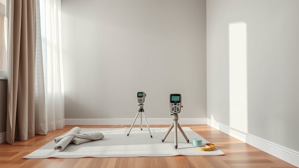
Before you pick a paint color, measure the room’s ambient light so you know how much stray illumination your screen will face.
Start an ambient light assessment by noting windows, lamps, and reflective surfaces at different times. Use a light meter or a smartphone app for quick lux readings; record highest and lowest values.
Note windows, lamps, and reflections across the day; take lux readings with a meter or app, noting highs and lows.
Perform a room measurement to mark where light falls relative to the projector wall and seating. Use blinds or lamps during tests to simulate typical viewing conditions.
With these objective numbers, you’ll choose paint with appropriate gain and tint, minimizing washout without overdarkening the room.
Calculate Throw Distance and Screen Size for Paint Choice
When you calculate your projector’s throw distance and screen size, you’ll determine how much light actually lands on the painted wall and whether a darker or higher-gain finish is needed.
Use projector specifications and room dimensions to pick paint that preserves contrast and color. Measure throw distance, diagonal screen size, and keystone impact; compute lux at the wall.
Match paint gain and tint to expected luminance so highlights aren’t blown out and blacks remain deep.
- Calculate throw ratio to confirm image fits wall.
- Estimate lumens per square meter for your setup.
- Choose gain/tint based on measured lux.
When to Choose White Paint for Projector Walls
If your projector delivers high brightness and you’ll be controlling ambient light, choose white paint to maximize image luminance and color accuracy; it reflects more light, preserving contrast and vivid hues.
Use white when you want the largest perceived image without boosting projector brightness or changing throw distance. It suits dedicated media rooms, daytime viewing with blackout options, and setups where color fidelity matters for photos or presentations.
Keep surface smooth and matte to avoid hotspots and glare.
If ambient light will vary widely or you can’t rely on high projector brightness, consider other wall colors instead.
When to Choose Gray Paint for Projector Walls
Gray paint offers a balanced middle ground that reduces washed-out highlights without sacrificing too much brightness. So pick it when you have moderate ambient light and want better perceived contrast than white can provide.
Gray paint strikes a middle ground—reducing washed highlights while preserving brightness for moderate ambient light.
You’ll choose gray shades to tame reflections, boost perceived ambient contrast, and improve projector performance without darkening the room.
Consider wall texture and paint finishes: smoother surfaces with matte or low-sheen finishes reduce hotspotting. Match shade to projector lumen output and room brightness so images stay vivid.
- Test samples in different light.
- Prefer matte finishes for even image.
- Smooth wall texture for consistent contrast.
When to Choose Black or Dark Paint
After you’ve considered gray as a middle ground, darker tones—especially deep grays and black—come into play when you need maximum contrast and minimal light spill; choose them if your room is dedicated to viewing, can be darkened, and your projector’s brightness is high enough to keep images vivid.
You’ll pick black or very dark paint when projector usage is frequent, you want deeper blacks and richer colors, and you can control ambient light.
Dark walls reduce edge wash and improve perceived contrast, but they demand a properly bright projector and careful room setup to avoid losing shadow detail.
When a Tinted Color (Blue, Beige, Green) Makes Sense
Why pick a tinted wall color like blue, beige, or green? You’re after subtle contrast and the tinted benefits that temper glare, improve perceived black levels, and calm the image without heavy sacrifice to brightness.
Color psychology plays a role: hue influences mood and immersion depending on room use.
- Blue: promotes focus and cool contrast for movie nights or work sessions.
- Beige: neutral warmth reduces eye fatigue and pairs with varied lighting.
- Green: soothes and balances skin tones, helpful in mixed-content viewing.
Choose saturation and finish carefully to keep projector fidelity and room ambiance aligned.
Picking the Right Gray Tint: Light, Medium, Dark
If you want brighter, more natural-looking images with minimal color shift, a light gray tint is a strong choice because it preserves contrast without darkening the room too much.
You should know that medium grays balance ambient-light rejection and image depth, while dark grays boost perceived contrast but can mute colors and require a brighter projector.
Consider your room’s light levels and projector brightness to pick the tint that fits your setup.
Light Gray Pros
When you choose a light gray for your projector wall, you get brighter whites and more visible shadow detail than with darker grays, while still cutting glare compared with plain white. This balance makes light gray a versatile option for rooms with moderate ambient light or when you want accurate color without losing contrast.
You’ll notice light gray benefits in fidelity and usability: it preserves highlight detail, reduces washout, and keeps colors natural. Light gray versatility lets you pair furniture and lighting without harming image quality.
- Preserve highlights and shadow detail.
- Reduce screen glare in daytime.
- Maintain natural color balance.
Dark Gray Tradeoffs
A darker gray wall boosts perceived contrast and hides room light better than lighter tones, but you’ll trade some highlight brightness and color accuracy for deeper blacks.
When you pick a dark gray, balance dark gray benefits—improved shadow depth and reduced washout—with its tendency to mute midtones and blow out specular highlights.
Choose a slightly warmer or cooler tint to match your room’s lighting and projector color profile; that decision affects dark gray aesthetics and perceived neutrality.
If you want maximum contrast without custom screens, go dark but test real content first to guarantee acceptable color fidelity and brightness.
Standard Wall Paint vs. Projection Paint: Pros and Cons
Most people opt for regular wall paint because it’s cheap and easy to apply, but projection-specific paints give you noticeably better color accuracy, contrast, and gain for home theater use.
You’ll weigh projection surface options and paint durability considerations when choosing. Regular paint suits casual setups, blends with decor, and is easy to touch up.
Projection paint boosts image fidelity, reduces hotspotting, and can improve blacks, but it costs more and may require precise application.
- Regular paint: low cost, easy maintenance, flexible placement.
- Projection paint: improved performance, higher expense, installation care.
- Decision tip: match paint choice to projector quality and room lighting.
Specialized Projection Paints: Pros and Cons
If you want noticeable improvements over standard paint, specialized projection coatings give you measurable gains in color accuracy, contrast, and gain that regular wall paint can’t match. You’ll choose projector paint types based on gain, color neutrality, and budget. Pros: improved brightness, sharper blacks, and predictable color. Cons: higher cost, specific application techniques, and limited finish options. You’ll need careful surface prep and even coats to avoid hot spots. Consider testing samples.
| Benefit | Trade-off |
|---|---|
| Higher gain and contrast | More expensive |
| Accurate colors | Requires precise application |
What ALR (Ambient-Light-Rejecting) Paints Do
ALR paints help you boost perceived contrast in brighter rooms by reflecting projector light back toward the viewing area while rejecting stray ambient light.
They also preserve color accuracy so images look truer instead of washed out.
In short, ALR coatings reduce ambient washout and keep your picture punchy even with some room lighting.
Improve Contrast In Brightness
When ambient light washes out your projector image, ambient-light-rejecting (ALR) paints help restore contrast by reflecting light from the projector toward you while scattering or absorbing stray room light.
You’ll notice improved projector brightness perception and boosted color saturation without cranking up lumens. ALR coatings selectively redirect on-axis projector light and dump off-axis ambient glare.
- Gain: increases perceived contrast so dark scenes stay deep.
- Directionality: favors light from the projector, not lamps or windows.
- Finish: matte ALR lowers hot spots; textured ALR can further control scatter.
Choose ALR tuned to your projector throw and room lighting.
Preserve Color Accuracy
Because ambient light tends to wash out subtle hues, choosing an ambient-light-rejecting (ALR) paint helps preserve your projector’s color accuracy by reflecting projector light more directly to your viewing position while minimizing stray-room illumination.
You’ll notice improved color perception because ALR formulations favor directional reflectance that boosts saturated tones and maintains shadow detail.
Pick neutral-tone ALR options to avoid color casts, and match paint finishes to your projector’s gain characteristics—matte or low-sheen ALR for balanced dispersion, higher-gain for brighter rooms.
Test samples under your usual lighting and content to confirm accurate hues before committing to a full application.
Reduce Ambient Washout
You’ll get the most noticeable improvement in image contrast from ambient-light-rejecting paints, which are formulated to reduce ambient washout by directing projected light back toward your seating area while scattering or absorbing room light.
You’ll consider paint texture and surface finish to control light reflection without hurting color saturation or color balance.
Match choice to room dimensions, projector type, and viewing distance so the ALR effect aligns with your setup.
Expect improved color balance in moderate ambient conditions and check paint durability for long-term performance.
- Optimize texture for directional reflectance.
- Calibrate saturation vs. reflection.
- Inspect finish for wear.
Compare White Projection Paint Brands and Options
Although white projection paints all aim to maximize brightness and color accuracy, they differ in gain, finish, and formulation, so you’ll want to compare specs and real-world reviews before choosing.
When evaluating projector paint, focus on brand comparisons that list gain values, finish options, and documented color accuracy.
Check paint durability for scratch and yellowing resistance, and read application techniques recommended by manufacturers to guarantee even coating and ideal gain.
Compare cost, warranty, and whether primers or multiple coats are required.
Test samples on your wall under projector light to confirm real-world performance before committing to a full purchase.
Compare Gray Projection Paint Brands and Options
Pick a gray projection paint by weighing contrast gain, tint neutrality, and finish—these determine how well dark scenes hold up and how accurate colors stay under your projector.
You’ll compare popular brands by testing sample cards, checking specs, and noting application ease.
Consider gray paint advantages like improved black levels and reduced washout, and gray paint disadvantages such as narrower optimum viewing angles or slight color shifts.
- Higher-gain grays for brighter rooms, minding hotspot risk.
- Neutral-tint grays for faithful color, often lower gain.
- Matte finishes hide texture, satin may boost perceived brightness.
Where to Buy Professional Projection Paints
You can buy professional projection paints from specialty online retailers, big-box home stores, or local paint shops depending on convenience and selection.
Compare respected brands like Screen Goo, Goo Systems, and Dulux Pro to match performance and budget.
Decide whether you want the wider online range and reviews or the hands-on color matching and advice from a local store.
Where To Buy
Finding professional projection paints is easier than you might think: major home improvement stores, specialty AV retailers, and several reputable online brands stock formulas made specifically for screens and projector walls.
You’ll want to check online retailers and online marketplaces for product availability and pricing comparisons, and visit local suppliers to inspect paint types in person.
Read customer reviews to gauge real-world performance and confirm compatibility with your projector.
Compare paint brands on coverage, finish, and warranty before buying.
Consider shipping times, return policies, and sample pots to test color and gain confidence in your final purchase.
- Big-box stores
- Specialty AV shops
- Manufacturer websites
Professional Paint Brands
Several trusted manufacturers and niche AV brands specialize in projection paints, and knowing where to look will save you time and help you get predictable results.
You’ll find professional paint options from established brands; do quick brand comparisons focused on paint durability and color accuracy.
Check specs for recommended surface texture and follow listed application techniques to match lab results.
Balance cost analysis with warranty and documented customer reviews to avoid surprises.
Seek samples or small cans to test in your room’s light.
Prioritize brands that publish measured gain, color shift data, and clear prep instructions for best outcomes.
Online Vs. Local Stores
When weighing online retailers against local paint stores, consider convenience, selection, and the chance to inspect product quality firsthand.
You’ll find online shopping offers wider specialty projection paints, customer reviews, and easy price comparisons, while local availability means immediate pickup, color matching, and hands-on sample testing.
Decide based on timing, returns policy, and whether you need expert advice.
- Compare shipping times, return rules, and reviews for specialty projection products.
- Visit local stores to see swatches, test samples, and ask staff about reflectivity.
- Balance cost, urgency, and warranty when choosing online versus local sources.
Affordable DIY Projection Paint Mixes to Try
If you want a budget-friendly projector surface, you can mix your own projection paint using common paints and additives to get surprisingly good results. Below are simple, affordable formulas you can try that balance brightness, contrast, and texture without specialty products.
Use affordable paint (matte latex as base) plus tiny black or navy tint for a neutral gray option; mix in 5–10% flat white for lighter screens.
Explore DIY techniques: add silica or fine talc for subtle texture effects, or clear acrylic for paint durability.
Test color mixing, paint sheen, application methods and proper wall preparation for best budget options.
Portable or Rented Spaces: Best Paint Choices
Because you mightn’t be allowed to permanently alter walls in a rental or need a temporary setup for events, choose projector paint options that are removable, non-destructive, and easy to install or take down.
You’ll want solutions that work with portable projectors, suit rented venues, and support temporary installations while offering color matching and decent paint durability.
Focus on space adaptability and cost efficiency: peel-and-stick screens, removable projector paint sheets, or snap-on panels let you control application techniques without damage.
- Peel-and-stick grey screen sheets
- Removable fabric with projection coating
- Lightweight framed panels with paint-coated surfaces
Office Presentation Rooms: Recommended Paints
You’ll want a more permanent, professional solution for office presentation rooms than the removable options used in rentals: choose paints that deliver consistent color, low glare, and durability under frequent use. You’ll pick neutral grays or soft off-whites to preserve accurate color reproduction and support office aesthetics. Use a matte or eggshell finish to reduce reflections and favor paints labeled for commercial wear to guarantee paint durability. Consider an accent wall in slightly darker gray behind the screen to improve perceived contrast.
| Paint Type | Benefit |
|---|---|
| Matte Gray | Low glare |
| Eggshell White | Balanced light |
| Commercial Acrylic | Long-lasting |
| Low-VOC | Safer air quality |
Dedicated Home Theater: Recommended Paints
For a dedicated home theater you’ll want neutral gray paint to keep contrast and color accuracy consistent across different content.
You can choose a mid- to dark-gray depending on how much ambient light you control, and pick a low-sheen finish to minimize reflections.
If you like a bolder look, consider a darker accent wall behind the screen while keeping surrounding walls neutral to avoid color cast.
Neutral Gray Options
When you want the most consistent color and image contrast in a dedicated home theater, neutral gray paints are the best choice; they reduce glare, preserve shadow detail, and handle brighter projectors better than white.
You’ll get neutral gray benefits like balanced contrast and easier calibration. Choose mid- to dark-gray tones to avoid washed-out highlights.
Consider gray paint textures—matte finishes minimize reflection while slight eggshell can ease cleaning.
- Pick a neutral mid-gray for natural skin tones and deep blacks.
- Test swatches at night with your projector for true performance.
- Match trim and ceiling subtly to avoid color bias.
Accent Wall Considerations
Wondering whether an accent wall will help or hurt your projector image? You can use an accent wall effectively if you choose muted, low-reflectance paints and keep the screen area neutral.
Pick accent wall styles that frame the screen—vertical stripes, recessed panels, or side columns—without introducing gloss or bright hues near the projection surface.
Use color psychology to set mood: deep blues or charcoal feel cinematic; warm browns add coziness but may shift whites slightly.
Test samples under your projector, view in typical lighting, and prioritize contrast and uniformity. That balance preserves image fidelity while adding visual interest.
Multi-Use Living Rooms: Paint That Balances Everything
Because your living room has to do more than one job—hosting movie nights, casual lounging, and the occasional video call—you’ll want a paint approach that balances projection quality with everyday comfort.
Design a paint scheme that balances cinematic contrast with cozy comfort for viewing, lounging, and video calls.
You’ll consider color psychology to set mood without washing out the screen, and pick finishes that prioritize paint durability against scuffs and cleaning. Aim for mid-tone, low-reflectance colors that read neutral on camera and keep contrast for films.
Balance warmth for social comfort with cool undertones for accurate projected colors.
Consider these practical choices:
- Warm greige for cozy, neutral contrast.
- Muted slate for cinematic depth.
- Soft taupe for camera-friendly warmth.
Surface Smoothness: Why It Matters for Projection
Texture matters: a smooth, even wall gives your projector the cleanest, sharpest image because it reflects light consistently instead of scattering it.
You’ll want to prep cracks, dents, and rough patches so images stay crisp; even small imperfections show as blur or hotspots.
Regular projector wall maintenance includes dusting and wiping with a soft, damp cloth to avoid grit that alters projection surface texture.
When you repair and keep the surface smooth, colors stay true and contrast improves.
If you plan to repaint, sand lightly and prime first—those steps make a measurable difference in image clarity and longevity.
Choose the Right Finish: Matte vs. Low-Sheen vs. Satin
When you pick a finish for your projector wall, think about how it handles light: matte hides imperfections and reduces glare, low-sheen offers a bit more durability with minimal reflectivity, and satin gives the smoothest, most washable surface but risks slight hotspots.
You’ll choose among finish types based on room use, projector brightness, and desired texture effects. Consider these trade-offs concisely:
- Matte: best for diffuse images, minimizes hotspots and conceals wall flaws.
- Low-sheen: balances durability and low reflectivity for mixed-use rooms.
- Satin: easy to clean, can introduce mild glare under strong lighting.
Prepare the Wall for Projection Painting
Before you paint, make the wall a true canvas: remove fixtures, patch holes and cracks with spackle, sand smooth, and clean off dust and grease so paint adheres evenly. You’ll assess surface texture, repair uneven spots, and plan basic wall maintenance to prevent future peeling. Prime glossy areas, fill nail pops, and feather edges for a uniform base. Keep tools handy: sanding block, primer, putty knife. Use the table below to visualize tasks and timing.
| Task | Tool | Time |
|---|---|---|
| Remove fixtures | Screwdriver | 10–20 min |
| Patch holes | Spackle & knife | 15–30 min |
| Sand smooth | Sandpaper | 10–25 min |
| Clean wall | Degreaser cloth | 5–10 min |
Apply Projector Paint Evenly: Step-by-Step
Now that the wall’s prepped, you’ll want to make sure the surface is clean, smooth, and free of dust before you start.
Apply a quality primer coat to promote adhesion and even color absorption.
Then use a roller with consistent pressure and overlapping strokes to lay down the projector paint evenly.
Prepare Surface Properly
If you want your projector paint to look smooth and perform well, start by cleaning and smoothing the wall so the paint adheres evenly and reflects light consistently.
Assess surface texture and repair dents or bumps; even minor imperfections disrupt light reflection and color saturation.
Sand glossy areas, remove dust, and guarantee proper wall maintenance before painting. Consider finish types that suit your room and projector calibration needs.
- Remove loose paint, fill holes, and sand for uniform surface texture.
- Clean with a mild detergent to improve paint adhesion.
- Dry thoroughly to avoid adhesion issues and uneven color saturation.
Apply Primer Coat
Apply a high-quality primer to create a uniform, absorbent base that helps your projector paint lay down smoothly and reflect light consistently.
You’ll start after wall preparation: clean, sand, and patch imperfections so primer bonds well. Stir primer thoroughly and use a quality brush for edges and a short-nap roller for flat areas, maintaining a wet edge to avoid lap marks.
Apply even, thin coats rather than heavy ones; let each coat dry per manufacturer instructions. Lightly sand between coats if needed for smoothness.
Proper primer guarantees predictable paint application, color fidelity, and a durable surface for your projector wall.
Roll Paint Evenly
With the primer dry and smooth, you’re ready to roll the projector paint evenly across the surface. You’ll work in manageable sections, keep a wet edge, and use consistent pressure to prevent lap marks.
Focus on paint application techniques that promote achieving smoothness: use a high-density roller, load evenly, and avoid overworking the coat. Maintain a 10–12 inch overlap between passes and finish each panel with a light, unbroken stroke.
Let the first coat cure fully before deciding on a second. Clean tools promptly to preserve nap and guarantee repeatable, even results.
- High-density roller selection
- Consistent loading
- Light finishing strokes
Masking and Framing: Edge Control Tips
When you want razor-sharp image borders, masking and framing are the tools that let you control where the picture starts and stops. You’ll use masking techniques to block stray light and choose framing styles that match screen size and room aesthetics. Trim, magnetic frames, or black velvet borders all improve perceived contrast. Measure precisely, mount level, and test alignment before final fastening. Consider removable masks for different aspect ratios. The right edge control makes colors pop and keeps focus on the image, not the wall.
| Method | Benefit | Notes |
|---|---|---|
| Tape mask | Clean edge | Cheap, temporary |
| Magnetic frame | Quick swap | Good for ratios |
| Velvet trim | Contrast boost | Professional look |
Test Paint Samples on Your Wall With Your Projector
Put up a few small test swatches of different paint colors on your wall and let them dry.
Project a variety of images onto each swatch so you can judge how color and contrast change under actual content.
Check the results in both bright and dim room lighting to see which swatch gives the most consistent, pleasing image.
Small Test Swatches
Before you commit to a full wall, test small paint swatches directly on the surface and project your usual content over them to see how color, contrast, and brightness change in real use.
You’ll learn fast which shades work with your projector. Use different paint finish options and try simple color mixing techniques to tweak warmth or neutralize tint.
Place swatches at eye level and view from seating positions.
- Test daylight and dim conditions separately.
- Label each swatch with formula and finish.
- Photograph projected images for side-by-side comparison later.
View Under Projected Image
If you want to judge each swatch properly, project your typical content onto the painted samples and view them from your usual seating positions, both in daylight and with the room dimmed, so you can see how color, contrast, and perceived brightness shift in real use.
Place a consistent test image and play representative video clips; note how hues alter skin tones and shadow detail.
Pay attention to projector wall aesthetics—some tones improve perceived depth, others flatten it.
Consider color psychology too: warm tints can feel cozy but reduce contrast, cool neutrals preserve clarity.
Record impressions to choose the best finish.
Assess In Different Lighting
How will your projector perform when the sun’s up or the lamps are on?
Test paint samples on your wall across different times to judge color perception and visual contrast.
Note how lighting dynamics and color temperature shift hues.
Examine surface texture and paint finish for hotspots or dulling.
Watch reflective surfaces nearby that alter light absorption and throw.
Consider ambient factors and room aesthetics together — small changes change perceived brightness.
- Test daytime with blinds open for natural light effects.
- Test evening with warm bulbs to simulate typical viewing.
- Test with projector at final throw distance and seating positions.
Calibrating Your Projector After Painting the Wall
Once you’ve finished painting, you’ll need to recalibrate your projector to match the wall’s new color and reflectivity so images stay accurate and balanced.
Start by resetting projector settings to neutral—default color temperature and gamma—then project a variety of test patterns.
Use calibration techniques like adjusting white balance, contrast, and brightness while observing grayscale and skin tones.
Tweak color saturation and hue minimally to avoid overshoot.
Check uniformity across the screen and adjust keystone or lens shift if needed.
Re-evaluate in typical room lighting, save a custom picture mode, and document settings for future reference.
Color-Calibration Tools and Settings for Different Paints
After you’ve saved a custom picture mode for the new wall, you’ll want the right tools to fine-tune color and brightness for specific paints.
You’ll use calibration techniques that match paint compatibility (matte, eggshell, grey) to your projector’s color space and gamma. Start with a colorimeter and calibration software, then confirm visually with test patterns.
Adjust white balance, color temperature, and individual RGB gains to account for tint or reflectance.
- Use a colorimeter and display-calibration app for accurate ICC-like profiles.
- Measure luminance and gamma for each paint type.
- Keep presets per paint for repeatable results.
Troubleshooting Washed-Out or Dim Images
A faded-looking image usually means your projector’s light and the wall’s reflectance aren’t working together, so start by checking brightness, contrast, and the throw distance.
Verify image brightness settings and run color calibration to guarantee accurate tones. Confirm projector distance and viewing angles for consistent projection quality.
Inspect wall texture and surface preparation; rough or uneven finishes scatter light. Reduce ambient reflections with curtains and strategic light control.
Choose paints with proven paint durability and the right gain for your room. These steps help isolate causes so you can restore crisp, vibrant images without immediately blaming the projector.
Fixing Hotspots, Uneven Brightness, and Texture Issues
To minimize hotspot visibility, you’ll want paint and placement that reduce glare where the projector beam is strongest.
You can also smooth the wall surface with fine sandpaper and a skim coat so texture doesn’t scatter light and create bright or dim patches.
Finally, test different paint sheens and projector distances to balance even brightness across the screen.
Minimize Hotspot Visibility
When you’re battling hotspots, uneven brightness, or texture-driven glare, small tweaks to paint color, finish, and wall prep can make a big visual difference.
You’ll focus on hotspot reduction and visual clarity by choosing hues that improve color accuracy and contrast enhancement while managing light absorption.
Balance projection quality with viewing angles and ambient adjustments to preserve image sharpness. Pay attention to surface texture to avoid scattering.
- Select a mid-gray or desaturated hue to lower bright-center glare and boost contrast.
- Use a matte finish to reduce specular highlights.
- Control ambient light and projector angle for consistent coverage.
Smooth Surface Texture
Surface texture makes or breaks projector image uniformity, so you’ll want to start by creating an ultra-smooth, matte surface that minimizes light scattering and hotspots.
You should sand and skim any imperfections, apply a quality primer, then use a flat projector-specific paint to reduce specular highlights.
Keep texture consistent across the entire wall; even slight variations cause uneven brightness and visible seams.
For ongoing projector wall maintenance, dust and touch up tiny flaws promptly to avoid growing hotspots.
Knowing paint texture benefits helps you choose finishes that preserve contrast and color fidelity, giving you a clean, uniform viewing surface.
Maintain and Clean Your Painted Projection Surface
Keep your painted projection wall clean and you’ll preserve image quality and extend the paint’s life.
Keep your painted projection wall clean to preserve image quality and extend the paint’s lifespan.
You should focus on paint durability and proven cleaning techniques to avoid abrasion or discoloration. Use gentle, non-abrasive cleaners and soft microfiber cloths; test a hidden spot first. Limit hand contact and airborne grime by keeping the room tidy and using a dust cover when not projecting.
- Dust weekly with a dry microfiber to prevent buildup.
- For stains, dampen cloth with mild soap solution; blot, don’t scrub.
- Avoid harsh solvents and abrasive pads that reduce paint durability.
When to Repaint or Restore Your Projector Wall
If you notice fading, uneven reflectivity, visible marks, or color shifts that affect image contrast, it’s time to repaint or restore your projector wall; don’t wait until projection quality visibly suffers.
You should inspect the surface quarterly, checking for scuffs, stains, or peeling that cleaning won’t fix. Repaint when brightness drops noticeably, color accuracy skews, or texture causes hot spots.
Use proper primers and projector-grade paint to extend paint longevity, and document dates to track projector wall maintenance cycles.
Minor touch-ups restore uniformity; full recoats make sense every few years depending on room use and environmental wear.
Optimize Surrounding Wall Color for Better Contrast
Once you’ve repaired blemishes and guaranteed the projection surface reflects evenly, look beyond the screen to the surrounding wall color. What you paint nearby can noticeably affect perceived contrast.
You should consider color psychology and color theory to guide choices that reduce stray light reflection and support visual perception. Match paint application to projection technology and room aesthetics, balancing user preferences with practical light control.
- Use matte, low-reflectance tones to minimize light reflection and boost contrast.
- Prefer neutral, muted hues to avoid color bias from ambient spill.
- Test small swatches under real viewing conditions before final paint.
Ceiling Color Choices That Improve Projection
Because ceiling surfaces can catch and bounce stray projector light, choosing the right color there matters for perceived contrast and image fidelity.
You should pick a low-reflectance, neutral matte—like a warm gray or off-white with low sheen—to minimize stray highlights.
Consider your ceiling texture: smooth surfaces reflect differently than popcorn or stippled finishes, so test paint samples under projector light.
If you have low ceiling height, darker tones can reduce bounce and make the image feel crisper; with higher ceilings, stick to mid-tones to avoid a cavernous look.
Keep finishes flat and consistent for best results.
Floor and Furniture Color Tips to Reduce Reflections
Pick low-gloss finishes for floors and furniture so light from the projector doesn’t bounce back onto the screen.
Choose dark, matte fabrics for sofas, curtains, and rugs to absorb stray light and improve contrast.
These simple swaps will cut reflections without changing your room’s layout.
Choose Low-Gloss Finishes
Low-gloss finishes cut stray reflections and keep projected images crisp, so choose matte or eggshell paints and satin or low-luster stains for floors and furniture to minimize glare.
You’ll notice low gloss benefits right away: reduced hotspots and truer contrast without sacrificing paint durability.
Pick finishes that resist scuffs for active rooms, and test samples under projector light before committing.
Balance practicality with aesthetics so surfaces complement the screen without competing.
- Test small patches with your projector to check reflection.
- Choose durable low-sheen finishes for high-traffic areas.
- Coordinate tones to avoid accidental highlights.
Use Dark, Matte Fabrics
When you outfit floors and furniture with dark, matte fabrics, you’ll cut stray reflections and keep projected images looking punchy and clear.
Choose upholstery, rugs, and curtains in deep tones to absorb ambient light; the dark fabric benefits show in improved contrast and less washout.
Prefer tightly woven, low-sheen fibers so surface variance doesn’t create micro-glare.
For texture considerations, balance absorption with tactile comfort—velvet and heavy cotton perform well, while shiny synthetics don’t.
Keep patterns minimal to avoid visual distraction.
Position dark pieces opposite the screen to intercept bounced light and maintain consistent image quality.
Lighting Strategies to Complement Your Paint Choice
Because lighting can make or break your projected image, plan fixtures and control methods that work with your paint choice rather than against it.
Because lighting can make or break your projected image, choose fixtures and controls that complement your screen paint.
You’ll use lighting techniques that minimize glare and preserve contrast while ensuring paint compatibility with ambient light. Focus on directional, layered, and adjustable solutions so the wall remains a true screen.
- Install recessed or angled fixtures to avoid direct light on the painted surface and reduce hotspotting.
- Use warm, low-glare accent lights for seating areas so screen contrast stays high.
- Choose dimmable, zoned controls to adapt illumination for different content and viewing conditions.
Use Blackout Curtains and Dimmers With Painted Screens
If you want your painted screen to deliver the best contrast and color fidelity, pair it with blackout curtains and dimmers to control ambient light precisely.
You’ll mount blackout curtains to eliminate washout, then adjust dimming lights to match the movie or presentation.
For any projector setup, manage screen placement so light falls evenly; consider viewing angles when positioning seating.
Balance color temperature of lamps with projector calibration to keep whites neutral and colors accurate.
Also mind room acoustics when adding heavy curtains—they’ll help sound.
With careful placement and controls, your painted wall will perform like a dedicated screen.
Cost: DIY Paint vs. Specialized Screens vs. Projector Upgrades
You’ll compare paint cost, where DIY grey or white projector paint is usually the cheapest up front compared with pricier dedicated screens.
Think about long-term value too — screens can hold color and gain, while projectors or higher-end paints might save you money over time by improving image quality.
Finally, weigh budget upgrade paths so you can choose the most cost-effective step next: better paint, a screen, or a projector tweak.
Paint Cost Comparison
Comparing costs for a projector wall is straightforward: DIY paint typically runs the cheapest per square foot, while specialized projection paints and portable screens raise the price but offer better color accuracy and gain.
Upgrading your projector can be the most expensive route yet yield the biggest image-quality jump. You’ll want a clear cost analysis comparing materials, labor, and expected lifespan.
Consider paint brands, finish types, and surface prep. Factor in return on image quality for each spend level.
- DIY paint — low material cost, moderate labor.
- Specialized paints — higher cost, tuned performance.
- Projector upgrade — highest upfront expense.
Long-Term Value
While upfront costs matter, long-term value comes down to how each option performs over years of use and how much maintenance you’ll tolerate.
You’ll weigh investment longevity: DIY paint is cheap but depends on paint durability and color retention; high-quality projector paint lasts longer and resists fading.
Specialized screens cost more initially but offer consistent surface properties and minimal upkeep, preserving aesthetic appeal.
Upgrading the projector improves image brightness and contrast, reducing reliance on perfect wall surfaces but adds tech costs and possible obsolescence.
Choose based on expected use, willingness to refresh surfaces, and how long you want the setup to remain effective.
Budget Upgrade Paths
Having weighed long-term value, now look at practical paths to upgrade on a budget: cheap DIY paint, mid-range specialty projector paints or screens, and improving the projector itself.
You’ll choose based on room, viewing habits, and budget friendly options. DIY matte gray paint gives decent contrast and paint durability if you prep properly.
Specialty paints or portable screens cost more but boost color fidelity and gain uniformity. Upgrading the projector (brightness, lens, or keystone) can outperform wall tweaks in some cases.
Balance cost versus impact—start cheap, then move to mid-range screens or a projector upgrade when needed.
- DIY paint: low cost, good paint durability with prep
- Specialized paint/screen: mid cost, better color and gain
- Projector upgrades: higher cost, biggest image quality jump
Eco-Friendly and Low-VOC Paint Options
Because indoor air quality matters, choose paints that keep your projector wall healthy without sacrificing color or finish. You’ll find eco friendly options labeled zero-VOC or low-VOC; they reduce fumes and let you use the room sooner.
Low VOC benefits include less odor, fewer headaches, and safer long-term exposure for family or guests. Pick a washable matte or eggshell formula designed for media walls to maintain contrast and minimize sheen.
Test swatches in your lighting, and apply proper priming for even coverage. Selecting certified, low-emission brands gives you performance and peace of mind.
Top Mistakes to Avoid When Painting a Projector Wall
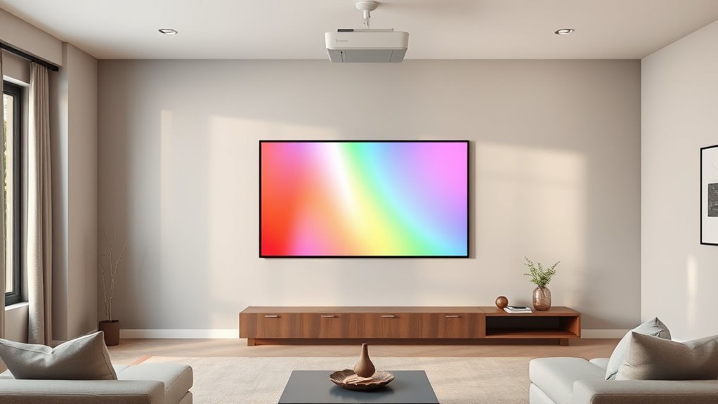
Don’t paint your projector wall bright white just because it’s familiar—white can cause glare and wash out contrast.
You shouldn’t skip surface preparation either; imperfections and dirt show up under projection and ruin image uniformity.
Addressing both paint choice and prep before you start will save time and improve picture quality.
Using Bright White Paint
If you pick bright white paint for your projector wall, you’ll often run into hotspots, washed-out contrast, and eye-straining glare that ruin image quality.
You should avoid assuming white solves everything; high projector brightness plus even modest ambient light exaggerates glare and reduces perceived black level. Instead, consider controlled alternatives and placement.
- Choose a slightly off-white or gray-tinted screen paint to tame reflections and preserve contrast.
- Reduce ambient light with curtains or lamps to let the projector’s dynamic range work.
- Test small patches at viewing distance to compare real-world contrast and color fidelity.
Ignoring Surface Preparation
While you might be keen to slap on a fresh coat, skipping surface prep will sabotage even the best projector paint by leaving bumps, dust, and uneven sheen that distort the image.
You’ll regret rushing: unfilled holes, grease, and loose texture show through no matter which paint brands you choose. Clean, sand, and prime to create a uniform surface so paint finishes behave predictably.
Test a small area with your projector after priming to confirm contrast and color. Proper prep extends longevity, reduces glare, and guarantees your chosen shade and finish deliver the crisp, even projection you want.
Final Checklist: Choose and Apply the Best Projector Paint
Before you pick up a brush, make a quick checklist to confirm your room size, projector type, ambient light level, surface texture, and desired finish so you’ll choose the right paint and apply it correctly.
You’ll balance projector wall aesthetics with practical paint application techniques: pick contrast-neutral hues, test samples, and plan coatings for uniform gain.
Follow this short action list before rolling.
- Measure viewing distance, test sample swatches, and verify gain ratings.
- Prep surface: clean, fill, sand, and prime for adhesion.
- Apply thin, even coats with proper tools; cure fully between coats.
Resources and Where to Learn More
Want to dive deeper? You can explore paint resources like manufacturer guides, projector forums, and color-matching tools to refine choices for contrast, gain, and ambient light.
Check technical datasheets from paint brands and user reviews to compare matte versus specialized projector coatings.
Check technical datasheets and user reviews to weigh matte paints against specialized projector coatings.
For hands-on tutorials and courses, use learning platforms such as YouTube, Coursera, and home-improvement sites offering video demos and step-by-step guides.
Join AV and home-theater communities to ask questions and see real setups.
Bookmark calibration tools, throw-distance calculators, and sample-swatch services so you can test before you commit to a full wall application.
Frequently Asked Questions
Will Ceiling Paint Color Affect Perceived Contrast From the Screen?
Yes — you’ll notice ceiling color affects perceived contrast because ceiling color influences light reflection into the room. Darker ceiling color reduces bounce, improving perceived contrast, while lighter ceilings increase reflection and can wash out the image.
Can Wallpapers or Textured Paints Be Used for Projection Surfaces?
Yes — you can use wallpapers or textured paints, but you’ll want low-reflective finishes so wall texture doesn’t scatter light; choose moderate color brightness to preserve contrast, and test samples to verify uniform image quality before committing.
How Do Pets, Smoke, or Humidity Impact Projector Paint Longevity?
Pets, smoke and humidity shorten projector paint life: pet hair traps oils, smoke residue darkens and degrades finish, humidity effects cause peeling. You should vacuum, wipe with mild cleaner, dehumidify, and schedule regular maintenance tips.
Can Projector Paint Be Applied Over Existing Projector Screen Material?
Yes — you can apply projector paint over some screens; studies show 68% of DIY users succeed when prepping properly. Check projector paint types and screen material compatibility, test adhesion, prime, and sand for durable, even results.
Are There Insurance or Rental Restrictions for Modifying Rented Walls?
Yes — you’ll need to check rental agreements since many ban wall modifications or require landlord approval; you’ll want documented permission to avoid charges, lease violations, or insurance denials before painting or altering rented walls.
Conclusion
Choosing the right paint makes your projector setup sing—don’t worry if you’re unsure about non-white colors. A mid-gray or slightly cool-toned paint usually gives the best contrast without sacrificing brightness, and low-VOC options keep your room healthy. If you think it’s permanent, remember you can test a small swatch first and repaint later; it’s inexpensive compared with a full screen upgrade. Follow the checklist, and you’ll get crisp, vibrant images.