What Color to Paint Basement Walls? Best Ideas
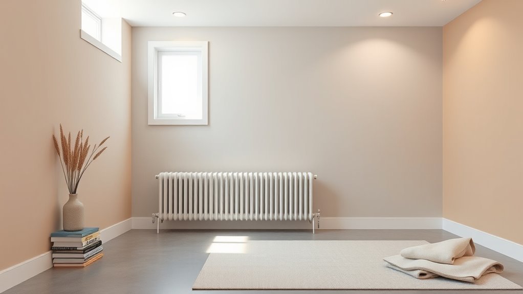
Choose warm neutrals or soft pastels—warm whites, pale greiges, muted blues, and sage—to make your basement feel bright and cozy while reflecting light and masking damp spots. Test large swatches at different times and under your lamps, since natural and artificial light change how hues read. Use darker accents to define zones and moisture-resistant primers and paints in problem areas. Keep colors light for low ceilings; explore tailored palettes ahead to pick the perfect scheme.
What Color Works Best for Basements Overall?
Because basements often lack natural light and can feel cramped, you’ll want colors that brighten and open the space without feeling cold.
You’ll lean toward warm neutrals and soft pastels that reflect light and create a cozy, inviting vibe. Think warm whites, pale greiges, muted blues, and sage—choices grounded in basement color psychology that favor comfort and perceived spaciousness.
For flexibility, pick a main neutral wall color and layer with accent shades from popular basement hues to define zones.
Test samples on large wall areas, view them at different times, and choose what feels balanced and livable.
How Natural Light Changes Basement Paint Choices?
Now that you’ve picked warm neutrals or soft pastels to open a basement, consider how much natural light the space actually gets—this will change which tones work best.
If light is scarce, choose brighter, higher-value hues to counter gloom; cool tones can feel flat without sunlight.
In sunlit corners, richer colors read truer and add coziness without closing the room.
Test swatches at different times to see natural light impact on undertones.
Remember basement color psychology: lighter shades expand and uplift, while deeper hues create intimacy.
Match paint choices to daily light patterns for balanced, consistent results.
How Artificial Lighting Affects Wall Color?
When you rely on artificial light, the bulb type and color temperature will change how paint reads on your basement walls, often more dramatically than natural light does.
You’ll notice warm bulbs deepen reds and yellows, while cool bulbs emphasize blues and greens. Adjust fixtures and spacing to control shadows and evenness.
Test swatches at night under the same lamps you’ll use; lighting temperature shifts perceived hue and color saturation, making neutrals look cozy or washed out.
For multipurpose basements, choose paints that tolerate varied lamps, and favor samples over assumptions before committing to a final color.
Choosing Colors by Basement Purpose: Living Space vs Storage
Lighting choices shape how colors behave, but your basement’s purpose should guide which hues you choose.
Lighting alters color—let your basement’s function steer your hue choices for best mood and practicality
If you use the space for living, pick tones that support color psychology and mood enhancement—warm neutrals for cozy family rooms, soft greens for calm, muted blues for focus.
For storage, prioritize practicality: washable, mid-tones that hide scuffs.
Consider these quick rules:
- Living space: prioritize comfort, cohesion with upstairs, and durable finishes.
- Multipurpose: zone with contrasting but harmonious shades.
- Storage/workshop: choose stain-resistant, low-maintenance colors that conceal wear.
Best Colors for Brightening Low-Ceiling Basements
When you’re working with a low-ceiling basement, choose light-reflective neutrals like soft whites, warm beiges, or pale grays to bounce light around the room.
Paint the ceiling a brighter, slightly cooler shade than the walls to create the illusion of height.
Use a subtle contrast between walls and trim to define space without visually lowering the ceiling.
Light Reflective Neutrals
Anyone looking to make a low-ceiling basement feel taller should start with light-reflective neutrals—soft whites, warm greiges, and pale taupes that bounce available light and visually lift the space.
You’ll use light reflective techniques and neutral color psychology to choose hues that increase perceived height without feeling cold. Consider finishes, undertones, and coordinated trim for cohesion.
- Soft white: maximizes brightness with minimal contrast.
- Warm greige: adds depth while keeping reflection high.
- Pale taupe: introduces subtle warmth for comfortable, airy rooms.
Apply satin or eggshell finishes and keep clutter low to amplify results.
Ceiling-Height Contrast
How can you use contrast to make a low-ceiling basement feel taller? Use a lighter ceiling and a slightly darker wall to lift the eye upward; this tricks visual perception into sensing more vertical space.
Paint the ceiling a bright white or soft warm tone, then choose walls in pale grays, creams, or muted pastels. Keep trim and fixtures close to the ceiling color to blur boundaries.
Avoid heavy, dark ceilings or high-contrast crown moldings that cut the room off. Adjust lighting to wash the ceiling evenly—recessed or uplighting enhances the effect.
Small changes in ceiling height cues make a big difference.
Best Colors for Making Small Basements Feel Larger
To make a small basement feel larger, choose light neutral tones that reflect light and keep the space airy.
You can add cool pastel hues for subtle depth without closing the room in.
For a polished look, use a monochromatic contrast between walls and trim to create visual continuity and perceived space.
Light Neutral Tones
When you want a small basement to feel more open, light neutral tones are your easiest and most effective tool; they reflect available light, blur edges, and create the sense of higher ceilings without major renovation.
Choose light neutral palettes and calming beige tones to keep the space airy and warm. You’ll find these simple strategies effective:
- Paint walls in warm off-white to bounce light without starkness.
- Use a slightly darker trim to define features subtly.
- Add reflective accents—mirrors or metallic fixtures—to amplify light.
Stick to low-contrast, cohesive shades to maintain the illusion of space.
Cool Pastel Hues
If light neutrals make the room feel open and warm, cool pastel hues push that sense of space a step further by adding subtle color without absorbing light. You’ll choose mint, powder blue, or lavender to brighten corners and lift ceilings. Use pastel palettes to reflect light and create airy depth; color psychology shows cool tones calm and expand perception. Paint ceilings a shade lighter than walls, keep trim crisp, and add mirrors to amplify effect. Simple furnishings and consistent flooring maintain flow.
| Shade | Effect | Tip |
|---|---|---|
| Mint | Refreshes | Pair with white |
| Powder blue | Expands | Use matte finish |
| Lavender | Soothes | Limit accents |
Monochromatic Contrast
Although you might think bold contrasts close in a room, a monochromatic scheme actually enlarges a small basement by using a single hue in varied tones and finishes; you’ll create visual continuity that reads as open space rather than chopped-up zones.
Use light mid and deep variations to add depth without breaking the field, and introduce subtle texture with matte and satin finishes.
Try these approaches to keep the effect airy and intentional:
- Paint walls pale, trim slightly darker, ceiling brightest to lift sightlines.
- Add contrasting accents like navy pillows or charcoal furniture sparingly.
- Use layered lighting to reveal tone differences and expand perception.
Best Colors for Cozy, Intimate Basement Rooms
Choose warm, subdued hues that make a basement feel snug rather than cavernous. You’ll favor deep terracotta, muted olive, and rich charcoal to anchor the room. Pair colors with cozy textures and intimate lighting to pull walls inward and soften echoes. Use layered lamps, wall sconces, and low-watt bulbs rather than overhead glare. Accent with wood tones and woven rugs to add warmth. Keep ceilings a shade lighter than walls to avoid closure. Test samples under your actual fixtures.
| Color | Mood | Pairing |
|---|---|---|
| Terracotta | Warm | Leather, wood |
| Olive | Earthy | Brass, linen |
| Charcoal | Cozy | Velvet, warm light |
Neutral Paint Colors That Suit Any Basement

Any neutral you pick should make the space feel open and adaptable without flattening character; think warm greiges, soft taupes, and light greys that reflect light and work with both cool and warm accents.
You’ll want neutral color palettes that tie flooring, furniture, and lighting together while staying current with basement color trends.
Consider finishes and undertones to avoid muddy hues.
Try these simple approaches:
- Soft greige for versatile backgrounds that cozy up decor.
- Light taupe to add subtle warmth without overpowering.
- Pale grey with blue undertones to brighten low-light basements and modernize the space.
Warm Paint Colors to Add Coziness to Basements
To make your basement feel inviting, try a warm neutrals palette—think creamy taupes, soft beiges, and gentle greys with warm undertones.
Pair those with soft terracotta tones on an accent wall or in textiles to introduce a cozy, grounded vibe.
You’ll keep the space bright while adding depth and warmth.
Warm Neutrals Palette
A warm neutrals palette makes a basement feel inviting without overpowering the space—think soft taupes, creamy beiges, and muted terracottas that reflect light while adding depth.
You’ll find warm neutral tones anchor cozy color schemes, letting furniture and lighting breathe. Choose finishes that bounce limited basement light: eggshell for walls, satin for trim.
Use contrast sparingly to keep the room calm.
- Start with a dominant beige or taupe.
- Add textured accents: woven rugs, linen curtains.
- Layer in deeper browns for depth and balance.
This approach keeps the basement welcoming and versatile.
Soft Terracotta Tones
When you paint your basement in soft terracotta tones, the space instantly feels warmer and more intimate without becoming heavy. You’ll welcome that subtle, sunbaked glow that complements low ceilings and limited light.
Choose soft terracotta palettes with muted apricot, dusty clay, and blush undertones to keep things cozy yet bright. Pair walls with natural wood, deep green accents, and warm metals for contrast.
Consider terracotta texture options—matte paint, lime wash, or subtle stucco—to add depth without clutter. With thoughtful lighting and minimalist decor, your basement becomes a snug, stylish retreat you’ll actually use.
Cool Paint Colors for a Modern Basement Look
If you want a sleek, contemporary basement, cool paint tones will instantly upgrade the space without overpowering it. You’ll choose from modern color palettes that emphasize blues, greens, and soft neutrals to keep the room airy and refined.
Use basement accent walls sparingly to define seating or media zones without shrinking the room. Consider these options:
Accent walls can define seating or media zones—use them sparingly to add depth without crowding the space
- Deep teal for drama that still feels fresh.
- Muted sage to bring subtle warmth with cool undertones.
- Icy blue-gray for a calming, spacious backdrop.
Pair these with crisp trim and layered lighting to complete a clean, modern look.
Gray Shades That Work Well on Basement Walls
Consider gray shades for your basement walls to create a balanced, modern backdrop.
You can choose a light warm gray to brighten the space, cool charcoal tones for drama, or greige for flexible warmth that pairs with many accents.
Think about lighting and furnishings to decide which gray will best suit your room.
Light Warm Gray
Because light warm gray reflects a bit of soft warmth, it keeps basement spaces feeling cozy without closing them in. You’ll find light warm gray shades calm visual clutter, brighten low ceilings, and pair nicely with wood and brass accents.
Choose tones with subtle undertones to match your light and furniture.
- Pick samples to view at different times of day.
- Pair with warm whites for trim and ceilings.
- Use satin or eggshell finishes to hide imperfections and bounce light.
Watch undertones—the right light warm gray undertones prevent green or purple casts and keep the space inviting.
Cool Charcoal Tones
Shifting from light warm gray, cool charcoal brings a deeper, more modern mood to basement walls without making the space feel cramped.
You can use charcoal accents on a single feature wall or lower half to anchor the room while keeping ceilings and trim lighter for contrast.
Pair these grays with layered lighting and reflective surfaces to prevent gloom.
Choose paint sheens that suit wall textures—eggshell smooths minor flaws, satin highlights architectural details.
For furnishings, stick to cool neutrals and a few warm wood tones to soften the palette.
The result feels sophisticated, cozy, and intentionally designed.
Greige For Versatility
If you want a color that quietly bridges warm and cool tones, greige is your go-to for basement walls. You’ll get greige balance that adapts to lighting, making the room feel cohesive whether you use warm wood or cool metal accents.
Choose undertones based on light: warmer greige for cozy lounges, cooler greige for modern workshops.
- Pick samples to test in morning and evening light.
- Pair greige warmth with layered textiles and warm lighting for depth.
- Use trim in crisp white to keep the space fresh and prevent muddiness.
Greige lets you change decor without repainting.
Beige and Greige Options for Flexible Styling
While often dismissed as safe, beige and greige give you versatile, modern backdrops that adapt to any style—from cozy traditional to sleek contemporary.
You’ll appreciate beige versatility in rooms where furnishings change often; it pairs with rich woods, bold accents, or soft pastels without clashing.
Greige warmth offers subtle depth, preventing spaces from feeling flat while keeping light reflective.
Greige adds gentle warmth and depth, keeping rooms lively and light-reflective without overpowering the palette
Choose warm-leaning tones for comfort or cooler greiges for a crisp edge.
Test samples under basement lighting, then coordinate trim and textiles to reinforce mood.
These neutrals let you update decor easily without repainting every season.
White Paint Choices That Avoid a Sterile Feel
Beige and greige give you a forgiving base, but white can brighten a basement without feeling clinical when you pick the right tint and finish.
Choose warm white options with slight yellow or peach undertones to cozy up low ceilings. Pair them with textured white finishes on an accent wall or trim to add depth and hide imperfections.
Consider these simple approaches:
- Off-white eggshell for walls—soft sheen, forgiving.
- Creamy matte on nooks—mutes glare, feels warm.
- Textured white finish on lower half—visual interest, durable.
You’ll keep the space airy without sterility.
Bold Accent Colors to Energize Basement Zones
One strong accent wall or a handful of vivid pops can instantly energize separate basement zones and give each area its own personality.
You can choose vibrant color schemes to define a media corner, playroom, or home gym without overwhelming the space. Contrast saturated hues with neutral surroundings, and use energizing wall designs like geometric patterns, color-blocking, or a single mural to create focal points.
Keep ceilings and large surfaces light to maintain openness. Test swatches under basement lighting, and pick finishes that resist moisture.
With careful placement, bold accents lift mood and function without sacrificing cohesion.
Dark Paint Choices for a Dramatic Basement Finish
You can use deep, moody hues like charcoal, navy, or forest green to give your basement a dramatic, cozy feel.
Pair those dark walls with layered lighting—task, ambient, and accent—to keep the space functional and prevent it from feeling closed in.
Thoughtful placement of lamps and sconces will create contrast and highlight architectural features.
Deep Moody Hues
A deep, moody palette can turn a basement into a striking, intimate retreat that feels intentionally designed rather than an afterthought.
You’ll use moody palettes and deep textures to create depth without clutter. Choose rich charcoal, navy, or forest green for walls, then layer matte and satin finishes to add subtle variation.
Keep furnishings minimal and tactile so color reads as the hero. Consider these approaches:
- Charcoal walls with warm wood accents.
- Navy with brass or leather details.
- Forest green paired with stone or concrete elements.
Paint boldly, then let materials and scale do the rest.
Contrast With Lighting
Lighting transforms dark paint from oppressive to cinematic, and you’ll want to plan sources that celebrate depth rather than erase it. You’ll use lighting fixtures and fixture placement to sculpt shadow effects and enhance wall textures. Balance bulb brightness and color temperature: warmer tones reduce harsh contrast, cooler hues sharpen color mapping. Combine ambient lighting with focused lamps to control light saturation and create drama. Reflective surfaces bounce highlights; matt walls hold mystery. Consider a simple guide:
| Purpose | Tip |
|---|---|
| Highlight | Accent lights, low bulb brightness |
| Depth | Wall washers, careful fixture placement |
| Mood | Dimmer ambient lighting, controlled shadow effects |
Earth Tones for a Welcoming, Organic Basement
When you choose earth tones for your basement, you create a calm, grounded space that feels naturally welcoming. You’ll use warm taupes, soft moss greens, and terracotta to anchor the room without overwhelming it.
Add earthy accents and organic textures to bring depth and comfort.
- Layer neutrals to keep the space cohesive.
- Introduce wood and woven elements for tactile warmth.
- Use matte finishes to reduce glare and enhance coziness.
Stick to a limited palette so the basement feels unified. These choices make the area inviting, versatile, and perfectly suited for relaxed living.
Pastel and Muted Colors for Soft, Family-Friendly Basements
Shifting from earth tones’ grounded warmth, pastel and muted hues brighten basements while keeping them gentle and family-friendly. You can choose soft blues, pale greens, or blush pinks to open low ceilings and reflect light without feeling sterile.
Use pastel palettes to layer color—walls, trim, and textiles—so spaces feel cohesive and calm. Muted tones hide wear better than stark white and pair well with wood accents and durable fabrics for active households.
Keep contrast low for soothing rooms, or add a deeper accent to define play or lounge areas while maintaining an overall tranquil, inviting vibe.
How Undertones Change the Way a Basement Color Reads?
Pay attention to undertones because warm and cool bases can make the same shade feel cozy or crisp in your basement.
You’ll see lightness shift perception too—paler hues read airier while darker ones deepen the room.
Combine undertone and value choices to control whether the space feels inviting or more modern.
Warm Vs Cool Undertones
Although two paints may look similar in the swatch, their undertones can make a basement feel cozy or cavernous, and you’ll notice the difference as soon as the light hits the walls.
You’ll choose between warm undertones that add depth and inviting glow, or cool undertones that open space and feel crisp. Consider how fixtures and flooring interact, then test samples on different walls.
Try this quick checklist:
- Observe samples at morning, noon, and evening light.
- Pair warm undertones with wood or warm metal accents for coziness.
- Use cool undertones with concrete or chrome finishes to brighten.
Lightness And Hue Impact
After you’ve settled on warm or cool undertones, consider how a color’s lightness and hue will actually read in your basement—undertones can flip a paint from airy to heavy depending on how light or saturated it is. You’ll use color psychology to shape mood: lighter, de-saturated hues expand low ceilings; saturated warm hues energize but can feel cramped. Test swatches at different times of day to judge emotional impact. Match finish (matte vs eggshell) to lightness. Compare options quickly:
| Lightness | Hue | Effect |
|---|---|---|
| Pale | Cool | Airy, calming |
| Pale | Warm | Cozy, soft |
| Mid | Cool | Balanced, neutral |
| Mid | Warm | Inviting, lively |
Picking Paint Finishes for Basement Durability and Light
When you’re choosing paint for a basement, finish matters as much as color because it affects durability, light reflection, and maintenance.
You’ll balance paint durability with desired sheen to handle moisture, scuffs, and cleaning. Smooth concrete or drywall responds differently than rough wall textures, so pick a finish that conceals flaws yet bounces light where needed.
Consider these practical options:
- Flat/matte for low glare on imperfect surfaces.
- Satin for a washable, slightly reflective surface that hides minor texture.
- Semi-gloss for high-traffic trim and moisture-prone areas needing frequent cleaning.
Test samples under basement lighting before committing.
Layering Accent Walls and Trim to Define Basement Zones
If you want to create clear zones without building walls, layer accent walls and trim to guide the eye and define function—use a bold or textured accent on the focal wall, then pick trim and secondary hues that echo or soften that tone to frame seating, play, and storage areas. You’ll use layered textures and contrasting trim widths to produce defined spaces that read as purpose-built. Paint choices, trim gloss, and simple molding create connections. Use consistent rhythm so zones feel intentional.
| Zone | Accent Idea | Trim Treatment |
|---|---|---|
| Seating | Deep slate | Wide, low gloss |
| Play | Warm ochre | Rounded, durable |
| Storage | Soft neutral | Minimal, clear |
Pairing Wall Paint With Basement Floors and Ceilings
Layered accents and trim set clear zones, but you’ll also want your wall paint to work with the basement’s floors and ceilings so each area reads as a whole.
Balance color harmony and flooring compatibility by considering tone, texture, and light. Match warm walls to wood or warm-toned vinyl; cool neutrals suit concrete or gray tile. Low ceilings benefit from lighter paint; high ceilings handle deeper shades.
Tips:
- Test samples beside floor and ceiling materials to check undertones.
- Use bridging trim color to connect contrasts without competing.
- Keep finishes consistent for seamless visual flow.
Using Two-Tone Walls to Define Basement Zones
You can define separate zones in your basement by using two-tone walls that assign different functions to each area.
Balance lighter and darker shades so darker colors ground seating or media zones while lighter tones keep play or exercise areas bright.
Use connecting trim or a mid-height chair rail to make the shift feel intentional and polished.
Define Zones With Color
Dividing your basement into distinct zones with two-tone walls makes the space feel organized and intentional without building walls. You can use color psychology and color temperature to signal function: cooler hues for a media area, warmer tones for a play or lounge space.
Keep shifts crisp so each zone reads clearly.
- Choose a dominant neutral base to unify the room.
- Apply a saturated accent on lower or upper halves to define activity areas.
- Use matching trim or a narrow divider stripe to tie zones together.
This approach gives clarity and purpose while keeping the open plan flexible.
Balance Light And Dark
How can you make a low-lit basement feel both cozy and spacious? Use two-tone walls to play with light and shadow: paint the upper portion a pale, reflective hue and the lower portion a richer, grounding color.
You’ll create color balance that defines seating, play, or storage zones without bulky dividers. Keep the dividing line low for intimacy or higher for openness, and choose finishes that respond differently to lamps and recessed lighting.
Contrast should be deliberate—too stark breaks flow, too subtle blurs zones. Test swatches under evening light to guarantee the mix reads right across real conditions.
Use Transitional Trim
When you want two-tone walls to feel intentional rather than segmented, bridging trim lets you connect colors smoothly while defining zones: a thin chair rail, picture molding, or stepped casing can carry the darker hue into a lighter field and create a deliberate visual seam that reads as architectural, not accidental.
You’ll use connecting aesthetics to guide viewers between cozy and airy areas, and choose trim styles that suit your basement’s character.
Consider practical options:
- Paint the rail the darker color to anchor a lounge.
- Opt for white picture molding for clean contrast.
- Use stepped casing for subtle depth and flow.
Choosing a Color Palette Around Existing Basement Furniture
Looking at the furniture you already have will make choosing a basement palette much easier: pick two dominant tones from key pieces—sofas, rugs, or built-ins—and build complementary wall shades around them.
You’ll create color harmony by selecting a neutral or muted wall hue that ties those tones together, then introduce an accent wall or trim that enhances furniture contrast.
Test swatches near seating and under lighting you use most. If patterns dominate, choose simpler wall colors; if pieces are solid, you can be bolder.
Keep samples up for several days to judge how artificial and natural light shift the balance.
Matching Paint to Basement Flooring Types (Concrete, Carpet, Wood)
If your basement has concrete floors, you’ll want paint colors that warm up the space and hide any gray undertones.
For carpeted basements, choose hues that complement the carpet’s tone so the room feels cohesive rather than chopped up.
And if you have wood floors, pick wall colors that bring out the grain and warmth without clashing.
Color With Concrete Floors
Because concrete floors can read cool and industrial, you’ll want wall colors that either warm the space or embrace the loft-like feel.
Aim for color harmony and clear floor compatibility when choosing tones. Consider these approaches:
- Warm neutrals (taupe, warm gray) — soften concrete’s chill and tie to wood accents.
- Deep jewel tones (teal, emerald) — create cozy contrast and modern drama.
- Light, warm whites or creams — reflect light, brighten low basements without feeling sterile.
Test samples next to the actual floor at different times of day to confirm balance, then pick finishes that resist moisture and hide imperfections.
Paint For Carpeted Basements
Any carpet color you choose will change how paint reads, so pick wall tones that either harmonize with or intentionally contrast the pile.
When you have carpeted basements, prioritize paint color considerations like undertone balance and light reflection; warm carpets suit cool neutrals, and cool carpets pair with warm beiges.
Test samples over the actual carpet to judge interactions. For carpet compatibility, consider traffic patterns—darker walls hide scuffs near seating, lighter shades brighten low-ceiling rooms.
Match trim and wood accents to both carpet and paint for cohesion. Keep contrast moderate to avoid visual clutter and maintain depth.
Testing Paint Colors in Your Basement
How will a color really look under your basement lighting? You’ll want to do deliberate paint testing and consider color psychology to match mood and function.
Try these steps:
- Paint three 2×2-foot swatches on different walls; observe saturation and undertones.
- Live with samples for several days, noting how artificial lights and shadows shift perception.
- Photograph swatches under the fixtures you’ll use, then compare prints or files side-by-side.
Record reactions—what feels cozy, bright, or cold—and avoid rushing decisions.
Small samples reveal contrasts with trim, flooring, and fixtures so you pick a color that truly works.
Best Times of Day to Evaluate Basement Paint Samples
Now that you’ve tested samples and seen how fixtures change color, pick specific times to evaluate them so you get an accurate sense of how they’ll read day-to-day.
Schedule sample testing during morning, midday, and evening to capture natural light shifts and artificial illumination. Check after sunrise when cool tones show, at midday for strongest daylight, and at dusk to see warmth from fixtures.
Test samples in the morning, midday, and dusk to see cool, full, and warm light effects.
Also assess at night with typical lamps and overheads to judge true nighttime lighting conditions.
Take photos and notes at each time, compare hues side-by-side, and choose the option that performs consistently across your real-use lighting conditions.
How Many Paint Samples to Try Before Deciding?
Wondering how many paint samples you should try? You’ll want enough to compare but not so many you get overwhelmed. Use focused paint sample strategies and keep evaluating color choices as you go.
- Start with 3 core shades: a light, a mid, and a dark to see contrast.
- Add 2 variations of your favorite to test undertones in different light.
- Reserve 1 bold or unexpected option to challenge your instincts.
Try samples on large cards or small wall patches, live with them a few days, and narrow to the one that feels right for your basement.
Tools and Techniques for Sampling Basement Paint
Gather the right tools and use targeted techniques to make sampling basement paint fast and reliable. You’ll need color swatches, sample pots from preferred paint brands, quality brushes or rollers, painter’s tape, and a small trim board for portable tests.
Apply sampling techniques: large patches on different wall textures, painted panels for varying paint finish, and multiple coats where needed. Record the testing process, note how color psychology affects mood under different lighting conditions, and view samples at day and night.
Compare finishes and brands side-by-side before committing, ensuring results translate to your actual basement space.
How to Prep Basement Walls for Paint: Cleaning and Repair
After you’ve compared swatches and test panels, get the walls ready so those sample results hold up over time. You’ll focus on surface preparation: clear debris, assess wall texture, and check for damp spots.
Follow this 3-step checklist:
- Clean: wall cleaning with detergent, scrub off efflorescence and mold, rinse thoroughly to aid mold prevention.
- Repair: surface repair cracks and spalled concrete; sand to uniform wall texture for better adhesion.
- Inspect: perform moisture assessment; let walls dry before primer application.
Proper prep increases paint durability and reduces rework, so don’t skip these critical steps.
When to Use Moisture-Resistant Primer in Basements?
You should apply a moisture-resistant primer before painting if the basement has any history of dampness, efflorescence, or visible water stains.
Check for musty odors, peeling paint, or salty residue on the walls—those are clear signs of moisture risk.
Using the right primer early will block moisture, improve adhesion, and protect your finish.
When To Apply Primer
Because basements tend to trap moisture, you’ll want to know exactly when to use a moisture-resistant primer—apply it anytime walls are damp, have efflorescence, or show past water damage before painting.
You’ll pick primer types for concrete, masonry, or painted surfaces and time primer application after repairs and drying.
Follow this checklist:
- After cleaning and allowing 24–72 hours drying following spot repairs.
- When surface salts or efflorescence have been removed and the substrate feels dry.
- Before any color coat if you’ve had previous staining, mold remediation, or patched areas.
This guarantees paint adhesion and extends finish durability.
Signs Of Moisture Risk
When basement walls show peeling paint, musty odors, visible damp spots, or white powdery deposits (efflorescence), treat them as moisture risks and use a moisture-resistant primer before painting.
You should perform moisture detection with a meter or probe any suspicious areas; drywall and concrete behave differently, so test multiple spots.
If readings exceed recommended limits or you notice recurring dampness, pause painting and address leaks or ventilation.
Improve humidity control with a dehumidifier, proper grading, and sealed vents.
Apply a vapor-barrier primer on clean, dry surfaces after repairs. That sequence prevents paint failure and protects your basement finish.
How to Choose Mold- and Mildew-Resistant Paints?
Wondering which paint will actually keep mold and mildew at bay? You’ll want coatings designed for mold prevention and moisture control. Pick a high-quality latex or epoxy paint labeled “mildew-resistant” and check for antimicrobial additives.
Prioritize breathable formulations that let trapped moisture escape rather than seal it in.
- Choose paints with anti-microbial or fungicidal labels and third-party test data.
- Use satin or semi-gloss finishes for easier cleaning; they resist staining and microbial growth.
- Combine paint choice with proper priming and surface prep to remove existing spores and guarantee adhesion.
These steps cut mildew risks and extend finish life.
Painting Around Basement Windows and Low Light Sources
If your basement windows are small or light is limited, choose paints and techniques that maximize brightness and minimize shadows while keeping surfaces durable and easy to clean.
Paint trim and sills in a slightly glossy, light-reflective finish to bounce available light inward. Use warm off-whites or very light pastels on walls to avoid a cold, cave-like feel.
Paint trim and sills in a soft sheen and choose warm off-whites or pale pastels to brighten and soften the space
Pair paint choices with simple window treatments that don’t block light—sheer curtains or top-mounted blinds—and layer targeted lighting solutions like wall sconces or adjustable LED fixtures.
Keep finishes washable near windows to handle condensation and occasional dirt without repainting.
Ceiling Paint Strategies to Increase Perceived Height
You can make a low basement feel taller by painting the ceiling a lighter shade than the walls to push it visually upward.
Try a gloss or semi-gloss finish to reflect light and enhance that sense of height.
For a subtle lift, add thin horizontal accent bands where the wall meets the ceiling to draw the eye upward.
Paint Ceiling Lighter Than Walls
When you paint the ceiling a shade or two lighter than the walls, the room instantly feels taller and more open; the lighter surface reflects light upward, reducing the visual weight of the ceiling and drawing the eye up.
You’ll pick ceiling colors that complement wall tones and use simple paint techniques to enhance height without fuss.
Try these quick approaches:
- Use a pale neutral ceiling slightly lighter than the wall for subtle lift.
- Create a soft contrast by choosing a cool-toned ceiling against warm walls.
- Keep edges crisp with careful cutting-in to emphasize vertical lines and perceived space.
Use Gloss Or Semi-Gloss
Although gloss and semi-gloss finishes are often saved for trim, using them on a ceiling can subtly boost perceived height by reflecting more light upward, so the room feels brighter and less capped. You’ll want gloss finishes where you need maximum reflectivity and easy cleaning, while semi gloss durability gives a balance of sheen and resilience. Apply thin, even coats to avoid drips and highlight molding. Consider light, warm tones to enhance lift.
| Benefit | Best Use | Tip |
|---|---|---|
| Reflectivity | Ceilings | Thin coats |
| Cleanability | High-traffic | Mild cleaner |
| Subtle lift | Low ceilings | Warm light |
Add Horizontal Accent Bands
If you want to visually raise a low ceiling, add narrow horizontal accent bands that draw the eye upward and create the illusion of extra height. You can pick subtle contrasts or bold stripes to suit your space.
Use clean tape lines and consistent spacing for professional results. Try these horizontal design options and accent band techniques:
- Paint thin, lighter bands near the top to reflect light and lift the room.
- Contrast a dark wall with a slim bright band to create a crisp visual break.
- Use alternating neutral tones for a textured, elegant effect that feels taller.
Trim and Door Paint Tips for Basement Cohesion
Because trim and door colors frame your space, choosing the right tones instantly ties the basement together and highlights architectural details without overwhelming the room.
Trim and door colors frame the space, unifying the basement and highlighting details without overpowering the room.
You’ll pick trim finishes that suit the ceiling height and lighting—gloss for easy cleaning in activity areas, satin for subtle reflection in lounges.
Coordinate door styles with paint: simple panel doors work with muted contrasts, while modern slab doors tolerate bolder hues.
Use a consistent trim color to unify connected rooms, or pick a slightly darker shade than walls for depth.
Test samples under basement lighting and apply 2 coats for durable, even coverage.
How Color Affects Perceived Temperature in Basements
You can make a basement feel warmer by choosing warm tones like reds, oranges, or rich tans, which create a cozier atmosphere.
Cooler blues and greens will make the space feel fresher and cooler.
Also remember that brighter shades tend to feel airier while darker ones feel more intimate, so balance hue and brightness to get the temperature impression you want.
Warm Tones Feel Cozier
When you paint basement walls in warm tones—think soft terracotta, golden beige, or muted mustard—they visually raise the room’s perceived temperature, making the space feel cozier and more inviting without changing the thermostat.
You’ll create a cozy atmosphere and a warm ambiance that encourages lingering. Use these tactics to maximize impact:
- Pair warm walls with wood accents and soft lighting to amplify intimacy.
- Choose mid-tone paints; too dark shrinks the space, too bright loses warmth.
- Add textiles—rugs, throws, curtains—in complementary hues to layer warmth.
These choices make your basement feel welcoming, functional, and comfortably lived-in.
Cool Tones Feel Cooler
Although cool tones can make a basement feel larger and more airy, they also lower the room’s perceived temperature, so choosing the right blues, greens, or soft grays helps you create a rejuvenating, calm environment without touching the thermostat. You’ll use cool color psychology to set mood and influence temperature perception: teal lifts spirits, sage soothes, and slate feels crisp. Balance saturation to avoid a chilly, clinical vibe. Pair cool walls with warm accents—wood, textiles, lighting—to keep comfort. Test samples in your basement light before committing; subtle shifts change how cool a color actually feels.
| Color | Effect |
|---|---|
| Teal | Energizing yet cool |
| Sage | Calming, natural |
| Slate | Crisp, modern |
Brightness Impacts Perception
Because brighter paint reflects more light, it makes a basement feel both airier and warmer to the eye.
So choosing higher-value colors can counteract that cool, underground vibe. You’ll use brightness perception and color psychology to shape mood: lighter shades bounce light, reducing shadowed corners and making spaces feel inviting.
Consider these practical choices:
- Soft warm neutrals to add subtle warmth without overwhelming.
- Pale yellows or warm beiges to amplify light and suggest heat.
- High-value pastels for a fresh, cozy feel while keeping contrast low.
Test samples under your basement lighting before committing.
Budget-Friendly Paint Choices That Still Look Great
Pick a durable, budget-friendly paint and you’ll transform your basement without overspending. You can explore budget-friendly options from popular paint brands that balance coverage and durability.
Use color swatches to test light and moisture effects before committing. Choose washable finishes and neutral tones for versatile, stylish choices that suit furniture and lighting.
For cost-effective solutions, buy gallons during sales and consider contractor-grade lines that perform well.
Apply simple DIY techniques—proper prep, primers for damp areas, and smooth rollers—to get professional-looking results without hiring help, keeping quality high while controlling costs.
Hiring a Pro vs DIY for Basement Painting (When Color and Conditions Matter)
You can handle many basement paint jobs yourself, but when color choices meet tricky conditions—like high humidity, uneven surfaces, or complex trim—bringing in a pro often pays off.
You’ll weigh skill, time, and long-term results against cost. Pros excel at paint preparation and moisture mitigation, and they advise on color psychology for the desired mood.
Consider these points:
- Complexity: mold, efflorescence, or textured concrete needs expertise.
- Color impact: pros simulate lighting to refine hue and finish.
- Cost vs longevity: DIY saves money now; pros prevent costly fixes later.
Common Color Mistakes in Basements and How to Avoid Them
When basements get the wrong color—or the right color applied without considering light and moisture—you’ll end up with a space that feels smaller, colder, or unfinished.
You should avoid deep hues in low-light corners, assuming they’ll always add coziness; color psychology matters, but context does too.
Don’t pick glossy finishes where dampness or texture shows—they’ll highlight imperfections.
Steer clear of trendy, high-contrast schemes that clash with existing fixtures.
Common misconceptions include thinking darker always means warmer or that neutral equals boring.
Test swatches under basement lighting, consider moisture-resistant paints, and pick tones that boost light and cohesion.
How to Refresh Previously Painted Basement Walls Without Stripping
A quick refresh can revive basement walls without the mess of stripping: start by cleaning surfaces with a mild degreaser, scrape loose paint, and sand rough spots to promote adhesion.
You’ll focus on efficient wall prep and smart color matching to make paint stick and look cohesive. Follow these steps:
- Patch cracks, vacuum dust, and apply primer to sealed areas for uniform adhesion.
- Test a small swatch with your chosen shade, viewing in different light before full application.
- Use a high-quality roller and two thin coats, feathering edges to blend with existing paint.
Seasonal Color Choices and How They Perform Year-Round
Although seasonal palettes bring fresh energy, you’ll want colors that stay balanced through shifting light and humidity in a basement.
Choose mid-tone neutrals or muted greens and blues that adapt to warm summer glow and cool winter light, offering consistent year-round appeal.
Test swatches on multiple walls and observe at different times to confirm depth and warmth remain pleasing.
Accent with seasonal decor—richer throws or bright art—rather than swapping paint.
Stick to durable finishes suited for basements to keep tones true.
That approach gives you flexible color that feels intentional every season without constant repainting.
Paint Maintenance Tips for Basements With High Humidity
Because basements trap moisture, you’ll need a maintenance routine that prevents peeling, mold, and staining on painted walls.
Use humidity resistant paints and follow moisture management strategies so coatings last. Check walls monthly for blistering, efflorescence, or soft spots; address sources fast.
Keep ventilation running and dehumidifiers set to 50% or lower. Clean with mild detergent and scrub mold with recommended cleaners; repaint affected spots with mildew-resistant primer and topcoat.
- Inspect monthly and fix leaks immediately.
- Run ventilation/dehumidifiers; monitor humidity.
- Recoat with humidity resistant paints when finish degrades.
Color Ideas for Finished Basement Home Theaters
When you’re designing a finished basement home theater, choose colors that deepen focus and cut glare so the screen stays the room’s star.
Pick deep matte tones—charcoal, navy, or espresso—to reduce reflections and make image contrast pop. Use an accent wall behind seating or the screen in a slightly darker shade to anchor the space.
Choose deep matte hues—charcoal, navy, or espresso—and a darker accent wall to minimize glare and sharpen contrast.
Coordinate trim and ceiling in muted neutrals to avoid distraction. Integrate themed decor sparingly so it enhances mood without brightening the room.
Choose paints compatible with soundproofing options and install acoustic panels in matching hues for a cohesive, cinema-ready finish.
Color Ideas for Basement Home Offices and Studios
If you want a basement office or studio that boosts focus and creativity, pick colors that balance energy with calm—soft greens and warm grays encourage concentration, while muted blues and terracotta add a subtle creative spark.
You’ll tailor tones to tasks: focused desk work benefits from low-contrast neutrals; brainstorming and art thrive with accent color pops.
Consider lighting and storage to keep the space airy.
Examples:
- Warm gray walls, sage accent, task lighting for a productive home office.
- Muted blue backdrop, wooden trims, adjustable lamps for a calm creative studio.
- Terracotta accent wall, neutral base, bright overheads for inspiration.
Color Ideas for Family Playrooms and Guest Suites in Basements
For family playrooms and guest suites in basements, choose colors that balance lively energy with restful comfort so the space feels welcoming for kids and adults alike. Use family friendly colors like soft teal, muted yellow, or warm gray to keep moods bright without overwhelming. Add accents with playful paint—stripes, chalkboard walls, or stenciled motifs—to inspire creativity and calm. Layer lighting and textiles to adjust atmosphere for play or rest. Below are quick color combos and uses to guide choices.
| Base Color | Accent Idea | Mood |
|---|---|---|
| Soft Teal | Cream trim | Calm + fresh |
| Muted Yellow | Navy stripe | Cheerful |
| Warm Gray | Chalk wall | Cozy creative |
| Pale Peach | Patterned pillow | Gentle warmth |
Frequently Asked Questions
Will Basement Paint Colors Affect My Home’s Resale Value?
Absolutely — subtle, strategic shades sell. You’ll tap resale psychology and current color trends to make spaces seem spacious, spotless, and sensible; buyers’ll favor neutral tones, but tasteful accents can boost appeal and perceived value.
How Do Paint VOC Levels Impact Basement Air Quality?
Paint VOC levels directly affect basement air quality: you’ll follow VOC regulations, choose low-VOC paint selection, expect fewer odor concerns, and rely on air filtration to reduce lingering fumes, improving health and resale perceptions.
Can Wallpaper or Wall Panels Be Used Instead of Paint?
Yes — you can use wallpaper options or panel styles instead of paint; you’ll choose moisture-resistant vinyl or textured panels, prep and seal walls, control humidity, and install proper adhesives and vents to prevent peeling and mold.
How Long Before Furniture Can Be Moved Against Freshly Painted Walls?
Wait at least 24–48 hours before moving furniture, but full curing can take 7–30 days depending on paint types and humidity. You’ll want to use lighter contact after two days and avoid heavy pressure until fully cured.
Do Color Choices Influence Pest Visibility or Attraction?
Yes — color choices can affect pest visibility and, indirectly, attraction: you’ll spot insects more easily on light walls, and color psychology can influence your perception of cleanliness, though pests respond mostly to light, odors, and habitat more than paint.
Conclusion
Wrap your basement in a color that feels like sunlight spilling across a warm floor or a cozy theater curtain—pick bright, warm neutrals to lift low ceilings, soft cool blues to calm home offices, and deep charcoal for a dramatic media den. Match paint to light and purpose, and seal with moisture-resistant finishes so your walls stay fresh like morning light on painted brick. With the right hue, your basement will invite you in every time.