What Color to Paint Walls With Gray Cabinets? Best Ideas
With gray cabinets, pick walls that either warm or crispen the space depending on the cabinet undertone and light. Go timeless with crisp white or warm beige for a clean backdrop, try greige or soft cream to neutralize cool grays, or choose muted blues and sage for a calming contrast. For drama use deep charcoal or black accents, and in small or dim rooms stick with light, warm whites to keep things open — keep going to see specific combos and tips.
Quick Picks for Wall Colors With Gray Cabinets
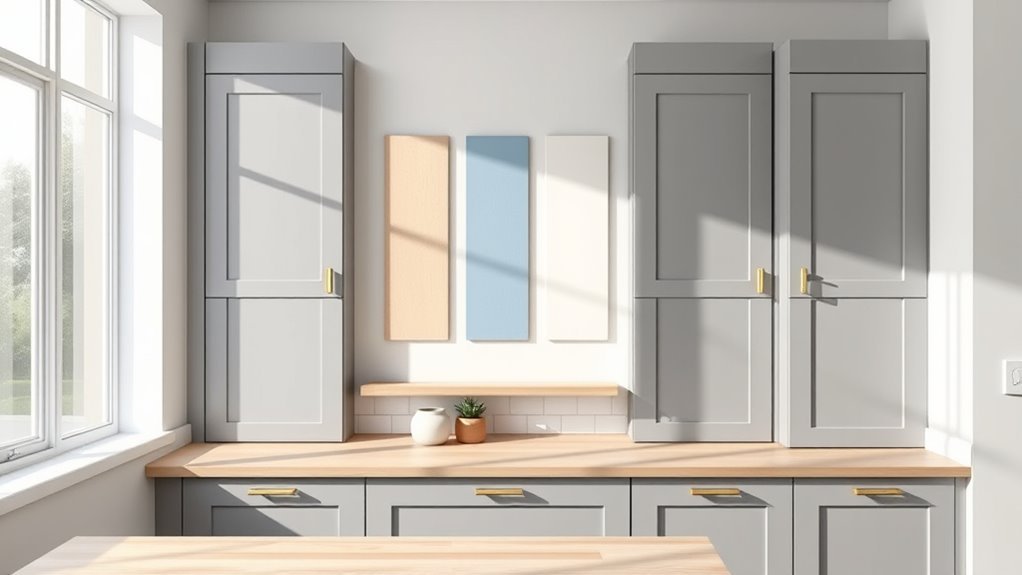
When you want fast, reliable choices that work with gray cabinets, go for timeless neutrals like crisp white, warm beige, or soft greige—each complements gray without competing.
You’ll pick a neutral base, then introduce accent colors through decor, rugs, or art to add personality without overwhelming the room.
Consider texture variations—matte paint, subtle plaster, or shiplap—to create depth while keeping the palette calm.
Introduce texture—matte paint, gentle plaster, or shiplap—to add depth while preserving a calm, cohesive palette
If you prefer bolder walls, choose muted blues or sage that harmonize with gray.
Test samples under your lighting, and keep finishes cohesive to maintain a polished, balanced look.
How Cabinet Undertones Affect Wall Choices
Because gray isn’t one uniform shade, its undertones—cool blue, warm taupe, or greenish—will change how wall colors read in your space, so you should identify the cabinet’s undertone before choosing paint. Once you know it, pick wall hues that support or contrast subtly for balanced cabinet colors and wall harmony. Cooler greys pair with soft whites or pale blues; warmer greys suit creams or muted terracotta. Use the table to test options visually and note mood impacts.
| Cabinet Undertone | Suggested Wall Hues |
|---|---|
| Cool blue | Soft white, pale blue |
| Warm taupe | Cream, muted terracotta |
| Greenish | Warm beige, soft olive |
Measure Room Light to Pick Flattering Wall Shades
Start by evaluating how much natural light your room gets at different times of day so you know whether colors will read warm or cool.
Note the temperature of your artificial lighting—warm bulbs will soften grays while cool bulbs make them feel crisper.
Finally, observe where shadows and contrast fall so you can choose wall shades that balance the room’s highlights and darks.
Assess Natural Light Intensity
If your room gets lots of daylight, you can lean into cooler or darker wall shades; if it’s dim, pick lighter, warmer hues to keep the space from feeling heavy.
Stand in different spots at morning, noon and evening to judge natural light and note shadows. Observe how light intensity shifts with seasons and nearby trees or buildings.
Use a simple light meter app or the camera histogram to quantify brightness if unsure. Record which walls receive direct sun and which stay shaded—those choices determine whether gray cabinets need contrast or soft complementary tones to read well.
Note Artificial Light Temperature
When you judge wall colors, check the artificial light temperature in the room—warm incandescent or LED lights cast yellow-orange tones that soften cool grays, while cool white or daylight bulbs push grays toward blue and can make warm paints look flat.
You’ll want to measure temperature effects with a simple bulb label or a smartphone app, then test paint swatches under that light at different times. That tells you which undertones will read true and which will shift.
- Try warm bulbs with cooler gray cabinets for cozy balance.
- Use cool bulbs to accent modern, blue-leaning grays.
- Note mixed lighting and prioritize the dominant artificial light.
Observe Shadow And Contrast
After checking how artificial light skews color, look closely at how shadows and contrast play across your room—those variations determine which wall shades will flatter gray cabinets.
Notice where natural light fades into shadow and how surfaces reflect or absorb tones; that shadow play changes perceived warmth and depth.
Test paint samples at different times and view them near cabinets to judge contrast levels.
Aim for color harmony by balancing cabinet gray with wall tones that either lift it (soft warm neutrals) or sharpen it (cool muted hues), depending on the mood you want and the room’s light dynamics.
Testing Paint Samples With Gray Cabinets
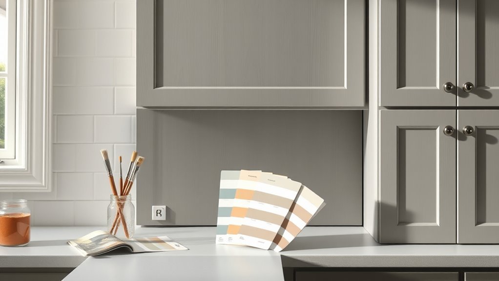
Test paint samples near windows so you can see how they read in natural light.
Compare each swatch against your cabinet finish and hardware to judge contrast and warmth.
For a clearer view, try large peel-and-stick samples so you can move them around and live with the color.
Test Samples In Natural Light
Since natural light reveals undertones and true contrast, bring paint swatches into the room at different times of day and tape them next to your gray cabinets so you can see how they interact in morning, midday, and evening light.
You’ll notice subtle shifts that affect color psychology and mood influence, so record which swatch reads warm, cool, or neutral. Move samples around high and low on the wall to account for reflections and shadow.
Take photos at set times to compare later. Trust your eyes over labels; daylight shows what a paint will actually look like beside your cabinets.
- Observe shifts during sunrise, noon, and sunset
- Note perceived warmth/coolness and contrast
- Photograph and annotate for later comparison
Compare With Cabinet Finish
When you hold paint samples up to your gray cabinets, take note of the cabinet finish—matte, satin, or gloss—because each finish reflects light differently and can make the same paint read warmer, cooler, or more saturated.
You’ll want to test samples against cabinet textures too; a rough, painted wood absorbs light differently than smooth thermofoil. Stand at multiple angles to observe finish contrasts between wall color and cabinet sheen.
Cooler paints can appear flat next to gloss, while warm tones may glow against matte. Document your observations and choose a color that balances those contrasts for cohesive results.
Try Large Peel-and-Stick
After you’ve compared samples against the cabinet finish, try using large peel-and-stick paint samples to see how wall colors read across the whole room. You’ll get immediate context for lighting, scale, and undertones next to your gray cabinets.
Peel and stick versatility helps you test several hues without commitment, and design flexibility means you can reposition samples until you’re sure.
- Check samples at different times of day to notice undertones.
- Tape samples near cabinets and opposite windows to assess contrast.
- Use oversized strips to evaluate how a color flows around corners and cabinets.
A Quick Decision Checklist for Choosing a Wall Color
If you want to pick a wall color quickly and confidently, use this checklist to narrow choices by lighting, undertone, contrast, and mood.
First, assess natural and artificial light—north-facing rooms need warmer tones; south-facing handle cooler hues.
Check your light first: north-facing rooms benefit from warmer tones, while south-facing spaces suit cooler hues.
Second, match undertones: cool grays pair with cool wall pigments, warm grays with warmer ones.
Third, decide contrast level—high contrast creates drama, low contrast feels cohesive.
Fourth, consider color psychology and mood influence: calm blues, energized yellows, neutral beiges.
Finally, test samples on different walls, view at various times, and commit when a sample still feels right.
Best White Shades for Gray Cabinets
When you’re pairing white walls with gray cabinets, you’ll want to choose between warm off-white tones that add softness and cozy contrast or a crisp true white for a modern, high-contrast look.
Warm off-whites have subtle yellow or beige undertones that temper the coolness of gray.
Crisp true whites make the cabinetry pop and keep the space feeling bright and clean.
Warm Off-White Tones
Since gray cabinets already lean cool, choosing a warm off-white lets you soften the room without losing contrast. It creates a creamy backdrop that makes gray feel inviting rather than stark.
You’ll find warm off-white palettes balance steel tones and add subtle warmth, helping your space feel lived-in and layered. Pick cozy neutral shades with yellow, beige, or blush undertones to complement rather than compete with gray.
Test samples in morning and evening light to avoid surprises. Consider trim and ceiling in slightly different warms to add depth.
- Soft beige-cream for traditional warmth
- Blush-tinted off-white for softness
- Pale buttery tones for subtle glow
Crisp True White
A crisp true white will make your gray cabinets pop by offering a clean, high-contrast backdrop that feels modern and fresh.
You’ll appreciate how crisp contrasts define cabinet edges, hardware, and architectural details, creating a polished, gallery-like look. Choose a true white without warm or cool undertones so your gray reads clearly, not muddied.
White walls boost bright reflections, amplifying natural light and making small kitchens feel larger.
Pair with matte or eggshell finishes to balance sheen against glossy cabinets. Keep trim and ceilings the same white for cohesion, and use accessories to introduce subtle warmth or color.
Warm Beiges and Greiges That Soften Gray Cabinets
If you want to soften the coolness of gray cabinets, warm beiges and greiges bring just the right amount of warmth without clashing with modern finishes.
You’ll use warm undertones to counterbalance cool cabinetry, creating soothing contrasts that feel inviting rather than stark. Choose a greige for subtle depth or a beige for a sunlit vibe; both keep the space cohesive while highlighting hardware and countertops.
Consider finishes and lighting to fine-tune the mood.
- Greige with taupe hints for understated elegance
- Soft beige to warm pale grays without overpowering
- Warm neutral with low sheen for cozy reflection
Cool Blues That Pair With Cool Gray Cabinets
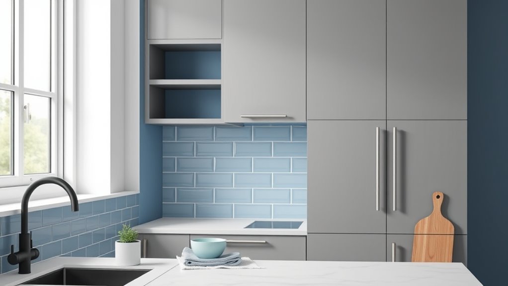
If you want a fresh, calming look, soft sky blue walls will brighten cool gray cabinets without overpowering them.
For a bit more depth, try a dusty teal blend to add subtle contrast and a modern, cozy feel.
Both choices keep the palette cool and cohesive while letting your cabinetry remain the star.
Soft Sky Blue
Several shades of soft sky blue bring a fresh, airy contrast to cool gray cabinets without competing for attention. You’ll find soft sky tones create a calming ambiance that lifts a room, making cabinets feel crisp and modern.
Use matte or eggshell finishes to keep reflections subtle and let hardware stand out. Pair with warm wood accents to prevent sterility, or choose white trim for clean lines.
Consider lighting—natural light enhances the hue, while cool LEDs emphasize its blue undertone.
- Balance with warm textiles and rugs
- Test paint samples in different light
- Keep ceiling and trim bright white
Dusty Teal Blend
Soft sky blue warms a room with airy brightness, but dusty teal brings a moodier, more sophisticated cool that complements gray cabinets beautifully. You’ll find dusty teal inspiration in muted seaside tones that balance cool gray without overpowering it. Use dusty teal accents—throw pillows, a backsplash, or open shelving—so the color reads intentional, not heavy. Pair with pale trim and warm wood to avoid chilliness. Visualize the mix:
| Element | Impression |
|---|---|
| Dusty teal walls | Calm, refined |
| Gray cabinets | Grounding, modern |
| Wood/trim accents | Warmth, contrast |
This blend feels composed and contemporary.
Muted Greens to Calm Gray Cabinetry
When you pair gray cabinets with muted greens, you create a calm, grounded backdrop that softens the room without competing for attention.
You’ll find muted green tones settle nicely against cool or warm grays, anchoring kitchens and bathrooms while keeping spaces serene.
Use matte finishes to enhance subtlety and let natural light reveal nuanced undertones.
These calming color palettes suit minimalist, Scandinavian, and modern farmhouse styles, bringing nature indoors without overwhelming.
- Layer with warm wood or brass accents for contrast.
- Add textured textiles to prevent flatness.
- Test samples in different light before committing.
Dusty Pinks and Blushes That Warm Gray Cabinets
If you want to warm up gray cabinets without sacrificing sophistication, dusty pinks and blushes offer a subtle, elegant solution. You’ll balance cool gray tones with a muted dusty rose that reads refined rather than saccharine.
Choose a soft blush for walls to create a gentle, luminous backdrop that highlights cabinetry details and metallic hardware. Pair with crisp white trim and natural wood accents to keep the palette grounded.
Lighting matters: warmer bulbs enhance the pink undertones, while ample daylight keeps the look fresh. Use samples on large poster boards to confirm the mood before committing.
Charcoal and Deep Grays for Layered, Moody Looks
Because darker tones add depth without feeling heavy, charcoal and deep-grays create a layered, moody backdrop that makes gray cabinets read intentional and luxe.
You’ll use charcoal textures to anchor the room while maintaining subtlety; pair matte walls with satin cabinets for tactile interest.
Deep gray contrasts let you define zones—kitchen workspaces, dining nooks—without stark shifts.
Balance is key: introduce warm wood, brass, or soft textiles to prevent chill.
Consider lighting that reveals depth rather than flattens it.
- Layer finishes: matte walls, semi-gloss trim, textured fabrics
- Add warm accents: wood, brass, woven rugs
- Use adjustable lighting to sculpt depth
Black Accents and Trim With Gray Cabinets
Although bold, black accents and trim can actually sharpen gray cabinets and give your space a tailored, modern edge. You’ll use black accent walls sparingly to create focal points—behind open shelving or a breakfast nook—without swallowing light.
Matte black trim around windows and doors crisply defines shapes, boosting gray cabinet contrast and making hardware pop. Balance is key: pair with warm wood or soft textiles to avoid starkness.
Keep finishes consistent—matte with matte, gloss with gloss—for cohesion. Strategic lighting prevents heaviness, so incorporate layered fixtures and undercabinet lights to highlight cabinetry and maintain warmth.
Soft Yellows and Buttery Tones to Brighten Kitchens With Gray Cabinets
Sunshine hues like soft yellows and buttery tones lift gray cabinets, giving your kitchen a warm, inviting glow without overwhelming the palette.
Sunshine yellows and buttery tones brighten gray cabinets, adding warm, inviting glow without overpowering the palette
You’ll find these shades brighten spaces while keeping sophistication; they work as subtle brightening techniques that respect gray’s neutrality and tap into uplifting color psychology.
Use them on walls or an accent island to bounce natural light and soften metallic finishes. Keep trim crisp to maintain contrast and avoid muddiness.
- Choose warm, muted yellows for longevity and balance.
- Pair with natural wood or brass for warmth.
- Test samples in morning and evening light.
Navy and Indigo Pairings for Classic Contrast
If you want a timeless, sophisticated look, pair gray cabinets with navy or indigo walls to create bold contrast without overpowering the room.
You’ll ground the space while keeping it elegant; lighter gray trim or countertops will prevent heaviness.
Introduce navy accents through hardware, barstools, or pendant shades to echo the walls without matching exactly.
Layer indigo textiles—rugs, curtains, cushions—to add depth and soften acoustics.
Balance lighting with warm metallics or soft white fixtures so the palette feels inviting, and choose a mid-tone navy if you want more versatility for accessories and artwork.
Terracotta and Rust Hues With Gray Cabinets
Don’t be afraid to pair warm terracotta or rust walls with gray cabinets — the earthy tones create a cozy, high-contrast backdrop that still feels modern.
You’ll enhance that warmth by introducing textured accents like woven rugs, matte ceramics, or reclaimed wood shelves.
Balance is key: let the gray remain grounding while the terracotta adds depth and personality.
Warm Earthy Contrast
When you pair gray cabinets with terracotta or rust tones, you create a lively, grounded contrast that warms the space without overwhelming it.
You’ll enjoy how earthy tones balance cool gray, bringing depth and a cozy vibe. Choose a muted terracotta for subtle warmth or a richer rust for bolder energy.
Keep trim and ceilings lighter to preserve brightness, and let the walls carry the warmth.
- Use terracotta on an accent wall to highlight cabinetry
- Pair rust hues with neutral accessories to avoid visual clutter
- Test samples in different light to find your ideal warm contrasts
Accent With Textures
Layering textures is an easy way to make terracotta and rust tones sing against gray cabinets, so mix matte clay tiles, woven linens, and rough-hewn wood to add tactile warmth and visual interest.
You’ll balance bold color with subtle finishes: fluted ceramics, brushed metal hardware, and a sisal rug create texture layering that prevents flatness.
Use open shelving to show pottery and linen napkins for tactile contrasts that read cozy, not cluttered.
Keep countertops neutral and let textured accents carry the palette—this lets rust hues pop while gray cabinets remain sophisticated, grounded, and adaptable to changing decor.
Choosing Wall Finishes for Durability and Look
Because your gray cabinets will be a long-term anchor in the room, choose wall finishes that balance durability with the look you want—scrubbable eggshell or satin for high-traffic spaces, matte for a softer, modern feel in low-traffic areas, and semi-gloss for trim or moisture-prone spots.
You’ll want paint finishes that deliver on wall durability without overpowering color choice. Test samples on different walls and view them in various light.
Consider maintenance, sheen, and how the finish reads with cabinet hardware. Choose what fits daily use and aesthetic restraint.
- Test scrubbability and stain resistance
- Compare sheens in natural light
- Prioritize easy cleaning
Using Trim and Ceiling Color to Frame Gray Cabinets
If you want your gray cabinets to feel intentional and grounded, use trim and ceiling color to frame them—crisp white trim makes gray pop and keeps the room bright, while a slightly warm or off-white trim can soften the contrast for a cozier look.
You’ll pick trim color choices based on light, style, and desired contrast: stark white for modern, warm white for traditional, or a charcoal trim for drama.
For ceiling color options, stick mostly to bright white to reflect light, or choose a very pale tint of your wall hue to create subtle depth without competing with the cabinetry.
Two-Tone Wall Strategies With Gray Cabinetry
You can use two-tone walls to balance and highlight gray cabinets by keeping the upper portion light and the lower portion darker for grounding.
Try an accent stripe or panel behind open shelving to create focus, or mirror the effect by painting the lower wall and trim a deeper shade.
Two-tone trim treatments also tie cabinets into the room while adding architectural interest.
Upper Light, Lower Dark
One smart way to add depth to a room with gray cabinets is to paint the upper walls a lighter shade and the lower walls a darker one; this two-tone approach frames cabinetry, anchors the space, and makes ceilings feel higher without changing trim.
You’ll create contrast balance while maintaining color harmony by choosing related tones—cool grays above, richer charcoal below, or a soft taupe over a deep slate. Keep the division at chair-rail height or slightly above cabinets for coherence.
Consider finishes and lighting so the darker lower portion reads intentional, not heavy.
- Use semi-gloss below for durability.
- Test swatches in natural light.
- Coordinate with flooring undertones.
Accent Stripe Or Panel
Want a quick way to add personality without repainting the whole room? Try an accent stripe or panel to complement gray cabinets. You can pick bold or subtle Accent Styles—matte navy, muted teal, or warm terracotta—to create contrast without clashing.
Use clean Panel Techniques: measure precisely, use painter’s tape, and choose semi-gloss for easy wiping near counters. Position a horizontal stripe at countertop height or a vertical panel to frame a focal wall.
These two-tone ideas add depth and modern flair while keeping cabinets central, and they’re reversible if you change your mind later.
Two-Tone With Trim
Try pairing two tones separated by trim to give your gray cabinets a polished, intentional backdrop. You’ll create deliberate color contrast that frames cabinetry and defines zones without overwhelming the room.
Use the trim as a clean dividing line: darker shade below for grounding, lighter above to open sightlines, or vice versa for drama. This approach gives visual balance and lets you coordinate hardware, counters, or backsplashes.
Consider combinations that echo cabinet undertones and room lighting to avoid clashing.
- Pair warm taupe below with cool pale gray above.
- Use deep navy lower with soft cream upper.
- Try charcoal base and muted mint top.
Color Flow for Open-Plan Spaces With Gray Cabinets
When your kitchen, dining, and living areas share sightlines, establishing a cohesive color flow becomes essential so the gray cabinets feel intentional rather than isolated. You’ll pick a dominant wall tone and repeat accents to create color harmony and design cohesion across zones. Stick to two to three complementary neutrals, introduce one accent hue in textiles or art, and carry trim or ceiling color consistently. Use connections like area rugs or a shared backsplash to link spaces visually.
| Zone | Dominant Tone | Accent |
|---|---|---|
| Kitchen | Warm gray | Brass |
| Dining | Soft beige | Terracotta |
| Living | Pale greige | Navy |
Small-Kitchen Color Tricks to Make Gray Cabinets Feel Larger
In a small kitchen, you’ll get the biggest visual boost by choosing high light-reflective paints that bounce daylight around and make gray cabinets feel airier.
Pairing those bright walls with a monochromatic contrast—lighter or darker gray accents—keeps the look cohesive while adding depth.
Use the contrast sparingly on trim or a single wall to maintain openness without losing dimension.
Light Reflective Paint
Because small kitchens feel cramped more by shadow than by square footage, choosing a high light-reflective paint will instantly open the space and make your gray cabinets read lighter and larger.
You’ll notice how paint that bounces daylight and artificial light sources reduces contrast and softens cabinet edges. Use finishes with moderate sheen to avoid glare while maximizing bounce.
Color psychology favors warm whites or pale creams to add inviting depth without competing with gray. Balance practicality and mood by testing swatches under morning and evening light.
- Test near natural windows and fixtures
- Compare finishes, not just hue
- View samples at different times
Monochromatic Contrast
Pairing your gray cabinets with a carefully chosen monochromatic scheme will make them feel taller and more integrated without adding visual clutter.
You’ll pick varying gray tones—lighter walls, mid-tone cabinets, darker trim—to create monochromatic harmony that visually stretches height.
Keep finishes consistent: matte walls, satin cabinets, subtle sheen on hardware.
Use vertical elements like tall open shelving or a floor-to-ceiling backsplash to reinforce the lift.
Add small contrasting accents—brass pulls, black pendant lights, or a warm wood stool—to prevent flatness without breaking the unified palette.
This approach keeps the small kitchen airy, cohesive, and visually larger.
Lighting Scenarios: North, South, and Artificial Light Tips
1 key factor to take into account when choosing wall colors with gray cabinets is the room’s light source: north-facing rooms give cool, indirect light, south-facing rooms bathe spaces in warm, direct light, and artificial light can shift hues dramatically—so test paint swatches under the actual lighting at different times of day before committing.
You’ll judge how north light softens cool grays, how south light boosts warmth, and how artificial lighting changes color temperature.
Consider light intensity and shadow effects when pairing paint with cabinetry to avoid muddy or washed-out results.
- Note bulb color and color temperature.
- Observe shadow effects at peak and low light.
- Adjust finish for reflectance and light intensity.
Minimalist Color Pairings for Modern Gray Cabinets
When you aim for a minimalist look with modern gray cabinets, stick to a restrained palette—think crisp whites, warm beiges, and a single accent tone—to keep the space calm and cohesive.
You’ll embrace minimalist aesthetics by pairing mid-tone gray cabinets with pure white walls for high contrast or soft beige for subtle warmth.
Introduce one accent—matte black, muted navy, or terracotta—to add focus without clutter.
Keep trim and hardware simple to maintain gray harmony across surfaces.
Limit patterns, choose streamlined fixtures, and let texture (wood, concrete, linen) provide depth while preserving a clean, modern feel.
Color Pairings for Farmhouse and Traditional Gray Cabinets
If you want a cozy, lived-in feel for farmhouse or traditional gray cabinets, lean into warm neutrals and heritage hues that highlight their classic lines.
You’ll embrace farmhouse charm and traditional elegance by choosing creams, muted greens, and soft taupes that let cabinetry stand out without competing.
Pick finishes with subtle warmth and matte sheens to keep rooms feeling authentic. Balance wood accents and vintage fixtures to complete the look.
Consider layered textures—shiplap, beadboard, or aged metal—for depth.
- Creamy off-white for airy warmth
- Sage or olive for gentle contrast
- Warm taupe to anchor the palette
Transitional and Contemporary Color Pairings for Gray Cabinets
Because shifting and contemporary styles favor clean lines and pared-back palettes, you’ll want colors that emphasize simplicity and modern balance without feeling cold.
Choose soft warm grays, greiges, or muted taupes as intermediary hues to bridge cabinet tone and wall. Add crisp white trim to lift the scheme and keep it airy.
For bolder rooms, use deep navy, charcoal, or forest green to create contemporary contrasts that feel intentional, not heavy. Matte finishes and satin sheens reinforce modernity.
You’ll coordinate lighting and textiles to maintain cohesion, letting color choices highlight architecture and clean cabinetry lines.
Coordinating Backsplash and Countertops With Wall Color and Gray Cabinets
While gray cabinets give you a neutral anchor, your backsplash and countertops decide whether the room reads soft and unified or bold and layered.
Choose wall color to either highlight or mute patterns: pale walls let veined stone sing, while deeper hues ground colorful tiles. Match undertones—cool grays with blue-veined counters, warm grays with beige slabs—to keep harmony.
Consider scale: small subway tiles feel subtle; large slabs feel modern.
- Pair contrasting backsplash materials with subtle wall paint for interest.
- Use complementary countertop textures to balance matte cabinetry.
- Keep grout and edge details tied to your wall’s undertone.
Accent Colors for Hardware, Textiles, and Décor With Gray Cabinets
Pairing gray cabinets with warm metallic finishes like brass or bronze will instantly add warmth and polish to the space.
You can introduce bold textile accents—think jewel-toned pillows or a patterned rug—to inject personality without overwhelming the gray.
Finish the look with natural wood accessories to bring in organic texture and balance.
Warm Metallic Finishes
One smart way to lift gray cabinets is to introduce warm metallic finishes—think brass, aged gold, or copper—for hardware, textiles, and décor to add depth and a welcoming glow.
You’ll pair metallic textures with gray to create contrast and subtle luxury without overwhelming the palette. Use finishes sparingly to highlight focal points and unify the room.
- Choose matching hardware tones for cohesion.
- Add small décor pieces like trays or frames for layered warmth.
- Select light fixtures or faucets that echo warm accents for continuity.
These choices make gray cabinets feel intentional, cozy, and refined.
Bold Textile Accents
If you want to make gray cabinets pop, introduce bold textile accents—think jewel-toned pillows, vibrant rugs, or patterned curtains—to inject personality and balance the neutral backdrop.
You’ll layer bold patterns sparingly so they energize without overwhelming; a statement runner or geometric cushions ties cabinetry to seating.
Choose textured fabrics like velvet, boucle, or chunky knit to add warmth and tactile contrast against smooth cabinet finishes.
Coordinate accent colors with hardware tones and wall paint for cohesion, and rotate textiles seasonally to refresh the room.
Bold textile accents let you experiment colorfully while keeping gray cabinets grounded and stylish.
Natural Wood Accessories
Nothing complements gray cabinets like natural wood accessories; they warm the space and add tactile depth without competing with your palette.
You’ll find natural wood tones balance cool grays, soften metal hardware, and introduce organic texture. Choose streamlined pulls, open shelving, or seating in light oak for modern calm, or go deeper with walnut for contrast.
Mix in rustic accents sparingly—reclaimed frames or a live-edge cutting board—to keep the look intentional.
Let textiles echo wood warmth: linen seat cushions or jute rugs pair well. Keep finishes matte to preserve subtlety and maintain cohesion across finishes.
- Oak floating shelves
- Walnut knife block
- Jute runner
Paint Sampling, Ordering, and Budget Tips for Gray-Cabinet Rooms
When you’re deciding on wall paint for rooms with gray cabinets, start small and test big: order sample pots, brush out a few 12×12-inch swatches on different walls, and view them at various times of day to see how undertones shift. Compare paint brands and budget friendly options, note sheen, and buy extra for touch-ups. Order full cans only after live testing. Track quantities and costs to avoid surprises. Use this quick comparison:
| Item | Pros | Qty/Cost |
|---|---|---|
| Sample pots | Low cost, accurate | 3–5/$15–40 |
| Full cans | Coverage | Per sq ft/varies |
Common Mistakes When Pairing Walls With Gray Cabinets
One common mistake is choosing a paint that clashes with your gray cabinets’ undertone—cool grays need warmer or true-neutral walls, while warm grays call for cooler or balanced tones to avoid a muddy look.
You might ignore color psychology, pick too-low contrast, or match everything so closely the room feels flat. Aim for contrast balance that highlights cabinet color without overwhelming the space.
Test samples in different light, consider finishes, and stick to a palette that complements your cabinets’ mood. Avoid trends that conflict with long-term cohesion; instead, choose thoughtful pairings that age well.
- Skipping wall samples in varied light
- Overmatching values and hue
- Forgetting color psychology effects
Troubleshooting: Walls Look Dull With Gray Cabinets – Fixes
If your walls read dull against gray cabinets, don’t assume the paint is to blame—lighting, finishes, and undertones often play bigger roles.
First, assess light: add layered lighting (ambient, task, accent) and swap bulbs to warmer or higher-CRI options to reveal true hues.
Next, change finish—move from flat to eggshell or satin to reflect light and reduce a flat look.
Counter cool gray undertones with warmer wall shades or introduce trim in a brighter white.
Use reflective accents, mirrors, and lighter textiles as dull appearance solutions focused on enhancing room brightness without repainting.
Before-and-After Examples to Inspire Gray-Cabinet Palettes
Because seeing real transformations helps you trust a palette, these before-and-after examples spotlight practical gray-cabinet pairings and the small tweaks that make them sing.
You’ll notice how light warms a cool gray, how accent walls shift perception, and how hardware and trim balance contrast. Use color psychology to choose hues that support mood—calming blues, energetic yellows, grounding greens—and watch how subtle saturation changes modernize a space.
Follow current design trends but prioritize longevity. Study these swaps to copy proportions, finishes, and lighting choices so your gray cabinets feel intentional and refreshed.
- Swap warm wood floors for pale oak to lift the room
- Add a matte navy accent wall and brass pulls for contrast
- Increase warm layered lighting to counteract cool grays
Where to Find Pros and Paint Visualizers for Gray-Cabinet Projects
Looking for help or a way to preview gray-cabinet paint choices? You can find pro painter recommendations through local review sites, neighborhood social groups, or manufacturer dealer locators; ask for references, recent photos, and written estimates.
For seeing color combos, use paint visualizer tools from major brands and apps that let you upload photos of your kitchen. Try virtual consultations many pros offer — they’ll combine professional advice with visual mockups.
Save your favorites, compare lighting options, and get sample pots for real-world testing. Combining expert input with visualizer tools streamlines decisions and reduces costly mistakes.
Frequently Asked Questions
How Do I Coordinate Wall Color With Gray-Painted Furniture Besides Cabinets?
You’ll coordinate wall color with gray-painted furniture by using color psychology to pick warm or cool undertones, testing samples, and adding accent walls, textiles, and metallics to balance mood, depth, and contrast throughout your space.
Can Wall Color Affect Perceived Cabinet Hardware Finish?
Yes — wall color can change how hardware contrast reads; you’ll notice finishes shift against warm or cool paints. Choose tones that enhance finish harmony or boost contrast deliberately, and you’ll control perceived metallic warmth and brightness.
Will Wall Color Choices Impact Resale Value in Different Markets?
Yes — your wall color can affect resale value; resale trends and market preferences mean neutral, broadly appealing tones usually sell better, while bold or niche choices risk narrowing buyer interest, so choose colors that attract the local market.
How to Match Wall Color When Cabinets Have Mixed Materials (Wood + Gray)?
Think Renaissance: you’ll balance wood tones and gray by choosing a neutral undertone that creates color harmony, matching warmth to wood while letting gray read cool, testing samples in different light before committing to paint.
Do Seasonal Color Trends Matter for Long-Term Cabinet Paint Decisions?
They matter only modestly; you’ll follow seasonal palettes for inspiration, but prioritize neutral undertones and classic contrasts so your gray cabinets keep lasting appeal, letting you update accessories instead of repainting every trend cycle.
Conclusion
You’ve got great options for walls that’ll make your gray cabinets sing — from warm creams to moody blues — and taking light, undertones, and samples into account keeps you on track. Test swatches, avoid matchy mistakes, and use visualizers or pros if you’re unsure. Trust your instincts: think of your room as a stage, with wall color setting the light that lets your gray cabinets become the star.