What Paint for Living Room Walls? Best Colors
Pick a neutral base like warm gray, greige, or soft white and test swatches on different walls at various times to confirm the undertone. Use matte or eggshell for low-traffic, satin or semi-gloss where you need scrubbability. Lighter tones open small rooms; deeper muted hues add intimacy in large spaces. Match undertones to wood and fabrics, and choose low‑VOC if air quality matters. Keep going to learn finishes, lighting effects, and pro tips.
How to Choose a Living-Room Paint Color (Quick Framework)
How do you pick a color that actually works for your living room? Start by evaluating light, furniture, and mood: decide if you want calm, energetic, or cozy—color psychology helps you link hues to feelings.
Test swatches on different walls and observe them at morning, noon, and evening to see shifts. Factor in seasonal trends only if you enjoy rotating accents; otherwise pick a base that endures.
Consider scale: darker tones make spaces intimate, lighter ones open them up. Commit after living with samples for a week, then choose the shade that consistently feels right.
Choosing the Right Finish for Living-Room Walls
When picking a finish, think about matte versus eggshell: matte hides flaws but eggshell is easier to clean.
Consider how durable and scrubbable the finish needs to be for your household traffic.
Also remember sheen affects how light reflects and can change how a color reads in the room.
Matte vs. Eggshell
Although both matte and eggshell finishes keep colors looking rich, they serve different practical needs and aesthetics in a living room.
You’ll prefer matte when you want soft, wall-hugging color and minimal sheen; matte finish benefits include hiding imperfections and creating a cozy, gallery-like backdrop.
Eggshell gives a subtle luster that reads cleaner and slightly more formal while still feeling warm; eggshell durability makes it a good middle ground.
- Use matte for low-traffic accent walls and art-filled areas.
- Choose eggshell where you want gentle reflectivity and easier maintenance.
- Test both in your lighting before committing.
Durability And Scrubbability
Now that you’ve weighed matte versus eggshell for look and feel, you’ll also want to contemplate how the finish stands up to daily life. You’ll pick a finish balancing paint durability with appearance: higher-sheen finishes resist scuffs and allow gentler cleaning techniques, while flat paints hide imperfections but need touch-ups. Test a small area and note stain resistance. Follow manufacturer cleaning techniques—mild soap, soft cloth, gentle pressure—to avoid removing pigment. Consider traffic level: family rooms benefit from more scrub-friendly finishes.
| Finish | Best Use |
|---|---|
| Flat | Low-traffic walls |
| Eggshell | Moderate-traffic rooms |
| Satin | High-traffic areas |
Sheen Impact On Lighting
Because sheen changes how light behaves on your walls, picking the right finish affects both brightness and texture perception.
You’ll notice sheen effects alter glare and depth: matte hides imperfections and soaks up light, eggshell gives subtle bounce, while satin or semi-gloss reflects more, enhancing highlights.
Consider lighting variations in the room—natural light softens sheen, directional lamps emphasize it.
Match finish to function: lower sheen for cozy, high sheen for lively or high-traffic areas.
Balance aesthetics and practicality, testing samples under real lighting before you commit.
- Matte: soft, low reflectivity
- Eggshell: mild sheen, versatile
- Satin/semi-gloss: brighter reflection
How Lighting Alters Color in Your Living Room
When you change the lighting in your living room, colors can shift dramatically—from warm and cozy to cool and washed out—so it’s important to test paint under the actual conditions where it’ll live.
You’ll notice color psychology changes with light: warm bulbs deepen reds and yellows, creating intimacy, while cool bulbs push blues and greens toward calmness.
Consider lighting types—incandescent, LED, fluorescent and natural daylight—and how each alters hue, saturation and contrast at different times.
Hold large swatches on multiple walls, observe morning and evening, and choose a shade that reads consistently with your preferred mood and activities.
Matching Paint Undertones to Furniture and Flooring
If you want your living room to feel cohesive, match paint undertones to the dominant tones in your furniture and flooring so colors sit together instead of clashing.
You’ll create color harmony by identifying warm or cool bases—wood floors often read warm, metal or grey textiles read cool. Use undertone matching to pick paints that echo those subtle hues, ensuring walls support rather than fight your décor.
Test swatches near furniture in different light. Consider these simple checks:
- Hold swatches against upholstery to spot warm vs cool contrast
- Compare swatches to floor edges at various times of day
- Choose samples and live with them for a week
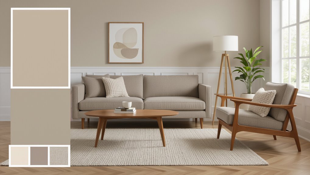
Best Neutral Living-Room Paint Colors
Neutral paint gives your living room a timeless backdrop that lets furniture, art, and textiles take center stage while still adding warmth or coolness as needed.
Choose soft grays, greiges, and warm whites to rely on neutral color psychology—calming, adaptable hues that support mood without dominating.
Opt for soft grays, greiges, and warm whites—calming, adaptable neutrals that support mood without stealing the show.
Cool beiges and pale taupes read modern and pair well with metal and glass, while traditional creams feel elegant.
Test swatches under your light, since undertones change perception.
Follow timeless color trends but prioritize pieces you love; neutrals should showcase your style, anchor the room, and let seasonal accents shift the vibe easily.
Warm Neutrals That Make a Room Feel Cozy
Start with soft beige foundations to create a calm, versatile backdrop that lets your furniture shine.
Then consider warm greige options when you want a modern feel with cozy undertones.
Finish with creamy taupe accents to add depth and a touch of warmth without overpowering the room.
Soft Beige Foundations
When you want a living room that feels warm and inviting without shouting for attention, soft beige is an ideal foundation; its gentle warmth anchors furniture and fabrics while letting accent colors shine.
You’ll appreciate soft beige textures—velvet pillows, linen drapes, woven rugs—that add depth without competing. Choose soft beige pairings like muted greens, terracotta, or navy for contrast.
Keep trim crisp and add layered lighting to avoid flatness. Use these simple strategies to make the room feel lived-in and calm.
- Layer subtle fabrics for tactile interest
- Use accent colors sparingly for balance
- Vary finishes to prevent monotony
Warm Greige Options
If soft beige feels a little too straightforward, consider warm greige for a slightly more sophisticated base that still reads cozy.
You’ll appreciate how warm greige palettes bridge beige and gray, giving walls subtle depth without coldness. Choose warmer undertones if you want an inviting backdrop for wood finishes and brass accents.
Pair cozy greige tones with layered textiles—wool throws, linen curtains—to emphasize comfort. Keep trim a crisp off-white to maintain contrast and prevent muddiness.
Test samples at different times of day; natural and artificial light will reveal undertone shifts so you pick the most flattering hue.
Creamy Taupe Accents
Although it reads neutral at first glance, creamy taupe brings a warm, enveloping softness that makes your living room feel instantly cozy. You can layer it as an accent on a single wall, trim, or built-ins to add depth without overpowering the space.
Use creamy taupe inspiration from fabric swatches and natural fibers to guide undertones, then balance light with crisp white or deeper chocolate hues.
Try these simple creamy taupe combinations to refine mood and texture:
- Pair with warm whites and natural wood for a serene backdrop.
- Accent with muted greens to add organic contrast.
- Add brass fixtures for subtle warmth and shine.
Cool Neutrals for a Modern, Airy Living Room
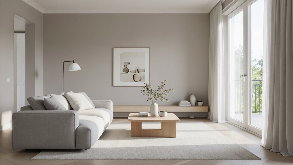
Cool neutrals give your living room a clean, modern feel without feeling cold, blending soft grays, greiges, and muted taupes to create an airy backdrop that lets furniture and art stand out. You’ll find cool neutrals anchor modern palettes, brighten small spaces, and pair easily with wood tones or metal finishes. Choose matte or eggshell for subtle depth, and test samples at different times of day to guarantee warmth. Use layering—rug, throw, pillows—in varying textures to avoid flatness.
| Benefit | Tip |
|---|---|
| Brightens space | Use light-reflective finishes |
| Versatile base | Pair with wood accents |
| Calming mood | Add textured fabrics |
| Easy updates | Swap accessories seasonally |
Best Bold Living-Room Colors for Accent Walls
A bold accent wall can transform your living room by adding drama, depth, and a focal point without overwhelming the space. You can choose vibrant jewel tones—emerald, sapphire, amethyst—to create richness, or try daring color combinations like navy with mustard for contrast.
Pick one wall that complements furniture and light, then balance with neutral surroundings so the accent sings.
- Emerald for warmth and sophistication
- Sapphire for calm intensity
- Mustard paired with navy for energetic contrast
You’ll want durable, washable paint and test samples at different times of day before committing.
Where to Place Accent Colors: Walls, Trim, Ceilings
Those bold accent walls you’ve been considering can do more than anchor a room; where you place color—on full walls, trim, or the ceiling—changes how the space feels and reads. You’ll use accent color placement to draw focus: a single wall creates drama, painted trim sharpens edges, and a colored ceiling lifts or lowers perception. Consider wall texture options—matte hides flaws, eggshell balances sheen, satin cleans easily. Match finish and placement to function and furniture.
| Placement | Effect | Best Finish |
|---|---|---|
| Full wall | Focal point | Matte |
| Trim | Definition | Semi-gloss |
| Ceiling | Height illusion | Satin |
| Partial wall | Subtle accent | Eggshell |
Choosing Paint for Open-Plan Living Spaces
When you’re painting an open-plan space, think of the whole area as a connected canvas: choose a cohesive palette that lets zones read together while allowing subtle shifts to define function.
You’ll aim for color flow and space harmony, using variations in tone rather than stark contrasts. Select a dominant neutral, then introduce accent hues to signal dining, lounging, or workspace. Keep finishes consistent to unify surfaces.
- Use a slightly warmer tint for sociable areas.
- Apply a cooler, muted shade where focus is needed.
- Tie everything together with a recurring accent color in textiles and trim.
Small Living-Room Color Tricks to Appear Larger
If you want your small living room to feel bigger, use color to stretch walls and brighten corners: choose light, warm neutrals on three walls and a slightly paler shade on the wall with the largest window to reflect daylight.
Keep trim and ceiling in a crisp, slightly lighter tone, and introduce slim, low-contrast accents to avoid interrupting visual flow.
Use horizontal stripes sparingly to widen perception, paint alcoves a subtle tint to recede, and pick matte finishes to minimize glare.
These color illusions improve spatial perception, guiding sightlines and making proportions feel airier without changing layout or scale.
Large Living-Room Color Strategies to Feel Cozier
Because large rooms can feel impersonal, use color to tighten the space and invite warmth: pick deeper, muted hues on walls to create intimacy without shrinking scale.
Use deeper, muted wall hues to tighten large rooms and invite warmth without shrinking the scale.
You’ll balance richness with accents and materials that feel lived-in. Add cozy textures and layered lighting to reinforce the effect: rugs, curtains, textured throws, and dimmable fixtures make the room embrace you.
Consider anchoring zones with color and coordinating furniture tones so sightlines feel intentional. Use these tactics together to avoid cold expanses and keep flow natural.
- Choose warm, desaturated wall colors for depth
- Layer fabrics and tactile accessories
- Install layered lighting for adjustable ambiance
Using Two-Tone Living-Room Walls and Trim
While two-tone walls and trim can add depth and structure to your living room, they also let you define scale and mood without heavy décor changes.
You can use two-tone techniques like dividing walls horizontally, painting lower panels darker, or trimming in contrasting shades to highlight architecture.
Pick wall color combinations that balance contrast and cohesion—soft neutrals with a saturated trim or complementary muted hues work well.
Keep ceiling and largest surfaces lighter to preserve openness.
Test samples on different walls, consider lighting at various times, and commit to clean lines with proper tape for a polished, intentional finish.
Paint Colors That Work With Wood Furniture
Two-tone walls and trim have already shown how color can frame and enhance your room’s architecture.
So now let’s look at choosing paints that flatter wood furniture. You’ll aim for color harmony that complements wood tones rather than competing.
Consider contrasts and undertones: warm woods pair with muted greens, cool woods suit soft blues, and rich mahogany thrives with creamy neutrals.
Balance saturation so furniture remains focal. Test swatches near windows and lamps to see shifts through the day.
- Muted sage for warm oak
- Soft blue-gray for cool maple
- Creamy beige for dark cherry
Paint Colors for Upholstered and Leather Sofas
When you pick wall colors for upholstered or leather sofas, think about fabric texture and finish as much as hue—matte, nubby upholstery soaks up color differently than glossy leather, and that affects contrast and mood.
You’ll choose warmer neutrals to cozy up soft fabrics, or cooler, deeper tones to let leather become focal. Consider color contrast to set either subtle harmony or bold separation.
Test paint beside the actual sofa in different light and view from typical seating spots. Check fabric compatibility with undertones to avoid clashes.
Small swatches tell you more than swatches on a screen.
Match Paint to Artwork, Rugs, and Textiles
Keep your walls neutral to anchor the room and let artwork, rugs, and textiles take the spotlight.
Then pull one or two accent hues from those pieces to use on trim, an accent wall, or accessories.
That way your paint ties the room together without competing with the decor.
Anchor With Neutral Walls
Although neutral walls might seem understated, they give your room a cohesive backdrop that lets artwork, rugs, and textiles take center stage. You’ll use neutral color psychology to calm the space and make bold pieces pop without visual competition.
Focus on texture and tone when layering neutrals so everything feels intentional rather than flat. Choose warm or cool neutrals to support your palette, then adjust trim and ceiling shades for subtle contrast.
Consider how light shifts color through the day, and pick finishes that suit your lifestyle.
- Match fabric textures to wall tone
- Use muted patterns for depth
- Balance scale and proportion
Coordinate With Accent Hues
Start by pulling a dominant or secondary color from your artwork, rug, or cushions and use it as a guiding accent for the walls or trim; this creates a purposeful link between surfaces and textiles so the room reads as a curated whole.
Then sample paint next to those pieces to test light and texture. You’ll aim for color harmony by choosing hues that echo undertones rather than match exactly.
Use accent balance: limit bold accents to focal areas like a single wall, trim, or pillows. This keeps the scheme cohesive without overwhelming the space, letting artwork and textiles shine while unifying the room.
Living-Room Paint Colors by Style: Scandi, Mid‑Century, Farmhouse
Whether you prefer the airy simplicity of Scandi, the bold warmth of Mid‑Century, or the cozy charm of Farmhouse, choosing paint that matches your style ties the room together.
You’ll use Scandi simplicity with pale grays or warm whites to maximize light and calm; Mid century vibrancy calls for saturated teals, mustard, and terracotta to energize; Farmhouse warmth favors soft creams and muted greens for comfort.
Consider Color psychology to set mood and Texture contrast—matte, eggshell, or subtle washes—to add depth.
Use color psychology to shape mood, and layer matte, eggshell, or subtle washes for tactile depth.
Match finishes to furniture and lighting so the palette feels intentional and cohesive.
- Scandi simplicity: pale neutrals
- Mid century vibrancy: bold accents
- Farmhouse warmth: soft, muted tones
How to Test Paint Samples Like a Pro
Now that you’ve narrowed styles and hues, test paint samples in the room to see how light and furniture change them. Apply several 12×12″ swatches on different walls at eye level, plus a large poster-board sample you can move.
Observe colors at morning, midday and evening to capture lighting considerations. Live with samples for a few days, viewing near windows and beside lamps. Note undertones against trim, upholstery and flooring.
Take photos under consistent light for comparison. Use paint sample techniques like thinning, layering, and testing sheens to guarantee the final choice complements your space.
Picking Durable, Washable Paint for High-Traffic Rooms
Because high-traffic rooms take more abuse, pick paint formulated for durability and easy cleaning so you won’t be repainting every year.
You want a semi-gloss or satin finish that resists scuffs and wipes clean without fading.
Compare paint brands for stain resistance and coverage, read labels for washable claims, and test samples on walls.
Use maintenance tips like gentle cleaners, prompt spot treatment, and microfiber cloths to extend life.
Choose colors that hide dirt—mid-tones work best.
- Look for “scrubbable” or “washable” on the can
- Compare warranties and coverage among paint brands
- Establish simple maintenance tips routine
When to Choose Low‑VOC and Eco-Friendly Paints
If you or someone in your home has asthma, chemical sensitivities, young children, or you just want a healthier indoor environment, choose low‑VOC and eco‑friendly paints to cut fumes and off‑gassing; they emit far fewer volatile organic compounds than conventional formulas, so you’ll get better indoor air quality during and after painting.
Opt for eco friendly options when you need quick reoccupation, are painting bedrooms or nurseries, or want sustainable materials certified by third parties.
Consider low VOC benefits for allergy sufferers, pets, and energy-efficient homes where reduced indoor pollutants matter.
Read labels, compare certifications, and ventilate while painting.
How Temperature and Season Affect Color Perception
While you mightn’t notice it at first, the season and the temperature in your room change how paint looks: warm sunlight brings out yellow and red undertones, making warm hues appear richer, while cool, overcast light mutes those tones and emphasizes blues and greens.
You’ll see shifts between morning warmth and evening coolness; heating or AC can subtly alter perceived saturation. Use color psychology and seasonal trends to pick shades that feel right year-round. Test samples in different conditions.
Consider these quick tips:
- View swatches at multiple times of day
- Note how heating affects warmth perception
- Rotate accents by season
Avoid 8 Common Living-Room Color Mistakes (And Fixes)
Don’t let overpowering bold hues swallow your space—start by testing swatches in different light.
Check for mismatched undertones between walls and furnishings so colors don’t clash once the sun moves.
And if your lighting’s poor, swap bulbs or add lamps to see true color before committing.
Overpowering Bold Hues
Because bold colors grab attention fast, you can easily let them dominate your living room and leave little room for balance.
You should use bold color psychology to choose hues that energize without overwhelming; pair vivid accents with neutrals to let personality pop. Test samples on different walls and live with them for days before committing.
Use striking color combinations sparingly so focal pieces shine, not shout.
- Anchor a bold wall with soft textiles and wood tones.
- Limit saturated hues to one or two elements, then repeat subtly.
- Introduce metallic or glass accents to diffuse intensity.
Poor Lighting Choices
If your lighting’s off, colors won’t read the way you expect—what looks warm in a showroom can feel flat or jaundiced at home.
You’ll make poor color choices if you ignore how natural and artificial light shift tones across the day. Test samples on multiple walls, observe them morning and evening, and note lighting effects from windows, fixtures, and bulbs.
Choose paints that tolerate low light if your room’s dim, or go slightly cooler for south-facing, bright spaces.
Swap bulbs to match your paint’s warmth, or add layered lighting so the color reads consistently and feels intentional.
Mismatched Undertones
When undertones clash, your carefully chosen hues can fight instead of flatter, making walls, trim, and décor look off even when each piece seems right on its own.
You’ll notice warmth against coolness creating visual tension; aim for color harmony by testing swatches under real light.
Pick one dominant undertone for walls, then match trim and furnishings to that family to restore undertone balance.
If a finish still jars, introduce a neutral that bridges both. Simple swaps fix most issues quickly.
- Test large swatches in different lighting
- Choose one dominant undertone
- Use bridging neutrals to unify elements
Quick Decision Checklist and Where to Buy or Hire Pros
Use this quick checklist to lock in a paint choice and decide who’ll do the job: confirm your room’s lighting and undertones, pick a primary and accent color, test swatches on three walls, set a realistic budget, and choose whether you’ll DIY or hire a pro based on time, skill, and finish quality.
Consider color psychology and current paint trends to match mood and resale value.
Think about how color choices influence mood and resale—follow trends sparingly to balance style with lasting appeal
Shop local paint stores for color-matched samples, big-box retailers for value, or specialty brands for premium pigments.
Hire a licensed painter for complex prep or high-end finishes; DIY smaller rooms if you’ve got steady hands.
Frequently Asked Questions
How Long Does Paint Typically Take to Fully Cure in a Living Room?
Paint typically takes about two weeks to fully cure, though some finishes need up to 30 days; paint curing depends on humidity effects and temperature, so you’ll want good ventilation and low humidity to speed the process.
Can I Paint Over Wallpaper Without Removing It First?
Yes — you can, but assess condition, prep properly, and prime first; removing loose paper improves results, avoiding trapped moisture. For best paint adhesion, prioritize wallpaper removal when damaged, otherwise clean, sand, and use a quality bonding primer.
What Tools Do I Need for a Professional-Looking DIY Paint Job?
You’ll need quality brushes, rollers, roller frames, trays, painter’s tape, drop cloths, sandpaper, spackle, putty knife, primer, and a ladder; learn paint application techniques and color selection tips to guarantee crisp edges, even coverage, and cohesive room results.
How Much Paint Will I Need for a Standard-Sized Living Room?
You’ll need about two to three gallons for a standard-sized living room; calculate paint quantity by measuring room dimensions, multiplying wall area, then dividing by coverage per gallon, and add 10–20% for touch-ups and second coats.
Should I Prime New Drywall Before Applying My Chosen Color?
Yes — you should prime new drywall before applying color. I once skipped priming and saw uneven sheen; priming benefits include uniform absorption and truer choosing colors results, so you’ll save touch-ups and get consistent coverage.
Conclusion
You’ve got the tools—now picture the room. Think about light, undertones, finish, and the mood you want, but don’t decide just yet. Test swatches at different times, stand back, and live with them for days. If something feels off, tweak undertones or try a warmer or cooler shade. When you finally pick the color, the reveal will feel like a small miracle—your living room quietly transformed, ready to welcome whatever comes next.