What Paint Is Best for Living Room Walls?
You’ll get the best balance of durability, cleanability, and a flattering look with a high-quality latex paint in eggshell or satin sheen; these hide minor flaws, resist scuffs, and wipe clean while keeping odors low. Choose satin or semi-gloss where walls see hands or spills, and matte or eggshell for softer, low-traffic spaces. Prime stained or porous surfaces first, pick a premium brand for better coverage, and keep going to learn practical prep and application tips.
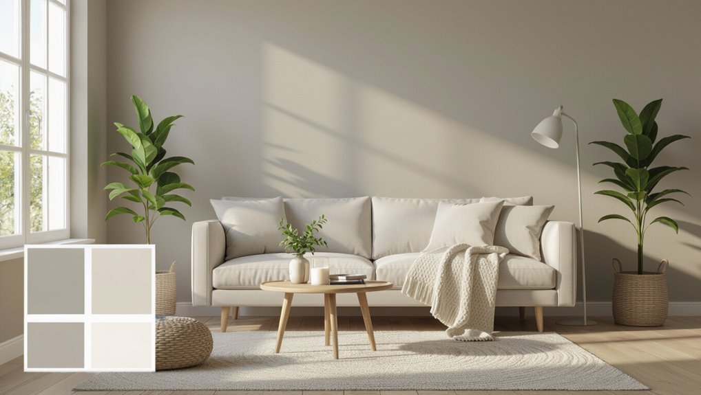
Quick Recommendation: Best Paint for Most Living Rooms

For most living rooms, a high-quality eggshell or satin latex paint is your best choice: it balances a soft, low-sheen finish with durability and easy cleaning, so you get a refined look that stands up to daily wear.
You’ll pick a versatile base that handles light, hides minor imperfections, and wipes clean.
Consider color psychology when choosing hue—warm neutrals soothe, cool tones expand space, and accents energize.
Use satin on trim for subtle sheen and eggshell on walls for gentle depth.
Introduce texture contrast with fabrics, rugs, or a matte accent wall to enrich the room’s feel.
Define Your Goal: Durability, Mood, or Easy Maintenance?
Decide whether you want paint that stands up to wear or paint that looks flawless — you can’t always get both.
If you have kids or pets, pick a durable, washable finish that handles scuffs and frequent cleaning.
If appearance is your priority, you can opt for softer sheens that hide imperfections but may need more careful upkeep.
Durability Vs. Appearance
Think about what matters most: long-lasting finish, the exact mood a color sets, or paint that wipes clean without special care.
You’ll weigh durability considerations against appearance impact: high-quality latex or enamel resists scuffs and holds color, so it’s ideal where wear is likely.
But matte sheens can soften a room’s vibe despite being less forgiving, while satin or eggshell balance resilience with subtle sheen.
Choose based on traffic, furniture proximity, and how bold or calm you want the space to feel.
Decide whether longevity or the precise visual effect takes priority before you buy.
Maintenance And Cleaning
While you’re choosing paint, set a clear maintenance goal—do you want something ultra-durable, a finish that preserves a specific mood, or paint that cleans up with minimal fuss?
Decide if you’ll need frequent wipe-downs or gentle care to keep sheen and color. For kids or high-traffic areas pick scrubbable satin or semi-gloss; for cozy, low-traffic rooms choose matte and accept gentler cleaning techniques.
Follow simple maintenance tips: blot spills immediately, use mild detergent and soft cloths, avoid abrasive scrubbers, and test cleaners in a hidden spot.
Regular dusting prevents buildup and prolongs finish life.
Which Paint Finishes Suit Living Room Walls?
Because your living room gets the most use and attention, choosing the right paint finish matters as much as the color itself: it affects durability, light reflection, and how easy walls are to clean.
You’ll weigh paint finish comparisons: flat hides imperfections but scuffs easily; eggshell balances subtle sheen with modest scrubbability; satin offers durability and gentle glow, great for high-traffic walls; semi-gloss is best for trim or areas needing frequent cleaning.
For sheen recommendations, pick eggshell or satin for general walls, flat for low-traffic textured ceilings, and reserve semi-gloss where moisture or heavy wear demands tougher surfaces.
Which Paint Types Suit Living Rooms? (Latex, Acrylic, Oil)
You’ll find latex paint’s easy cleanup and low odor make it a sensible everyday choice for living rooms.
Acrylics add extra durability and color retention if you want a long-lasting finish.
Oil paints can give a smooth, hard surface and rich sheen, but they need longer drying times and stronger solvents.
Latex Paint Pros
If you want a durable, easy-to-use option for living room walls, latex paint is a great choice because it dries fast, cleans up with water, and resists yellowing over time. You’ll appreciate latex paint advantages like low odor, quick recoat times, and stain resistance. It offers excellent latex paint longevity when properly applied and maintained, so walls stay fresh longer. Use quality primer and proper sheen for durability. Compare finish, cleanup, and durability at a glance:
| Feature | Benefit | Tip |
|---|---|---|
| Cleanup | Water-based | Use soap and water |
| Durability | Resists yellowing | Prep surface well |
| Recoat speed | Fast | Paint multiple coats same day |
Acrylic Paint Benefits
When you want paint that’s tougher and more flexible than standard latex, acrylic is a smart pick for living room walls because it bonds strongly to surfaces, resists cracking, and holds color longer in bright light.
You’ll appreciate acrylic versatility: it adapts to different sheens and substrates, cleans up easily, and dries quickly so you can finish rooms faster. Expect excellent color vibrancy that stays truer over time.
Consider these practical benefits:
- Durable finish that tolerates light wear and frequent cleaning
- Fast drying to reduce project time and recoat wait
- Good adhesion over primed drywall and previously painted surfaces
Oil Paint Considerations
Acrylic’s quick drying and easy cleanup make it a practical choice, but oil paint still has strengths worth considering for living rooms.
You’ll appreciate oil paint advantages like rich, durable finishes, superior leveling that hides brushstrokes, and excellent stain resistance for high-traffic spaces. It produces deeper color depth and lasts longer between repainting.
However, oil paint drawbacks include long drying times, strong fumes, and tougher cleanup requiring solvents. You’ll pay more for material and ventilation.
Choose oil for formal, low-odor-controlled rooms where durability and finish matter; otherwise, modern waterborne options often offer a better balance.
Balancing Durability and Aesthetics: A Decision Framework
Because your living room needs both resilience and style, choosing paint comes down to prioritizing where each quality matters most. You’ll weigh wear resistance against visual impact, using color psychology to set mood while selecting texture options that hide scuffs or add depth.
Ask where traffic, sunlight, and furniture meet walls, then map finish and formulation to those zones.
- High-traffic accent walls: durable, easy-to-clean to protect focal areas.
- Low-traffic feature walls: richer pigments and tactile textures for drama.
- Connecting zones: compromise with mid-durability, balanced hue for cohesion.
Make choices room-by-room, not one-size-fits-all.
Which Sheens Hide Imperfections vs. Which Clean Easily?
Although sheens don’t change color, they change how flaws and dirt show up on your walls, so you’ll want to pick finishes based on whether you need to hide imperfections or clean frequently.
For a sheen comparison, flat and matte offer the best imperfection camouflage, masking bumps and repaired areas but resisting scrubbing.
Eggshell softens textures while giving modest cleaning ease for light cleaning.
Satin and semi-gloss reflect more light, highlighting flaws yet offering superior cleaning ease for fingerprints and scuffs.
Choose based on room use: prioritize flat/matte for hiding flaws, satin/semi-gloss where regular wiping keeps walls fresh.
Paint for High-Traffic Family Living Rooms
For high-traffic family living rooms, you’ll want a durable, washable finish that stands up to daily wear and scrubbing.
Look for stain-resistant paint formulas that repel spills and resist marks.
Choose easy touch-up colors or matching swatches so repairs blend seamlessly when kids or pets leave their marks.
Durable, Washable Finishes
When you need walls that stand up to sticky hands, pet noses, and daily scuffs, choose paints labeled durable and washable—they’re formulated to resist stains and scrub without losing finish.
You’ll want a finish texture that balances cleanability with muted sheen; eggshell or satin often works best.
Think about color psychology too—calming neutrals hide wear and keep energy steady.
Practical tips:
- Choose satin or eggshell for easy wiping and low glare.
- Test small swatches to check how color and sheen hide marks.
- Use quality primer to guarantee topcoat adhesion and longer wear.
These choices keep your living room looking fresh.
Stain-Resistant Paint Options
If your living room sees lots of spills, fingerprints, and pets, pick stain-resistant paints designed to repel grime and tolerate repeated cleaning.
You’ll want formulations labeled “stain-resistant” or “scrubbable,” often featuring tougher binders and washable finishes for superior paint durability.
Look for low-VOC or eco friendly options that balance performance with indoor air quality, especially in family spaces.
Test samples by spilling a little water or mild detergent and wiping after it dries to judge how the finish holds up.
Choose a satin or semi-gloss sheen where durability matters; they resist marks and make maintenance straightforward without heavy upkeep.
Easy Touch-Up Colors
Because high-traffic family rooms get scuffs and smudges fast, choose paint colors and finishes that make touch-ups nearly invisible and effortless. You’ll want hues that hide marks and blend with natural wear, so focus on mid-tone neutrals and soft patterns.
Prioritize easy touch ups and color durability by keeping a small labeled can of your exact mix.
- Warm greige for forgiving stains and subtle variation
- Muted sage to mask fingerprints and maintain warmth
- Deep taupe for resilience in play or TV zones
With the right shade and satin or eggshell finish, repairs vanish.
Low‑VOC and Eco‑Friendly Paints for Living Rooms
Although paint choices often focus on color and finish, you’ll want to contemplate low‑VOC and eco‑friendly options for your living room because they cut down on odors, indoor air pollution, and long‑term health risks.
You’ll find water‑based acrylics and natural paints labeled as eco friendly options that reduce off‑gassing. Check product data sheets and third‑party certifications, and compare VOC levels to local VOC regulations to guarantee compliance.
Low‑VOC paints now offer durable, washable finishes and good coverage, so you won’t sacrifice performance. Choose a reputable brand, ventilate during application, and allow adequate cure time before heavy use.
Primer: How It Affects Coverage and Color Accuracy
After choosing a low‑VOC or natural paint, you’ll want to prime the walls to lock in stains, equalize porosity, and give your topcoat a consistent surface to grab onto.
Primer improves adhesion, reduces the number of topcoats, and prevents tannin bleed through. Choose primer types based on substrate: high-adhesion for slick surfaces, stain-blocking for water or smoke marks, and universal primers for fresh drywall.
Coverage effects vary: some primers hide previous colors better, others thin out requiring extra coats.
Consider these quick scenarios:
- New drywall: drywall primer for even absorption
- Stained wall: stain-blocking primer
- Glossy surface: bonding primer
How Sheen Changes Color Perception in Different Light
Pay attention to sheen because matte and gloss finishes make the same color read very differently—matte softens and hides flaws while gloss boosts contrast and reflection.
You’ll notice gloss can make hues look richer and slightly darker under direct light, whereas matte keeps tones more muted and consistent.
Test your chosen sheen in the room’s lighting to see how it shifts the hue before you commit.
Matte Versus Gloss Contrast
When you change a paint’s sheen, you change how light interacts with the surface—and that shifts how a color looks in your living room.
You’ll notice matte benefits like hiding imperfections and softening light, while gloss drawbacks include amplified reflections and showy texture.
Decide based on activity, light, and desired mood. Consider these visual outcomes:
- Matte: absorbs light, mutes tone, creates cozy backdrop.
- Satin/eggshell: slight sheen, livelier color without harsh shine.
- Gloss: reflects light, boosts vibrancy, highlights every brushstroke.
Choose matte for calm, gloss for impact, and satin for balance.
Sheen Impact On Hue
Sheen doesn’t just change texture—it shifts how you perceive a color under different lighting.
You’ll notice that higher sheens reflect more light, making hues appear brighter and slightly cooler, while lower sheens absorb light, deepening and warming tones.
When picking paint, test swatches at different times of day to see sheen effects on color perception across natural and artificial light.
Consider room orientation, bulb temperature, and furnishings, since gloss can highlight imperfections and alter contrast.
Choose a sheen that complements the mood you want—soft and cozy with matte, crisp and lively with eggshell or satin.
How to Read Paint Samples and Test Swatches at Home
Curious how a small swatch can change the whole room? You’ll rely on paint sample techniques to judge true color. Apply large cards, test directly on walls, and view at different times to note color perception impact. Take notes and photos for comparison.
Curious how a small swatch can transform a room—test big, live with patches, and compare at different times.
- Tape 6″x6″ cards in key spots
- Paint 12″x12″ patches and live with them for 48 hours
- Compare swatches against furniture and trim
Don’t trust the chip alone; observe edges and saturation. Record which selections feel balanced and eliminate options that clash. Decide when a sample reads right, not just attractive on paper.
How Natural and Artificial Lighting Affect Paint Color
Because light shifts throughout the day, the same paint can look warm and cozy in morning sun and flat or cool by evening — so check swatches at different times and under both daylight and indoor lamps.
You’ll notice light temperature affects how pigments read: cool daylight pulls blues and greens forward, while warm bulbs boost reds and yellows.
Position samples where natural and artificial light mix, and observe color perception from multiple angles.
Dimmer settings change saturation, so test with real fixtures and lamps you use nightly.
Trust your eyes over labels; lighting, not paint names, will define the room’s feel.
Choosing Paint Colors for Small, Medium, and Large Rooms
When you pick paint for a room, scale matters as much as shade: small spaces benefit from lighter, cooler tones that visually expand, medium rooms handle a wider range of hues and accents, and large rooms can take darker, richer colors without feeling cramped.
Consider color psychology and room dimensions when choosing finishes, then use these quick guidelines to guide decisions:
- Small: pale blues, soft greys, satin sheens to reflect light and open sightlines.
- Medium: versatile mid-tones with warm or cool accents to balance proportion.
- Large: deeper, moodier hues to add intimacy while maintaining scale.
Best Paint Choices for Accent Walls and Contrasting Trim
Looking to make a focal point without repainting the whole room? You can pick an accent wall ideas approach: choose a deeper hue of your main color or a bold complementary shade to draw eyes.
For trim, use contrasting colors like crisp white or a darker tone to frame architectural details and add polish. Matte or eggshell on the accent wall reduces glare; satin on trim offers durability and easy cleaning.
Test samples on different walls and observe them in morning and evening light. Keep the rest of the room neutral to let the accent and trim communicate confidently.
Matching Paint to Furniture and Flooring Tones
When you pick paint, think about whether your furniture and floors run warm or cool so the room feels cohesive.
You can use contrast to make pieces pop or harmony to create a calm, blended look.
Test samples next to your actual wood tones and upholstery to see how the colors interact in your light.
Warm Vs Cool Tones
Although you might be tempted to pick a paint color you simply like, matching warm or cool wall tones to your furniture and flooring will make the whole room feel cohesive; you’ll shape mood and flow by choosing tones that echo existing materials.
Use warm color psychology to enhance wood, leather, and brass, creating a cozy, inviting space. Choose cool color associations to complement stone, metal, and gray fabrics for a calm, airy vibe.
Imagine these scenarios:
- Sunlit oak floor with terracotta sofa and amber accents
- Slate tiles with navy sofa and chrome lamps
- Pale ash wood with mint textiles and silver frames
Contrast And Harmony
Because your furniture and floors set the visual weight of the room, you’ll want paint that either complements them or deliberately contrasts to create focal points.
You’ll decide based on scale and mood: use contrast techniques like accent walls, trim in a deeper shade, or a bold saturated hue against neutral upholstery to draw the eye.
For a restful look, apply harmony elements—soft neutrals, undertone matching, or coordinated sheen levels—to tie wood grains and textiles together.
Test samples at different times of day, view them near key furniture pieces and flooring, and choose the approach that balances cohesion with purposeful drama.
Cost vs. Quality: When to Splurge on Premium Paint
If you want paint that lasts, looks better, and hides imperfections, splurging on premium brands often pays off.
You’ll balance upfront cost against a cost advantage over time: premium paint uses quality materials and performance features that boost paint durability and aesthetic value.
Consider whether the room’s use and your timeline make it a long term investment or if budget friendly options suffice.
Think about touch-up frequency, cleaning needs, and light exposure before deciding to splurge.
- Fewer coats, better coverage
- Easier cleaning, resistant finish
- Stronger hide for flaws and color fidelity
Recommended Paint Brands and Product Lines for Living Rooms
When you pick paint for your living room, focus on brands and product lines known for true-to-color pigments, durable finishes, and smooth coverage so you get the look and longevity you expect.
Choose Benjamin Moore Aura or Regal for rich pigments and stain resistance, or Sherwin-Williams Emerald for durability and wide color psychology-friendly palettes.
If you want eco-friendly options, try Farrow & Ball’s low-VOC Estate Emulsion or Behr’s Marquee low-odor formulas.
For budget-conscious quality, Valspar Reserve performs well.
Sample swatches under your room’s light, and prioritize washable, fade-resistant lines that match your lifestyle and design goals.
Prep and Application Tips for a Flawless Painted Finish
You’ve picked a paint line that fits your room’s look and needs—now get the surface ready so that color and finish perform their best. Good surface preparation prevents peeling, hides imperfections, and helps your chosen color psychology read true.
Patch holes, sand gloss, and clean dust; prime where needed.
- Repair cracks, sand smoothly, wipe with a damp cloth.
- Use painter’s tape, drop cloths, and a quality angled brush for edges.
- Roll in a “W” pattern, maintain a wet edge, apply two thin coats.
Let each coat dry fully and inspect in varied light before declaring done.
Cleaning, Maintenance, and Common Painting Mistakes
Although regular dusting and quick spot-cleaning won’t solve every problem, keeping your living room walls clean and performing basic maintenance will extend paint life and keep colors true.
Use gentle cleaning techniques: soft microfiber, mild detergent, and a rinse to remove grime without abrading finish.
Follow maintenance tips like touching up scuffs promptly and inspecting caulking and trim annually.
Avoid common mistakes: scrubbing too hard, skipping primer, or choosing the wrong sheens for high-traffic areas.
Your paint selection matters—pick washable, durable formulas for living rooms so routine cleaning won’t dull color or damage the surface.
Frequently Asked Questions
Can I Paint Over Wallpaper Without Removing It First?
Yes—you can often paint over wallpaper, but it depends on wallpaper types and condition; you’ll need to guarantee seams are sealed, clean glossy surfaces, prime for paint adhesion, and use proper products to avoid bubbling or peeling.
How Long Should I Wait Before Moving Furniture Back In?
Measure twice, act once. You should wait at least 48–72 hours for drying time before furniture placement, longer if humidity’s high or paint’s deep; gently test a corner, and don’t rush to avoid sticking or smudging.
Can Paint Smell Trigger Allergies or Asthma After Drying?
Yes — paint fumes can still trigger allergies or asthma after drying; you’ll want to improve air quality, maintain indoor ventilation, and avoid strong-VOC paints. You’ll reduce allergy triggers by airing rooms and using low-odor products.
Are Special Paints Needed for Rental Properties With Strict Rules?
Yes — you’ll often need special paints that meet rental restrictions, and coincidentally temporary colors designed for easy removal make that simple; choose low-VOC, washable, peelable or primer-backed options so you won’t damage walls.
How Often Should I Repaint to Maintain Color Freshness?
You should repaint every 3–7 years to prevent color fading; high-traffic or sunlit rooms need shorter repaint frequency, while low-use spaces can wait longer. You’ll refresh finish, cover wear, and maintain consistent color.
Conclusion
You’ve got the know-how now—so pick the finish that fits your life, the paint that matches your budget, and the prep that prevents headaches. But before you rush to the brush, pause: think about how the room will feel, how often it’ll be wiped down, and whether light or family traffic will test your choice. Make that final decision slowly, then watch the color transform the room—quietly, brilliantly, for years.