Which Walls to Paint? Interior Guide
You’ll get the biggest payoff by painting high-visibility walls first—think entryways, a living-room feature wall, or the wall behind the bed—and pick the largest, least-prepped surface that ties to your room’s purpose and light. Define your goal—mood, focal point, or concealment—then test swatches at different times of day. Lighter hues expand small rooms; accent walls add depth. Start with one bold move and you’ll find the rest of the plan falls into place as you explore more.
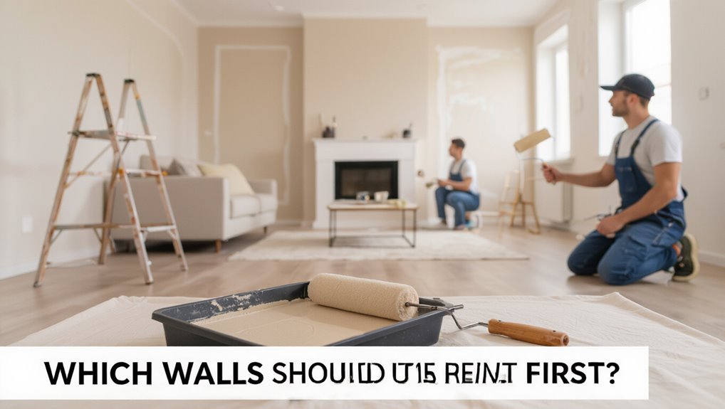
Which Walls Should You Paint First?
Wondering which walls to tackle first? You’ll prioritize focal walls and high-visibility areas—entryways, living-room feature walls, and the wall behind your bed.
For efficient wall selection, choose surfaces that set the room’s tone and won’t require extensive prep, like minimal patching. Start with the largest, most impactful wall to establish your color strategy and test swatches under different light.
Pick walls that set the room’s tone and need little prep; begin with the largest, most impactful surface to test color.
Save cramped corners and utility walls for later; they’re low priority and useful practice.
Painting primary walls first helps you commit to a palette, adjust contrast, and streamline the rest of the project without redoing work.
Quick Framework: Decide Paint Goals and Constraints
Now that you’ve picked the walls that will shape the room, decide what you want the paint to do and what limits you’re working with.
First, state the paint purpose: mood setting, focal emphasis, concealment, or coordination with furnishings.
Note practical constraints—budget, finish durability, lighting, and time for coats.
Use color psychology to guide emotional impact: calming blues for rest, warm tones for energy, neutrals for flexibility.
Balance ambition with constraints: prioritize high-impact walls if budget or time is tight.
Make a short checklist of goals, non-negotiables, and trade-offs before testing samples on selected walls.
How Room Size Changes Your Painting Choices
In a small room, what you paint can make the space feel larger or tighter, so you’ll want to contemplate perceived space effects carefully.
Lighting changes how color reads at different scales, so test swatches under natural and artificial light before committing.
Think about scale—trim, accent walls, and patterns all interact with room size and light to shape the final feel.
Perceived Space Effects
Small changes in paint — like a darker accent wall or a brighter ceiling — can make a room feel noticeably larger or cozier. So you’ll want to choose colors with the space’s dimensions in mind.
You use perceived space tactics via color psychology: lighter hues expand, richer tones hug. Maintain spatial awareness by balancing color saturation and wall textures to avoid overwhelming corners.
Add visual interest with a single textured or saturated wall while keeping others muted to preserve design cohesion. These choices shape room atmosphere, guiding how open or intimate a space seems without altering structure.
Lighting And Scale
Those perceived-space choices work hand in hand with lighting and scale, because how a color reads depends on both room size and light levels. You’ll use lighting techniques and respect scale impact when picking walls to paint.
Smaller rooms need lighter hues and balanced artificial light; large rooms tolerate bold accent walls and layered daylight. Consider how ceilings, furniture, and window size change perception.
- Use bright, cool paint with ample task lighting for small kitchens
- Warm tones plus dimmable layers in cozy nooks
- Dark feature walls in expansive living areas
- Reflective finishes to amplify light
- Match trim contrast to ceiling height
How Natural Light Should Shape Wall Color
Wondering how sunlight should steer your paint choices? You’ll use natural light to decide hue, tone, and finish.
Observe light quality at different daytimes and note wall reflection—bright north light softens warm tones, while southern sun intensifies them.
In low-light rooms, pick lighter, warmer colors and satin or eggshell finishes to boost bounce.
In intensely lit spaces, cooler or deeper shades prevent glare and fading; flatter finishes reduce sheen.
Test samples on the actual wall and watch them across hours; that live trial reveals undertones and durability, helping you choose colors that feel consistent and intentional.
When Should You Paint All Walls the Same Color?
If your space is small or open, painting all the walls the same color can make the room feel larger and more cohesive.
You’ll also want a uniform palette in rooms that flow into one another to maintain a consistent visual rhythm.
And if your furnishings are neutral or simple, a single wall color lets textures and accents take center stage.
Small Or Open Spaces
In small or open-plan rooms, painting all the walls the same color can simplify the space and make it feel larger and more cohesive. You’ll get a seamless flow that reduces visual clutter and lets furniture and accents stand out.
Use color psychology and color harmony to choose hues that boost space perception and calm traffic between zones. Consider wall textures and paint finishes to add interest without breaking cohesion. Rely on accent techniques sparingly to create focal points and maintain visual balance.
- Choose a light, warm palette
- Match sheen for consistency
- Layer texture subtly
- Use minimal accents
- Test samples in daylight
Consistent Flow Rooms
When rooms flow into one another—like an open-plan kitchen and living area or a series of connected hallways—painting all the walls the same color creates a seamless backdrop that clarifies sightlines and makes the whole layout feel larger and intentionally curated.
You should match walls when you want strong color flow and easy room shifts, establishing cohesive themes that guide movement. Uniform paint supports spatial harmony and visual continuity, reinforcing design rhythm across areas.
Use texture variation, furnishings, and accents to prevent monotony while letting wall dynamics read as one coherent canvas, simplifying decisions and emphasizing architectural flow.
Neutral Or Simple Decor
Extending the idea of unified rooms, you’ll find that neutral or simple decor pairs perfectly with painting all walls the same color because it reinforces calm and lets furnishings take center stage.
You’ll choose uniform walls when you want cohesion, light reflection, and an unobtrusive backdrop for art or texture. Neutral color palettes and simple decor styles amplify spaciousness and let accents pop.
Consider these scenarios:
- Small rooms needing visual expansion
- Open-plan spaces requiring unity
- Galleries or art-focused areas
- Rentals where flexibility matters
- Bedrooms aiming for restful ambiance
Paint all walls the same when simplicity and versatility matter most.
How to Create an Effective Accent Wall
Although choosing a single wall might seem simple, an effective accent wall should draw the eye, complement the room’s focal point, and balance color and texture without overwhelming the space.
An accent wall should attract the eye, support the room’s focal point, and balance color and texture subtly.
You’ll start by picking accent colors that tie into existing textiles and finishes. Test swatches in different light, then choose a finish—matte for subtlety, satin for depth.
Introduce interest with restrained wall patterns or a bold paint technique, but keep furniture and décor calmer. Use trim or molding sparingly to frame the wall.
Finally, step back and live with it for a few days before committing.
Which Wall Makes the Best Focal Accent?
Which wall should you pick as the focal accent? Choose the wall that naturally draws attention—usually the one you face on entry or behind a main furniture piece.
Use the focal wall to anchor the room with accent colors, not overwhelm it. Consider sightlines, lighting, and function.
- Wall you see first when entering
- Wall behind the sofa or bed
- Wall with the largest uninterrupted space
- Wall that gets the best natural or spotlighting
- Wall opposite a window for balanced contrast
Pick a color that complements surrounding tones, then test samples at different times of day.
Use Paint to Highlight Architectural Features
Once you’ve chosen a focal wall, you can use paint to call out the room’s architectural details—molding, built-ins, alcoves, or fireplace surrounds—and make them read as intentional design elements rather than afterthoughts.
Pick a hue that contrasts subtly with surrounding walls to draw attention without overwhelming the space. Use darker tones in recessed areas to create depth or lighter shades on protruding features to bring them forward, highlighting textures and emphasizing symmetry where present.
Be deliberate: test swatches at different times of day, keep finishes consistent for cohesion, and let paint reveal the architecture’s best lines.
When to Paint Trim, Baseboards, and Moldings
When should you paint trim, baseboards, and moldings? You’ll tackle trim painting when walls change color, baseboard styles shift, or molding finishes wear.
Timing depends on color coordination goals, desired texture contrast, and current paint sheen. Consider maintenance tips and evolving design trends before you start.
- Fresh wall color? update trim to match paint sheen.
- Switching to modern baseboard styles? repaint for cohesion.
- Damaged molding finishes? repair, then repaint.
- Want texture contrast? choose matte or semi-gloss strategically.
- Routine refresh: every few years per wear and maintenance tips.
Plan for cohesive results and efficient work.
Should You Paint the Ceiling a Different Color?
Curious whether you should paint the ceiling a different color? You can—doing so defines space, highlights architectural details, or softens overhead surfaces.
Choose a ceiling color that complements walls; lighter shades open a room, while a slightly richer tone adds warmth without overwhelming.
Pick a ceiling hue that complements the walls—lighter tones broaden, while a richer shade adds cozy warmth without overpowering.
Use paint contrasts sparingly: strong contrasts suit focal areas like dining rooms or accented beams, but could feel heavy in small spaces.
Test samples on different walls and view them at various times of day.
Keep finish in mind—flat hides imperfections, satin reflects light.
Ultimately, pick what supports your room’s function and mood.
How Color Affects Perceived Room Depth
Choosing ceiling color can change how a room feels, but wall color plays an even bigger role in how deep a space appears. You’ll use color psychology and hue selection to shape spatial perception and create depth illusion.
Consider wall warmth and color saturation to push or pull surfaces, balancing color harmony and light reflection for visual expansion and room atmosphere.
- Cool, low-saturation hues recede
- Warm, saturated hues advance
- Monochrome palettes simplify depth cues
- Accent walls change perceived distance
- Trim and ceiling contrast amplify edges
Apply choices deliberately to control perceived room depth.
Which Walls to Paint in Open-Plan Spaces?
Which walls should you paint first in an open-plan space to define zones without fragmenting flow? Start by choosing a focal boundary—like the wall behind a sofa or breakfast bar—and treat it as an accent wall to anchor the area.
Use color psychology to assign mood: calming blues for relaxation zones, energizing yellows near work or dining. Keep adjacent walls lighter or neutral to maintain cohesion and sightlines.
Paint connecting walls in diluted tones of your accent to link spaces subtly. Prioritize visible boundaries from major sightlines and maintain consistent trim and ceiling tones so the layout reads as one harmonious whole.
Let Furniture Decide Which Wall to Paint
Let your largest or most important piece anchor the wall you choose so the color feels intentional.
Match paint intensity to the scale of your furniture to keep the room balanced.
Use paint to highlight key pieces—think behind a sofa, bed, or console—to make them pop.
Anchor Wall Choice
Sometimes the simplest way to pick an anchor wall is to follow your furniture—place your largest piece against the wall you want to highlight and paint it to create an instant focal point.
You’ll use an accent wall to frame sofas, beds, or consoles, tapping color psychology to set mood. Choose a wall that won’t fight sightlines or doors, and test swatches at different times of day.
Consider these quick checks:
- Visibility from entry points
- Backdrop for key furniture
- Natural light interaction
- Connection with adjoining rooms
- Ease of repainting or updating
Let the room’s purpose guide your choice.
Balance With Scale
If your furniture helped you pick an anchor wall, now let scale refine that choice: pick the wall that balances the room’s largest pieces so they don’t overwhelm or disappear.
Consider sofa depth, bookcase height, and media cabinets; position paint where those items create scale harmony with surrounding space.
Use wall proportions to judge whether a bold color will anchor a heavy couch or make a slender console vanish.
Step back and view arrangements from doorways and seating zones.
If one wall restores visual equilibrium between tall and low elements, paint it—your furniture should determine the wall that keeps the room feeling balanced.
Highlight Key Pieces
Think about the furniture you want to spotlight and choose the wall that makes those pieces sing: a painted backdrop can sharpen a sofa’s silhouette, raise a bookshelf’s presence, or turn a favorite artpiece into a focal point.
Let furniture decide: position the couch or cabinet against the painted wall so you’re highlighting textures and accentuating patterns already in the room. Choose contrast for drama or a tonal shade for cohesion.
Test swatches behind pieces, consider lighting, and keep traffic flow clear. Use paint to frame, not overpower.
- Pick the wall behind main seating
- Paint behind tall furniture
- Match trim subtly
- Test swatches in light
- Keep sightlines clear
Which Walls to Paint in Small Rooms & Bathrooms?
Wondering which walls to paint in a small room or bathroom? You’ll usually want lighter hues on most walls to open the space, using color psychology to choose calming neutrals or soft pastels.
Paint the wall behind a vanity or a bed as an accent wall to add depth without overwhelming. In tight bathrooms, paint ceilings a shade lighter than walls to lift the room. Keep trim and doors crisp for contrast.
If you crave drama, confine darker colors to a single wall or recessed niche. Test samples in varied light before committing to avoid shrinking the feel.
Which Walls to Paint in Large Living Rooms?
Looking to make a large living room feel inviting without losing its scale? You’ll want to focus on color contrast and wall balance to define areas and keep openness.
Paint an accent wall behind seating to anchor the room, or choose a deeper hue on the fireplace wall for a focal point.
Consider two-tone treatments—darker lower walls, lighter upper—to add warmth without shrinking space. Use trim or molding in a contrasting shade to tie zones together.
Finally, test samples at full size to guarantee the balance reads right from different angles.
- Anchor a seating wall
- Accent the fireplace
- Two-tone lower/upper
- Contrasting trim
- Full-size samples
Which Walls to Paint in Bedrooms for Relaxation?
When you want your bedroom to feel restful, start by choosing calming colors like soft blues, muted greens, or warm neutrals.
Consider placing an accent wall behind the headboard to anchor the room without overwhelming it.
Also factor in natural light—brighter rooms can handle richer hues while dimmer spaces benefit from lighter, reflective tones.
Calming Color Choices
If you want your bedroom to feel truly restful, choose cool, muted tones like soft blues, muted greens, or warm grays that help slow your breathing and calm the mind.
You’ll create serene shades and soothing tones that encourage sleep, so pick hues with low saturation and medium lightness. Paint all walls in one soft color for cohesion, or subtly vary nearby tones for depth without distraction.
Consider finishes—matte hides imperfections and limits reflection. Use natural fabrics and simple decor to complement the palette.
- soft blue
- muted green
- warm gray
- pale lavender
- creamy beige
Accent Wall Placement
After choosing calming hues, decide where an accent wall will best reinforce restfulness rather than distract. Place it behind the bed to create a visual anchor that promotes calm and frames sleep rituals.
You’ll want modest color contrast—softly deeper tones rather than high drama—to avoid overstimulation. Consider wall texture: matte paint or subtle plaster so light isn’t bouncing wildly and patterns remain subdued.
If your room is small, avoid wrapping the accent around multiple walls; keep it singular to preserve spaciousness. Test swatches at night and day to guarantee the placement soothes across activities like reading and winding down.
Natural Light Considerations
How much natural light floods your bedroom will shape which walls you paint, so look at morning and evening sun before picking a hue.
You’ll consider natural light effects and color temperature to create a relaxing space. Face the wall you want emphasized toward the brightest exposure, or choose cooler tones on shaded walls to balance warmth.
For calm, pick muted colors and test samples at different times. Remember to factor in window size and reflective surfaces.
- Observe sun patterns for a week
- Test paint swatches morning and night
- Use cooler hues on sunny walls
- Choose warmer tones on north walls
- Consider finish for glare
Which Walls to Paint in Kitchens and Dining Areas?
Which walls should you paint to make your kitchen and dining area feel cohesive and functional? Focus on a primary wall behind key features—an accent wall behind the stove, island, or dining table draws attention and anchors the space.
Paint surrounding walls in a complementary neutral to preserve color harmony, letting cabinetry and backsplashes pop.
In open-plan layouts, use the same palette on shared walls to unify zones; vary finish or depth to define function without visual clutter.
For small kitchens, lighter tones on most walls expand space while a single darker accent adds depth and personality.
Which Walls to Paint in Hallways and Entryways?
Start by thinking about the first wall you see when you come in, since it sets the tone for the whole home.
Consider using an accent wall to add personality without overwhelming narrow spaces.
Don’t forget staircase and landing walls, which offer vertical drama and continuity between floors.
First Wall You See
Ever noticed the wall you see first when you walk in sets the tone for the whole house? You want that entry wall to create strong first impressions and deliver visual impact without overwhelming the space.
Choose a color that complements adjoining rooms, balances light, and reflects your style. Consider texture, finish, and scale to guide attention.
Quick checklist to decide:
- Contrast with nearby walls
- Durable, easy-to-clean finish
- Lighting that enhances color
- Artwork and hardware placement
- Proportion relative to foyer size
Paint that first wall thoughtfully and you’ll welcome visitors with confidence.
Accent Wall Opportunity
Curious where an accent wall will do the most good? You’ll want a hallway or entry that naturally draws the eye—end walls, short runs, or spaces behind console tables. Choosing accent wall colors can highlight architecture, add depth, and set mood. Accent wall benefits include directing flow, adding personality, and making small areas feel intentional.
| Location | Effect |
|---|---|
| End wall | Focal point |
| Behind table | Anchors decor |
| Short run | Adds depth |
| Narrow hall | Widens visually |
| Entry alcove | Welcomes guests |
Staircase And Landing Walls
A staircase and its landing act like a visual spine for your home, so paint choices should reinforce movement and sightlines; concentrate color on the wall faces you see while ascending and at the landing to create continuity, highlight architectural details, or pause the eye with a contrasting hue.
You’ll use staircase aesthetics and landing colors to guide rhythm and focus. Consider scale, light, trim, and safety when choosing tones.
- Emphasize the wall you face mid-climb
- Use a continuous hue to unify flights
- Paint the landing for a destination feel
- Highlight balustrades with contrast
- Keep stair treads and risers practical
How to Choose Paint Finishes by Wall Type
Different wall surfaces demand different finishes, so match the paint sheen to the room’s function and texture to get the best look and durability.
Match paint sheen to each room’s texture and use for the best appearance and lasting durability.
For smooth plaster in living areas, choose an eggshell or satin sheen—these balance subtle luster and paint durability while showing minimal imperfections.
In high-traffic zones like hallways or kids’ rooms, go semi-gloss for easier cleaning.
Textured walls hide flaws, so flat or matte works and keeps surfaces from looking blotchy.
Bathrooms and kitchens need moisture-resistant semi-gloss on trim and lower walls.
Always test a small patch to confirm the finish flatters your wall texture and use.
When to Use Bold Colors vs Neutrals
Now that you’ve matched sheen to surface and function, think about how color affects mood and perceived space.
You’ll choose bold color psychology when you want drama, focus, or energy, and neutral color versatility for calm, flow, or resale appeal.
Consider scale, light, and purpose: bolds shrink visually but add character; neutrals expand and coordinate.
Use contrast sparingly and test swatches.
Quick checklist to decide:
- Room purpose: active vs restful
- Natural light: bright vs dim
- Furniture: statement pieces or subtle backdrop
- Long-term plans: trend vs timeless
- Accent strategy: single wall or all-over
Trust sight tests before committing.
Use Patterns and Murals: Which Wall Gets the Art?
Where should you place a pattern or mural to make the biggest impact without overwhelming the room? Consider mural placement on a single dominant wall—behind a bed, sofa, or fireplace—to create focal points and strong visual impact.
Use pattern selection that complements existing furniture and scale; smaller rooms suit subtle repeats, larger spaces handle bold motifs.
Prioritize art integration with surrounding elements, maintaining color harmony and texture variety so the wall feels intentional, not tacked on.
Keep design balance by limiting competing features and allowing negative space to breathe; that controlled contrast guarantees your mural or pattern reads as deliberate, not chaotic.
Match Wall Color to Floors and Rugs
When you pick a wall color, check that the undertones harmonize with your floors and rugs so warm or cool tones don’t clash.
If your rug has a bold pattern, balance it with a more muted wall shade to keep the room from feeling busy.
Use contrasting colors sparingly to add depth and highlight architectural features.
Consider Undertone Harmony
Because your floors and rugs set the room’s base, match wall undertones to them so colors feel cohesive rather than clashing.
You’ll use color temperature and harmony theory to guide choices: warm woods pair with warm undertones, cool grays suit cool floors.
Check samples in different lights, and lean subtle to let textures sing.
- Hold a swatch against the rug in daylight
- Note warm vs cool biases on wood grain
- Test large samples on multiple walls
- Aim for undertone echoes, not exact matches
- Consider trim as a buffer between tones
Balance Patterned Rugs
Start by letting the rug lead: patterned rugs set a strong color story, so match your wall to their dominant or background hue to keep the room feeling unified rather than busy.
You’ll assess rug colors and decide which tone reads as main or secondary. Use pattern placement to guide where the eye rests—paint walls to echo the rug’s calmer fields, not its small accents.
Low-contrast wall shades let furniture and art pop while preserving cohesion with floors. If the rug is bold across a hallway, choose subtler wall tones to avoid visual fatigue and maintain spatial flow.
Contrast For Depth
If you want to add depth, contrast your walls with the tones in your floors and rugs so surfaces read as distinct layers rather than a single flat plane.
You’ll improve depth perception by choosing wall hues that either warm or cool against flooring, creating clear separation without fighting the room’s palette. Aim for balanced color contrast to guide the eye and define zones.
Consider these quick strategies:
- Pick a wall shade two to three steps lighter or darker than the rug.
- Use cool walls with warm wood floors, or vice versa.
- Anchor with a darker accent wall.
- Test swatches in different light.
Which Paint Choices Help Resale Value?
Thinking about resale, which paint choices actually help you get the best return? You’ll boost resale appeal by choosing neutral, widely appealing hues—soft grays, warm beiges, and clean whites—that let buyers envision their style.
Follow current market trends: subtle contrasts and muted accent walls sell better than bold, personal colors. Use high-quality, durable finishes that resist scuffs in high-traffic areas and freshen trim for a crisp look.
Avoid overly trendy or niche palettes that date quickly. Stick to consistent colors throughout open spaces to make the home feel larger and moveable, helping buyers justify higher offers.
How Lighting Fixtures Change Painted-Wall Choices
How will fixtures affect the way paint reads in your rooms? You’ll notice lighting influence instantly: fixture styles and color temperature change color perception and mood setting.
Consider brightness levels and fixture placement to manage wall reflections and shadow play. Match bulbs to paint undertones for desired ambiance effects.
- Choose warm or cool bulbs to tweak hues.
- Use directional fixtures to sculpt texture and shadow play.
- Add dimmers for adjustable brightness levels and mood setting.
- Select fixture styles that complement paint sheen for coherent wall reflections.
- Place fixtures to avoid glare and preserve true color perception.
How to Plan a Multi-Room Color Scheme
Want a home that flows from room to room? You plan colors by prioritizing color harmony, mood influence, and design coherence while weighing trend considerations against personal preferences. Use color psychology and spatial awareness to choose hues that open, cozy, or unify spaces. Consider texture effects and accentuating features to create focal points and maintain wall balance across rooms.
| Strategy | Purpose |
|---|---|
| Anchor hue | Unifies circulation |
| Accent palette | Highlights features |
| Neutral passage | Eases mood shifts |
Test passages visually, adjust contrasts, and keep proportions consistent for a cohesive multi-room scheme.
How to Test Paint on Candidate Walls
When you test paint, put sample swatches where they’ll get natural light so you see the true tone.
Try samples on more than one candidate wall to compare how color reads against different angles and surfaces.
Check those swatches at morning, midday, and evening to catch how the hue shifts with changing light.
Test Samples In Natural Light
Ready to see how a color really behaves? You’ll test samples in natural light to judge hue, finish, and interaction with room conditions. Tape 4–6″ swatches on candidate walls, keeping notes on time and weather.
Observe changes across morning, noon, and late afternoon to catch shifts in color temperature and shadow emphasis from wall texture.
- Place samples on nearby walls, not just a corner
- Use both painted sample cards and small rolled patches
- Check under direct sun and diffused shade
- Photograph at different times for comparison
- Record impressions and lighting conditions
Assess Paint On Multiple Walls
How will the same paint read on different walls in your room? You’ll place swatches on candidate walls to compare hue, sheen, and effect with your furniture.
Consider color psychology—some walls calm, others energize. Note wall textures: smooth reflects more, textured absorbs light differently.
Stand back and imagine each wall as a focal or background element. Use this simple table to register feelings.
| Left wall | Cozy, grounding |
|---|---|
| Right wall | Airy, uplifting |
| Accent wall | Dramatic, intimate |
Decide which wall will carry mood versus support, then prioritize painting based on impact and function.
Observe Colors At Different Times
Because light shifts throughout the day, check your paint samples at multiple times to see how color, warmth, and sheen change. View them in morning, midday, late afternoon, and under evening/artificial light so you can judge true mood and match with furnishings.
Observe color perception closely and note time influence on undertones. Track seasonal changes too, since sunlight angle alters light effects and color changes. Test on candidate walls, not just swatches, to see mood variations across the room.
Try this quick checklist:
- Sample large patches on each wall
- Photograph at set times
- Note furniture and fabric interactions
- Compare artificial lights
- Record observations for decisions
Budget-Friendly Tricks for Painting Fewer Walls
If you want to refresh a room without repainting every surface, focus on high-impact areas that draw the eye—an accent wall, trim, or even the ceiling—so you get a big visual change for less time and money.
You’ll use color psychology to pick tones that suit room function and create color harmony with existing pieces. Consider wall texture and choose a complementary paint finish to hide imperfections.
Work within budget constraints by painting only focal walls, updating accessory coordination like cushions and art, and following seasonal trends for inexpensive, timely swaps that feel intentional.
Paint Durability & Maintenance: Long-Term Planning
When you plan for long-term durability, pick quality primers and paints suited to the room’s wear—moisture-resistant formulations for bathrooms, washable finishes for halls, and UV-stable paints for sunlit spaces—so you cut down on touch-ups and repainting frequency.
You’ll boost paint longevity and color durability by focusing on surface preparation and finish selection, and by choosing eco-friendly options when possible.
Follow maintenance tips and wall protection routines to reduce repaint frequency. Simple cleaning methods extend wear resistance.
Key actions:
- Prep surfaces thoroughly
- Pick durable finishes
- Use washable paints
- Protect high-traffic walls
- Schedule gentle cleaning routines
Frequently Asked Questions
Can I Use Different Brands of Paint on Adjacent Walls Safely?
Yes, you can use different brands on adjacent walls safely if you match finish, sheen, and surface prep; test for paint brand compatibility, guarantee color and formula harmony, and blend edges carefully to preserve adjacent wall aesthetics and avoid visible shifts.
Will Paint Color Choices Affect Indoor Air Quality or Allergies?
Think of colors as weather: they can calm or rile you. You’ll see paint ingredients and VOC emissions influence allergy triggers and air quality; choose eco friendly options for lower irritation, balancing color psychology with paint durability.
How Soon Can I Hang Artwork After Painting a Wall?
You can usually hang artwork after paint’s dry to the touch in a few hours, but wait for full drying and curing—typically 24–48 hours—to guarantee proper adhesion and avoid damage; account for paint type and drying time.
Can Accent Walls Increase or Reduce Natural Light Reflection?
Like a mirror, an accent wall can boost or soak up light depending on light color impact and texture effects; you’ll see pale, smooth finishes reflect more light, while dark or textured paints absorb and scatter it, changing ambiance.
Should I Repaint Before Selling if Previous Colors Were Unusual?
Yes — you should repaint before selling; you’ll broaden appeal with neutral repainting strategies, avoid buyers’ distraction, and use color psychology to evoke calm, warmth, or spaciousness, helping buyers imagine themselves living in the space.
Conclusion
You’ve got this—start with the walls that’ll make the biggest impact on daily life, like the largest wall in an entryway or the wall behind your bed. Decide your goals, test swatches, and let room size and light steer you. Paint fewer walls when you’re on a budget, and pick durable finishes for high-traffic spots. With a little planning, your home will look brand-new—like it was redesigned by a tiny army of interior wizards.