Why Does Paint Look Different on Walls?
Paint looks different on your walls because light, surface, and surroundings all change how your eyes see hue and brightness. The angle, time of day, and whether light is warm or cool will shift undertones. Smooth, glossy surfaces reflect more and look brighter; textured or matte walls scatter light and soften color. Old paint, primer, or stains can alter the tone, and adjacent colors create contrast. Keep exploring and you’ll learn practical fixes and testing tips.
Quick Answer: Why Paint Color Looks Different on Different Walls
Because light, surface, and surroundings all change how color appears, the same paint can look different from room to room.
Because light, surface, and surroundings shift how color reads, the same paint can appear different in each room.
You notice color perception shifts with lighting, wall texture, and nearby furnishings; cool light makes tones lean blue, warm light pulls them yellow.
Surface sheen and paint consistency affect how much light reflects, so glossy finishes read brighter than matte ones.
Room size and adjacent colors alter your visual judgment, creating contrasts or harmonies that change perceived shade.
To predict results, test large swatches in each space, view them at different times, and use consistent samples for accurate comparison.
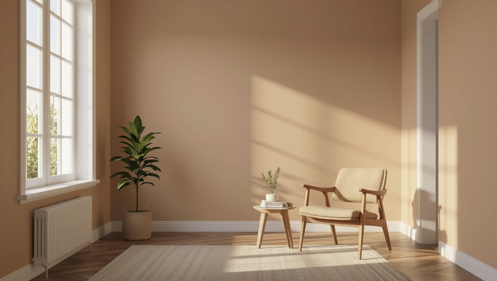
How Light Direction and Quality Change Paint Color
When light hits a wall from different angles and sources, you’ll see the same paint shift in tone and intensity. Direct sunlight brings out subtle undertones and increases contrast, while diffuse or shaded light softens color and mutes highlights.
You notice how light quality and directional lighting alter color perception: low angles emphasize texture and shadow effects, while overhead light flattens surfaces.
Temperature impact and time of day change apparent warmth, and different light sources create varied casts. Reflective surfaces nearby bounce color, shifting color context.
Understand these variables and you’ll control mood influence and choose paint that performs predictably.
How Natural vs. Artificial Light Shifts Warm and Cool Tones
Although natural light shifts through the day and artificial light stays more constant, you’ll notice each source pulls paint toward warm or cool tones in predictable ways.
You’ll use color temperature to predict tone perception: the daylight spectrum leans blue in morning and evening, warming at midday, while artificial brightness often favors warm or neutral bulbs.
Compare light sources in the same room under ambient lighting to see hue variations and color contrast change.
Shadow effects deepen cool tones and soften warm ones, altering emotional response.
Test swatches at different times and with lamps to choose colors that behave as you want.
How Wall Texture Changes Paint Color and Sheen
If your wall has a pronounced texture—like orange peel, knockdown, or heavy plaster—it scatters light unevenly, which makes the same paint look darker in recessed areas and shinier on raised surfaces; smoother walls reflect more uniformly, so color and sheen read truer to the can. You’ll notice texture impact immediately: rough surfaces create micro-shadows and highlight edges, emphasizing sheen variation and altering perceived saturation. Choose flatter sheens to hide flaws or higher sheens on smooth walls for durability. Compare samples in place and at different angles to predict final appearance.
| Surface | Effect |
|---|---|
| Orange peel | Mottled light |
| Knockdown | High contrast |
| Plaster | Deep shadows |
| Smooth | Even reflection |
How Underlying Surfaces (Primer, Old Paint, Stains) Shift Color
When you paint over a bare surface versus a primed one, the primer evens out porosity and can make colors appear truer.
If you’re covering old paint, its tone and gloss can tint the new coat unless you strip or prime first.
And persistent stains can bleed through, so you’ll want a stain-blocking primer to prevent color shifts.
Primer Vs. Bare Surface
Because the surface beneath your paint either soaks up or reflects light, primer and bare substrate can make the same color look noticeably different.
You’ll notice primer application evens porosity, improving color consistency and paint adhesion, while bare surfaces change tint and depth.
Consider these factors before you paint:
- base coat evens absorption and aids finish compatibility
- surface preparation removes contaminants that alter hue
- texture impact shifts sheen and perceived shade
- stain prevention primer blocks bleed-through and ghosting
- adhesion and bonding reduce peeling, preserving true color
Use primer when you want predictable, lasting results.
Old Paint And Stains
Primer evens out substrate effects, but old paint layers and lingering stains can still shift how a new color reads on your wall. You’ll notice color fading, uneven tone from paint layering, and texture variation that alters sheen across finish types. Do surface prep: clean, sand, and handle stain removal before priming. Test color matching over existing tones to avoid surprises. Below is a quick reference to guide decisions.
| Issue | Impact | Fix |
|---|---|---|
| Old paint buildup | Muddy undertone | Sand, degloss |
| Stains | Bleed-through | Spot prime |
| Faded areas | Patchy look | Blend, retint |
| Texture variation | Light scattering | Skim coat, sand |
Why Paint Sheen Affects Perceived Color
If you stand back and squint, you’ll notice that the same paint color can look brighter or deeper depending on its sheen. You’ll see sheen impact immediately: gloss reflects light, making colors pop; matte absorbs light, muting tones.
That change alters your color perception without any pigment change. When choosing finish, consider how light and texture interact so the room reads the way you want.
Think about practical effects:
- Gloss emphasizes highlights and imperfections
- Satin balances shine and softness
- Eggshell gives subtle luster
- Matte hides flaws, softens hue
- Semi-gloss boosts contrast and depth
Why Paint Formulas Read Differently Up Close vs. Far Away
When you stand close to a painted surface, tiny differences in pigment concentration, binder, and the way light scatters at the micro level become visible, while stepping back blends those nuances into a single, more uniform color. You notice paint saturation, micro texture, and subtle color bias up close; your eye adaptation and ambient lighting change what you register. From afar, visual contrast reduces and light reflection averages across the surface, shifting color perception and apparent color temperature. Use the table to compare effects:
| Up Close | Far Away |
|---|---|
| high detail, saturation cues | averaged hue, lower contrast |
| eye adaptation reveals bias | ambient lighting dominates |
How Large Surfaces Change Color Intensity
Because your eye averages color over wide areas, large painted surfaces often appear less intense than small swatches. So a hue that seemed vivid on a sample wall can read washed out across an entire room.
A color that pops on a swatch can look muted across a whole room—our eyes average wide areas.
You should consider color perception, surface reflection, and ambient lighting together. Large fields change perceived color temperature and reduce visual contrast, while material influence and application method alter sheen and depth.
Do sample testing on full walls at different times. Remember psychological effects and environmental factors when choosing tones.
- Averaging reduces saturation
- Reflection alters brightness
- Lighting shifts temperature
- Texture changes depth
- Finish impacts perception
How Neighboring Colors Alter Your Paint’s Appearance
Though adjacent hues can seem subtle on their own, they dramatically shift how your paint reads by changing contrast, temperature, and perceived saturation.
You use color theory to predict interactions: complementary colors increase color contrast and vibrancy, while analogous choices create color harmony and calm.
Color psychology explains mood shifts as warm neighbors raise color temperature and cool ones cool it. Your color perception depends on surrounding saturation and light, and color mixing in reflections alters tones.
Be mindful of color influence from trim, furnishings, and art—each element shifts color saturation and overall balance, so test samples together.
How Room Size and Ceiling Height Shift Color Perception
In smaller rooms, you’ll notice colors feel more concentrated and can seem stronger than they do in open spaces.
Low or high ceilings change how light bounces, so the same paint can read warmer or cooler depending on height.
Pay attention to these scale effects because they directly alter perceived color intensity.
Room Size Effects
When you step into a small room, paint can feel more intense and saturated, while high ceilings and open spaces tend to soften and wash out the same color. You notice how color psychology and visual harmony shift with scale: tight quarters amplify color contrast and mood influence, while open plans dilute it.
Spatial perception changes how you pick tones; design principles push you toward lighter hues to expand feeling. Light reflection and surface dynamics matter more in compact areas, making finishes read differently.
- Small rooms heighten color contrast
- Textures alter perceived saturation
- Dark tones feel enclosing
- Light hues expand space
- Scale guides accents
Ceiling Height Impact
Because your eye registers height as part of a room’s scale, ceiling height changes how paint reads: low ceilings make colors feel more concentrated and intimate, while tall ceilings let the same hue breathe and appear lighter. You’ll notice ceiling color choices and how they interact with vertical space shift perceived warmth and openness. Dark ceilings can lower visual height; light ceilings lift it. Use trim to separate planes and guide gaze. Consider light sources and sightlines when choosing tones so the room reads as meant.
| Ceiling Height | Effect | Tip |
|---|---|---|
| Low | Cozier | Light ceiling color |
| High | Airy | Accent upper walls |
| Mid | Balanced | Match trim color |
Perceived Color Intensity
Ceiling height shapes how paint reads, but room size and that same height also change how intense a color feels.
You notice color perception shift as walls, ceiling, and floor create a visual context that alters light reflection and ambient influence. Your choice taps color psychology and can provoke an emotional response; you’ll balance color harmony and contrast.
Consider these practical cues:
- Low ceiling + dark paint = cozy, compressed feel
- High ceiling + saturated hue = dramatic, airy effect
- Small room + bright tone = expanded perception
- Large room + muted shade = calm, balanced look
- Lighting direction modifies artistic interpretation and mood
How Application Technique Changes Paint Color and Finish
If you change how you apply paint—brushing, rolling, or spraying—you’ll see shifts in both color perception and finish because technique alters sheen, film thickness, and texture.
You choose application methods knowing surface preparation matters: a smooth, clean wall shows truer tones.
Technique impact appears as visible brush strokes, consistent roller application, or ultra-smooth spray techniques, each creating finish variations.
Visible brush marks, uniform roller texture, or seamless spray application — each method yields distinct finish variations.
Layering effects change depth and saturation, while uneven film thickness alters light reflection.
You manage drying time and overlap to avoid lap marks and streaks.
Why Primer Type and Coverage Matter for True Color
When you pick the right primer and apply it evenly, the paint you choose will show its true color rather than being muddied by the substrate. Different primers seal, tint, and absorb differently, so coverage and type directly affect hue and sheen.
You’ll notice primer importance when stains, textures, or base colors bleed through; proper coverage effects prevent undertones from altering final color. Choose primer type—stain-blocking, bonding, or tinted—based on surface and finish.
Apply consistent coats for uniform absorption. Consider these practical points:
- Surface staining risks
- Porosity and absorption
- Tinting to counter base hues
- Sheen interaction
- Adhesion and longevity
Single Coat vs. Multiple Coats: Effects on Depth and Uniformity
If you try to cover a wall with a single coat, you’ll often see thin spots and streaks where the underlying color shows through.
Applying multiple coats evens out those inconsistencies and builds richer, more consistent depth.
You’ll get a truer, more uniform finish when you layer paint rather than relying on one pass.
Single Coat Coverage Issues
Sometimes a single coat seems like it’ll do the job, but you’ll usually notice differences in depth and uniformity compared with multiple coats. You’ll face single coat challenges when pigments don’t fully hide the old color, and your coverage expectations may be unmet.
Expect variations in sheen, thin spots, and visible roller or brush marks. Know where a single coat might work and where it won’t.
- uneven pigment distribution
- substrate color bleeding through
- gloss and sheen inconsistency
- visible application marks
- durability and touch-up issues
Plan accordingly to avoid surprises and get the finish you want.
Multiple Coats Enhance Uniformity
One or more additional coats will reliably even out color depth and hide inconsistencies that a single coat often leaves behind. When you apply another coat, you improve color consistency and reduce translucency from underlying surfaces. Proper paint application—wet edges, consistent pressure, and correct drying times—lets each layer bond and smooth out streaks or patchiness. Multiple coats deepen hue and provide a uniform finish, so your wall looks intentional rather than splotchy. Plan for at least two coats on most surfaces, more on drastic color changes, and always follow manufacturer recoat times for best results.
| Before | After |
|---|---|
| Primer show-through | Full coverage |
| Streaks | Smooth finish |
| Thin spots | Even depth |
| Patchy tone | Consistent hue |
| Fast dry errors | Blended surface |
Optical Tricks That Fool Your Eyes (Metamerism, Sheen Glow)
When light hits paint, it can trick your eyes in ways that make the same swatch look different across a room; metamerism and sheen glow are two common culprits.
You notice color perception shifts when light sources change, causing visual illusions where pigments match under one lamp but not another. Sheen glow makes glossy areas appear lighter or richer from certain angles.
Watch for edges, reflections, and surrounding colors that alter your judgment. Consider these factors:
- light source spectrum
- viewing angle effects
- surrounding color contrast
- finish-related reflections
- surface texture influence
These optical tricks explain surprising inconsistencies.
Practical Steps to Test Paint Samples Reliably
How should you test paint samples to get results that match real life? You’ll start by applying large sample patches directly on the wall rather than relying on tiny chips.
Use multiple coats and let them dry between layers to reveal true sheen and depth. Arrange a paint swatch comparison on neutral backgrounds to spot subtle shifts, and label each test with brand, formula, and finish.
Try color testing techniques like viewing at different angles and near trim to check contrast. Photograph samples under consistent conditions for later review.
Record impressions after several hours to account for visual settling.
Where and When to Test: Best Locations and Lighting Times
Test your paint samples in natural light so you can see true color and undertones.
Check them at different times of day—morning, midday, and evening—to catch shifts from cool to warm lighting.
Move samples to the exact wall locations where the paint will live to judge how room light affects the hue.
Test In Natural Light
Where should you place your swatches to see the paint’s true color? Test them where natural light hits the wall most; your color perception shifts with angle and intensity.
Place samples on the actual wall, not a scrap, and view from typical standing positions.
- Near windows that get direct sunlight
- On interior walls opposite windows for reflected light
- Beside permanent furniture to judge contrast
- At eye level and lower to compare viewing angles
- On different walls to note surrounding influences
You’ll notice subtle undertones and how light warms or cools paint, helping you choose confidently.
Check At Different Times
When should you look at your swatches? Test them in the spots where paint will live: near windows, corners, and opposite walls.
Observe at different times of day—morning, midday, evening—to see shifts in warmth, coolness, and reflectivity.
Take samples outside for comparison, then bring them back inside to note how artificial lights alter hue.
Repeat across seasons to account for seasonal changes like brighter summer light or muted winter sun.
Photograph samples at consistent angles and review later.
Quick Fixes When a Color Reads Wrong After Painting
If a freshly painted wall reads off—too pink, too flat, or oddly dull, you don’t have to repaint the whole room.
Use quick fixes that respect color psychology and your chosen paint brands. Try lighting experiments and small paint layering to tweak depth. Consult color wheels and sample swatches before committing further.
Use smart, gentle tweaks—lighting, layered washes, and swatches—to fine-tune color without repainting.
- Swap bulbs to change tone and mood
- Apply glaze or tinted wash for subtle shift
- Add texture contrasts with fabrics or panels
- Test finish options on corners to alter sheen
- Frame art or trim to recalibrate perceived hue
These steps save time and reveal true color.
When to Repaint Versus Adjust Lighting or Finishes
Start by evaluating paint wear to see if fading, stains, or peeling mean you actually need a new coat.
Then check how natural and artificial lighting change the color throughout the day.
Finally, determine whether switching to a different sheen or finish would solve the issue without repainting.
Assess Paint Wear
Because paint ages unevenly, you’ll want to separate real wear from issues you can fix with light or a different finish before reaching for a new can.
Inspect surfaces for scuffs, chips, or bubbling that show paint aging rather than temporary grime. Tap areas to test adhesion and compare patches under consistent daylight. Note any color fading where sunlight hits; that suggests replacement, not just cleaning.
Decide whether texture, sheen, or localized damage drives the look.
- Scratches and chips
- Adhesion loss when tapped
- Staining versus surface dirt
- UV-driven color fading
- Sheen inconsistency indicating wear
Check Lighting Effects
How does lighting change what you actually see on a wall? You should inspect light temperature and ambient light levels at different times; warm bulbs boost color saturation, cool light mutes tones.
Note wall orientation—north walls stay cooler, south faces warm up—and watch shadow effects from furniture and fixtures.
Reflective surfaces and decor contrast alter perceived hue and depth, so move items before deciding to repaint.
Consider color psychology: a shade that feels calm in daylight may feel gloomy at night.
If adjustments to bulbs, curtains, or placement fix it, you can avoid repainting; otherwise, reassess paint finish choices.
Evaluate Finish Compatibility
If changing bulbs or moving furniture doesn’t fix the way a color reads, it’s time to check whether the paint finish itself is working with your room’s conditions.
You should evaluate finish compatibility: consider finish selection against light, sheen compatibility with adjacent surfaces, and whether gloss levels amplify flaws.
Inspect texture interplay and surface preparation—rough walls hide color, smooth walls reflect more.
Decide if repainting is needed or if finish maintenance will suffice.
Weigh finish durability for high-traffic areas and how color layering affects perception.
Ask: will a different sheen or improved prep solve it, or is a full repaint required?
- Sheen compatibility
- Finish selection
- Surface preparation
- Finish durability
- Texture interplay
Pro Tips From Painters to Avoid Surprises on the Final Wall
1 simple habit pros swear by is doing a full mock-up: paint a few large test swatches, view them at different times of day, and inspect from the room’s main angles to catch sheen, color shifts, and texture surprises before committing.
You’ll also tape off boundaries, label mixes, and photograph samples for consistent comparison.
Think about color psychology when choosing tones—observe how light changes mood.
Consider color psychology—watch how natural and artificial light shift mood before committing to a hue
Ask about paint layering to know how undercoats affect depth and sheen.
Use flat primer then finish coats, test lighting with lamps, and walk the space several times before buying gallons to avoid costly redo.
Frequently Asked Questions
Will Paint Color Change as My Furniture and Décor Evolve Over Years?
Yes — your paint color will shift as your furniture and décor evolve, because color trends and lighting effects interact with finishes and textiles. You’ll notice shifts over years, so choose flexible neutrals or adaptable accent tones.
Do VOCS or Paint Age Alter Color Over Time?
Fading, flaking, fainting — yes, paint can change. You’ll notice color fading as VOC effects and sunlight, dirt, and age alter pigments; you’ll need touch-ups or repainting to restore original, consistent color over time.
Can Humidity During Application Permanently Shift Final Color?
Yes — humidity during application can permanently shift the final color. You’ll see humidity effects if paint dries unevenly; adjust application techniques, slow drying, and proper ventilation so pigments settle uniformly and color stays true.
Does Paint Color Look Different on Curved or Angled Walls?
Yes — you’ll notice paint shifts on curved or angled walls because lighting conditions alter reflection and shadow, and wall texture changes how light scatters; these combined effects make color appear different across surfaces.
Will Nearby Glass or Mirror Reflections Affect Perceived Wall Color?
Yes — reflections from nearby glass or mirrors will affect how you perceive wall color, because reflected light sources and color temperature mix with ambient light, shifting hues and brightness, so colors can appear warmer, cooler, or muted.
Conclusion
You’ll see paint change because light, surface, and underlying layers lie to you—so test before you commit. Try samples at different spots and times; check texture, primer, and neighboring colors to separate real shifts from tricks of light. If a color reads wrong, adjust lighting, finishes, or neutral accents; repaint only when those fixes fail. Pros swear by multiple, lived-in tests—investigate thoroughly and you’ll avoid costly surprises on your final wall.