What Color to Paint a Vaulted Ceiling to Make It Look Stunning
Pick a ceiling color that fits your room’s light and mood: pale neutrals or soft whites will open and lift a vaulted space, warm creams or muted taupes make it feel cozier, while deep, dramatic hues create intimacy and a striking focal point. Test large swatches at different times of day, coordinate with walls, trim, and beams, and choose a flat to satin sheen to hide flaws yet allow cleaning. Keep going to learn practical steps and pro tips.
Quick Answer Best Colors to Paint a Vaulted Ceiling for Maximum Impact
If you want the room to feel larger, paint the vaulted ceiling a soft, light neutral to visually lift the space.
To make it cozier, choose warm creams or muted earth tones that bring the ceiling down a touch.
For drama or brightness, go bold with a deep accent color or a crisp high-gloss white to catch the light.
One-sentence recommendations for common goals (make room feel larger, cozier, dramatic, bright)
When you want a vaulted ceiling to change the mood of a room, pick paint that matches the goal: pale neutrals and soft whites open the space, warm taupes or deep creams make it feel cozier, charcoal or jewel tones add drama, and crisp high-gloss whites or light pastels boost brightness.
For guidance on what color to paint a vaulted ceiling, choose: pale neutrals, warm taupe, charcoal, or high-gloss white.
Understanding Vaulted Ceilings Basics You Need to Know
A vaulted ceiling is an elevated, angled roofline that changes how light and space read in a room, so you’ll want to contemplate how it alters brightness and perception.
You’ll face unique visual challenges and opportunities with height, sharp angles, shifting shadows, and new sightlines that can either exaggerate or tame the room’s scale.
Choosing color for vaulted surfaces means thinking about how hue, value, and finish interact with scale, light, and texture to either amplify height or make the space feel cozier.
What is a vaulted ceiling and how it affects light and perception
Vaulted ceilings lift a room both physically and visually, creating taller walls and angled planes that change how light moves and how you perceive space.
You’ll notice light travels differently—spreading, reflecting, and pooling—so colors read differently than on flat ceilings.
Because of that, you’ll want paint tones that respond well to varied illumination, balancing warmth and coolness to influence mood and perceived volume.
Key visual challenges and opportunities (height, angles, shadows, sightlines)
Having taller, angled planes changes how you see and feel a room, so you’ll want to think about specific visual challenges and opportunities these ceilings introduce.
They can exaggerate scale, create dramatic sightlines, and cast deep shadows.
You’ll need to balance proportion, focal points, and visual continuity so the ceiling feels intentional rather than overpowering, guiding the eye without fragmenting the space.
How color interacts with scale, light, and texture on vaulted surfaces
Because tall, sloped ceilings expand the room visually, the colors you pick will actively change perceived scale, bounce light differently across angles, and either emphasize or soften surface textures.
Choose pale, cool hues to amplify height and diffuse light; warmer, darker tones make vaults feel cozier and closer.
Satin or eggshell finishes reveal texture; matte conceals imperfections and calms glare.
Choosing a Color Strategy Factors to Consider
Think about how you want the room to feel—calm, energizing, or cozy—and let that guide your ceiling color.
Consider how natural and artificial light, plus architectural features like beams or skylights, will change the color’s effect.
Coordinate with your walls, flooring, and furniture whether you’re matching, contrasting, or using the ceiling as an accent.
Room function and desired mood
When you choose a ceiling color, start with what the room does and how you want people to feel in it.
For calm bedrooms, pick soft neutrals or muted blues.
For lively kitchens or playrooms, try warm, energizing hues.
In formal spaces, use sophisticated tones to convey elegance.
Match color intensity to activity: subtle for relaxation, bolder for stimulation and focus.
Natural and artificial lighting considerations
Although lighting changes a color’s appearance more than anything else, you can control that effect by evaluating both natural and artificial light in the room.
Note where sunlight falls and its color temperature throughout the day. Test paint swatches under morning, midday, and evening light and under the fixtures you’ll use.
Adjust hue or sheen to maintain warmth, contrast, or subtlety as needed.
Wall-to-ceiling coordination: matching, contrast, or accent
As you plan wall-to-ceiling coordination, decide whether you want the ceiling to blend in, provide contrast, or act as an accent—each choice changes perceived height, light, and mood.
If you want unity, match tones; for drama, contrast with a darker or richer hue; to highlight, use a subtle accent color.
Consider texture and trim for clean connections.
Architectural features and focal points (beams, dormers, skylights)
1 key decision with beams, dormers, and skylights is whether you want those elements to disappear, stand out, or subtly guide the eye—and your paint strategy should support that goal.
Paint beams darker for contrast and drama, match dormers to walls for cohesion, or highlight skylight surrounds with a light-reflective shade to amplify daylight.
Use trim finishes to define or soften changes.
Flooring and furniture color palette integration
Start by looking at three things: your flooring’s undertone, the dominant furniture hues, and how much contrast you want between floor and ceiling.
Let your ceiling color echo warm or cool undertones to harmonize with floors. Match or slightly lighten tones against furniture for cohesion, or choose a subtle contrast to highlight architectural height.
Test samples under real light before deciding.
Color Options and When to Use Them
When you pick a ceiling color, think about the mood you want and the room’s scale so the paint supports the space.
Here are five common options and quick notes on when to use them:
- Crisp white/off-white: brightens and feels clean, great for low ceilings or minimalist rooms.
- Soft neutrals and pale pastels: blend warmth or subtle color without overwhelming, but test for undertones in different light.
- Bold/dark and accent ceilings: create drama or a focal point—use in cozy rooms or to tie a room’s palette together.
Crisp white and off-white when to use and effect
Although a crisp white ceiling can make a room feel taller and brighter, choosing between true white and an off-white depends on your light, trim color, and the mood you want to create.
Pick true white for stark, modern spaces with abundant light and cool trim.
Use warm off-white to soften contrast, tame glare, and complement warm woods or vintage details for a cozier, more forgiving finish.
Soft neutrals (beige, greige, light gray) benefits and pitfalls
If you want a ceiling that feels warm without drawing attention, soft neutrals like beige, greige, and light gray give you that subtle backdrop while balancing warmth and modernity.
They broaden spaces, hide imperfections, and pair with most palettes.
Be cautious: too-dark neutrals can flatten height, and yellowish undertones may clash with cool walls.
Test samples in varied light before committing.
Pale pastels (muted blues, greens, blush) where they work best
Soft neutrals lay a calm foundation, but pale pastels — muted blues, sage greens, and dusty blushes — bring a quiet hint of color that still reads subtle from below.
Use them in sunlit rooms, coastal interiors, nurseries, or Scandinavian schemes to enhance airiness. They minimize visual weight, complement natural wood and white trim, and reflect light softly without overwhelming the space.
Bold/ Dark ceilings (navy, charcoal, deep green) creating drama and intimacy
When you want to make a room feel cozy, dramatic, or architecturally grounded, choosing a bold ceiling color—navy, charcoal, or deep forest green—does the job without relying on heavy ornament.
Dark ceilings draw the eye upward, visually lowering high vaults and creating intimacy.
Pair them with lighter walls, strategic lighting, and reflective accents to keep the space balanced and avoid feeling cave-like.
Accent color ceilings (one wall/ceiling as focal) application tips
Looking to create a striking focal point without repainting every wall? Use an accent ceiling tied to one wall: choose a complementary or contrasting hue, test samples under real light, and extend color down one wall to anchor the space.
Keep adjacent walls neutral, limit trims to one finish, and use crisp edge lines. Balance scale with furnishings and artwork.
Two-tone and gradient ceiling treatments visual lift techniques
If you want to visually lift a room without changing its architecture, two-tone and gradient ceiling treatments give you subtle height and depth by manipulating color contrast and value.
Use a darker band near walls and lighter center to draw eyes up, or paint a soft gradient from pale center to richer edges.
Test samples, keep shifts smooth, and match trim for cohesion.
Step-by-Step Guide to Selecting the Perfect Ceiling Color
Start by evaluating how much natural and artificial light fills the room and measure light levels to guide your base choice.
Then collect large swatches—especially on vaulted planes—so you can examine them at different times of day and next to trim, beams, and walls.
Finally, pick the appropriate sheen and ceiling-specific paint once you’ve seen how samples perform in real conditions.
Step 1: Assess lighting and measure light levels
Because light changes how color reads, assess the room’s lighting and measure its levels before choosing a ceiling hue.
You’ll note source direction, intensity, and color temperature to predict paint behavior. Use simple tools and observations to quantify brightness.
- Check natural light throughout the day
- Measure with a light meter or phone app
- Note artificial fixture types and bulb temperatures
Step 2: Collect samples and test large swatches on vaulted planes

Now that you’ve measured light and noted its sources, gather paint samples and apply large swatches directly to the vaulted planes to see how color behaves at scale.
Paint panels at least 2×3 feet on different planes, including high and low angles. Live with each swatch for a few days, note undertones against trim and fixtures, and eliminate colors that clash or wash out the space.
Step 3: Evaluate samples at different times of day
When will a color really show its true self in your room?
You’ll observe swatches morning, noon, and evening, noting shifts from cool to warm.
Check under direct sun, diffuse daylight, and artificial light.
Photograph each stage and jot concise impressions—brightness, hue shift, and contrast with shadows.
Repeat across cloudy days to guarantee the choice stays flattering.
Step 4: Coordinate with trim, beams, and walls
As you move from testing samples to finalizing your choice, think about how the ceiling will interact with trim, beams, and walls so the whole room reads as a cohesive composition.
Coordinate undertones: warm ceilings pair with warm wood or cream trim; cool ceilings suit gray or white trim.
Contrast beams for drama or match them to blend. Sample combos before committing.
Step 5: Finalize sheen and paint type for ceilings
Before you pick a color, decide on the paint sheen and type because they affect appearance, durability, and how light interacts with your ceiling.
Choose flat or matte to hide imperfections and soften light, or low-sheen for slight reflectivity.
Use acrylic latex for easy cleanup and stability.
For high-traffic or moisture-prone vaulted areas, pick mildew-resistant or washable formulas to guarantee longevity.
Paint Sheen, Finish, and Practical Considerations
For vaulted ceilings you’ll usually pick flat, eggshell, or satin depending on how much light reflection and texture you want—flat hides imperfections, eggshell offers slight sheen, and satin gives durability.
Choose low‑VOC, washable, and stain‑resistant formulations for better indoor air quality and long‑term performance.
Use extension poles, angled rollers, and steady overlap techniques to get even coverage on steep slopes.
Recommended sheens for vaulted ceilings (flat, eggshell, satin) and why
Vaulted ceilings benefit from lower-sheen paints because they reduce glare and hide surface imperfections—so you’ll usually choose flat, eggshell, or satin depending on appearance and durability needs.
Flat masks flaws and gives a soft, expansive look but isn’t washable.
Eggshell balances subtle sheen with easier cleaning.
Satin offers more durability and slight sheen for trim or high-traffic vaulted areas without obvious reflections.
Paint types and durability (low-VOC, washable, stain-resistant)
Choosing the right sheen is just one part of selecting paint for high ceilings; you’ll also want to evaluate paint type and durability to match your room’s use and indoor-air quality goals.
Pick low-VOC or zero-VOC formulas to limit odors and toxins.
Choose washable, stain-resistant finishes for kitchens, kids’ rooms, or high-traffic areas so you can clean marks without damaging the surface.
Tools and techniques for even coverage on angled ceilings
Start by gathering the right tools—an extension pole, angled brush, good-quality roller with a nap suited to your ceiling texture, and a sturdy ladder or scaffold—so you can work safely and reach every slope without stretching.
Choose eggshell or satin for subtle sheen; flat hides imperfections. Use slow, overlapping strokes, and keep a wet edge.
- Cut in angles first
- Roll in sections
- Inspect under different light
Design Scenarios and Color Recipes (Case-based)
You’ll find practical color recipes and the reasons they work for specific spaces, like an open-plan living room with abundant natural light, a small bedroom with a vaulted ceiling, a rustic exposed-beam room, and a modern minimalist loft.
For each case I’ll suggest ceiling hues, complementary wall tones, and explain how they affect perceived space, warmth, and texture.
Use these examples as starting points you can tweak to match your lighting and style.
Open-plan living room with lots of natural light color recipe and rationale
Because an open-plan living room with abundant natural light already feels airy, pick a ceiling color that enhances that brightness while tying the space together—soft off-white with a hint of warm undertone keeps the room luminous and inviting, while a very pale, desaturated color (like a whisper of blue or green) can subtly define ceiling planes without closing the room in.
| Area | Color tip |
|---|---|
| Main ceiling | Warm off-white |
| Accents | Pale desaturated blue |
| Trim | Crisp white |
Small bedroom with vaulted ceiling color recipe and rationale
When a small bedroom has a vaulted ceiling, lean into the height by choosing a ceiling color that visually lowers the space without making it feel cramped; a soft, mid-tone warm gray or muted greige on the sloped planes brings the ceiling down slightly while keeping the room cozy and proportionate. Use pale walls, matte finish, warm accents, and lower-profile lighting.
| Element | Choice |
|---|---|
| Ceiling | Warm gray greige |
| Walls | Pale warm white |
| Trim | Soft off-white |
| Lighting | Low-profile warm LEDs |
Rustic or exposed-beam space color recipe and rationale
If your room shows off beams or reclaimed wood, choose a ceiling palette that celebrates that texture while keeping the overall feel warm and grounded. Pick warm neutrals for soffits, whitewash beams, and deep accent overhead to add contrast. Balance light and shadow; protect wood tones with matte finish.
| Element | Color idea |
|---|---|
| Soffits | Warm beige |
| Beams | Whitewash |
| Vault plane | Deep taupe |
| Trim | Soft cream |
Modern minimalist loft color recipe and rationale
Shifting from the warmth of exposed wood to a clean, airy loft calls for a pared-back palette that amplifies space and light. You’ll use crisp white ceilings, soft gray walls, and matte black accents for contrast. Keep finishes low-sheen to reduce glare and emphasize geometry.
| Element | Color/Finish |
|---|---|
| Ceiling | Crisp white, matte |
| Walls | Soft warm gray |
| Accents | Matte black trim |
Common Mistakes and How to Avoid Them
Don’t pick a ceiling color from tiny paint chips alone — they don’t show how a shade reads across a whole room.
Check the paint under your room’s lighting and at different times so you don’t get surprised by shifts, shadows, or glare.
Also avoid accidental drama by testing contrasts with beams and choosing a sheen that won’t glare on sloped surfaces.
Mistake: Choosing colors from small paint chips only
While small paint chips give you a quick sense of a hue, they’re misleading because they don’t show how color reacts to room size, light, or neighboring surfaces; you should always test larger swatches or paint samples on the actual ceiling to see the true effect before committing.
Tape up several 12×12 swatches, view them at different times, and live with them for days to judge depth and undertone.
Mistake: Ignoring lighting shifts and shadows
After you’ve tested larger swatches on the ceiling, don’t stop observing how light changes throughout the day — ceilings look different in morning glare, midday brightness, and evening shadow.
Note where shadows deepen and where color washes out. Adjust hue or sheen to keep the space balanced under varied lighting.
Consider bulb temperature and placement so tones remain flattering at all hours.
Mistake: Over-contrasting beams and ceiling unintentionally
If you paint beams and the ceiling too far apart in tone or temperature, you’ll create a harsh, disconnected look that fights the room’s flow.
Keep contrast subtle: pick complementary undertones and test samples together under real light.
Aim for harmony—slightly darker beams or a softly warmer ceiling—so architecture reads cohesive, not chopped.
Balance maintains warmth and visual continuity.
Mistake: Wrong sheen creating glare on sloped planes
Just as you want beams and ceilings to read as one cohesive element, you also need to watch the paint sheen on sloped planes—like vaulted ceilings or dormer angles—because the wrong finish will throw glare and highlight every imperfection.
Choose low-sheen or flat finishes to minimize reflections, test samples under real light, and avoid semi-gloss on slopes so texture and joints stay discreet and the ceiling reads smooth.
Best Practices and Pro Tips
Grab large-format test swatches and check them from your main sightlines to see how the ceiling reads in real use.
Balance warm and cool undertones against your flooring, furniture, and light so the room feels cohesive, and decide whether matching walls and ceiling will unify the space or a contrasting shade will add needed definition.
For vaulted or complex geometries, consider hiring a pro who can advise on sightlines, paint finishes, and safe access.
Use large-format test swatches and view from main sightlines
Start with several large-format swatches—at least A2 size or bigger—and mount them where you’ll usually view the room, like the main seating area or entry sightline.
Step back and observe at different times and lighting. Note how color reads against architectural shadows and ceiling height.
Photograph from your primary viewpoints to compare options later, then narrow choices based on real-room effects rather than online swatches.
Balance warm vs cool undertones with room elements
When you balance warm and cool undertones, let the room’s fixed elements guide your choice: wood finishes, flooring, upholstery, and major textiles will either harmonize with a warm ceiling or make a cool ceiling read harsh.
Match undertones to dominant materials—gold woods, leather, and terracotta favor warmth; chrome, glass, and pale stone suit cools.
Test swatches near these elements before committing.
When to paint walls and ceiling the same color vs different
Having matched undertones to your room’s fixed elements, you’ll next decide whether to use the same color on walls and ceiling or choose contrasting tones; that choice affects perceived height, light, and cohesion.
Use the same color to unify and make a vaulted space feel taller and calmer. Use a lighter ceiling to open space or a darker accent to add drama and define planes.
Working with professionals for complex vaulted geometries
Because vaulted ceilings combine tricky angles, hard-to-reach planes, and variable light, you’ll want pros who understand geometry, scaffold safety, and color behavior at height.
Hire painters with experience on vaulted spaces, request mockups, and confirm they use proper rigging, high-quality primers, and extension tools.
Discuss finish choices, accent strategies, and touch-up plans so outcomes match your vision and withstand maintenance.
Cost, Timeframe, and DIY vs Pro Decision Guide
You’ll want rough cost estimates for paint and any labor so you can budget accurately.
Plan time for prep, priming, and multiple coats—expect the job to take at least a day or two depending on room size.
Consider hiring a pro for high ceilings, scaffolding needs, or textured finishes that are hard to reach or require special skills.
Rough cost estimates for paint and labor
Estimating ceiling paint costs comes down to three factors: the paint type and quantity, the labor or your time if you DIY, and any prep or repair work the ceiling needs.
Expect paint costs of $30–$70 per gallon (high-quality), plus primer if needed.
DIY saves labor but costs your time; pros charge $1.50–$4.50 per sq ft depending on height and complexity.
Time required for prep, priming, and multiple coats
When planning ceiling work, factor in prep, priming, and drying times upfront so you don’t underestimate the total project length.
Prep (taping, sanding, dust control) can take several hours to a day.
Primer needs 2–4 hours to dry between coats; paint often requires two coats with 2–6 hours drying each.
Allow a full weekend for a DIY job; longer for larger areas.
When to hire a pro (height, scaffolding, textured finishes)
Because working overhead is tougher than it looks, call a pro for ceilings that are very high, require scaffolding, or have complex textured finishes you can’t safely or cleanly handle yourself.
They’ll assess access, safety, and finish technique, estimate cost and timeline, and deliver consistent results.
DIY when ceilings are reachable, smooth, and you have time; hire pros for risk, speed, or specialty textures.
Frequently Asked Questions
You probably have practical questions about vaulted ceilings, like whether a dark color will make the room feel smaller or if exposed beams should match the ceiling.
You’ll also want to know which sheen hides imperfections best, how skylights change color choices, and whether wallpaper or murals work up high.
Let’s answer those common concerns so you can pick the right finish for your space.
Will painting a vaulted ceiling dark make the room feel smaller?
Curious if a dark color on a vaulted ceiling will shrink the space?
Dark ceilings can create intimacy and draw the eye upward, which may feel cozier rather than smaller.
If your room lacks natural light, heavy dark tones might feel enclosed.
Balance with lighter walls, ample lighting, and reflective surfaces to maintain openness while enjoying the drama of a deep ceiling shade.
Should I paint exposed beams the same color as the ceiling?
Wondering whether to paint exposed beams the same color as the ceiling? You can — matching them creates a seamless, airy look that visually raises the ceiling and keeps focus on room proportions.
Alternatively, painting beams a contrasting shade emphasizes architecture and adds warmth or drama.
Consider room scale, natural light, and your style: subtle match for cohesion, contrast for character.
What sheen works best to hide imperfections on a vaulted ceiling?
Although a perfectly smooth finish is ideal, a low- to flat-sheen paint will do the best job hiding imperfections on a vaulted ceiling; it minimizes light reflection so bumps, seams, and texture read less noticeably from below.
You’ll want matte or flat for most rooms; eggshell can work in higher-traffic spaces but shows more sheen.
Test samples under your room lighting first.
How do skylights affect ceiling color choice?
If you’ve chosen a low- or flat-sheen to mask vaulted-ceiling flaws, remember that skylights change how paint reads by flooding the space with natural light and shifting its temperature throughout the day.
You should test swatches at different times, noting cool morning light versus warm afternoon glow.
Pick colors that hold contrast and warmth when sunlight varies, avoiding shades that dull or shift oddly.
Can I use wallpaper or murals on a vaulted ceiling?
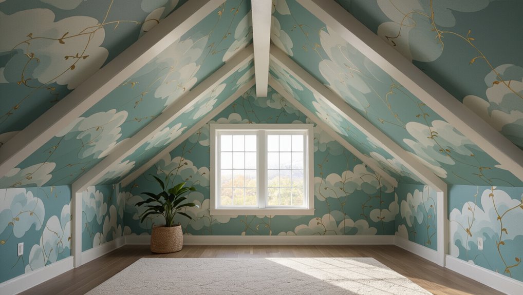
Can you use wallpaper or murals on a vaulted ceiling? Yes—you can, but plan carefully.
Choose lightweight, single-ply wallpapers or painted murals to avoid sagging.
Account for height, access, and seams; install with scaffolding or a pro for safety and alignment.
Pick patterns that follow the slope and lighting to enhance depth without overwhelming the space.