The Best Paint Finish for Color Drenching Your Walls
For a color-drenched room you’ll usually pick a low- to mid-sheen so the hue feels rich without glare; matte or low-sheen matte deepens saturation and hides flaws in bedrooms and low-light spaces, eggshell adds subtle warmth in living rooms, and satin or semi-gloss gives kitchens and bathrooms washable durability while keeping color vibrant. Prep, primer and multiple thin coats matter more than sheen, and keep going to learn room-by-room tips and tricks.
Quick Answer Best Paint Finish for Color Drenching Your Walls
If you want to drench a room in color, go with a satin or eggshell for living areas and bedrooms—those finishes give rich, even coverage without too much shine.
For high-traffic spaces or bathrooms, choose a semi-gloss so the color stays vibrant and the walls are easy to clean.
Use matte only on ceilings or low-traffic spots if you want deep color with zero sheen but less durability.
Direct recommendation summary (best finish(es) by effect and room type)
For a bold, color-drenched look that really pops, choose a high-sheen finish like satin or semi-gloss for trim and accent walls, and an eggshell or low-sheen matte for larger wall expanses to keep depth without glare.
You’ll pick what paint finish for color drenching based on effect and room type:
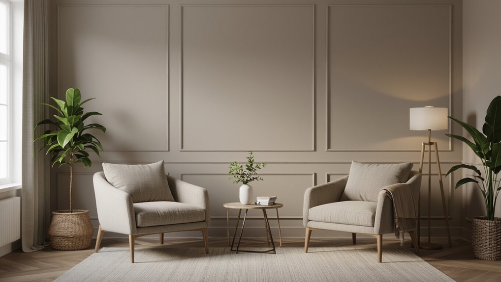
- Living room: eggshell for warmth
- Kitchen: semi-gloss for durability
- Bathroom: satin for moisture
- Bedroom: low-sheen matte for calm
- Hallways: satin for wipeability
What ‘œColor Drenching’ Means for Paint Finish
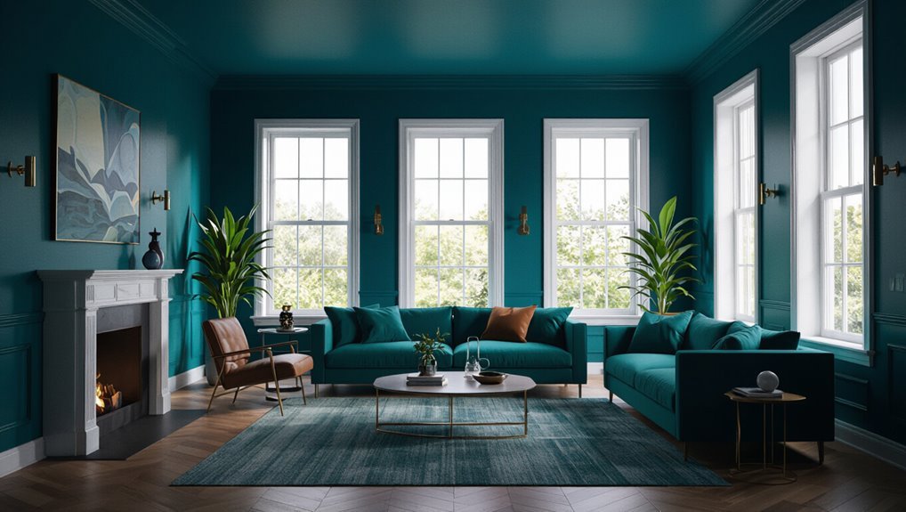
Color drenching means saturating a room with a single strong hue to create an immersive mood and visual impact.
You’ll want to contemplate how different finishes—matte, eggshell, satin, or gloss—change perceived saturation, depth, and sheen, with glossier surfaces boosting color intensity and matte tones muting it.
Choose extreme drenching for bold, intimate spaces and subtle saturation when you want color presence without overwhelming the room.
Definition and visual goals of color drenching
Anyone can create a color-drenched room by saturating walls, trim, and sometimes ceilings with a single hue to produce a bold, enveloping effect.
You aim to unify space, heighten mood, and simplify decor choices.
Color drenching emphasizes tone over pattern, creates immersive contrast or harmony with furnishings, and directs attention to architectural lines while making a strong, cohesive visual statement throughout the room.
How finish affects color saturation, depth, and sheen
When you drench a room in a single hue, the paint finish becomes as important as the pigment itself because it governs how saturated, deep, and shiny that color will read.
Matte soaks up light, muting glare and boosting perceived depth; satin and eggshell add subtle luster, enriching saturation; gloss intensifies sheen and contrast, making colors pop but revealing surface variations.
When to choose extreme color drenching vs. subtle saturation
If you want a room that grabs attention, go for extreme color drenching—saturated walls in a single bold hue will create an immersive, theatrical effect that demands compatible finishes and careful lighting.
Choose extreme when you want drama and can control light and accents; pick subtle saturation for calm, layered tones that work with varied furnishings, softer sheens, and flexible styling.
How Paint Finishes Influence Appearance and Perception
Think about the sheen spectrum as a tool you use to control how much light a wall throws back.
Higher sheens boost contrast and make colors look richer, while flatter finishes soak up light and soften perceived intensity.
And remember: glossy paints spotlight texture and flaws, whereas matt or eggshell finishes help hide surface irregularities.
Sheen spectrum explained
Sheen isn’t just a finish—it’s how paint talks to your eye, changing color, depth, and texture depending on gloss level. You choose matte for softness, eggshell for subtle warmth, satin for durability, and gloss for punch. Match sheen to room use and mood to drench color without overemphasis.
| Sheen | Look | Best for |
|---|---|---|
| Matte | Soft | Bedrooms |
| Satin | Durable | Hallways |
| Gloss | Highlight | Trim |
Light reflection, contrast, and perceived color intensity
Because finish controls how much light bounces off a wall, it directly changes contrast and how vivid a color looks.
So you’ll notice the same paint reading differently in matte versus gloss. Higher sheen boosts reflected light, sharpens edges, and intensifies saturation, while lower sheen softens highlights and mutes contrast.
Choose finish to match desired drama, depth, and perceived color strength.
Texture and surface irregularities: how finish hides or highlights flaws
Besides affecting light and color, finish also changes how surface flaws read to your eye.
Matte finishes absorb light and mask bumps, small cracks, and patchy texture, so your walls look smoother.
Sheenier paints reflect light, emphasizing imperfections and brush strokes, so they’ll stand out.
Choose finish based on your wall’s condition: hide irregularities with flat sheens, reveal them with glossier ones.
Primary Recommendation: Best Finishes for Color Drenching (Main Guidance)
For true color drenching, you’ll usually pick a matte or flat finish for its rich, even look, though it can show marks and isn’t ideal for high-traffic spots.
If you want the deepest, velvet-like tone, low-sheen matte or ultramatte often performs best, while eggshell or satin gives a good balance of durability and depth for everyday rooms.
Avoid high gloss and semi-gloss when you want uniform, soaked-in color, since their shine fights the drenching effect.
Matte/Flat pros, cons, and ideal use cases
Matte (or flat) paint soaks up light and hides surface flaws, making it the go-to if you want deep, saturated color without sheen.
You’ll love its velvety finish in low-traffic rooms, bedrooms, and ceilings. It’s less washable and can mark more easily, so avoid busy areas or trim.
Touch-ups blend well, but prepare surfaces carefully for best results.
Low-sheen Matte/Ultramatte when it’s superior for deep color
If you loved the velvety look of flat paint but want even richer, more saturated color, low-sheen matte (often called ultramatte) is your go-to.
It deepens pigments, hides minor imperfections, and creates a luxurious, enveloping finish. Use it on feature walls, bedrooms, or dining rooms where drama matters and traffic is light—just expect slightly lower washability than glossier options.
Eggshell/Satin balanced option for durability + depth
Balance is the name of the game with eggshell or satin finishes: they deepen color without sacrificing durability, so you get rich, drenchable hues that stand up to everyday wear.
You’ll enjoy subtle sheen that reveals depth and texture, resists scuffs, and cleans easily.
Choose eggshell for softer glow, satin for slightly more resilience in higher-traffic rooms.
When to avoid high gloss and semi-gloss for drenching effects
Eggshell and satin give you rich, wash-able color without shouting for attention, but you’ll want to steer clear of high-gloss and semi-gloss when your goal is a deeply drenched, velvety wall color.
High-sheen finishes reflect light, reveal flaws, and flatten saturated tones.
Pick low-luster sheens in large rooms or moody spaces to preserve depth, hide imperfections, and maintain a soft, immersive finish.
Choosing Finish by Room and Lighting Conditions
In low-light or small rooms you’ll often want a finish that deepens color without looking flat.
In contrast, bright sunlit spaces benefit from finishes that keep hues from washing out.
For kitchens, bathrooms, and other high-traffic or moisture-prone areas, pick a more durable, wipeable finish and accept slight sheen trade-offs for longevity.
Decide whether ceilings, trim, and accent walls should match for cohesion or contrast for emphasis, then choose complementary sheens to support that look.
Low-light rooms and small spaces finishes that maximize color richness
When a room has limited natural light or feels cramped, choosing a finish that deepens color without creating glare helps you keep the space rich and inviting.
Use matte or low-sheen eggshell to absorb light and saturate pigment, masking imperfections. These finishes add depth without bounce.
In tiny rooms, avoid high gloss; instead pick a velvety finish for warmth and true color fidelity.
Bright, sunlit rooms finishes that prevent washed-out color
Want to keep sunlight from washing out your paint? Choose an eggshell or low-luster finish to tame glare while preserving color depth.
These finishes diffuse bright light, reduce hotspots, and resist obvious imperfections on sunlit walls. Avoid high gloss, which reflects too much and bleaches hues.
Test samples in afternoon sun before committing to ascertain true color and finish balance.
High-traffic and moisture-prone areas (kitchen, bathroom) durable finish trade-offs
Because kitchens and bathrooms see spills, splashes, and constant use, you’ll want a finish that balances durability with appearance.
Choose semi-gloss or satin for easy cleaning and moisture resistance; semi-gloss hides less but wipes best, satin masks imperfections while still standing up to scrubbing.
Avoid flat finishes that stain easily; prioritize mildew-resistant, washable formulations for long-term performance.
Ceilings, trim, and accent walls: matching or contrasting finishes
If you’re aiming for cohesive rooms, keep ceilings and trim lighter and glossier than walls so lines read sharp and light reflects where you want it.
For a more dramatic or layered look, contrast a matte wall with glossy trim or paint the ceiling in a slightly darker tone to add depth.
Choose finishes by light, wear, and style:
- Glossy trim for crisp edges
- Satin walls for washability
- Matte for cozy depth
- Semi-gloss in humid rooms
- Contrasting ceiling to expand or cozy
Surface Preparation and Application Tips to Maximize Color Drenching
You’ll want to start by properly prepping the wall—patch holes, sand glossy spots, and apply a primer that’s made for deep colors to guarantee even absorption.
Use the right tool for the job (brush for edges, a nap roller for walls, or a sprayer for large areas) and keep a consistent technique to avoid lap marks.
Plan for multiple thin coats, respect drying times, and control temperature and humidity for the truest, most saturated finish.
Preparing the wall (priming, patching, sanding) why it matters
A smooth wall starts with proper prep: patch nail holes, sand rough spots, and prime bare or repaired areas so paint adheres evenly and color soaks in.
You’ll remove dust, bumps, and glossy residue so finish appears consistent. Proper patching prevents telegraphing, sanding creates keying for adhesion, and priming after repairs guarantees true, even depth without wasted coats or blotchy results.
Primer selection for deep colors and uniform absorption
After you’ve filled, sanded, and primed repaired areas, pick a primer that prevents deep colors from bleeding through and evens out porosity so your topcoat soaks uniformly.
Choose a high-hide, stain-blocking primer for rich pigments; consider tinted primers matched to your topcoat to reduce coats.
Use oil-based or high-quality shellac for stains, and acrylic bonding primers on porous or previously painted surfaces.
Tools and techniques (brush vs. roller vs. sprayer) for even finish
When you want a smooth, even finish that lets rich colors sing, pick the right tool and match your technique to the surface: brushes handle cutting in and detail, rollers cover flat walls quickly and control nap for texture, and sprayers deliver the most uniform, paint-drenching coat on large or intricate areas.
- Use angled brush for edges
- Choose roller nap to match surface
- Practice steady passes
- Keep sprayer moving to avoid runs
- Blend overlap for seamless finish
Number of coats, drying times, and environmental conditions
Three coats often aren’t necessary, but plan on at least two: a full base coat to seal and establish color, then a finish coat to boost depth and evening out.
Allow manufacturer drying times—typically 2–4 hours between coats, longer in cool or humid conditions. Aim for 50–70% humidity and 50–75°F.
Sand lightly between coats for adhesion and remove dust before applying the final layer.
Color Selection and Finishing Strategies to Amplify Drenching
Choose colors with intentional undertones, strong saturation, and clear contrast to give your walls real depth.
Use glazing, scumbling, or tonal washes in layers to build richness without muddying the hue.
Anchor the effect by coordinating trims, ceilings, and furnishings so the drenched color reads as a cohesive, intentional finish.
Using undertones, saturation, and contrast to enhance depth
If you want walls that read as dimensional instead of flat, focus on how undertones, saturation, and contrast work together to deepen perception.
Choose undertones that harmonize with room light, tweak saturation to push or pull planes, and use contrast—trim, ceiling, furniture—to define edges.
You’ll control perceived depth by balancing muted and vivid areas, avoiding abrupt shifts that flatten the drench.
Layering techniques: glaze, scumble, and tonal washes for richer walls
You’ve set the stage by tuning undertones, saturation, and contrast; now apply layered finishes to make those choices read as textured, luminous walls.
Start with a translucent tonal wash to unify color, add a soft scumble to suggest depth, then glaze selectively for sheen and richness.
Work wet-over-dry, control translucency, and step back often to balance intensity and maintain subtle variation.
Accent elements (trim, ceilings, furnishings) to support the drenched effect
Contrast is what keeps a drenched wall from feeling one-note, so pair your saturated field with trim, ceiling, and furniture choices that either amplify that depth or give it breathing room.
Use high-gloss or semi-gloss trim in a darker or complementary hue for definition, matte ceilings in a softened tint to lift the room, and streamlined furnishings that echo or neutralize the dominant color.
Durability, Maintenance, and Cleaning Considerations
Think about how finish affects cleanability and longevity—glossier paints wipe easier while matte and ultramatte show scuffs and can be harder to clean.
You’ll need different touch-up strategies for ultramatte and matte areas since they hide repairs differently and may require spot-priming or feathering.
For high‑use spaces, consider protective topcoats or alternative finishes to boost durability without losing the look you want.
How finish affects cleanability and longevity
Because paint finish determines how a wall stands up to scrubbing and daily wear, choosing the right sheen directly affects how long your paint job lasts and how easy it’s to keep clean.
You’ll favor satin or semi-gloss in high-traffic, moisture-prone rooms because they resist stains and wipe without damage.
Flat and matte hide imperfections but need gentler cleaning and more frequent repainting.
Touch-up strategies for matte and ultramatte finishes
When you need to touch up matte or ultramatte walls, accept that these finishes show repairs more easily and plan accordingly: feather edges of old paint, blend with a small brush or mini-roller, and work fast to match texture.
Test in inconspicuous spots, use the same batch if possible, and sand lightly between coats. Keep touch-up areas minimal to reduce visible differences.
Protective topcoats and alternatives for high-use areas
After you’ve nailed touch-up techniques for matte and ultramatte walls, consider whether a protective topcoat or a more durable finish would serve high-traffic areas better.
You’ll protect color and reduce scuffs with clear water-based polyurethane or a matte varnish.
For kitchens and hallways, pick satin or eggshell for easier cleaning.
Recoat annually in busy zones and spot-clean gently with mild soap.
Common Mistakes That Ruin Color Drenching and How to Avoid Them
Don’t pick a sheen that fights your lighting or the room’s function — it can make colors read flat or overly reflective.
Make sure you prep surfaces and use primer so absorption is even and you don’t need extra coats.
Also consider nearby finishes and materials so your drenching color complements, not clashes, with the rest of the space.
Choosing the wrong sheen for lighting or usage
Although a paint’s sheen might seem like a minor choice, picking the wrong one can drastically change how light plays across your walls and how colors feel in the room.
You’ll want matte for hiding flaws and reducing glare in low-traffic, cozy spaces, while satin or eggshell works for moderate traffic.
Use semi-gloss for trim and moisture-prone areas to resist wear and reflect light.
Poor surface prep and uneven absorption
When you skip proper surface prep or ignore how porous a wall is, paint soaks in unevenly and your color loses its depth and uniformity.
You should clean, sand, and repair dents or flaking first. Test absorption with a damp sponge, seal highly porous areas, and sand smooth before painting.
That consistency guarantees even sheen and true, saturated color across the whole wall.
Underestimating primer or number of coats
Fixing surface flaws and matching absorption gets you most of the way to a rich, even color, but skimping on primer or coats will still leave your walls looking flat or streaky.
You should use a quality primer to seal substrates and block stains, then apply enough thin, even coats to build depth.
Test coverage in varied light and don’t cut corners.
Ignoring surrounding finishes and materials
If you overlook the finishes and materials around a wall, even a perfectly applied paint can look off — too flat, too warm, or oddly muted.
Consider trim sheen, flooring tones, countertops, and hardware; they influence perceived color and finish.
Test swatches near those elements, adjust sheen to harmonize, and swap samples under varied light so the drenched color reads as you intend.
Cost and Practical Trade-offs
You’ll notice significant price gaps between finishes and brands, so factor cost per gallon and coverage into your choice.
Matte and flat paints save money upfront but often need more prep and touch-ups, while satin or semi-gloss cost more yet cut down on labor with easier cleaning and fewer repairs.
Consider hiring a pro for large or high-traffic rooms where durability and finish uniformity matter; DIY can work for small, low-traffic projects.
Price differences by finish and brand
Choosing a paint finish means balancing upfront cost with long-term value, and different brands price their sheens noticeably differently.
You’ll find matte often cheaper per gallon but premium eggshell and satin carry higher price tags for durability and pigment load.
High-end brands charge more for color retention and coverage, so compare coverage rates and warranty details to decide which offers the best value.
Time and labor implications of matte vs. durable finishes
Paint finish affects how much time and effort you’ll spend on prep, application, and touch-ups: matte hides wall imperfections so you can skim fewer repairs, but it often needs more coats and careful application to avoid lap marks.
Durable eggshell and satin lay down smoother with better coverage and clean-up, cutting long-term maintenance and repainting time.
Choose matte if texture matters; pick durable for faster upkeep.
When to hire a professional vs. DIY
If you’re comfortable with basic prep and modest repairs, a DIY job can save money—especially on small rooms where material and time costs stay low.
But hire a pro when walls need extensive patching, tricky finishes, high ceilings, or fast, flawless results that justify labor costs.
You’ll also hire pros for textured or glazed finishes, tight timelines, or if you lack tools, patience, or confidence.
Quick Comparison Cheat Sheet
For a fast reference, here’s which finish works best in each room and why—prioritizing depth, durability, or washability so you can pick what matters most.
You’ll see satin or eggshell suggested for living areas where depth and moderate washability matter, while semi-gloss is flagged for kitchens and bathrooms for top durability and easy cleaning.
Use flat or matte where texture and depth beat scrubbability, like adult bedrooms or ceilings.
Best finish per room and priority (depth, durability, washability)
When you’re choosing a finish room-by-room, prioritize what matters most—depth (how rich the color looks), durability (how well it resists scuffs), and washability (how easily you can clean it)—so you can match finishes to each space’s needs. Use this quick guide to pick smartly.
| Room | Priority | Recommended Finish |
|---|---|---|
| Living | Depth | Eggshell |
| Kitchen | Durability | Semi-gloss |
| Bedroom | Washability | Satin |
| Hallway | Durability | Semi-gloss |
Best Practices Checklist Before You Paint
Before you open a can, run a quick pre-paint checklist: check lighting, make sample boards, pick the right primer, and gather your tools.
Test samples on-site and observe them at different times of day so you can judge both finish and color under real light.
That simple plan will save time and avoid costly surprises.
Pre-paint checklist (lighting test, sample boards, primer, tools)
One simple checklist will save you time and money: test lighting, try sample boards, prime appropriately, and lay out the right tools so you can paint confidently and avoid costly mistakes.
- Check room lighting and note color shifts.
- Apply sample boards on different walls.
- Choose primer based on surface and color depth.
- Gather rollers, brushes, trays, and drop cloths.
- Confirm ventilation, tack cloths, and patching supplies.
On-site test plan: how to test finish and color at different times of day
You’ve checked lighting, taped up sample boards, and primed where needed; now test those samples in real conditions at different times so you know exactly how finish and color will behave.
Observe at morning, midday, golden hour, and artificial-light evening. Photograph each sample, note sheen reflections and undertones, and record room activities.
Compare notes before choosing finish and final coat.
FAQ
You probably have questions about how finish affects color depth and durability, especially with dark or richly pigmented paints.
We’ll answer whether matte flattens dark tones, how to get full color (and color drenching) in kitchens or bathrooms without losing durability, and whether to use tinted primer or extra topcoat tints.
You’ll also get straightforward fixes for sheen variations after painting.
Will a matte finish make a dark color look flatter?
Although matte finishes absorb light rather than reflect it, they won’t necessarily make a dark color look flat—you’ll mostly notice reduced sheen, softer edges, and fewer highlights that can mute depth.
You can preserve richness by choosing saturated pigments, using multiple coats for even coverage, and optimizing lighting placement.
Textures and trim contrasts also help maintain dimensionality without adding gloss.
Can I get color drenching in a kitchen or bathroom without sacrificing durability?
Matte finishes can mute depth, but that doesn’t rule out bold, saturated color schemes in high-use rooms like kitchens and bathrooms.
Choose a durable matte or low-sheen enamel formulated for moisture and scrubbability, seal trim and high-contact areas, and use proper prep and primer.
That way you keep intense, drenched color while resisting stains, mildew, and frequent cleaning without compromising the look.
How many coats are needed to achieve full color depth with deep pigments?
How many coats do you really need to get a deep, even color? You’ll usually need two to three topcoats with deep pigments.
Apply one solid coat, let it dry fully, then evaluate. Dark, saturated shades often demand a third coat for uniformity and to hide roller marks.
Thin, even layers beat heavy single coats—drying time and proper technique matter more than quantity.
Is it better to use tinted primer or multiple topcoat tints for intense color?
After you’ve established how many topcoats a deep pigment needs, you’ll face the choice: tint the primer or add extra tinted topcoats for intensity.
Tinting primer boosts coverage, reduces bleed-through, and often cuts the number of colored coats you need.
Extra tinted topcoats can deepen hue incrementally but use more paint and time.
For efficiency and truer color, tint primer first.
How do I fix sheen variations after painting?
Notice uneven shine? You can fix sheen variations by lightly sanding glossy spots with fine-grit paper, cleaning dust, and applying a thin, even layer of matching finish—feather the edges to blend.
If problems persist, recoat the whole wall with the same sheen and proper roller nap or spray technique.
Maintain consistent lighting to spot issues while you work.