
How to Make Paint Look Old and Faded on Walls Like a Pro
You can make fresh paint look authentically old by layering muted base colors with one or two contrasting undercoats, then using thin washes, glazes, and selective sanding to reveal those layers. Focus wear on high‑touch zones, feather edges, add dry‑brushed highlights and subtle grime in corners for depth, then seal with a protective topcoat. Test ratios on samples and work gradually so it feels natural — keep going and you’ll pick up pro tips for each technique.
What This How‑To Covers: Aging Painted Walls
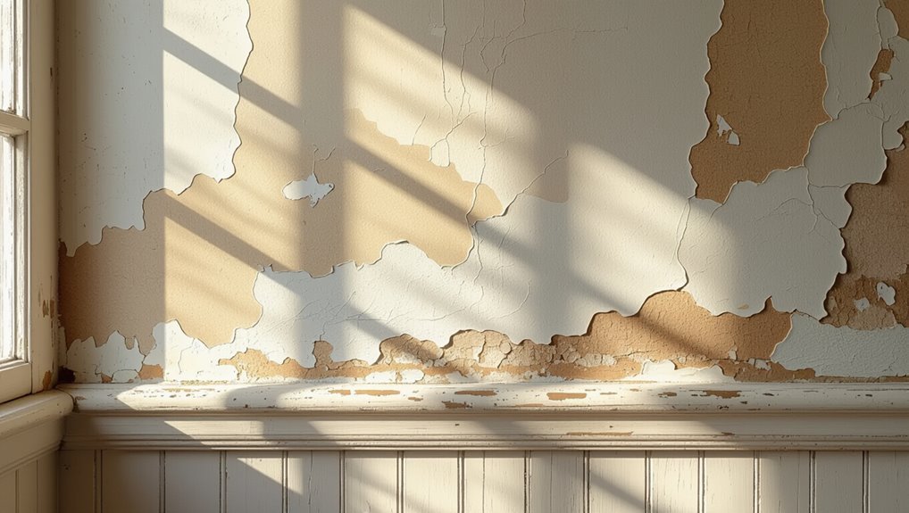
While this guide focuses on aging painted walls, you’ll get practical methods that work on drywall, plaster, and wood surfaces.
You’ll learn aging techniques like sanding, glazing, and selective wash-off to mimic years of wear.
You’ll apply tools and timing to control subtle weathering and achieve vintage aesthetics without overdoing it.
Each step’s concise, safe, and repeatable for consistent results.
Decide Your Aged Look: Fade, Distress, or Layered Patina
Want a softly sun‑bleached look, obvious wear, or a complex built‑up finish? You pick the mood: faded charm for subtle, even color loss; distressed elegance when you want chips, rubbed edges, and visible underlayers; or layered patina for depth—glazes, tints, and selective sanding combine.
Decide scale, intensity, and authenticity before you start so the result feels intentional and cohesive.
Quick Step‑By‑Step: Make Paint Look Old
Now that you’ve picked the look—softly sun‑bleached, clearly distressed, or layered with patina—it’s time to get hands‑on.
Prep the wall, sand subtly, and apply a thin base.
Layer washes using aged color palettes, glaze sparingly, then distress edges and high spots.
Blend with vintage texture techniques—dry‑brushing, gentle sanding, and light glazing—until the finish feels naturally worn and balanced.
Choose Base Colors and Believable Underlayers
Start with muted base tones like chalky whites, grays, or softened pastels to read as naturally aged.
Add layered undercoats—brush on a contrasting midtone and a darker primer in spots—then scuff or sand to reveal those layers.
Vary your colors subtly across the surface so the fading looks random and believable.
Pick Muted Base Tones
When you pick muted base tones, think about the colors that would naturally sit beneath weathered paint—faded whites, chalky creams, soft grays, and desaturated pastels—because believable underlayers make aging convincing.
You’ll favor muted palettes that read as worn, using subtle shifts in hue and saturation. Use color psychology to evoke warmth or coolness, then test swatches in different light before committing.
Add Layered Undercoats
Layered undercoats give your paint depth and history, so choose two to three base colors that could plausibly sit beneath the topcoat—think a sun-softened cream, a warm gray, and a hint of muted terracotta for warmth.
You’ll apply undercoat colors in thin, varied passes, scuff between layers, and use layered techniques like partial wiping or dry brushing so the topcoat reads as naturally worn.
Use Color Variation
Although choosing colors might feel like a final flourish, pick your base and underlayers with intention so the weathered look reads believable; aim for hues that could naturally age together—faded whites, warm grays, and muted earth tones—and keep contrast subtle so the topcoat can show through in believable ways.
| Base | Underlayer |
|---|---|
| Faded white | Warm beige |
| Warm gray | Taupe |
| Muted ochre | Rust |
| Soft sage | Driftwood |
Use color psychology and historical techniques to guide choices.
Tools and Materials Painters Use for Aging
If you want paint to look authentically aged, you’ll need the right tools and materials: brushes and rollers in varied stiffness, sandpaper and sanding blocks, glaze or dilution medium, stains and washes, waxes, and basic distressing implements like steel wool, chisels, or razor blades.
Use this tools overview and material essentials list to select quality items that let you layer, scuff, glaze, and tint precisely for convincing aging.
Prep the Wall: Clean, Patch, and Prime for Distressing
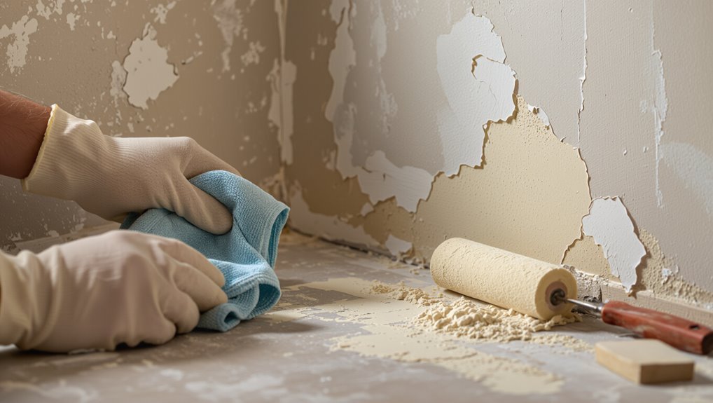
Before you start distressing, clean, patch, and prime the wall so your aging effects sit evenly and last.
You’ll follow wall preparation steps: surface cleaning with mild detergent, sanding glossy spots, and repairing cracks using proper patching techniques.
Choose primer selection suited to your substrate and finish to guarantee adhesion.
Proper prep makes wall distressing predictable, durable, and authentic.
Test Techniques on a Sample Board First
Now that the wall’s prepped, try your aging methods on a sample board to see how they behave and interact.
Use multiple sample boards for different layers, dries, and tools. Record ratios, timing, and tool pressure during technique testing so you can replicate successful results.
Adjust grit, wiping, and scuffing until the effect matches your vision before touching the actual wall.
How to Thin Paint for Natural Color Washes
When you want a natural color wash, start by picking the right medium—water for water-based paints, glazing medium for acrylics, and mineral spirits for oil-based paints.
Test mixing ratios on a scrap board (common starting points are 4:1 paint to medium for subtle tinting and 1:1 for stronger washes) and adjust until you get the transparency you want.
Apply thin, even strokes and build layers gradually rather than trying to get the look in one heavy pass.
Choosing The Right Medium
Although a full-strength coat can look crisp, you’ll get a softer, more natural wash by thinning your paint to let underlying texture and color show through.
Choose a medium that suits your surface and chosen finish: water for latex, glazing medium for deeper translucence, or mineral spirits for oil.
Consider color theory and paint selection so tones blend naturally and age authentically without overpowering texture.
Mixing Ratios And Technique
With your medium chosen, determine ratios that give the effect you want and test them on a scrap before committing to the surface.
You’ll thin paint gradually—start 1:1 paint to water or medium, then adjust. Use glazing medium for translucence.
Practice mixing techniques to control opacity and flow. Apply thin layers, blending edges while wet.
Remember basic color theory to harmonize faded hues.
Apply a Color Wash to Simulate Sun‑Faded Paint
A color wash gives your paint a soft, sun-bleached look by lightly tinting the surface rather than covering it; you’ll dilute paint with water (or glazing medium) and brush or rag it on in thin, even layers until the fade feels natural.
You’ll use color wash techniques to target sunny walls, vary dilution, feather edges, and blend to mimic authentic sun fading effects without harsh streaks.
Use Glazes to Build Depth and Uneven Aging
When you glaze, you’ll layer semi-transparent paint to create subtle shifts in tone and mimic the uneven loss of pigment that happens over time; each thin coat deepens shadows and softens highlights so the weathered finish reads as natural rather than painted-on.
You control glaze application with a soft brush or rag, blending edges and varying opacity.
These aging techniques let you build believable, uneven depth.
Selective Sanding: Reveal Underlayers Safely
If you sand selectively, you can reveal older layers and create convincing wear without stripping the whole piece. You’ll use light sanding techniques to expose spots, follow safety precautions, and keep edges natural.
- Test hidden area first
- Use fine grit and feather strokes
- Vacuum and wipe dust often
- Wear mask, goggles, and gloves
Layered Distressing: Where to Expose and Protect
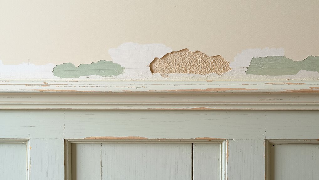
Decide where natural wear would show—edges, corners, drawer fronts and handles are good spots to expose underlying layers.
Protect ornate trim and painted motifs so their details stay crisp while you distress surrounding surfaces.
Use crisp shifts between layers by feathering sanding and blending colors to keep the look intentional.
High-Wear Exposure Areas
Because everyday touch points take the most abuse, you’ll want to plan layered distressing around knobs, edges, and flat surfaces where people actually grab and set things down.
Emphasize faded elegance and rustic charm while protecting structural areas.
Apply technique to:
- Door frames
- Window sills
- Stair rails
- Mudroom benches
Distress subtly, concentrating wear where hands and objects contact surfaces.
Decorative Feature Protection
Now that you’ve targeted high-touch zones, turn your attention to decorative features you want to showcase rather than wear down.
You’ll mask trim, moldings, and stencil details before distressing adjacent planes. Protect these elements with temporary guards or clear wax to preserve decorative finishes while you abrade surrounding paint.
This selective wall protection keeps accents crisp and intentional amid aged-looking surfaces.
Layer Transition Techniques
Think of layered distressing as controlled reveal—you’ll intentionally expose underlying colors and textures while protecting areas you want to keep intact.
You choose where to age, balancing layer blending and texture variation. Use tools and tape to guard features, then blend edges.
Steps:
- Map zones
- Protect trim
- Sand selectively
- Feather layers for realism
Dry‑Brushing for Soft Worn Highlights
Start with a dry brush and a light touch: dip just the tips of a stiff-bristled brush into paint, wipe most of it off on a rag, then drag the nearly‑dry brush across raised areas to create soft, worn highlights that mimic natural wear.
Use targeted dry brushing techniques for corners, edges, and texture; layer subtly for believable aging effects without overworking the surface.
Create Streaks and Drips That Read Like Weathering
Start by prepping the surface so paint adheres unevenly where you want natural streaks to form.
Thin your paint to the right viscosity so it runs without pooling or losing color.
Use a controlled drip technique—apply thin lines, tilt or blot to guide runs, and stop them before they overwork the effect.
Prep The Surface
Before you paint, roughen and selectively thin the surface so drips and streaks will behave like real weathering, not accidental messes.
You’ll assess surface texture and wall condition, then prep deliberately:
- Sand high spots lightly.
- Scuff glossy finishes.
- Clean grime from pores.
- Tape areas you don’t want runoff.
This gives controlled streak paths that read authentic.
Thin Your Paint
1 simple trick is to thin your paint so it moves like real runoff: dilute with a compatible solvent or water until it’s just fluid enough to form controlled streaks and occasional drips, then test on scrap to tune viscosity and flow. Adjust color intensity and paint consistency for subtle fading, working in layers to build realistic weathering.
| Tip | Result |
|---|---|
| Thin | Flow |
| Test | Control |
| Layer | Depth |
| Vary | Tone |
Controlled Drip Technique
A few controlled drips can turn flat paint into convincing weathering by mimicking how water carries pigment down surfaces.
You’ll adjust paint consistency and guide drip patterns for realism. Try this:
- Thin paint slightly.
- Load brush; touch top edge.
- Encourage drips with gravity.
- Soften edges with damp sponge.
Step back, edit sparingly, and keep streaks varied.
Add Faux Dirt and Grime to Corners and Seams
When you want paint to read as genuinely aged, focus on corners, seams, and tucked edges where dirt naturally accumulates; these spots sell the illusion.
Use subtle faux dirt techniques: dilute brown and gray washes, apply with a stiff brush or sponge into creases, then soften edges with a dry brush.
Control grime application—less is more—to keep results believable and restrained.
Simulate Mildew, Rust, and Water Stains
If you want paint to look convincingly aged, mimic the specific patterns of mildew, rust, and water stains rather than slapping on generic smudges.
- Use sponges and stippling for subtle mildew effects.
- Thin burnt umber for streaky rust textures along metal lines.
- Diluted brown-green glazes suggest water stains from drips.
- Blend and feather edges as part of aging techniques for realistic wear.
Mimic Sun Bleaching and UV Fading
After you’ve added mildew, rust, and water stains, shift focus to how sunlight fades pigments over time.
Use diluted white or pale washes where sun would hit, feathering edges for gradual fade. Add thin layers and sand lightly between coats to create varied loss.
Practice sunlight simulation on scrap first, then adjust paint application intensity to match natural UV bleaching patterns.
Age Trim and Moulding to Match the Walls
Though often overlooked, ageing trim and moulding to match faded walls is key to a convincing weathered look; you’ll use targeted aging techniques and adjusted trim finishes so everything reads cohesive.
- Sand edges subtly
- Thin glaze over base coat
- Lightly scuff high spots
- Seal with matte varnish
Match tones to wall fade for seamless integration.
Distress Hardware and Fixtures for Cohesion
When you want the room to read as truly lived-in, distressing hardware and fixtures brings the whole look together by matching their wear to the faded walls and trim.
You’ll gently sand edges, rub metal with steel wool, and apply dark wax or diluted paint to create patina.
Choose finishes that echo your distressed fixtures for cohesive design throughout the space.
Salt, Vinegar, and Household Shortcuts That Work
If you’re after inexpensive, natural methods to age paint, reach for salt, vinegar, and other pantry staples that reliably mimic years of wear.
Use these household shortcuts and precise aging methods:
Use simple pantry tricks—salt, vinegar, tea—for precise, natural-looking paint aging and authentic wear.
- Scatter coarse salt on tacky paint for subtle pitting (salt techniques).
- Dab diluted vinegar for softened edges (vinegar effects).
- Blot with tea for tone.
- Lightly sand and seal.
When to Sand‑Through vs. Use Crackle Medium
Because each method gives a distinctly different aged look, you should pick sand‑through when you want actual underlying layers to show through—sharp, worn edges and exposed base color—or choose crackle medium when you want a controlled, all‑over fine network of hairline fractures that reads like old lacquer.
Use sanding techniques for targeted wear and texture, and apply crackle effects for uniform vintage patina.
Fixing Mistakes and Blending Repairs Seamlessly
Start by evaluating the error honestly so you know whether you need a quick touch-up or a more involved repair.
Use gentle sanding, feather edges, and match tones when blending colors. Follow these repair techniques:
- Light sand and clean.
- Thin glaze to blend.
- Stipple texture to match.
- Layer and dry-check color.
Work patiently so repairs disappear into the aged finish.
Seal the Aged Finish: Wax, Matte, or Satin Coats
Now seal your aged finish with a protective topcoat that preserves the weathered look without adding unwanted shine.
Choose matte coating for a true antique vibe or a subtle satin finish where durability’s needed.
Practice wax application for delicate, buffable protection and layer thinly.
Use proper sealing techniques: test on scrap, apply evenly, and cure fully to keep texture and patina intact.
Room‑Specific Tips: Kitchens, Baths, Living Rooms
Kitchens, baths, and living rooms each demand different approaches when you want paint to look aged—consider moisture, traffic, and sightlines as you choose techniques and sealers.
- Kitchens: use muted kitchen accents and durable topcoats.
- Baths: choose moisture‑resistant bathroom finishes and subtle distressing.
- Living rooms: layer living room textures and worn edges.
- Color schemes: pick faded palettes that read cohesive.
Maintain Your Aged Finish: Cleaning and Touchups
Although a distressed finish looks effortless, it needs regular care to keep that lived-in charm; you’ll want a simple routine that balances gentle cleaning with careful touchups so the patina lasts without losing its character.
Use mild cleaning methods—soft cloth, diluted soap, spot test—then employ subtle touchup techniques: feathering paint, thin glazes, or light sanding to blend repairs so your aged look stays authentic.
Cost and Time Estimates Per Technique
1 practical way to plan your project is to break costs and time down by technique so you can compare trade-offs and pick the approach that fits your budget and schedule.
Do a quick cost analysis and estimate time investment for each method:
- Distressing: low cost, moderate time.
- Glazing: medium cost, higher time.
- Dry brushing: low cost, low time.
- Layering washes: medium cost, high time.
Common Faux‑Aging Mistakes and How to Avoid Them
When you try to make paint look old, small mistakes quickly read as fake—so pay attention to scale, consistency, and where natural wear would happen. You’ll avoid common pitfalls by studying light, traffic patterns, and material junctions. Use expert tips: layer subtly, sand selectively, blend edges, and step back often to check realism.
| Mistake | Fix |
|---|---|
| Uniform fading | Vary intensity |
| Harsh edges | Feather edges |
| Wrong scale | Match room size |
| Overdoing | Less is more |
| Ignoring details | Target corners |
Frequently Asked Questions
Can Aged Paint Be Safely Removed Later Without Damaging Drywall?
Yes — you can remove aged paint later without damaging drywall if you use gentle removal techniques and prioritize drywall preservation; you’ll sand lightly, use mild chemical strippers or heat cautiously, patch imperfections, and finish with proper priming.
Will Aging Techniques Affect Paint VOCS or Indoor Air Quality?
Absolutely — you’ll dramatically lower VOC considerations and indoor pollutants by choosing low-VOC products and proper ventilation; don’t assume glazing, distressing, or sealers won’t add fumes, so test products and air out the room thoroughly.
Can I Age Paint Over Wallpaper or Textured Plaster?
Yes — you can age paint over wallpaper or textured plaster, but you’ll test adhesion first. Use gentle aging techniques, guarantee wallpaper compatibility, prime if needed, and avoid heavy distressing that could peel or damage the surface.
How Do I Match Aged Finishes Across Adjacent Rooms Painted Years Apart?
You’ll match aged finishes by sampling and blending colors, creating subtle color blending shifts at thresholds, and adjusting sheen for finish consistency; you’ll feather edges, test in natural light, and keep notes to repeat formulas room-to-room.
Are There Insurance or Rental Lease Implications for Intentional Distressing?
You should check your lease and insurer first: intentional distressing techniques might violate lease terms or be deemed damage, risking denied insurance coverage; get written permission and document methods to avoid disputes and protect your coverage.
