How to Find Paint Color of Wall: Simple Matching Methods
You can quickly match a wall color by taking a small chip or snapping a well-lit photo, then comparing paint chips or using a phone app or spectrophotometer under natural light. Test removable swatches and live patches at eye level and check them at different times to spot undertone shifts. Decide if you need an exact touch-up or a repaint based on damage and sheen, and always try a small patch first — keep going for tips on testing, ordering, and touch-ups.
Quick Answer: Fastest Way to Match Paint
Want the quickest match for a wall color? You can grab a small chip, use a portable spectrometer or phone app, and compare samples under natural light.
Consider color psychology to keep mood consistent, and match paint finishes, sheen included, so touch-ups blend. Test a tiny patch before buying more.
This saves time and prevents mismatched tones or glare differences.
Decide: Touch‑Up or Full Repaint?
Once you’ve matched the color and checked finish and lighting, decide whether you need a simple touch‑up or a full repaint. Assess damage, age, and visibility. Use touch up techniques for small scuffs; consider repaint considerations for faded or large areas.
| Option | When to choose |
|---|---|
| Touch‑up | Small marks, matched sheen |
| Repaint | Widespread fading, pattern mismatch |
Do You Need an Exact Match or a Close One?
How close does the color really need to be: an exact replica or just visually similar?
Decide if you have an exact preference or can accept slight shifts.
Consider color harmony with furniture, your personal style, room mood and color psychology.
Think about design trends and visual impact; small brand variations often occur.
Choose based on how noticeable mismatches will be in the space.
Compare Paint Chips to Match Wall Color
Before you start, gather several paint chips and hold them against the wall under the room’s normal lighting so you can see true color differences.
Move the chips around, tilt them, and view from different angles to spot subtle shifts in hue, value, and saturation.
Use paint chip selection with color wheel comparison, note lighting conditions, surface texture and finish variations, plan sample placement, consider color psychology, and consult digital tools.
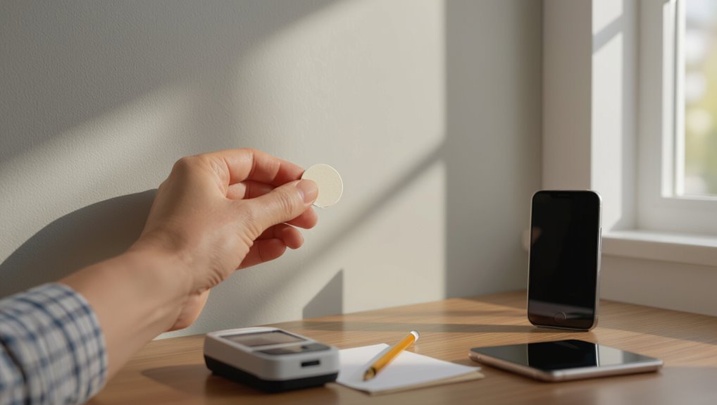
Use a Removable Swatch to Test Color in Place
Pick a few removable swatches and stick them directly to the wall where you’ll see them most.
Then live with them for a few days so you can judge the color under your everyday lighting and traffic patterns.
You’ll verify color perception and color accuracy by visual comparison, noting light effects and swatch durability.
Focus on testing conditions with removable samples.
- swatch placement
- visual comparison
- testing conditions
Photograph Paint for Color‑Matching Apps
Grab your phone or camera and shoot the wall straight-on in consistent light so an app can read the true color—position yourself perpendicular to the surface, avoid wide-angle distortion, and take multiple images at different times of day to account for changing light.
Use steady photo lighting, high image resolution, note surface texture, make subtle angle adjustments, test editing tools, compare app features, consult app comparisons and user reviews, apply color theory for color accuracy.
Best Smartphone Apps and Quick Tools for Matching Paint
Several smartphone apps and quick tools can get you within a few shades of your wall’s true color fast, so you can narrow down paint choices without hauling home sample chips.
You’ll explore smartphone options, app reviews, color palettes and user experiences.
Try these matching techniques via photo guides and tool comparisons:
- Visual picker apps
- AR preview tools
- Portable color meters and tech innovations
When to DIY and When to Take a Sample to the Paint Store
The apps and pocket tools you just read about will often get you close enough to choose a finish or order samples.
However, there are times you’ll want to bring a physical swatch to the paint store. For DIY considerations, weigh project assessment, paint types, and matching techniques.
Manage color perception and set realistic color expectations; seek professional advice when sample preparation or complex matches exceed your skills.
How Paint Stores Use Spectrophotometers to Match Color
When you bring a paint chip or sample to the store, a spectrophotometer measures the light reflected from it across different wavelengths to record its exact color signature.
The technician then compares that signature to the store’s database and runs the matching software, which suggests a formula and any tint adjustments needed.
You’ll usually get a printed formula and a small test pot to confirm the match before full-scale mixing.
How Spectrophotometers Work
1 practical tool you’ll see at paint counters is the spectrophotometer, a device that reads the exact color of a painted surface and converts that information into a formula your store can mix.
It shines controlled light, measures reflected wavelengths, and compares the result to a color database so you get a precise match.
- optical sensors, light wavelengths, color calibration
- surface textures, environmental factors, color perception
- color theory, paint formulations, color consistency, application techniques
Matching Process Steps
After the spectrophotometer captures a sample, paint-counter staff follow a clear matching routine to turn that readout into a usable paint formula.
You’ll watch technicians check sample placement, assess wall conditions and texture variation, consider lighting effects and color psychology, and use matching tools plus color theory to tweak tint.
They test paint finishes, confirm surface preparation, and try brush techniques for final approval.
How to Prepare a Clean Wall Sample for Professional Matching
Before you cut or remove anything, pick a spot that’s clean, original (not repainted), and out of direct sunlight so the color reads true.
You’ll use careful cleaning techniques and sample preparation to preserve color.
Do:
- Gently clean with mild detergent, rinse, dry.
- Remove a small, intact paint chip using a sharp blade.
- Label location and note lighting conditions.
Match Paint by Sheen: Why Finish Matters
Don’t assume the same pigment looks identical across finishes — sheen can change how you perceive color.
You’ll notice matte absorbs light and mutes tones while gloss reflects light and can make colors read brighter.
Pay attention to how light hits the wall, because angles and intensity will amplify those differences.
Sheen Changes Color
While the color swatch may look the same on paper, the sheen you choose can make that hue read lighter, darker, or more saturated on your wall.
So you’ll want to match finish as well as pigment when replicating paint. You’ll note sheen impact and sheen perception in a quick sheen analysis.
Consider:
- sheen variations and sheen types
- sheen comparison and sheen reflection
- sheen effects on color fidelity
Matte Versus Gloss
Sheen doesn’t just alter brightness—it changes how texture and depth read, so you should also match finish when matching paint.
You’ll consider sheen impact on color perception; matte softens flaws while gloss highlights them.
Choose based on finish durability and aesthetic preferences.
Match application techniques for consistent coverage, and note maintenance differences—cleaning, touch-ups, and wear vary by sheen.
Light Interaction Effects
Light reflecting off a wall changes how you perceive its color and depth, so matching finish is as important as matching pigment.
You’ll notice sheen alters color perception under different lighting conditions and affects surface texture visibility and visual contrast.
Consider:
- Matte hides flaws, aids color blending, influences color psychology
- Satin balances color harmony and durability
- Gloss boosts highlights, reacts to environmental factors
Account for Lighting: Daylight, Warm Bulbs, and Mixed Light
Because the same paint can look very different under various lighting, you should evaluate wall color at multiple times and with the bulbs you’ll actually use.
Check color temperature and light intensity in natural illumination and with bulb types you’ll install.
Note shadow effects, reflective surfaces, and ambient light variations so your color perception stays consistent across morning, evening, and mixed-light conditions.
How Dirt, Age, and Sun Fade Change Your Paint Color
Over time dirt and surface staining can dull your walls and make colors look muddier than they are.
Sunlight and UV exposure will bleach pigments, especially on south- and west-facing walls, so the color you see now may be lighter or less saturated than the original.
Before matching paint, clean a small area and check shaded spots to get a truer sense of the true color.
Dirt And Surface Staining
Though a wall’s painted hue might’ve seemed constant when it was new, dirt, grime, and surface staining quietly alter that color over time.
You should do surface analysis and use cleaning techniques and cleaning solutions for stain removal.
Key considerations:
- stain characteristics and environmental effects on paint durability
- surface preparation and wall maintenance routines
- prevent accelerated color fading with timely care
Sunlight And UV Fading
Surface dirt and stains will change how a color looks, but prolonged sun exposure and UV radiation do more than just darken grime—they chemically alter pigments and binders so paint actually loses color and shifts hue.
You’ll notice sunlight effects and UV impact creating fading patterns and color shifts.
Consider environmental factors, maintenance tips, fading prevention, and repainting schedules to preserve paint longevity.
Match Tricky Colors: Whites, Neutrals, and Pastels
Because whites, neutrals, and pastels shift so easily with light and surroundings, you’ll need a careful approach to identify them: inspect paint chips under the room’s natural light at different times, compare large swatches pinned to the wall, and note undertones by viewing edges against trim and flooring.
Whites, neutrals, and pastels shift with light—test chips in natural light, use large swatches, and check undertones.
Use these tips:
- Test swatches with different paint finishes and ambient lighting to see color saturation.
- Check wall textures and blending techniques to guarantee color harmony.
- Consider color psychology and accent colors when finalizing choices.
Match Color Across Surfaces: Drywall, Wood, Metal, Fabric
After you’ve isolated subtle whites and pastels on walls, the next step is to match those tones across different materials—drywall, wood, metal, and fabric—since each absorbs and reflects pigment differently.
You’ll assess drywall textures, wood finishes, metal types and fabric patterns, noting sheen variations, color undertones, surface conditions and aging effects.
Then choose samples and view them in planned lighting before final selection.
Custom Matches: Tinting and Blending Steps Explained
When you need a perfect match, tinting and blending give you control over subtle undertones and sheen so the repaired or new section disappears into the surrounding finish.
You’ll use tint techniques and blending methods with careful sample preparation, apply color theory for color adjustments, then follow application tips to feather edges and match texture.
- measure undertones
- mix small increments
- blend progressively
Test Swatches: How Many Samples to Try and Where to Place Them
You should try multiple shades so you can compare subtle differences side by side.
Test each swatch in different light throughout the day to see how color shifts.
Place samples at eye level in the spots where the wall will be most seen.
Try Multiple Shades
Pick three to five swatches to get a clear sense of how different tones read in your space, and place them where the wall will be most visible—near seating areas, by windows, and on the largest wall—so you can see how light and room function affect each shade.
Consider:
- color psychology, shade harmony, texture influence for room ambiance
- seasonal changes, color layering, emotional impact in schemes
- color theory, visual perception, design trends when deciding
Test In Different Light
After narrowing your options to a few swatches, test them under the different light conditions they’ll live with to see how they actually read.
Put several samples where morning, midday, and evening light hit, and observe color perception shifts.
Consider paint durability for finish choices and how color psychology affects mood in each light.
Try at least three swatches for reliable comparison.
Place At Eye Level
A good rule is to test at least three swatches and place them at eye level where you’ll most often view the wall; this gives you direct, real-world impressions without the distortion caused by looking up or down.
You should consider wall placement, lighting, and sightlines.
Try these focused checks:
- View from seating and standing
- Check near fixtures and trim
- Observe at different times of day
Evaluate Samples Over Several Days: What to Watch For
While you test your paint samples over several days, pay attention to how the color shifts with changing light and activities in the room.
Notice color perception changes from seasonal lighting and environmental factors.
Vary sample placement and observe texture influence on sheen.
Consider color psychology effects on mood, assess color harmony with furnishings, and weigh personal preference before deciding.
Common Matching Mistakes and How to Avoid Them
Mistakes happen when you rush matching paint, so slow down and check the details: lighting, sheen, undertones, and how the color reads next to trim and furniture.
You’ll avoid common pitfalls by controlling light influence, rotating sample placement, and watching for visual fatigue during color comparison.
- Check sheen impact on different surfaces
- Account for age effects and surface differences
- Use multiple matching techniques
When to Accept a Close Match (and Save Time/Cost)
You don’t always need a perfect match—ask whether the color difference will be noticeable from a few feet or under different lighting.
Consider your budget and timeline: matching exactly can cost more and take longer, so a close match might be the smarter choice.
If small imperfections bother you, there are quick fixes like touching up trims, using connecting moldings, or repainting smaller sections instead of the whole wall.
When Color Differences Matter
Context matters: not every wall needs a perfect, undetectable color match, and knowing when a close match is acceptable can save you time and money.
You’ll weigh color psychology, aesthetic harmony, room ambiance, personal preference, texture impact, design cohesion, seasonal changes, complementary colors, mood influence, and cultural significance.
- Inspect from typical viewpoints
- Match under real lighting
- Prioritize focal surfaces
Budget And Time Tradeoffs
After you decide which walls need exact matches and which can be more forgiving, weigh the time and cost of perfect matching against practical savings.
You’ll use budget considerations and cost analysis to decide if minor variation is acceptable. Factor time constraints, project timeline, resource allocation, financial planning, and expense management.
Prioritizing tasks lets you accept close matches where savings and speed matter most.
Practical Fixes For Imperfections
When a perfect repaint would blow your schedule or budget, accept a close match and use simple fixes to keep the room looking cohesive.
Use color theory basics and lighting considerations to choose the best match, apply wall preparation tips, and use paint application methods plus finish selection advice.
- Cleaning procedures and maintenance strategies
- Surface compatibility and texture matching
- Color correction techniques
Next Steps: Ordering Paint, Touch‑Ups, and Record‑Keeping
Decide what you need and order exact matches: measure the area, note the finish, and choose whether you want a full can or a smaller touch‑up size.
Use paint ordering services, record keeping and paint tracking for color formulas and receipts.
Learn touch up techniques and surface preparation, label cans for paint storage, and follow maintenance tips so touch‑ups blend and future matches stay simple.
Frequently Asked Questions
Can Paint Color Vary Between Different Batches of the Same Formula?
Yes — you can notice batch differences; manufacturers aim for color consistency, but slight variations occur. If you’re matching paint, always check batch numbers, test a swatch, and adjust or rebatch as needed.
Will Primer Affect the Final Visible Color of a Repainted Area?
Yes — primer effects can change the final visible color, so you’ll prep surfaces thoroughly, choose compatible primers, apply even application techniques, and test samples to guarantee color consistency before repainting for reliable, predictable results.
Can Humidity or Season Affect How Paint Dries and Looks?
Ironically, your paint won’t dry faster by wishing—humidity effects slow curing and deepen sheen, while seasonal changes shift drying time and color perception. You’ll notice longer tackiness in damp months and crisper finish in dry ones.
Do VOC Levels or Paint Type (Acrylic vs. Oil) Change Color Perception?
Yes — VOC effects and paint sheen can change how you perceive color; low-VOC or high-VOC formulations and acrylic versus oil binders shift undertones and gloss, so you’ll notice subtle hue, depth, and reflectance differences.
How Should I Store Leftover Paint to Preserve Its Color?
Picture a sealed paint canister tucked like a time capsule; you’ll store leftovers upright, label lids with color and date, wipe rims, add plastic wrap, keep cool and dark to prevent color fading and stir before reuse.
Conclusion
You’ve got the tools now, so trust your eye and take small steps: decide whether you need a touch‑up or a full repaint, test chips and swatches in the room, and watch them at different times of day. Like tuning an instrument, matching paint asks for patience and tiny adjustments. When a close match sings in the light, accept it — document the formula for future encore performances and save time, money, and headaches.