Should Ceiling Be Painted Same Color as Walls? Pros and Cons
You can paint the ceiling the same color as the walls when you want a cohesive, larger-feeling space and to hide flaws, and you can choose contrast when you want drama, definition, or to highlight fixtures. Light, matching ceilings boost brightness and perceived height; dark ones add coziness and depth. Consider light, room size, function, and resale before deciding. Keep samples and mockups handy so you’ll avoid surprises and learn the best approach for each room.
How to Use This Guide: Decide, Test, Paint
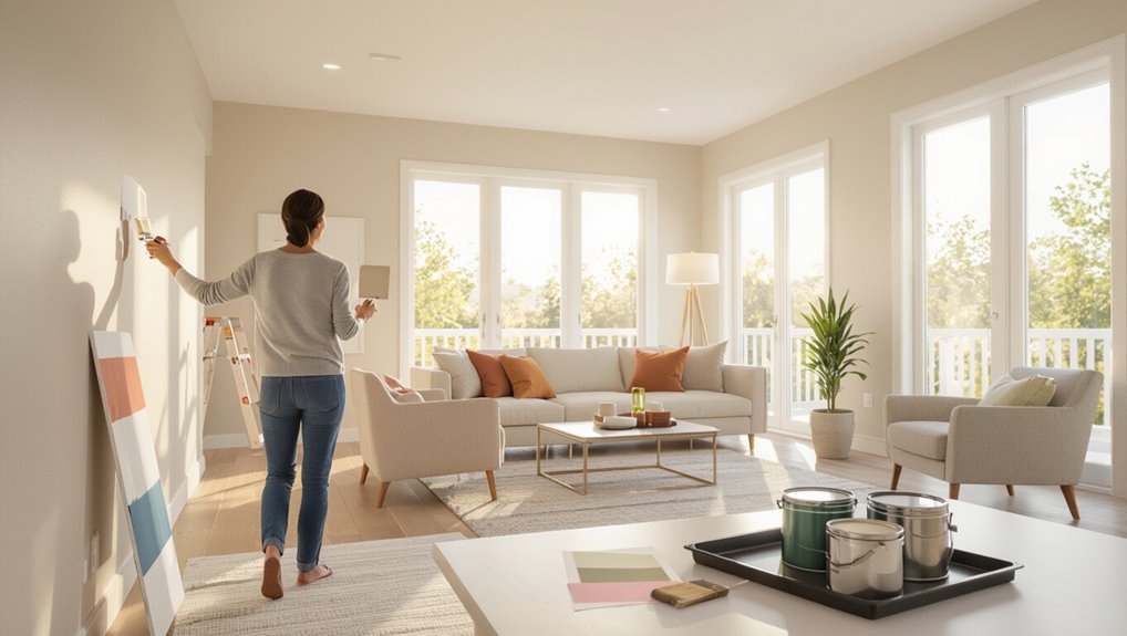
Before you immerse yourself in painting, decide what effect you want, test your ideas in the room, then paint with confidence.
You’ll use color psychology to set mood, weigh practical considerations like light and maintenance, and try samples on multiple walls and the ceiling.
Note how fixtures and furniture respond, then choose the scheme that feels cohesive, functional, and true to your vision.
Quick Answer: Should Ceilings Match Walls?
Yes—you can match the ceiling to the walls to create strong visual continuity that makes the room feel cohesive.
Doing so can also change spatial perception: a matched ceiling often makes a space feel taller or more unified, while a contrasting ceiling can define height and add drama.
Consider your room’s size and lighting to decide which effect you want.
Visual Continuity Benefits
When you paint the ceiling the same color as the walls, the room feels more unified and spacious because your eye isn’t stopped by a contrasting line where wall meets ceiling.
You’ll create color harmony and stronger room cohesion, letting fixtures and furnishings stand out without competing edges.
This seamless backdrop simplifies decorating choices and produces a calmer, more intentional interior.
Spatial Perception Effects
If you want a room to feel taller or more expansive, matching the ceiling to the walls can help your eye keep moving uninterrupted, making corners and edges disappear. You’ll improve spatial awareness and influence color perception, creating cohesion. Consider trade-offs below:
| Effect | Result |
|---|---|
| Continuous plane | Feels larger |
| Contrast loss | Less definition |
| Cozy feel | Intimate space |
| Lighting impact | Alters perceived hue |
Why Matching Matters: Visual and Practical Effects
Although matching the ceiling to the walls might seem purely aesthetic, it changes how you perceive height, light, and room flow—and it affects maintenance and resale appeal.
You’ll gain matching aesthetics and color harmony that simplify decorating, create cohesive photos for listings, and make touch-ups easier.
It can unify open plans, reduce visual clutter, and help potential buyers imagine the space without jarring contrasts.
How Matching Changes Perceived Ceiling Height
Because your eye seeks continuity, painting the ceiling the same color as the walls makes the boundary between them recede, so rooms feel taller and more unified.
You’ll notice a visual illusion that raises perceived ceiling height, especially in compact spaces. By removing contrast, your room reads as one continuous volume, simplifying proportions and making low ceilings feel less oppressive without structural changes.
Matching Ceilings and Room Brightness
When you paint the ceiling the same color as the walls, light spreads more evenly across surfaces and the room often reads brighter because there’s less contrast to interrupt reflection.
You’ll notice the brightness impact and improved color harmony.
Consider practical effects:
- Fewer shadows
- Diffused daylight
- Consistent artificial light
- Easier color matching
How Matching Shapes Mood and Coziness
When you paint the ceiling the same color as the walls, you create a unified color envelope that feels calm and cohesive.
That continuity can make the room read taller or cozier depending on the hue and perceived room height.
You’ll also affect light reflection balance, so consider how the finish and tone will soften or brighten the overall mood.
Unified Color Envelope
If you paint the ceiling the same color as the walls, you’ll create a unified color envelope that visually wraps the room and alters how it feels—cozy and intimate with darker tones, airy and expansive with lighter ones.
- You control mood through color choice and contrast.
- You boost design harmony across surfaces.
- You simplify decorating decisions.
- You create a continuous backdrop for furniture and art.
Perceived Room Height
Painting the ceiling the same color as the walls can noticeably change how tall a space feels, because matching tones blur the boundary between vertical and overhead planes and make the room read as one continuous volume; darker, unified colors pull the ceiling down for a cozier, more intimate feel, while lighter, seamless hues lift the space and make it seem airier. You’ll notice perceived spaciousness shifts via ceiling illusions.
| Effect | Color Choice | Mood |
|---|---|---|
| Lowered ceiling | Dark | Cozy |
| Raised feel | Light | Airy |
| Neutral blend | Mid | Balanced |
| Accent strip | Contrast | Defined |
Light Reflection Balance
Because ceiling and wall colors share light, matching them changes how much bounce you get in a room and directly affects mood and coziness: lighter, reflective tones amplify daylight and make spaces feel airy, while deeper, low-reflectance hues absorb light and create a warmer, more intimate atmosphere.
- You get improved light balance.
- You’ll boost aesthetic harmony.
- You control perceived warmth.
- You shape coziness and mood.
When Matching Hides Architectural Flaws
When you match the ceiling to the walls, you can visually blur edges and downplay uneven lines, so imperfections like low beams, dropped soffits, or subtle drywall seams become less noticeable.
You’ll achieve architectural harmony through strategic color blending, making shifts smoother and flaws recede.
Use matte finishes and consistent tones to minimize glare and keep attention on layout rather than imperfections.
When Matching Makes a Room Feel Boxed In
Blending the ceiling with the walls can hide flaws, but it can also make a small room feel boxed in if you’re not careful.
Blending the ceiling with walls hides flaws but can make a small room feel cramped if overdone.
You’ll notice how unified color perception lowers vertical contrast, shrinking perceived height.
Consider:
- Keep ceilings lighter than walls.
- Use crown molding to break sameness.
- Add vertical accents.
- Rely on tall furniture to restore scale.
Light vs. Dark Ceilings: Which Value to Choose
Curious whether a light or dark ceiling will work better in your space? You’ll weigh light ceiling benefits—airiness, brightness, perceived height—against dark ceiling drama—coziness, depth, bold contrast. Choose based on mood, scale, and light levels. Use the table below to compare quickly.
| Effect | Light Ceiling | Dark Ceiling |
|---|---|---|
| Perceived height | High | Low |
| Ambience | Bright | Intimate |
| Best rooms | Small/dim | Large/well-lit |
| Visual impact | Subtle | Strong |
Warm vs. Cool Ceilings: Color Temperature Effects
Although ceilings are often overlooked, their color temperature shapes how you feel in a room: warm ceilings (yellows, soft peaches, warm whites) make spaces feel cozy and inviting, while cool ceilings (blues, crisp whites, grays) create a cleaner, more spacious or energizing vibe.
Ceiling color temperature subtly shapes mood: warm hues cozy and intimate, cool tones airy, crisp, and energizing.
- Warm = snug, lowers perceived height.
- Cool = airy, raises perceived height.
- Use color psychology to guide mood.
- Consider temperature perception with lighting.
Which Rooms Benefit Most From Matching Ceilings
If you want a small room to feel larger, painting the ceiling the same color as the walls will visually expand the space.
In rooms with very high ceilings, matching colors can create dramatic cohesion that draws the eye upward without feeling disconnected.
Consider the room’s proportions and light when deciding whether a unified palette will help or hinder your goals.
Small Rooms Expansion
When you paint the ceiling the same color as the walls, small rooms instantly feel taller and more cohesive because the eye doesn’t stop at a contrasting edge; instead, it follows an uninterrupted plane that visually expands the space.
Use these small space tricks and visual tricks in:
- Bathrooms — feel airier.
- Kitchens — streamline sightlines.
- Hallways — reduce claustrophobia.
- Closets — seem larger.
High-Ceiling Drama
Because high ceilings draw your eye upward, painting the ceiling the same color as the walls can turn soaring vertical space into a deliberate design feature rather than an intimidating void. You’ll emphasize high ceiling aesthetics and create dramatic effects in living rooms, galleries, and entryways. Choose warm tones for coziness or deep hues for theater-like intimacy.
| Room Type | Benefit | Suggested Tone |
|---|---|---|
| Living Room | Unified space | Warm |
| Gallery | Focused display | Neutral |
| Entryway | Welcoming drama | Deep |
Rooms Where Ceiling Contrast Usually Works Better
Although open-concept living areas often benefit from a cohesive palette, many spaces gain character when you contrast the ceiling with the walls. Doing so can define function, add depth, and draw the eye upward in rooms like dining areas, entryways, and home offices.
- Dining — contrast benefits highlight focal lighting.
- Entryway — sets tone immediately.
- Home office — separates work zone.
- Bathroom — masks ceiling texture while adding drama.
Small-Room Strategies to Expand Space Visually
If you want a small room to feel larger, use ceiling treatments that lift the eye and reduce visual clutter: paint the ceiling a lighter shade than the walls, keep trim and moldings minimal, and choose a matte finish to avoid highlighting imperfections.
Then apply color layering techniques—soft gradients, pale trims—and spatial illusion tricks like matching upper walls to ceiling to create seamless height and visual openness.
High-Ceiling Strategies to Create Intimacy
When you want to make a high ceiling feel cozier, use visual tricks to lower it, like painting a band or the entire ceiling a slightly darker shade than the walls.
Add warm color accents through textiles and artwork to pull the room inward.
Finish with scale-appropriate lighting—pendants or layered fixtures—to create comfortable, human-scaled zones.
Lower The Ceiling Visually
To make a tall room feel cozier, bring the eye downward with design choices that visually lower the ceiling.
You’ll use contrast, scale, and placement to alter ceiling height and visual perception.
- Hang lower light fixtures.
- Add horizontal moldings.
- Use darker paint band near top.
- Employ tall furniture and artwork clustered mid-wall.
Warm Color Accents
Because warm tones draw the eye downward and cozy the space, adding rich accents—like terracotta throws, mustard pillows, or a deep ochre accent wall—will make a high ceiling feel more intimate.
Use warm color palettes to anchor seating areas, layer textiles and art, and consider subtle accent ceiling options to tie the scheme together so the room reads as inviting rather than cavernous.
Scale-Appropriate Lighting
If you want a high ceiling to feel intimate rather than overwhelming, choose lighting that matches the room’s scale and purpose.
You’ll focus on scale considerations and thoughtful lighting placement to draw the eye down and warm the space.
- Layered pendants for zones.
- Dimmable recessed for mood.
- Wall sconces to reduce height.
- Floor lamps for close-up warmth.
Open-Plan Flow: When to Match Across Spaces
When you’re dealing with an open-plan home, matching the ceiling to the walls can create a seamless, airy flow that visually links connected areas and reduces visual clutter. You’ll enhance open plan aesthetics and maintain color harmony, making shifts feel intentional. Use matching ceilings to unify zones; contrast when you need subtle separation.
| Benefit | When to Use |
|---|---|
| Unity | Whole space feels cohesive |
| Airiness | Small ceilings visually lift |
| Focus | Highlight furniture groups |
| Separation | Define dining without walls |
| Flexibility | Easier redecorating choices |
Historic Homes: Matching to Preserve Character
Preserving a historic home’s character often means keeping the ceiling the same color as the walls, so original proportions and period details read as they were meant to.
You’ll protect architectural integrity and support historic preservation by maintaining color harmony and design consistency.
Consider these actions:
- Use original palettes.
- Match trims.
- Respect moldings.
- Prioritize aesthetic appeal and character preservation.
Modern Homes: Matching for a Minimalist Look
Shifting from historic preservation to modern interiors, you can use a same-color ceiling and walls to reinforce a minimalist aesthetic and make spaces feel unified.
In modern homes, matching surfaces simplify sightlines, reduce visual clutter, and emphasize form and function.
You’ll achieve clean minimalist aesthetics and strong design harmony, especially in open plans, where continuity enhances calm, scale, and effortless cohesion.
Trim, Molding, and Matched Ceilings: How They Interact
When you paint a ceiling the same color as the walls, consider how the trim will frame that unified surface and either blend in or stand out.
You’ll want to choose trim tones that create the shift you want—crisp white for contrast or a muted match for seamless flow.
Also think about molding profiles and how their painted color can emphasize or soften architectural lines.
Trim And Ceiling Harmony
Although trim and ceiling often get treated as separate decisions, their relationship profoundly affects a room’s perceived height, style, and finish.
You’ll want to contemplate trim color and ceiling texture together.
- Match glossy trim with smooth ceilings.
- Contrast matte trim against textured ceilings.
- Use pale ceilings to lift low rooms.
- Keep consistent undertones for cohesion.
Molding Color Transitions
Because molding bridges walls, trim, and ceiling, its color becomes the visual cue that ties those surfaces together or sets them apart.
You’ll pick molding styles to guide color changes: match trim and ceiling for seamless flow, contrast trim to define edges, or paint the molding a hybrid tone to ease bold shifts.
Test samples under real light before committing.
Lighting Tips for Matched Ceilings
How will your lighting change once the ceiling matches the walls? You’ll need to rethink lighting placement and color temperature to avoid flatness.
Consider these tips:
- Add layered fixtures for depth.
- Use adjustable accents to highlight texture.
- Choose warmer or cooler bulbs based on room mood.
- Incorporate dimmers to control contrast and prevent monotony.
Which Paint Sheens Work Best for Matched Walls and Ceilings
Now that you’ve adjusted lighting for a matched ceiling, pick a sheen that balances appearance and practicality. You’ll weigh durability, light reflection, and cleaning needs in a clear paint sheen comparison. For smooth ceilings, matte hides flaws; eggshell or satin suit living spaces; semi-gloss works for trim or moisture-prone areas. Consider ceiling texture options before final sheen choice.
| Matte | Eggshell | Semi-gloss |
|---|---|---|
| Hides flaws | Soft reflection | Durable |
| Low sheen | Living rooms | Bathrooms |
Paint Selection Checklist for Matching Ceiling and Walls
When you’re ready to match your ceiling and walls, use a concise checklist to pick paint that looks cohesive and performs where it matters.
- Choose a hue that supports color harmony with existing trim.
- Test samples under real light.
- Match sheen to minimize contrast without hiding ceiling texture.
- Confirm finish durability for cleaning and moisture resistance.
Tools and Techniques for a Seamless Matched Finish
Before you paint, fix cracks, sand uneven spots, and prime any stains so the color lays down smoothly.
Use the right tools—angled brushes for edges, a quality roller for flats, and an extension pole for ceilings—to keep coverage consistent.
Work in controlled strokes and overlap wet edges to avoid lap marks and achieve a seamless matched finish.
Prep And Surface Repair
Start by inspecting the ceiling for cracks, stains, or texture inconsistencies so you can prioritize repairs that guarantee a seamless match with the walls.
For proper ceiling preparation and surface repair, follow steps you can handle confidently:
- Patch cracks and holes with joint compound.
- Sand smooth once dry.
- Prime stained areas.
- Feather texture changes for a uniform finish.
Tools And Application
With repairs finished, gather the right tools to make the ceiling and walls read as one surface: a quality roller with a ¾”–1″ nap for textured ceilings, a smooth ⅜” nap roller for flat ceilings, angled brushes for edges, extension poles, and a sturdy ladder or scaffold.
Choose compatible paint types, test sheen and color, and use consistent application techniques—cut in edges first, roll in overlapping W patterns, and maintain wet edges.
Step-by-Step Plan to Paint the Ceiling the Same as the Walls
Gather your tools and plan the job so you’ll work efficiently and avoid mishaps when painting the ceiling the same color as the walls.
Consider ceiling textures and current color trends before starting.
Follow this plan:
- Prep: clean, repair, and mask edges.
- Prime: apply suitable primer for surface.
- Cut-in: paint edges with brush.
- Roll: use extension pole for even coverage.
Two-Tone and Accent-Ceiling Alternatives
If you want more visual interest than a uniform ceiling, two-tone schemes and accent ceilings give you options that highlight architectural features, define zones, or introduce contrast without repainting every wall.
You can use Accent Colors and Ceiling Patterns tied to Room Themes and Design Trends.
Combine Color Combinations, Texture Contrast, Decorative Elements, and Mood Lighting to establish Visual Hierarchy and accent Architectural Features.
Two-Tone Strategies That Complement Matched Ceilings
After exploring two-tone and accent ceilings, you can apply similar principles to schemes where the ceiling matches the walls while a second color anchors trim, built-ins, or a focal wall.
Use two tone color sparingly to create contrast strategy and visual balance.
Consider:
- Complementary shades on trim
- Accent ceilings echoed subtly
- Layered textures for depth
- Color harmony for design cohesion
How Furniture and Textiles Interact With Matched Ceilings
One way matched ceilings change a room is by shifting how your furniture and textiles read against the walls—when the ceiling and walls share a color, sofas, rugs, and curtains either blend into a seamless backdrop or stand out as intentional focal points depending on scale, pattern, and texture. You’ll adjust furniture placement, textile patterns, color coordination, and upholstery choices for balance.
| Element | Effect |
|---|---|
| Sofa | Anchors or hides |
| Rug | Defines zone |
| Curtains | Extend color |
| Cushions | Add contrast |
Color Psychology: Emotional Effects of Matched Ceilings
When ceilings and walls share a color, the room’s mood reaches upward as well as outward, making you feel either cocooned or liberated depending on the hue and intensity.
When ceiling and walls wear the same hue, the space’s atmosphere lifts and wraps you, intimate or freeing.
You’ll notice color associations and emotional resonance shape perception:
- Pale blue — calm, airy
- Deep gray — intimate, grounding
- Warm beige — cozy, neutral
- Bold teal — vibrant, enveloping
Case Study: Small Living Room With a Matched Ceiling
Because your living room is small, painting the ceiling the same color as the walls can visually expand the space and create a seamless, airy feel that makes the area seem taller and less boxy.
You’ll enhance color harmony, reduce visual breaks, and simplify lighting choices. Choose lighter tones to maximize openness, add contrast with furnishings, and keep trim minimal for a cohesive small space effect.
Case Study: Bedroom With a Matched Ceiling for Calmness
You’ll notice a matched ceiling instantly softens the room and boosts an enhanced sense of calm.
By continuing the wall color upward, you create seamless visual continuity that reduces contrast and visual clutter.
This simple choice helps the space feel more restful and cohesive.
Enhanced Sense Of Calm
Serenity grows in a bedroom where the ceiling shares the wall color, because the uninterrupted plane removes visual interruptions and makes the room feel cocooned.
You’ll notice calming colors create a soothing atmosphere that eases tension.
Try these simple steps:
- Pick muted tones.
- Limit contrast.
- Use soft lighting.
- Keep decor minimal to maintain quiet comfort.
Seamless Visual Continuity
When you paint the ceiling the same soft hue as the walls, the room reads as a single, uninterrupted volume that immediately feels calmer and more cohesive.
You’ll notice seamless shifts from wall to ceiling, reducing visual clutter and making the space appear larger.
This matched treatment promotes color harmony, so your bedroom feels restful and deliberately designed without distracting contrasts.
Case Study: Kitchen Where Contrast Was Better
Because this kitchen had high ceilings and dark cabinetry, choosing a crisp white ceiling against warm gray walls made the room feel brighter and gave the cabinets clean visual separation.
You’ll notice improved kitchen aesthetics and clear color harmony.
Consider these practical benefits:
- Enhanced brightness
- Defined cabinetry
- Balanced proportions
- Modern contrast
Common Mistakes to Avoid When Matching Ceiling and Walls
Don’t use a high-sheen finish on the ceiling if your walls are matte — the light will highlight imperfections and clash visually.
Also pay attention to trim and connections, since mismatched tones or overlooked moldings can make a seamless look read as careless.
Fix the finish and trim issues first so your matched ceiling and walls actually feel intentional.
Incorrect Paint Finish Choice
Choosing the wrong paint finish can wreck the look you were aiming for, so pay attention to sheens as you match ceiling and walls.
You’ll want consistent finish texture to avoid highlights or dull spots. Watch for incorrect sheen choices between surfaces and consider:
- Flat vs satin
- Semi-gloss on ceilings
- Sheen contrast visibility
- Lighting revealing texture differences
Ignoring Trim And Transitions
When you paint ceilings and walls the same color but overlook trim and changes, the result often looks unfinished or awkward. Trim lines, crown molding, and doorway edges frame your surfaces, so they need deliberate treatment to keep the look cohesive.
Don’t ignore how ceiling textures contrast with wall patterns; choose trim color or subtle shadow lines to define shifts, ensuring edges read intentional rather than accidental.
How to Test a Matched Ceiling: Samples and Mockups
Curious how your matched ceiling will actually look? Use sample techniques and mockup methods to preview results.
Try these steps:
Try these steps to preview your ceiling — quick tests, mockups, and timing reveal the true match.
- Paint small ceiling swatches near light sources.
- Tape up full-size paper mockups to view from floor.
- Observe at different times and light angles.
- Compare swatches against wall paint in natural and artificial light before committing.
Quick Troubleshooting: Fixing Common Post-Paint Problems
Once you’ve tested swatches and mockups and started painting, you may still run into a few common issues — uneven coverage, visible brush marks, lap lines, or slight color differences as paint dries.
Address them by feathering edges, using consistent stroke direction, sanding high spots on ceiling texture, and applying a thin second coat with appropriate paint finish.
Let full cure show true color.
Cleaning and Scuff Repair for Matched Paint
Start by gently cleaning the surface to remove dirt, oils, and scuff residue so your matched paint can perform as planned.
Use proper cleaning techniques and test a hidden spot.
For scuff repair, follow steps below:
- Wipe with mild detergent and water.
- Use magic eraser gently.
- Sand tiny blemishes lightly.
- Touch up with matching paint and feather edges.
Budget Considerations: When Matching Saves or Adds Cost
How much will matching your ceiling to the walls affect your budget?
You’ll want a clear cost comparison: matching can lower waste and labor if you’re already painting walls, but may add paint quantity and prep for high ceilings.
Factor primer, finish choice, and touch-up ease.
Decide if the aesthetic balance gained justifies extra expense before committing.
Resale Impact of Matching Ceilings to Walls
If you’re preparing a home to sell, matching the ceiling to the walls can influence buyers’ perceptions and your final offer: a unified color scheme often reads as modern and deliberate, but it can also narrow appeal if the tone feels too bold or personal.
- Boosts perceived cohesion and resale value.
- Risks clashing with diverse buyer preferences.
- Follow market trends cautiously.
- Use color psychology to broaden appeal.
Decision Checklist: 10 Questions to Decide Whether to Match
Wondering whether to paint your ceiling the same color as the walls? Use this 10-question checklist to decide:
Does matching support color harmony with furniture?
Consider whether a unified ceiling and wall color will harmonize with your furniture’s tones and patterns.
Will it affect perceived height?
Does lighting enhance ceiling aesthetics?
Is trim contrast desired?
Will room function benefit?
Are samples convincing?
Is resale a concern?
Can you commit long-term?
Is texture compatible?
Will maintenance be manageable?
Final Steps: Paint Day Checklist and Touch-Up Plan
1 final run-through makes paint day smoother and keeps touch-ups minimal: gather your tools (roller, brushes, drop cloths, painter’s tape, tray, ladder), confirm paint quantities and sheens, charge batteries for any sprayers or lamps, and set up proper ventilation and lighting so you can see true coverage.
- Protect floors and furniture.
- Cut in ceilings first.
- Keep a wet edge.
- Note touch up techniques and leftover paint for fixes.
Frequently Asked Questions
Will Matching Ceilings Affect HVAC or Insulation Performance?
No, matching ceilings won’t affect HVAC or insulation performance; you’ll only gain color consistency and visual harmony, since paint alters appearance, not thermal properties, so your heating, cooling, and insulation will perform the same.
Can Matching Ceilings Change How Insects or Dust Show Up?
Yes — matching ceilings can alter color perception, so you’ll notice insect visibility and dust differently; lighter matches hide dust better, while darker or contrasting ceilings make small insects and debris stand out more against the uniform backdrop.
Do Matched Ceilings Impact Acoustic Reflections and Room Noise?
Yes — matched ceilings can change sound by altering acoustic balance and visual cues; you’ll hear reflections differently, you’ll notice less perceived echo if surfaces reduce scattering, and you’ll consider adding sound absorption to actually tame room noise.
Will Matched Ceilings Alter Perceived Color of Art and Textiles?
Yes — matching ceilings can shift art perception and textile harmony by changing overall light balance and contrast; you’ll notice muted highlights, altered color saturation, and a stronger cohesive backdrop that can either flatter or dull displayed pieces.
Can Pets or Children Cause Different Wear on Matched Ceilings?
Yes — kids and pets accelerate wear: remember a toddler drawing like graffiti on a white ceiling, showing how pet behavior and sticky hands create distinct wear patterns; color fading and surface durability depend on activity and paint quality.
Conclusion
You’re the conductor of this room’s mood, so trust your instincts: matching the ceiling to the walls can knit the space together like a cozy blanket or, if you want lift, leave it light and airy. Test swatches, imagine the light, and weigh resale and budget before committing. On paint day, follow your checklist and keep a touch-up plan ready — your choice will set the tone, so make it intentional and bold.