
What Are the Best Colors to Paint a Bedroom for Comfort
You’ll sleep and relax best in muted, nature‑inspired tones like soft blues, pale greens, warm grays, dusty lavender, or gentle terracotta; these cool and warm neutrals lower stimulation and promote calm. Pick a shade that suits the room’s function and how natural light shifts through the day, test swatches at different times, and coordinate bedding and textures to reinforce the mood. Keep things simple and layered for comfort, and if you want specifics, there’s more guidance ahead.
Best Calming Bedroom Colors : Quick Answer
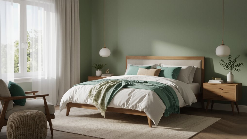
If you want a calm bedroom, choose muted, cool tones—think soft blues, pale greens, warm grays, or dusty lavenders—because they lower stimulation and help you relax.
You’ll favor soft pastels and nature inspired hues that promote restfulness.
Pair them with simple linens, minimal clutter, and gentle lighting so your space feels balanced, serene, and consistently conducive to sleep.
How to Choose Bedroom Paint: 4 Key Criteria
Think about how you’ll use the room and what mood you want—your paint should support sleep, work, or relaxation.
Consider how natural and artificial light change color throughout the day, since that affects how hues read on your walls.
Together, functionality and lighting will guide the right palette for your bedroom.
Room Functionality
Because how you use the room shapes your color choices, start by listing the activities you’ll do in the bedroom—sleeping, working, dressing, or exercising—and note how often each happens.
Match paint to function: use color psychology to calm sleep areas, energize brief workout corners, and create neutral tones for dressing.
Prioritize space harmony so shifts feel intentional and support your routines.
Lighting And Mood
Now that you’ve matched color to how you’ll use the room, consider how light reshapes those choices: natural and artificial light will change a hue’s warmth, saturation, and perceived brightness throughout the day.
You should test swatches at different times to align color psychology with desired mood and account for lighting effects.
- Morning natural light
- Afternoon glare
- Warm bulbs evening
- Dimmable fixtures
How Natural Light Changes Paint Choices
When sunlight floods a room, it changes how paint looks throughout the day, so you’ll want to test swatches at different times before committing.
Note the natural light impact: morning coolness, midday intensity, evening warmth.
Observe paint color perception on north- versus south-facing walls, and pick tones that hold true under varied light.
Test large samples to avoid surprises.
How Room Size Affects Color Perception
If your room’s small, darker hues can feel heavy and close, while lighter shades bounce light and make the space seem larger; choose colors knowing they’ll either absorb or reflect light and change how much distance you perceive.
- Use pale tones to expand spatial perception.
- Reserve deep colors for accents.
- Match sheen to light for subtle depth.
- Apply color psychology to set mood and scale.
Choosing Cool vs Warm Bedroom Paint
Think about how color temperature changes a room’s feel: cool tones like soft blues and greens make the space feel calm and airy.
Warm tones such as muted golds and terracottas create a cozy, intimate atmosphere.
You’ll pick based on the mood you want to wake up to or unwind in.
Cool Tones For Calm
Because cool tones naturally soothe your senses, they’re a strong choice if you want a calm, restful bedroom.
Choose serene blues and tranquil greens to lower stress, improve sleep, and make the room feel airy. Pair soft neutrals and pale accents to maintain balance.
Consider finishes and lighting to avoid flatness.
- Pale blue
- Sage green
- Soft gray
- Mint accent
Warm Tones For Coziness
While cool tones calm and open a room, warm colors make a bedroom feel snug and inviting—perfect if you want a space that wraps you in comfort.
Choose muted terracotta, soft ochre, or cocoa to create intimacy.
Pair paint with cozy textures and warm accents like plush throws, brass lighting, and wooden furniture so the room feels layered, comforting, and restful.
Best Finishes: Matte vs Eggshell for Bedrooms
Choosing between matte and eggshell finishes comes down to how you want your bedroom to look and live: matte hides imperfections and gives a soft, velvety feel, while eggshell adds a faint sheen that’s easier to clean.
Consider:
- matte benefits: hides flaws, cozy mood
- eggshell durability: wipes clean, longer life
- light reflection
- maintenance needs
How to Test Paint Samples at Home
When you bring paint samples home, test them on several walls and view them at different times of day so you see how light, room orientation, and surrounding colors change the look.
Use paint sample methods like large swatches, poster board patches, and taped strips.
Record observations under morning, noon, and evening light during color swatch testing to pick the best, consistent hue.
Which Colors Reduce Visual Stimulation for Sleep
To reduce visual stimulation for sleep, choose low-contrast neutrals like soft taupes or warm grays so your eyes don’t keep searching for focal points.
You’ll also want muted cool hues—gentle blues and sage greens—that signal calm without feeling stark.
Pairing these tones keeps the room restful and helps your mind wind down.
Low-Contrast Neutrals
If you want your bedroom to feel calm and promote better sleep, low-contrast neutrals are a smart choice because they minimize visual stimulation and create a seamless, soothing backdrop.
You’ll use subtle texture contrasts and color psychology to add interest without jarring the eye.
Try these approaches:
- Warm beige walls with linen bedding
- Soft greige and matte finishes
- Pale taupe trim blending in
- Sand-toned rugs and curtains
Muted Cool Hues
Although cool tones can feel fresh, muted versions—think dusty blue, soft sage, and slate gray with warm undertones—reduce visual stimulation and help your brain wind down.
You’ll sleep better with muted blues and soft greys that calm the nervous system, minimize contrast, and create a cocooned feeling.
Pair them with warm wood and soft textiles to keep the room inviting without overstimulation.
How to Pair a Main Wall With Accents
When you pick a main wall color, think of it as the room’s anchor and choose accents that either lift it or settle it down.
Use an Accent Wall for focus, maintaining Color Harmony with trims and art.
Use an accent wall to create focus, while keeping color harmony through coordinated trim, furnishings, and artwork.
Consider contrast, saturation, texture, and repetition to balance mood and scale.
- Contrast
- Saturation
- Texture
- Repetition
Coordinating Bedding and Décor With Paint
After you’ve chosen a main wall and its accents, bring that palette into bedding and décor so the room reads as one composed space. Match bedding patterns to wall tones, use decorative accents to echo accent hues, and balance solids with prints. Keep contrast moderate for calm, and repeat a key color in trim or pillows to unify the scheme.
| Element | Tip |
|---|---|
| Sheets | Solid neutral |
| Pillows | Accent color |
| Throws | Texture focus |
| Art | Repeat hue |
How Light Blue Promotes Relaxation and Sleep
If you want your bedroom to feel calm and sleep-ready, paint the walls a soft light blue—its cool, low-saturation tones slow your heart rate and cue your brain that it’s time to unwind.
You’ll use color psychology to shape bedroom ambiance and foster rest. Consider:
- Low-sheen paint
- Pale blue bedding
- Warm lighting
- Minimal clutter
Why Soft Greens Feel Soothing in Bedrooms
Because soft greens mirror the tones you find in nature, they calm your nervous system and make a bedroom feel restful without being dull.
You’ll choose nature inspired palettes to create gentle contrast, using muted greens to reduce visual noise.
These hues tap into psychological effects that lower stress and encourage focus, so your sleep space feels balanced, fresh, and quietly restorative.
How Muted Lavenders Add Restful Warmth
While still soft enough to feel gentle, muted lavenders wrap a bedroom in warm calm by blending subtle purple tones with gray or beige undertones.
This ensures your space reads cozy rather than overtly feminine. You’ll create a restful ambiance using layered textiles and soft lighting.
Markdown list:
- Pale lavender walls
- Neutral trim
- Warm wood accents
- Soft, textured bedding
When Warm Neutrals Make a Room Feel Cozy
Texture and tone matter when warm neutrals make a room feel cozy: choose beige, taupe, or soft greige to create a comforting backdrop that invites relaxation.
You’ll layer cozy textures—wool throws, woven rugs, linen curtains—and add warm accents like brass lamps or terracotta pots.
Keep contrasts subtle, stick to a limited palette, and let soft lighting deepen the intimate, soothing vibe.
Why Pale Pinks Can Soften a Space
A soft wash of pale pink can instantly calm a room, lowering visual intensity and making surfaces feel gentler to the eye.
You’ll notice pale pinks deliver subtle softening effects through color psychology, reducing tension and boosting restful mood. Their emotional impact is quiet yet clear, pairing easily with neutrals to keep the space airy and serene.
- choose muted tones
- balance with neutrals
- use matte finishes
- layer textures
When Earthy Terracottas Work for Comfort
When you want a bedroom that feels rooted and warm, earthy terracotta tones can create an instant sense of comfort without overwhelming the space.
You’ll choose terracotta textures on a feature wall or textiles to add depth, pairing them with soft neutrals.
Use earthy accents like woven baskets, clay lamps, and linen bedding to balance warmth while keeping the room calm and inviting.
How to Pick Colors for Shared or Guest Rooms
When choosing colors for a shared or guest room, think about the activities that’ll happen there and match the tone—calm hues for sleep, brighter tones for work or play.
Start with a neutral base so the space stays flexible for different guests and uses. Add one or two accent colors to inject personality without overwhelming the room.
Tone Coordination With Activities
Because shared and guest rooms serve different needs at different times, you’ll want colors that flex with activity—restful hues for sleep, energizing accents for work or play.
Use color psychology and activity alignment to choose tones that signal purpose and mood.
- Soft blue for rest
- Warm yellow accents for focus
- Muted green for calm productivity
- Soft coral for welcoming energy
Neutral Bases For Flexibility
Pick a neutral base that adapts to multiple uses—shared bedrooms and guest rooms benefit from shades that anchor the space without competing with personal items or occasional decor swaps.
You’ll choose warm greiges or soft taupes that use neutral color psychology to calm and broaden appeal.
These versatile design choices let you layer textiles and lighting for comfort without repainting between guests or roommates.
Accent Colors For Personality
Now that you’ve set a flexible neutral base, add accents that reveal personality without overwhelming shared spaces.
Choose a bold accent for focal walls, textiles, or art. Balance with muted tones so guests feel comfortable.
Use playful patterns sparingly for pillows or rugs to inject warmth.
- Focal wall
- Accent textiles
- Art and accessories
- Removable wallpaper
How Seasonal and Personal Taste Should Guide Color
When seasons shift, let the light, temperature, and your changing moods steer your color choices so the room feels right year-round. Cooler, muted blues or greys can calm a hot summer bedroom, while warmer ochres or deep greens cozy up a chilly winter space.
Use seasonal influences and personal preferences to pick hues, swap textiles seasonally, and balance comfort with timeless choices.
How to Fix Paint That Feels Off After Painting
If the color still feels off after painting, check the color temperature next—you might be seeing too much cool blue or warm yellow under your room’s light.
You can also adjust the paint sheen, since flat versus satin or gloss changes how color reads and how light reflects.
Try swapping a sample or repainting a small patch with a different sheen before committing to the whole room.
Color Temperature Check
Because light can change how a color looks from day to night, you should check the paint’s temperature in different lighting before declaring it finished.
You’ll assess color psychology and emotional impact across conditions, then tweak.
- Inspect at sunrise.
- Inspect at midday.
- Inspect under warm evening lamps.
- Inspect with cool artificial light and note shifts.
Adjust Paint Sheen
A few minutes of careful sheen adjustment can fix paint that looks wrong after it dries, and you don’t always need to repaint an entire wall.
If color seems off, test different sheen finish types on a small area—matte hides flaws, eggshell softens light, satin boosts durability.
You’ll quickly see paint sheen effects; choose the finish that balances light reflection and room comfort.
Quick Calming Paint Palettes to Try
When you want a soothing bedroom without overthinking, choose palettes that balance soft neutrals with a single muted accent; they calm the eye and make the room feel intentionally peaceful.
- calming blues + cozy neutrals for a coastal restful vibe.
- serene greens + earthy tones for grounding, balanced accents.
- muted lavenders + restful pinks for gentle, harmonious contrasts.
- warm beige + soft gray to keep focus and invite relaxation.
Frequently Asked Questions
Are There Health-Safe Paints for Sensitive Sleepers?
Yes — you can choose health-safe paints for sensitive sleepers: pick eco friendly options and low VOC paints, test samples for odor, ventilate during application, and consider certified zero-VOC brands to reduce irritation and improve sleep quality.
How Do Wall Textures Affect Perceived Color and Comfort?
Wall textures change color perception and tactile sensations; you’ll notice matte absorbs light making hues calmer, gloss reflects light brightening tones, and textured finishes add depth. Choose texture types that support visual harmony and soothing touch.
Can Ceiling Color Influence Sleep Quality?
Yes — and here’s why you’ll care: subtle ceiling colors can nudge your mood and breathing patterns; using cool, muted ceiling colors informed by sleep psychology helps you relax, lowering arousal and improving the chances you’ll fall and stay asleep.
What Lighting Bulbs Best Complement Calming Paint Hues?
You should pick soft white or warm yellow bulbs with CRI 90+, dimmable options, and lower kelvin (2700–3000K); they’ll enhance calming hues, reduce harshness, and let you create soothing, adjustable bedroom lighting for better relaxation.
How Often Should Bedroom Paint Be Refreshed for Optimal Coziness?
You should refresh bedroom paint every 3–7 years depending on color fading and paint durability; brighter or sun‑exposed walls need quicker touch‑ups, while durable, low‑fade paints let you wait longer for a cozy, maintained feel.
Conclusion
When you pick bedroom paint, aim for calm first: 60–80% of people report better sleep in cooler, muted rooms, so lean on soft blues, greens, and warm neutrals. Consider light, room size, and shared preferences, then test samples on different walls before committing. If it feels off, adjust trim, textiles, or a darker shade. Trust slow, intentional choices—your bedroom should restore you, not overstimulate you.
