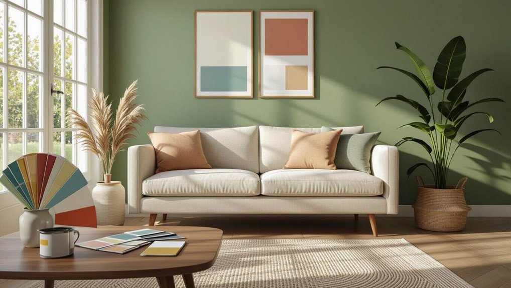
What Color to Paint My House Interior? Best Ideas and Tips
Pick colors that match each room’s function and mood—soothing blues for bedrooms, warm neutrals for living areas, and clean whites or soft greiges for kitchens and baths. Check undertones by comparing swatches near trim in natural light, test full-size samples at different times, and pick finishes by traffic and moisture (eggshell for living rooms, semi-gloss for trim). Use a cohesive palette with one or two anchors and repeat accents for flow; keep going to get step-by-step tips.
How to Choose the Right Paint Color for Your Home Interior
Wondering which paint will make your rooms feel welcoming and balanced? You’ll use color psychology to match mood and function: soothing blues for rest, warm neutrals for sociability, and accents to energize.
Consider lighting, room size, and existing finishes, and study popular trends for inspiration without copying.
Test samples on walls, live with them, then decide confidently based on daily views.
Quick Framework: Pick Color in Three Steps
Now that you know how color affects mood and what to test on your walls, pick a color in three simple steps: define the room’s purpose and desired mood, narrow choices by lighting and existing finishes, then try samples and live with them before committing.
Use color psychology to guide emotional goals, consider current trends as inspiration, and prioritize durability, contrast, and cohesion across adjoining spaces.
How Lighting Changes Paint Color Perception
Because light determines what your eye actually sees, the same paint can read warm, cool, bright, or flat depending on the light source and intensity.
You’ll notice how color psychology shifts with light temperature and seasonal influences; shadow effects and texture impact change visual perception, altering room ambience, contrast balance, and color harmony for mood enhancement.
- Morning glow
- Midday clarity
- Evening warmth
How Natural and Artificial Light Change Paint Colors
You’ll notice how natural light shifts color throughout the day, making warm tones glow in morning sun and cool tones look crisper in shade.
Artificial lighting—incandescent, LED, or fluorescent—casts its own temperature that can warm or cool a paint’s appearance.
Test swatches at different times and under your fixtures so you’re sure of the final look.
Natural Light Effects
How does the light in your room change the paint you pick? You’ll notice natural light and seasonal changes shift color saturation and reveal texture effects, affecting color psychology: warm whites glow in morning sun, cool tones calm north-facing spaces.
Consider light diffusion through windows.
- Morning sun: boosts warm whites.
- Overcast: mutes saturation.
- Afternoon: enhances cool tones.
Artificial Light Influence
When you switch on lamps or install overhead fixtures, artificial light reshapes how paint reads by altering hue, warmth, and perceived depth. Different bulbs—incandescent, LED, fluorescent—cast distinct color temperatures and render pigments unevenly.
You should test swatches under your lighting fixtures at different times because color psychology shifts with warmth and intensity, affecting mood, perceived size, and contrast in real rooms.
Read Wall Undertones So Colors Look Right
Because light and existing pigments affect every paint choice, you’ll want to learn to read a wall’s undertones before picking a new color.
Use basic color psychology and undertone analysis to predict mood and harmony. Check small areas, note warm or cool bias, then decide.
- Observe near trim and baseboards.
- Compare with neutral swatches.
- View at different times.
Test Paint Samples Like a Pro
Now that you can spot undertones, it’s time to test paint samples like a pro so you can see how colors actually behave in your space.
Put large test swatches on multiple walls at eye level, near windows and in dim corners.
Note lighting shifts throughout the day, label each swatch for color sample comparison, and live with them several days before deciding.
Pick the Right Paint Finish for Every Room
Pick a finish that matches each room’s use and desired look:
flat for low-traffic ceilings and to hide imperfections,
eggshell or satin for living areas and bedrooms where you want a soft sheen and easy cleaning,
semi-gloss for trim, doors, and moisture-prone spaces like kitchens and bathrooms,
and gloss for high-impact trim or furniture that needs extra durability.
You’ll choose among paint finish types and room specific finishes.
- Living room: satin warmth
- Bathroom: semi-gloss protection
- Trim: gloss durability
How Room Function Should Guide Color Choice
When you choose colors, think about how you’ll use each room and how color can support that purpose—calming hues for sleep spaces, energizing tones for work areas, and stain-hiding, darker shades where kids or pets play.
Use color psychology to match mood and function, and balance warmth, contrast, and texture for room harmony.
Test samples, then commit to shades that fit daily habits.
Make Small Rooms Feel Larger With Paint
Although you can’t change a room’s square footage, you can alter how it feels: light, cool hues and strategic contrast make ceilings and walls recede, while crisp trim and reflective finishes add perceived depth.
Use paint and design to suggest space:
- Light colors, mirror effects, and subtle wall decals boost openness.
- Vertical stripes and color contrasts elongate walls.
- Smart furniture placement supports open concepts and multi functional spaces.
Make High Ceilings Cozier With Paint
If your room feels cavernous, lowering the visual height with paint makes it feel warmer and more intimate without altering structure.
Paint the upper wall band or a deep-hued ceiling to create ceiling contrasts that visually drop height.
Pair with cozy textures in textiles and finishes to reinforce warmth.
Keep trim slightly lighter to define edges and maintain balance without shrinking the space.
Create Smooth Color Flow Between Rooms
To keep your home feeling connected, pick a cohesive palette with a few base shades that repeat between rooms.
Use accent tones to bridge passages—carry a wall or trim color from one space into the next to create visual links.
That way each room feels distinct but part of a harmonious whole.
Choose A Cohesive Palette
Think of your home as a connected story and pick a palette that guides the eye smoothly from room to room; you’ll create balance by repeating one or two anchor colors and varying tones, accents, or finishes to suit each space’s function and light.
Use color psychology and seasonal trends to inform choices.
- Anchor neutrals for flow
- Accent variation per room
- Adjust finish for light
Transition With Accent Tones
One simple way to guide the eye between rooms is to carry a shared accent tone from one space to the next, varying its saturation, placement, or finish so it feels familiar without repeating exactly.
You’ll use Accent Color Selection and subtle Shift Techniques: repeat the hue as trim, textiles, or artwork, shift intensity between rooms, and balance contrasts so movement feels intentional and cohesive.
Plan a Whole-House Color Palette Step by Step
Before you pick a single swatch, map how light, flow, and function connect across your home so each room feels intentional and cohesive; this step keeps adjacent spaces from clashing and helps you choose a limited palette that works everywhere.
Use color theory and color psychology to set moods and shifts.
- Identify base neutrals.
- Select coordinating accent families.
- Test samples by light.
Use Color to Create Contrast Without Overwhelming the Room
Now that you’ve mapped a cohesive palette, use contrast to give rooms definition without overpowering them.
You’ll balance bold and soft hues with subtle contrast techniques: trim, textiles, and furniture finishes.
Rely on color layering—start with a dominant neutral, add mid-tone anchors, then small pops.
Begin with a dominant neutral, anchor with mid tones, then finish with small, intentional pops of color.
Keep saturation controlled and repeat colors across adjoining spaces so contrast reads intentional, not chaotic.
How to Use Accent Walls Without Dating Your Home
When you pick an accent wall, favor timeless hues like deep navy, muted olive, or warm charcoal so the room stays stylish as trends change.
Pair that color with balanced neutrals—think soft whites, greiges, or light tans—to keep the look grounded and versatile.
That contrast highlights the accent without committing the whole space to a dated palette.
Choose Timeless Accent Colors
Although an accent wall can instantly change a room’s mood, choose colors that stay stylish over time so the change feels deliberate, not dated.
You’ll pick hues from timeless palettes and aim for accent harmony with existing finishes.
Consider these options:
- Deep navy for depth and longevity.
- Warm terracotta for subtle warmth.
- Muted forest green for classic calm.
Balance With Neutrals
Picking a standout hue like navy, terracotta, or forest green makes a room tell a story, but pairing that wall with the right neutrals keeps the look current rather than dated. You’ll use neutral color psychology to balance mood and scale; neutral color combinations anchor accents, textures, and trim so the accent wall feels intentional, not trendy.
| Role | Neutral | Effect |
|---|---|---|
| Background | Warm beige | Cozy |
| Trim | Soft white | Clean |
| Furniture | Taupe | Grounding |
| Accent | Charcoal | Contrast |
| Textile | Greige | Layering |
Best Neutral Paint Colors for Timeless Interiors
Neutral paint colors give your home a lasting backdrop that works with changing trends and furnishings.
You’ll choose shades that support neutral color psychology and timeless design trends, calming rooms while letting decor shine.
Consider these classic neutrals to guide selections:
- Warm greige for cozy, adaptable spaces.
- Soft taupe to ground living areas.
- Pale mushroom for airy, elegant rooms.
Timeless Colors That Still Feel Fresh
Those understated neutrals set a steady stage, but you can keep rooms feeling current by layering in timeless hues with a fresh twist.
Choose timeless palettes like warm greiges, soft sage, or muted navy to anchor spaces.
Use fresh neutrals on trim and textiles to brighten and add contrast.
You’ll create balanced, enduring interiors that still feel modern and inviting.
When to Choose Bold Accent Colors Instead of Neutrals
When should you reach for a bold accent instead of sticking with neutrals? You choose bold when you want energy, personality, or focal contrast.
Use bold color psychology to influence mood and guide attention. Consider strategic accent color placement to highlight architecture or art.
Bold color shifts mood and focus—place accents strategically to spotlight architecture, art, and key focal points.
- To energize a dull hallway.
- To define an open-plan zone.
- To spotlight trim or built-ins.
Living Room Color Schemes for Modern, Traditional, Eclectic
For a modern living room you’ll want a cool, pared-back palette—think soft grays, crisp whites, and muted blues—to keep lines clean and spaces airy.
If you prefer traditional style, choose warm neutrals and rich accents like cream, taupe, and deep reds or golds to create a cozy, layered feel.
For an eclectic look, mix unexpected bold colors and patterns with a unifying neutral so the room feels vibrant but intentional.
Modern Palette Basics
Because your living room sets the tone for the whole home, choosing a modern palette means balancing clean lines, thoughtful contrast, and textures that keep the space warm without cluttering it.
You’ll use modern color psychology and minimalistic design to guide choices that feel calm yet dynamic.
- Neutral base with deep accent
- Monochrome with metallics
- Soft pastels with charcoal highlights
Traditional Warm Tones
Switching from the cool restraint of a modern palette, traditional warm tones bring a cozy, inviting feel to living rooms while still working with modern, traditional, or eclectic styles.
You can choose traditional color palettes—creamy ivories, muted terracottas, and olive greens—and layer warm tone combinations with wood trims, brass accents, and soft textiles to create balanced, timeless rooms that feel both lived-in and refined.
Eclectic Bold Combinations
While bold, eclectic combinations might seem risky, they let you inject personality and drama into a living room without sacrificing cohesion.
You can mix eclectic palettes and bold contrasts to bridge modern, traditional, and eclectic styles.
Try these approaches:
- Jewel-toned accent wall with neutral seating.
- Patterned wallpaper paired with matte black trim.
- Warm terracotta sofa against teal cabinets and brass fixtures.
Bedroom Paint Ideas for Better Sleep and Relaxation
A few thoughtful color choices can make your bedroom a calm, restorative retreat where you fall asleep faster and wake feeling refreshed.
Use bedroom color psychology to pick muted blues, soft greens, or warm neutrals that lower arousal.
Create calming color schemes with low-contrast palettes, matte finishes, and accent neutrals.
Keep art and lighting gentle to support relaxation and consistent sleep cues.
Home Office Paint Colors That Improve Focus
Just as bedroom colors can soothe you into better sleep, the hues you pick for a home office can sharpen concentration and reduce mental fatigue.
Choose focus boosting colors that suit your tasks and home office vibes. Try these:
- Soft blue for calm, clear thinking.
- Muted green to reduce eye strain.
- Warm gray for neutral, unobtrusive focus.
Bathroom Paint Colors for a Spa-Like Feel
You can create a spa-like bathroom by choosing soothing neutral hues like warm beige or soft greige to keep the space calm and timeless.
Pair those with calming cool tones—muted blues or gentle seafoam greens—to evoke water and fresh air.
Mix neutrals and cools for balance, using the cooler shades as accents or on a single focal wall.
Soothing Neutral Hues
When you want your bathroom to feel like a calming retreat, choose soothing neutral hues—soft beiges, warm grays, and muted greens—that create a serene backdrop without feeling cold or sterile.
You’ll layer soothing textures and subtle neutral patterns to add depth. Consider:
- Matte paint with linen towels.
- Warm gray walls, wood vanity.
- Muted green accents, stone tiles.
Calming Cool Tones
If soothing neutrals set a warm, grounded base, cooling the palette brings a different kind of calm—think pale aqua, soft slate, and sea-glass greens that mimic water and sky. You’ll love serene blues, tranquil greens, muted grays, soft pastels, airy lavenders, cool whites, rejuvenating teals, and gentle aquas for a spa-like bathroom.
| Shade | Mood | Tip |
|---|---|---|
| Aqua | Calm | Matte finish |
| Slate | Grounding | Accent tile |
| Lavender | Soft | White trim |
| Teal | Fresh | Natural wood |
Kitchen Paint Colors That Balance Style and Resale
A few thoughtful color choices can make your kitchen feel fresh and personal while keeping broad appeal for future buyers.
You’ll follow kitchen color trends without sacrificing resale value by choosing timeless, versatile hues.
Consider:
- Soft gray cabinets with warm white walls.
- Navy island with neutral cabinetry.
- Sage or muted blue accents for a modern, calm look.
Hallway and Entryway Paint Ideas for a Great First Impression
When someone walks in, you want a hallway that feels light and bright to set a positive tone.
Choose durable, high-traffic finishes so scuffs and fingerprints stay manageable in busy entryways.
Use contrasting accents and trim to add personality without overwhelming the space.
Light And Bright Choices
Since your hallway and entryway set the tone for the rest of your home, choosing light, bright paint can make that first impression feel welcoming and spacious.
Use light color psychology and bright color trends to pick airy neutrals or soft pastels.
Consider these quick ideas:
- Pale warm white for warmth and clarity
- Soft mint for freshness and lift
- Blush beige for subtle warmth and depth
Durable High-Traffic Finishes
Choose finishes that stand up to constant foot traffic and still look good: durable paints with scrubbable, low-sheen formulas protect walls from scuffs and fingerprints while keeping maintenance simple, so you’ll spend less time touching up and more time enjoying a welcoming entry.
For hallways and other high traffic areas, pick resilient, washable coatings in neutral tones that hide wear and simplify cleaning.
Accent And Trim Contrast
A bold trim color or a contrasting accent wall can instantly define your entry and guide visitors’ eyes, so pick hues that complement your main walls while adding visual interest and depth.
Use accent wall techniques and trim color psychology to set mood.
Try combinations that balance scale and light:
- Deep navy trim with soft gray walls
- Warm terracotta accent with white trim
- High-contrast black frame around doorway
How to Coordinate Paint With Flooring and Cabinetry
Several simple rules will help you harmonize paint with your floors and cabinets so rooms feel intentional rather than accidental.
You’ll aim for color harmony by choosing hues that complement flooring contrast rather than clash.
Seek a cabinetry match in undertones, maintain texture balance between walls and surfaces, guarantee style consistency across materials, and use finish coordination to keep sheen and durability aligned.
Match Paint to Existing Furniture and Fabrics
Look at the dominant hues in your furniture and fabrics to choose a paint that feels cohesive with the room.
Then build an accent color palette around those main tones so trims, pillows, and accessories reinforce the scheme.
Finally, check undertones and paint finishes to make sure everything reads true together under your lighting.
Assess Dominant Fabric Hues
Start by identifying the dominant hues in your upholstery, drapes, and rugs—those are the colors your eye notices first and that will anchor the room.
Note fabric patterns and consider basic color psychology to set mood.
Then compare paint swatches under natural light to match or balance tones.
- Bold solids
- Subtle textures
- Mixed prints
Coordinate Accent Color Palette
Now that you’ve assessed the dominant fabric hues, use them to build an accent palette that ties paint to your furniture and textiles.
Pick one or two accents from upholstery or rugs, apply accent color psychology to set mood, and test swatches in natural light.
Balance with complementary color schemes for contrast, then repeat accents in cushions, art, and accessories to unify the room.
Consider Undertones And Finishes
One step you shouldn’t skip is matching paint undertones and finishes to your existing furniture and fabrics, because subtle undertone clashes can make coordinated rooms feel off even when colors seem similar.
You’ll guarantee color harmony by testing swatches near textiles and wood, and by choosing appropriate finish options.
- Compare swatches to upholstery lighted naturally.
- Note warm vs. cool undertones.
- Match sheen to furniture sheen.
How to Use Patterns and Painted Trim to Add Interest
Although a room’s color sets the mood, patterns and painted trim give it personality and depth. They guide the eye, highlight architectural features, and let you introduce contrast without repainting every surface.
Use pattern combinations sparingly—one focal wall or subtle stencil—then tie elements with consistent trim techniques.
Paint door casings or built-ins to frame views, balance scale, and inject curated flair without overwhelming the space.
Choose Trim and Ceiling Paint That Complements Walls
When you pick trim color, think about whether you want it to blend with your walls or provide a crisp contrast.
For ceilings, choose a finish—matte for hiding imperfections or eggshell/satin for a bit of sheen—that works with the room’s light and mood.
Coordinating trim and ceiling choices will unify the space and highlight your wall color.
Trim Color Coordination
Trim and ceiling paint frame your walls and can make or break the room’s overall look, so pick shades that enhance rather than compete with your main color.
You’ll use coordinating shades and trim styles to highlight architectural elements. Consider trim placement, trim details, trim textures and contrasting finishes to create subtle accent contrasts.
- White or off-white for classic contrast
- Deeper hue for drama
- Tone-on-tone for cohesion
Ceiling Finish Choices
Ceilings play a quiet but essential role in how a room feels, so choose a finish that supports your wall and trim choices rather than competing with them.
You should match ceiling colors to room scale—lighter for height, subtle contrast for definition.
Consider simple ceiling textures to hide imperfections, and pick a sheen that complements trim without drawing attention, keeping the overall palette cohesive and calm.
How to Pick Kid- and Pet-Friendly Paint Colors
Looking for paint that stands up to sticky fingers, muddy paws, and frequent touch-ups?
Choose durable, washable finishes and neutral kid-friendly colors that hide marks and grow with your family.
Consider pet-friendly options that resist scratching and odors.
Think low-VOC and easy-clean sheens.
- Durable eggshell for living areas
- Semi-gloss for trim and play zones
- Matte for ceilings and calm spaces
How Warm vs Cool Palettes Affect Mood
When you pick a warm palette—think reds, oranges, and golden yellows—you’ll create energizing, cozy spaces that encourage conversation and activity; cool blues and greens calm and focus.
Use color psychology and color symbolism to weigh emotional impact, atmospheric effects, and mood shifts.
Balance personal preferences with cultural influences, historical context, and color trends while considering seasonal colors to guide choices.
Seasonal and Lighting-Driven Color Tweaks to Try
Pay attention to how morning light warms your walls and consider cooler or lighter shades for east-facing rooms to keep them feeling fresh.
Swap in seasonal accents—like richer throws or a bolder trim color in fall—to change the mood without repainting.
And pick finishes that work with dimmer switches so your color still reads well when you lower the lights.
Morning Light Adjustments
Because morning light shifts so much through the year, you’ll want to tweak your paint choices to keep colors feeling true and welcoming.
Notice morning ambiance and adjust for changing light intensity: cooler pale tones for soft winter mornings, warmer creams for bright summer sun, or muted greens to calm variable skies.
- Test swatches at sunrise
- Rotate sheer curtains
- Use adjustable bulbs
Seasonal Accent Swaps
If you swap a few small accents each season, your room will feel refreshed without a full repaint.
Swap throw pillows, vases, and artwork to reflect seasonal hues and current color trends. Choose warmer accents for autumn and cooler, airy pieces for summer.
Let lighting guide choices: brighter accents under strong sunlight, muted tones during shorter days to keep balance and cohesion.
Dimmer-Friendly Finishes
Small seasonal swaps set the mood, but your wall finish can make or break how those accents read as light changes.
Choose dimmer friendly colors and durable finishes so rooms stay flattering from bright to cozy.
Try these tweaks for balance:
- Matte eggshell for gentle diffusion and minimal glare.
- Satin for warmth and easy cleaning.
- Low-sheen enamel for resilience and soft highlights.
How to Use Painted Trim and Molding for Depth
When you paint trim and molding with intention, they do more than frame a room—they sculpt it, adding layers of depth and visual interest.
Use painted accents on baseboards, window casings, and crown to draw the eye and define zones.
Contrast sheen levels for subtle relief, mix bold and neutral trim styles to guide flow, and keep lines crisp for a polished, dimensional finish.
Best Color Pairings for Modern, Traditional, and Eclectic Homes
Wondering which combos will make your space feel intentional rather than tossed together? Use color psychology and trend forecasting to guide choices so rooms read cohesive.
- Modern: charcoal, soft white, brass accents for stark contrast and warmth.
- Traditional: warm taupe, cream, deep navy for layered comfort.
- Eclectic: teal, terracotta, muted mustard tied with neutral grounding pieces.
How to Handle Tricky Undertones in Popular Colors
When a popular color shows an unexpected undertone, start by testing swatches everywhere in the room so you see how light and surrounding colors change it.
You can balance a skewed hue with crisp or contrasting trim to make the undertone read more intentionally.
Finally, adjust your lighting—warmer or cooler bulbs can neutralize unwanted casts and give you the look you want.
Test Swatches Everywhere
Color shifts can sneak up on you, so always test swatches on multiple walls and at different times of day to catch tricky undertones in popular colors.
Use test swatch techniques and prioritize effective testing to see warm or cool casts.
Try these quick checks:
- Morning light on east wall.
- Afternoon glare on south wall.
- Night with artificial bulbs.
Balance With Trim
Pairing your wall shade with the right trim is one of the quickest ways to neutralize tricky undertones and keep a room feeling balanced.
Choose crisp white or warm cream to counter blue or green casts, or use a deeper trim for deliberate color contrast.
Match trim styles to room scale—simple profiles for modern spaces, detailed moldings for traditional rooms—to reinforce your chosen palette.
Neutralize With Lighting
How will the light in your room change the way a paint looks? You’ll use lighting techniques to tame cool or warm undertones and apply paint psychology to set mood.
Test swatches at different times, then choose fixtures and bulbs that neutralize unwanted hues. Try these quick strategies:
- Morning sunlight: softens blues.
- Warm bulbs: mute green undertones.
- Layered lighting: balance color.
How to Read Paint Chips and Color Names Wisely
Ever wonder why the tiny paint chip can feel so decisive? You’ll learn paint chip meanings by viewing chips under different lights, on large swatches, and beside your furnishings.
Trust less the poetic color name psychology—names can bias choices. Note undertones, test full-size samples on walls, and live with them for days before committing to guarantee the hue reads right.
Budget-Friendly Paint Strategies That Still Look Upscale
If you want an upscale look without overspending, prioritize a few high-impact moves: choose a cohesive palette, invest in quality paint for key surfaces, and use affordable finishes strategically to mimic luxury.
- Use budget options for walls, splurging on satin for focal walls.
- Add trim in semi-gloss for crisp contrast.
- Pick statement hardware and faux-marble accents to echo upscale finishes.
How to Decide When to Repaint vs Refresh Trim
Pairing fresh wall paint with tidy trim can instantly lift a room, but you’ll want to know when a full repaint is necessary versus a quick trim refresh.
Inspect chips, yellowing, and caulk gaps; use trim maintenance tips like sanding and touch-up before replacing.
Consider repaint frequency based on wear, sunlight, and moisture—refresh every few years, repaint entire room when multiple surfaces show age.
How to Layer Color for Depth With Glazes and Stains
Depth comes from subtle contrast, and glazing or staining lets you build layered color without repainting a room entirely.
You’ll use color layering techniques to add warmth, age, or depth.
Follow glazing application tips:
- Apply translucent glaze over base, wipe for soft texture.
- Layer thin stains on wood, let each dry.
- Sand lightly between coats for control.
Common Color Mistakes and How to Avoid Them
When choosing colors, you’ll want to avoid a few common pitfalls that can turn a good scheme into a muddled one: relying on swatches alone, neglecting lighting, and overloading on trends.
Test large patches, observe hues at different times, and consider color psychology to match rooms’ purpose.
Don’t ignore emotional impact; balance bold choices with neutrals and edit ruthlessly to prevent visual chaos.
How to Finalize Your Paint Decision and Start Painting
Before you pick up a brush, confirm your final choice by testing full-size samples on the walls where the paint will live—observe them in morning, afternoon, and artificial light, and view them from different spots in the room.
Use color psychology and current paint trends to guide mood and accents. Then prepare tools and timeline.
Let color psychology and current trends steer your mood and accents—then gather tools and map your timeline.
- Patch
- Prime
- Paint
Frequently Asked Questions
How Long Should I Wait Before Painting After Removing Wallpaper?
Wait 24–48 hours after wallpaper removal so the wall fully dries; for stubborn damp spots, wait longer. Use wall preparation tips and proven wallpaper removal techniques, then sand, prime, and you’ll be ready to paint.
Can Paint Help Hide Minor Wall Surface Imperfections?
Yes — paint can help mask minor flaws: think of a fog softening a skyline. You’ll control appearance via color selection and texture considerations; flatter finishes and darker tones hide bumps, while glossy paints emphasize imperfections.
What Eco-Friendly Paint Certifications Should I Look For?
Look for eco friendly options like Green Seal, GREENGUARD, and EPA Safer Choice; they verify low VOCs and safer paint ingredients. You’ll also check for zero-VOC labels and third-party toxin testing to guarantee healthier indoor air.
How Do I Prepare Plaster or Drywall for Paint if Damaged?
Like a mason restoring ruins, you’ll remove loose material, sand, apply plaster repair or drywall patching compound, feather edges, sand smooth, prime, and paint—doing small repairs yourself saves time and keeps surfaces durable and neat.
Is It Better to Hire a Pro or DIY for Textured Ceilings?
You’ll usually hire a pro for textured ceilings unless you’re skilled; texture options require technique and cleanup. You’ll weigh pros cons: cost versus quality, time, and risk—DIY saves money but can leave visible mistakes.
Conclusion
Picking colors can feel overwhelming, but you don’t need to be a pro to get it right. Use the three-step framework, test swatches in different light, and trust undertones—small samples win over guesswork. If you’re worried about making a costly mistake, remember paint’s reversible: start with trims or an accent wall, live with it, then adjust. Once a color passes the light-and-swatch test, commit and enjoy the transformation.