
What Color to Paint Your Walls: A Simple Guide to Choosing Right
Pick your wall color by matching it to your lighting—natural daylight, warm bulbs, or cool LEDs—and then test swatches in that real setup from day to night. Lighter shades make rooms feel bigger and keep shadows softer, while cohesive undertones help color flow near doorways and hallways. Coordinate your walls with trim and flooring (warm, cool, or neutral) so undertones don’t fight. Use eggshell or satin for most rooms, and never skip samples—you’ll avoid surprises and find your perfect palette if you keep going.
Start With Your Wall Color’s Lighting Type
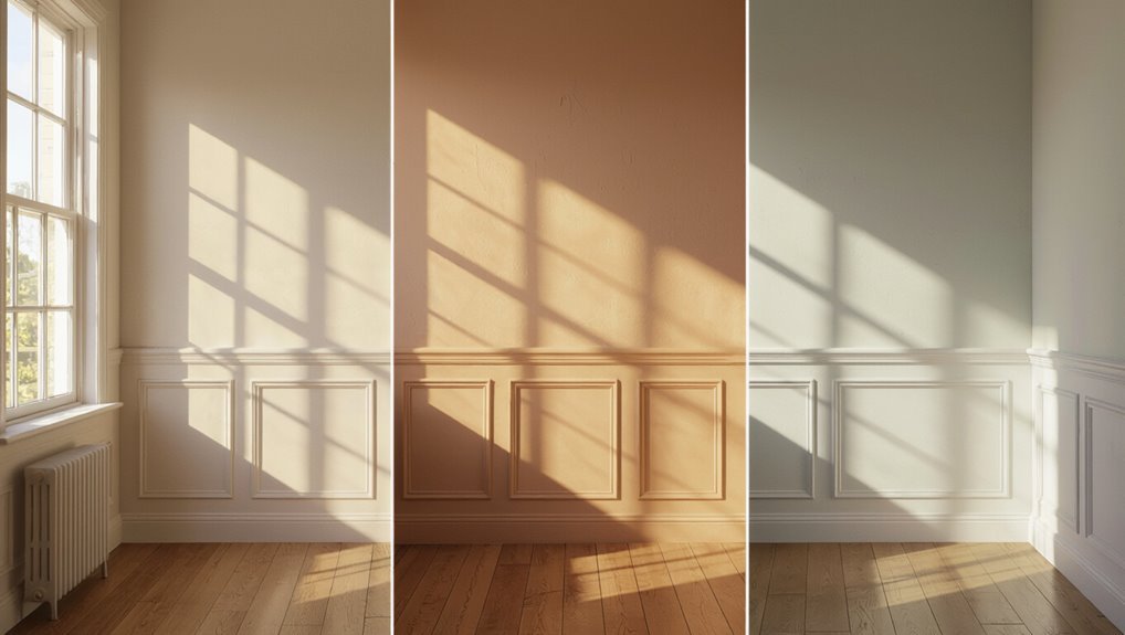
Before you pick a wall color, check your room’s lighting type—natural daylight, warm incandescent bulbs, or cool LEDs all shift how paint looks.
You’ll notice lighting effects change the way undertones show up: yellows deepen under warm bulbs, while grays can look bluish with cool LEDs.
Notice how lighting shifts undertones: warm bulbs deepen yellows, while cool LEDs can make grays look distinctly bluish.
Start by observing the space at different times, then test swatches directly under your actual fixtures.
If possible, switch bulbs on and off and watch for color temperature shifts across the day.
Once you match your preferred tone in that environment, choose your final shade with confidence.
Use Wall Color to Make Rooms Feel Bigger
You can make any room feel roomier by choosing light wall colors that reflect more light and visually expand the space.
Stick to strategic shades, not heavy or busy tones, to help prevent visual clutter.
When in doubt, pick a brighter color and keep it consistent across adjoining walls for an airy, open look.
Light Colors Expand Visual Space
Light wall colors make any room feel larger by bouncing more daylight around, so the space looks brighter and more open. You’re using light color psychology to guide visual space perception: pale whites, soft creams, and cool grays reflect light, reduce shadow gaps, and help walls visually “step back.” Pick shades that match your window brightness, then keep trims and ceilings slightly lighter for a seamless glow. If you choose warm whites, the room feels cozy; cool whites feel crisp and airy.
| Shade | Best for | Effect |
|---|---|---|
| Soft White | Low light | Opens instantly |
| Cream | North-facing | Warms shadows |
| Pale Gray | Busy light | Calm, airy |
Strategic Shades Avoid Clutter
Strategic wall shades help you avoid visual clutter while you make the room feel bigger, building on the brightness benefits from lighter colors.
Choose soft neutrals or muted pastels so walls recede instead of competing with furniture. You maintain color harmony by matching wall undertones to your floors and large pieces, then repeating one accent color in textiles or art.
Keep visual balance: paint ceilings a shade lighter than walls, and use one consistent trim color. If you want contrast, limit darker shades to an accent wall or built-ins.
This approach keeps sightlines calm and open.
Coordinate Wall Color With Trim and Flooring
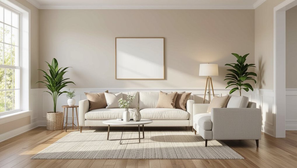
When you coordinate your wall color with trim and flooring, you should first match the trim’s undertones—warm, cool, or neutral.
Next, you’ll want your wall shade to blend with the flooring tones so the room feels cohesive instead of choppy.
Take a look in natural light and adjust until everything harmonizes.
Match Trim Color Undertones
Matching trim color undertones keeps your room from looking mismatched, even when the wall color feels “right.”
Start by identifying whether your trim and flooring lean warm (yellow/golden), cool (pink/blue/gray), or neutral, then choose a wall color with a similar undertone—don’t rely on brightness alone.
Aim for trim color harmony by matching undertone balance across surfaces.
Use these quick checks:
- Look at trim in daylight and evening light.
- Compare against drawer pulls, baseboards, and moldings.
- Notice if white reads creamy or bluish.
- Pair warm trim with warm wall undertones.
- Pair cool trim with cool wall undertones.
Blend With Flooring Tones
Once you’ve matched trim undertones, coordinate your wall color with your flooring tones so everything feels cohesive.
Start by identifying whether your floors lean warm or cool—oak, honey, and walnut usually feel warm; slate and ash often read cool.
Pick a wall shade that supports that direction, not fights it. For light floors, choose slightly deeper wall colors to create color harmony without overpowering the room.
For dark floors, go lighter on walls so you keep comfortable flooring contrast and brighter sightlines.
Test samples in daylight and at night, then adjust until changes look seamless.
Test Warm vs Cool Undertones in Wall Color
Wondering why a paint color looks “right” in the store but flat or harsh on your walls? You need an undertone comparison.
Light shifts, so test warm and cool versions in your space before committing, using color psychology to guide you. Compare swatches on the same wall, then check them at morning, noon, and evening.
- Paint two 12×12 swatches side by side
- Label them “warm” and “cool” clearly
- Observe with both natural and lamp light
- Notice how skin tones look nearby
- Pick the undertone that feels calmer and cleaner
Pick a Light Wall Color for Airy Rooms
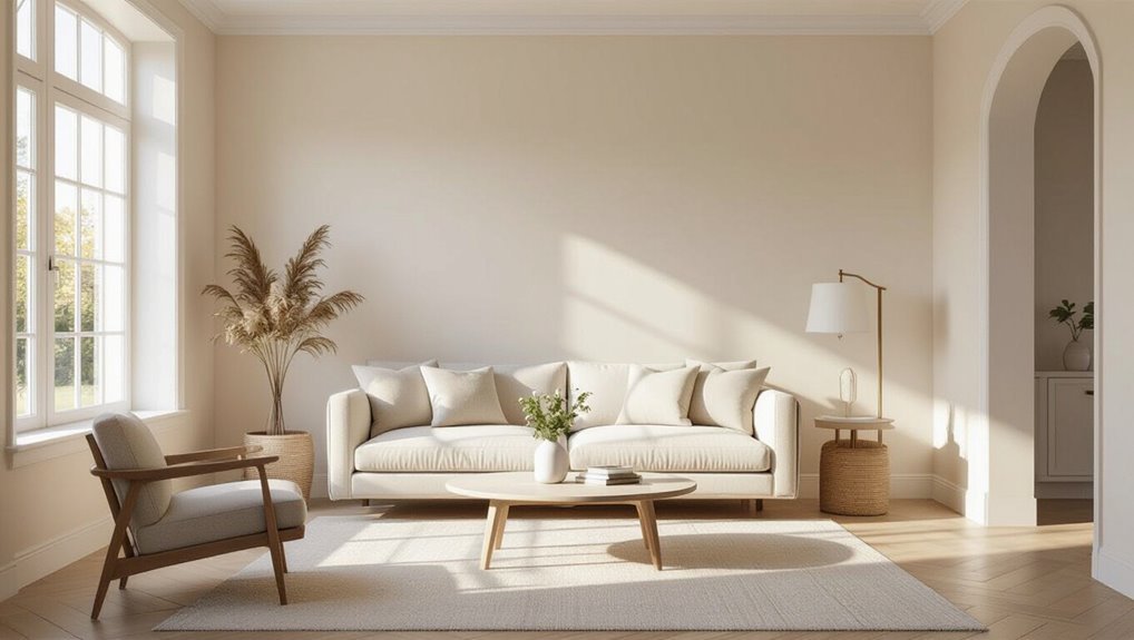
When you want airy, bright rooms, pick a bright white or soft cream that reflects light instead of absorbing it.
You’ll enhance natural light flow and make walls feel more open and clean.
Stick with light tones to keep the space looking fresh, breezy, and truly airy.
Choose Bright White Or Cream
Bright white and cream both create the airy, open feel you want, so choose the one that matches your lighting and furnishings.
If your space gets cool, northern light, you’ll love the bright white benefits: crisp walls that make trims and decor pop.
For warmer, sunnier rooms, cream offers a softer backdrop and delivers cream color warmth without feeling heavy.
Use this checklist to decide fast:
- Test both shades on your walls
- Match undertones with your flooring
- Consider how white trim looks nearby
- Pick accents that contrast gently
- Recheck at night with lamps
Enhance Natural Light Flow
To keep your space airy and welcoming, pick a light wall color that amplifies natural light instead of absorbing it. You’ll want soft whites, pale warm creams, or very light greige to bounce daylight deeper into the room.
When you choose these hues, wall reflections spread across surfaces and make corners feel brighter. Test samples on two different walls—one near the window and one farther away—then watch how they look at morning and evening light.
Avoid cool, stark whites if your space feels too bright or harsh, and steer clear of off-whites with strong yellow undertones.
Keep Space Feeling Airy
After you’ve optimized natural light flow, choose a light wall color that keeps the room feeling open and breezy.
Go for soft whites, pale creams, or gentle warm grays that reflect daylight instead of absorbing it. Pair your chosen shade with airy textures and open furnishings so sightlines stay clear and the space feels calm.
Consider these quick checks:
- Test samples in morning and evening light
- Choose warmer whites for cozy brightness
- Pick cooler tones to sharpen crispness
- Limit contrast with trim and ceilings
- Keep bulky pieces away from windows
When you do, your room stays airy, welcoming, and bright.
Choose Cozy Neutrals for a Warm Living Room
Cozy neutrals help you create a warm, inviting living room without fighting your furniture or décor.
Pick soft beiges, creamy whites, and greige tones, then let your existing pieces guide the undertone. You can add depth by layering cozy textures like boucle pillows, knit throws, and reclaimed wood shelves.
Choose warm accents—like caramel leather, brass lamps, or terracotta planters—to bring the color to life.
Keep walls in muted shades so light feels gentle, not harsh. Test samples on two walls, observe them morning and night, and commit when they stay comforting.
Go Bold With an Accent Wall Color
Pick a statement accent shade that matches your mood—think deep teal, moody navy, or warm terracotta.
Then balance it with neutral surroundings so the room still feels cohesive and calm.
When you get the contrast right, your accent wall becomes the focal point without overpowering everything else.
Pick A Statement Accent Shade
An accent wall can anchor your whole room, so choose one bold shade that reflects your style and sets the mood.
You should start with statement accent ideas you actually love, then narrow down using bold color choices that match your daily vibe.
Try accent wall techniques that make the color feel intentional, not accidental. Use:
- Deep navy for confident, calm energy
- Warm terracotta for inviting character
- Emerald green for rich, fresh drama
- Charcoal or black for sleek contrast
- Golden yellow for bright, creative lift
Test swatches in daylight and night lighting, then commit confidently.
Balance With Neutral Surroundings
Once you’ve chosen a bold accent wall color, balance it with neutral surroundings so the room feels intentional, not overwhelming.
You should let neutrals do the heavy lifting: paint the other walls in warm whites, greiges, or soft taupes, then repeat those tones in trim, rugs, and curtains.
This approach supports neutral color psychology—calm backgrounds make your accent look richer, not chaotic.
If your accent runs cool, choose neutrals with hints of beige to add balancing warmth.
Finally, keep hardware and lighting in similar finishes so everything connects smoothly.
Decide Wall Paint Sheen for Everyday Wear
When you choose a wall paint sheen for everyday life, you need to balance durability with how much light your room reflects. You pick the sheen types that match your routines, then you consider durability factors like scrubbing, fingerprints, and everyday scuffs.
For most rooms, eggshell or satin keeps walls looking smooth while resisting marks. Use these quick checks as you decide:
- High-traffic areas need satin for easier wipe-downs
- Bedrooms can use eggshell to hide imperfections
- Bathrooms should lean toward semi-gloss for moisture
- Ceilings work best with flat for low glare
- Test samples in both daylight and night light
Match Wall Color to Furniture and Wall Art
Before you pick a wall color, pair it with your furniture tones and your wall art so the whole room feels intentional. Start by matching undertones: if your sofa reads warm, choose warm walls; cool woods call for cooler paint. Use your art for cues—take a dominant hue or a midtone shade and echo it lightly in the walls for furniture harmony and art inspiration. Consider:
| Your furniture | Wall color direction |
|---|---|
| Warm wood | Cream, greige, soft peach |
| Cool gray | Soft blue-gray, cool white |
| Black accents | Charcoal, deep jewel tones |
Plan Wall Color Flow Through Connected Rooms
After you match wall color to your furniture and wall art, you’ll want the same thought to carry from room to room. Plan your connected layout so the eye moves smoothly and you get room harmony.
Choose a main shade for high-traffic areas, then alter undertones gradually to create color shifts near doorways and hallways. Test samples on all adjacent walls and observe them at different times of day.
Choose a main shade for busy areas, then shift undertones near doorways and hallways—test on adjacent walls at different times of day.
- Pick one anchor color
- Use lighter/darker steps
- Repeat accent tones sparingly
- Blend around trim and openings
- Walk the route before committing
Use Wall Color Psychology to Set the Mood
Wall color psychology helps you shape how a space feels before you ever hang art or add furniture, so choose hues with intention.
Start by matching your goals: warm tones like soft reds and golden creams boost mood enhancement by feeling welcoming and energizing.
Cool blues and greens slow you down, supporting calm focus and reducing restlessness.
Neutrals don’t have to be bland—greige and creamy whites can create a balanced, emotionally steady backdrop.
For a dramatic effect, use deep shades in small areas to add richness and emotional impact.
Trust your daily rhythms, then paint accordingly.
Test Wall Paint Colors With Proper Samples
Test your wall paint colors with proper samples, because lighting changes everything once the color hits your space. You should do real sample application before committing. Tape off sections, apply swatches, and watch them at different times of day. Compare how each paint shifts beside trim and flooring, and you’ll avoid surprises.
- Label each swatch and date it.
- Test color combinations on the same wall.
- Apply two coats where possible.
- Observe morning, afternoon, and evening light.
- Let samples cure, then re-evaluate.
Once you’ve verified your favorite option, choose confidently and move forward.
Avoid These Common Wall Color Mistakes
Even if you love a color online, a few common mistakes can ruin the final look in your home. You should avoid skipping sample tests, because lighting changes everything by room and time. Don’t chase color trends blindly; pick what matches your furnishings and finishes. Be careful with seasonal shades—using winter tones in bright rooms can feel harsh, while warm shades in shaded rooms can look muddy. Choose the right sheen, too; glossy walls highlight flaws. Finally, don’t ignore undertones; they shift when paired with warm or cool decor.
| Mistake | Why it fails | Fix |
|---|---|---|
| Wrong sheen | Shows defects | Match surface |
| Ignored undertones | Color shifts | Check samples |
| No room context | Lighting surprises | Test at day/night |
| Trend over fit | Feels off | Coordinate decor |
Choose Wall Color for Dark Rooms and Low Light
When your room stays dim, your wall color becomes a lighting tool—not just a design choice. You can brighten corners by using smart dark room strategies that reflect light instead of swallowing it.
Start by picking warm, soft whites or creamy beiges; they lift shadows while staying calm. Then plan contrast carefully so furniture still pops without making walls feel harsh.
Try these low light solutions:
- Choose satin or eggshell finishes to bounce light
- Go one or two shades lighter than you think
- Use warm undertones, not icy grays
- Paint ceilings in the lightest tone available
- Add one light accent wall for depth
Build a Simple Wall Color Palette You’ll Love
A simple wall color palette keeps your space cohesive without limiting your style. Start by picking one main neutral and one accent shade that matches your personal preferences, then confirm it with fabric patterns and texture variations in your decor.
Test two to three paint swatches in different lighting so seasonal changes and mood influences don’t surprise you. Use color psychology to decide whether you want calm, energy, or focus, and consider cultural significance and historical styles for a grounded look.
Finally, balance your room functionality: choose warmer tones for living areas and cooler tones for work spaces. Follow color trends, but prioritize how you feel.
Frequently Asked Questions
Can I Paint Over Wallpaper Without Removing It?
Yes—you can paint over wallpaper without removing it, but only if it’s firmly stuck and clean. Scuff the surface for better wall texture and paint adhesion, then prime with a bonding primer. Avoid bubbling by letting everything dry fully.
What’s the Best Wall Paint Primer for Stains or Dark Walls?
Use a stain-blocking primer like Zinsser BIN or Kilz Original—over 50% of paint adhesion problems stem from dirty, unprepared surfaces. For dark walls, do dark color preparation, spot-prime stains, then topcoat. You’ll get fewer bleed-throughs and smoother coverage.
How Do I Fix Roller Marks or Streaks After the Paint Dries?
To fix roller marks or streaks, let the paint cure fully, then sand smooth with fine-grit paper. Wipe dust, spot-prime if needed, and re-roll lightly with a quality roller. Use streak removal techniques carefully, feather edges.
Should I Match Wall Color to Ceiling Color, and How?
Yes—often you should match for color harmony, but use ceiling contrast to avoid a flat look. Pick the same hue family; go slightly lighter on the ceiling. Test swatches in daylight and evening light, then adjust for undertones.
How Many Coats Are Usually Needed for Full, Even Coverage?
Usually you need 2 coats for full, even coverage; experts estimate 80% of visible color depth comes from the second coat. Use primer first if needed, then choose paint finish options that hide patchiness and respect color undertones.
Conclusion
When you pick a wall color, you’re really choosing how your home will feel. Start with your lighting, then aim for the right scale—lighter shades can make rooms seem bigger, especially in low light. Match your walls to your trim and flooring, and test warm vs. cool undertones with real samples. Mistakes happen when you skip samples or ignore lighting. Finally, build a simple palette you’ll still love later—like a puzzle, piece by piece.
