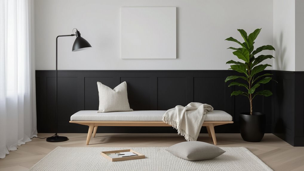
Which White Paint Is Best for Interior Walls? Top Picks
You’ll get the best interior white by matching undertone, finish, and durability to your room’s light and use. Pick a warm white for cozy spaces and a cool white for crisp, modern rooms; neutrals work when you want flexibility. Choose matte or eggshell for low sheen, satin for washability, and semi-gloss for trim. Test large swatches in morning and evening light and note batch numbers—keep going and you’ll find the perfect shade and finish for each space.
Which White Paint Is Best for Interior Walls? Quick Checklist
Want a quick way to pick the best white paint for your walls? Use a checklist: consider undertone, finish, durability, and coverage.
Compare swatches in your space, read white paint comparisons, and note current white paint trends for style cues.
Prioritize low-VOC formulas and sample before committing.
You’ll avoid costly mistakes and choose a white that matches function and mood.
How Lighting Changes White Paint Appearance
You’ll notice white paint looks different depending on natural versus artificial light, so check samples at various times of day.
Pay attention to directional light too—north-facing rooms and strong sidelighting can make whites read cooler or show texture.
Test swatches on walls where the light hits to see the true effect before you commit.
Natural vs Artificial Light
How does light change the way white paint looks in your room? You’ll notice natural light brings clarity and cool undertones, while artificial light adds warmth or yellowing; choose based on mood.
Consider feelings:
- Bright morning sun — uplifting, crisp.
- Soft evening lamps — cozy, intimate.
- Mixed lighting — unpredictable, dynamic.
Trust samples under both natural light and artificial light before deciding.
Directional Light Effects
Because light hits walls from different angles, the same white paint can look dramatically different across a room — warm and golden where sunlight streams in, cool and flat in north-facing corners, and brighter or more textured where angled light grazes the surface.
You’ll notice light diffusion softens hue shifts, while texture contrast from finish and surface irregularities creates shadows.
Choose paint and finish with those effects in mind.
How Undertones Change White Paint Choices
One subtle shift in undertone can make a white feel warm and cozy or crisp and clinical, so you’ll want to assess them before picking a shade.
You’ll notice undertone significance in every room; color perception shifts with light and decor. Choose intentionally:
- Warm (creamy) — inviting, soothing.
- Cool (blue) — crisp, modern.
- Neutral — balanced, adaptable.
Matte vs Eggshell vs Satin: Which Finish Is Right?
When choosing between matte, eggshell, and satin, think about how much wear the room will get and how often you want to clean walls.
Matte hides imperfections best but eggshell and satin offer tougher, easier-to-wipe finishes with smoother coverage.
We’ll compare their durability and appearance so you can pick the finish that fits the space.
Durability and Maintenance
If you want walls that stand up to daily life with minimal upkeep, the finish you pick matters as much as the paint color.
You’ll weigh color psychology with paint longevity when choosing. Consider how each finish handles wear:
- Matte: conceals flaws, less washable—cozy but fragile.
- Eggshell: balanced durability, forgiving and gentle.
- Satin: most washable, bright and resilient.
Appearance and Coverage
Along with durability, how a finish looks and hides imperfections will shape the final feel of a room.
So you’ll want to compare appearance and coverage before picking matte, eggshell, or satin.
Matte hides flaws and softens color psychology.
Eggshell balances subtle sheen and washability.
Satin boosts reflectivity and cleans easily.
Consider wall texture, lighting, and traffic when choosing.
How to Test White Paint Samples at Home
Before you commit to a full paint job, test several white samples on your walls to see how they look in your specific light and next to your furnishings.
Use paint sample techniques and focus on testing color accuracy. Try these steps to feel confident:
- Paint large swatches at different heights.
- Observe at morning, noon, night.
- Compare swatches beside fabrics and trim.
How to Approve Paint Samples Before Painting
When you’re ready to approve a white paint sample, trust the swatch that consistently looks right in natural and artificial light and plays well with your furnishings; mark that choice and note the exact brand, color name, and finish so you can match it later.
Finalize after focused sample testing in key spots, confirm the chosen paint finish, check under different times of day, and record batch details before ordering.
How Primer Affects Your Final White Paint Color
What you prime with matters: the tint and base of your primer can shift the final white, especially over darker or colored surfaces.
Choose a primer with the right tint and good coverage so your topcoat needs fewer coats and shows its true finish.
Also match primer finish to the paint—smoother primers help glossier whites reflect light evenly, while textured primers can mute brightness.
Primer Tint And Base
Because primer sits under your finish coat, its tint and base can subtly — or dramatically — change how a white paint looks, so you’ll want to choose wisely.
Pick primer types and base selections that suit your surface and desired warmth.
Consider:
- Warm-tinted primer for cozy whites.
- Cool-tinted primer for crisp whites.
- Neutral base for true whites.
Primer Coverage And Finish
Although primer often hides under your finish coat, its coverage and sheen directly influence how a white paint reads on your walls, so choose one that matches the surface and the finish you plan to use. You’ll compare primer types for ideal coverage and sheen to guarantee true whites.
| Primer Type | Best For |
|---|---|
| Latex | Drywalls |
| Oil | Stains |
| Shellac | Odors |
| Bonding | Glossy surfaces |
When to Use Tinted Primer Versus White Primer
When you’re prepping walls for a new color, choosing a tinted primer over a white one can save you time and coats—tinted primer closely matches your topcoat and boosts coverage, while white primer’s neutral base works better when you’re switching to light or very different hues.
Use tinted primer benefits when covering deep colors; use white primer applications for drastic shifts.
- Relief
- Confidence
- Pride
How Lighting, Undertone, and Finish Interact
Pay attention to how natural versus artificial light shifts a white’s appearance throughout the day, because sunlight and bulbs bring out different hues.
You’ll notice undertones—cool blues, warm yellows, or soft greys—either read as crisp or cozy depending on that light.
Also consider finish: higher reflectivity boosts glow and can make undertones more obvious, while matte tones them down.
Natural vs Artificial Light
Because light shifts throughout the day, the same white paint can look crisp and cool in morning sun and soft and warm under evening lamps.
So you’ll want to take into account both natural and artificial sources when choosing undertones and finish.
You’ll notice mood changes quickly:
- Bright daylight lifts edges.
- Warm bulbs soften contrast.
- Dim light cozyfies spaces.
Choose swatches accordingly.
Undertone Effects On Perception
Although lighting, undertone, and finish each affect a room on their own, they really work together to shape how you perceive white paint—cool undertones read crisper in bright daylight but can look harsh under cool LED.
Warm undertones mellow in incandescent or warm-LED light yet may appear yellowish in northern exposure.
Finish amplifies all of this by changing reflectivity and edge definition.
You’ll notice undertone impact immediately; small shifts change room mood and perception influence guides your final choice.
Finish Reflectivity And Glow
Undertones set the mood, but finish controls how that mood reads in your space—sheens change how light bounces, how colors appear at the edges, and how much texture shows.
You’ll notice glow intensity shift with finish choice; sheen impact alters perceived warmth and clarity. Choose based on room light and tactile preference:
- Matte: soft, low glow
- Eggshell: balanced warmth
- Semi-gloss: bright, crisp
Which Whites Work Best in Bright, Sunlit Rooms?
Which whites should you pick for bright, sunlit rooms? Choose warm off-whites and soft creams that tame sunlight impact without feeling dull.
You’ll want hues with subtle undertones—warm beige, pale peach, or soft yellow—that maintain color harmony with wood and textiles.
Avoid stark, clinical whites that glare; pick balanced shades that read comfortable, luminous, and inviting in strong natural light.
Which Whites Work Best in North-Facing Rooms?
In north-facing rooms you’ll want whites with cool undertones that counteract the bluish light.
Choose higher LRV options so walls don’t read too dim, but steer clear of whites with any yellow tint that will look muddy under indirect light.
Test samples on different walls to see how the undertone and brightness behave throughout the day.
Cool Undertone Whites
Because north-facing rooms get cooler, bluer light, you’ll want whites with subtle cool undertones that neutralize that cast without making the space feel icy.
You’ll appreciate cool undertone benefits and thoughtful cool white pairings to warm mood subtly.
Consider these emotional cues:
- Soft slate accents for calm.
- Pale lavender for serenity.
- Warm wood to balance and invite.
Higher LRV Options
When north-facing rooms feel dim, choose whites with higher LRV so surfaces reflect more light and keep the space bright without looking stark.
You’ll favor high LRV options to create bright spaces and an airy feel; color psychology guides calm room ambiance.
Pair reflective surfaces with texture contrast for design harmony, boosting clean aesthetics and paint longevity while keeping the look fresh and balanced.
Avoiding Yellow Tints
If your room faces north and feels cool or blue, pick whites with neutral or slightly warm undertones to avoid a yellow cast that looks dated or off.
You’ll balance color theory and mood by choosing carefully among paint brands.
Consider:
- Soft warm white for cozy light
- True neutral for crisp clarity
- Gentle cream to lift shadows without yellowing
Best White Paints to Make Small Rooms Feel Bigger
Light colors open space, and the right white can make a small room feel airy rather than washed out.
Choose crisp, cool whites with subtle undertones to bounce light; matte or eggshell white paint textures reduce glare while reflecting brightness.
Pair with minimal trim contrast and strategic mirrors to amplify small room illusions.
You’ll create depth without overwhelming the space.
Best Warm White Paints for Cozy Spaces
When you want a cozy room, warm whites with subtle yellow, peach, or beige undertones make the space feel inviting without looking dingy.
Think about pairing them with wood tones, soft textiles, or warm metals to amplify the snug vibe.
Also consider finish and lighting—matte hides imperfections and softens light, while your bulb color will shift undertones noticeably.
Warm Undertones Explained
Because warm undertones carry soft yellow, beige, or peach hints, they make rooms feel inviting and cozy without appearing dated.
You’ll notice warm undertone characteristics in how light melts across walls, creating calm.
Consider these emotional cues as you choose:
- Comfort — wraps spaces in softness.
- Warmth — adds gentle glow.
- Harmony — balances furnishings and mood.
Best Room Pairings
Now that you know how warm undertones create a cozy, glowing backdrop, pick rooms where that softness will matter most. You’ll choose bedrooms, living rooms, and nurseries to enhance color psychology, mood lighting, and spatial perception. Use bright accents, textured finishes, wall art, and decorative elements to match room themes.
| Room | Purpose | Styling Tip |
|---|---|---|
| Bedroom | Rest | Mood lighting |
| Living Room | Gather | Bright accents |
| Nursery | Calm | Soft wall art |
| Dining | Cozy | Textured finishes |
| Hallway | Passage | Decorative elements |
Finish And Lighting Effects
Finish choices shape how warm whites read in your space, so pick a sheen that matches the room’s use and lighting.
You’ll balance finish types with lighting intensity to set mood:
- Matte for soft, cozy calm.
- Eggshell for gentle reflectivity in dim rooms.
- Satin/semi-gloss for brighter, lively spaces.
Choose based on traffic, maintenance, and the emotional tone you want.
Best Cool White Paints for Modern Interiors
When you want a crisp, contemporary backdrop that keeps rooms feeling bright without looking sterile, cool whites are the go-to choice for modern interiors. You’ll pick cool white tones that enhance modern aesthetics, define clean lines, and reflect light.
| Paint | Effect |
|---|---|
| Soft Cool | Subtle clarity |
| Bright Cool | Crisp contrast |
| Blue-leaning Cool | Fresh serenity |
Top White Paints for Living Rooms
When choosing a white for your living room, you’ll want to weigh warm versus cool tones to match your lighting and furnishings.
Also consider finish and sheen—flat hides imperfections while eggshell or satin offers washable durability for high-traffic areas.
I’ll recommend specific whites and finishes that suit different living room styles.
Warm vs Cool Whites
Curious which white feels right for your living room? You’ll choose based on mood: warm undertones invite coziness; cool undertones feel airy and modern.
Consider how light changes the tone and what furniture you have. Decide by emotion:
- Cozy — soft, warm whites for comfort.
- Crisp — cool whites for clarity.
- Balanced — neutral whites to blend styles.
Finish And Sheen
After you pick the right white tone, decide on finish and sheen because they shape how color reads and how the room performs. You’ll choose between finish types—flat, eggshell, satin, semi-gloss—based on durability and light. Sheen levels affect reflectivity and hide imperfections; higher sheen cleans easier. Match finish to traffic and lighting for the best living-room result.
| Finish | Sheen | Best Use |
|---|---|---|
| Flat | Low | Low-traffic walls |
| Eggshell | Low-Med | Living rooms |
| Satin | Med | Trim, high-traffic |
| Semi-gloss | High | Doors, trim |
Top White Paints for Bedrooms
Because your bedroom should feel calm and restorative, choosing the right white paint matters more than you might think—soft, warm whites create coziness while cool whites feel crisp and airy.
You’ll pick paints that enhance bedroom ambiance and subtle white paint textures. Consider these to evoke feeling:
- Warm off-white — cozy, enveloping
- Soft cool white — airy, serene
- Creamy neutral — gentle, restful
Top White Paints for Kitchens
Kitchens need whites that balance brightness with practicality, so pick shades that hide wear, reflect light, and complement cabinets and surfaces. You’ll want durable, washable paints that enhance kitchen aesthetics and pair with white cabinetry without feeling sterile. Choose warm whites for cozy vibes or cooler whites for a crisp look; finish matters—satin or semi-gloss for easy cleaning.
| Paint | Finish | Best For |
|---|---|---|
| Soft White | Satin | Family kitchens |
| Cool White | Semi-gloss | Modern kitchens |
| Warm White | Satin | Traditional kitchens |
| Bright White | Semi-gloss | Small kitchens |
| Creamy White | Satin | Rustic kitchens |
Top White Paints for Bathrooms
Bathrooms demand whites that stand up to humidity and frequent cleaning while keeping the space feeling fresh and spa-like.
So you’ll want paints with mildew-resistant formulations and finishes that balance durability with a soft, reflective look.
You’ll choose for bathroom humidity and moisture resistance, aiming for calming light tones.
- Crisp bright white — clean, energizing
- Soft warm white — cozy, soothing
- Cool blue-white — spa-like, airy
White Paints That Pair Well With Trim and Moldings
When you’re choosing a white for walls, think about how it will contrast or blend with trim and moldings so the overall look feels intentional and balanced.
Pick a wall white that offers clear trim compatibility—warmer whites work with yellowed moldings, cooler whites suit crisp trim.
Coordinate undertones and finish levels, and match paint sheen between trim and walls to keep shifts clean and deliberate.
Choosing White Paint to Match Wood Floors
If your trim and moldings already set a warm or cool tone, let that cue your wall white and keep the same logic for wood floors: consider the floor’s undertone and choose a white that either complements or intentionally contrasts it.
You’ll judge white paint undertones for wood floor compatibility by mood:
- Warm oak = creamy white
- Cool maple = crisp white
- Dark walnut = soft bright white
Best White Paints for Gray-Based Decor Schemes
When you’re working with gray-based decor, choose whites with cool undertones to keep the palette calm and cohesive.
Those cooler whites give gray walls a clean, balanced look without feeling washed out.
Then add warm accents—wood, brass, or burnt orange—to create striking contrast and visual warmth.
Cool Undertones For Balance
Although gray-based schemes can feel stark, cool-leaning whites soften the mood and bring visual balance without warming the palette.
You’ll love cool white palettes for balancing neutrals and creating calm, airy rooms. Choose paints that read slightly blue or green-leaning.
- Serene
- Crisp
- Restorative
Contrast With Warm Accents
Shifting from cool-leaning whites that soothe gray schemes, you can energize the same palette by adding warm accents—think honeyed woods, brass fixtures, and terracotta textiles—to create a pleasing contrast.
Choose a crisp white with subtle gray undertones so your warm accents pop without clashing.
You’ll preserve color balance, highlight textures, and make rooms feel intentional, inviting, and visually layered.
Best White Paints to Pair With Colorful Accents
Pick a white that supports your accents instead of competing with them; crisp, warm, or soft whites can either make colors pop or gently harmonize with them.
You’ll create white harmony while letting colorful accents shine. Choose based on mood and light:
- Crisp white for vivid contrast.
- Warm white to cozy brighter hues.
- Soft white to soothe bold palettes.
Best Budget-Friendly White Paints
When you’re shopping on a budget, focus first on coverage and hide so you don’t need extra coats.
Pick a finish and formulation that’ll hold up in high-traffic areas without looking flat or glossy.
Compare value per gallon to balance upfront cost against durability and coverage.
Coverage And Hide
Because you’re likely covering existing color or imperfections in a budget project, coverage and hide are the most important factors to evaluate—cheap paint isn’t just about price per gallon, it’s about how many coats you’ll need.
You’ll want coverage strategies that save time and materials and products that truly hide imperfections. Consider:
- One-coat claim verification
- Tinting for opacity
- Primer pairing for stubborn stains
Durability And Finish
While durability and finish might seem like separate concerns, they work together to determine how a budget white paint will look and wear over time; you’ll want a formula that resists scuffs, washes clean, and dries to the right sheen for the room. Focus on durability factors and available finish options to match traffic and lighting.
| Brand | Durability | Finish |
|---|---|---|
| Brand A | High | Eggshell |
| Brand B | Medium | Satin |
| Brand C | Low | Flat |
Value Per Gallon
Look for paints that give you solid coverage and durability for the least money per gallon, since that’s what really determines value; a cheap sticker price means little if you need multiple coats or frequent touch-ups.
You’ll want affordable options that stretch farther, but don’t ignore premium choices when longevity matters.
- Save now
- Avoid regrets
- Invest smartly
Premium White Paints Worth Splurging On
If you want a white that truly elevates a room, premium paints are worth the investment for their richer pigments, smoother application, and superior durability.
You’ll find premium brands offering consistent coverage, fewer coats, and refined sheens.
Choose luxury finishes for formal rooms, trim, or accent walls when you want depth, washability, and a long-lasting, pristine look that justifies the cost.
Low‑VOC and Eco‑Friendly White Paints
Because you’ll be spending a lot of time in painted rooms, choosing low‑VOC and eco‑friendly whites keeps indoor air healthier and reduces environmental impact without sacrificing appearance.
Choosing low‑VOC, eco‑friendly whites keeps indoor air healthier and reduces environmental impact without compromising style.
You’ll appreciate eco friendly options that look crisp and feel safer. Consider low VOC benefits like reduced odors and quicker occupancy.
- Peace of mind
- Cleaner air
- Smaller footprint
Best Washable White Paints for High-Traffic Walls
When you’re painting halls, kids’ rooms, or entryways, choose a white that stands up to scrubbing and everyday wear.
Look for formulas with proven durability and easy-to-clean resins so stains lift without fading the color.
Also consider stain-resistant sheen options—like satin or semi-gloss—that balance touch-up ease with a subtle finish.
Durability And Scrubbability
Though you want a bright, fresh white, high-traffic rooms demand paint that stands up to daily wear and cleaning.
You’ll look for durability testing and scrubbability standards so scuffs and stains don’t linger. Choose paints rated for frequent washing, and remember:
- Confidence in longevity
- Relief when marks vanish
- Pride in spotless walls
Stain-Resistant Sheen Options
1 clear choice for high-traffic spaces is a satin or semi-gloss finish, since these sheens resist stains and let you scrub without dulling the color; pick a washable white formula labeled “scrubbable” or “washable” and you’ll keep walls bright with minimal effort.
| Finish | Best Use | Note |
|---|---|---|
| Satin | Hallways | Good stain resistance |
| Semi-gloss | Kitchens | Top scrubbable option |
| Eggshell | Living rooms | Balanced sheen levels |
| Matte | Ceilings | Lower durability |
| Pearl | Bathrooms | Moisture-friendly |
Which White Paints Hide Wall Imperfections Best?
Curious how a white paint can make your walls look smoother? You’ll want formulas that prioritize imperfection coverage and gentle texture enhancement.
Choose matte or eggshell finishes, higher pigment loads, and light-diffusing additives to mask flaws. Feel relieved when surfaces appear even and soft.
- Matte finish for concealment
- Pigment-rich formulas
- Light-scattering additives
Easiest-to-Touch-Up White Paints
After picking a white that hides imperfections, you’ll want one that’s forgiving when scuffs, nails, or paint fades show up later.
Choose paints with good tinting strength and semi-gloss or satin sheens for easy spot repairs. They blend well against high contrast accents and minimize differences on textured finishes.
Keep a small mixed-can sample for perfect future touch-ups.
How to Coordinate White Walls With Cabinetry
When you’re matching white walls to cabinetry, think about undertones and sheen as your primary tools:
Choose whites that flatter wood or painted cabinets, use cabinet color coordination to plan warmth or coolness, and add texture contrast for depth.
- Pick undertones to create calm.
- Match sheen for cohesion.
- Layer texture contrast to enliven the space.
Choosing White for Open-Plan Spaces
How do you pick a single white that ties an open-plan living area together without flattening the space? You balance open plan harmony with accents and finishes, testing whites under varied light to preserve depth and improve spatial perception. Use a consistent undertone and layer textures to delineate zones while keeping cohesion.
| Zone | Undertone | Finish |
|---|---|---|
| Living | Warm | Eggshell |
| Kitchen | Neutral | Satin |
| Dining | Cool | Matte |
| Hall | Warm | Satin |
Choosing White for Period Homes and Cottages
Open-plan spaces rely on a consistent undertone and layered textures, but period homes and cottages ask for a more historical, characterful approach.
You’ll choose whites that honor historic context and reveal architectural details.
Consider mood, finish, and contrast to highlight mouldings and beams:
- Soft warm whites for coziness
- Muted creams for authenticity
- Off-whites to accent trims and shadows
Choosing White for Minimalist and Scandinavian Styles
1 clean, cool white can anchor a minimalist or Scandinavian room, giving you a crisp backdrop that emphasizes light, form, and natural materials. You’ll use minimalist accents and layered textures to keep spaces calm while introducing Scandinavian warmth through wood and textiles.
| Light | Texture | Tone |
|---|---|---|
| Pale | Linen | Soft |
| Chalk | Wool | Warm |
| Frost | Birch | Subtle |
Choosing White for Contemporary and Industrial Styles
If you liked the crisp, light-filled feel of Scandinavian whites, you can push that clarity into contemporary or industrial interiors by choosing whites with cooler, more neutral undertones and higher reflectance to highlight clean lines and exposed materials.
Push Scandinavian clarity into contemporary or industrial spaces with cool, neutral, high-reflectance whites that emphasize lines and materials.
You’ll want contemporary whites and industrial whites that feel deliberate. Consider:
- Stark cool whites for contrast.
- Soft neutral whites for balance.
- High-CRI finishes to reveal texture.
How to Create Depth Using Multiple Whites
You can build visual depth by layering warm and cool whites—use warmer tones on cozy walls and cooler whites where you want brightness.
Contrast a slightly darker or brighter white on trim to frame the space and make architectural details pop.
Also consider how light direction shifts undertones throughout the day so you pick complementary whites for each plane.
Layering Warm and Cool
When you combine warm and cool whites, rooms gain subtle depth without adding color, letting architectural details and furnishings stand out; mixing tones guides the eye and defines layers of space.
You’ll use layering textures and color harmony to craft mood. Try these steps to feel the difference:
- Paint a warm white main field.
- Use cool white accents.
- Add textured finishes for depth.
Contrast With Trim
Although the walls can wear a soft, warm white, contrasting them with a crisper, cooler trim instantly defines edges and adds architectural clarity; pick trims a shade lighter or cooler than the main field so moldings, window frames, and doors pop without introducing color. You’ll use trim contrast to add depth and guide accent colors throughout the room.
| Element | Tone | Purpose |
|---|---|---|
| Walls | Warm | Base |
| Trim | Cool | Definition |
| Door | Neutral | Connection |
| Molding | Lighter | Highlight |
| Frames | Crisp | Focus |
Light Direction Considerations
How does light shape the way multiple whites read across a room? You’ll use direction, light intensity, and color temperature to sculpt depth.
Choose warmer whites where light’s soft, cooler whites in shadow, and brighter whites for focal walls.
- Evoke calm with diffused morning light.
- Create drama with angled afternoon light.
- Soften edges under cool, even lighting.
How to Avoid Whites That Read Yellow or Blue
Want your walls to look crisp rather than warm or cool? Test swatches on different walls and observe at various times to judge color temperature and visual perception.
Pick whites with neutral undertones (look for low chroma, balanced pigment). View samples beside your furniture and under your lighting.
Avoid relying on a single sample or photo; confirm in real conditions before committing.
Common Mistakes When Picking a White Paint
When you rush the process or rely on a single paint chip, you’ll end up with a white that clashes with your light, furnishings, or finish.
Common mistakes include skipping real-world swatch testing, ignoring undertones, choosing paints without considering sheen, and buying the first “clean” white you see.
You should avoid following fleeting color trends or trusting unfamiliar paint brands.
- Skipping swatches
- Ignoring undertones
- Wrong sheen
How Natural Light Variations Affect Seasonal Color
You’ve avoided the common mistakes—tested swatches, checked undertones, picked the right sheen—so now consider how changing natural light will alter that white across the year.
You’ll notice seasonal impact: winter’s cool sun shifts color perception toward blue, summer’s warm light warms it.
Think about natural light angles, light diffusion through windows, and atmospheric changes when planning interior design choices.
Professional Designer Tips for Choosing Whites
Although the differences between whites can seem subtle, a designer knows that the right one makes the whole room sing—so start by defining the room’s purpose, the fixed finishes (floors, cabinets, trim), and the mood you want.
Use white paint psychology and timeless white trends to guide choices.
Consider:
- Light direction
- Undertones
- Finish level
How to Sample and Approve Whites Before Full Roll-Out
Now that you’ve narrowed whites by purpose, finishes, and undertones, it’s time to sample them in the actual space so you can see how they perform. Use patch samples, full-card swatches, and observe across daylight and artificial light. Try different sampling techniques, get stakeholder color approval, and note reflections.
| Sample Type | Tip |
|---|---|
| Patch | Test 2×2′ |
| Card | View at eye-level |
Cost Estimate: Painting a Room White From Start to Finish
Estimating the cost to paint a room white depends on a few clear factors: room size, surface prep needs, paint quality, and whether you hire pros or DIY.
You’ll want a simple cost comparison: labor, paint, and extras.
- Labor: pros vs. DIY emotion—relief or stress.
- Paint: premium or budget.
- Painting supplies: rollers, tape, primer.
Which Whites Work Best With Trim/Ceiling Contrasts?
After you’ve budgeted for labor, paint, and supplies, you’ll want to think about how wall whites play with trim and ceilings. Choose warm whites or cool whites for undertone harmony; consider trim compatibility and ceiling contrast to control light reflection and room atmospheres. Match design styles, color pairings, and accent colors deliberately.
| Option | Use | Effect |
|---|---|---|
| Warm | Cozy rooms | Soft glow |
| Cool | Modern spaces | Crisp light |
| Neutral | Flexible | Balanced contrast |
Quick Checklist: Choose the Perfect White Paint
How do you pick the right white without second-guessing? Use this quick checklist to feel confident, guided by color psychology and current white trends.
- Test samples in morning and evening light to see undertones.
- Pair with trim/ceiling contrast for the mood you want.
- Consider finish and room function to match durability with atmosphere.
Frequently Asked Questions
Can White Paint Reduce Indoor Allergens or Mold Growth?
Not directly: you won’t get allergen reduction or reliable mold prevention just from regular white paint, but choosing paints labeled antimicrobial or mold-resistant can help reduce spores and support allergen reduction when combined with proper cleaning and humidity control.
How Does White Paint Affect Room Acoustics?
White paint minimally affects room acoustics; you’ll notice little change because typical paints lack significant acoustic properties. For better sound absorption, you’ll need textured finishes, thicker coatings, acoustic panels, or soft furnishings to dampen echoes and reverberation.
Are Any White Paints Pet-Safe During Application and Drying?
Like a soft blanket, yes — you can choose pet safe options; you’ll want low‑ or zero‑VOC paints, ventilate well, keep pets out during application and drying, use barriers, and follow application tips to minimize exposure.
Will White Paint Impact Resale Value in Different Markets?
Yes — white paint can affect resale value differently by market trends and buyer preferences; you’ll boost appeal in modern, minimalist markets but might need warmer or characterful whites where buyers favor cozy, traditional aesthetics to maximize returns.
Can Smart Home Lighting Systems Alter White Paint Appearance Significantly?
Yes — you’ll notice white paint can “change its mood” under different lighting temperature; smart home bulbs shift color reflection and warmth, so you’ll tweak scenes to flatter finishes and avoid harsh, unflattering contrasts.
Conclusion
Choosing the right white paint can transform your space—and 92% of homeowners say fresh paint boosts perceived home value, so it’s worth testing carefully. Consider light, undertones and finish, then sample in different lighting before committing. Use matte for low-traffic walls, eggshell or satin where you need durability, and pick a trim/ceiling contrast that complements your chosen white. Follow the quick checklist, sample widely, and you’ll pick a white you love.