What Exterior Paint Color Goes With Red Brick
You’ll want neutrals and nature-inspired hues that let the red brick stay central while adding contrast. Think warm creams, soft greiges, or cool charcoals for trim and siding; muted sage, deep olive, or navy work well for accents like doors and shutters. Match paint warmth to your brick’s undertone and test samples in morning and evening light. Keep large surfaces subtle and use bold colors sparingly, and if you keep going you’ll find tailored palettes and practical tips.
Quick Answer: Best Colors for Red Brick

When choosing exterior paint for red brick, pick colors that balance the brick’s warmth and let architectural details stand out. You’ll lean toward neutrals like soft gray, warm taupe, or creamy off-white to complement rather than compete.
Choose exterior paints that balance red brick’s warmth—soft grays, warm taupes, or creamy off-whites to complement details.
Deep charcoal or navy can anchor trim and shutters, creating contrast that highlights moldings.
Olive green or muted sage ties the home to its yard, aiding landscape coordination and curb appeal.
Consider your interior decor so exterior choices flow into entryways and sightlines.
Test samples at different times of day, then pick the hue that feels cohesive and enduring.
Identifying Your Brick’s Undertone
Before you settle on a paint palette, figure out whether your red brick leans warm (orange or rust), cool (bluish or purple), or neutral—this undertone will change how nearby paint hues read.
You’ll inspect bricks up close and step back, considering historical architecture styles and cultural influences that might explain color choices. Note mortar color and weathering; they shift perceived undertone.
Use this quick checklist to identify yours:
- Warm: orange/rust highlights, pairs with creams and warm taupes.
- Cool: bluish/purple cast, suits grays and slate blues.
- Neutral: balanced red, works with many palettes.
How Lighting Shifts Brick and Paint

When you view red brick and paint at different times of day, morning light will read cooler and more muted.
In contrast, evening light brings warmer, richer tones. You’ll notice how cool versus warm light shifts undertones and can make chosen paint look more yellow, pink, or brown.
Also watch how changing shadow intensity alters contrast and can hide or highlight texture and color progression.
Morning vs. Evening Light
Because the sun rides higher and warmer as the day goes on, morning and evening light can make the same red brick and paint look like two different palettes. You’ll notice sunlight reflection brightens cooler trims in the morning, revealing crisp contrasts.
In the evening, amber deepens reds and hides subtle undertones. Color fading appears more pronounced at dusk when shadows lengthen, so test samples at both times. Consider how gloss and texture respond, too.
- Morning: cooler, crisper contrasts from direct reflection.
- Midday: true color, harsher highlights.
- Evening: warmer, muted tones with apparent fading.
Warm vs. Cool Tones
Although light shifts throughout the day, warm and cool tones consistently change how your brick and paint read together, so you’ll want to choose colors that work under both.
You’ll notice warm light brings out orange and red in brick texture, making creamy or taupe paints harmonize. Cool light mutes those reds, so grays and soft blues can complement without clashing. Test swatches at different times to see how undertones shift.
Consider paint durability too—finishes that resist fading keep *desired* tones steady. By sampling in varied light and picking durable formulas, you’ll *guarantee* balanced, lasting exterior color choices.
Shadow Intensity Change
If you position swatches and samples around your home at different angles, you’ll see how changing light deepens shadows on brick and alters the paint’s perceived hue and saturation. You’ll notice shadow depth varying with time of day and surface texture, and light diffusion softens contrasts.
Test samples near eaves, corners, and open façades to gauge shifts.
Consider these scenarios:
- Morning light: warm, low-angle shadows deepen mortar lines, making cool paints look muted.
- Midday: strong light reduces shadow depth, revealing true saturation.
- Evening: diffuse light warms reds, shifting neutral paints toward amber.
Neutral Trim Colors That Flatter Brick
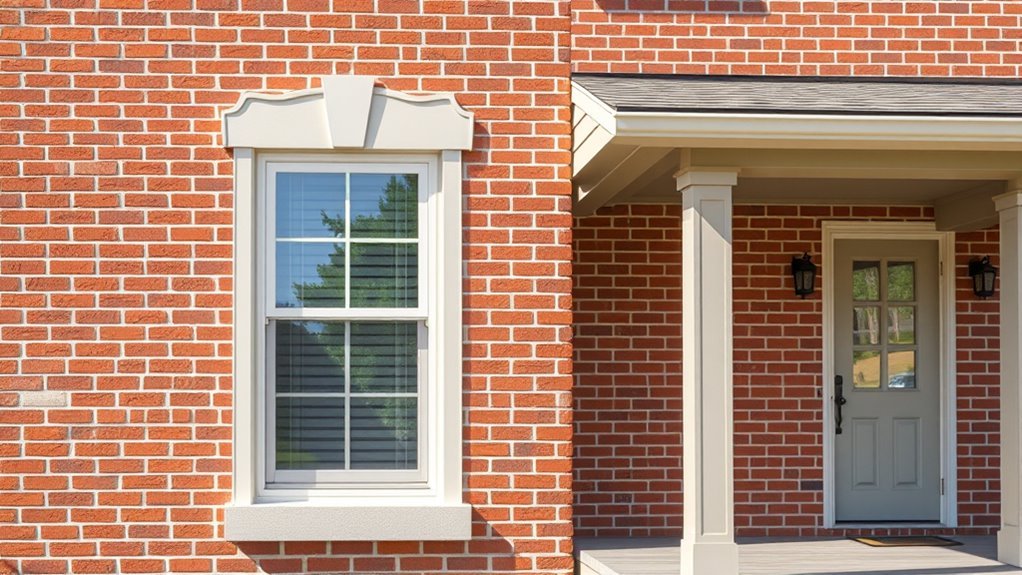
When you choose neutral trim for red brick, you’re framing the home in a way that highlights the masonry without competing with it. Pick trims in warm taupes, soft greiges, or muted charcoals to respect historic preservation while acknowledging cultural influences on regional palettes.
You’ll want contrast enough to define windows and cornices but subtlety to let brick texture remain focal. Think about durability and maintenance—dirt-masking tones reduce repainting frequency.
Test swatches at different times of day to confirm harmony. Ultimately, select neutrals that balance contrast, context, and longevity so the brick keeps center stage.
Warm vs. Cool White Trim Choices
Because white trim can read warm or cool depending on undertones and surrounding materials, picking the right shade matters when you want the brick to look its best. You’ll choose warm whites to cozy the red tones or cool whites to crisp them, considering Exterior lighting and how Landscaping complements the facade. Test samples at different times of day. Think about window frames, eaves, and porch details together.
- Warm white: soft cream that enhances red brick’s richness.
- Cool white: bluish-white that sharpens contrast and modernizes.
- Mid-tone off-white: balances warmth and coolness for varied light.
Gray Siding Options for Red Brick
When you pair red brick with cool charcoal siding, you’ll get a modern, high-contrast look that highlights the brick’s warmth.
If you prefer something softer, warm greige tones bridge the brick and trim for a more inviting feel.
For a lighter touch, pale silver accents brighten the facade without competing with the brick.
Cool Charcoal Pairings
While cooler grays can seem stark against warm red brick, a deep charcoal siding creates a sleek, modern contrast that highlights the brick’s warmth and texture.
You’ll balance the palette by adding crisp white trim and matte black fixtures, which keep the look refined without softening the brick’s character.
Think about garden design and landscape integration: plantings with varied greens and silvery foliage will bridge the charcoal and red tones.
Use these ideas to visualize the effect:
- Dark charcoal siding, white trim, black hardware.
- Mixed green plantings with silver-leaf accents.
- Minimalist stone path tying to brick tones.
Warm Greige Choices
If you want a softer shift than stark charcoal, warm greige siding lets you tone down red brick’s vibrancy while keeping a unified, contemporary look. You’ll pick shades that balance clay tones, using color psychology to convey warmth and restraint. Choose mid-tone greiges for contrast without starkness; deeper greiges add depth. Prioritize exterior durability—look for fade-resistant, moisture-proof finishes. Sample at different times of day and against brick mortar. Visualize combinations:
| Shade | Mood | Finish |
|---|---|---|
| Greige Taupe | Cozy | Satin |
| Warm Stone | Neutral | Eggshell |
| Driftwood Gray | Grounded | Matte |
Pale Silver Accents
Because pale silver grays reflect light without competing with red brick’s warmth, they make an elegant, understated backdrop for masonry and trim. You can use them to soften contrasts, highlight architectural details, or create a cohesive palette that suits both Historical restoration and Modern minimalist styles.
Choose finishes that read cool in sunlight and warm at dusk to complement brick tones.
- Soft silver siding with white trim for period-accurate Historical restoration.
- Matte pale gray panels and black accents for a Modern minimalist look.
- Light silver shingles paired with natural wood to add subtle texture and warmth.
Blues and Navy Accents That Work
When you want a crisp contrast that still feels classic, blues and navy accents deliver on red brick without overpowering it. You can paint shutters, doors, or trim in deep navy for a refined look, or choose lighter cerulean for a friendlier vibe.
Think about interior decor flow—carry an accent pillow or trim hue indoors to link rooms to your exterior. Coordinate with landscape integration by using planters, urns, or foliage with complementary blooms and textures.
Stick to two-tone schemes to avoid visual clutter, and test samples in different light to guarantee the blue reads true against warm brick.
Greens That Harmonize With Brick
Blues pair beautifully with red brick, but leaning into greens brings a more organic, grounded feel that complements the brick’s warm tones.
Blues suit red brick, but green hues lend an organic, grounded contrast that warms and complements masonry.
You’ll find green palettes that echo surrounding foliage, tie into garden pathways, and frame windows without overpowering the masonry. Choose muted sage for subtle contrast, deep olive for classic elegance, or a cool fern for freshness.
Pair trims in creamy neutrals and use darker greens on shutters to guide the eye. Think of accent plantings as extensions of your paint choice—coordinated foliage reinforces cohesion and softens corners while highlighting architectural details.
- Muted sage
- Deep olive
- Cool fern
Using Black and Charcoal Accents
If you want to add drama and definition to red brick, black and charcoal accents deliver crisp contrast without clashing with the masonry’s warmth. You’ll use these deep tones on trim, windows, and doors to frame brickwork and make architectural details pop.
Pairing with stone accents keeps the palette grounded, while metal fixtures in similar shades reinforce cohesion. Black shutters or a charcoal front door create focal points without overpowering the facade.
For curb appeal, balance darkness with thoughtful lighting and plantings so the house reads as intentional, achieving strong curb presence and landscape harmony.
Tans and Beiges to Soften Brick
Choose warm tans and beiges to mellow red brick without losing its character.
Consider contrasting trim and accent colors—like creamy whites or deeper taupes—to frame doors, windows, and shutters.
Pick finishes and textures (matte for concealment, satin for easy cleaning) that suit the home’s style and weather.
Warm Neutral Pairings
Because warm tans and beiges mellow the strong red tones, pairing them with brick creates a balanced, inviting look that still feels grounded. You’ll choose warm neutrals that echo interior color trends while linking exterior walls to porch ceilings or garage doors, creating flow between inside and out.
Consider how these hues work with landscaping to enhance curb appeal and landscape design integration.
- Soft taupe siding to calm vibrant brick.
- Sandy beige for a sunlit, cohesive facade.
- Pale caramel accents that warm entryways without overpowering brick.
Trim And Accent Options
When you soften red brick with tans and beiges, trim and accents become the finishing touch that ties the whole exterior together. You’ll pick trim in warm cream or soft taupe to frame windows and doors without competing with brick. Use a slightly darker beige for shutters and a lighter tan for fascia to create subtle contrast. Coordinate accent doors or a porch ceiling in muted ochre to add personality. Mind Garden landscaping and Exterior lighting when choosing tones so plants and fixtures harmonize. Small metal accents in bronze or aged brass complete the look with enduring warmth.
| Element | Suggested Tone |
|---|---|
| Window trim | Warm cream |
| Shutters | Soft taupe |
| Front door | Muted ochre |
| Metal accents | Bronze/aged brass |
Texture And Finish Choices
Although you’re working with tans and beiges to soften red brick, texture and finish will determine whether the look feels modern, cozy, or weathered. You’ll pick finishes that complement your architectural style and garden landscape, so choose intentionally.
Smooth eggshell reflects light for a contemporary vibe.
Matte hides imperfections for a cottage feel.
Satin offers subtle sheen, balancing brick texture.
Consider masonry sealers to unify tones without losing character.
- Smooth eggshell on trim for modern contrast.
- Matte on siding to emphasize cozy, aged warmth.
- Satin on shutters to tie brick and plantings together.
Bold Front-Door Colors That Pop
If you want your red brick home to stand out, pick a bold front-door color that creates instant curb appeal and personality. You’ll choose hues based on your architectural style: a colonial might suit navy or hunter green, while a modern brick house handles matte black or bright yellow.
Consider how the door color interacts with garden landscaping—use complementary accents in planters or trim to tie the look together. Don’t forget hardware finish and durable exterior paint that resists fading.
Test samples at different times of day and against the brick’s undertones to guarantee the color truly pops.
Choosing Roof and Gutter Colors
Once you’ve picked a door color that energizes your facade, think about how the roof and gutters will frame that look—these large surfaces set the visual weight of your house and can either harmonize with or overpower the brick and trim.
Choose roof tones that tie to mortar or deep trim, and select gutters that recede or echo accents. Consider how roof color affects landscape integration and how gutters complement porch decor.
Options to visualize:
- Dark charcoal roof, matching gutters to trim for sleek contrast.
- Warm brown roof, bronze gutters tying to porch decor.
- Olive-gray roof, muted gutters blending with greenery.
Pairing Brick With Siding Materials
When you mix brick with other siding materials, aim for balance so the textures and colors complement rather than compete. Brick gives weight and warmth, while siding can add pattern, contrast, or a lighter visual plane.
You’ll pair horizontal lap, board-and-batten, or cedar shakes to emphasize lines or soften massing. Choose siding tones that pick up mortar or brick undertones, and coordinate trim and exterior accents with your interior paint palette for cohesion.
Consider scale: large siding fields suit lighter hues, small details handle bolds. Tie it all to landscaping design so materials and colors feel integrated across the whole site.
How to Test Paint Samples Outdoors
Because paint looks different in varying light and next to brick, you should test full-size samples outdoors before committing, applying them directly on the wall or on large boards placed near the façade.
You’ll see how exterior texture affects color depth and evaluate paint durability. Pick sunny and overcast times, note wet and dry appearances, and observe from street and close-up. Keep samples up for a week to catch shifts.
- Mount boards at eye level near brick to compare scale.
- Label each sample with brand, formula, and date.
- Photograph samples morning, noon, and evening for reference.
Matching Mortar and Paint Tones
Look closely at your mortar to spot its undertones—cool gray, warm beige, or yellow ochre—and use that as a starting point.
Match paint colors that echo those undertones so the brick and trim feel unified.
If you want contrast, choose a paint warmth that complements rather than fights the mortar’s tone.
Match Mortar Undertones
If you want your painted trim or accents to feel cohesive with red brick, start by matching the mortar’s undertones—those subtle warm, cool, or neutral hints that change how colors read next to the brick. You’ll notice mortar reflects regional Historical architecture and Cultural influences, so sample on-site. Compare swatches against mortar in different light. Choose undertones that whisper, not shout.
- Warm undertones: pick creamy ivories or soft taupes for unity.
- Cool undertones: try slate grays or muted blues for contrast.
- Neutral undertones: select true whites or soft greiges for balance.
Coordinate Paint Warmth
When you coordinate paint warmth with red brick, match the paint’s temperature to the mortar’s undertone so the whole façade reads as intentional rather than accidental. You’ll pick warm creams or cool grays depending on whether mortar leans beige or blue-gray. Consider landscape integration so plantings echo warm or cool notes, and choose porch color schemes that bridge brick and trim. Test samples at different times of day. Use the table below to quick-reference pairings and keep choices consistent across trim, doors, and accents.
| Mortar Undertone | Suggested Paint Warmth |
|---|---|
| Beige | Warm creams |
| Yellow | Soft tans |
| Blue-gray | Cool grays |
| Neutral | Balanced taupes |
Painting Window Frames and Shutters
Although the brick sets the mood for your home’s exterior, painting window frames and shutters lets you refine the style and add contrast that ties the whole facade together. You’ll focus on window casing finish and pick shutter styles that echo architectural details.
Choose high-contrast darks for drama or soft neutrals for subtlety. Keep trim crisp to frame views and guarantee paint sheen resists weather.
- Black or charcoal for bold, modern contrast.
- Soft cream or warm taupe for classic, muted charm.
- Deep green or navy to introduce color without clashing.
Proportions: Paint Coverage and Balance
Think about how much of your facade each color will cover, since coverage ratios affect how dominant a hue reads from the street. You’ll want to balance visual weight so a bold trim or dark shutter doesn’t overpower the red brick field.
Consider trim versus field proportions carefully to keep the overall look grounded and harmonious.
Coverage Ratios Matter
Because paint doesn’t cover every surface the same way, you need to think about how much of your home each color will actually show—brick, trim, siding, and accents all demand different amounts of paint and attention. You’ll plan coverage ratios so dominant surfaces don’t overwhelm accents.
Consider exterior durability and paint application: some finishes need thicker coats or primers, others last longer on sun-exposed walls. Calculate gallons per square foot for each element, then balance cost, upkeep, and contrast so the brick remains focal.
Practical ratios keep the scheme cohesive and reduce surprises during real-world painting.
- Main siding percentage vs. brick
- Trim and fascia allocation
- Accent and door coverage
Visual Weight Balance
When you balance visual weight, you decide how much eye-catching color each surface gets so the red brick stays dominant without feeling heavy. You’ll assign stronger hues to smaller elements—doors, shutters, a porch—so they punctuate rather than overpower the masonry.
Use muted tones on larger planes to let brick read as the main material. Consider garden decor and landscape integration: repeat accent colors in planters, benches, or a gate to tie scenes together.
Measure proportions visually from the street, adjust paint coverage so focal points pop, and keep the overall composition cohesive and grounded in the brick’s warmth.
Trim Versus Field
Although the field — the large painted surfaces like siding or stucco — usually reads as the house’s visual background, you’ll control the overall feel by choosing how much of that canvas is painted versus how much remains brick. Decide whether trim dominates or the field does, considering exterior wall textures and how light hits surfaces.
Use landscape color coordination to link paint, brick, and planting. Balance keeps proportions pleasing.
- Thin trim, dominant brick: warm mortar, subtle field.
- Bold trim, muted field: crisp lines, emphasize architectural detail.
- Equal parts: harmonious contrast, cohesive curb appeal.
Common Color Mistakes to Avoid
If you pick colors that clash with red brick’s warm, earthy tones, you’ll end up with a house that feels off rather than cohesive. Don’t choose overly bright or neon shades that fight the brick; they disrupt color psychology and make curb appeal jarring.
Avoid tiny swatches dictating a whole façade—test large samples in varied light. Steer clear of trendy extremes that’ll date quickly and undermine exterior durability, like thin finishes prone to fading.
Don’t ignore contrast: too little makes details disappear, too much creates discord. Pick balanced neutrals or muted complements and confirm they age well.
Seasonal and Neighborhood Considerations
Because seasons and neighborhood character shape how colors read, you should consider both when choosing paint for red brick. You’ll want hues that work in cooler winters and bright summers; follow Seasonal paint trends but don’t chase every fad.
Also evaluate Neighborhood style compatibility so your choice complements nearby homes and local regulations.
- Match contrast: higher contrast pops in snowy months, subtler tones suit leafy summers.
- Respect scale: historic districts favor muted, period-appropriate colors; modern areas accept bolder accents.
- Test samples: view swatches at different times and alongside neighboring facades before committing.
Sample Palettes for Warm vs. Cool Brick
When you’re pairing paint with red brick, start by identifying whether the brick reads warm (red, orange, or brown undertones) or cool (purple, blue, or gray undertones), since that distinction guides complementary and contrasting choices. You’ll choose palettes that respect historical architecture and reflect local cultural influences. Warm bricks suit creams, olive greens, rich taupes; cool bricks pair with soft grays, slate blues, and crisp whites. Use the table to mix main, trim, and accent ideas and test samples in sunlight.
| Brick Type | Main Color | Accent/Trim |
|---|---|---|
| Warm | Cream | Olive |
| Warm | Taupe | Rust |
| Cool | Soft gray | Navy |
| Cool | Slate blue | White |
Frequently Asked Questions
Can I Paint Brick Itself, or Only the Surrounding Siding and Trim?
Yes—you can paint brick itself, not just siding and trim. Use proper brick surface preparation, cleaning, and mortar repair. Apply suitable primers and breathable masonry paints, and follow painting techniques for adhesion, durability, and moisture control.
How Does Brick Color Affect Home Resale Value?
Brick color can influence resale by signaling curb appeal and style; you’ll attract buyers with cohesive interior design and mindful color psychology, so choose hues that complement brick, feel neutral, and evoke warmth, trust, or modern freshness.
Are There Paint Finishes Better Suited for Exterior Brick Areas?
Of course you’ll pick the fanciest sheen—yet the truth is practical: you’ll want satin or elastomeric for texture options and superior paint durability, since they handle brick’s irregular surface and weathering far better than flat finishes.
Can Exterior Lighting Fixtures Change Perceived Paint Colors at Night?
Yes — you’ll notice outdoor ambiance shifts as lighting effects alter hues, warmth, and contrast; warm bulbs soften reds, cool LEDs brighten neutrals, and layered fixtures create depth, so test samples under nighttime lighting before deciding.
Should Landscaping Colors Coordinate With Brick and Paint Choices?
Yes, you should: coordinate landscaping colors with brick and paint so garden plantings and driveway materials complement each other, creating cohesive curb appeal; choose foliage, blooms, and hardscapes that balance tones and enhance overall harmony.
Conclusion
You’ve got lots of great options when matching paint to red brick — and remember, about 73% of homebuyers say exterior curb appeal strongly influences their purchase decision, so your choice matters. Identify your brick’s undertone, test paint samples in different light, and pick a trim color that balances warmth or coolness. Keep coverage proportional to architectural features, avoid overly trendy hues, and choose a palette that complements your neighborhood and seasonal shifts.