What Color to Paint Kitchen Walls With White Cabinets
With white cabinets, you’ve got a flexible canvas—soft gray or warm greige keeps things calm and modern, pale blue or mint feels fresh and airy, navy or deep green adds dramatic contrast, and buttery cream warms the space. Check your light: north-facing rooms cool hues, south-facing warm them. Test swatches on multiple walls at different times before committing. Keep trim neutral and consider an island or backsplash accent to tie it together—more practical tips follow.
Best Paint Colors for White Kitchen Cabinets (Quick Shortlist)
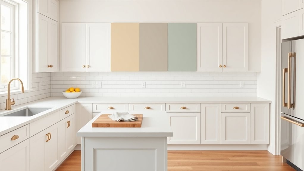
Start with a few fail-safe colors that pair beautifully with white cabinets: soft gray for a subtle, modern look; warm greige to add cozy depth; navy for bold contrast; pale blue or mint for a fresh, airy feel; and buttery cream if you want a warm, timeless kitchen.
Pair white cabinets with soft gray, warm greige, navy, pale blue or mint, or buttery cream for standout style.
You’ll pick hues that highlight white cabinetry and complement finishes—think brushed brass or matte black cabinet hardware.
Consider durable paint near a busy kitchen appliance zone and choose a sheen that stands up to splashes.
Test swatches in your light, next to countertops and appliances, before committing.
Why White Cabinets Work With Almost Any Wall Color
Because white reflects light and reads as a neutral canvas, it lets you pair virtually any wall color without clashing. You’ll find white cabinets balance bold hues, pastels, and earthy tones by anchoring the palette and preventing visual overload.
Color psychology plays here: white feels clean and calm, so saturated walls read as intentional accents rather than chaotic choices. You can switch trends without replacing cabinetry, and maintenance choices like high-quality finishes improve paint durability so walls withstand cleaning and wear.
In short, white cabinets give you flexible, forgiving design that adapts to mood, trend, and practical needs.
How Lighting Changes Wall Color With White Cabinets
Look at how natural light changes the way a paint color reads against white cabinets—north-facing rooms will make colors feel cooler, while south-facing light warms them up.
Pay attention to your artificial lighting too, since warm bulbs can soften cool tones and cool bulbs can sharpen warm ones.
Test paint swatches at different times of day and under your fixtures to see the true effect.
Natural Light Effects
How does natural light change the way your wall color reads next to white cabinets? You’ll notice natural light shifts color perception throughout the day, warming hues at sunrise, cooling them in shade, and softening contrasts with white cabinetry. You can test swatches at different times to pick a tone that consistently flatters your cabinets and mood. Below is a small emotional guide:
| Morning | Midday | Evening |
|---|---|---|
| Cozy optimism | Crisp clarity | Gentle calm |
| Warm glow | True tones | Muted shadows |
Trust daylight to reveal undertones; choose a color that feels right in varied natural light.
Artificial Light Influence
Natural daylight gives you a baseline, but artificial lighting ultimately defines how your chosen wall color reads when the sun goes down. You’ll notice white cabinets reflect whatever light you use, altering color perception and mood. Consider these points:
- Warm LEDs cast yellow tones, warming cool paints and softening contrasts.
- Cool fluorescents push blues and greens, making neutrals feel stark.
- Dimmer switches let you control intensity, shifting saturation and perceived depth.
- Task lighting highlights backsplashes and can reveal undertones invisible in ambient light.
Test paint swatches under your fixtures to see true Artificial lighting effects.
How to Choose a Wall Color: 5-Step Decision Checklist
When you’re ready to pick a wall color for white cabinets, follow a clear five-step checklist that narrows choices fast and avoids costly mistakes. Consider color psychology and paint durability first: think mood, traffic, and finish. Test swatches under your light, compare with countertop tones, and pick a coordinating accent. Finalize with sample cans and evaluation over days.
| Step | Action | Result |
|---|---|---|
| 1 | Assess light | True hue seen |
| 2 | Note surfaces | Coordinated palette |
| 3 | Swatch multiple | Narrow options |
| 4 | Check durability | Practical choice |
| 5 | Live-test | Confident pick |
Choosing a Mood: Cozy, Airy, Modern, or Dramatic
Because the color you pick sets the room’s personality, decide whether you want cozy, airy, modern, or dramatic and let that priority guide every other choice. Use color psychology to match mood and consider paint durability for high-traffic kitchens.
Pick tones and finishes that support:
- Cozy — warm hues, matte finishes, textured accents.
- Airy — pale blues or greens, satin sheens, lots of light.
- Modern — cool neutrals, crisp contrasts, semi-gloss for easy cleaning.
- Dramatic — deep jewel tones, high-contrast trim, durable finishes to handle wear.
Trust mood first; practical choices like finish and durability follow.
Warm Neutrals That Complement White Kitchen Cabinets
If you want a kitchen that feels warm and timeless, lean on warm neutrals like soft greige, creamy beige, and muted taupe to complement white cabinets without competing with them. You’ll use color psychology to create coziness, choosing undertones that flatter your cabinet finish and natural light. Pick paints with good paint durability for high-traffic zones and easy cleaning. Test samples on different walls and observe at various times.
| Tone | Best Use | Maintenance |
|---|---|---|
| Soft greige | Open, sunlit kitchens | High (scrubbable) |
| Creamy beige | Traditional, cozy nooks | Medium |
| Muted taupe | Transitional styles | High |
Cool Neutrals and Soft Grays to Keep Things Calm
Although cool neutrals and soft grays can feel understated, they give white cabinets a serene, modern backdrop that keeps the kitchen calm and cohesive. You’ll want tones that reflect light without washing out details, letting hardware and countertops stand out. Balance minimalism with warm touches through accents.
- Choose a soft gray with blue or green undertones to add depth.
- Use decorative wall art sparingly to introduce texture and contrast.
- Keep trim crisp white to highlight cabinet lines.
- Consider kitchen plant placement for subtle life and color.
These choices keep the space peaceful and intentionally styled.
Pastels and Pale Colors for an Airy Cottage Look
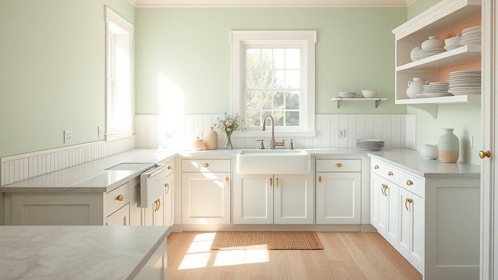
When you paint kitchen walls in soft pastels—think pale mint, blush, or buttery lemon—you give white cabinets an airy, cottage feel without overpowering the space. You’ll create gentle contrast that highlights trim and lets light linger. Pair pastel walls with vintage patterns on textiles for nostalgic charm, and choose eco friendly paints to keep the room healthy. Balance color with natural wood or white counters, and add brass or worn iron accents for warmth. Small doses of pattern and texture make the look personal, cozy, and timeless.
| Light | Texture | Feeling |
|---|---|---|
| Mint | Linen | Fresh |
| Blush | Lace | Warm |
| Lemon | Wood | Sunny |
| Pale blue | Wicker | Calm |
Bold Blues and Greens for Modern Contrast
Because deep blues and saturated greens sit opposite white on the color wheel, they give your cabinets crisp, modern contrast that reads fresh instead of heavy. You’ll use color psychology to decide mood: navy steadies, teal enlivens, emerald feels luxe.
Think about light—natural daylight softens intense hues—then plan paint application for even coverage and true color. Follow these quick steps:
- Test samples on different walls at various times.
- Choose sheen to balance durability and reflection.
- Use primer to prevent patchiness and guarantee adhesion.
- Apply two thin coats, sanding lightly between for a smooth finish.
Deep Charcoals and Black Tones for Dramatic Kitchens
If you want a truly dramatic backdrop, deep charcoals and near-black tones make white cabinets pop while keeping the space sophisticated and modern. You’ll create striking contrast that highlights cabinetry lines and hardware.
Choose matte finishes to minimize glare and emphasize wall texture, or satin for subtle depth. Pair dark walls with plenty of task lighting and reflective surfaces so the room won’t feel heavy.
In kitchen decor, these tones read elegant and intentional, anchoring open layouts and lending a gallery-like vibe. Use them confidently on main walls; balance with lighter floors and metallic accents for equilibrium.
Where to Use Trendy Accent Colors (Backsplash, Island, Trim)
Think about placing a bold color on your backsplash to create a focal point without repainting the whole room.
You can use the same accent on the island to tie the space together, or reserve it for trim to add subtle continuity.
Mix and match sparingly so the accents feel intentional, not overwhelming.
Backsplash Color Placement
Where should you splash a bold, trendy color in a kitchen with white cabinets? Focus on backsplash placement first: it anchors visuals and guides color coordination with walls and fixtures. Choose one statement area and balance it.
- Behind the range to create a focal point you’ll love.
- Along the sink wall for daily visual interest and easy cleanup.
- In a narrow strip under cabinets to hint at color without overwhelm.
- As a full-height run for dramatic, cohesive impact.
Keep finishes in mind—glossy for brightness, matte for warmth—and sample in your light before committing.
Island And Trim Accents
Want a quick way to introduce a trendy color without overhauling the whole kitchen? Use island accents to anchor the space: paint the base a bold hue or add stained wood for warmth while keeping countertops neutral.
Pair that with subtle trim contrast—door casings, window frames, and open shelving backs—to tie the island into the room. Keep the rest of the cabinetry white so the accent reads intentional, not overpowering.
Repeat the accent in small decor or barstools for cohesion. This approach lets you update style easily and swap colors later without repainting the entire kitchen.
Match Paint Sheen to Cabinet Finish for Balance
Because your cabinets already draw the eye, match the wall sheen to their finish so the room feels cohesive—you’ll avoid jarring contrasts and highlight the kitchen’s design instead. Choose sheen with intent: color psychology affects perceived warmth and light, while paint durability matters in high-traffic zones.
Consider these steps to balance gloss and mood:
- Use satin or eggshell if cabinets are semi-gloss to soften reflections.
- Match matte walls to flat cabinet faces for a calm, modern feel.
- Pick higher-sheen trim for easy cleaning near handles and prep areas.
- Test samples under your kitchen light to confirm harmony.
How Hardware and Countertops Change Color Perception
Although paint color sets the stage, your hardware and countertops actively tweak how those hues read, so you should consider them before committing to a wall shade.
Remember: paint sets the scene, but hardware and countertops subtly shift how colors read—test them together before choosing.
You’ll notice warm brass or wood counters push whites toward cream, while stainless steel and quartz keep whites crisp and cool. Think about color psychology: metallics feel modern and energizing; natural stone reads calming and grounded.
Hardware finish, countertop pattern, and edge profile change perceived contrast and saturation. Also weigh paint durability against kitchen wear—gloss or semi-gloss holds up near counters.
Test combinations in situ to confirm the overall balance.
How to Sample Paint: Swatches, Peel‑and‑Stick, Lighting
Now that you’ve considered how hardware and countertops shift white’s appearance, it’s time to sample paint in the actual space so you can see those interactions for real. Use paint sampling to test choices at scale and watch lighting effects across the day.
Try these steps:
- Buy small swatches and paint tester pots for the top candidates.
- Apply peel-and-stick large samples and tester patches on multiple walls.
- Observe samples in morning, midday, and evening light; note temperature shifts.
- Live with patches for a few days before deciding to guarantee color stability.
This practical routine reduces surprises and builds confidence.
Trim, Ceiling, and Island Color Rules That Work
Think about trim and molding as the frame that finishes your white cabinets—you’ll usually want crisp white or a slightly warmer off‑white to keep lines clean.
Let the ceiling be a soft, light shade (even the same white) to lift the room, while the island can be a bolder contrast or a complementary, muted tone to anchor the layout.
These simple rules help you balance brightness, depth, and visual interest without overwhelming the space.
Trim And Molding Colors
When you’re pairing trim, ceiling, and island colors with white cabinets, aim for a clear hierarchy: trim usually reads as the frame, the ceiling as the backdrop, and the island as the focal point.
Choose trim and molding colors that anchor the room without competing. Consider color psychology and paint durability when selecting sheen and tint—trim handles scuffs, so pick washable finishes.
Use these simple rules:
- Match trim white to cabinet white for cohesion.
- Contrast trim slightly for definition.
- Use warm or cool undertones to tie wall color.
- Test samples under real light before committing.
Ceiling And Island Shades
How do you balance ceiling and island shades so they support white cabinets without stealing the show? Choose a ceiling color one to two shades lighter than the walls to widen the space. Consider ceiling textures sparingly so they add interest without clutter.
For the island, pick a grounding tone that complements cabinetry and ties into countertops or flooring. Use island materials—wood, stone, or metal—to introduce warmth or contrast; match finishes to hardware for cohesion.
Keep trim and ceiling neutrals to preserve brightness, and let the island be your focal accent rather than overpowering the crispness of white cabinets.
Small Kitchen Color Strategies With White Cabinets
Although white cabinets already open up the space, choosing the right wall color can make a small kitchen feel even brighter, airier, or cozier depending on your goal. Use color psychology to decide mood: cool hues expand, warm tones hug.
White cabinets widen the room—pick cool tones to expand or warm hues to cozy, and always test swatches in real light.
Focus on paint application for an even finish that reads larger. Try these strategies:
- Pale blue or soft green to amplify light.
- Warm beige or muted terracotta for cozy depth.
- High-gloss backsplash accent to reflect light without overwhelming.
- Dark accent on one wall to add contrast while keeping three walls light.
Test swatches in real light before committing.
Coordinating Wall Color in Open-Plan Kitchens
In an open-plan kitchen, you’ll want wall colors that keep sight lines seamless so spaces feel connected. Use slightly different hues or accent walls to define zones without breaking the flow.
Balance light and contrast so your white cabinets pop while the overall space stays bright and cohesive.
Seamless Sight Line Flow
When your kitchen opens into living or dining areas, pick a wall color that keeps sight lines calm and connected so the whole space reads as one cohesive room. You’ll want a Seamless sightline and clear Visual continuity between zones, so colors should relate rather than compete.
Consider these steps to maintain flow:
- Choose a dominant neutrals-based hue that complements white cabinets.
- Use slightly warmer or cooler tones in adjacent areas to echo the kitchen.
- Match trim and door colors to create uninterrupted progression.
- Test paint in natural and artificial light to guarantee consistent perception across spaces.
Zone-Defining Color Choices
Because open-plan homes ask you to juggle multiple functions, use wall color to subtly define zones without shutting spaces off—pick hues that relate to your white cabinets but vary in depth or temperature to signal shifts.
You’ll employ color psychology to assign purpose: soft greens for calm eating areas, warm ochres for social nooks, muted blues for workstations. Keep *gradients* cohesive by repeating an undertone from the kitchen walls in adjacent zones.
Consider paint application—sheen and texture—so light behaves consistently. Test swatches at different times, and choose colors that read harmonious from multiple sightlines while still marking distinct areas.
Balancing Light And Contrast
Shifting from zone-defining choices, you now need to balance light and contrast so the whole open-plan feels intentional rather than patchwork. You’ll use color psychology and paint texture to link spaces without overwhelming them. Consider these steps:
- Pick a dominant neutral to keep flow and reflect light.
- Use one accent hue in adjoining zones to create contrast without clash.
- Match sheens—matte for walls, satin for kitchens—to control perceived depth.
- Test samples in different spots and times to judge contrast and warmth.
These moves make progression feel curated, cohesive, and comfortable across your open layout.
Frequently Asked Questions
How Does Cabinet Age Affect Paint Color Choice?
Older cabinets limit bold choices because worn cabinet finish and reduced material durability mean you’ll favor forgiving, muted hues; newer cabinets’ pristine finish and stronger material durability let you choose bolder, high-contrast colors with confidence and longevity.
Can Wall Color Hide Kitchen Imperfections?
Yes—you can mask flaws by choosing wall texture wisely; subtle textures and strategic accent wall placement draw eyes away from imperfections, while smooth, darker finishes can hide blemishes and create a cleaner, more forgiving look.
What Colors Increase Perceived Resale Value?
Timeless tans, tranquil grays, and soft greiges boost buyers’ interest; you’ll pair them with a subtle kitchen backsplash and flattering pendant lighting to feel cohesive, clean, and contemporary, increasing perceived resale value across demographics.
How to Coordinate Paint With Existing Flooring?
Match paint undertones to your flooring’s warm or cool hues, and test samples across Lighting effects during day and night. You’ll tie Decorative accents and cabinets together, creating cohesive flow while highlighting texture and contrast.
Are Washable Paints Necessary for Kitchen Walls?
Yes — you should choose washable paints. I once scrubbed a ketchup streak that vanished like a tide; washable sheens protect mural designs and textured finishes, letting you clean spills without damaging artwork or wall character.
Conclusion
You’ve got lots of great options for walls with white cabinets—about 60% of designers say homeowners choose soft neutrals or greige for lasting appeal—so start there if you’re unsure. Think about mood, lighting, and traffic flow, then sample colors in different light. Pick trim and islands deliberately for contrast or continuity. With a quick five-step check and real-life swatches, you’ll confidently pick a color that makes your kitchen feel exactly how you want.