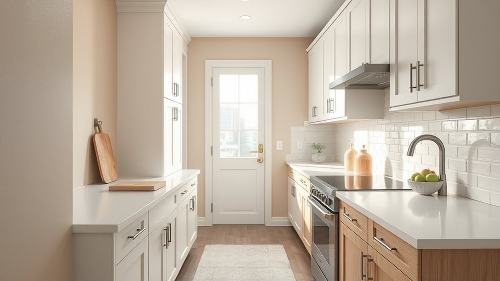
What Color to Paint Kitchen Walls
Pick kitchen wall colors based on your light, size, cabinetry, and the mood you want. Choose light neutrals like warm whites, beiges, or soft grays to brighten small or low-light spaces. Go for pale blues or greens to calm the room, or add a bold accent wall for energy. Match undertones to cabinets and test swatches in different lighting. Use matte or eggshell finishes for durability, and keep looking for tips on choosing finishes and accents.
Quick Color Picks for Every Kitchen Style
Whether your kitchen feels modern, cozy, or somewhere in between, picking a paint color that matches the style makes the whole space come together — and you can do it quickly by leaning on a few reliable options.
You’ll pick crisp white or soft gray for modern looks, warm beige or sage for cozy vibes, and navy or charcoal for dramatic contrast.
Consider color psychology to match energy levels, and prioritize paint durability in high-traffic zones.
Test swatches under your lighting, pair with trim and cabinets, and choose a finish that balances washability and sheen so your choice lasts.
How Kitchen Colors Shape Mood and Appetite
When you choose kitchen colors, they do more than look good — they influence mood, behavior, and even appetite. You’ll notice warm tones like reds and oranges can boost energy and appetite, while greens and blues calm you and may suppress hunger. Use color psychology to match desired dining vibes, and pick finishes that balance aesthetic with paint durability for busy areas.
Consider contrasts to highlight prep zones or dining nooks without overwhelming the space.
Use contrasting colors to define prep zones or dining nooks, creating focus without overpowering the room.
- Red/orange: energize, increase appetite
- Yellow: cheerful, stimulates conversation
- Green: calming, natural appetite balance
- Blue: tranquil, may reduce hunger
How Light Changes Paint: Natural and Artificial
Look at your kitchen at different times of day to see how natural light warms or cools paint tones. Notice how artificial bulbs—warm, cool, or daylight—can shift a color’s appearance and affect contrast.
Try samples under both lighting conditions before you commit.
Natural Light Effects
Because light shifts throughout the day, the same paint can read warm and cozy at sunrise, crisp and true at noon, and muted by dusk — so you should test colors in the actual light they’ll be seen in. You’ll notice north-facing rooms stay cooler, while south-facing bring warmth; this affects color psychology and how vivid hues feel. Natural light also reveals surface imperfections, so choose finishes that aid paint durability. Observe samples on different walls and times.
- Test samples morning, noon, evening.
- Use large swatches on multiple walls.
- Note reflections from floors/cabinets.
- Track changes over several days.
Artificial Light Influence
Natural light changes how paint reads, but artificial lighting can alter it just as dramatically — often in ways you won’t notice until after installation. You should test swatches under every fixture type you plan to use, since warm bulbs deepen yellows and cool LEDs push blues toward gray.
Consider placement and shade style; pendant, recessed, and under-cabinet lighting each cast different shadows and highlights that shift tone. Remember color psychology: warmer light makes spaces feel cozier, cooler light feels cleaner and more alert.
Sample paint at night and day, with chosen lighting fixtures, so your final color matches intent.
Match Wall Paint to Cabinets, Counters & Hardware
When choosing a wall color, coordinate it with your cabinets, counters, and hardware so the whole kitchen feels intentional and balanced. You’ll want Cabinet color coordination to either complement or contrast cabinetry while considering countertop tones.
Think about Hardware finish matching so fixtures tie into the palette. Test swatches near cabinets and counters to see undertones at different times of day.
Choose a wall hue that supports focal elements without competing.
- Pick a dominant undertone from cabinets/counters.
- Match hardware finish accents to wall accents.
- Use swatches beside cabinet doors.
- Reassess under real lighting.
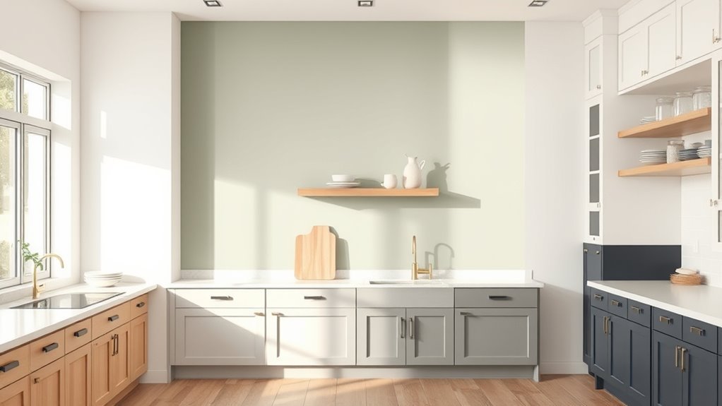
Kitchen Paint Choices to Make Small Spaces Feel Bigger
To make a small kitchen feel larger, choose light neutrals like soft whites, pale beiges, or warm grays to visually open the room.
Cool tones—pale blues or greens—tend to recede and can add perceived depth.
A high-gloss finish bounces light and increases sense of space.
Combine these strategies to amplify brightness and airiness without changing the layout.
Light Neutrals Expand Space
Although small kitchens can feel cramped, choosing light neutral paints instantly opens the room and reflects more light, making the space feel larger and airier. You’ll use color psychology to pick warm beiges, soft greiges, or pale creams that feel inviting without shrinking the room.
Prioritize paint durability for high-traffic areas so walls stay fresh. Pair neutrals with glossy trims or reflective backsplashes to boost brightness. Consider natural light and fixtures when selecting undertones.
- Soft beige for warmth and cohesion
- Pale greige for modern neutrality
- Creamy white to maximize light
- Durable eggshell finish for easy cleaning
Cool Tones Recede Visually
Why not let cool colors push your kitchen walls back and make the room feel more spacious? You’ll use color psychology to influence visual perception: blues, greens, and soft lavenders recede, creating depth so walls seem farther away.
Choose muted, slightly grayish tones to avoid overwhelming contrast with cabinets and counters. Pair cool walls with warm accents to keep the space inviting without shrinking it.
Test samples at different times of day to see how natural light shifts the effect. By intentionally selecting cool hues, you’ll craft a kitchen that feels airier and more open, even when square footage is limited.
High Gloss Reflects Light
Cool, receding hues can open up your kitchen, and glossy finishes amplify that effect by bouncing light around the room. You’ll notice how Glossy finishes and Reflective surfaces make walls feel farther away, brightening corners and reducing shadows. Use them strategically: on upper walls, cabinet faces, or a single focal wall to avoid glare.
Balance sheen with matte accents so the space stays warm and textured. Consider durable, washable high-gloss for busy kitchens. Test samples under morning and evening light to confirm the effect before committing.
- Paint primers
- Sample swatches
- Cabinet fronts
- Accent wall
How to Sample Paint and Compare Undertones
When you’re ready to sample paint, pick several shades and test them on large, separate sections of wall rather than tiny swatches so you can see how undertones shift with light and surrounding finishes.
Use sampling techniques like paint strips, peel-and-stick large samples, and full-pint brush-outs.
Try paint strips, peel-and-stick large samples, and full-pint brush-outs to see true color and undertones.
Observe at different times—morning, noon, evening—and near countertops, cabinets, and floors.
For undertone comparison, photograph each sample under the same light and note warm or cool bias.
Trust your eyes over names; a “greige” can read warm in tungsten or cool in daylight.
Remove samples only after you decide.
Timeless Kitchen Colors : When to Play With Trends
If you want a kitchen that lasts beyond seasonal fads, start with a base of timeless colors—think warm whites, soft grays, and muted blues—and reserve bolder, trend-driven hues for accents you can change easily.
You’ll pair classic walls with Vintage accents like hardware or open shelving, or introduce Eco friendly palettes via low-VOC paints and sustainable materials.
Use accents to test trends without commitment, swapping rugs, backsplashes, or lighting.
Consider texture and finish over loud colors for longevity.
Practical contrast keeps the space current while the base remains calm.
- Start neutral
- Add swap-friendly accents
- Choose sustainable paint
- Focus on texture
Frequently Asked Questions
How Often Should I Repaint Kitchen Walls for Maintenance?
You should repaint kitchen walls every 5–7 years for maintenance, or sooner if wear shows; follow wall color trends and paint color psychology to refresh mood, improve cleanliness, and keep finishes durable in high-traffic areas.
Are Low-Voc Paints Safe for Families With Asthma?
Absolutely — low-VOC paints drastically cut harmful fumes, and you’ll usually see improved indoor air quality and reduced paint toxicity concerns; you’ll still want to ventilate, choose certified brands, and avoid strong odors for sensitive asthma sufferers.
Can I Paint Over Wallpaper in the Kitchen?
Yes—you can paint over kitchen wallpaper, but you’ll usually get better results with wallpaper removal first; otherwise texture shows. Prep well, fix seams, prime, then choose paint color selection that suits light, style, and durability.
What Finish Is Best for Washable Kitchen Walls?
Want something resilient and easy to clean? You should pick semi-gloss or satin for washable kitchen walls; they boost paint durability, resist stains, and help with color coordination across cabinets and trim while still hiding minor imperfections.
How Do I Remove Paint Fumes Quickly After Painting?
Open windows and doors, run fans and exhaust, and use ventilation techniques like cross-breezes and box fans; place paint odor absorbers (charcoal, baking soda) around the room, and avoid heat to speed fume dissipation.
Conclusion
You’ve got a buffet of color choices that’ll quietly nudge your kitchen toward cozy, bright, or boldly polite. Trust your light and your daily habits to steer you, and sample swatches like you’re taste-testing desserts—subtle undertones matter. Pair walls with cabinets and counters for a calm chorus, or let a trend whisper through an accent hue. When in doubt, pick a timeless base and flirt with seasonal splashes—you’ll feel at home before you know it.