What Color to Paint TV Wall? Modern Ideas
Pick a rich, low‑reflective color—deep charcoal, matte navy, or warm taupe—to make your TV pop, cut glare, and create a modern, cozy backdrop. For living rooms, consider warm neutrals or deep charcoal to balance seating and hide reflections. Bedrooms benefit from muted blues or greens for calm, while home theaters suit very dark matte tones to maximize contrast. Test swatches in your light and try mid‑tone greys for kitchens; keep going to see tailored ideas and paint codes.
Quick Guide: Best TV Wall Colors By Room
When choosing a TV wall color, think about how light, viewing distance, and room use affect contrast and glare so your screen always looks its best.
For living rooms, pick warm neutrals or deep charcoal to balance color psychology and maintain cozy room cohesion; they hide glare and suit varied seating.
Bedrooms benefit from muted blues or greens for calm, low-reflective surfaces.
Home theaters call for very dark matte tones to maximize contrast.
Kitchens and family rooms can handle mid-tone greys or earth hues that resist stains and tie decor together.
Always test swatches under real lighting before committing.
Why Paint Color Matters For TV Viewing
When you pick the right paint color behind your TV, you’ll cut down on distracting glare that washes out the picture.
A darker, non-reflective hue can also make colors pop by boosting perceived contrast.
Small changes to wall tone and finish will give you a noticeably better viewing experience.
Reduce Screen Glare
One simple change you can make to improve your TV viewing is choosing paint that minimizes glare; darker, matte finishes absorb stray light instead of reflecting it back at the screen.
You’ll reduce screen reflection and use color psychology to create a calm backdrop that keeps your eyes on the picture. Focus on surface finish and tone to prevent distraction.
- Pick matte or eggshell finishes to scatter light.
- Choose medium-dark neutrals to limit contrast with the screen.
- Avoid glossy trims and metallic accents near the TV.
- Test samples at viewing time to confirm reduced reflections.
Enhance Perceived Contrast
Reducing glare helps your eyes focus, but paint color itself also shapes how vibrant and detailed images appear on screen.
You can use contrast techniques like a darker matte wall behind the TV to deepen blacks and make colors pop, or a soft neutral to keep highlights from washing out.
Consider color psychology: warm tones can enhance perceived warmth in scenes, cool tones can sharpen blues.
Test swatches at viewing distance and under evening light to see real effects.
Balance wall color with ambient lighting—dimmable lamps or bias lighting amplify contrast without causing eye strain.
Define Your Room’s Function And Mood
Although your TV wall will catch the eye, start by clarifying how you’ll use the room and what mood you want to create.
Decide room function early—entertainment, lounging, or multiuse—so your color choice supports activity and mood setting.
Keep finishes practical for everyday use and pick hues that reinforce the intended vibe: calming neutrals for relaxation, deep tones for cinema, warm shades for sociability.
Consider how furniture, textiles, and accessories will interact with the wall color to maintain cohesion.
Prioritize comfort and functionality, then accentuate mood with accent colors or textures.
- Define primary use
- Choose desired mood
- Match furnishings
- Plan accents
Assess Natural Light At The TV Wall
How much natural light hits your TV wall at different times of day? You’ll perform a natural light assessment by tracking light direction analysis across morning, midday, and evening to see glare risks.
Conduct a room exposure evaluation—note windows, obstructions, and reflective surfaces.
Consider seasonal light changes: angle, duration, and brightness shift through the year.
Record light intensity effects on colors and contrast so you’ll predict how tones read on-screen.
Use these findings to choose hues that reduce glare, preserve contrast, and complement ambient shifts.
This practical check guarantees wall color impact supports viewing comfort and visual balance.
Evaluate Artificial Lighting And Fixtures
Think about the light temperature you want—warm tones will cozy up the room while cooler tones keep colors crisp around the TV.
Position fixtures to minimize glare and reflections on the screen, using wall washers or adjustable sconces where needed.
Make sure you have good control and dimming options so you can fine-tune brightness for different viewing moods.
Assess Light Temperature
Before you pick paint or hang art, check the color temperature of your room’s artificial lights—warm (2700–3000K) will deepen cozy tones, neutral (3500–4100K) keeps colors true, and cool (5000K+) makes colors appear crisper and bluer.
You’ll notice how light reflection alters perceived hue and contrast; color psychology also plays a role in mood and viewing comfort. Match paint to lighting for desired effect.
Consider bulbs you already have and test swatches at night.
- Test swatches under each fixture.
- Note glare and specular highlights.
- Compare warm vs cool at eye level.
- Choose bulbs to support the palette.
Positioning Of Fixtures
Now that you’ve matched paint and bulb temperature, turn your attention to where fixtures actually sit around the TV.
You’ll plan fixture arrangement to avoid glare, reflections, and hot spots on the screen. Place lights slightly above and to the sides, angled away from the display, and stagger heights to soften contrast.
Consider wall sconces, recessed cans, or narrow picture lights that frame rather than compete with the TV. Aim for lighting balance between ambient and accent sources so your painted wall reads true on screen and in person.
Test positions at viewing height before finalizing mounts or wiring.
Control And Dimming Options
While choosing fixtures matters, how you control them determines whether your TV wall reads right at any hour. You’ll want dimming that’s smooth, responsive, and compatible with your bulbs and dimmers.
You’ll pick controls that match lamps, LEDs, and smart bulbs to avoid flicker and preserve color temperature. Consider presets and scenes for movie nights, bright tasks, and relaxed evenings.
Choose dimming techniques that work with triac, ELV, or PWM drivers, and test before installation. Remote, in-wall, or app controls should be intuitive so you’ll change mood instantly.
- Preset scenes
- Smooth dimming
- Device compatibility
- Color temperature control
How TV Type (LED, OLED, QLED) Affects Choices
Because your TV’s display tech changes how colors, contrast, and reflections behave, you should tailor paint and finish choices to LED, OLED, or QLED screens.
Consider TV technology impact: LED vs OLED matters because OLED’s deep blacks let you pick richer accent walls without washout, while LEDs need balance to avoid glare.
Consider TV tech: OLED’s deep blacks allow richer accent walls, while LEDs require balanced tones to minimize glare.
QLED color choices favor hues that boost perceived saturation. Think screen brightness effects and display contrast importance when selecting tones.
Note viewing angle considerations—darker, neutral walls reduce distraction from off-axis shifts.
Match modern aesthetic preferences and ambient lighting influence to create a cohesive, cinema-friendly backdrop.
Choose Finish: Matte Vs Satin For TV Walls
Having picked colors that suit your TV’s tech and room lighting, you’ll want to decide on paint finish—matte or satin—since finish affects glare, depth, and maintenance.
You’ll choose matte for minimal reflection and a cinematic backdrop, or satin for subtle sheen that boosts color vibrancy and makes cleaning easier.
Balance aesthetics and practical needs: consider color psychology—darker mattes calm, warmer satins energize.
Evaluate finish durability for households with kids or pets. Match finish to decor and lighting to avoid distractions while enhancing contrast.
- Matte: low glare, moody
- Satin: slight sheen, easy-clean
- Durability: check rating
- Test samples first
Screen Size And Viewing Distance Guide
Pick a screen size that matches how far you’ll sit and the room’s layout to get comfortable, immersive viewing without eye strain.
Measure your typical viewing distance, then use a simple rule: multiply the screen diagonal by 1.5–2.5 for HD, or 1–1.5 for 4K, to find an ideal viewing distance.
Position the TV so the center sits at eye level when seated.
Consider room furniture and traffic flow so the screen size doesn’t overwhelm the space.
If you’ll switch seating, choose a slightly larger screen and adjust mounting height.
Prioritize practical measurements over trendy sizes for lasting comfort.
Contrast Rules: Matching Wall To Screen Blacks
When you match the wall tone to your TV’s blacks, aim for a subtle contrast that prevents the screen from looking washed out or floating against an intrusive backdrop.
You’ll use color psychology to set mood without overpowering visuals, choosing a mid-deep hue that complements the TV’s native blacks. Prioritize screen harmony so images retain depth and blacks stay convincing.
Consider finish and ambient light; matte reduces glare, satin reflects more. Balance contrast so your display feels anchored yet distinct from the wall. Practical options help you tune perception without losing immersive picture quality.
- Test swatches in evening light
- Pick matte or low-sheen paint
- Use one to two tones darker than black
- Avoid high-gloss or bright colors
Match Paint To Your TV’s Whites And Blacks
Beyond balancing your wall with the TV’s blacks, you should also consider how the wall interacts with the screen’s whites and highlights.
You’ll pick a paint that creates color harmony between deep blacks and bright whites so images feel natural. Aim for a mid-tone or slightly warm neutral to prevent whites from appearing harsh and blacks from losing depth.
That visual balance reduces eye strain and keeps contrast crisp without competing with content. Test small samples under typical lighting to verify how highlights read, then choose the shade that preserves contrast while blending the TV into the room’s palette.
Test Paint At Your TV’s Viewing Angle
When you’re seated, look at the wall from your usual viewing spot to see how the color reads with the screen’s glow.
Put up several swatches and watch them while the TV is on and off to spot shifts in contrast and tone.
That way you’ll pick a shade that stays comfortable during real viewing conditions.
View From Seating
Because your TV will dominate the wall from a seated viewpoint, test paint at the exact height and distance you’ll watch from to see how colors read with the screen on and off.
You want color psychology to support relaxation and reduce eye strain; pick tones that balance contrast without causing glare. Consider how ambient light shifts during viewing and how hues affect perceived contrast and viewing comfort.
Sit, watch, and note fatigue levels.
- Observe at typical seating distance.
- Check with the TV on varied content.
- Note reflections and glare at eye level.
- Record comfort after 30 minutes.
Test Multiple Swatches
Try several paint swatches at the exact angle and height you’ll view the TV so you can see how each hue interacts with the screen and ambient light.
Place swatches with deliberate swatch placement across the wall, varying sample size and noting texture variation.
Observe under different lighting conditions to judge hue saturation and paint finish effects.
Test simple color layering to simulate accent trims or shadows.
Think about room integration and color psychology—how warmth or coolness affects focus and mood.
Record the visual impact from seating, then compare notes to pick the swatch that balances contrast, glare reduction, and cohesive design.
How To Test Paint Samples Behind The TV
Start by cutting small paint swatches on poster board or using peel-and-stick samples so you can move them behind the TV without marking the wall.
Hold each sample in place at evening and daytime light to see how color, sheen, and reflections change with the screen on and off. You’ll test how hues read with glare, mood lighting, and accents.
Consider paint brands and basic color theory when choosing tones and finishes. Take notes and photos for comparison.
Think about paint brands and color basics; document your choices with notes and photos for easy comparison.
- Test several sheens (matte to satin).
- Observe reflections with the screen on.
- Compare samples to furniture and art.
- Note how ambient light shifts tones.
Evaluate Paint Under Evening Viewing Conditions
After you’ve compared samples in daylight and checked reflections with the screen on, it’s time to see how those same swatches behave during evening viewing. Dim your room lights to mimic typical TV-watching conditions and observe each paint patch from the couch.
Note shifts in hue, saturation, and perceived warmth—colors can look richer or washed under low light. Pay attention to evening ambiance: cooler tones may recede, warm tones can feel cozy or overpowering.
Consider color psychology too; darker muted shades reduce eye strain and focus attention on the screen, while brighter hues distract. Choose the swatch that balances contrast and comfort.
Use Bias Lighting And Dimmable Fixtures
You’ll want bias lighting behind your TV to reduce eye strain, improve perceived contrast, and make colors pop without changing the wall paint.
Position dimmable fixtures so they cast a soft, even glow—behind the TV and along the wall’s edges—avoiding direct reflections on the screen.
Use dimmers to fine-tune brightness for daytime, evening viewing, or movie nights.
Bias Lighting Benefits
When you add bias lighting behind your TV and pair it with dimmable fixtures, you’ll reduce eye strain, boost perceived contrast, and create a more cinematic viewing experience without changing the screen itself.
You’ll enjoy a gentle ambient glow that eases fatigue during long sessions and enhances color depth. Use color temperature that complements your wall paint and match intensity to room lighting.
Set scenes for movies, gaming, or casual TV with dimmable control. Benefits include improved comfort, better perceived black levels, and flexible mood lighting.
- Reduced eye strain
- Enhanced contrast perception
- Improved color accuracy
- Flexible mood setting
Dimmable Fixture Placement
Because proper placement shapes both comfort and picture quality, plan dimmable bias lights so they sit evenly behind the TV at top and sides or along a centered horizontal strip; aim for a soft, halo effect that prevents hotspots, keeps light off the screen, and lets you fine-tune brightness for different content.
You’ll choose dimmable lighting that matches your room’s scale and select fixture styles—LED strips for discreet glow, sconces for accent, or modular panels for control.
Follow practical installation tips: mount at eye-height reference, hide wiring, use compatible dimmers, and test light placement before finalizing to guarantee even, glare-free viewing.
Dark Colors To Reduce Glare
If glare from your TV distracts you, painting the wall behind it in a deep, matte color can cut reflections and improve perceived contrast.
You’ll notice dark color benefits quickly: less bounce from lamps and windows, sharper blacks, and a calmer viewing field. Choose pigments with low sheen and consider warm or cool undertones to match decor.
For practical setup, focus on positioning and finish as much as hue.
- Matte finish to minimize specular highlights
- Deep tones to improve perceived contrast
- Coordinate undertones with room lighting
- Test samples at viewing distance and evening light
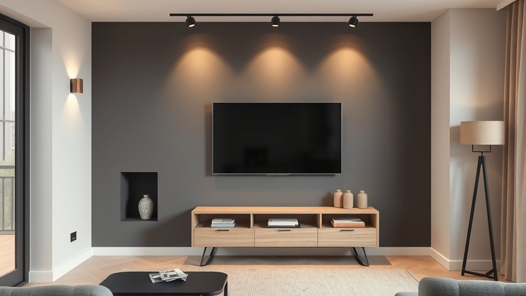
Charcoal & Deep Gray For A Cinematic Feel
Though darker than mid-tone grays, charcoal and deep gray give your TV wall a cinematic depth that makes images feel richer and more immersive.
You’ll create a charcoal ambiance that minimizes reflections and focuses attention on the screen, while pairing matte finishes to absorb stray light.
Use lighter trim or textured media consoles to prevent the space from feeling heavy. Accent lighting—picture lights or LED strips—adds contrast and reveals the deep gray elegance without washing out colors.
This palette suits minimalist or cozy setups alike; balance with warm textiles and metallic accents to keep the room inviting.
Navy & Deep Blue: Depth Without Losing Detail
When you paint your TV wall in navy or deep blue, you get dramatic depth without sacrificing image clarity. You’ll find navy tones anchor the room, making colors on screen pop while keeping reflections low.
Painting the TV wall navy adds dramatic depth and keeps screen colors vivid while minimizing reflections
Choose a matte finish to reduce glare and balance with lighter furniture or trims so the wall doesn’t feel heavy. Use layered lighting to preserve contrast and mood.
- Pick a true navy or slightly muted deep blue for neutral accuracy.
- Test swatches near the TV at different times.
- Pair with warm wood or pale textiles.
- Keep finishes low-sheen for clarity.
Forest Green For A Cozy Screen Backdrop
A forest green TV wall creates a warm, enveloping backdrop that keeps your screen feeling crisp while making the room cozier; it soaks up excess light without dulling colors, especially when you pick a mid-tone with cool undertones. You’ll feel a cozy atmosphere that invites lingering evenings and pairs well with wooden furniture or woven textiles. Use matte finish to reduce glare, add soft lighting to highlight texture, and include plants or stone accents to reinforce natural elements.
| Texture | Pairing |
|---|---|
| Matte paint | Oak console |
| Velvet sofa | Brass lamp |
| Woven rug | Potted fern |
| Stone shelf | Soft light |
Using Black Carefully Without Claustrophobia
If you want to use black as a TV wall without making the room feel claustrophobic, balance it with good lighting, reflective surfaces, and lighter surrounding tones so the darkness reads as intentional depth rather than oppression.
You’ll create black accents that anchor the screen while preserving a cozy atmosphere. Control space perception with contrast and scale: keep ceilings light, add mirrors or metallics, and choose slim furniture profiles.
Use layered lighting—ambient, task, accent—to avoid swallowed corners. Maintain visual balance by limiting black to one feature wall and tying it to accessories so the room feels deliberate, not overwhelmed.
- Layered lighting
- Reflective surfaces
- Light ceilings
- Minimal, scaled furniture
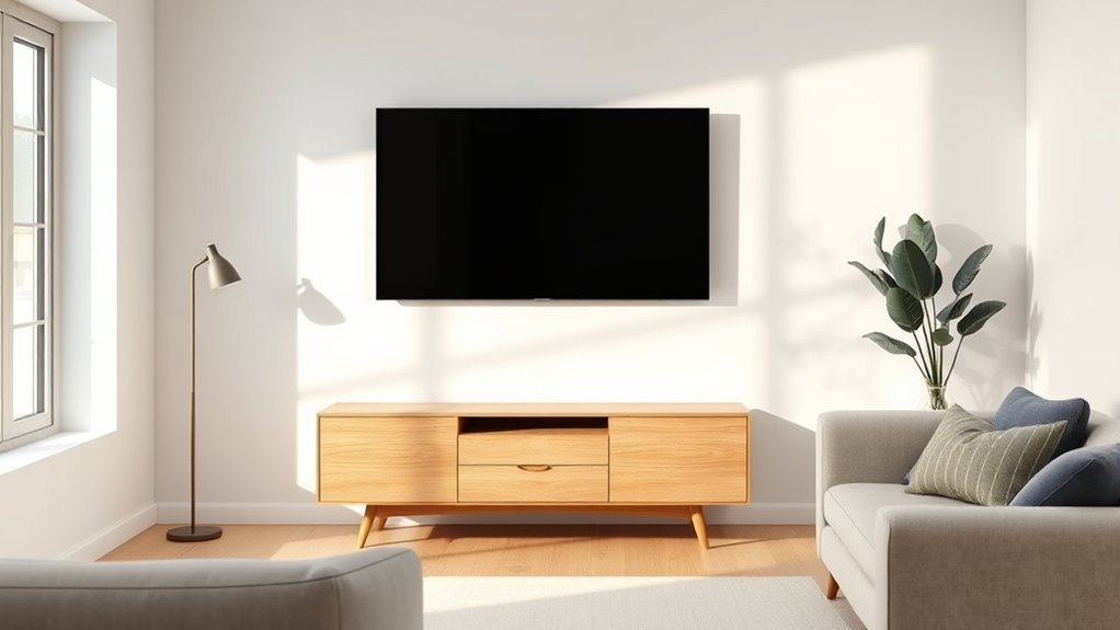
Warm Mid-Tone Neutrals Behind The TV
Warm mid-tone neutrals—think taupe, warm greige, or muted caramel—give your TV wall depth without overpowering the room, and they make the screen feel like a natural focal point.
You’ll appreciate how warm undertones soften glare and reduce contrast, so images feel calmer and viewing is easier. Choose a shade that complements existing wood, textiles, and metal to maintain color harmony across the space.
Use matte finishes to minimize reflection, and paint only the TV wall if you want a subtle anchor. Add simple molding or a slim floating shelf to enhance depth without competing with the screen.
Greige & Warm Gray For Subtle Contrast
Choose greige or warm gray to give your TV wall a subtle contrast that complements wood tones and brings out natural grain.
Layer textured fabrics like linen throws and woven rugs to add depth without overpowering the finish.
Use accent lighting—wall washers or picture lights—to highlight those textures and make the neutral shift feel intentional.
Pairing With Wood Tones
When you pair greige or warm gray with wood tones, you create a subtle, sophisticated backdrop that highlights grain and finish without stealing the show.
You’ll find that this combo delivers restrained elegance, letting furniture and built-ins read clearly against the wall. Keep contrast low for cohesion, or boost it slightly to define the TV area. Aim for color harmony by matching undertones—warm grays with honey woods, greige with cooler oaks.
- Match undertones for seamless unity.
- Use mid-tone finishes to avoid glare.
- Accent with matte trim for depth.
- Test swatches beside actual wood.
Layering Textures And Fabrics
If you want subtle contrast in a greige or warm gray TV wall, layer varied textures and fabrics to add depth without changing the color story.
You’ll mix velvet cushions, linen drapes, and a boucle throw to create quiet interest while keeping tones cohesive. Use textural layering with matte paint, a low-pile rug, and woven baskets for dimensional balance.
Choose a restrained fabric combination—two to three textures max—so the scheme feels intentional, not busy. Anchor seating with a neutral sofa and introduce metallic or wood accents sparingly.
This approach keeps focus on the TV wall while enriching the room’s tactile appeal.
Accent Lighting Effects
Although greige and warm gray read as understated on their own, carefully placed accent lighting can subtly sculpt the TV wall and reveal depth without altering the color story.
You’ll use light to highlight texture, guide sightlines, and influence mood; accent color psychology matters, so pick hues that support calm or energy. Match fixtures to lighting color temperature for cohesive warmth or coolness.
Consider these approaches:
- Cove lighting for even, soft haloing.
- Wall washers to emphasize vertical planes.
- Directional sconces to create dramatic pockets.
- LED strips behind the TV for gentle backlight contrast.
Beige & Tan To Keep The Room Airy
Choose a soft beige or warm tan to keep your TV wall airy and inviting; these neutral hues reflect light, make the room feel larger, and provide a calm backdrop that won’t compete with the screen.
You’ll balance beige tones across furniture and rugs, so the wall feels integrated rather than washed out. Use tan accents sparingly—throw pillows, a slim shelf, or a picture frame—to add warmth and depth without stealing focus.
Stick to matte finishes to minimize glare, and coordinate wood finishes and textiles to create a cohesive, relaxed viewing area that feels bright, open, and timeless.
Cool Light Grays For A Modern Minimal Look
Moving from warm beiges, cool light grays give your TV wall a modern, minimal feel that makes screens pop without overwhelming the room.
You’ll enjoy neutral, calming backdrops that suit light gray palettes and minimalistic styles, letting artwork and media stand out.
Choose a matte finish to reduce reflections and pair with subtle textures for depth.
Keep trim crisp and furniture simple to maintain balance.
Consider contrast with wood tones or black accents to anchor the space.
- Reduce glare with matte paint
- Use consistent tones across the room
- Add texture, not color
- Anchor with dark accents
Soft Whites To Maximize Brightness, Limit Glare
When you want a bright, airy room that keeps your TV viewable, soft whites are ideal—they reflect light without creating harsh glare and make spaces feel larger and cleaner.
You’ll pick a warm off-white or cream to balance screen contrast while promoting brightness enhancement across the room.
Position ambient lighting and matte finishes to prevent reflective hotspots; these choices support glare reduction so reflections won’t compete with on-screen detail.
Soft whites also simplify décor decisions, letting furniture and artwork stand out without overwhelming the display.
Choose a paint with good coverage and low sheen for best, consistent results.
When To Use Bold Accent Colors Behind A TV
When you pick a bold accent behind your TV, think about contrast with the room palette so the screen and décor both stand out.
Use rich hues to highlight architectural features like niches or built-ins and make the TV feel intentionally framed.
At the same time, consider viewing comfort—avoid colors that cause glare or strain during long watch sessions.
Contrast With Room Palette
A bold accent wall behind your TV can sharpen the room’s look and draw the eye exactly where you want it. However, you should choose color and saturation that harmonize with your existing palette to avoid visual clash.
You’ll use contrast to define the TV area while preserving color harmony and mood enhancement. Pick tones that complement dominant textiles, flooring, and art; test paint swatches under your lighting.
Consider scale and viewing distance so contrast doesn’t overwhelm.
- Match undertones (warm/cool)
- Use one saturated anchor color
- Introduce neutrals to buffer contrast
- Test at night and day
Highlight Architectural Features
If you’ve used contrast to anchor the TV area, consider turning that accent into a frame for existing moldings, built-ins, or alcoves by choosing a bold color that celebrates those features rather than hiding them. You’ll draw attention to architectural highlights and create intentional feature contrasts that feel curated. Pick a hue that complements trim and textures, then paint only recesses or surrounding panels to emphasize depth. Balance boldness with neutral surroundings so the TV remains integrated. Test samples at different times of day and photograph them to confirm the accent enhances character without overwhelming the room.
| Area | Finish | Effect |
|---|---|---|
| Molding | Matte | Definition |
| Alcove | Satin | Depth |
| Built-in | Semi-gloss | Pop |
| Paneling | Flat | Cohesion |
| Niche | Eggshell | Focus |
Consider Viewing Comfort
Wondering whether a bold accent behind your TV will strain your eyes? You want colors that help focus without causing glare.
Consider room lighting, screen brightness, and viewing angles before choosing vivid hues. Use color psychology to match mood—deep blues calm, warm terracottas energize—but test swatches at dusk and night.
- Pick a matte finish to reduce reflections.
- Test how contrast affects perceived black levels.
- Observe from all seating positions for consistent viewing angles.
- Balance bold accents with neutral surrounds to avoid eye fatigue.
Make decisions based on real viewing conditions, not just trends.
Terracotta Or Rust As A Trendy Accent Wall
Because warm, earthy hues instantly ground a room, terracotta or rust makes a striking accent behind your TV without overpowering the space.
You’ll love how terracotta tones bring warmth and texture, pairing naturally with wood media consoles and woven rugs.
Use rust accents sparingly—shelves, frames, or a thin trim—to echo the wall without cluttering the view.
Keep surrounding walls neutral and choose a matte finish to reduce glare and reflections during viewing.
If your room gets plenty of natural light, the color will feel vibrant; in dimmer spaces, balance it with layered lighting and lighter furnishings to maintain contrast.
Deep Plum & Burgundy For A Luxe Backdrop
Move from the sun-warmed terracotta palette to deep plum and burgundy when you want a more luxurious, cinematic backdrop for your TV.
You’ll use plum accents and burgundy richness to create a luxe ambiance that reads modern elegance.
Consider color psychology: these sophisticated tones foster intimacy and focus, offering dramatic contrast with screens and warm vibes against wood or brass.
- Anchor the wall with deep plum for depth.
- Layer burgundy richness in textiles for warmth.
- Add metallics to amplify luxe ambiance.
- Keep surrounding decor neutral to spotlight modern elegance.
Muted Mustard Or Ochre For Warmth And Personality
Try a muted mustard or ochre when you want a TV wall that feels warm, grounded, and unexpectedly modern. You’ll give the room personality without overwhelming it: muted mustard reads sophisticated against neutral sofas, while warm ochre brings sunny depth that flatters wood tones.
Pair with matte black or slim metallic frames for the TV to keep contrast crisp, and choose low-sheen paint to avoid reflections. Balance intensity by keeping surrounding walls light and adding textiles in complementary rusts or deep greens.
The result is a cozy, stylish focal wall that supports both screen time and conversation.
Textured Finishes For A TV Wall
For a TV wall that feels tactile and intentional, consider textured finishes like matte plaster, Venetian stucco, or a wood-paneling effect.
You can keep plaster subtle for soft light diffusion, use Venetian stucco to add polish and depth, or mimic wood for warmth without full carpentry.
Choose the texture that complements your room’s style and balances screen glare.
Matte Plaster Texture
Matte plaster brings a subtle, velvety depth to a TV wall, giving your screen a refined backdrop without glare or distraction.
You’ll appreciate how a matte finish softens reflections and keeps focus on content. Proper plaster application builds a uniform, tactile surface that complements modern décor.
You can choose neutral tones to recede or richer shades for contrast, while texture remains understated. Maintenance is simple: dust lightly and spot-clean as needed.
Consider these practical benefits:
- Reduces screen glare effectively.
- Hides minor wall imperfections.
- Adds tactile warmth without shine.
- Works with varied color palettes.
Venetian Stucco Accent
If you liked the soft, glare-free look of matte plaster, Venetian stucco offers a more polished, dimensional alternative that still keeps the focus on your screen. You can use venetian stucco techniques to build subtle sheen and depth, choosing modern color palettes that complement your décor without overpowering the TV. Apply thin layers, burnish between coats, and test finishes under viewing angles. Keep trim minimal and mounting low-profile. Below is a quick reference to guide choices and care.
| Finish | Effect | Maintenance |
|---|---|---|
| Polished | Reflective depth | Low, dusting |
| Troweled | Soft texture | Occasional touch-up |
| Matte burnish | Muted sheen | Moderate care |
Wood Paneling Effect
One or two horizontal planks can instantly warm a TV wall, and textured wood-panel finishes give you that cozy, dimensional look without bulky carpentry.
You can mimic wood textures with panels, vinyl planks, or paint techniques to add depth while keeping installation simple. Aim for color harmony with surrounding walls, furnishings, and the screen to avoid visual competition.
Choose matte or satin finishes to reduce glare and highlight grain. Consider contrast or subtle matching depending on mood.
Use the list below to guide choices and keep the design balanced.
- Material selection
- Grain direction
- Finish sheen
- Color balance
Wallpaper & Fabric Panels Behind The TV
When you mount wallpaper or fabric panels behind the TV, you create an instant focal wall that hides cords, adds texture, and complements your room’s palette without bulky furniture.
You’ll boost wall texture and achieve design harmony by choosing patterns and fabric choices that echo existing tones. Use color layering to frame the screen and introduce material contrast—velvet or woven panels beside matte wallpaper heighten visual interest.
Panels also offer sound absorption, improving audio clarity. Keep scale in mind so the treatment enhances aesthetic appeal without overwhelming the room, and select finishes that resist glare for ideal viewing.
Gallery And Shelving That Don’t Distract The Screen
Although you want decor around the TV to add personality, keep your gallery and shelving low-key so your screen stays the focal point.
You’ll choose a restrained gallery arrangement: small frames, consistent matting, and muted artwork that complements wall color without competing.
Opt for streamlined shelving style—floating shelves or slim ledges—that hold a few curated objects.
Balance is key; leave negative space so the TV breathes.
- Limit frame sizes and stick to one color palette.
- Use shallow, unobtrusive shelves.
- Space pieces evenly; avoid clutter.
- Keep accessories minimal and tonal to support the screen.
Frame Your TV With Trim Or A Painted Border
If you’ve kept the gallery and shelving muted, framing the TV with trim or a painted border gives the screen a defined presence without adding visual noise.
You’ll choose trim styles or border options that suit your room—clean moulding for modern minimalism, chunky frames for warmth.
Consider color psychology when picking contrast or a subtle tone-on-tone to control visual impact and make the screen a deliberate focal point.
Use texture layering—matte paint against glossy trim—to add depth.
Keep proportions right to preserve design balance and achieve aesthetic harmony so the TV complements, not competes, with the space.
Conceal Cables With Color-Matched Paint
Because cables stand out most against contrast, paint them the same color as the wall to make them recede visually and keep your TV installation clean.
Paint cords the wall color so they visually recede, keeping your TV installation clean and discreet.
You’ll improve color matching and cable management at once, whether you run cords in a surface raceway or along baseboards. Match sheen and tint for the least visible result, and touch up after installation.
- Choose paint that matches wall hue and finish.
- Paint raceways, conduits, and clips before mounting.
- Test a small area to confirm visual blend.
- Repaint after hardware adjustments for seamless concealment.
Two-Tone Walls And Color-Blocking Options
You can use horizontal color bands to stretch the room visually or create zones around your TV.
Try splitting the wall with an accent color on the lower or upper half and a neutral on the opposite to balance drama with calm.
These simple color-blocking moves let you highlight the screen without overwhelming the space.
Horizontal Color Bands
- Low band: darker base to ground the set
- Middle band: focal color at eye level
- High band: light tone to lift ceiling
- Thin trim: crisp divider for definition
Accent And Neutral Split
After setting up horizontal bands, consider splitting the wall into an accent and neutral zone to create drama without overwhelming the room.
You can paint behind the TV a bold hue and keep surrounding areas soft to balance focal impact with calm. Use color psychology to pick tones that suit viewing—deep blues for relaxation, warm ochres for energy—while the neutral side grounds the scheme.
Crisp dividing lines or subtle overlaps create modern color-blocking; textured finishes add depth without clutter.
Maintain design harmony by coordinating furniture, textiles, and lighting so the two-tone wall feels intentional and composed.
Pairing TV Wall Color With Furniture & Textiles
When choosing a TV wall color, think about how it will frame your furniture and textiles so the whole room feels intentional and balanced.
When selecting a TV wall color, let it frame your furniture and textiles for a cohesive, intentional room.
You’ll match furniture styles and textile patterns to the wall so color harmony and design cohesion follow naturally.
Consider material contrasts—wood, metal, velvet—so stylistic balance emerges without competing focal points.
Aim for aesthetic appeal and visual comfort by testing swatches against upholstery and rugs.
- Sample colors against key textiles.
- Prioritize furniture tones before accents.
- Use finishes to soften contrasts.
- Keep patterns scaled for calm cohesion.
Creating Color Balance With Complementary Hues
Pairing your TV wall with furniture and textiles sets a solid visual foundation, and you can build on that by using complementary hues to bring balance and energy to the room.
You’ll use color psychology to guide choices: warm accent tones opposite cool base shades create vibrancy without chaos.
Pick one dominant wall color and introduce its complement in cushions, art, or a rug to anchor sightlines and maintain focus on the screen.
For subtlety, choose muted complements; for drama, go saturated.
Test samples together under your lighting to guarantee the complementary schemes feel intentional and support viewing comfort.
Paint Sheen Choices To Minimize Glare & Marks
Because your TV wall sees both light reflections and everyday contact, choosing the right paint sheen matters: You’ll want a finish that balances glare reduction with mark resistance.
Because the TV wall faces reflections and wear, choose a sheen that balances glare control with easy cleaning.
Matte sheens hide reflections but can scuff; low-sheen (eggshell) offers subtle texture and better cleanability. Satin improves mark resistance and wipes clean without heavy shine.
Avoid high-gloss unless framing accents; it creates distracting reflections. Consider lighting angles and typical contact—kids, pets, cleaning frequency—when selecting sheen.
Test samples on the wall at viewing height and check for glare at different times. Pick the sheen that preserves picture clarity and stands up to daily wear.
- Matte — low glare, moderate mark resistance
- Eggshell — balanced glare reduction, easier cleaning
- Satin — higher mark resistance, minimal reflections
- Gloss — strong mark resistance, high glare
Select Paint Brands And Accurate Sample Tools
You’ll want to stick with trusted paint brands for consistent quality and durable pigments.
Test sample swatches on the actual TV wall and view them in different lighting to avoid surprises.
Use accurate color-matching tools or spectrophotometer readings when you need a precise match.
Trusted Paint Brands
While a bold color can transform your TV wall, choosing the right paint brand and testing accurate samples will make that transformation predictable and long-lasting.
You’ll want trusted brands that offer durable finishes, reliable pigments, and sustainable options while respecting color psychology for mood control.
Pick low-VOC formulas if health matters, and look for consistent batch codes. Compare pigment concentration and lightfastness ratings.
Consider customer reviews and professional recommendations to avoid surprises.
- Benjamin Moore – excellent pigmentation and consistency
- Sherwin-Williams – wide palette, professional-grade options
- Farrow & Ball – rich depth, eco-conscious choices
- Behr – affordable, solid durability
Sample Swatch Methods
Start with three reliable sample methods to see how colors will actually read on your TV wall: 4×4 paint chips for quick comparisons, larger peel-and-stick swatches for viewing from different angles and distances, and 12×12 or 18×18 painted panels to assess finish and light interaction.
You’ll use sample testing to judge color psychology and mood setting, noting how light simulation alters tone. Place swatches at typical viewing height for true swatch placement, try texture options on panels, and do finish comparison under evening and daytime light.
Evaluate visual impact, color harmony, and trend analysis before committing.
Accurate Color Matching
How do you guarantee the wall color you pick looks the same on-screen as it does in the room? You’ll choose reputable paint brands with consistent pigments and buy large samples to test under your lighting.
Consider color psychology and color harmony so the hue complements furnishings and on-screen tones. Use these accurate sample tools to confirm match:
- High-quality 4×6 paint chips under different lights.
- Peel-and-stick large sample boards for full-wall preview.
- Spectrophotometer reading at multiple spots.
- Digital color-matching apps calibrated to your monitor.
Then paint a hidden test patch and view TV content to finalize your selection.
Budget Tips: Paint And Prep Under $200
A few smart choices let you paint and prep a TV wall for under $200 without sacrificing quality: pick a durable mid‑range paint, forego costly primers by using a paint‑and‑primer combo when the wall’s in decent shape, and stick to essential tools like a good roller, angled brush, drop cloth, and caulk.
You’ll find affordable options at big-box stores and local outlets; compare sales and use coupons.
Use proven DIY techniques: sand high spots, fill holes with spackle, tape edges carefully, and apply two thin coats.
Sand rough spots, spackle holes, tape edges neatly, and finish with two thin, even coats for best results.
Rent specialty tools only if necessary and conserve paint with proper rolling.
Test Paint At Different Times Of Day
Wondering how a swatch will really look in your living room? You should test paint at different times of day to see true color psychology in action and how lighting effects shift tones.
Paint small panels where your TV will hang, then observe morning, afternoon, evening, and under artificial light. Note warmth, contrast, and glare so the wall complements the screen without overpowering it.
- Morning: cool, crisp hue visibility
- Afternoon: natural saturation peak
- Evening: softer, muted tones
- Artificial: bulb color and intensity
Record observations and choose the shade that balances mood and viewing.
Open-Plan Living: Paint Choices For TV Walls
If your living area flows into the kitchen or dining room, pick a TV-wall paint that ties the zones together while keeping sightlines calm. You’ll choose a hue that respects color psychology—muted blues, warm greiges, or soft greens—so the TV wall feels intentional without dominating.
Use an accent shade that echoes kitchen cabinetry or dining chairs to create design harmony. Matte finishes reduce glare and focus attention on the screen.
If you want contrast, limit it to a framed panel or floating shelf backdrop so the open plan reads cohesive rather than visually fragmented.
How Natural Light Changes Your TV Wall Color
Because natural light shifts throughout the day, the same paint can read warm and cozy in the morning but flat and cool by evening.
Natural light changes all day, so the same paint can feel warm in morning and cool by evening.
You should test swatches at different times to see how undertones react to sunlight and shade. You’ll notice natural light impact on color perception: north-facing rooms keep cooler hues, while south-facing ones amplify warmth.
Track changes and choose a hue that stays pleasing through shifts. Consider finish and contrast with your TV to avoid glare.
Test panels on the wall for several days. Do this checklist:
- Observe morning light.
- Observe midday light.
- Observe evening light.
- Note shadow areas.
How Artificial Light Alters Paint Appearance
Natural light shifts can mislead you about a color’s true tone, but artificial lighting will redefine it once the sun goes down.
You’ll notice color temperature from warm to cool bulbs changes perceived hue, while lighting intensity alters saturation and contrast.
Consider fixture type and placement to control ambient light and avoid glare on screens.
Paint finish and wall texture affect light reflection—matte hides flaws, satin boosts glow.
Assess room orientation to plan evening scenes and aim for color harmony with furnishings.
Prioritize visual comfort and high light quality so your TV wall looks intentional at any hour.
Kid- And Pet-Friendly Paint Options For TV Areas
When you’re choosing paint for a TV wall in a home with kids or pets, pick low-VOC and non-toxic formulations to keep air quality safe.
Opt for washable, durable finishes so you can wipe off fingerprints, crayon marks, and paw prints without damaging the color.
These choices let you protect both your family and your wall’s appearance.
Low-VOC And Non-Toxic
If you want a stylish TV wall without exposing kids or pets to harmful fumes, choose low-VOC or zero-VOC paints designed for indoor use; they cut down on off-gassing while still offering good coverage and color retention.
You’ll find eco-friendly options with modern palettes that won’t sacrifice paint durability. Pick certified brands, check ingredient lists, and test samples in your room’s light.
Clean-up is easier with water-based formulas, and scents dissipate quickly. Consider finishes suited to the space, but avoid high-gloss where reflections distract.
- Look for third-party certifications
- Test samples
- Prioritize water-based formulas
- Follow manufacturer prep instructions
Washable Durable Finishes
Because your TV wall gets a lot of traffic—tiny hands, pet noses, and the occasional scuff—you’ll want a finish that handles cleaning without fading or chipping.
Choose washable paints with stain resistance and durable coatings so you can wipe spills fast.
Focus on surface preparation to guarantee adhesion and color longevity; sand, prime, and repair imperfections before you paint.
Consider textured finishes to hide marks and eco-friendly options if indoor air quality matters.
You’ll appreciate easy maintenance: quick spot cleaning, occasional gentle scrubbing, and a finish that keeps your TV wall looking fresh for years.
Seasonal And Trend-Forward TV Wall Picks
Start with one standout seasonal accent and build the rest of the TV wall around it: you can swap textiles, art, and small decor to echo spring pastels, cozy autumnal tones, or the crisp neutrals of winter without repainting the whole space.
Use seasonal palettes and trend analysis to pick a base hue that adapts. Choose accents that layer easily, then rotate finishes and lighting to refresh mood.
Keep the TV area cohesive by repeating one or two colors and textures.
- Choose a flexible base
- Rotate accent textiles
- Update artwork seasonally
- Adjust lighting and metallics
Update A TV Wall Without A Full Repaint
When you don’t want to repaint, small swaps and smart additions can completely refresh a TV wall: change trim, add a mural decal, install floating shelves, or layer peel-and-stick panels to introduce texture and color without the mess of paint.
You can mix paint textures with removable wallpaper or tiles to create wall patterns and visual depth. Use accent lighting to highlight color layering and influence mood; subtle LEDs shift color psychology and support design themes.
Rotate accessories with seasonal changes to keep the look current. Focus on pieces that reflect your personal style while keeping updates simple and reversible.
When To Hire A Color Consultant Or Painter
Wondering if you should call in a color consultant or painter? You’ll know when decisions feel overwhelming or results must be precise. A consultant brings color psychology insight and expert recommendations; a painter delivers flawless execution.
Hire help if you need accurate sampling, matched finishes, time savings, or technical fixes like textured walls or tricky trims.
- You want confident color choices informed by color psychology.
- You need expert recommendations for lighting and scale.
- You lack time or painting skills for a clean outcome.
- Your wall has repairs or complex details needing pros.
Choose based on scope and budget.
Common Mistakes When Painting A TV Wall
Don’t pick a wall color that clashes with your screen — the wrong contrast can make images look washed out or too harsh.
Also don’t ignore glare and reflections from windows or lights, since they’ll ruin viewing angles and cause eye strain.
Before you paint, test swatches at different times of day and with the TV on to avoid these common mistakes.
Choosing Wrong Contrast
Many homeowners pick a paint contrast that overwhelms the screen, making the TV look harsh or washed out; you should aim for a balance that reduces glare and preserves picture quality.
You want color harmony between wall and furnishings so the screen sits naturally in the room without fighting for attention. Choose muted tones or mid-range shades to maintain visual appeal and avoid extremes that distort perceived contrast.
Consider finish too—matte softens reflections, satin can brighten. Test samples beside the TV at viewing distance and varying light so the chosen contrast truly complements your setup.
- Test colors at viewing distance
- Prefer mid-tones
- Match room palette
- Check finishes
Ignoring Glare And Reflection
After balancing contrast, the next pitfall is overlooking glare and reflections that can ruin picture quality. A well-chosen wall color means little if light bounces off the surface into your screen.
You should assess natural and artificial light paths, test paint samples at different times, and consider matte finishes or darker hues to minimize shine.
Remember color psychology affects mood but not mirror-like glare, so separate aesthetic choices from functional ones.
Also evaluate wall textures; subtle textures scatter light better than glossy, flat surfaces.
Position lamps, use curtains, and pick finishes that prioritize viewing comfort over pure appearance.
10 TV Wall Looks To Try (With Paint Codes)
When you want your TV wall to feel intentional, pick a cohesive look and paint it with specific colors that work together; the suggestions below include exact paint codes so you can recreate each style confidently.
Use color psychology and trending shades to set mood settings; apply accent techniques, texture options, and lighting effects for room harmony and aesthetic balance.
Follow design principles while honoring personal style.
- Moody charcoal — Benjamin Moore HC-166 “Kendall Charcoal” for drama.
- Soft taupe — Sherwin-Williams SW 7049 “Softened Green” for warmth.
- Deep navy — Farrow & Ball No. 281 “Hague Blue” for contrast.
- Pale gray — Behr N520-2 “Silver Drop” for serene backdrop.
Frequently Asked Questions
Will a Painted TV Wall Affect My TV Warranty or Heat Dissipation?
Generally no — painting the wall won’t void warranty implications, and it rarely affects heat management unless you seal vents or attach insulating materials behind the TV. You should follow manufacturer guidelines and avoid blocking airflow or ports.
Can I Use Magnetic or Dry-Erase Paint Behind the TV Safely?
You can, but don’t assume it’s harmless: magnetic paint benefits include mounting light items, and dry erase paint uses offer note-taking, yet you’ll avoid heat/damage risks by keeping coatings thin, away from vents, and using compatible products.
How Do I Repair Scuffs or Marks on a Painted TV Wall Later?
You clean scuffs gently, sand rough spots, prime bare areas, then use matching paint for paint touch ups; keep wall maintenance tips ready like testing color, using small brushes or rollers, and blending edges for a seamless finish.
Are There Fire-Safety or VOC Concerns for Enclosed TV Alcoves?
Picture warm electronics breathing; yes, you should follow fire regulations and ventilation requirements. You’ll guarantee clear airflow, use low‑VOC materials, keep heat sources away, and install smoke detectors so your alcove stays safe and code‑compliant.
Can Acoustic Paint or Soundproofing Coatings Improve Dialogue Clarity?
Yes — you’ll notice improved dialogue clarity when you use acoustic paint or soundproofing coatings; they boost acoustic performance by adding sound absorption, reducing reflections and mid–high frequency echoes so speech becomes clearer in your room.
Conclusion
You’ve got the tools to make your TV wall sing—think of it like choosing the soundtrack for a film: the right color sets mood, focus, and comfort. Trust your room’s light, function, and fixtures to guide you, and don’t be afraid to test swatches or update accents instead of repainting. If it feels overwhelming, call in a pro. With one confident coat, you’ll turn that blank wall into the opening scene of your best nights in.