How to Paint a Wall Two Colors for a Modern Look
Decide on two coordinated colors and where the divide will sit, then measure and mark a level line. Clean, repair, and prime the wall if needed, gather quality brushes, rollers, painter’s tape and drop cloths, and start with the lighter base color. Seal the tape edge with base paint, let it dry, then apply the darker accent; remove tape while slightly tacky for a crisp edge. Follow simple blending and cleanup tips below to finish like a pro and learn more.
Quick 5‑Step Two‑Tone Wall Guide
Start by deciding which two colors you want and where the divide will sit—midway for a bold stripe, lower for a chair-rail look, or high for a modern band.
Measure, mark, and level the line; tape cleanly. Prime if needed for wall textures, then roll base and cut in the second shade.
Finish, remove tape, and assess color psychology impact.
Two‑Tone Looks to Match Your Room
Think about how your color pairs will interact with the room’s existing tones and natural light.
Choose one dominant shade that complements your furniture and a secondary hue that accents without overpowering.
Balance warm and cool elements so your two-tone wall ties the whole space together.
Color Pairing Tips
When choosing two colors, consider the room’s purpose and existing finishes so the palette feels intentional and balanced; calming blues suit bedrooms while energetic yellows work well in kitchens or play areas.
Use color theory to pick contrasts or harmonies, favoring muted tones for subtle modern aesthetics.
Test swatches under real light, and commit to a dominant and supporting shade for cohesion.
Balance With Furniture
Once you’ve settled on a two‑color scheme, let your furniture guide how those colors play across the walls.
Arrange furniture placement to anchor darker tones and preserve room functionality.
Use color coordination with upholstery and accents to tie halves together.
Add texture contrast—rugs, cushions, wood—to deepen interest.
Aim for style harmony and visual balance so the two‑tone layout feels intentional and livable.
Pick Complementary Hues for a Modern Vibe
Although complementary colors sit opposite each other on the color wheel, they create a balanced, modern look when you pair them thoughtfully.
Use color psychology and hue harmony to guide choices so rooms feel intentional.
Consider:
- Choose a dominant hue and a supporting complement.
- Test swatches in natural light.
- Repeat accents to unify the scheme and keep it contemporary.
Use Contrast, Saturation, and Finish to Set Mood
Play with contrast to create visual interest between the two colors—high contrast grabs attention, while low contrast feels calm.
Use saturation to set the emotional tone: brighter hues energize, muted tones soothe.
Choose finishes that control light reflection so the wall reads warmer, cooler, or more subtle depending on sheen.
Contrast Creates Visual Interest
When you pair two colors, contrast—through hue, saturation, and finish—becomes the tool that sets the room’s mood. A high-contrast combo with one vibrant, glossy shade and one muted, matte tone feels energetic, while low contrast with similar saturations and sheens reads calm and cohesive.
You’ll use contrast to create visual depth and employ color psychology to guide feeling.
- Define focal area
- Balance weights
- Test finishes
Saturation Sets Emotional Tone
After you’ve considered contrast and finishes, look at saturation—how intense or muted each hue is—to steer the room’s feeling.
You’ll use saturation psychology to choose vivid or softened tones: high saturation energizes, low soothes.
Balance two colors so their emotional impact matches purpose—restful bedroom, lively kitchen—and test samples in different light before committing.
Finish Influences Light Reflection
Finish matters because gloss level changes how much light your wall throws back into the room, so choosing matte, eggshell, satin, or semi-gloss directly shapes brightness and mood.
You’ll pick finish types to control light diffusion and reflective properties, affecting color perception and room ambiance.
Consider:
- Matte — soft, low sheen levels
- Satin — balanced reflection
- Semi-gloss — bright, durable
Measure and Map Your Wall
Start by measuring the full height and width of your wall with a tape measure. Then mark those dimensions on paper to create a simple scaled diagram.
Note door and window locations, outlets, and trim. Label wall dimensions clearly and sketch proposed color placement, including dividing lines and angles.
Use the diagram to calculate paint coverage and verify your two-color design balances visually.
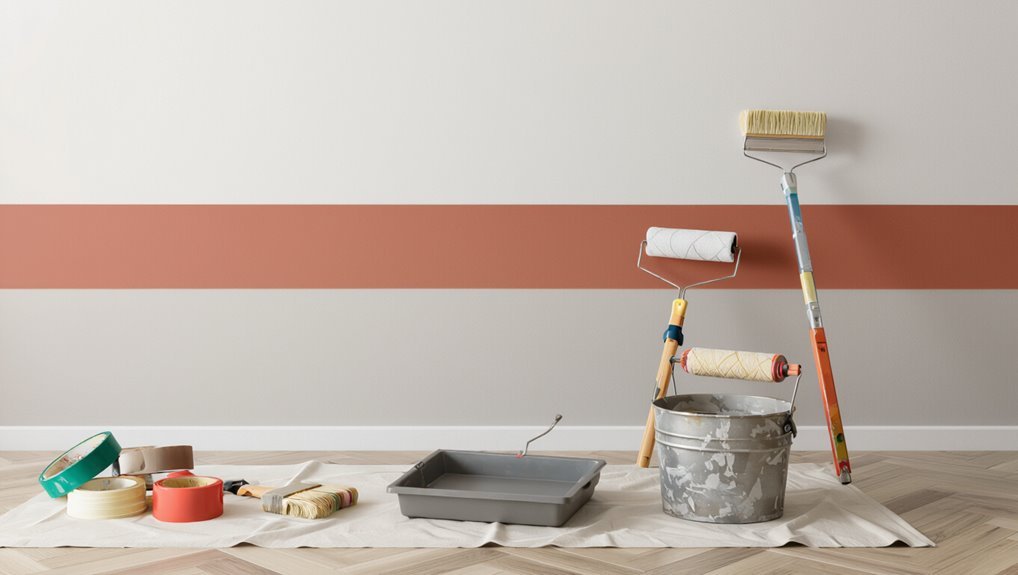
Tools and Materials Checklist
Now that you’ve measured and mapped the wall, gather the right tools and supplies to make the job smooth.
You’ll need essential painter’s tools like brushes, rollers, drop cloths, painter’s tape, and a level.
Also collect the required paint supplies—two coordinated paints, primer, trays, stirring sticks, and rags—so you won’t have to stop mid-job.
Essential Painter’s Tools
A good tools-and-materials checklist makes a two-tone wall easier and faster to paint, so gather the right items before you tape and roll.
You’ll need reliable tools and know paint types and brush sizes to match edges and texture. Prioritize quality for clean lines.
- Tape, level, straightedge
- Angled and flat brushes
- Rollers, trays, extension pole
Required Paint Supplies
Before you pick up the tape, make sure you’ve got the right paints, primers, and finishing supplies so the job goes smoothly.
Gather two paint types (eggshell and semi-gloss), primer, quality brushes, rollers, tray, painter’s tape, drop cloths, sandpaper, filler, and a level.
Consider color psychology when choosing hues and buy enough paint for full, consistent coverage.
Prep: Clean, Repair, and Prime the Wall
Because clean, smooth walls make the color shift sharp and long-lasting, start by washing the surface, fixing any holes or cracks, and priming bare or stained areas.
Use proper wall preparation techniques and wall cleaning methods so paint adheres. Do this:
- Wash and de-grease.
- Patch and sand.
- Prime problematic spots.
You’ll get crisp lines and durable results.
Choose Horizontal, Vertical, or Geometric Splits
How do you want the eye to move across the room? Decide: horizontal stripes widen, vertical splits add height, or angled geometric patterns create energy.
Consider furniture placement and natural light so the division complements flow.
Pick proportions—half-and-half, one-third/two-thirds—or bold shapes for focal impact.
Keep contrast and color harmony in mind to maintain a modern, balanced look.
Mark Level Lines and Reference Points
Start by snapping clear reference lines where the two colors will meet so you can work confidently and straight.
Use simple marking techniques and reliable reference tools to plot level lines and points.
Follow this quick checklist:
- Measure and mark datum points.
- Snap a chalk line between points.
- Verify level with a spirit level.
Keep marks minimal and visible for accuracy.
Mask for Razor‑Sharp Two‑Tone Edges
Pick a high-quality painter’s tape that sticks well but removes cleanly so your line stays crisp.
Press the tape edge firmly and run a dry finger or a plastic card along it to seal any gaps.
Then seal the tape edge with a thin coat of the base color before applying the second color to lock in a razor-sharp two-tone edge.
Choose Proper Tape
When you want a crisp, razor‑sharp edge between two colors, use a high‑quality painter’s tape designed for clean lines—thin, low‑tack tapes with a tight adhesive bond work best on smooth walls, while medium‑adhesion tapes are safer on painted or slightly textured surfaces to prevent paint bleed or damage.
- Choose tape types for surface.
- Test tape application on scrap.
- Press edges firmly before painting.
Seal Paint Edges
Before you apply the contrasting color, seal the tape edge so the line stays razor‑sharp: run a thin coat of the base wall color along the tape crease and let it dry, which fills any gaps and blocks bleed-through when you paint the second color. Use edge sealing techniques and tape application tips to press tape firmly, skim sealant, then paint.
| Step | Tool | Tip |
|---|---|---|
| 1 | Painter’s tape | Align carefully |
| 2 | Brush | Seal with base |
| 3 | Roller | Smooth finish |
| 4 | Knife | Trim if needed |
Which Color to Paint First : And Why
Although it might seem arbitrary, you should start with the lighter or base color because it’s easier to cover a light coat with a darker one than vice versa.
You’ll consider color psychology and surface preparation as you plan.
Follow this quick checklist:
- Paint base/lighter first.
- Mask and prep edges.
- Apply darker accent after drying for crisp contrast.
Cut In by Hand: Brush Techniques
If you want crisp, professional-looking edges, cut in by hand with a high-quality angled sash brush and steady, confident strokes.
Work in manageable sections, loading the brush lightly to control brush pressure and prevent drips.
Use the angled tip to guide a smooth bead of paint along trim, keeping wrist movement steady for edge precision.
Feather outward for seamless blending.
Roller Strategy for Even, Lap‑Free Coverage
Now that your edges are clean, move on to rolling to blend the cut-in with the field without lap marks.
Use a consistent roller technique and steady paint application to keep coverage even. Work wet edge to wet edge, light pressure, and overlapping passes.
- Load roller evenly
- Roll in a “W” pattern
- Finish with long, light passes
Create a Soft Ombré or Fade Transition
Choose colors with shared undertones or adjacent shades on the color wheel so the fade looks natural and balanced.
Use a wet-on-wet blending approach—work from the darker color into the lighter using a dry brush or sponge to soften the seam as you go.
Test your technique on a sample board to adjust pressure, stroke length, and color mix before you start the wall.
Color Selection Strategy
Several subtle steps will help you create a smooth ombré shift between two wall colors: pick hues with similar undertones, decide where the midpoint will sit, and plan intermediate mixes.
You’ll use color psychology and trending palettes to set mood. Consider:
- Base and accent choice
- Midpoint hue samples
- Light exposure and finish selections
Blending Techniques Guide
A soft ombré depends on controlled blending and deliberate brushwork, so set up your workspace with clean edges, accessible mixes, and the right tools before you start.
You’ll tape a crisp boundary, lay base color, then work wet-on-wet with a dry brush or sponge to feather the join.
Practice paint gradients, use light pressure, and step back often to refine blending techniques.
Fix Edge Problems: Bleed, Feathering, Overlap
Edges tell the eye whether your two-tone wall looks professional or rushed, so you’ll want to tackle common issues like bleed, feathering, and overlap right away.
Edges reveal whether a two-tone wall looks crisp or sloppy—address bleed, feathering, and overlap immediately.
- Use clean edge techniques: press tape firmly, remove while wet.
- Correct bleed with a small brush and thin paint application to seal gaps.
- Fix feathering/overlap by sanding lightly and re-coating with controlled brush strokes.
Adding Trim, Rail, or Molding for Separation
1 simple trim piece can transform a two-tone wall from painted separation into a deliberate design line, and you’ll want to choose the right profile, height, and placement before cutting or nailing. Pick trim styles and molding options that suit rail designs; use separation techniques for clean color changes, strong visual divisions, pattern integration, and subtle texture contrast.
| Element | Purpose |
|---|---|
| Trim styles | Define line |
| Molding options | Add depth |
| Rail designs | Guide eye |
| Separation techniques | guarantee clean |
| Color changes | Balance tones |
Drying, Recoats, and When to Remove Tape
Once your trim or rail is secure and the paint feels set to the touch, you’ll want to monitor drying times closely before applying a second coat or removing masking.
Follow these steps:
- Wait manufacturer-recommended drying times; test with a light fingertip touch.
- Recoat only when dry to the touch and not tacky.
- For clean tape removal, pull slowly at a 45° angle while paint’s slightly dry for best tape removal.
Tricks for Doors, Windows, and Outlets
When painting around doors, windows, and outlets, mask carefully and work in small sections so you can feather edges and avoid drips. Use angled brushes for trim, a mini roller for flat areas, and painter’s putty or outlet covers to protect hardware while keeping movement and access easy.
Align paint finish and color accents on door frame and window trim for edge protection, design continuity, and style cohesion.
Clean‑Up, Touch‑Ups, and Storing Leftovers
Gather your tools and work systematically: wipe down trim and floors, remove tape, and wash brushes and rollers right away so paint doesn’t harden.
Gather tools and work methodically: wipe trim and floors, remove tape, and wash brushes and rollers promptly.
Tackle touch‑ups, then use smart cleanup strategies and proper leftover storage. Follow these steps:
- Sand and feather edges.
- Use a fine brush for seams.
- Seal cans, label color/mix.
Design Variations: Bands, Blocks, Angled Panels
If you want a simple way to add interest, try bands, blocks, or angled panels—each creates a distinct mood: horizontal bands widen a room, stacked blocks add a modern grid, and angled panels bring energy and movement.
You can mix band patterns, block designs, and angled accents to emphasize color contrasts and wall textures.
Keep proportions tuned to modern themes and the room’s scale.
Budget and Timeline: Finish This Weekend
Set aside a weekend and a modest budget, and you can repaint a single wall in two colors without breaking the bank.
You’ll use cost saving tips and time saving strategies to plan, prep, and paint efficiently.
- Buy sample-size paint and essential tools.
- Tape crisp lines, work top-down.
- Schedule drying times to finish Sunday night.
Frequently Asked Questions
Can I Use Wallpaper on One Half and Paint the Other for a Two-Tone Look?
Yes — you can mix wallpaper patterns on one half and paint finishes on the other; you’ll want a crisp dividing line, compatible textures, and proper prep so seams stay smooth and visuals feel intentional and modern.
Will Two-Tone Walls Affect My Home’s Resale Value?
Yes — two-tone walls can affect resale value. You’ll attract buyers aligned with market trends and risk deterring others; cater to buyer preferences by choosing neutral, widely appealing color pairings and keeping professional finishes to maximize appeal.
Can I Achieve a Two-Tone Effect on Textured Plaster or Stucco?
Yes — you can achieve a two-tone effect on textured plaster or stucco; you’ll need flexible brushes, rollers, and angled tools to respect textured finishes, and plan strong color contrast while testing samples to guarantee clean lines and balanced visual impact.
Are There Eco-Friendly or Low-Voc Paint Options for Two-Tone Walls?
Yes — you can choose sustainable options like low‑VOC, plant‑based, or recycled‑content paints; pick color combinations that balance neutrals and accents, and you’ll reduce toxins while creating a striking two‑tone modern finish.
How Do I Match Two-Tone Wall Colors Across Connected Rooms or Hallways?
Imagine a condo using soft gray and warm beige in connected rooms to flow seamlessly. You’ll create color harmony by choosing a shared undertone and use connection techniques like consistent trim or a narrow accent band to tie spaces together.
Conclusion
You’ve turned a blank wall into a two‑tone statement that hums with modern energy—like a skyline at dusk where one color anchors the horizon and the other lifts the eye. Picture crisp lines and balanced contrast framing your furniture; feel the room breathe with fresh rhythm. Keep those leftover swatches and a steady brush for small fixes, and you’ll preserve this clean, contemporary look—ready to welcome light, life, and whatever comes next.