
What Will My Wall Look Like Painted? How to Preview Colors Before You Commit
You can’t trust a tiny chip—try quick swatches and a full‑wall sample so you see undertones, finish, and how light shifts color from morning to evening. Place samples near your furniture and on different walls; note north or south exposure and ceiling height. Use peel‑and‑stick swatches or paint large boards to move around the room. Take photos at multiple times and jot reactions. Keep testing until a choice feels right, then check the troubleshooting and saving tips below.
Choose a Preview: Quick Swatch or Full‑Room Test?
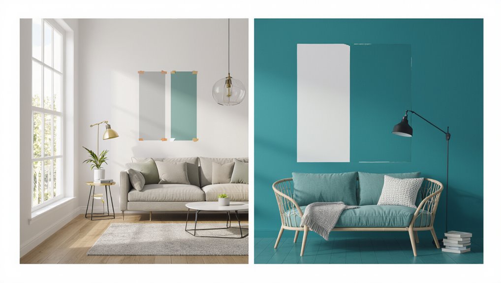
Wondering whether to try a quick swatch or a full‑room test? You’ll choose based on risk and scale: swatches work for instant impressions, while full‑room tests reveal undertones and shifts.
Consider color psychology—the mood each hue evokes—and test how samples interact with furniture to guarantee aesthetic harmony. You’ll save time and regret by matching intent to preview scope.
Lighting: How Color Shifts During the Day
Because natural and artificial light change throughout the day, the same paint can look dramatically different from morning to evening.
So you should evaluate samples at multiple times before committing. Pay attention to color perception shifts as sun angle, cloud cover, and bulbs alter tones.
Observe day lighting effects in the morning and afternoon, and note evening color changes under warm indoor lighting to decide confidently.
Why Undertones Matter More Than the Swatch Shade
If you focus only on the swatch’s apparent shade, you can miss the undertones that actually determine how the color reads in your room; warm, cool, or neutral undertones shift a paint’s character against different furnishings, lighting, and finishes.
You’ll test samples on several walls, compare them beside textiles, and prioritize undertone importance to achieve lasting color harmony.
How Room Size Alters Perceived Color Intensity
When a room is small, colors feel more concentrated and intense; in larger spaces they breathe and soften.
So the same paint can read dramatically different depending on square footage and ceiling height.
You’ll notice color perception changes with room dimensions: intensity variation stems from spatial influence and light reflection.
Understand the size effect to predict decor impact and anticipate mood shifts before you commit.
How Surrounding Furnishings Shift a Paint’s Look
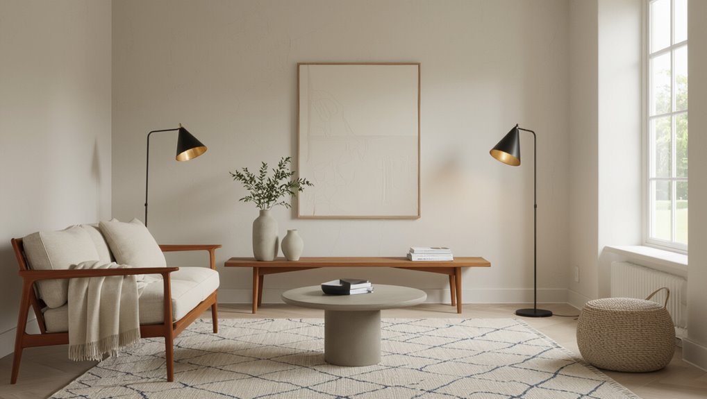
Room size sets the stage for how a color reads, but the furniture and textiles are the actors that change its performance. You’ll notice furniture contrast and texture influence shifting spatial perception and mood setting. Aim for color harmony and design synergy to achieve style cohesion; use accent emphasis wisely.
| Element | Effect | Tip |
|---|---|---|
| Sofa | Anchors | Contrast |
| Rug | Softens | Texture |
Use Paint Swatches Smartly to Compare Tones
Because paint looks different on a swatch than on a wall, hold several chips together and tape larger samples to the actual wall to compare tones in the light you’ll live with.
Use swatch comparisons and sample layering to assess finish variations and texture effects.
Note visual impact and color psychology to guarantee color harmony and design cohesion before you commit.
How to Order and Compare Physical Paint Sample Cards
If you want accurate color previews, start by ordering physical sample cards from several brands and finishes so you can compare true tones side by side.
Pick different sample card types—strip, fan, and larger panel—to see undertones and finish effects.
Use online ordering to grab specific shades, request free swatches when available, and test cards under your room’s light before deciding.
When to Use Sample Pots Versus Full‑Size Cans
Before you commit to a whole room, you’ll want to sample first to see how the color reads on your walls and in different light.
Think about coverage versus test area: a sample pot covers a small patch well, while a full‑size can lets you try larger swatches or paint an accent wall.
Balance cost and waste tradeoffs—sample pots are cheaper and less wasteful for trials, but a full can can save time if you’re already sure of the shade.
When To Sample First
Wondering whether to buy a sample pot or a full-size can?
Decide based on timing considerations: if you’re tight on time and need results fast, grab a full can; if you’re testing light, mood or color psychology effects, start with sample pots.
Use samples when you’re uncertain about undertones or emotional impact, then scale up once you’re confident.
Coverage Vs. Test Area
When you need to see how a color behaves across light and texture, think about coverage versus test area—sample pots cover just a few square feet, so they’re perfect for testing on trim, a single wall section, or swatches on different surfaces.
A full-size can lets you paint larger expanses to judge overall balance and flow. Use varied paint application techniques to reveal color saturation effects across surfaces.
Cost And Waste Tradeoffs
If you’re unsure how much paint you’ll need or how permanent a choice will be, weigh cost against waste: sample pots keep upfront costs low and limit leftover paint, while full-size cans save per‑square‑foot expense if you’re committed to the color.
Choose sample pots for short tests and waste reduction; pick cans for large areas to maximize cost efficiency and avoid repeated trips.
How to Apply Sample Paint Patches for Accurate Testing
Pick a few test locations that represent different light and sight lines in the room, like a sunlit wall, a shaded corner, and an area near furniture.
Apply generous swatches—about the size of a sheet of paper or larger—so you can see how the color reads at distance and up close.
Let them dry and observe at different times of day before you decide.
Choose Test Locations
Where should you place your sample patches to get the most reliable read on a color? Use test area selection and sample placement strategies: test near natural light, artificial light, corners, and focal spots. Observe at different times.
| Location | Light Type | Tip |
|---|---|---|
| Window wall | Natural | Morning/afternoon |
| Hallway | Mixed | Check at night |
| Corner | Shadowed | Large patch |
| Accent spot | Focal | Eye-level |
Apply Generous Swatches
Apply broad, several-inch swatches rather than tiny samples so you can see how the color reads across light and texture; press paint on in blocks, varying orientation and edge finish.
When you test, prioritize consistent color application and note sheen differences. Record swatch size and placement, view at different times, and compare adjacent samples to judge true impact before committing to a full coat.
How to Test Paint on Different Wall Surfaces
Because different wall materials absorb and reflect paint differently, you should always test colors on each surface you’ll be painting.
Apply swatches to drywall, plaster, brick, and trim to see real results. Note how paint finish and wall texture change sheen and depth.
Observe samples in morning and evening light, touch surfaces to check coverage, and pick the most consistent option.
How Ceiling Height Changes Color Perception
After you’ve tested swatches on each surface, think about how ceiling height will change how those colors read in the room. You’ll notice low ceilings make dark hues feel heavy; tall ceilings amplify airy tones. Use paint psychology to tweak mood. Consider visual impact and color perception when choosing trim or accent walls to balance scale and proportion.
| Situation | Effect |
|---|---|
| Low ceiling | Feels lower |
| High ceiling | Feels grand |
| Dark paint | Absorbs light |
| Light paint | Expands space |
Test Paint Under Different Artificial Lights
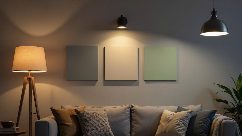
Wondering how your chosen shade will behave at night? Test paint swatches under varied artificial illumination—warm, cool, and neutral bulbs—to see shifts.
Note how color temperature alters hue, depth, and contrast at eye level and corners.
Try the swatch in the room during typical evening activities, photograph it under each bulb, and compare before committing to a full coat.
How Window Direction (North, South, East, West) Affects Color
If your room faces north, you’ll notice colors read cooler and slightly bluer because the light is more indirect.
South-facing rooms get strong, warm sunlight that makes paints look richer and more golden.
Consider where your windows point before you commit to a shade so you know how it will actually appear.
North Light Coolness
North-facing windows cast a cool, steady light that mutes warm pigments and makes blues, greens, and grays read truer.
When you test paint in a north-lit room, expect colors to look slightly cooler and less vibrant than they’ll elsewhere in the house.
Note north light color and north light temperature when sampling—add warm accents or stronger saturation to compensate, or test in different light before committing.
South Light Warmth
Because south-facing windows flood a room with warm, consistent daylight for most of the day, colors will read brighter and warmer there than in north-lit spaces. You’ll notice south light impact on paint undertones; choose cooler tints to balance intensity or embrace warmth. Track warmth perception at different times to decide.
| Time of Day | Effect | Tip |
|---|---|---|
| Morning | Soft warm | Swatch |
| Noon | Bright warm | Test |
| Evening | Golden | Adjust |
How to Evaluate Color at Multiple Times of Day
As light changes through the day, check your paint at several key times—morning, midday, late afternoon, and after sunset—to see how undertones shift and how the color reads against furniture and finishes.
Note how color psychology alters mood across hours and how seasonal influences modify natural light.
Test swatches on different walls, observe with lamps and curtains, and record impressions for each moment.
Why Camera Photos Can Mislead Your Color Choice
Photos you snap can trick you because your camera’s white balance often shifts colors away from what you actually see.
Different light sources and brightness levels will also change a paint’s apparent hue in the photo.
Before you commit, compare photos with real-life swatches under the room’s lighting.
Camera White Balance Errors
When your phone or camera auto-adjusts white balance, it can shift paint tones enough to trick your eye and lead you to pick the wrong color. You should check camera calibration and color accuracy, use RAW or manual white balance, and compare shots to a neutral card. Quick table:
| Issue | Effect | Fix |
|---|---|---|
| Auto WB | Tint shift | Manual WB |
| JPEG | Flattened tones | RAW |
| Screen | Boosted contrast | Calibrate |
Lighting Alters True Hue
Because different light sources cast distinct color casts, a room you photograph under warm incandescent bulbs will make paint read more yellow or orange than it really is.
You’ll misjudge color perception if you ignore lighting effects and hue variations.
Use natural light for accurate color comparison, note daylight influence on room ambiance, and test shade dynamics at different times to choose confidently.
Take Accurate Color Photos With Your Smartphone
If you want wall colors to look true in photos, set your phone up intentionally: clean the lens, turn off filters, and shoot in natural light near a window.
Use smartphone settings and focus techniques for sharp shots, apply photography tips for picture composition, and note lighting conditions.
Use mobile apps and editing software for subtle contrast adjustment and color matching to preserve color accuracy.
When and How to Use Digital Color Visualizers
Now that you’ve got accurate photos, digital color visualizers let you try paint options quickly and see how they read in your actual rooms.
Use digital tools to load your photos, test several tones, and compare finishes.
Check color accuracy by viewing under different lighting and on multiple devices.
Save favorites, note paint codes, and sample small areas before committing.
How Augmented Reality Apps Simulate Paint on Your Walls
When you point your phone at a wall, augmented reality apps map its dimensions, detect edges and lighting, and overlay accurate paint swatches so you can see colors in place. You’ll tweak hue, finish, and intensity; color simulation uses real-time shading, virtual painting layers, and visualization tools to improve user experience. Mobile applications blend interactive design with design technology.
| Feature | Benefit |
|---|---|
| Real-time mapping | Accurate fit |
| Lighting adapt | True tones |
Limitations of Online Paint Previews and How to Compensate
Remember that your screen may not show true colors and that room lighting and paint finish change how a shade looks in real life.
Don’t trust the preview alone—test samples under your lighting and view them on different devices.
That way you’ll spot shifts from screen inaccuracy and finish effects before you commit.
Screen Color Accuracy
How accurate is that paint sample on your screen? You should know screen calibration affects color perception, so online swatches can mislead.
Calibrate your monitor, view images in native apps, and compare swatches on multiple devices.
Order physical samples and match them under normal viewing conditions. Rely on digital previews only for general direction, not final decisions.
Lighting And Finish
Curious how the same swatch can look dramatic in one room and dull in another? You’ll need to test real lighting and finish.
Online previews miss subtle shifts, so try these practical checks:
- View swatches at different times to test lighting techniques
- Paint small sample areas with varied finish types
- Compare under artificial and natural light before you commit
How to Create Inexpensive Sample Boards for Room‑Scale Tests
Start by assembling a few large sample boards you can move around the room—these let you test how paint reads on different walls, next to windows, and under your lighting without committing to a full coat.
Use inexpensive sample board materials like foam core or plywood, paint several swatches, and employ visual comparison techniques by placing boards side-by-side and observing color shifts throughout the day.
Try Peel‑and‑Stick Full‑Wall Swatches
Want to see a true-to-scale color without painting the whole room?
Try peel‑and‑stick full‑wall swatches for peel‑and‑stick convenience and realistic impact. You’ll test light, scale, and undertones using removable wall swatches that won’t damage paint.
Consider these tips:
- Apply a full panel on one wall
- Check at different times of day
- Remove and reposition easily
How to Cut and Arrange Sample Cards to Mimic Trim and Ceiling Contrasts
When you’re testing how a wall color will play with trim and ceiling tones, cut your sample cards into strips that match the width of your baseboards and crown molding so you can hold them directly against the painted edge; this lets you see how the color reads at the junctions and whether you need a warmer or cooler trim. Use sample card techniques to mock trim contrast.
| Step | Tool | Result |
|---|---|---|
| Cut | Scissors | Trim strip |
| Arrange | Tape | Mock junction |
| Compare | Natural light | True tone |
| Swap | Multiple cards | Contrast test |
| Note | Photo | Reference |
How to Factor Flooring and Rug Tones When Previewing Paint
Because floors and rugs anchor a room, you’ll want to contemplate their undertones and textures before committing to a paint.
Floors and rugs set the room’s foundation—consider their undertones and textures before choosing paint.
Testing how warm or cool flooring colors shift a wall hue and whether a patterned rug will read as part of the palette or a competing accent is essential.
Consider flooring compatibility and rug color when sampling:
- Check undertones against samples.
- View at different times of day.
- Pair solid walls with busy rugs to balance.
Preview Paint in Open‑Plan and Multi‑Colored Spaces
If you’re working with an open-plan or multi-colored space, previewing paint means thinking about sightlines and how hues read from multiple angles at once.
You’ll test color psychology across zones, guarantee multi-color harmony and spatial balance, and plan paint layering to guide visual flow.
Check texture contrast and accent integration so shifts feel intentional and cohesive throughout the open layout.
How to Choose Accent Wall Colors and Preview Their Effect
When picking an accent wall, think about how natural and artificial light changes the color throughout the day.
Match the accent to your main furnishings so it enhances rather than competes with textures and patterns.
Use digital previews or samples on the wall to see the combined effect before committing.
Consider Room Lighting
Although light changes a color’s mood more than anything else, you can control how an accent wall reads by evaluating both natural and artificial lighting in the space.
Use color psychology to predict mood influence and emotional impact. Consider light intensity, color temperature, seasonal changes, and color harmony for design cohesion and aesthetic balance.
- Test at different times
- Compare bulbs
- Note glare and shadows
Balance With Furnishings
Because your furnishings set the room’s visual weight, choose an accent color that complements their tones and textures so the space feels intentional rather than patched together.
Test swatches beside sofas, rugs, and wood to judge paint harmonization and avoid clashes. Use one bold wall to create furniture contrast or pick muted shades to unify pieces.
Preview under real light before committing.
How to Test Coordinating Palettes Instead of Single Colors
If you want a room that feels cohesive, test coordinating palettes rather than single paint chips—seeing how several hues interact will reveal balance, contrast, and mood in real conditions.
Try sample boards with paint swatches, fabrics, and finishes to assess color harmony, texture influences, and emotional impact across design themes and seasonal trends.
Consider:
- accent colors and contrasting shades
- visual balance and style consistency
- scale and material cues
How to Preview Paint With Existing Artwork and Textiles
Start by matching the undertones of your artwork and textiles to the paint swatches so colors don’t clash once they’re on the wall.
Lay fabrics and framed pieces against sample-painted boards or taped swatches to see how textiles read in different lights.
Build small vignettes with lamps, frames, and cushions to preview the overall mood before you commit.
Match Undertones First
When you preview paint against artwork and textiles, focus on matching undertones first so colors sit in harmony rather than clash.
You’ll spot warm or cool bases, then choose paint that supports undertone harmony and the room’s color psychology.
Check pieces under natural light, compare swatches, and decide confidently.
- Identify warm vs cool
- Use neutral bridging tones
- Re-evaluate in different light
Test With Textiles
Matching undertones gives you a foundation; now test potential paints directly against the textiles and artwork that live in the room.
Hold textile swatches beside fabric patterns and artwork to judge fabric hues and pattern scales.
Notice texture contrasts and layering techniques to refine material selection.
Use color combinations and color psychology as design inspiration so your walls harmonize with existing pieces.
Create Mini Vignettes
Although the swatches you’ve tried give a good baseline, create small vignettes with your artwork and textiles to see how paint reads in real arrangements.
Set up test clusters on a wall or board. Try these mini vignette ideas and color pairing tips:
- Group framed art with a throw pillow
- Layer a rug swatch under a lamp
- Tape fabric strips beside prints
How Gloss Level (Flat, Eggshell, Satin) Affects Final Appearance
Gloss level changes how a color reads more than you might expect; flat, eggshell, and satin finishes reflect light differently, which alters perceived depth, richness, and surface texture.
You’ll notice gloss effects and sheen impact change aesthetic appeal and surface texture.
Consider finish variation for light reflection and durability comparison—satin cleans easier—balancing maintenance needs with the look you want.
When to Test Primer Versus Painted Samples
When you’re deciding whether to test a primer or a painted sample, consider the surface and the change you’re making.
Decide whether to test a primer or painted sample based on the surface and the change you need.
You’ll test primer types when covering stains, tannins, or dramatic color shifts; test painted samples to judge final hue and sheen.
Plan sample timing: prime first if needed, then paint.
- Stained surfaces
- Drastic color change
- New drywall or repairs
How to Spot Undertone Conflicts With Natural Wood and Metal Finishes
After you’ve tested primers and paint samples, check how your chosen wall color plays with existing wood and metal finishes.
Hold samples near trim and furniture to assess undertone matching—warm walls can clash with cool-grain woods.
For metal harmony, view finishes under room lighting to spot reflections.
Conduct a simple finish evaluation in different light times to confirm overall wood compatibility and metal harmony before committing.
How to Predict Color Fading and Maintenance Over Time
Because light exposure and surface type determine how paint ages, you should assess both to predict fading and maintenance needs.
Because light and surface type govern paint aging, evaluate both to anticipate fading and maintenance needs.
Consider fading predictors and environmental factors like sun, humidity, and pollutants. Choose paint for durability and color longevity, and plan upkeep techniques.
Use maintenance strategies for color protection to preserve long term aesthetics.
- test small areas
- select high-UV formulas
- schedule regular cleaning
How to Use Neutral Anchors to Make Bold Colors Work
If you want a bold wall to feel intentional instead of overwhelming, anchor it with neutrals that balance scale and intensity; think of neutrals as visual pause buttons that let the color sing without shouting.
Use neutral color schemes on trim, floors, and large furniture to ground bold color integration.
Apply color balance techniques—limit bolds to an accent wall, textiles, and art per accent wall strategies so the room reads cohesive.
How to Narrow Choices From Dozens to a Shortlist
When you’re staring at dozens of paint swatches, narrow them by setting clear constraints—light level, room function, existing finishes, and the mood you want—and immediately eliminate anything that clashes.
Use practical tests to avoid decision fatigue and apply color psychology sparingly to guide choices.
Try this shortlist method:
- Pick three tonal families
- Test two samples in different light
- Keep one neutral anchor
How to Judge Whether a Color Suits Your Lifestyle and Mood
Think about how a color will affect your daily mood—will it energize you in the morning or calm you down at night?
Consider the room’s main activities and whether the hue supports focus, relaxation, or socializing.
Finally, ask if you’ll still enjoy that color years from now or if it’ll feel tired quickly.
Daily Mood Impact
Because your home shapes daily emotions, choose colors that match how you live and want to feel: calm neutrals for rest, energetic hues for activity, and balanced tones for focus.
Use color psychology to track mood variations, emotional effects, personal preferences, seasonal influences and spatial perception.
Consider color symbolism for ambiance setting:
- Test swatches in different light
- Note mood shifts over days
- Adjust based on use
Activity And Function
Match wall color to how you actually use a room: choose restful shades for bedrooms, lively tones for playrooms or kitchens, and muted, focused hues for home offices.
You’ll apply color psychology to the room atmosphere, weigh emotional impact and personal preference, consider texture influence and visual balance, note seasonal changes and color trends, and draw on artistic inspiration or cultural significance.
Long-Term Wearability
When you pick a paint color, consider how it will live with you over years, not just how it looks on a sunny afternoon; assess whether the hue fits your daily routines, energy levels, and changing tastes so it won’t feel tiring or out of place down the line.
Balance color longevity, fading factors, wear resistance, maintenance considerations, durability testing, environmental impacts, color refresh, and surface preparation.
- Test real light
- Check finish durability
- Plan refresh intervals
How to Avoid Common Sample‑Testing Mistakes
If you want reliable results from paint samples, test them properly and avoid shortcuts that skew what you see. You’ll check lighting at different times, note color psychology effects, and use adequate sample size on the wall. Avoid tiny swatches, glossy finishes, and isolated spots that lie. Trust real-condition testing and repeat checks.
| Mood | Reality |
|---|---|
| Hope | Truth |
| Calm | Contrast |
| Joy | Shade |
How to Get Unbiased Feedback From Friends or Contractors
When you ask for opinions, use specific, visual questions like “Does this read warmer or cooler in this corner?”
Make sure everyone sees the same lighting by reviewing samples at different times of day or with the same lamps.
Ask for honest, actionable input—what they’d change and why—so you can make informed decisions.
Ask Specific, Visual Questions
Want feedback that’s honest and useful? Ask specific, visual questions to capture visual color preferences and color psychology insights.
Point them to true samples and scenes, not impressions.
Try prompts like:
- “Which of these three swatches reads warmer in this corner?”
- “Does this hue feel calming or energetic here?”
- “Which trim contrast looks clearer against daylight?”
Keep answers focused and actionable.
Share Consistent Lighting
Share consistent lighting so everyone sees the same color story: photograph swatches and painted samples under the same light source—preferably natural north light or a single, daylight-balanced bulb—and note the time of day and fixture type so friends or contractors can review the exact conditions. Use consistent lighting sources to control light temperature, lighting angles, artificial lighting, shadow effects and color perception.
| Location | Light type | Notes |
|---|---|---|
| Window | natural light | north-facing |
| Ceiling | daylight bulb | fixture type |
| Lamp | warm LED | angle info |
| Corner | mixed | shadow effects |
Encourage Honest, Actionable Input
Ask for specific, usable feedback rather than a vague thumbs-up or thumbs-down: tell your friends or contractor exactly what you need them to evaluate—hue accuracy, undertones, how the color reads in different parts of the room—and give them a short checklist or questions to answer.
Use prompts to avoid decision fatigue and address color psychology, emotional impact, cultural influences, color symbolism, design trends, personal style, and color preferences.
- Readability
- Mood
- Contrast
Same Color Name, Different Paints: What Changes?
Even when two cans both say “Ocean Mist,” you’ll notice differences once you roll them on the wall: base formulas, pigment blends, and sheen change how a color looks under light.
You’ll test samples on different walls and view them at various times to judge color perception.
Note that paint finish shifts depth and reflectivity, so satin, eggshell, or matte will alter the final look.
How to Estimate Paint Quantity From Your Preview Tests
Now that you’ve seen how different formulas and sheens change a swatch on your wall, you can use those same test areas to estimate how much paint you’ll need.
Measure each sample area, record coverage per can, then scale up with paint quantity calculation and sample area estimation.
Consider:
- Coverage variability by sheen
- Number of coats needed
- Surface texture adjustments
How to Document Your Tests So You Don’t Forget a Favorite
When you test colors, place samples in their designated spots so you see how they read in context.
Keep a simple lighting notes log—time of day and bulb types—so you can compare looks under different conditions.
Label each chip with the brand, code, and room to avoid forgetting a favorite.
Paint Sample Placement
Anyone testing paint should mark and photograph each sample so you don’t lose track of favorites later.
Place swatches at eye level and at corners where walls meet. Note sample application method and observe color layering. Photograph with a neutral white card for reference.
- Label brand, finish, date
- Record wall location
- Keep a small swatch booklet for comparisons
Lighting Notes Log
Because light changes everything, keep a concise log every time you test a paint so you can recreate the look later.
Note lighting fixtures, natural sunlight timing, color temperature and bulb types. Record ambient light, light intensity, daylight balance and shadow effects.
Jot reflective surfaces nearby and whether warm tones dominate. Include test date, time and room orientation so you can compare results accurately.
Chip Labeling System
After you’ve logged lighting details, set up a simple chip labeling system so you can quickly identify which swatch produced that look.
Number or code chips, note paint name, finish, and date. Track chip color consistency and any chip texture variations.
Use a small notebook or photos with captions plus:
- code
- paint name
- location/date
Make a Confident Final Decision Using Your Test Results
When your test swatches have lived on the wall for a few days, take a close look at them in morning, midday, and evening light so you can judge how each shade actually performs.
Record what you like and what you don’t, then narrow your choices to the two that work best across lighting and furnishings.
Weigh color psychology and emotional impact, personal preferences, lifestyle compatibility, visual harmony, color associations, decision making strategies, and practical applications.
How to Troubleshoot After the First Coat Looks Different Than Samples
If the first coat looks off compared with your samples, don’t panic—you can usually fix the issue without repainting the whole room.
Check surface preparation, drying times, and application techniques. Consider paint brands, finish types, color mixing and paint layering to improve color consistency and visual impact.
Test for texture effects.
Try:
- Sand and prime
- Thin coats
- Alternate roller/brush methods
How to Save Time and Money While Previewing Paint Colors
You can save time and money by trying paint samples on your wall before buying gallons.
Use virtual tools and paint apps to visualize colors quickly and rule out options without multiple trips to the store.
Combining small physical samples with digital previews helps you make a confident choice with minimal waste.
Try Samples First
Want to skip costly mistakes and nail the color on your first try? Try samples first: buy varying sample size pots, consider color saturation and finish impact, and note texture influence from walls.
Use deliberate application technique and thoughtful sample placement. Track testing duration and create color grouping to compare.
- Test full coats
- Observe at different times
- Compare grouped samples
Use Virtual Tools
After testing physical samples, try virtual tools to speed up color decisions and cut costs.
You can upload photos, apply virtual color tools, and preview tones across lighting scenarios. Digital visualization helps you compare hues quickly, avoid costly mistakes, and share options with family or contractors.
Rely on these apps to narrow choices before committing to full paint cans or professional consultations.
Frequently Asked Questions
Will Paint VOCS or Odor Affect My Color Choice or Testing Process?
Yes — VOC sensitivity and odor preferences can influence testing methods and color perception, so you should choose low‑VOC paints, ventilate during sampling, use odor‑neutral testers, and compare swatches in real light to guarantee accurate results.
Can Wall Texture or Imperfections Make Colors Look Uneven After Painting?
Yes — texture impact and imperfections change color perception; rough or patched walls create shadows and highlights that make paint appear uneven, so you’ll want to repair, prime, and test samples under real lighting before committing.
Do Primer Colors or Existing Paint Affect Final Shade Even After Priming?
Yes — primer impact matters: if you skip surface preparation or use a weak primer, underlying tones and existing paint can show through. Color transparency varies, so choose quality primer and address stains for true final shade.
Will Paint Sheen Hide or Highlight Wall Blemishes Differently Across Colors?
Of course, you’ll love how sheen effects “hide” everything—except they won’t; higher sheens highlight texture and raise blemish visibility, while flatter finishes mask imperfections, so pick sheen to balance reflectivity with concealing flaws.
How Does Sample Aging or Storage Alter Color on Sample Cards or Pots?
Aging and poor storage cause sample degradation, so you’ll see pigment fading, yellowing, and a color shift on cards or pots; you’ll need fresh samples kept cool and dark to judge true installed hues.
