Can You Paint Kitchen Cabinets the Same Color as the Walls? Design Tips Inside
Yes — you can paint your kitchen cabinets the same color as the walls to create a streamlined, modern look that makes compact or open-plan kitchens feel larger. Match hues carefully, test swatches in different light, and use contrasting sheens (matte walls, semi-gloss cabinets) to keep depth and durability. Prep, prime, and choose durable topcoats for kitchen wear. Keep lighting, countertops, and hardware in mind — continue for practical steps, pitfalls, and design variations.
Can You Paint Kitchen Cabinets the Same Color as the Walls? Quick Answer
Yes—you can paint cabinets the same color as the walls, and it often creates a streamlined, spacious look.
It works best in small kitchens, open-plan spaces, or when you use slightly different finishes or tones to add subtle contrast.
Avoid exact matches if your room lacks texture, architectural detail, or varied lighting, since everything can blend into a flat, monotonous feel.
Direct answer summary
You can paint kitchen cabinets the same color as the walls, but do so intentionally—matching creates a seamless, modern look that can make a small kitchen feel larger, while it can also flatten visual contrast in bigger spaces.
If you’re asking “can I paint kitchen cabinets same color as walls,” the short answer is yes; weigh scale, finish, and accents to avoid a flat, lifeless result.
When it works best (short criteria)
Often the trick is picking situations where a unified color actually helps — small kitchens, open-plan spaces where you want flow, or rooms with strong architectural details that need calming.
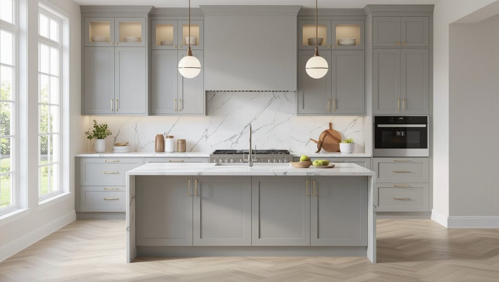
Choose matching cabinets when you want seamless visual expansion, minimal contrast, easy coordination with countertops and hardware, and a subtle, sculptural look.
It works best with good lighting and simple cabinet profiles.
When to avoid matching exactly
Matching cabinets and walls can create a calm, expansive look, but there are clear situations where you shouldn’t paint them the same color.
Avoid exact matches if your kitchen lacks natural light, has busy cabinetry details, or needs visual separation between work zones.
Also skip matching when resale appeal matters—contrasting trim or islands adds depth and makes finishes read more intentional and high-end.
Understanding the Concept: Why Match Cabinets to Walls?
When you match cabinets to walls, you control the room’s visual effects and where the eye travels.
That continuity can make a small kitchen feel larger and more cohesive by reducing visual breaks.
It’s a common move in minimalist, modern, and Scandinavian styles where simplicity and flow are key.
Visual effects and design goals
Because your cabinets occupy a large visual plane, aligning their color with the walls can make the room feel larger and more cohesive, while contrasting tones emphasize architectural details and create focal points.
Decide whether you want harmony or drama: matching simplifies and soothes; contrast highlights hardware, trim, or islands.
Use texture, finish, and accent pieces to refine mood and guide sightlines.
Perceived space and flow: how matching affects room size
If you want the room to read as one continuous space, aligning cabinet and wall colors is a simple way to make boundaries recede and sightlines flow.
When surfaces blend, corners disappear and visual interruptions shrink, so the room feels larger and calmer.
Use consistent tones to unify zones, then add contrast sparingly with hardware or textiles to retain depth without breaking the openness.
Style contexts where matching is common (minimalist, modern, Scandinavian)
Though it might seem subtle, matching cabinets to walls is a defining move in minimalist, modern, and Scandinavian interiors because it reinforces clean lines and an uncluttered feel.
You’ll create visual continuity that makes surfaces recede, highlight form over ornament, and let texture or hardware carry interest.
Use muted palettes, natural materials, and simple silhouettes to maintain calm, cohesive spaces without visual competition.
Factors to Consider Before Matching Cabinets and Walls
Before you match cabinets to walls, consider how your kitchen’s size and layout will affect color balance and sightlines.
Think about natural and artificial light, cabinet style and depth (flat, shaker, raised panel), and the contrast between wall and cabinet finishes.
Also account for existing countertops, backsplash, and hardware colors so everything reads as a cohesive scheme.
Kitchen size and layout
When planning cabinet and wall colors, think about how your kitchen’s size and layout will affect light, sightlines, and movement.
In tight galley or L-shaped kitchens, matching hues can visually expand space and simplify flow.
In open-plan or island layouts, use matching tones sparingly to avoid monotony—add contrast with islands, backsplashes, or hardware to define zones and guide movement.
Natural and artificial lighting effects
Light changes how color reads, so take stock of both natural and artificial sources before you match cabinets and walls.
Check daytime sun angle and window size—warm morning light warms paint, while north light cools it.
Evaluate overhead, task, and accent fixtures; bulbs’ color temperature shifts perceived hue.
Test full-size samples at different times to verify consistent, flattering results.
Cabinet style and depth (flat, shaker, raised panel)
Natural and artificial lighting affect how color reads, but the cabinet’s style and depth play an equally big role in how paint and stain perform.
You’ll notice flat slabs read modern and uniform, shaker profiles add subtle shadow and texture, and raised panels create pronounced highlights.
Choose matching tones carefully: deeper profiles show contrast more, so test samples on actual doors to be sure.
Wall finish vs. cabinet finish differences
Because walls and cabinets get different amounts of wear and visual emphasis, matching them isn’t just about color — it’s about finish, sheen, and durability too.
You’ll want a washable, tougher cabinet finish (semi-gloss or satin) and a more forgiving, lower-sheen wall paint (eggshell or matte).
Match tones, not sheen; consider touch points, cleaning frequency, and light reflection to keep the space cohesive.
Existing countertop, backsplash, and hardware colors
When you’re choosing cabinet and wall colors, start by accounting for the tones and finishes of your countertop, backsplash, and hardware since they’ll anchor the whole palette and affect perceived contrast.
Match warm stone to warm paints, and cool quartz to cooler hues. Consider metallics: brass warms, stainless reads cooler.
Keep contrast enough to define cabinet edges so the room doesn’t feel flat.
Resale considerations and neighborhood norms
After you’ve balanced countertops, backsplashes, and hardware, think about how color choices will read to future buyers and within your neighborhood.
If homes nearby trend neutral, a bold monochrome might limit appeal. Neutral, timeless finishes usually boost resale and attract wider buyers.
Match your finish level to surrounding properties, but keep a few tasteful accents to maintain personality without harming marketability.
How to Successfully Paint Cabinets the Same Color as Walls
To paint your cabinets the same color as the walls, start by choosing the right shade and finish and testing samples in different lighting.
Prepare both surfaces thoroughly—clean, sand, and prime—and decide whether you want a finish contrast like matte walls with semi-gloss cabinets.
Use careful painting techniques (brushing or spraying, and overlapping edges strategically) to create a seamless, professional look.
Step 1 Choose the right shade and finish
Curious how to make cabinets blend with walls without losing character? Choose a shade that complements existing undertones—warm or cool—and pick a finish that fits use: satin or semi-gloss for durability and wipeability, matte for a modern, softer look.
Consider slight contrast via trim or hardware to preserve depth. Aim for cohesion while keeping practical wear resistance in mind.
Step 2 Test color samples in different lighting
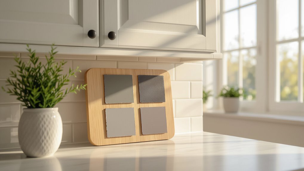
Because lighting can change a paint’s appearance dramatically, you should test samples at different times of day and under all the light sources in the room.
Tape several 6×6 swatches on cabinet doors and walls, observe morning, midday, and evening light, and check with overhead, under-cabinet, and task lighting.
Note undertones, sheen differences, and how shadows affect color.
Step 3 Prepare cabinets and walls for paint (cleaning, sanding, priming)
Now that you’ve seen how lighting changes color, you’ll want a spotless, consistent surface before you start painting cabinets and walls the same shade.
Clean grease and grime with trisodium phosphate or a degreaser, sand to scuff glossy finishes, fill imperfections, and tack cloth dust.
Prime bare wood and previously stained areas with a bonding primer for even adhesion and color.
Step 4 Decide on finish contrast (matte walls vs. semi-gloss cabinets)
When you paint walls and cabinets the same color, choosing different sheens creates the separation your eye needs—typically a matte or eggshell on walls and a semi-gloss on cabinets.
You’ll get contrast from sheen, not hue, so pick semi-gloss for durability and easy cleaning on cabinetry.
Matte walls hide imperfections and reduce glare, balancing the brighter cabinet finish for a cohesive look.
Step 5 Paint technique for seamless look (brushing, spraying, overlap tips)
Start by choosing the right application method for your skill level and space: brushing gives control on trim and recessed panels, spraying delivers the smoothest, factory-like finish for flat surfaces, and rolling can work on larger door faces if you use a fine-nap foam roller.
Work in thin, even coats, keep wet edges, overlap passes slightly, and sand lightly between coats for a seamless, uniform appearance.
Step 6 Protect surfaces and add durable topcoat
Seal the finish with a durable topcoat to protect cabinets that share a color with your walls and keep scuffs, grease, and frequent cleaning from revealing edges or inconsistencies.
Choose a water-based polyurethane or conversion varnish for durability, apply thin even coats, sand lightly between coats with fine grit, and allow full cure time.
Clean with mild detergent to preserve the finish.
Step 7 Reinstall hardware and evaluate final balance
Reattach your hardware and take a step back to assess the overall balance between cabinets and walls.
Check how knobs, pulls and hinges contrast or blend; swap finishes if details disappear.
Open doors to view interior trim and shadow lines.
Adjust lighting to judge color shifts at different times.
If balance feels off, tweak hardware, accents or wall decor until the room reads cohesive.
Design Strategies and Alternatives to Exact Matching
You don’t have to match cabinets and walls exactly to get a cohesive look — try tonal matching by keeping the same hue but changing value or saturation.
Consider accents like a different finish, matching only uppers or the island, or using trim, molding, and backsplash to separate surfaces without clashing.
Texture and material choices (wood grain, matte vs. gloss, tile) can further differentiate same-color areas while keeping the palette unified.
Tonal matching same hue, different value or saturation
When exact cabinet paint matches aren’t possible, lean into tonal matching: keep the same hue while varying value or saturation to create cohesion without a factory-perfect match.
You’ll get unity with subtle contrast that reads intentional.
- Choose a lighter value for walls to open space
- Darker cabinets add grounded focus
- Lower saturation for a softer, calming palette
- Bolder saturation defines focal areas
Accent contrast matching walls but using different cabinet finish
Although the wall color ties the room together, choose a different cabinet finish to create intentional contrast that feels curated rather than mismatched.
Pick a matte cabinet against glossy walls, or a textured stain against smooth paint, to echo the hue while adding depth.
Hardware, subtle distressing, or a satin sheen will reinforce cohesion without disappearing into the background.
Partial matching matching upper cabinets or island only
If you want a cohesive look without committing to full uniformity, match only the upper cabinets or the island to anchor the scheme and let the rest play supporting roles.
Choose which element feels most central, then repeat that wall color on it for balance.
Use complementary tones, varied textures, and consistent hardware so the partial match reads intentional rather than accidental.
Trim, molding, and backsplash to create separation without color clash
Because trim, molding, and backsplash sit at the junctions between surfaces, you can use them to define zones and prevent colors from clashing without forcing an exact match.
Choose crisp white or a complementary neutral trim to frame cabinets, add a slim molding to create visual separation, and pick a backsplash tone or pattern that bridges wall and cabinet hues for cohesion without identical paint.
Using texture and materials to differentiate same-color surfaces
Once you’ve framed cabinets with trim and a coordinating backsplash, you can keep a single color across walls and millwork while using texture and material to separate surfaces.
Choose matte paint on walls, semi-gloss on cabinets, or butcher block counters against painted bases.
Add fluted or beadboard cabinet fronts, textured tile, or metal hardware to create contrast so each plane reads distinctly without changing hue.
Common Mistakes and How to Avoid Them
Don’t just pick a paint color from a swatch and assume it’ll match—test samples on your cabinets first.
Choose the right finish, account for lighting and undertones, and prep surfaces properly to avoid uneven results.
If things go wrong, I’ll show simple troubleshooting steps to fix mismatches without redoing the whole job.
Mistake: Choosing the exact same paint without testing
While a paint swatch might look perfect on the store card, it can read completely different on your cabinets once it’s applied and dry, so always test before committing.
Paint behaves differently on wood, laminate, and drywall; lighting shifts color.
Prime and brush a small panel, view it at various times, and live with it for a day before ordering full cans.
Mistake: Using inappropriate paint finish for cabinets
Pick a finish that matches how you use your kitchen: glossy sheens hide stains and stand up to scrubbing, while flat or matte finishes show marks and wear faster.
Choose semi-gloss or satin for cabinets—they resist moisture and clean well. Reserve matte for low-traffic areas.
Test on a door, consider durability over look, and use a durable cabinet-specific primer and topcoat.
Mistake: Ignoring lighting and undertones
If you ignore how light and undertones interact, a color that looked great in the store can read completely different in your kitchen.
Check paint swatches at different times and under your actual lighting.
Consider warm or cool undertones in cabinets, walls, and adjacent rooms.
Test large samples on both wall and cabinet surfaces before committing to avoid clashes or a muddy, lifeless result.
Mistake: Poor surface prep causing uneven appearance
Because paint only looks as good as the surface beneath it, poor prep will make even premium colors appear blotchy, peeling, or textured.
You’ll want to clean, sand, fill holes, and remove grease before priming. Skipping steps causes uneven sheen and visible repairs.
Take time to prep each door and frame so your cabinets and walls read as intentional, cohesive surfaces rather than amateur finishes.
How to troubleshoot and fix mismatches
When cabinet colors don’t match, start by identifying the cause—lighting, finish sheen, paint batch differences, or aging—and you’ll save time and money by targeting the real problem rather than repainting blindly.
Check under different lighting, compare sheen with a flashlight, and swatch a fresh batch nearby.
Sand glossy spots, feather edges, or use glazes to blend. Repaint only when necessary.
Best Practices and Expert Tips
When choosing finishes, you’ll want durable, wipeable paints for cabinets and more forgiving sheens for walls to balance wear and reflection.
Pay attention to undertones, test sample panels under your kitchen light to avoid metamerism, and match hardware and trim finishes to reinforce cohesion.
I’ll also share practical maintenance and cleaning tips to keep same-color kitchens looking consistent over time.
Recommended finishes for cabinets vs. walls
Although cabinets and walls share a room, they often benefit from different finishes to balance durability, maintenance, and visual impact.
Use semi-gloss or satin on cabinets for scuff resistance and easy cleaning, and choose matte or eggshell on walls to hide imperfections and reduce glare.
For open shelves, consider durable clear coats; for painted doors, prioritize moisture-resistant, wipeable finishes.
Color-matching tips: undertones, sample panels, and metamerism
If you want a consistent look, start by checking undertones—warm, cool, or neutral—and compare them side by side under the light you’ll use in the room.
Test full-size sample panels on cabinet doors and walls, view at different times, and photograph them.
Beware metamerism: colors can match in one light but not another, so confirm matches under daylight and artificial lighting before committing.
Hardware and trim choices to enhance cohesion
1 smart hardware and trim strategy can make your cabinet color sing and tie the whole kitchen together: pick finishes and profiles that echo your cabinet tone and the room’s style, then keep scale and placement consistent so details read as a deliberate system rather than a patchwork.
Choose trim paint sheen to match light reflection, use unified metal finishes, and align pull sizes with drawer and door proportions.
Maintenance and cleaning tips for same-color kitchens
Keeping a same-color kitchen looking fresh means being proactive about cleaning and maintenance so small issues don’t read as big ones.
Wipe cabinets daily with a mild, pH-neutral cleaner; tackle grease promptly. Use soft cloths, avoid abrasive pads.
Refinish or touch up chips quickly to prevent contrast. Clean hardware regularly and reseal high-traffic finishes yearly to preserve uniform appearance.
Cost, Time, and DIY vs. Professional Considerations
You’ll want to compare estimated costs and time for DIY painting or refinishing against hiring a pro so you can set a realistic budget and schedule.
Consider bringing in a professional for complex repairs, full refinishes, or if you need a fast, guaranteed finish.
If you tackle it yourself, make a checklist of required tools and materials—sanders, primers, paints, brushes, and safety gear—before you start.
Estimated costs and time for DIY and pro jobs
While costs vary by materials and scope, you can expect a DIY cabinet refresh to run from a few hundred to about $1,500 for paint and basic hardware. Expect 2–7 days DIY, 3–10 days pro. DIY saves money but demands time; pros cost more ($1,000–$8,000) and speed. Choose based on budget, schedule, and skill.
| Option | Cost | Time |
|---|---|---|
| DIY | $200–$1,500 | 2–7 days |
| Pro | $1,000–$8,000 | 3–10 days |
| Hybrid | $500–$3,000 | 2–7 days |
When to hire a professional painter or cabinet refinish expert
When should you call in a pro? If you lack time, experience, or proper ventilation, hire a painter or refinish expert.
Pros handle complex prep, durable finishes, and color matching faster and often with better warranty options.
Choose pro help for high-traffic kitchens, custom cabinetry, structural repairs, or when resale value matters.
DIY suits simple, low-risk refreshes only.
Tools and materials checklist for DIY
If you decide to tackle a cabinet refresh yourself, plan your tools, materials, budget, and schedule up front so you don’t get stalled mid-project.
Estimate costs for primer, paint, brushes, rollers, sandpaper, masking, and hardware; allow time for prep, sanding, drying, and multiple coats.
Decide whether your skills and time justify DIY or if hiring a pro is more cost-effective.
Before-and-After Case Examples and Visual Inspiration
You’ll see how a small kitchen instantly feels bigger when cabinets and walls match, and why that same approach can make a large kitchen feel flat.
In big spaces I’ll show examples where contrasting trim, textured backsplashes, or an accent island break up monotony.
You’ll also get quick before-and-afters of island-only matching to judge its impact on flow and focus.
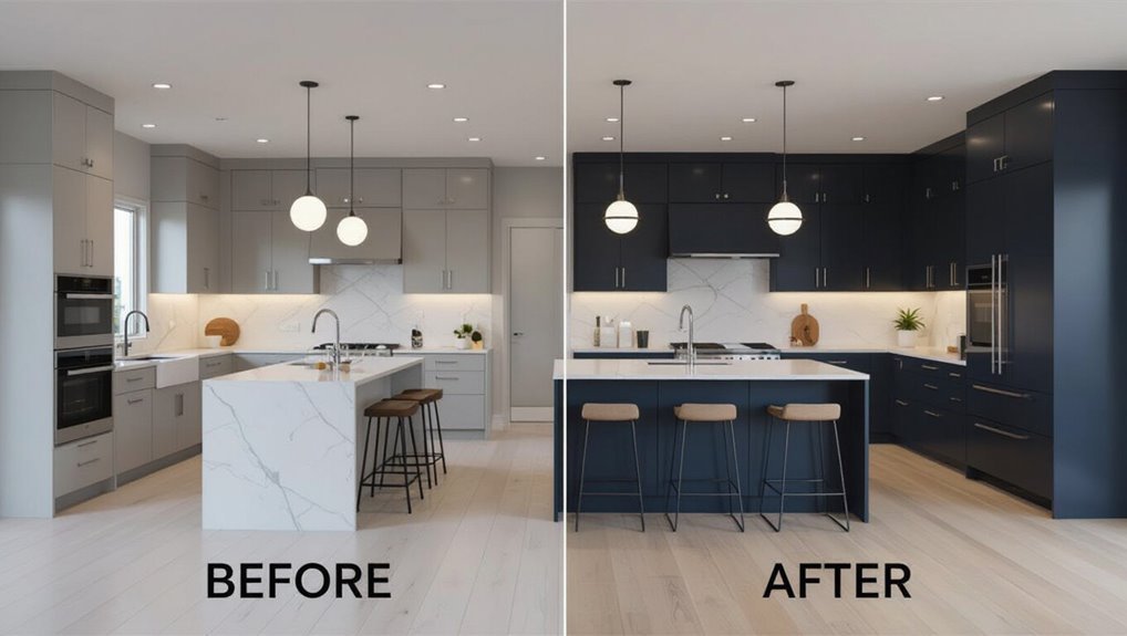
Small kitchen that benefits from matching cabinets and walls
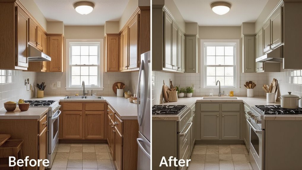
Because small kitchens can feel cramped, matching your cabinets and walls creates a seamless backdrop that visually expands the space and simplifies the room’s lines.
You’ll make the area feel brighter and less cluttered, especially with a light neutral. Use consistent trim and subtle hardware for depth, add a contrasting countertop or textured backsplash, and keep styling minimal to preserve the airy effect.
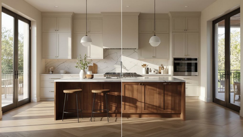
Large kitchen where matching creates monotony and the fix
When a spacious kitchen has cabinets and walls in the exact same tone, the room can feel flat and uninspired; breaking that monotony calls for deliberate contrasts and layered finishes.
Introduce darker base cabinets, a lighter wall shade, or a textured backsplash. Add metallic hardware, open shelving, and varied lighting to create depth.
Before-and-after examples show how small shifts restore warmth and visual interest.
Island-only matching and its impact
If matching an entire kitchen can read flat, matching just the island gives you a powerful, intentional anchor without overwhelming the space.
You’ll see before-and-after examples where a wall-matched island ties palettes together, highlights countertops, and creates focal contrast with surrounding cabinets.
Use texture, hardware, or lighting to prevent sameness—this approach balances cohesion and visual interest while boosting resale appeal.
FAQs
You probably have quick questions like whether painting cabinets the same color as walls will make the space feel smaller or if you can use the same paint for both.
You’ll also want to know how to get a durable cabinet finish with wall paint, whether cabinets should match countertops or walls, and how to fix a color that looks flat.
I’ll answer those points clearly so you can choose a look that lasts and feels lively.
Will painting cabinets the same as walls make my kitchen look smaller?
Curious whether painting your cabinets the same color as your walls will shrink the room? It can, but not always.
Matching tones creates a seamless look that can make small kitchens feel larger by reducing visual breaks.
Dark, flat hues may absorb light and feel heavy, while lighter, reflective finishes keep the space airy.
Balance with lighting and hardware to avoid a boxed-in feel.
Can I use the same paint for walls and cabinets?
Wondering whether you can use the same paint for walls and cabinets? Yes — you can match color, but pick formulations suited to each surface.
Use paint with appropriate sheen and adhesion for cabinets, and standard wall paint for broader areas.
Test samples side by side, evaluate color under kitchen lighting, and confirm the look before committing to full application.
How do I ensure the cabinet finish is durable if using wall paint color?
If you like the wall color for your cabinets, make the finish last by choosing the right paint formulation and prep steps: clean and sand surfaces, use a high-bond primer, pick a hard-wearing topcoat (semi‑gloss or satin for cabinets), and apply thin, even coats with proper drying time between them.
Use a quality brush or HVLP sprayer, scuff between coats, and cure fully before heavy use.
Is it better to match cabinets to wall color or to countertops?
Should you match cabinets to the walls or the countertops? You’ll usually pick the surface that anchors the room: match cabinets to countertops for cohesion when counters are bold or patterned; match cabinets to walls for a seamless, airy look when walls are subtle.
Consider contrast, material textures, and focal points. Prioritize balance so one element complements rather than competes with another.
How do I recover if the color match looks flat or lifeless?
Matching cabinets to walls or countertops sets the tone, but sometimes the result can feel flat or lifeless once everything’s in place.
Add contrast with trim, hardware, or open shelving in a darker or brighter hue.
Layer textures—matte vs. gloss, wood accents, patterned backsplashes—and introduce lighting: under-cabinet, pendants, or warm bulbs.
These shifts revive depth without repainting everything.