Do You Paint Ceiling and Trim Same Color? Here’s the Truth
You can—and often should—paint your ceiling and trim the same color when you want a streamlined, modern look or need an easy, renter-friendly refresh. Matching tones opens small rooms, softens sightlines, and creates a cozy vibe in bedrooms, while homeowners can still choose a slightly deeper trim for depth. Keep contrast for ornate or formal spaces where details should pop. Follow a few finish and testing tips, and you’ll see how to choose confidently as you explore more.
Quick Answer Should You Paint Your Ceiling and Trim the Same Color?
If you want a quick verdict: cozy bedrooms and small rooms can benefit from matching ceiling and trim for a cohesive, intimate feel, while living rooms and kitchens usually do better with contrasting trim to highlight architectural details.
For bold, modern spaces you can even match everything for a streamlined look, but in formal areas a crisp white trim often reads cleaner.
If you rent, stick to removable or neutral choices; if you own, feel free to experiment with a unified scheme.
Short verdict for different room types
When deciding whether to paint your ceiling and trim the same color, consider the room’s purpose and size: matching hues can simplify small or utilitarian spaces, while contrasting trim often adds depth and polish in formal living areas or rooms with architectural details.
- Small bath: yes—do you paint ceiling and trim same color for continuity.
- Hallway: yes—keeps flow.
- Living room: no—contrast adds formality.
- Bedroom: optional—depends on mood.
One-sentence recommendation for homeowners and renters
Although matching ceiling and trim can simplify small or rental spaces and hide imperfections, homeowners often get a more finished, architectural look by choosing a slightly contrasting trim.
If you rent, match or use neutral trims to keep things simple and reversible; if you own, pick a trim shade one to two tones deeper or brighter than the ceiling to add depth and lasting value.
Basic Understanding What Painting Ceiling and Trim the Same Color Means
When you paint the ceiling and trim the same color, you’re deciding whether features like crown molding, baseboards, and window and door trim should blend in or stand out.
Matching everything creates a seamless, modern look, while contrasting trim emphasizes architectural detail.
You’ll also want to know basic terms—flat, eggshell, semi-gloss—and consider color temperature because finish and tone change how unified the space feels.
Definition and common approaches (ceiling, crown molding, baseboards, window/door trim)
Think of painting ceiling and trim the same color as simplifying your room’s palette: it means using one hue — often a flat or low-sheen finish on the ceiling and a higher-sheen trim — across the ceiling, crown molding, baseboards, and window/door casings so those elements read as a unified plane rather than separate accents.
You can match everything, paint trim slightly glossier, or tone trim subtly darker for cohesion.
Visual and architectural effects of uniform color vs. contrasting trim
Color choices change how you perceive a room’s shape and details: painting the ceiling and trim the same color visually blends architectural elements, while contrasting trim calls attention to edges and moldings.
You’ll create a seamless, airy feel when surfaces read as one plane, ideal for small rooms or modern minimalism.
Contrast emphasizes detail, depth, and formality, shaping focal points and perceived proportions.
Terminology to know (flat, eggshell, semi-gloss, color temperature)
Blending a ceiling and trim can change a room’s feel, but how that blend reads depends a lot on paint type and hue.
You’ll choose finishes: flat hides imperfections on ceilings, eggshell gives low sheen for walls, and semi-gloss stands up to trim wear.
Also consider color temperature: warm tones feel cozy, cool tones feel crisp—match mood and lighting for best results.
When Same-Color Ceilings and Trim Work Best (Use Cases)
If you’re wondering when matching ceilings and trim actually help, think about the practical situations where a unified look does the work for you.
It’s especially useful when you want to make a small room feel larger, emphasize a minimalist scheme, hide bold architectural contrasts, or quickly refresh a rental without fuss.
Below are four common use cases to reflect on:
- Small rooms and low ceilings
- Modern/minimalist interiors
- High-contrast architectural details to de-emphasize
- Rental units and quick refreshes
Small rooms and low ceilings
Because tight spaces feel cluttered when you break their lines, painting the ceiling and trim the same color can visually lift low ceilings and make a small room feel more open—especially when you choose a light, muted tone that reflects light rather than absorbs it.
Use a unified hue to simplify sightlines, reduce visual clutter, and let furniture and decor read as intentional rather than crowded.
Modern/minimalist interiors
Wondering how to keep a modern or minimalist space feeling calm and cohesive? You’ll often want ceiling and trim in the same soft neutral to streamline sightlines and reinforce simplicity.
Matching tones reduces visual clutter, highlights clean architecture, and lets furniture or texture take center stage. Use matte finishes and subtle contrast—just enough to read edges without interrupting the room’s serene, restrained vibe.
High-contrast architectural details to de-emphasize
When you want to downplay bold moldings, exposed beams, or ornate cornices, painting the ceiling and trim the same color helps the eye skip over those features so the room reads as a single, calmer plane.
You’ll mask contrasts, simplify sightlines, and make furnishings and art take center stage. Use a subtle, neutral hue to unify without erasing character.
Rental units and quick refreshes
If you need a fast, budget-friendly update for a rental or staging project, painting the ceiling and trim the same color is a smart shortcut that saves time and hides small imperfections.
You’ll cut labor and material costs, speed turnover between tenants, and create a neutral, cohesive backdrop that appeals to more renters.
It also simplifies touch-ups and future repaints.
When You Should Keep Ceiling and Trim Different (Use Cases)
You’ll want to keep ceiling and trim different when you need the trim to stand out or perform differently than the ceiling. Contrast helps define architectural details and suits formal or traditional rooms with ornate moldings.
Also choose different paint when the trim needs a tougher finish for durability.
- Rooms needing defined architectural detail
- Formal spaces and traditional styles
- Rooms with intricate crown moldings or ornate trim
- Situations where trim durability and finish require different paint
Rooms needing defined architectural detail
Because architectural details define a room’s character, you’ll want to keep ceiling and trim colors different in spaces where moldings, beams, or built-in shelving deserve emphasis.
Contrast draws the eye to craftsmanship, highlights proportions, and separates planes.
Use a crisp trim hue against a softer ceiling to showcase details without overwhelming the room, ensuring focal elements read clearly and intentionally.
Formal spaces and traditional styles
Formal rooms—dining rooms, libraries, entry halls—benefit from a clear distinction between ceiling and trim to reinforce their structured, traditional character.
You’ll want crisp, contrasting trim to frame paneling, doors, and windows, emphasizing symmetry and formality.
Keep ceilings lighter to lift the space while using richer trim tones to anchor furnishings and architectural proportions, preserving an elegant, intentional aesthetic.
Rooms with intricate crown moldings or ornate trim
When a room features intricate crown molding or ornate trim, keep the ceiling a different color so those details read clearly and don’t get lost against a uniform surface.
You’ll highlight craftsmanship, create visual separation, and let shadows and profiles show. Choose a subtle contrast to avoid distraction; a slightly lighter or darker hue preserves elegance while ensuring the trim remains the room’s focal architectural feature.
Situations where trim durability and finish require different paint
Sometimes practical needs should drive your paint choices: if trim gets more wear or needs a tougher finish than the ceiling, keep them different.
You’ll want high-traffic trim in semi-gloss or enamel for scuff resistance and easy cleaning, while ceilings stay flat to hide imperfections.
Match colors for cohesion but prioritize durability and finish where function matters most.
How to Decide Step-by-Step Decision Guide {step-by-step}
Start by evaluating room size, ceiling height, and how much natural light you get so you know what colors will read best.
Next, consider the room’s architectural style and focal points, then pick finishes that meet durability and maintenance needs.
Finally, create a few color combinations to test with samples, then finalize your choice and plan the painting order.
Step 1: Assess room size, ceiling height, natural light
If you’re deciding whether to paint your ceiling and trim the same color, first evaluate three physical factors: room size, ceiling height, and natural light.
Smaller rooms and low ceilings benefit from lighter, uniform tones to feel larger. High ceilings can handle contrast.
Natural light changes color perception—south-facing rooms handle richer shades, while dim spaces need brighter, reflective finishes to stay airy.
Step 2: Identify architectural style and focal points
2. Identify your room’s architectural style and standout features before choosing trim and ceiling colors.
If you have ornate moldings, historic details, or exposed beams, pick trim that highlights those elements.
For minimalist or modern spaces, keep trim subtle to maintain clean lines.
Let focal points—fireplaces, built-ins, window frames—guide whether matching or contrasting colors will enhance the design.
Step 3: Choose paint finish and durability needs
Because different surfaces face different wear, you’ll pick finishes and formulations that suit each area’s use and exposure: choose a durable, scrubbable semi-gloss or satin for trim and high-traffic ceilings (like kitchens and hallways), while flatter, low-sheen paints work for smooth, low-touch ceilings in bedrooms or living rooms to hide imperfections.
Also consider stain-blocking primers for moisture areas, and washable formulas for kids’ rooms.
Step 4: Create color combos and test with samples
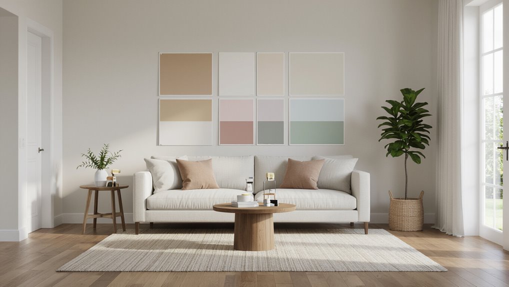
Samples make the decision concrete: lay out painted swatches for walls, ceilings, and trim so you can see how the colors interact in your actual light.
Tape samples in multiple spots, view at different times, and note reflections from floors and furnishings.
Try both matching and contrasting combos, then live with samples for a few days to judge mood, depth, and harmony before committing.
Step 5: Finalize decision and plan painting order
Now that you’ve lived with your swatches and compared matches and contrasts in real light, it’s time to lock in your choice and map out the painting sequence.
Decide ceiling, trim, and wall roles, then pick finishes.
Plan order: ceiling first, walls second, trim last.
Gather supplies, schedule timing for drying, and test one final small area to confirm satisfaction before committing.
Color and Finish Strategies
You’ll want to think about both color and finish when deciding whether to match ceiling and trim. Subtle choices—matching tones instead of exact hues, using different sheens, pairing warm or cool shades, and accounting for lighting—can change the feel of a room.
Below are four focused factors to evaluate as you plan.
- Match tones vs. exact color: aim for similar value or undertone rather than a pixel-perfect match.
- Different sheens for subtle contrast: matte ceilings with satin trim can read as intentional separation.
- Warm vs. cool combinations: pairing a warm trim with a cool ceiling (or vice versa) shifts mood and depth.
- Lighting effects: natural and artificial light will alter how closely colors appear to match.
Matching tones vs. matching exact color
Wondering whether to match tones or match the exact paint color? You can pair trim and ceiling by matching tonal temperature—warm to warm, cool to cool—to create cohesion without identical shades.
Matching exact color gives a seamless, tailored look but risks monotony. Choose tonal harmony for subtle contrast, exact matching for uniformity, and let room size and light guide your decision.
Using different sheens for subtle contrast
One simple way to get contrast without changing color is to vary the sheen: pairing a matte ceiling with a higher-gloss trim highlights architectural lines while keeping the palette cohesive.
You can use satin or semi-gloss on moldings for durability and shine, while eggshell or flat on walls reduces glare.
Choose sheens to balance light, hide imperfections, and subtly define spaces.
Warm vs. cool combinations for ceiling and trim
How should you pair warm and cool tones between ceiling and trim to shape a room’s mood?
Choose a cool ceiling to recede and calm—soft blues or pale grays—and warm trim to add grounding contrast, like creamy whites or soft taupes.
Or invert: warm ceiling brings coziness while cool trim sharpens edges.
Keep undertones consistent for harmony and predictability.
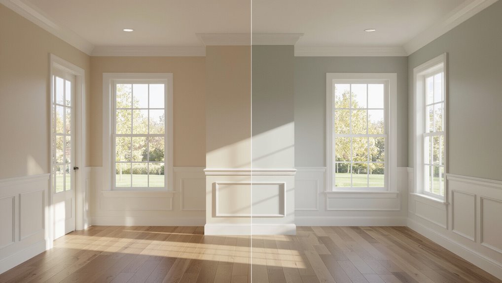
How lighting changes perceived match
Because lighting alters hue and sheen, the same paint can look like a precise match in one room and a mismatch in another.
You’ll notice warm bulbs deepen yellows and soften whites, while cool daylight sharpens blues and reveals undertones.
Test samples under each light source and at different times.
Adjust sheen to control reflection so trim and ceiling read consistently from every angle.
Practical Painting Considerations and Process {step-by-step}
Before you start, gather the right tools and materials and plan the prep work—masking, sanding, and priming—so you won’t stop mid-job.
Decide the order of painting (ceiling first or trim first) based on whether you’re using the same color or different colors to minimize touch-ups.
I’ll also cover common problems like bleed and brush marks and how to troubleshoot them as you go.
Tools and materials checklist
You’ll need a short list of reliable tools and quality materials to get a clean, consistent finish when painting ceilings and trim the same color.
Gather the right gear and you’ll work faster with fewer mistakes.
- High-quality paint (ceiling and trim formulas or a matched interior latex)
- Angled sash brush (2–2.5″)
- Mini roller and extension pole
- Painter’s tape, drop cloths, and sandpaper
Prep work: masking, sanding, priming
Start by protecting floors, fixtures, and walls you don’t want painted—lay drop cloths, run painter’s tape along trim edges, and cover light fixtures.
Sand trim and ceiling seams smooth, remove dust with a tack cloth, and fill gaps with caulk.
Prime bare wood, stained spots, or patched areas to guarantee adhesion and uniform sheen.
Work methodically and let each coat dry fully.
Order of painting when using same color vs. different colors
With prep complete and surfaces primed, decide the painting sequence based on whether you’re using the same color or different colors.
If matching colors, paint ceiling first, then trim while cutting in edges to hide overlaps.
If using different colors, paint ceiling, then walls, and finish with trim to protect clean edges.
Allow proper drying between steps to prevent smudges.
Troubleshooting common painting issues (bleed, brush marks)
Common problems like paint bleed, brush marks, and lap lines can ruin a smooth finish, but you can prevent or fix most of them with the right technique and timing.
Seal gaps with painter’s caulk, sand glossy trim, and use high-quality angled brushes.
Thin coats, maintain a wet edge, and lightly sand between coats.
Clean brushes and remove excess paint to avoid streaks.
Pros and Cons Comparison
You’ll want to weigh the pros and cons before deciding whether to paint your ceiling and trim the same color. Below is a quick comparison to help you judge how unified color affects light, space perception, and maintenance. Use it to guide your choice based on your room’s style and practical needs.
| Benefit | Drawback | Best for |
|---|---|---|
| Creates a seamless, cohesive look | Can reduce visual contrast and architectural detail | Small rooms or modern minimalism |
| Simplifies painting and touch-ups | Mistakes or wear are more noticeable across surfaces | Open-plan spaces with consistent lighting |
Pros of painting ceiling and trim the same
Although it might seem unconventional, painting your ceiling and trim the same color can instantly simplify a room’s look and make the space feel more cohesive.
You’ll create a seamless, modern backdrop that highlights furniture and art, mask minor imperfections, and streamline touch-ups.
This approach also shortens painting time and reduces trim-contrast distractions, letting architectural shapes read as a unified, calm composition.
Cons of painting ceiling and trim the same
If you prefer clearly defined architectural details, painting the ceiling and trim the same color can mute those edges and make rooms feel flat and less dimensional.
You’ll lose contrast that highlights moldings, door frames, and windows. It can make ceilings seem lower, reduce perceived depth, and limit design flexibility.
Repainting later is more work if you change your mind.
Common Mistakes to Avoid
Don’t assume the same sheen works everywhere—think about durability for trim and ease of cleaning.
Check how lighting and undertones affect the colors, and always try sample patches before committing.
Also remember trim needs more maintenance, so pick finishes and prep that can handle wear.
Using identical sheen without considering durability
When you pick the same sheen for both ceiling and trim without thinking about durability, you can end up with a finish that ages poorly in different areas.
Ceilings rarely take bumps or scrubbing, while trim needs to resist scuffs and cleaning.
Choose higher-sheen, washable paint for trim and a flatter, less reflective option for ceilings so each surface performs and cleans appropriately over time.
Ignoring lighting and undertones
How will your painted ceiling and trim actually look in the room’s light?
You can’t ignore lighting and undertones: natural and artificial light change perceived color, and warm or cool undertones shift whites and neutrals differently.
Consider window direction, bulb temperature, and nearby finishes so the ceiling and trim read as designed rather than clashing, yellowing, or appearing too blue.
Skipping sample patches and small tests
Even if you’re confident in the swatch, skipping sample patches gambles with how the paint will actually read on your ceiling and trim; small tests reveal undertones, sheen differences, and how light shifts color throughout the day.
Apply test patches on both surfaces, observe them morning and evening, and note how texture and adjacent colors change perception before committing to gallons.
Overlooking trim maintenance needs
Don’t ignore trim upkeep just because it’s smaller than walls—neglect shows up fast as chipped paint, cracked caulk, and dirt-filled crevices that ruin the whole look.
You should inspect trim regularly, touch up chips, recaulk seams, and clean grime. Keeping trim maintained preserves paint color, prevents moisture damage, and guarantees any decision to match or contrast trim with ceiling looks intentional and polished.
Tips and Best Practices for a Professional Look
You’ll want a few practical tips to get a polished result when matching ceiling and trim.
Try sample areas at different times of day, know when a pro will save you time and headaches, and plan simple upkeep so the finish stays crisp.
Below are four focused actions to help you look professional.
- Test paint swatches on hidden spots and observe them morning, noon, and evening.
- Tackle small rooms yourself, but hire a pro for high ceilings, intricate moldings, or uneven surfaces.
- Use high-quality primer and paint with the right sheen for trim versus ceiling.
- Keep touch-up paint, a small brush, and a routine cleaning schedule to prevent scuffs and discoloration.
How to pick sample areas and evaluate at different times of day
Start by choosing three to five small, discreet areas for paint samples—near a window, in a shaded corner, and close to trim—so you can see how light and surfaces interact.
Tape or poster-board each sample, label orientation, then observe morning, midday, and evening.
Note color shifts, sheen differences, and how shadows fall. Photograph for comparison and decide when tones remain consistent enough.
When to hire a pro vs. DIY
If the room’s layout, height, or trim details make painting awkward or risky, hire a pro—otherwise you can often get a crisp, polished result yourself with the right prep and tools.
Choose a pro for tall ceilings, intricate moldings, or time constraints.
DIY when you’re comfortable with steady brushwork, proper masking, quality paint, and patience to sand, prime, and apply tidy, even coats.
Maintenance tips for same-color trim and ceiling
Even with a flawless paint job, the real work is regular upkeep—so set a simple maintenance routine that keeps your same-color ceiling and trim looking sharp.
Dust weekly with a microfiber duster, spot-clean scuffs with mild soap and water, and touch up chips promptly using leftover paint.
Re-caulk seams yearly, inspect for moisture, and repaint high-traffic areas every few years.
Real-World Examples and Scenarios
If you’re in a small apartment, painting ceiling and trim the same light color can make the space feel larger and more cohesive.
In a traditional home, keeping trim a contrasting shade can preserve architectural details and character.
For open-plan living areas, use a consistent ceiling color with strategic trim choices to create visual continuity between zones.
Small apartment making space feel open
When you’re working with a compact apartment, painting the ceiling and trim the same color can visually erase boundaries and make the whole space feel taller and more continuous.
You’ll get a cleaner, airier look without changing your layout. Use a soft, light shade throughout, keep finishes matte to hide imperfections, and add layered lighting and minimal furnishings to reinforce openness and flow.
Traditional home when contrast matters
A compact apartment benefits from a continuous ceiling-and-trim treatment, but a traditional home often calls for deliberate contrast to emphasize moldings, doorways, and period details.
You’ll highlight carved cornices, wainscoting, and built-ins by choosing a crisp trim—bright white or deep charcoal—against a softer wall hue.
Use contrast to guide sightlines, frame architectural features, and preserve historic character without overwhelming rooms.
Open-plan living area continuity strategies
Because open-plan spaces flow into one another, keeping your ceiling and trim consistent can pull disparate zones together and make the whole area feel intentional.
Use the same neutral trim and ceiling to unify kitchen, dining, and living areas, then differentiate with rugs, lighting, and furniture.
In photos, consistent white trim reads cohesive; in darker schemes, match trim to ceiling for seamless connections.
Frequently Asked Questions (FAQ)
You probably have a few practical questions before deciding whether to paint your ceiling and trim the same color, so let’s clear up the common concerns.
Below are key FAQs that cover size perception, sheen and matching tips, molding choices, and how light and undertones change the result.
Read them to make an informed, confident choice for your room.
- Will painting trim and ceiling the same color make my room look bigger?
- Can I use the same paint sheen on ceiling and trim?
- How do I match new trim paint to existing ceiling paint, and is it okay to paint crown molding the same color as walls?
- How do lighting and undertones affect a same-color scheme?
Will painting trim and ceiling the same color make my room look bigger?
If you match your trim and ceiling to the same color, you’ll create a more unified, continuous look that can make the room feel taller or wider depending on the color and light.
Lighter, warm neutrals reflect light and open space; darker tones can add depth but may cozy a small room.
Consider natural light, room proportions, and furniture contrast to maximize perceived size.
Can I use the same paint sheen on ceiling and trim?
Wondering whether the same sheen works for both ceiling and trim? You can, but you probably shouldn’t.
Ceilings usually use flat or matte to hide imperfections and reduce glare, while trim benefits from satin or semi-gloss for durability and easy cleaning.
Matching sheens sacrifices function or finish. If you insist on uniformity, pick a compromise sheen and expect trade-offs in appearance or maintenance.
How do I match new trim paint to existing ceiling paint?
How do you match new trim paint to an existing ceiling without ending up with an obvious mismatch?
Start by taking a small ceiling paint sample to a paint store for color-matching.
Test matched swatches on trim pieces under the room’s lighting.
Choose the same sheen if practical, or slightly glossier for durability.
Adjust tint sparingly and reassess in different light before committing.
Is it okay to paint crown molding the same color as walls?
Matching trim to ceiling paint helps with color consistency, but you might also be thinking about painting crown molding the same color as your walls.
You can—doing so creates a seamless, modern look and makes rooms feel larger by eliminating contrast.
Keep scale and architectural detail in mind: if molding is ornate, a contrasting or glossed finish may preserve definition rather than hiding it.
How do lighting and undertones affect a same-color scheme?
Because light changes a color’s appearance and undertones carry subtle pigments, you’ll want to test paint in the room before committing to a same-color ceiling-and-trim scheme.
Natural, warm, or cool light will shift how the hue reads; glossy trim reflects more.
Sample large swatches at different times, view corners and ceilings, and adjust sheen or shade so the unified look reads intentional, not flat.
Conclusion and Recommendation + Next Steps
If you want a crisp, cohesive look, match ceiling and trim in small rooms or when aiming for a clean, modern feel.
However, keep them separate to highlight trim or in rooms with complex lighting.
Use a quick checklist—room size, lighting, architectural details, and your style goal—to make the final call.
Grab sample swatches, schedule a pro consult, or start a simple DIY plan to test the choice in your space.
Summary of when to match ceiling and trim
When you’re deciding whether to paint your ceiling and trim the same color, weigh the room’s size, light, and the look you want—unified palettes suit small or low-ceilinged rooms and minimalist styles, while contrast highlights architectural details and adds depth.
Choose matching finishes for cohesion and low fuss; opt for contrast when you want drama, emphasis, or layered dimension in well-lit, spacious rooms.
Quick checklist to make the final call
Since you’ll make the final call based on function and feel, use a short checklist: note room size and ceiling height, assess natural and artificial light, decide whether you want cohesion or contrast, consider trim and ceiling finishes, check how the color reads in different lighting, and account for practical factors like maintenance and resale.
- Test swatches in multiple lights.
- Prioritize function (brightness, scale).
- Match finish, not just hue.
- Consider long-term upkeep.
Call to action: sample swatches, professional consult, or DIY starter plan
Ready to try it out? Grab sample swatches, tape them on trim and ceiling, and view at different times.
If you want confidence, book a pro consult for measurements, lighting advice, and color matching.
Prefer hands-on? Follow a DIY starter plan: prep, prime, test, paint trim first, then ceiling.
Decide, act, and adjust based on real samples and lighting.