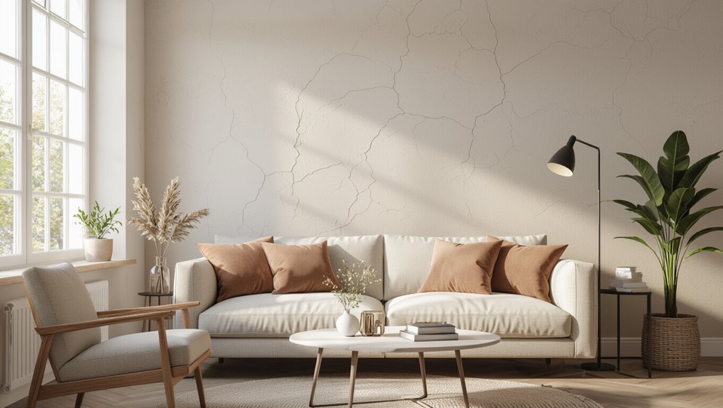
What Color Paint Best Hides Imperfections on Walls?
You’ll get the best concealment with muted mid-tone neutrals—think warm greige, dusty blue, or soft sage—because they cut contrast and diffuse reflections. Choose low-sheen or matte finishes to absorb light and soften bumps; avoid very light or glossy paints that spotlight texture. Warm undertones brighten and distract from dents, while cool muted tones soften shadows. Test swatches under your lighting and pick mid-values for the least visible flaws, and keep going to learn practical selection and prep tips.
Which Paint Colors Best Hide Wall Imperfections?
Wondering which paint colors will best conceal dings, dents, and uneven texture? You’ll use color psychology to choose hues that soften texture perception and control light reflection, employing color harmony and visual balance to mask flaws.
Apply color layering and subtle optical illusions rooted in design principles to improve wall aesthetics and spatial perception, so imperfections recede without calling attention to themselves.
Quick Answer: Best Overall Color Choices
Now that you know how color and light affect the eye, pick hues that minimize contrast and diffuse reflections so flaws recede.
Choose muted, mid-tone neutrals; they use color psychology to calm and lower visual perception of defects.
Choose muted mid-tone neutrals; their calming hues help downplay imperfections and soften visual contrast
Try these options:
- Warm greige for softness
- Dusty blue for subtle depth
- Sage green for natural concealment
These keep attention away from texture.
How Color Darkness Conceals Texture
Because darker paints absorb more light rather than bouncing it back, they’ll make bumps and minor texture less visible to your eye.
You’ll notice depth cues soften as shadows shrink, improving visual perception of uneven areas.
Use darker tones thoughtfully: color psychology affects mood, so pick shades that hide flaws without making rooms feel cramped.
Test samples under real lighting before committing.
Why Mid-Tones Balance Reflection and Hiding
Mid-tones give you the best of both worlds: they reflect enough light to keep a room feeling open while still muting surface irregularities that brighter paints would highlight.
Mid-tones strike the balance: they brighten space while softening surface flaws for depth and warmth.
You’ll use color psychology and light dynamics to choose tones that flatter texture without flattening depth.
- Moderate reflectance
- Balanced contrast
- Subtle warmth
Why Warm Neutrals Hide Dents and Patches
When you pick warm neutrals, their subtle undertones help blur small dents and patches so they don’t catch your eye.
Pairing those tones with a matte finish further softens the wall’s texture and reduces shine that highlights imperfections.
Together, warm undertones and low-sheen paint make flaws much less noticeable.
Warm Undertones Blur Flaws
Warm neutrals soften the look of dents and patched areas by reflecting light in a forgiving, diffused way that masks sharp edges and shadows.
You’ll use warm hues and simple illusion techniques to redirect focus and even tone.
Try these approaches:
- Layer subtle beige or taupe.
- Add soft contrast with trim.
- Use consistent color family to unify flaws.
Matte Finishes Soften Texture
You’ve seen how warm neutrals redirect attention and even out tone; now look at finish choice—matte sheens further disguise dents and patched spots by scattering light instead of reflecting it.
You’ll appreciate matte appeal because it reduces glare and flattens highlights, so your eye reads surfaces as smoother.
This subtle shift in texture perception makes minor imperfections far less noticeable without heavy repairs.
How Cool Grays Perform : And Their Limits
Although cool grays can make a room feel crisp and modern, they tend to reveal surface flaws more than warmer neutrals, so you’ll want to weigh their aesthetic against your wall condition.
Cool grays create a crisp, modern look—but they can highlight wall imperfections, so choose carefully.
You’ll notice cool gray tones amplify light reflection and texture.
Consider:
- Use matte sheens to mute flaws.
- Test in different light.
- Pair with warmer accents to soften contrast.
How Deep Blues and Greens Distract the Eye
When you paint a room in deep blues or greens, those rich tones draw attention away from bumps and uneven patches by creating a strong visual focus, so your eye overlooks minor surface flaws.
You’ll use moody hues—deep ocean, tranquil forest—to create serene depths and inviting coolness.
Bold contrasts and eye-catching accents add rich textures, calming ambiance, and sophisticated vibes that distract from imperfections.
Patterned and Faux Finishes: Do They Help?
You can use textured paints and faux finishes to mask minor surface flaws by breaking up flat light reflections.
Patterned treatments draw the eye across the wall, hiding small dents and uneven spots.
Faux finishes also add perceived depth, making imperfections less noticeable without major repairs.
Texture Masks Flaws
If your walls show bumps, dents, or uneven drywall seams, patterned textures and faux finishes can help hide those imperfections by breaking up light and distracting the eye.
You’ll use texture depth and color psychology to balance concealment and mood. Consider:
- Light stippling for subtle masking.
- Venetian plaster for refined depth.
- Sponge techniques to blend flaws and soften contrast.
Pattern Distracts Eyes
Because busy patterns break up uniform surfaces, they draw the eye to shapes and movement instead of flaws.
So patterned and faux finishes can be a practical strategy for disguising imperfections. You can pick pattern types—stripes, geometrics, subtle mottles—that direct attention away from dents.
Use restrained color contrasts to keep the room cohesive, and position patterns where flaws are most visible.
Faux Finishes Add Depth
When done well, faux finishes add visual depth that helps mask bumps, hairline cracks, and uneven texture by creating intentional variation across the wall; they’ll make flaws read as part of the surface rather than as standalone defects.
You can use faux textures and subtle color layering to distract and unify.
Try techniques:
- Sponging
- Ragging
- Venetian plaster
Eggshell Finish: Softening Surface Flaws
An eggshell finish gives you a soft, low-luster surface that helps blur minor dents, bumps, and brush marks without drawing attention to them. You’ll appreciate the eggshell sheen for hiding flaws while preserving subtle surface texture and easy cleaning.
| Feature | Benefit | Tip |
|---|---|---|
| Sheen | Hides small flaws | Use light priming |
| Texture | Softens bumps | Avoid heavy glazes |
| Care | Washable | Gentle sponge only |
When to Choose Matte to Downplay Texture
Choose matte when you want to mask texture and minimize attention to bumps or patchy spots.
It soaks up light instead of reflecting it, so surface blemishes stay less noticeable under different lighting.
Just remember that very glossy areas or heavy shadows can still reveal imperfections, so match finish to the room’s light conditions.
When To Use Matte
If you want to hide bumps, dents, or uneven plaster, matte paint is your best bet because it soaks up light instead of reflecting it back at the eye.
You’ll prefer matte benefits when texture matters, though note matte drawbacks like lower washability.
Use matte when:
- Texture needs disguising
- Light is direct or uneven
- You want a soft, cozy look
Hiding Surface Blemishes
When your walls show small dents, nail holes, or uneven plaster, matte paint helps mask those flaws by absorbing light instead of bouncing it back. This way, the surface reads smoother to the eye.
You’ll pair surface treatments and repair techniques with low-sheen wall textures, mindful paint layering, and protective finishes to boost paint durability, color harmony, visual balance, room ambiance, color psychology, contrast strategies, design trends, maintenance strategies, and aesthetic appeal.
Paint Finish vs Light
After repairing dents and smoothing plaster, think about how light will interact with your finish: matte paints absorb light and soften shadows, so they make bumps and brush strokes less obvious than glossier sheens.
You’ll use paint psychology and color perception to choose finish and tone.
Consider:
- Matte for textured walls.
- Eggshell where slight sheen’s fine.
- Gloss for trim and durability.
Why High-Gloss Highlights Imperfections
Because glossy finishes reflect more light, they make every bump, scrape, and roller mark stand out instead of hiding them.
You’ll notice high gloss reflections emphasize texture and imperfections, especially under directional or strong lighting.
Consider lighting considerations when choosing finish: bright, angled light magnifies flaws, so avoid gloss on imperfect walls.
Use smoother surfaces and controlled illumination to minimize visible defects.
How Satin Finish Performs on Flawed Walls
Satin finish sits between flat and semi-gloss in sheen, so you’ll get a soft, low-luster look that still reflects some light.
That subtle sheen can help hide minor bumps and roller marks better than gloss, but it may highlight deeper scratches or uneven patches.
Consider the wall’s condition and lighting—satin’s balance means it conceals modest flaws while revealing more pronounced ones.
Satin Finish Sheen Levels
Sheen matters when you’re hiding flaws: satin sits between flat and semi-gloss, offering a soft glow that gently masks minor bumps and roller marks without spotlighting texture.
You’ll want to contemplate satin finish sheen levels for balance.
- Low satin: minimizes texture.
- Medium satin: washable, subtle glow.
- High satin: brighter, reveals flaws more.
Conceals Vs. Highlights Imperfections
When you’re deciding whether a satin finish will mask your walls’ flaws or make them stand out, consider lighting and surface texture: satin’s low-to-medium sheen softens minor bumps and scuffs but will reveal deeper dents or brush marks under strong, angled light.
You can use conceal techniques—flat trims, careful patching, diffuse lighting—or highlight methods like spotlighting or glossy accents to emphasize texture.
How Color Value Affects Shadowing on Bumps
Because lighter values reflect more light, they’ll soften the appearance of small bumps while darker values deepen shadows and make texture stand out.
Lighter tones soften small bumps by reflecting light; darker hues deepen shadows and emphasize texture.
So choose a hue based on how much surface variation you want to disguise. You’ll notice color shadows change bump perception.
Consider:
- Light value: reduces contrast.
- Dark value: exaggerates texture.
- Matte finish: minimizes highlights.
Why Mid-Value Colors Reduce Visible Shadows
If you pick a mid-value color, you’ll reduce the contrast between highlights and shadows on bumps, so surface variations read as subtler changes instead of stark ridges.
You’ll notice improved shadow perception because mid tones soften light shifts, hiding flaws without flattening texture.
Color psychology also helps: neutrals and muted mid-values feel calm, drawing attention away from imperfections so your walls look smoother and balanced.
How Undertones Change Perceived Smoothness
Pay attention to undertones because cool and warm bases interact differently with shadows and highlights, changing how smooth walls look.
Higher saturation can call out texture while softer, muted tones tend to mask bumps.
Also consider how light direction and intensity make undertones shift, so test samples in your room before committing.
Cool Vs Warm Undertones
1 simple shift in undertone—cool or warm—can change how smooth your walls look, even when the surface is the same.
You’ll notice cool undertone effects soften shadows and mask minor bumps, while warm undertone benefits brighten and distract from imperfections.
Consider how each feels to you:
- Cool: minimizes depth.
- Warm: enhances warmth, hides flaws.
- Balance: pick based on lighting.
Saturation And Texture
Saturation affects how texture reads on your walls: more saturated colors make bumps and brushstrokes look sharper, while muted hues soften those details. You’ll use lower saturation levels to hide texture variation; higher ones emphasize it. Choose mid-muted undertones to balance color interest and conceal flaws.
| Saturation | Effect |
|---|---|
| Low | Masks texture |
| High | Highlights texture |
Light Interaction Effects
After you’ve chosen a saturation that softens bumps, consider how light and undertones will alter perceived smoothness.
You’ll notice light reflection and subtle undertones change color perception, emphasizing or hiding flaws.
Try these approaches:
- Test warm undertones in soft light.
- Use cool undertones where diffuse light minimizes sheen.
- Prefer matte finishes to reduce specular highlights and hide texture.
Choosing Colors to Minimize Thermal Contrast
When you pick paint to minimize thermal contrast, choose mid-tone, low-reflective shades that narrow the perceived temperature difference between surfaces. Cooler rooms benefit from warmer neutrals, while sunny spaces handle slightly cooler grays without looking chilly.
You’ll use color perception to balance warmth and coolness, mask uneven heat-related fading, and reduce stark shifts between walls, trim, and ceilings for a smoother, more cohesive appearance.
How Natural Light Changes What Hides Best
Pay attention to how the angle of light from your windows sculpts every bump and brushstroke on the wall.
What looks smooth at noon can reveal flaws in the evening, so consider time of day when choosing finish and color.
Also note that larger or differently positioned windows change shadow direction and intensity, so test paint under the actual light you’ll live with.
Angle Of Light
Because natural light shifts throughout the day, it dramatically changes which imperfections stand out on your walls. Low-angle morning or evening sun casts long shadows that make bumps and texture more obvious, while overhead midday light softens those shadows and can hide shallow irregularities.
Consider how light angle and shadow play affect your choices:
- Low-angle highlights texture.
- Midday minimizes shallow flaws.
- Diffuse light evens appearance.
Time Of Day
In the early morning and late afternoon, low-angle sunlight throws long shadows that make bumps and textures jump out, so you’ll notice imperfections more; around midday, the sun sits overhead and softens those shadows, making shallow flaws less visible.
While overcast or diffuse light gives the most even appearance and hides surface irregularities best. You’ll use morning light, evening shadows, sunlight intensity, directional lighting, ambient effects, natural brightness, artificial glow, and color perception to judge which paint conceals flaws.
Window Size And Position
When windows are large or placed to flood a wall, they throw broad, angled light that highlights every bump and seam.
So you’ll want flatter sheens and lighter, more even colors on those surfaces; conversely, small or high-set windows produce softer, more diffused illumination that helps conceal minor imperfections.
This lets you safely choose darker tones or subtle eggshell finishes without exposing texture.
- Assess window placement and light exposure.
- Use window treatments, curtain effects, frame color, and views to balance wall texture and architectural features.
- Factor seasonal changes and view impact for lasting design balance.
How Artificial Lighting Alters Texture Perception
How does artificial light change what you see on a wall?
You’ll notice artificial lighting shifts shadows, glare, and contrast, which alters texture perception and can exaggerate bumps or wash them out.
Warm, diffuse fixtures soften flaws; cool, directional bulbs emphasize ridges.
Position and beam angle matter, so choose fixtures that minimize sharp shadows if you want imperfections to recede.
How to Test Paint Samples for Flaw-Hiding
Start by painting samples on your wall and check them in natural light to see how they really look.
Try multiple sheens—matte, eggshell, and satin—to compare how each hides bumps and dents.
Stand close, then step back and view from different angles to catch imperfections you might miss up close.
Test In Natural Light
Want to see how a paint really performs? Use natural light testing to judge color perception and flaw-hiding. Follow these steps:
- Paint three small swatches near windows and in shaded corners.
- Observe at morning, midday, and evening light for shifts.
- Note which tone softens dents and texture without glare before committing.
Use Multiple Paint Sheens
Although you’ll likely pick a color first, testing several sheens is essential because finish affects how visible imperfections look; grab sample cards and paint small swatches in different light.
You’ll compare paint sheen options—matte, eggshell, satin, semi-gloss—and note sheen effects on texture and shadows.
Choose the finish that minimizes glare and blurs flaws without highlighting bumps or brush marks.
Inspect From Different Distances
After you’ve narrowed down sheen options, step back and view your sample patches from multiple distances to see how well each hides flaws.
You should vary distance perception and viewing angles, noting shadows and texture.
Test like this:
- Close (arms’ length) for detail.
- Medium (6–10 ft) for typical sightlines.
- Far (doorway/hall) for overall impact and flaw concealment.
Inspecting Walls: Dents, Cracks, Stains First
How do you know where to start? You’ll use simple wall inspection techniques: scan close-up and from a distance, feel for dents, and shine a light to spot hairline cracks.
Note stains’ size and source so you can clean or seal them first. Identifying common imperfections this way helps you prioritize repairs before choosing paint or texture to mask remaining flaws.
Best Colors for Small Rooms With Damaged Walls
When you’re working with damaged walls in a small room, warm medium-neutral shades can mask imperfections while keeping the space cozy.
Soft muted pastels soften scratches and stains without overwhelming the room.
Reserve deep accent hues for trim or a single wall to add depth without highlighting flaws.
Warm Medium-Neutral Shades
Warm medium-neutral shades—think soft taupes, warm greiges, and muted camel tones—cloak small rooms in enough warmth to distract from minor wall flaws while keeping spaces feeling cozy, not cramped.
You’ll enjoy warm undertone benefits and muted color palettes that soften texture.
Try these:
- Soft taupe for subtle depth
- Warm greige for balanced light
- Muted camel to mask imperfections
Soft Muted Pastels
If you liked the cozy neutrality of warm medium-neutrals, soft muted pastels offer a lighter option that still masks imperfections without drawing attention to flaws.
You’ll find soft pastel palettes—like dusty blush, sage gray, or pale lavender—hide minor dents and uneven texture by using subtle color variations and low-sheen finishes.
They brighten small rooms while keeping walls visually calm and forgiving.
Deep Accent Hues
Contrast works: deep accent hues can turn damaged walls into a feature rather than a flaw by using rich, saturated colors that draw the eye and mask irregularities.
This is especially effective in small rooms where darker tones make surface imperfections less obvious.
You’ll use deep color psychology, accent hue trends, emotional color impact, and bold color choices to create visual weight balance and color harmony strategies.
- Use saturated navy
- Try emerald green
- Choose charcoal gray
Best Colors for Large Rooms With Uneven Plaster
Any color you pick will interact with light and texture, so choose shades that minimize shadows and blur imperfections.
In large rooms, go for mid-tone warm neutrals or soft grays to even out sightlines; combine large room strategies with subtle matte finishes.
Address major issues first using plaster repair techniques, then paint—this makes colors more forgiving and surfaces appear smoother overall.
Colors That Hide Stains Versus Colors for Dents
Stain-prone areas call for deeper, warmer tones that mask discoloration, while dents read better against mid-tone, low-sheen colors that don’t throw sharp shadows; choose accordingly so your paint does the hiding work.
- Use high stain resistance finishes in kitchens.
- Pick mid-tones with low sheen for dent camouflage.
- Test samples under your lighting before committing.
Using an Accent Wall to Distract Problem Areas
If stains and dents are still drawing the eye despite careful color and finish choices, bring attention elsewhere with an accent wall.
You can highlight a single surface to showcase style while masking flaws on surrounding walls.
Accent wall benefits include directing focus and creating visual hierarchy.
Use bold hues or textured finishes as color distraction techniques to steer viewers away from imperfections.
How Trim and Moldings Conceal Imperfect Edges
You can use trim and moldings to create crisp junction lines that hide imperfect edges and give a finished look.
Their profiled shapes cast shadow lines that distract the eye from flaws. Painting the trim a contrasting color sharpens those edges and makes imperfections less noticeable.
Crisp Transition Lines
Trim and moldings create crisp junction lines that hide crooked cuts, uneven seams, and imperfect drywall edges by providing a clean visual boundary between surfaces.
You’ll use crisp edges and clean lines to enforce shift techniques and design cohesion.
Consider:
- Accent strategies for color harmony and border definition.
- Edge treatment to improve visual flow.
- Line precision for unified appearance.
Profiled Shadow Lines
Because shadow lines catch the eye more than tiny gaps, profiled trim becomes a practical disguise for imperfect edges. This lets you steer attention toward deliberate shadows instead of flaws.
You’ll pick moldings with crisp profiles so profiled shadows read as intentional design. Install them where walls meet ceilings or floors to break sightlines, using varied line textures to distract from uneven joins.
Painted Contrast Edges
When you paint moldings a contrasting color from the wall, they frame problem areas and make imperfect joins read as deliberate design choices.
You’ll use contrast to distract from uneven seams, leveraging paint texture and color saturation to control focus.
- Define edges with matte trim.
- Use higher saturation sparingly.
- Match sheen to minimize glare.
Strategic Color Zoning to Mask Uneven Surfaces
If you break a room into visual zones with thoughtfully chosen colors, you can steer attention away from dents, bumps, and uneven plaster.
Use color psychology to assign richer, warmer hues to focal areas and cooler, muted tones on flawed planes.
Exterior: Hiding Stucco and Siding Flaws
For exterior stucco and siding, pick earthy, medium-tone shades to help mask texture and minor flaws without looking flat.
Choose matte or low-sheen finishes since they reduce glare and make imperfections less obvious.
Lean toward warm, slightly busy undertones to hide stains and weathering while keeping the look natural.
Earthy, Medium-Tone Shades
Although they don’t scream for attention, earthy medium-tone shades quietly mask uneven stucco and siding by balancing light and shadow.
So you’ll see texture without obvious flaws. You’ll use earthy tones and medium shades informed by color psychology and color theory for paint selection.
Apply color layering and design principles to enhance aesthetic appeal, visual harmony, and conceal wall textures.
- Choose contrast
- Blend undertones
- Test samples
Matte And Low-Sheen Finishes
Matte and low-sheen finishes minimize glare and soften shadows, so they make stucco and siding imperfections much less noticeable when you stand back and view the house.
You’ll appreciate matte advantages for masking texture and minor cracks, while low sheen benefits add durability without reflecting flaws.
Choose a high-quality flat or eggshell exterior formula to conceal irregularities and resist weathering.
Warm, Busy Undertones
One effective trick is to pick warm, busy undertones—think rich tans, muted terracottas, or multitone blends—because they distract the eye and blend irregular textures on stucco and siding.
You’ll use color psychology and visual perception to mask flaws.
Try these approaches:
- Layered tones to hide shadow lines.
- Speckled finishes for texture variance.
- Earthy gradients for cohesive disguise.
Colors That Minimize Hairline Cracks
If you want wall flaws to disappear at a glance, choose mid-tone, low-sheen colors that neither reflect too much light nor absorb all of it. You’ll favor muted grays, warm beiges, and soft greens paired with hairline crack solutions and careful color application techniques. Use subtle contrast to distract the eye.
| Tone | Finish | Effect |
|---|---|---|
| Mid | Low-sheen | Hides texture |
| Muted | Matte | Softens cracks |
| Warm | Eggshell | Reduces glare |
Picking Paint for Patchy Repairs
When you’re touching up patchy repairs, match both color and sheen so the patched spots blend instead of standing out; even a tiny sheen difference will catch the eye.
Use color selection strategies and careful paint application techniques. Consider:
- Test swatches in different light.
- Thin coats to match texture.
- Feather edges with a soft brush for seamless blends.
Layering Paint and Glaze to Camouflage Flaws
You can soften uneven patches by brushing a translucent glaze over a base coat to blur texture without hiding color.
Try mixing different sheen levels—matte near flaws and satin elsewhere—to reduce light reflection and make imperfections less obvious.
Use feathered brush and roll techniques to blend edges so layers look seamless.
Layering With Translucent Glaze
Glazing lets you soften and disguise surface flaws by applying thin, translucent layers of color over a base coat.
You’ll use translucent techniques and glazing effects to mask texture, employing layering methods and subtle color blending for depth.
Try these steps:
- Thin glaze, brush in long strokes.
- Feather edges for smooth shifts.
- Build three light coats, drying between layers.
Varying Paint Sheen Levels
After layering translucent glaze to soften texture, turn your attention to sheen—mixing and matching gloss levels can dramatically mask imperfections.
You’ll assess sheen impact and finish comparison, balancing reflective qualities with light absorption to create visual depth.
Prioritize surface preparation and application techniques, weigh durability considerations and maintenance requirements, and aim for aesthetic balance that conceals flaws without sacrificing longevity.
Feathered Brush And Roll
One effective approach is to feather your brush and roll in overlapping, light strokes so paint and glaze blend seamlessly into the wall’s texture.
You’ll use a feathering technique and vary brush pressure to hide flaws without buildup.
- Thin glaze layer
- Light, crossed passes
- Soften edges with a dry brush
Work patiently; step back and adjust.
When to Use Textured Paint vs Smooth Paint
When you’re deciding between textured and smooth paint, think about the condition of the wall, the room’s function, and the finish you want to achieve.
If flaws are prominent, textured vs smooth favors texture to mask dents and unevenness. Choose smooth for modern, easy-to-clean spaces with minor imperfections.
Consider paint application technique and tools—rollers, trowels, or sprayers—to match texture and coverage needs.
How Primers and Undercoats Improve Concealment
Start with a good primer because it gives you a better coverage base for the topcoat, letting fewer thin spots show through.
An undercoat seals minor surface flaws and creates a uniform texture so your paint hides imperfections more effectively.
Together they boost opacity and make your final finish look smoother and more consistent.
Better Coverage Base
Because a proper base evens out color and texture, primers and undercoats play a big role in hiding wall flaws before you paint.
You’ll improve results using better coverage techniques and deliberate color application strategies. Apply a high-hide primer, sand between coats, and choose an opaque undercoat.
- High-hide primer
- Sanding step
- Opaque undercoat
Seals Surface Flaws
If you want paint to actually hide dents, hairline cracks, and uneven texture, sealing those flaws with the right primer or undercoat is essential.
You’ll apply a surface treatment that evens porosity, fills minor depressions, and reduces color contrast between patched areas and surrounding wall.
Pick stain-blocking or high-build primers to create a uniform base before your chosen topcoat for best concealment.
Best Primer Colors for Coverage
Choosing the right primer color can make a huge difference in how much paint you need and how well it conceals flaws, so pick a base that complements your final coat and the type of imperfections you’re hiding.
Choosing the right primer color dramatically reduces paint needed and better conceals flaws—match the base to your finish.
Consider:
- White for brightening, with strong stain blocking and fast drying times.
- Gray for coverage options and color mixing balance.
- Tinted primers improve adhesion qualities; follow surface preparation, primer types, application techniques, environmental factors.
How Many Coats Are Needed to Hide Flaws?
Most walls need two coats of paint to effectively hide common flaws, though the exact number depends on the surface, paint quality, and color change.
You’ll do a quick flaw assessment before starting. Dark-to-light shifts, porous surfaces, or cheap paint may need three coats.
Apply even paint application, let coats dry fully, and judge coverage; stop once texture and color look uniform.
Professional Fixes: Skimming, Sanding, When to Call Pros
Big imperfections call for professional fixes like skimming and power sanding, and you’ll want to know when to bring in a pro.
Use skimming techniques and sanding methods after a professional assessment.
Focus on patching strategies, flaw evaluation, surface preparation, texture analysis, and paint selection.
- Inspect severity
- Assess texture match
- Estimate prep time
Cost-Effective Paint and Color Strategies
After you’ve determined which repairs need a pro and which you can handle, focus on paint and color choices that save money without hiding results. You’ll pick budget friendly options like mid-grade eggshells, buy sample pots, and practice paint application to avoid repeats. Use strategic accent walls and repaint high-traffic areas selectively to stretch your budget.
| Strategy | Result |
|---|---|
| Mid-grade eggshell | Durable, forgiving |
| Sample pots | Avoid waste |
| Accent wall | Low-cost impact |
| Spot repaint | Targeted refresh |
Color Choices for Rental Units With Imperfect Walls
Several practical color choices can make imperfect walls look intentional and low-maintenance in rental units, so you’ll prioritize shades that conceal flaws and appeal to a wide range of tenants.
Use neutral, warm, and textured-friendly tones to balance rental aesthetics and color psychology.
- Warm greiges
- Muted sage
- Soft taupes
Advising Clients on Color With Flawed Walls (Pro Tips)
Want to help clients pick colors that minimize flaws and still feel intentional? Advise using color psychology to set mood, account for lighting effects, and exploit texture variation or pattern effects to distract.
Stress sheen choices, primer importance, and proper wall repairs before color layering.
Mention rental considerations, easy maintenance strategies, and recommend samples so clients can judge how choices conceal flaws in their space.
Common Color Mistakes That Reveal Imperfections
How do you avoid making a color choice that actually highlights bumps, cracks, or uneven texture? You should use color selection tips and wall texture analysis before picking shades.
Common mistakes include:
- Choosing very light, glossy paints.
- Using stark contrasts or high-saturation hues.
- Ignoring directional lighting that casts shadows on imperfections.
Avoid these to keep flaws from standing out.
Using Furniture and Decor to Compensate for Flaws
While you’re choosing paint to minimize flaws, place furniture and decor strategically to further distract from bumps and uneven texture; they can redirect the eye and create intentional focal points so imperfections fade into the background.
Use furniture arrangement to mask low spots and shadows, and choose decor selection that emphasizes texture and color contrast.
Balance pieces to guide attention away from problem areas.
Pattern Placement and Artwork to Distract From Flaws
Once you’ve arranged furniture to steer attention away from problem spots, use patterns and artwork to finish the job.
You’ll rely on pattern placement and artistic distractions to mask bumps and stains.
Consider these tactics:
- Hang large, off-center art to break focus.
- Use vertical stripes to elongate and hide seams.
- Group small frames for texture and visual noise.
How to Photograph Walls to Choose the Right Color
Want to be sure a sample looks the same in your room as it does on the swatch? Use photography techniques that capture lighting conditions and wall textures: shoot paint swatches under natural light, vary angle considerations, and document color samples from multiple distances.
Adjust camera settings for accurate white balance and exposure, assess surface evaluation, and check image quality to compare true tones before you commit.
Real-World Color Combos That Hide Defects
Curious which color pairings actually make bumps, hairline cracks, and uneven texture disappear to the eye?
You’ll use color theory and color psychology to guide combos that tweak visual perception and spatial perception, creating texture illusion and aesthetic balance.
Consider:
- Warm greige + soft white for lighting effects.
- Sage + muted taupe for room atmosphere.
- Deep charcoal + warm cream for mood enhancement and design harmony.
Quick Decision Guide: Pick a Color in Five Steps
Those color combos set the tone; now let’s make choosing a single paint color fast and reliable.
Step 1: assess natural and artificial lighting effects.
Step 2: note wall texture and blemishes.
Step 3: pick mid-tone neutrals to mask flaws.
Step 4: apply color psychology to match mood.
Step 5: sample large swatches at different times before committing.
When Repainting Is Enough vs When to Repair
Even if paint can freshen a room, you should first decide whether the surface problems are cosmetic or structural.
You’ll choose repainting strategies for scuffs and minor stains, but use repair techniques for cracks, moisture damage, or loose plaster.
Decide by severity, cost, and time:
- Cosmetic: repaint.
- Moderate: patch then repaint.
- Structural: repair first.
Maintenance Tips to Keep Flaws From Reappearing
If you want your fresh paint to look good for years, adopt a few simple maintenance habits: inspect walls monthly for early flaw detection, wipe stains with a mild cleaner, and repair nicks promptly.
Keep humidity controlled, avoid abrasive cleaners, and touch up using the same finish and proper surface preparation.
Regular care prevents small issues from becoming visible imperfections.
Final Checklist Before Committing to a Paint Color
Ready to commit to a color? Check these final considerations before buying:
- Test swatches in different light and on textured sections.
- Consider color psychology—mood, room function, and contrast with trim.
- Pick finish and quality that minimize flaws and suit maintenance.
Do small trials, confirm undertones, and guarantee the hue hides imperfections without sacrificing the room’s feel.
Frequently Asked Questions
Can Ceiling Color Choices Affect Perceived Wall Imperfections?
Yes — ceiling contrast and light reflection can affect perceived wall imperfections, so you’ll use softer contrasts and matte finishes to reduce glare, since lower light reflection minimizes shadows and makes flaws less noticeable across the room.
Do Textured Wallpapers Hide Flaws Better Than Paint?
Yes—you’ll find textured wallpapers hide flaws better than paint because textured patterns disguise dents and unevenness, and wallpaper durability resists wear. You’ll still prep surfaces, but texture and durability make imperfections far less noticeable.
How Do Seasonal Humidity Changes Affect Painted Imperfections?
Right off the bat, don’t sweat the small stuff: seasonal changes cause humidity effects that make paint expand, contract, and sometimes blister or craze, so you’ll see imperfections worsen or improve as moisture levels shift throughout the year.
Are Low-Voc Paints Less Effective at Covering Flaws?
No, low-VOC paints aren’t inherently less effective; you’ll achieve good results by using proper coverage techniques and selecting finish types wisely—opt for higher-quality primers, multiple thin coats, and matte or eggshell finishes to better mask flaws.
Can Color Affect Thermal Expansion and Lead to New Cracks?
Absolutely — color can influence thermal expansion and paint durability, and you’d think it could split the planet! Darker hues absorb heat more, increasing expansion cycles and stress, so choose pigments and coatings engineered for flexibility.
Conclusion
You’ve got this — mid-tone, warm neutrals are your safest bet to mask dents and uneven texture without shouting for attention. Pick shades that don’t reflect too much light, sample them under real lighting, and only patch major flaws before painting. Keep a steady hand on maintenance and touch-ups to avoid new blemishes. Don’t worry — like a trusty quill in a smartphone era, a smart color choice still saves the day.