What Color Room Is Best: Psychology of Paint Colors Explained
The best color depends on what you want from the room: choose calming blues or greens for restful bedrooms and focus, warm neutrals or muted yellows for sociable living areas, and clean whites or bright accents in kitchens and offices to boost clarity and energy. Consider undertones, lighting, and cultural preferences since they change how colors feel; test samples at different times. Keep accents minimal for balance — continue for practical tips on pairing, finishes, and hiring help.
What People Ask About Paint Color Psychology
Curious how paint colors affect mood? You’ll notice color preferences stem from cultural influences and personal experiences, shaping emotional connections through color symbolism.
You’ll ask about seasonal trends and paint trends tied to psychological associations that guide choices.
Consider how memories and context influence responses to hues, and how designers balance symbolism with your individual reactions when recommending palettes.
Quick Color Choices for Common Goals
When you want a fast, reliable result, pick colors that match your goal: calming blues and soft greens for relaxation, warm neutrals or muted yellows to boost comfort and sociability, and bright accents like coral or teal to spark energy and creativity.
Use color symbolism and associations to guide choices, consider cultural meanings, emotional impacts, personal preferences, seasonal trends, environmental influences, and current color trends.
How Paint Color Affects Mood and Behavior
Your paint choices shape how you feel in a room, so it’s worth thinking about color and your emotional state.
Warm hues like reds and oranges can boost energy and conversation, while cool blues and greens tend to calm and focus.
Consider how specific hues influence behavior when you pick a color for sleep, work, or social spaces.
Color And Emotional State
Although colors may seem purely decorative, they directly shape how you feel and behave in a room; warm tones can boost energy and sociability, cool hues often calm and focus, and neutrals provide emotional balance.
You’ll notice color symbolism and psychological associations trigger emotional responses via color memories. Cultural influences, personal preferences, color therapy, and environmental factors guide choices that steer mood, behavior, and wellbeing.
Hue Influence On Behavior
Because color taps into both instinct and memory, the hue you choose can nudge how you act in a space—energizing you with bright yellows, calming you with soft blues, or encouraging focus with muted greens.
- Use color symbolism and color associations to guide function.
- Balance cultural significance, historical context, and personal preferences.
- Consider sensory perception and psychological effects for emotional resonance.
How Undertones Change Color Across Rooms
Notice how undertones shift the way a color reads in a room, so you’ll see the same paint look warmer or cooler depending on its hidden base.
Pay attention to lighting—natural light brings out different undertones than incandescent or LED fixtures, and that can change the whole vibe.
Test samples at different times of day to make sure the undertone behaves the way you want.
Undertones Affect Perception
When you look at a paint swatch in your hand, you’re seeing only a sliver of its true character—its undertone can completely change how that color reads once it’s on your walls.
You’ll notice color perception shifts, undertone significance alters emotional resonance, and visual harmony depends on subtle hues.
Consider how undertones behave in different rooms:
- Warm undertones enhance coziness.
- Cool undertones enlarge spaces.
- Neutral undertones balance elements.
Lighting Alters Undertone
Undertones change dramatically once paint meets light, so you’ll want to evaluate the lighting in each room before committing to a shade.
Test samples at different times—morning, noon, evening—to see lighting impact on hues.
Natural, warm, and cool light shift color perception, intensifying or muting undertones.
Move swatches around and live with them briefly to confirm the right choice.
Natural vs. Artificial Light: Color Effects
Because light changes throughout the day, the same paint can read very different depending on whether you’re in natural or artificial light.
So you’ll want to test colors under both conditions before committing. You’ll notice natural light effects and daylight variations, while artificial light impact and light source influence create color perception shifts, ambient light dynamics, shadow play, and color intensity changes.
- Test at noon.
- Test at dusk.
- Test with lamps.
How Saturation and Brightness Influence Feeling
You’ll notice that high saturation makes colors feel bold and energizing, while low saturation creates a softer, more calming vibe.
Brightness shifts mood too: lighter tones open a space and lift spirits, darker tones feel cozy or dramatic.
Think about combining saturation and brightness to match the atmosphere you want.
High vs Low Saturation
How intense should a color feel in your room—bold and energizing, or soft and soothing? You’ll pick high saturation when you want excitement and focus; choose low saturation for calm, neutral backdrops. Balance matters: vivid accents lift mood, muted fields relax you, and connecting hues tie spaces together.
- Accent energy
- Calm foundation
- Connecting harmony
Brightness Alters Mood
When you tweak a color’s brightness, you change how a room feels almost instantly: lighter tones open and uplift, making spaces feel airy and spacious, while darker tones draw things in, adding intimacy and drama.
You’ll use color brightness to guide energy—high brightness boosts alertness and perceived space, low brightness soothes and encourages closeness.
Aim for emotional brightness that matches each room’s purpose.
Warm vs. Cool Palettes: When to Use Them
Color temperature shapes how a room feels: warm palettes—reds, oranges, and golden yellows—create coziness and energy, while cool palettes—blues, greens, and soft grays—promote calm and spaciousness.
You’ll use color symbolism and seasonal palettes to pick tones that match purpose. Consider:
- Warm for social, active rooms.
- Cool for bedrooms and study areas.
- Mix to balance mood and light.
Choosing Paint Finish for Mood and Durability
Think about how finish affects mood—matte feels cozy and soft while satin or gloss can read brighter and more energetic.
You’ll also weigh sheen against durability, since higher-sheen paints resist scuffs and clean more easily in busy rooms.
Below are practical maintenance tips to help you choose the right finish for each space.
Finish Effects On Mood
Although finish might seem like a purely practical choice, it shapes how a room feels as much as the hue does.
You’ll notice finish effects: matte soothes, satin balances, gloss energizes. Use color psychology to match mood—calm, neutral, lively—while considering cleaning needs.
Choose finishes that support the emotional tone you want without sacrificing function.
- Matte: calming
- Satin: versatile
- Gloss: vibrant
Sheen And Room Durability
When you pick a paint sheen, weigh how much wear the room will take alongside the mood you want to set; higher sheens resist scuffs and clean up easier, while lower sheens hide imperfections and feel softer.
Choose finish types by function: kitchens and hallways benefit from sheen durability and wipeability, while bedrooms and living rooms often suit matte or eggshell for a calming, forgiving look.
Practical Maintenance Tips
A practical approach to choosing paint finish balances how a room feels with how you’ll maintain it: pick higher sheens like semi-gloss for high-traffic, easy-to-clean areas and matte or eggshell for low-traffic spaces where you want a softer, more forgiving look.
You should prioritize surface preparation, finish selection, and paint maintenance to guarantee color longevity, using cleaning techniques, seasonal touch ups, product recommendations, and accounting for environmental factors.
- Prep surfaces
- Choose sheen per use
- Plan touch ups
Why Room Function Should Guide Color Choice
Because each room has a distinct purpose, you should pick colors that support how you’ll use the space; keep a functionality focus and aim for color harmony so mood and utility align. Use energizing tones in work areas, calming shades in lounges, and durable finishes where needed.
| Room | Mood | Suggestion |
|---|---|---|
| Office | Focused | Bright accents |
| Living | Social | Warm neutrals |
| Kitchen | Active | Clean whites |
| Hall | Shift | Soft tones |
Best Paint Colors for Bedrooms to Rest
If you want your bedroom to promote deep rest, choose colors that lower stimulation and invite calm rather than demand attention.
You’ll use color psychology to support bedroom tranquility: soft blues, muted greens, and warm neutrals soothe the nervous system and reduce visual noise.
Consider:
- Soft blue for relaxation
- Muted green for balance
- Warm beige for cozy calm
Best Paint Colors for Home Offices to Focus
To boost concentration in your home office, try cool blue tones that calm the mind and reduce distractions.
Pair soft green hues to refresh your focus without overwhelming the space.
Add warm neutral accents to keep the room cozy and grounded while you work.
Cool Blue Tones
Cool blues create a calm, focused backdrop for home offices, helping you stay productive without feeling sleepy.
They’ll foster a serene atmosphere with subtle, calming effects so you can concentrate longer.
Try these approaches to use blue effectively:
- Pale sky blue for openness and reduced visual clutter.
- Muted slate for professional focus.
- Navy accents for depth without distraction.
Soft Green Hues
When you want a workspace that feels alive but not distracting, soft greens bring balance by blending calming foliage tones with just enough warmth to keep you alert.
You’ll enjoy nature inspired serenity that reduces stress and steady focus.
Use muted sage or pale mint to create a revitalizing ambiance without overstimulation, pairing with simple furniture and plants to reinforce clarity and productivity.
Warm Neutral Accents
If you like the calm clarity of soft greens but want a cozier, grounded feel, warm neutrals give your home office steady focus without visual tension.
You’ll find warm neutral palettes blend with soft greens to reduce distraction and boost comfort.
Try cozy color combinations that support concentration and mood.
- Beige with olive undertones
- Taupe paired with sage
- Creamy tan and muted terracotta
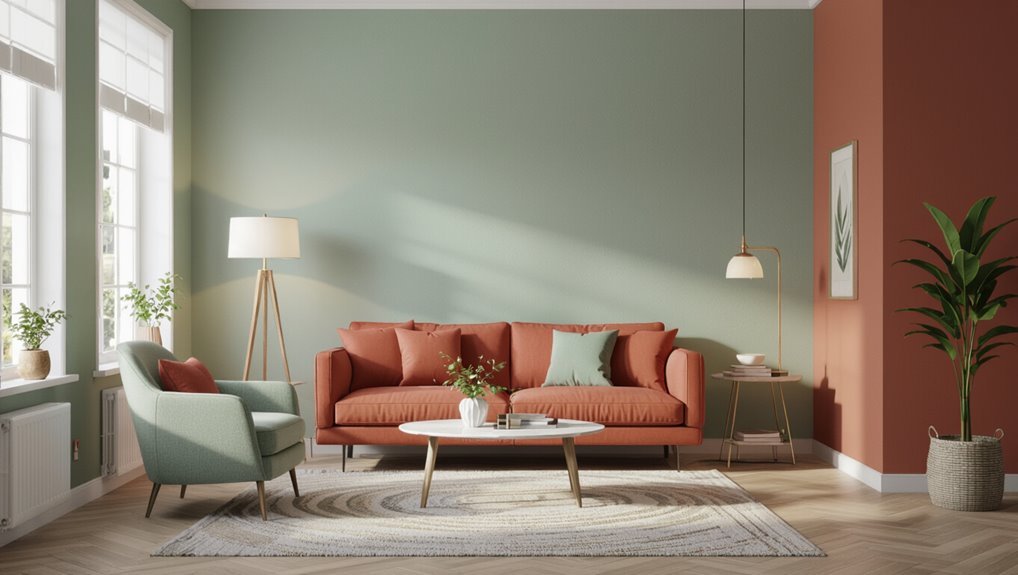
Best Paint Colors for Living Rooms to Socialize
Because your living room sets the mood for conversation and connection, pick paints that invite people in and keep them lingering.
You’ll use color associations to shape living room dynamics and boost social interactions. Choose hues for mood enhancement—warm terracotta, soft greens, or muted blues—to create vibrant atmospheres and inviting spaces.
Consider color trends and cultural influences to reflect personality without overpowering conversation.
Best Paint Colors for Kitchens and Dining Areas
Although kitchens and dining areas serve different functions, you’ll want paint that enhances appetite, conversation, and task visibility—all while reflecting your home’s style.
Pick hues that balance warmth and clarity, following kitchen color trends and boosting dining area aesthetics.
Choose colors that blend inviting warmth with bright clarity, reflecting trends while enhancing kitchen and dining aesthetics
Consider:
- Soft warm neutrals for versatility.
- Muted greens for fresh energy.
- Deep blues for cozy contrast and focus.
Small-Room Color Tricks to Feel Larger
When you want a small room to feel bigger, choose paint strategies that maximize light, depth, and continuity without overpowering the space.
You’ll use spatial perception and color illusions—light reflection on pale walls, subtle color contrast, and a lighter ceiling color.
Emphasize vertical lines, thoughtful furniture arrangement, mirror placement, visual tricks, and restrained color zoning to expand perceived space without clutter.
Large-Room Color Strategies to Feel Cozy
In a large room, you can create cozy pockets by painting warm accent zones that draw the eye and anchor seating areas.
Pair those color anchors with layered lighting—overhead dimmers, task lamps, and soft uplighting—to soften scale and add depth.
Together, warm accents and varied light make a big space feel intentionally intimate.
Warm Accent Zones
Pick one or two warm hues—like terracotta, mustard, or deep ochre—and use them as focused accents to instantly cozy up a large room.
You’ll harness warm color psychology and maximize accent zone impact by concentrating warmth in specific spots. Use:
- A fireplace wall
- A seating cluster
- Built-in shelves or a reading nook
This creates intimacy without overwhelming space.
Layered Lighting Effects
Although bright overhead lights can make a room feel cavernous, layering warm, dimmable fixtures lets you shape mood and reveal color depth so large spaces read as cozy. You’ll use layered ambiance, lighting temperature, illumination dynamics, shadow effects, color reflections, mood enhancement, space perception, emotional response, light diffusion, and visual warmth to craft intimate zones.
| Soft Lamps | Wall Washers | Accent Spots |
|---|---|---|
| Warm glow | Even color | Focused warmth |
| Subtle shadows | Broad diffusion | Reflective highlights |
Using Neutrals to Support Activity and Flexibility
When you choose neutral shades for a room, you give activities room to breathe and change without repainting. Soft grays, warm beiges, and muted whites act like a flexible backdrop that supports play, work, and rest.
Neutral palettes and versatile tones foster flexible spaces and activity zones, offering color adaptability for calming neutrals or energetic environments within functional design.
Neutral palettes and versatile tones create adaptable spaces, letting rooms shift between calm retreats and energetic hubs without repainting.
- Define zones
- Layer textures
- Add movable furniture
Accent Walls: How to Use Them Psychologically
One well-placed accent wall can change how you feel in a room by directing attention, setting mood, and defining purpose without overwhelming the space.
Use accent wall placement to create clear room focal points, balancing color contrast impact with color harmony tips.
Consider accent wall benefits, current accent wall trends, accent color psychology, and durable accent wall materials so the effect feels intentional and lasting.
Pairing Colors to Create Specific Moods
Pair colors deliberately to shape how a room feels: cool blues and soft grays calm and promote focus, while warm yellows and terracottas energize and invite conversation.
You’ll consider color harmony, color symbolism, cultural perceptions, historical contexts, and seasonal influences to tune emotional resonance and visual balance.
Use contrasting palettes to highlight features, respect spatial awareness, and honor personal preferences.
- Plan mood.
- Balance contrast.
- Respect context.
Testing Paint Samples Effectively Before Buying
After you’ve settled on the mood and palette, test paint samples on-site to see how color actually behaves in your space.
Apply paint swatches with varied application techniques on different surface textures, observing lighting conditions across day and night.
Compare color samples and color combinations, note finish types and drying times, and step back to judge true hue before buying.
Quick Color Formulas: Calm, Energize, Expand
Think of these quick color formulas as ready-made recipes you can use to calm, energize, or visually expand a room without overthinking the palette.
Use color symbolism and color therapy basics, balancing emotional resonance with design principles and personal preference.
Consider seasonal trends and cultural significance. Choose color combinations that alter spatial perception and psychological effects.
- Calm
- Energize
- Expand
How Personal Temperament and Culture Matter
Many factors shape how a color feels to you, so pick hues that reflect your temperament and cultural background rather than following trends blindly.
You should honor personal preferences and individual experiences: cultural influences, regional trends, and historical significance shape color associations and symbolic meanings.
Consider emotional connections, family dynamics, and social perceptions so your rooms feel authentic and support how you live and relate.
Avoiding Color Mistakes That Harm Comfort/Resale
If you want your rooms to feel comfortable and keep their market appeal, steer clear of extreme or overly trendy colors that limit buyers and unsettle daily living.
You should balance current color trends with timeless neutrals to protect resale value and respect buyer preferences while preserving comfort factors.
- Favor neutral bases.
- Accent sparingly.
- Test lighting first.
When to Hire a Color Consultant or Decorator
Wondering whether to bring in a color consultant or decorator? Hire one when you need expert advice on color trends, color harmony, and design principles that match your personal style and aesthetic goals.
They’ll balance client preferences with project budget, prevent costly mistakes, and translate ideas into cohesive schemes.
Call a pro if choices feel overwhelming or outcomes must meet specific resale or lifestyle needs.
Shopping Checklist: What to Note Before Buying Paint
What should you check before you buy paint? You’ll want to verify paint quality, finish, VOC levels, and sample on your wall.
Consider lighting, furniture, and current color trends, but prioritize durability and coverage.
- Test samples for true color and sheen.
- Check labels for coverage, VOCs, and drying time.
- Compare brands for price versus longevity.
Frequently Asked Questions
Can Paint Color Influence Perceived Air Quality or Odor in a Room?
Yes — you’ll perceive air quality and odor differently because color perception drives sensory association; warm hues can make smells seem stronger and cozy, while cool, pale tones often suggest freshness, so your senses will be biased.
Do Wall Colors Affect Sleep Disorders Like Insomnia or Circadian Rhythm?
You might doubt it, but yes, wall colors can matter: color psychology shapes your sleep environment, calming hues and bedroom ambiance influence emotional response and interact with light exposure, so they can help—or hinder—insomnia and circadian rhythm.
Can Paint Colors Impact Learning Outcomes in Children’s Classrooms?
Yes — color psychology can shape classroom environment and boost learning motivation; you’ll encourage focus and calm with muted blues or greens, stimulate creativity with warm accents, and support cognitive development by matching hues to activity demands.
Will Paint Color Choices Affect Pet Behavior or Stress Levels?
Yes — you’ll see effects: pet anxiety can be reduced by calming hues, since color associations influence mood; choose muted blues or greens, avoid bright reds or high-contrast patterns, and pair color with stable routines and enrichment.
How Do Evolving Trends Influence Long-Term Resale Value of Colors?
Trends don’t guarantee value, but you’ll find evidence that color psychology and resale trends shape market preferences; buyers’ emotional responses can boost or hurt resale, so you’ll favor timeless neutrals while tracking evolving popular shades.
Conclusion
You’ve learned how color, light, undertones, temperament and culture all shape a room’s feel — and you’ll pick what suits you. By coincidence, the exact shade you choose might echo a memory, mood or moment you didn’t expect, turning paint into more than decoration. Trust your instincts, test swatches in different light, and remember: the right color won’t just match your furniture — it can quietly match the life you want to live.