What Color Should I Paint My Home Exterior? Guide
Pick a color that flatters your architecture, fits the neighborhood, and suits your climate, then test large swatches on all sides at different times of day. Consider roof, trim, stone or brick undertones, and how landscaping will seasonally shift the look. Neutrals are safe for resale, bolds add curb appeal, and pastels soften cottage styles; choose durable, UV-resistant finishes and plan maintenance. Keep going to see palettes, combos, and step-by-step sample testing tips.
Quick Decision Checklist for House Color
Before you pick a paint chip, run through a quick checklist: note your roof, trim, and landscaping colors; consider your neighborhood’s style and any HOA rules; decide whether you want your home to blend in or stand out; test samples on all sides and view them at different times of day; and choose a finish that’s durable for your climate.
Before choosing a paint chip, check roof, trim, landscaping, neighborhood rules, test samples, and pick a climate-ready finish.
You’ll weigh color psychology to set mood—calming neutrals or energetic accents—and track seasonal trends so choices won’t feel dated.
Prioritize contrast for trim, factor in light direction, and sample large swatches.
Make a decision based on coherence, maintenance, and curb appeal.
Match Choices to Your Architecture
When you match paint to your home’s architectural style, aim for colors that reinforce its defining lines and historical intent rather than obscure them. You’ll respect historic styles by choosing palettes common to the era—soft neutrals for Craftsman, muted blues for Colonial—and use contrast to highlight trim and moldings. Consider scale, roof color, and materials so elements read clearly. Prioritize architectural harmony: let details pop or recede deliberately. Use the table below to compare approaches.
| Style | Typical Palette | Highlight Tips |
|---|---|---|
| Craftsman | Earthy | Contrasting trim |
| Colonial | Muted blues/whites | White trim |
| Victorian | Jewel tones | Accents on trim |
| Modern | Monochrome | Minimal contrast |
Read Colors Under Different Lighting
Check your paint samples in the morning when cool, angled light can make colors look softer and bluer.
Inspect them again at midday to see their truest tones under bright, neutral light.
Finally, review samples in the evening when warm, low-angle light can deepen and warm the hue.
Morning Light Effects
Because morning light brings cooler, bluer tones, your exterior paint can look noticeably different at dawn than it does later in the day. You’ll notice morning reflections soften warm hues and enhance cool ones; pay attention to light variations on walls, trim, and landscaping. Test samples at sunrise for accurate perception. Consider muted warm tones if you want balance, or embrace cool grays and blues to harmonize with early light. Observe how textures catch low-angle rays so you can choose finishes that hide imperfections. Use the quick reference below to anticipate effects while planning color choices.
| Element | Morning Effect |
|---|---|
| Warm paint | Appears muted |
| Cool paint | Intensified |
| Trim | Crisp contrast |
| Texture | Emphasized |
Midday True Colors
How do colors really look in the middle of the day? Midday light is the most neutral, revealing your paint’s true hue without warm sunrise or cool dusk shifts. You’ll see saturation and contrast clearly: whites feel crisp, grays read steady, and blues pop with clarity.
Check samples on all elevations—north, south, east, west—because reflections and shade still alter perception. Stand back, view from the street, and photograph at noon to compare.
If a color reads flat or overly intense, tweak undertones or sheens. Use midday observations to make final, confident exterior color choices.
Evening Warm Tones
When evening light hits your house, it wraps colors in a golden, warming filter that can soften contrasts and deepen pigments. You’ll notice sunset hues glow, making warm neutrals, terracottas, and muted reds feel richer. Choose tones that create a cozy ambiance without overpowering details; trim and accents can pop softly. Test samples late afternoon through dusk to see undertones shift. Use warmer whites or pale creams for balance. Consider contrast level: too much can read harsh, too little flattens form. Below is a quick guide to compare effects.
| Color family | Evening effect |
|---|---|
| Warm neutral | Embraces glow |
| Terracotta | Intensifies depth |
| Muted red | Warms edges |
| Pale cream | Softens contrast |
Coordinate Color With Landscaping and Neighborhood
If your landscaping and neighborhood feel like extensions of your home, pick exterior colors that create a smooth connection between them.
Look at dominant plant tones, hardscapes, and nearby homes to achieve landscape harmony and neighborhood cohesion. Use accent trims to echo foliage hues or stonework so connections feel intentional.
Consider dominant plant tones, hardscapes, and neighboring homes—echo foliage or stone with trim to create intentional cohesion.
Consider seasonal color shifts—evergreens versus flowering beds—and how light changes tones through the day. Match finish sheens to surroundings: matte for natural settings, subtle gloss for urban areas.
Walk the block, photograph plants at different times, and test samples on multiple walls before committing.
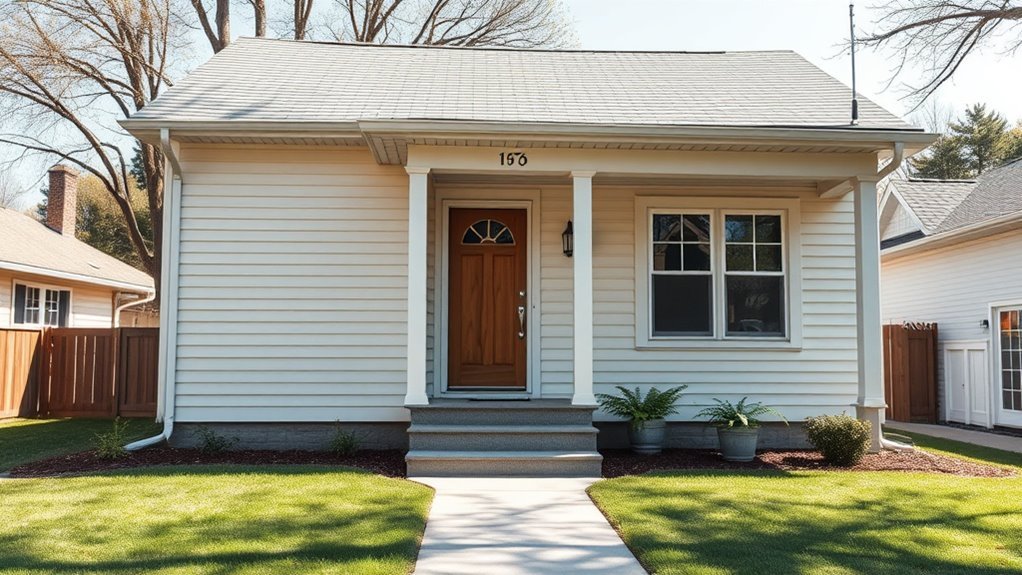
Choose a Main House Color (Neutral, Bold, Pastel)
Start with a neutral base if you want a timeless, low-maintenance backdrop that lets trim and landscaping stand out.
If you’re feeling adventurous, a bold hue can make your home pop, while pastels create a softer, more whimsical look.
Think about curb appeal, maintenance, and how each option fits your neighborhood before committing.
Neutral Base Benefits
Although bold hues grab attention, choosing a neutral base gives you a flexible foundation that makes styling, resale, and curb appeal easier to manage.
You’ll benefit from neutral color psychology: calm, approachable tones make buyers and visitors feel welcome and relaxed.
A neutral exterior creates a backdrop that highlights architectural details, landscaping, and hardware without competing for attention. It supports timeless design, so your home won’t feel dated after trends shift.
You can update accents, doors, or trim seasonally or for staging without repainting the whole house. Overall, a neutral base reduces risk and simplifies future changes.
Bold Or Pastel?
Wondering whether to go bold or pastel for your main house color? You’ll weigh bold statements against pastel serenity.
If you want curb appeal that stops traffic, pick saturated hues that highlight architectural features and trim. If you prefer calm and cohesive, choose soft, muted tones that blend with landscaping and sunlight.
Consider neighborhood context, resale value, and maintenance—intense pigments may fade faster and need touch-ups, while pastels hide dirt but can look washed out in flat light.
Test large swatches on different days, picture them at dusk, and trust your emotional reaction to the color.
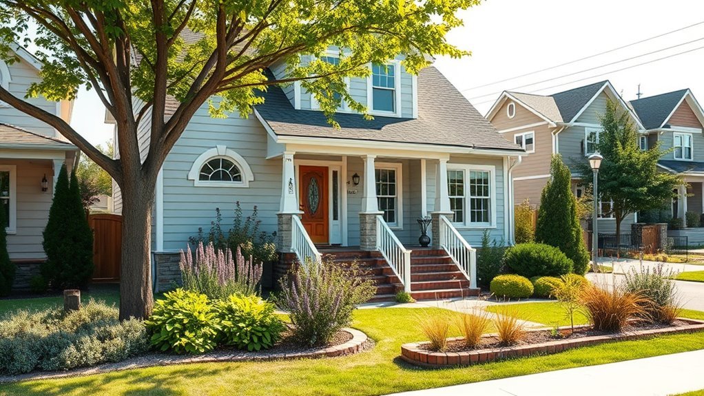
Pick Trim Colors for Eaves and Siding
Which parts of your roofline and walls get the most attention? You’ll guide viewers’ eyes by choosing trim that balances color harmony with striking trim contrast where needed.
Think about edges, eaves, and siding seams as framing elements.
- Use a lighter trim to lift dark siding or a darker trim to ground pale siding.
- Match trim undertones to main colors for seamless shifts.
- Reserve bold contrast for architectural details you want highlighted.
Test swatches in sunlight, consider maintenance, and keep proportions in mind so eaves and siding read as intentional, cohesive parts of your home’s exterior.
Select Accent Colors for Doors and Shutters
Ready to make your front door and shutters pop? Choose accents that reflect door color psychology—bold reds signal welcome, blues suggest calm, yellows feel cheerful. Match tones to your home’s personality and neighborhood. Consider shutter style trends: slim farmhouse, louvered colonial, or modern panels, and pick finishes accordingly. Use contrast for visibility or harmony for subtlety. Below’s a quick comparison to guide choices.
| Door Impact | Shutter Style | Suggested Accent |
|---|---|---|
| Energetic | Louvered | Red |
| Calm | Panel | Blue |
| Warm | Farmhouse | Yellow |
| Neutral | Modern | Charcoal |
Color Rules for Brick, Stone, Wood, Stucco
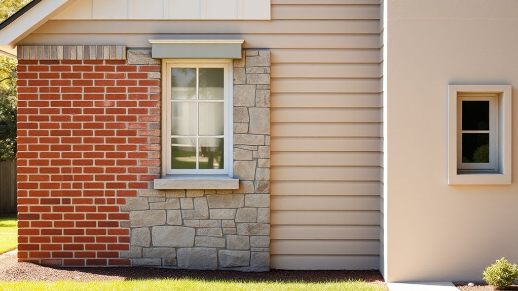
When you’re working with brick, pick paint tones that complement its existing reds, browns, or creams so the masonry stays grounded.
For natural stone, choose colors that enhance the stone’s undertones rather than compete with them.
Match wood and trim colors to their grain and finish so painted elements feel cohesive, not tacked on.
Complement Existing Brick Tones
Start by reading the undertones in your brick—reds can lean toward warm orange or cool brown, and greys may carry blue or green hints. You’ll pick a paint that creates color harmony while honoring masonry texture contrast.
Test swatches at different times of day, and keep mortar color in mind.
- Pair warm bricks with muted tans, deep olives, or rich charcoals for balanced warmth.
- Cool-toned brick works with soft blues, crisp whites, or slate greys to reinforce coolness.
- Use trim in a contrasting neutral to define edges without overpowering the brick.
Always test small areas before committing.
Enhance Natural Stone Palette
Although natural stone brings rich texture and varied tones, you can amplify its character by choosing paints that echo its dominant hues and subtle undertones. You’ll pick a palette that respects stone texture and creates color harmony across walls, trim, and accents. Lean toward muted shades that let veining sing, or choose a bold contrast for modern drama. Test swatches in different light, then commit to a unifying undertone—warm, cool, or neutral. Use finishes that complement rough surfaces and protect masonry. Let the stone guide mood, temp, and contrast so your exterior feels intentional.
| Warm | Neutral | Cool |
|---|---|---|
| Cozy | Balanced | Calm |
| Earthy | Timeless | Fresh |
Match Wood And Trim
Pick trim and wood tones that tie the exterior materials together so your home reads as a single, intentional composition. You want color harmony between siding, trim, and exposed wood; choose trims that pick up subtle undertones in wood textures to unify brick, stone, or stucco.
Balance contrast so trim frames without competing. Consider stain vs. paint for natural grain.
- Match undertones: warm woods with warm trim, cool woods with cool trim.
- Use samples outdoors to check light and adjacent materials.
- Prioritize durability: select finishes that protect wood and keep colors true over time.
Test Exterior Paint Samples Correctly
How will the color look on your house at different times of day? You should test paint directly on exterior surfaces, not just swatches.
Buy multiple sample sizes—small cans and larger quart samples—to cover enough area for a true sense. Paint 2–3 square-foot patches in sun, shade, and near trim so you’ll see how sunlight, shadows, and adjacent colors alter appearance.
Observe patches morning, midday, and evening over several days. Take photos from a distance and up close.
Remove samples only after you’ve compared them in varying light. This prevents surprises and helps you choose confidently.
Budget, Climate, Maintenance, and Fading
When you choose an exterior paint, factor in your budget, local climate, and the maintenance you’re willing to do, because those decisions affect color longevity and overall cost.
You’ll balance color psychology with practical needs: lighter hues resist heat, darker tones may fade faster, and high-UV areas demand durable formulas. Consider maintenance frequency and how seasonal changes influence fading and grime.
- Choose durable, slightly higher-cost paints in sunny or coastal climates.
- Plan for touch-ups if you pick vibrant or dark colors prone to fading.
- Factor repaint intervals into your long-term budget for consistent appearance.
How Color Affects Curb Appeal and Resale
Because your home’s exterior is the first thing buyers and neighbors notice, color choices directly shape curb appeal and perceived value. The right palette can make a property feel well-maintained, modern, or historically appropriate, while the wrong one can deter interest or lower offers.
You should use color psychology to evoke warmth, trust, or sophistication—neutral grays, soft whites, and muted blues appeal broadly.
Study neighborhood trends to guarantee your home fits the street while still standing out positively. Consistency with trim, accents, and landscaping boosts perceived quality.
Smart, restrained choices help you attract buyers and protect resale value.
Quick Palette Combos and Examples
If you want quick, reliable combos that look intentional, start with a primary body color, a crisp trim, and one accent hue for doors or shutters.
Pick combinations that match color trends but still suit your home’s era and neighborhood. Consider seasonal palettes to shift accents—warm brass for fall, cool teal for summer.
Try these simple sets:
- Soft gray body, bright white trim, navy door for classic contrast.
- Cream body, charcoal trim, red door for bold curb appeal.
- Olive body, cream trim, mustard door for modern warmth.
Test swatches in different light before committing.
Frequently Asked Questions
How Do Historic District Regulations Affect Exterior Paint Choices?
Historic district regulations limit your paint choices: you’ll need approval from preservation boards, follow approved color palette guidelines, and prioritize historic preservation principles; you’ll coordinate submissions, samples, and sometimes revert to period-appropriate hues.
Can I Change Color After HOA Approval Is Denied?
Once denied, you can’t repaint without approval; think of a neighbor who tried a bold teal and learned consequences. Explore alternative color options, file an appeal, and follow the HOA’s appeal process to gain permission legally.
What Paint Finishes Resist Mold in Humid Areas?
Use mold resistant paints with satin, semi-gloss, or gloss finishes; they shed moisture and resist mildew. You’ll prioritize humidity considerations, guarantee proper ventilation, and apply a quality primer to help coatings last in damp climates.
How to Match Colors for Future Home Additions?
You should sample paint on-site, use color theory to balance hue, value, and saturation, and respect your architectural style; you’ll photograph samples in different light, test adjacent trims, and pick tones that complement existing materials.
Are There Eco-Friendly Exterior Paint Options?
Yes — you can pick eco-friendly paints; don’t worry, they won’t compost your siding. You’ll enjoy sustainability benefits like low VOCs and recycled pigments, and color psychology still works, so choose hues that boost mood and curb appeal.
Conclusion
Picking the right exterior color ties everything together—architecture, light, landscaping, budget—and can boost curb appeal fast. Did you know homes with well-chosen, contrasting trim can sell for about 1–3% more? So test samples in different light, favor durable finishes for your climate, and pick a main hue that complements your neighborhood while showing your style. Trust your instincts, but confirm with swatches before you commit.