
How to Choose the Right Color to Paint Your Interior Walls
Choose a color by matching the room’s function, natural light, and finish to your mood and lifestyle. Pick calming neutrals or soft blues for bedrooms, energizing hues for home offices, and durable, washable sheens for high-traffic areas. Test large swatches at different times to spot undertones and sheen effects. Build a three-color palette—dominant, mid-tone, accent—and coordinate it with floors and finishes. Keep samples and notes so you can refine choices as you go and learn practical next steps.
Who This Guide Helps and the Decision You’ll Make
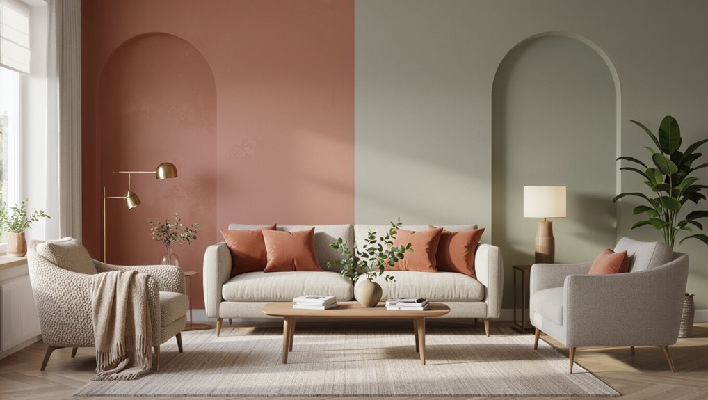
Whether you’re painting a single room or updating your whole home, this guide helps you pick interior wall colors that match your style, lighting, and budget.
You’ll learn basics of color psychology, practical sampling, and balancing trends with personal preference.
You’ll decide on a palette that supports daily life, complements furnishings, and feels right—without overcomplicating the process or wasting time and money.
Match Paint to Room Function
Because each room has a purpose, pick paint colors that support how you’ll use the space: calming neutrals or soft blues for bedrooms, energizing or clear hues for home offices, and durable, forgiving tones for high-traffic areas like hallways and kitchens.
Consider room purpose and basic color psychology to guide choices that boost rest, focus, or resilience; test samples in real light before committing.
Set Mood: Color Temperature Basics
When you pick a paint’s temperature—warm or cool—you shape how a room feels: warm tones (reds, oranges, warm yellows) make spaces cozier and more intimate, while cool tones (blues, greens, cool grays) create calm, airy environments.
- Use warm hues for social, inviting spaces.
- Choose cool hues for focus and relaxation.
- Balance temperature to control color psychology and emotional impact.
Size and Paint Color: Make Rooms Feel Bigger or Cozier
Although paint can’t change a room’s footprint, the colors you choose can visually expand or cozy up a space, so think strategically about hue, value, and contrast.
Use light, low-contrast palettes to enhance spatial perception and make small rooms feel airy.
Darker, warmer hues with higher contrast bring intimacy.
Color psychology guides whether you want openness or snug comfort.
Natural Light: How It Changes Paint Color Perception
Pay attention to when your room gets the most light, because morning and evening sun can make the same paint look warmer or cooler.
Also note which direction your windows face—south and west light tends to be strong and golden, while north light stays cooler and more consistent.
Test paint swatches at different times of day to see how the color shifts.
Morning vs. Evening Light
Morning and evening light shift the way paint reads on your walls, turning warm tones richer at sunrise and cooling them toward dusk.
You’ll notice morning reflections brighten cool hues and evening warmth deepens ambers.
Check colors at both times, and trust your eye.
- Observe at sunrise
- Recheck at dusk
- Choose the tone you prefer
Window Direction Effects
Which way do your windows face will shape how paint looks throughout the day.
You’ll notice window orientation impact color warmth and saturation: south-facing rooms feel brighter and warmer, north-facing stay cooler and bluer.
East brings crisp morning light; west offers golden evenings.
Consider light quality variations when sampling paint—test swatches at different times to see true color before committing.
Ceiling Height: Paint Choices That Lift or Lower a Room
If your ceilings are low, choose light, airy shades on both walls and ceiling to make the space feel taller.
For high ceilings, use darker or richer colors on the upper walls to emphasize depth and create cozy proportions.
You can also paint the ceiling a slightly lighter or darker tone than the walls to fine-tune the perceived height.
Low Ceilings? Go Light
When a room feels cramped because of low ceilings, choosing light, cool paint colors will visually lift the space and make it feel airier.
You’ll use light color psychology and consider ceiling height impact to plan tones that expand sightlines.
Try:
- Soft whites and pale blues to reflect light
- Muted greens for calm openness
- Light warm neutrals to keep warmth without heaviness
High Ceilings? Emphasize Depth
Low ceilings benefit from light, airy hues, but tall rooms let you play with depth and drama in ways low rooms can’t.
With high ceilings, you can use richer wall colors and darker ceilings to alter depth perception.
Introduce strong color contrast between upper and lower walls, or create an accent band to visually lower height and draw the eye, giving balance and intimacy.
Read Paint Swatches Correctly
How do you make sure a swatch really shows the color you’ll live with? Use smart reading techniques and focused swatch comparisons to avoid surprises.
Test large samples on different walls, observe them at several times of day, and view next to trim and furniture.
- Tape samples in multiple spots
- Check morning, noon, evening light
- Compare swatches side‑by‑side
Spot Undertones: Make Neutrals Read Warm or Cool
Because neutrals look different next to other colors, you’ve got to hunt for their undertones to make them read warm or cool.
Test swatches against wood, textiles, and lighting to see neutral color psychology in action.
Use warm undertone identification by comparing to yellow or red accents; use cool undertone contrast against blues or grays.
Apply color harmony principles to finalize your choice.
How Finish (Sheen) Alters Color Appearance
Think about how sheen changes a color: matte soaks up light and mutes contrast while gloss bounces light and sharpens edges.
You’ll notice high-sheen finishes highlight imperfections but stand up better to scrubbing and touch-ups.
Match sheen to the room’s light, traffic, and how much contrast you want.
Matte vs. Gloss Contrast
Finish matters: the same paint color can look dramatically different depending on whether you choose matte or glossy sheen.
You’ll decide mood and emphasis by mixing sheens for visual impact and texture contrast.
Consider uses:
- matte finish for subtle, forgiving walls
- gloss finish to highlight trim or focal areas
- combine both to guide attention and add depth
Light Reflection Effects
When light hits a wall, the paint’s sheen decides how much it bounces back, so the same pigment can read lighter, darker, or more saturated depending on gloss level.
You’ll notice high-gloss amps color and highlights imperfections, especially near reflective surfaces, while eggshell or satin tame glare.
Match sheen to room function and light temperature to keep tones consistent and intentional.
Durability And Touch-Ups
Sheen doesn’t just affect how color reads; it also changes how the surface wears and how easy repairs will be, so pick a sheen with both appearance and longevity in mind.
You’ll balance color longevity with touch-up ease; higher sheen scrubs better but shows flaws.
maintenance tips:
- Flat: hides flaws, harder to clean.
- Eggshell/satin: good balance, easier touch-ups.
- Semi-gloss: durable, shows imperfections.
How to Test Paint With Sample Patches (Best Practice)
Wondering whether that paint will look the same on your wall as it does on the chip?
Test with multiple sample patch techniques: roll and brush a few 12×12″ patches near corners and focal areas.
Let coats dry fully, then assess under your usual lighting.
Use straightforward color comparison tips—compare adjacent patches and observe against furnishings—to pick the truest match.
When and How to Test at Different Times of Day
Test your sample patches in the morning to see how cool, fresh light affects the color.
Recheck the same spots in the evening to observe warmer, golden tones and any shifts.
Comparing morning and evening views helps you pick a color that works throughout the day.
Test Morning Light
How does your paint look in the cool, early hours? You’ll notice morning light effects clearly—observe shifts and color temperature influence on swatches.
Test like this:
- Place large samples on different walls to see real contrast.
- Check at sunrise and mid-morning to note subtle shifts.
- Photograph samples for comparison, then live with them for a few mornings before deciding.
Check Evening Glow
Curious how your walls behave as daylight fades? Go back at dusk and under artificial lights to see evening ambiance shift.
Move samples to different walls, note changes in color perception, and photograph them under warm bulbs. Decide if the hue feels cozy or washed out.
Repeat on cloudy evenings and with lamps to confirm the color suits nightly moods.
Sampling Mistakes to Avoid
When you grab a few paint chips and assume they’ll look the same on your wall, you’re setting yourself up for disappointment—small samples can read completely differently once they’re up close, under real light, and across a larger surface.
Don’t trust tiny chips—colors shift when scaled up, seen close, or lit differently on your wall.
You should test bigger swatches, consider color psychology, and practice reliable sampling techniques:
- Paint 2×2 foot samples
- View at different times
- Assess beside furniture and trim
Build a Three-Color Palette for One Room
Now that you’ve tested large samples and seen how color behaves in the room, it’s time to assemble a balanced three-color palette that’ll guide every choice from walls to accents.
Use color theory to pick a dominant hue, a supporting mid-tone, and an accent.
Balance complementary shades for visual harmony, consider personal preferences, cultural meanings, and seasonal trends to guarantee the scheme feels right and lasting.
Layer Decisions: Walls, Trim, and Ceiling Explained
Although walls get most of the attention, your trim and ceiling play equal roles in shaping the room’s feel, so decide their colors with purpose: pick the dominant hue for the walls, a subtler mid-tone for trim to frame architectural details, and a lighter or contrasting ceiling shade to control perceived height and brightness.
- Use color theory and design principles for harmony and visual balance.
- Consider paint psychology, texture impact, and color symbolism.
- Respect cultural associations while keeping functional contrast.
Choose Trim Paint Color That Complements Walls
When you pick trim, focus on matching undertones rather than exact shades so the colors read cohesive in any light.
Consider the paint finish—trim often uses a glossier sheen for durability and contrast.
Use subtle contrast to define edges without overpowering the wall color.
Match Undertones, Not Shades
Because paint shades can look different depending on light, focus on matching undertones rather than exact shades when choosing trim color.
You’ll create color harmony and use complementary tones for a cohesive look. Test samples in room light, then pick the undertone that sings with your wall.
- View at different times
- Compare against white and warm swatches
- Trust subtle undertones
Consider Finish And Contrast
Matching undertones gets your colors singing together, but finish and contrast determine how that duet reads in the room. You’ll use color theory to decide whether trim should pop or recede; consider finish types—matte walls with semi-gloss trim reflects differently. Test swatches in light, then choose contrast level that suits scale and mood.
| Element | Option A | Option B |
|---|---|---|
| Wall finish | Matte | Eggshell |
| Trim finish | Semi-gloss | Gloss |
| Contrast | Low | High |
Pick a Ceiling Color to Contrast or Blend
1 smart ceiling choice can lift a room’s style: decide whether you want the ceiling to blend in and recede or contrast and draw the eye, and pick a finish that supports that goal.
Use ceiling contrast or blending techniques to steer mood.
Consider:
- Light, matte white to recede
- Soft tint to unify
- Bold hue to highlight architectural lines
Accent Walls: When Bold Works and When It Backfires
A bold accent wall can anchor a seating area, add depth to a narrow room, or highlight architectural features when you balance it with lighter surroundings.
But if you use an intense color on every visible wall or in a small, poorly lit space, it can quickly feel oppressive.
Think about scale, light, and the room’s purpose before committing to a dramatic shade.
When Bold Enhances Space
Bold accent walls can transform a room when you choose placement, color, and contrast with intention—used sparingly they draw the eye, define function, and add depth; used poorly they can overwhelm, shrink space, or clash with fixtures.
You’ll use bold accents and color psychology to expand or focus areas. Consider:
- Anchor a seating area with a rich hue
- Highlight architectural recesses
- Paint a far wall darker to add depth
When Bold Overwhelms Room
You can make a bold wall sing—or overwhelm the whole room if you’re not careful.
Choose contrast, scale, and placement deliberately to avoid bold color pitfalls. Test swatches in different light, limit saturated tones to one focal wall, and balance with neutral furnishings.
If the hue creates overwhelming aesthetics or visual tension, dial back saturation or switch to a subtler shade for harmony.
Saturation and Energy: How Vivid Colors Affect Space
When you choose vivid, highly saturated paint, the room instantly feels more energetic and focused, because intense hues grab attention and amplify visual activity.
You’ll notice vivid colors shift energy levels and alter space perception through color psychology and visual impact.
- Expect stronger emotional response and heightened mood.
- Balance bold choices with color harmony.
- Use accents to control intensity and maintain comfort.
Coordinate Paint With Flooring Types
Look at your flooring’s undertones and choose paint that complements them so the room feels cohesive.
You can also use contrasting wall colors to create visual depth and highlight architectural features. Aim for a balanced contrast that enhances the floor rather than clashes with it.
Match Undertones With Flooring
Although paint often grabs the spotlight, matching undertones with your flooring makes the whole room read as intentional rather than accidental.
You’ll check how wood, tile, and carpet undertones relate, ensuring color compatibility across flooring materials so hues feel cohesive.
Try these quick steps:
- Compare warm vs. cool undertones directly.
- Test swatches beside flooring in different light.
- Choose neutrals to bridge tones.
Contrast For Visual Depth
Use contrast to give your rooms depth by pairing paint tones that highlight your flooring’s texture and color rather than blending into it.
You’ll create visual interest by layering mid and light wall hues against dark floors, or vice versa, employing color layering to build dimension.
Add strategic accent contrasts on trim or a feature wall to define spaces and draw attention to architectural details.
Match Paint to Leather, Wood, and Metal Finishes
When you’re coordinating paint with leather, wood, and metal finishes, think about the dominant undertone and texture each material brings to a room; they’ll guide whether you choose a complementary hue, a contrast, or a neutral backdrop.
- Match leather tones to warm or cool walls for color harmony.
- Use paint to accentuate wood finishes and create texture contrast.
- Let metal accents dictate subtle undertones for style cohesion.
Kid- and Pet-Friendly Paint Color Strategies
When you’re choosing colors for a home with kids or pets, prioritize durable, washable finishes that stand up to scuffs and spills.
Pick non-toxic, low-odor paints to protect little lungs and curious noses while keeping drying time and fumes minimal.
Combining practical sheens with safer formulations lets you pick stylish colors without sacrificing health or easy maintenance.
Durable, Washable Finishes
Durable, washable finishes help your walls stand up to fingerprints, scuffs, and pet hair without sacrificing color or sheen.
You’ll choose durable finishes and washable paints that make cleaning easy and preserve tones.
Consider these practical tips:
- Pick satin or semi-gloss for high-traffic areas.
- Test patches for stain release.
- Use washable paints on trim and lower walls for longevity.
Non-Toxic, Low-Odor Options
Besides picking finishes that stand up to wear, you’ll want paints that keep your home healthy and comfortable—especially with kids and pets underfoot.
Choose low-VOC or zero-VOC formulas and look for certified eco friendly options to reduce fumes. Test small areas for odor and durability, ventilate during application, and prioritize brands with clear paint safety labels so you protect family health without sacrificing color.
Durable Finishes for High-Traffic Zones
Because high-traffic areas get more bumps, scuffs, and spills, you’ll want finishes that stand up to daily wear without sacrificing look.
High-traffic areas need durable finishes that resist bumps, scuffs, and spills while still looking great.
Consider these durability factors and finish recommendations to balance toughness and style:
- Satin for easy cleaning and subtle sheen
- Semi-gloss for moisture-prone spots and scrubbability
- Eggshell for moderate traffic where texture hides imperfections
Choose forgiving colors to mask wear.
Primer: When You Need It and What to Use
Primer matters when you want even coverage, better adhesion, or to block stains—use it whenever you’re painting over raw drywall, glossy surfaces, drastic color changes, or areas with smoke/tannin stains.
Choose from primer types like latex, oil-based, and stain-blocking formulas. You’ll get primer benefits: improved topcoat performance, fewer coats, and stain sealing.
Apply per instructions for best results.
Estimate How Much Paint and Supplies You’ll Need
Now that your walls are prepped and primed where needed, you’ll want to figure out exactly how much paint and what supplies to buy so you don’t run out mid-job or waste money on excess.
Use a paint calculator and make a supply checklist, then:
- Measure wall area and note coats needed
- Calculate gallons with coverage per can
- List rollers, brushes, tape, drop cloths
Plan a Realistic Budget for Paint and Tools
Now that you know roughly how much paint you’ll need, set a clear budget that covers cans plus extras for touch-ups.
Don’t forget to factor in tools and supplies like rollers, brushes, tape, and drop cloths. Allocating a bit extra will keep surprises from blowing past your budget.
Estimate Paint Quantity
Before you buy a single gallon, calculate how much paint and which tools you’ll really need so your budget stays accurate and waste is minimized.
Measure walls, subtract windows/doors, then use coverage rates. Compare paint types and color charts to pick finish and coats. Estimate extras for primer and touch-ups.
- Measure surface area
- Check coverage per can
- Add 10% contingency
Account For Tools & Supplies
Start by listing every tool and supply you’ll need so you can build a realistic budget instead of guessing at costs.
Include paint tools and supply essentials: rollers, brushes, trays, drop cloths, tape, and safety gear.
Factor color samples, testing methods, different paint finishes, mixing techniques, and cleanup supplies.
Tally costs into your project budget to avoid surprises.
Read Paint Labels and VOC Information Safely
When you pick up a paint can, read the label carefully so you know what’s inside and how it affects your health and indoor air quality.
Check for paint safety notes and VOC regulations; they guide ventilation and cleanup.
Look for low-VOC or zero-VOC claims, proper PPE, and disposal instructions.
- Ventilation tips
- PPE recommendations
- VOC limits and certification
Shop Paint Samples: Compare Brands and Swatches
After checking labels and VOC info, you’ll want to shop samples so you can compare how colors and finishes actually look in your space.
Test multiple swatches on different walls and observe at various times of day. Focus on sample selection that reflects your light and furniture.
Do a brand comparison for coverage, sheen, and true-to-chip accuracy before committing to a full can.
How to Document Final Colors for Future Reference
Keep a clear record of the exact colors, finishes, and application details so you (or future owners) can match them later.
Keep a clear record of exact colors, finishes, and application details so future matching is effortless.
Use concise color documentation for future reference and keep it with your home files.
Include:
- Brand, color name/number, and finish.
- Photos of painted walls in natural light.
- Date, room, and applicator notes (primer, coats, techniques).
How Trends Should (and Shouldn’t) Influence Your Choice
Trends can spark good ideas, but you should treat them as inspiration—not strict rules—so pick colors that suit your lifestyle, architecture, and the room’s light. Use trendy palettes sparingly; test samples. Favor timeless choices for main walls and accents for updates. Balance trend and permanence to avoid frequent repainting.
| Tip | Action |
|---|---|
| Sample | Try swatches |
| Accent | Use bold |
| Main | Choose neutrals |
| Refresh | Swap decor |
| Longevity | Prioritize quality |
Factor Long-Term Resale When Picking Paint Colors
While you want rooms to reflect your taste, remember buyers often prefer neutral, broadly appealing palettes—so choose colors that make spaces feel light, spacious, and versatile.
You’ll protect resale value by favoring timeless palettes and modest accents.
Consider:
- Soft neutrals to widen appeal
- Accent walls sparingly for personality
- Consistent tones throughout for cohesion and easy staging
Choose Colors for Open-Plan Living Areas
Open-plan spaces need a cohesive color strategy that ties living, dining, and kitchen areas together while letting each zone keep its own character.
You’ll aim for open plan harmony by selecting a unifying base color, then vary accents, textures, and finishes to define zones.
Maintain deliberate color flow so sightlines feel intentional, balancing contrast and continuity without abrupt breaks.
Transition Color Between Connected Rooms
How do you make color feel intentional as it moves from room to room?
You guide color flow with simple choices that create room harmony and clear connections. Use a consistent undertone, pick a neutral pivot, or introduce a shared accent to link spaces.
- Match undertones across rooms
- Use a neutral linking wall
- Repeat an accent color subtly
When to Hire a Color Consultant: And What They Do
Wondering whether to bring in a color consultant? You should hire one when choices overwhelm you, when color psychology matters for mood, or when color harmony between rooms matters. They assess light, sample palettes, and recommend finishes so you avoid costly mistakes.
| Service | Benefit |
|---|---|
| Assessment | Tailored palette |
| Sampling | Real-light tests |
| Harmony planning | Flow between rooms |
| Finish advice | Durable choices |
Troubleshoot Common Post-Paint Color Regrets
Ever painted a room only to feel let down once the light hits it? You can address color remorse with practical steps that respect color psychology and emotional impact.
Ever painted a room and felt let down when the light revealed something else? Take small, practical steps.
Try these quick fixes and repaint strategies to restore visual balance:
- Sample small sections to test tones and moods.
- Adjust trim or accent walls to shift perception.
- Use neutral overlays or partial repaints to soften intensity.
Freshen Color With Accessories and Lighting
If repainting feels like too big a step, you can refresh a room’s color without touching the walls by swapping accessories and fine-tuning lighting.
Use color psychology to choose accents that boost mood—warm throws for energy, cool pillows for calm.
Coordinate metals, textiles, and art for accessory harmony.
Adjust bulb warmth, brightness, and lamps to reveal tones you want and conceal ones you don’t.
Start Painting With Confidence
1 clear rule: prep beats panic. You’ll plan, test, and protect surfaces so color psychology and personal style shine without stress.
Follow steps, work steadily, and trust your instincts.
- Tape edges and cover floors
- Test swatches under real light
- Use quality tools and steady strokes
Start painting confidently; your room will reflect intent and calm.
Frequently Asked Questions
Will Paint Color Affect Indoor Wi‑Fi or Smart Device Performance?
No, paint color won’t affect Wi Fi frequency or smart device performance considerably; pigments don’t cause signal interference. You’ll still consider color psychology and room ambiance for comfort, not for altering wireless connectivity.
Can Paint Color Choices Influence Allergy or Respiratory Symptoms?
Yes: colors won’t directly cause allergies, but color psychology shapes choices, and paint finishes, VOCs, and dust-hiding hues can influence allergy triggers; pick low‑VOC paints, washable finishes, and lighter tones to reduce irritant buildup.
How Do Exterior Wall Colors Impact Interior Color Perception?
Exterior colors influence interior color perception by shaping mood and expectations through exterior color psychology, and they affect how natural light influence interior hues—warm exteriors boost perceived warmth inside, while cool exteriors can make interiors feel cooler.
Are There Eco-Friendly Paints That Change Color Over Time?
Yes — you can find eco friendly options that use color changing technology, like thermochromic or photochromic, low-VOC formulations. You’ll want certifications and durability checks, and you’ll test samples to confirm performance and finish.
Can Paint Color Affect HVAC Efficiency or Thermal Comfort?
Like a blanket, paint affects comfort: yes, color temperature and light reflection influence thermal comfort and HVAC load. You’ll notice lighter, cooler tones reflect heat and reduce cooling demand, while darker hues absorb warmth and raise it.
