What Color to Paint Walls When You Have Hardwood Floors
With hardwood floors anchoring your room, pick wall colors that either echo the wood’s undertone for a seamless look or contrast it with light neutrals, soft blues, or muted greens to brighten and balance the space. Warm woods pair nicely with creams, warm grays, and earthy greens, while cool-toned floors suit crisp whites and pale blues. Test samples in your light and consider sheen and trim for cohesion; keep going and you’ll find tailored options and room-by-room tips.
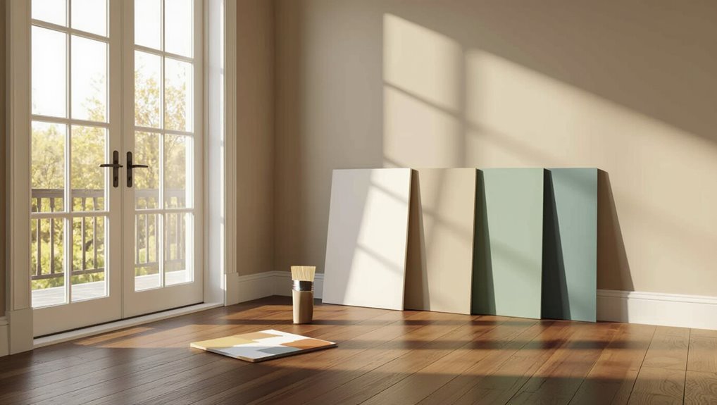
Quick Answer Best Wall Colors for Hardwood Floors
If you want a fail-safe look, go with warm neutrals—think soft beige, greige, or creamy off-white—which complement most hardwood tones and make your rooms feel cohesive and bright.
You’ll also consider cool grays for modern vibes, pale blues for contrast, and muted greens for warmth.
When deciding what color to paint walls with hardwood floors, pick tones that echo or softly contrast the wood’s undertone.
Understanding the Basics
You’ll want to understand why wall color matters with hardwood floors before picking a shade.
Consider how your floor’s tone, undertone, and finish interact with room size, light, and furniture to either harmonize or clash.
Learn basic color terms—warm vs. cool, undertone, saturation, and value—so you can judge combinations confidently.
Why wall color matters with hardwood floors
Because walls and hardwood floors share the same visual plane, the color you choose can change how warm, spacious, and cohesive a room feels.
Your wall color sets mood, contrasts or blends with the floor, and guides furniture and decor choices.
Picking hues that balance light, reflectivity, and overall contrast helps rooms read as intentional and harmonious instead of fragmented or visually noisy.
How hardwood tone, undertone, and finish affect color choices
When choosing wall paint, consider the floor’s tone, undertone, and finish—each one changes how colors read in the space and how they interact with light.
Cool-toned ash or gray floors pair best with crisp whites and muted blues; warm oak or cherry welcomes creams, warm grays, and earthy greens.
Glossy finishes reflect more light and amplify contrast, while matte soaks color in.
How room size, light, and furniture interact with floor and wall color
Although floor and wall colors set the stage, room size, natural light, and your furniture determine how those colors actually read—small rooms with dark floors feel heavier, while the same floors in a sunlit, open plan can feel grounded and elegant.
Consider scale: light walls and reflective finishes expand tight spaces; abundant daylight warms tones; chunky, dark furniture adds weight, while lighter pieces keep balance and flow.
Color terminology to know (warm vs cool, undertone, saturation, value)
Start by getting clear on four basic terms—warm vs. cool, undertone, saturation, and value—since they’re the tools you’ll use to match paint to hardwood.
You’ll learn how warmth echoes wood, how undertones reveal hidden matches, how saturation sets mood, and how value balances contrast so your floors and walls sing together.
- Cozy warmth
- Crisp coolness
- Subtle undertone surprise
- Bold saturated drama
- Calm balanced contrast
Choosing Colors by Hardwood Tone
Start by matching your wall color to the tone of your hardwood to create harmony in the room.
For example, light woods (maple, ash) pair well with soft neutrals and pastels. Medium woods (oak, hickory) suit warm beiges and muted greens, and dark woods (walnut, mahogany) handle richer, cooler tones.
Also consider gray-stained or whitewashed floors, which call for crisp whites, cool grays, or subtle blues to keep the space fresh.
Light hardwoods (maple, ash) recommended palettes and why
When your room has light hardwoods like maple or ash, lean toward palettes that enhance their warm, pale tones—soft neutrals, muted pastels, and pale greiges will keep the space airy, while gentle blues or sage greens add calm contrast without overpowering the floor.
You’ll feel openness, serenity, and subtle warmth that highlights grain and light.
- Cozy calm
- Soft elegance
- Gentle freshness
- Airy brightness
- Understated comfort
Medium hardwoods (oak, hickory) recommended palettes and why
Medium hardwoods like oak and hickory bring a rich, honeyed warmth to a room, so pick wall colors that either play up their depth—warm neutrals, terracotta, and olive—or provide lively contrast with cool slate blues and muted charcoal to balance the wood’s golden undertones.
Choose tones that feel intentional and let the floors sing.
- Cozy
- Grounded
- Inviting
- Balanced
- Refined
Dark hardwoods (walnut, mahogany) recommended palettes and why
Because dark hardwoods like walnut and mahogany carry deep, cool-to-warm richness, choose wall colors that either lift the room with soft, light neutrals and pale greiges or dramatize it with saturated jewel tones and inky charcoals so the floors read intentional rather than overpowering.
You’ll balance warmth, contrast, and mood while highlighting wood grain.
- Cozy velvet emerald
- Soft dove greige
- Warm blush beige
- Deep charcoal slate
- Pale linen white
Gray-stained and whitewashed floors recommended palettes and why
If you want a calm, contemporary backdrop that highlights subtle grain and cool undertones, gray-stained and whitewashed floors pair best with soft neutrals, muted pastels, and crisp accents that reinforce their airy, modern feel.
You’ll balance warmth and coolness with pale taupes, dove gray, blush, sage, and bright white trim to keep the room serene and fresh.
- Cozy comfort
- Quiet elegance
- Fresh clarity
- Gentle warmth
- Modern calm
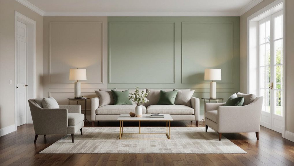
Color-by-Room Recommendations
Think about each room’s purpose and pick colors that support it: warm neutrals or muted blues for a welcoming living room, durable finishes and coordinated cabinet-and-floor combos in the kitchen, and soft, calming shades with higher-contrast accents in the bedroom.
For bathrooms with hardwood-look floors choose light, reflective hues and moisture-friendly paints to keep small spaces feeling open.
Use consistent or connecting tones in hallways and entries to tie rooms together and guide sightlines.
Living room mood goals and top color picks
Want your living room to feel cozy, bright, or dramatically elegant? Choose colors that match your hardwood tone and mood: warm taupes, soft creams, muted sage, deep navy, or rich charcoal.
Pair with textures and lighting to amplify feeling. Consider contrast with trim and furniture to balance warmth and depth.
- Warm taupe for snug comfort
- Soft cream for airy lightness
- Muted sage for calm
- Deep navy for drama
- Rich charcoal for sophistication
Kitchen durable finishes and color combos with cabinets and floors
One clear rule in kitchen design: pick durable finishes that stand up to spills and scuffs while choosing paint and cabinet colors that harmonize with your hardwood tone.
You’ll want easy-clean countertops, washable paint, and cabinet stains or colors that either match, contrast softly, or brighten the room to showcase wood grain.
- Warm oak + cream cabinets = cozy
- Dark walnut + light gray = modern
- White + natural wood = airy
- Navy + honey floors = bold
- Sage + reclaimed wood = grounded
Bedroom calming palettes and contrast strategies
When you’re choosing a bedroom palette, prioritize hues that promote rest—muted cool tones, soft neutrals, and warm greiges settle the eye and make hardwood floors feel anchored.
You’ll balance contrast by pairing lighter walls with richer trim or a darker accent wall to frame your bed, keeping textiles layered and low-contrast for a soothing, cohesive look.
- Gentle dove gray
- Misty blue
- Warm greige
- Soft taupe
- Muted sage
Bathroom small-space color tactics with hardwood-look floors
After you’ve settled on calming bedroom hues, bring that same sense of rest to a compact bathroom by using color to expand the space and complement hardwood-look floors.
Choose light, warm neutrals or soft greens to reflect light and unify tones.
Accent with a darker trim or tactile tiles for depth.
- tranquil
- airy
- cozy
- grounded
- refreshed
Hallways and entryways continuity and transition color strategies
Because hallways and entryways stitch rooms together, pick colors that ease movement from space to space while highlighting your hardwood floors’ warmth.
Use cohesive neutrals or a gentle gradient to guide sightlines, add trim contrast for definition, and consider durable, washable finishes to handle traffic.
Emotional cues help set tone:
- Welcome: warm beige glow
- Calm: soft gray-blue
- Energetic: muted terracotta
- Elegant: deep taupe
- Fresh: pale sage
Step-by-Step Color Selection Process
Start by identifying your floor’s true undertone and finish. Then note how natural and artificial light affects the room.
Pick a base wall color family—neutral, warm, cool, or bold—and apply sample swatches to see how they read at different times of day.
Finally, decide on paint sheens and the exact trim and ceiling colors before committing.
Step 1: Identify your floor’s true undertone and finish
When choosing wall color, first pin down your floor’s true undertone and finish so your paint complements rather than clashes.
Look at plank edges and unfinished spots to spot warm, cool, or neutral tones; note gloss, satin, or matte to match mood. Trust your eyes and samples.
- Warm oak: cozy, inviting
- Cool gray: calm, modern
- Neutral maple: balanced, flexible
- High gloss: polished, formal
- Satin/matte: relaxed, natural
Step 2: Assess natural and artificial lighting
Although your floor’s undertone sets a base, you’ll need to evaluate both natural and artificial light to see how paint will actually read in the room.
Check light direction, time-of-day shifts, bulb temperature, and fixture placement. Test swatches at different hours. Let light guide warmth or coolness so floors and walls feel harmonious.
- Warm morning glow comforts
- Harsh noon clarity sharpens
- Soft evening amber soothes
- Cool LEDs energize
- Dim corners invite coziness
Step 3: Choose base wall color family (neutral, warm, cool, bold)
Now decide which color family will guide the room’s mood: neutrals, warms, cools, or bolds.
Choose based on hardwood tone, room purpose, and how you want to feel—calm, cozy, fresh, or energized.
Match undertones to your floors and trim so the palette feels intentional.
- calm and soothing
- warm and inviting
- crisp and revitalizing
- dramatic and lively
- balanced and timeless
Step 4: Test paint samples and view at different times of day
Step 4 is where you bring swatches home and see how they act in real light—apply several large sample patches on different walls, live with them for a few days, and observe how morning, midday, and evening light change their appearance so you can pick the shade that truly works with your hardwoods and mood.
Test, note, and trust your gut.
- Relief when the color feels right
- Pride in a harmonious room
- Calm from warm undertones
- Energy from cool contrasts
- Confidence in your final choice
Step 5: Finalize paint sheens and trim/ceiling colors
Once you’ve settled on a wall color, choose sheens and trim/ceiling colors that support that mood and stand up to wear; sheens affect durability and light reflection, while trim and ceiling tones frame the room and sharpen contrasts with your hardwoods.
Pick satin or eggshell for walls, semi-gloss for trim, flat for ceilings, and coordinate undertones to tie everything together.
- Warmth
- Calm
- Contrast
- Elegance
- Coziness
Palette Examples and Pairings
You’ll see which neutral palettes reliably flatter warm, cool, and mid-toned hardwoods and why they’re safe choices.
I’ll also show bold accent wall ideas and specific flooring pairings so you can add contrast without clashing.
Finally, we’ll cover how to coordinate trim, ceiling, and molding colors for a polished, cohesive look.
Neutral palettes that always work with hardwood
When you’re pairing paint with hardwood, neutral palettes give you reliable harmony—warm woods like oak and cherry pair beautifully with creamy beiges and soft taupes, while cooler woods such as maple and ash look crisp against greige and pale gray. You’ll feel calm, balanced, and timeless.
- Cozy comfort
- Quiet elegance
- Subtle warmth
- Clean simplicity
- Serene backdrop
| Wood | Neutral |
|---|---|
| Oak | Beige |
| Cherry | Taupe |
| Maple | Greige |
| Ash | Pale gray |
Bold and accent wall ideas with flooring pairings
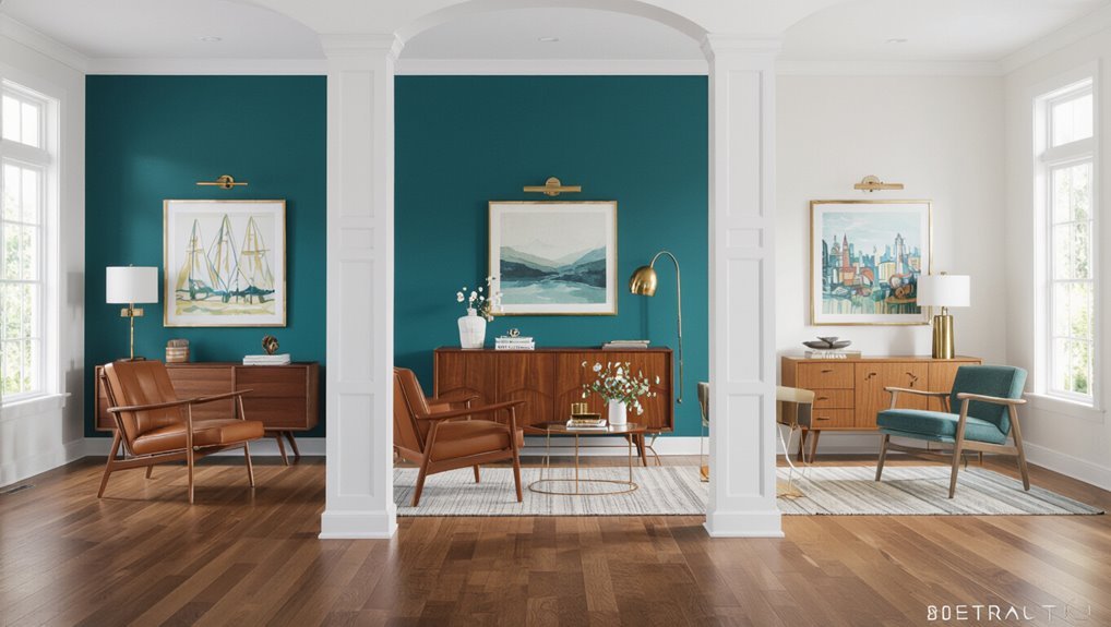
If neutrals set a steady stage, bold accent walls bring personality and drama without overwhelming your hardwood’s natural beauty.
Choose jewel tones for dark floors, warm terracotta with honey planks, navy to anchor wide oak, emerald for cool gray wood, or charcoal behind bookshelves to highlight grain.
These pairings create mood, depth, contrast, and warmth.
- Jewel tones with dark floors
- Terracotta and honey planks
- Navy with wide oak
- Emerald for gray wood
- Charcoal behind shelves
Coordinating trim, ceiling, and molding colors
While walls and floors grab most of the attention, trim, ceilings, and moldings tie the room together and can either sharpen or soften your hardwood’s look.
Choose crisp white for contrast, warm cream for softness, deep charcoal for drama, or match pale tones for seamless flow.
Pick finishes to reflect light and mood.
- Cozy
- Bold
- Serene
- Elegant
- Inviting
Common Mistakes and How to Avoid Them
Don’t ignore undertones—if your walls clash with warm or cool hues in the wood, test samples in different light and choose matching undertones.
Don’t pick a color just from a small swatch; paint large patches on multiple walls to see how the shade reads in the whole room.
And avoid matching furniture and floor tones exactly—use contrast through rugs, trim, or accent walls to prevent a flat, monotonous look.
Mistake: Ignoring undertones how it causes clash and fixes
When you overlook undertones, your carefully chosen paint can look wrong next to hardwood—too yellow against cool gray, or washed out beside warm mahogany.
Check undertones in both wood and paint, test samples in different light, and balance warmth or coolness to harmonize the room.
- Frustration when tones fight
- Relief when they align
- Confidence in cohesion
- Warmth restored
- Calm achieved
Mistake: Choosing colors only from swatches without full-room testing
Noticing undertones is only the start — you still can’t trust a tiny swatch to show how a color will behave across a whole room with hardwood floors.
You should test large patches, view at different times, and live with samples before committing. Small swatches lie; light, grain, and scale change everything.
- Frustration when a hue reads cold
- Surprise at muddy edges
- Regret over rushed choices
- Relief after a right match
- Confidence in a tested color
Mistake: Overmatching furniture and floor tones tips to create contrast
One common misstep is matching your wall color too closely to both the hardwood and your furniture, which flattens a room and hides each element’s best qualities; you should introduce contrast to let textures and shapes pop.
Consider these emotional cues to guide choices:
- Add a bold accent to spark joy
- Use cool tones for calm
- Insert warmth for coziness
- Choose dark trim for drama
- Layer textiles for depth
Best Practices and Pro Tips
You’ll want to balance contrast and harmony based on your design style so walls either complement or pleasantly contrast your hardwood.
Use rugs, textiles, and adjustable lighting to fine-tune how colors read in the room.
Also plan for maintenance—choose durable paint, keep touch-up supplies handy, and protect high-traffic areas from scuffs.
Balancing contrast and harmony for different design styles
When mixing wall color with hardwood floors, think about whether you want contrast to make features pop or harmony to create calm—and pick your palette to match the room’s style.
You’ll choose bold, cool, or muted tones based on style, light, and mood; test swatches and trust instincts.
- Energized contrast for modern spaces
- Serene harmony for Scandinavian calm
- Warm accents for traditional rooms
- Moody drama for eclectic looks
- Subtle unity for minimalist design
Using rugs, textiles, and lighting to adjust perceived color balance
Although wall color and hardwood set the foundation, rugs, textiles, and lighting let you fine-tune how those hues read in a room—softening contrast, amplifying warmth, or cooling tones to suit your mood.
Use layers to steer perception: choose rug undertones that echo or counter wood, swap throws for seasonal warmth, and adjust bulbs to reveal true paint.
- Cozy glow for evenings
- Crisp daylight for clarity
- Plush textures for comfort
- Contrasting patterns for energy
- Muted linens for calm
Maintenance considerations: scuffs, touch-ups, and paint durability
Because walls next to hardwood take more knocks and cleaning, plan for scuffs, touch-ups, and durable paint from the start.
Choose scrubbable finishes, keep a touch-up kit, and address marks quickly to protect your investment and calm daily wear worries.
- You’ll feel relieved fixing small dings fast
- Confidence from a matched touch-up
- Pride in well-kept rooms
- Calm knowing durable finishes endure
- Satisfaction maintaining beauty easily
Quick Reference Cheat Sheets
You’ll want a one-page cheat that matches paint picks to your floor tone—light, medium, or dark—so you can scan options fast.
Include a mood-based color map that groups calming, energetic, formal, and cozy palettes for quick decision-making.
Keep each sheet visual and simple so you can pick a direction in seconds.
One-page pick by floor tone (light / medium / dark)
When choosing paint by floor tone, think of your walls as the backdrop that either harmonizes with or highlights the wood beneath your feet; this one-page cheat sheet gives quick, confident picks for light, medium, and dark hardwoods so you can make fast decisions without overthinking.
| Floor tone | Quick pick |
|---|---|
| Light | Soft white |
| Medium | Warm greige |
| Dark | Deep navy |
| Trim | Crisp white |
Mood-based color map (calming / energetic / formal / cozy)
Mood shapes how a room feels the moment you step in, so pick wall colors that set the emotional tone you want: choose calming blues or greens for relaxation, bright yellows or corals to energize, deep charcoals or navy for formality, and warm beiges or terracottas to cozy up a space.
| Mood | Color Families | Effect |
|---|---|---|
| Calming | Soft blues, sage | Restful |
| Energetic | Yellow, coral | Stimulating |
| Formal | Navy, charcoal | Sophisticated |
| Cozy | Beige, terracotta | Warm |
FAQ
You probably have practical questions like whether bright colors work with dark hardwood, which hues warm or cool the floor, and if trim must be white.
You’ll also want advice on choosing paint sheen and whether your color choices could impact resale value.
Let’s answer those points clearly so you can pick colors with confidence.
Can I use bright or bold colors with dark hardwood floors?
Curious whether bold or bright paint will work with dark hardwood floors? Yes — you can.
Brights create dramatic contrast and enliven rooms, while deep brights add sophistication.
Balance intensity with trim, furnishings, and lighting so the floor anchors rather than overwhelms.
Test samples on large swatches at different times of day to guarantee the color reads the way you want.
What wall color makes hardwood floors look warmer or cooler?
If bold colors can energize a room with dark hardwood, the right wall hue can also shift how the floor reads temperature-wise.
Choose warm walls—creamy beiges, soft golds, terracotta undertones—to bring out amber and red notes.
For a cooler look, use pale grays, blue-greens, or crisp whites with cool undertones to emphasize ash and grayish tones in the wood.
Should trim and baseboards always be white with hardwood floors?
Must trim and baseboards always be white with hardwood floors? No — white is classic, but you can choose trim that complements your floor tone and style.
Darker stains or painted hues can create cohesion or contrast, depending on the look you want.
Keep trim a shade or two different from walls for definition, and test samples in natural light before committing.
How do I pick a paint sheen when pairing with hardwood?
Which sheen you pick matters because it affects durability, cleanability, and how your hardwood’s finish reads against the walls.
Choose eggshell or satin for living areas: they hide imperfections yet clean reasonably well and complement wood’s soft luster.
Use semi-gloss or gloss on trim and high-traffic zones for durability and contrast.
Match sheen subtly to your floor’s sheen for cohesion.
Will paint color choices affect resale value with hardwood floors?
Sheen choices help your rooms look cohesive, but color choices can have a bigger impact on buyers.
Neutral tones that complement hardwood—soft grays, warm beiges, muted greiges—appeal to a broad market and make spaces feel larger. Bold or very personal hues can limit interest.
If you want stronger color, consider accent walls that are easy for buyers to repaint.
Visual Inspiration Gallery and Sample Palette Downloads
Anyone can spark ideas in our Visual Inspiration Gallery, where curated room photos and real-life combos make it easy to imagine paint working with your hardwood.
Browse filtered galleries by floor tone, room, and style, then download printable sample palettes. You’ll get hex codes, suggested trim colors, and lighting notes so you can test swatches at home and choose confidently before committing to a full paint job.