How to Select Paint Colors: Expert Tips for Perfect Home Design
Choose paint colors by first defining each room’s purpose and the mood you want, then assess natural and artificial light and existing finishes. Pick a dominant hue plus two supporting tones, test samples on different walls and at various times, and note undertones that shift with light. Use warm colors for coziness, cool for calm, and neutrals to connect spaces. Finalize with finishes that suit wear and document your palette—keep going to learn practical tips and troubleshooting.
How To Choose Paint Colors: A Quick Framework
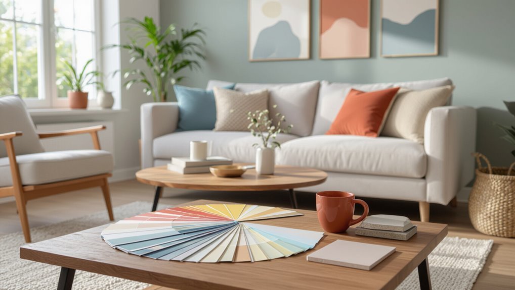
When you’re overwhelmed by swatches, start with a simple framework: define the room’s purpose, assess existing light and finishes, pick a dominant color, and choose two supporting tones for balance.
You’ll use color psychology to set mood, factor seasonal trends for timely appeal, and test samples on different walls.
Trust your instincts, prioritize cohesion, and adjust hue intensity for comfort and scale.
Use A Step‑By‑Step Color Selection Process
If you want reliable results, follow a clear step‑by‑step color selection process that breaks the job into manageable actions: gather color inspiration sources like photos, fabric swatches, and neighborhood palettes; shortlist three to five hues; test samples on different walls and lighting; note how seasonal trends affect appearance; live with samples for days; compare undertones before committing to your final paint choice.
Pick The Mood You Want Each Room To Evoke
Mood guides every color decision, so decide what you want each room to feel before you pick hues.
Mood should lead color choices—decide how each room should feel before selecting any hue.
Think about function and desired emotion: calm, energizing, cozy, or formal.
Use mood psychology to match paint to purpose and rely on common color associations to steer choices—bluish tones for serenity, brighter accents for liveliness.
Test samples in the room’s light before committing.
Use Basic Color Theory: Warm, Cool, Neutral
Now that you’ve picked the feeling you want, use basic color theory to guide your choices: warm, cool, or neutral palettes shape how a room reads and how you feel in it. You’ll use color psychology to choose tones, balance with complementary colors, and pick neutrals as anchors.
| Palette | Effect |
|---|---|
| Warm | Cozy |
| Cool | Calm |
| Neutral | Flexible |
| Mix | Balanced |
Understand Paint Undertones And How They Shift With Light
Because paint contains subtle pigments, undertones can make a color lean warmer, cooler, or greener than it looks on a swatch.
Those shifts become obvious as light changes during the day. You’ll learn to spot blue, pink, or yellow hints that alter mood and color psychology.
Test samples at different times to see true hues under varied lighting effects before committing.
Measure Natural And Artificial Lighting In Your Space
Once you’ve noticed how undertones shift with changing light, it’s time to quantify that light so you can choose colors that perform predictably. Measure lighting impact by noting natural reflections, artificial influences, and seasonal changes at set times. Record lux, direction, and source to predict color perception.
| Time | Source | Measurement |
|---|---|---|
| Morning | Window | |
| Noon | Overhead | |
| Evening | Lamp | |
| Night | Mixed |
Choose A Base Palette Before Picking Specific Shades
Start by picking a neutral base—whites, grays, or warm beiges—so your room has a flexible backdrop.
Note each neutral’s undertone (cool, warm, or green) so your accents and furniture will harmonize.
Also match the palette to the room’s function—calm tones for bedrooms, energetic hues for kitchens and play areas.
Start With Neutrals
Although bold accents grab attention, begin with a neutral base so you can build a cohesive palette that supports every room and accessory.
You’ll use color psychology and neutral palettes to set mood and flow. Pick versatile walls, then add accents.
Consider:
- Calm tones
- Warm grounding
- Light-reflecting shades
- Accent-ready neutrals
Define Your Undertones
Undertones guide how a color will really read in your space, so identify whether your base leans warm, cool, or neutral before choosing specific shades. You’ll use color psychology and color symbolism to set mood, then test swatches under real light. Pick a base palette first to guarantee cohesion, then layer accents confidently.
| Warm | Neutral | Cool |
|---|---|---|
| Beige | Greige | Blue |
| Gold | Taupe | Gray |
Consider Room Function
Now that you’ve pinned down undertones, think about how you’ll use each room before choosing a base palette.
Match mood to function: calming hues for bedrooms, energetic tones for kitchens.
Consider room layout and furniture arrangement to guide focal walls and flow.
Choose a versatile neutral base, then layer accents that support activity and light.
- Rest
- Entertain
- Work
- Play
Match Paint Color Families To Room Function
Think about how the room will feel and what you’ll use it for so you can match the color family to its purpose.
Factor in natural and artificial light plus the activities that happen there, since brightness and function change how colors read.
If a space needs energy, go bolder; if it needs rest, choose calmer tones.
Match Mood To Purpose
Because the colors you choose shape how a room feels and functions, start by pairing color families with the room’s purpose: calming blues and muted greens for bedrooms, energizing yellows or warm reds for kitchens or workspaces, and neutral grays or beiges for flexible living areas.
Use mood psychology and color symbolism to guide choices.
- Restful
- Invigorating
- Neutral
- Focused
Consider Light And Activity
When choosing paint, consider how natural and artificial light interact with the room’s activity level so colors support both function and mood; bright, cool hues can wake up a sunlit breakfast nook, while softer, warmer tones help a dim home office feel inviting without distracting you.
Match color families to activity zones, noting light temperature shifts throughout the day so finishes enhance focus, relaxation, or energy.
Balance Boldness With Calm
Although bold hues can energize a space, you’ll want to pair them with calmer tones that suit the room’s purpose.
Use color psychology and mood influence to decide. Balance texture contrast and accent choices for style harmony.
Consider personal preference, trend awareness, and seasonal inspiration.
- Pick one dominant calm tone.
- Add one bold accent.
- Layer textures.
- Test lighting.
Create A Cohesive Home Color Story With Rules And Examples
By setting a few clear rules—like a dominant base color, two coordinating accents, and a unifying finish—you’ll make every room feel intentional and connected without matching everything exactly.
Use color psychology and color symbolism to guide mood. Consider color trends and historical palettes. Blend color harmonies and seasonal colors. Honor cultural influences, and balance personal preferences.
Apply concise examples to illustrate each rule.
Create A Paint Flow Plan: Primary, Secondary, Accent Rooms
Start by defining your primary palette—the core few hues that will anchor your whole home.
Then map how secondary rooms will alter those tones subtly so changes feel intentional.
Finally, plan accent rooms where you’ll introduce bolder contrasts or pops to create focal points.
Define Primary Palette
When you map out a paint flow plan, pick a primary palette first—this set of two to four core hues will anchor your home and guide choices for adjacent rooms.
You’ll consider color psychology and cultural influences to set mood and cohesion. Choose tones that feel timeless, versatile, and comforting.
- Calm
- Warmth
- Energy
- Serenity
Map Accent Transitions
Although your primary palette sets the tone, mapping accent shifts guarantees each room feels deliberately connected rather than accidentally matched. You’ll plan accent color psychology and shift techniques: pick anchor rooms, stagger intensity, repeat accents in small doses, and note sightlines.
| Room | Accent | Role |
|---|---|---|
| Living | Teal | Anchor |
| Hall | Soft teal | Bridge |
| Bedroom | Teal accent wall | Destination |
How To Test Paint Samples On Walls
Before you commit, try paint samples directly on your walls so you can see how each color looks in real light and beside your room’s finishes.
Try paint samples directly on your walls to see true color in real light and next to your finishes.
Test samples with different paint finish options and consider color psychology to match mood. Apply patches, live with them, then decide.
- Sample large
- Use primer
- Note texture
- Ask others
Evaluate Samples At Different Times Of Day
Put your samples on different walls and check them in the morning when cool, blue-toned light can make colors look fresher.
Come back in the evening to see how warm, low light softens tones and changes the room’s ambience. Noticing those shifts will help you pick a color that works throughout the day.
Morning Light Differences
When you look at paint samples in the morning, the light’s cool, low angle can make colors read bluer and less saturated than they’ll later in the day.
You’ll notice morning light shifts color perception, so test samples on walls.
Consider how mood changes:
- Calm
- Crisp
- Muted
- Fresh
Trust what you see across hours before deciding.
Evening Ambience Effects
As morning light makes colors look cooler, evening light will warm them and soften contrasts. So you should check samples again as the sun sets.
You’ll notice evening lighting brings out undertones and alters perceived depth. Watch color changes from daylight to artificial light, sampling near lamps and windows.
Make decisions based on how hues behave at dusk to guarantee mood and consistency.
Compare Swatches Against Your Furnishings And Flooring
Anyone can get overwhelmed by paint chips, so hold swatches next to your main furniture and flooring to see how hues interact in real light.
Consider swatch lighting and surface compatibility to judge color harmony and texture contrast.
Think about room personality and color psychology to guide emotional response and visual flow.
Prioritize design consistency and aesthetic balance.
- Relate
- Contrast
- Balance
- Feel
Select Trim And Ceiling Colors That Complement Walls
Although trim and ceiling colors often play supporting roles, they dramatically shape how wall colors read and how a room feels.
You’ll use trim color psychology to choose white or soft neutrals for calm, or warm off-whites to cozy a space.
Consider ceiling color impact: bright white opens height, pale hues add warmth.
Test samples under your lighting before committing.
Decide Between High‑Contrast Trim Or Tonal Trim
Want a bold edge or a subtle, unified look? You’ll weigh high contrast benefits against tonal trim advantages to set mood and focus.
Decide by room size, light, architecture, and desired drama.
Consider room size, natural light, architecture, and how dramatic you want the space to feel.
- Make moldings pop.
- Soften shifts.
- Highlight character.
- Create calm cohesion.
Choose Paint Sheen For Every Surface And Why It Matters
Pick the right sheen by learning basic types—flat, eggshell, satin, semi-gloss, and gloss—and what each looks like.
Match sheen to surface suitability, since walls, trim, kitchens, and bathrooms need different levels of reflectivity.
Consider durability and maintenance too, because higher sheens stand up to cleaning and wear better than low-sheen finishes.
Sheen Types Explained
Sheen matters because it changes how paint looks and performs on different surfaces.
Choosing the right finish will affect durability, maintenance, and how colors read in a room.
You’ll weigh sheen types and finish levels: gloss variations, sheen durability, application methods, and maintenance tips influence aesthetic impact and light reflection.
- Excitement
- Confidence
- Comfort
- Pride
Surface Suitability Guide
1. You’ll match sheen to surface: eggshell or satin for living rooms and bedrooms where a soft color finish and subtle paint texture flatter walls; semi-gloss suits trim, kitchens, and bathrooms for moisture-prone areas; flat or matte works on ceilings and low-traffic walls to hide imperfections.
Consider surface porosity and desired reflection to choose the right sheen and achieve cohesive results.
Durability And Maintenance
Now that you’ve matched sheen to the room and surface, consider how durability and maintenance will affect long-term appearance and care.
You’ll want paint choices that balance color longevity with finish maintenance. Focus on surface preparation and proper application techniques to boost texture durability, wear resistance, and stain resistance against environmental factors.
- Protect
- Repair
- Clean
- Preserve
Use Finishes To Highlight Architectural Details
When you want trim, moldings, or built-ins to stand out, choose a finish that contrasts with nearby surfaces so light plays across the detail and draws the eye.
Use sheen and color to highlight textures, emphasize contrasts, enhance features and accentuate details.
Thoughtful finishes showcase architecture, define spaces, create depth and unify styles, so select finishes that reinforce your room’s character.
Pick Accent Walls Strategically, Not Randomly
If you’re adding an accent wall, choose its location with purpose rather than picking a random surface; let the wall reinforce a focal point—like a fireplace, bedhead, or a view—and support traffic flow and sightlines so the color feels intentional and balanced.
- Use accent wall ideas tied to function.
- Apply color psychology for mood.
- Anchor furniture visually.
- Keep surrounding tones calm.
Combine Patterned Wallpaper With Paint Colors
When you pair patterned wallpaper with paint, focus on matching undertones rather than exact hues so the combination feels cohesive.
Keep the scale and texture balanced by using solid paint on large walls and reserving busy patterns for smaller areas. This approach keeps the room unified without overwhelming the eye.
Match Undertones, Not Hues
Think of undertones as the secret language between wallpaper and paint; they tell you whether colors will harmonize or clash.
You’ll match warmth or coolness, not exact hues, to honor color symbolism and evoke emotional response.
Consider color psychology, cultural significance, color trends, and historical context when choosing.
- Warm
- Cool
- Neutral
- Accent
Balance Scale And Texture
Because patterned wallpaper can dominate a room, you’ll balance scale and texture by pairing its motif with paint that either calms or complements it—large, bold prints need simpler, softer paint treatments, while small-scale patterns can handle stronger hues or textured finishes. Use texture balance and scale harmony to guide choices; mute paints soothe, bolder finishes highlight focal walls.
| Wallpaper Type | Paint Strategy |
|---|---|
| Large print | Soft, matte neutrals |
| Small print | Accent colors, textured paint |
| Busy pattern | Solid, calming tones |
Balance Bold Hues With Neutral Grounding Tones
Although bold colors bring energy and personality, you’ll want neutral grounding tones to keep a space from feeling overwhelming.
Use texture combinations and color psychology to balance drama with calm.
Combine textures and color psychology to offset bold drama with soothing calm for balanced, inviting spaces.
Try these emotional anchors:
- Warm beige for comfort.
- Cool gray for calm.
- Soft white for clarity.
- Muted taupe for sophistication.
Layer contrasts thoughtfully to maintain harmony.
Use Color To Make Small Rooms Feel Larger
If you want a cramped room to feel airier, choose lighter, cooler tones and keep contrast minimal so surfaces read as continuous planes.
Use light colors, monochromatic schemes and color continuity to enhance spatial perception.
Add reflective surfaces and smart furniture placement, and try subtle vertical stripes or optical illusions.
Rely on color psychology to create an airy ambience without cluttering the visual field.
Use Color To Make Large Rooms Feel Cozier
In large rooms, you can make the space feel cozier by choosing warmer paint tones like terracotta, mustard, or deep taupe.
Use those colors to anchor seating areas and define intimate zones within the room.
Choose Warmer Paint Tones
You can make a large, echoing room feel much cozier by choosing warmer paint tones; rich creams, soft terracottas, and muted golds visually pull the walls inward and invite a sense of intimacy.
Use warm color psychology and color temperature effects to guide choices that soothe.
- Embrace soft terracotta
- Layer warm creams
- Add muted gold accents
- Balance with deep neutrals
Create Intimate Zones
When a room feels too vast, break it into smaller, cozier zones using color to define each area; paint a reading nook a deeper, warmer hue and keep adjacent traffic areas lighter so the space reads as intentional rather than cavernous.
You’ll use color psychology for emotion impact, adjust spatial perception with intimate layering, establish visual boundaries, enhance sensory experience, and create comfort zones that preserve design flow.
Select Colors That Flatter Room Size And Ceiling Height
Although small rooms can feel cramped with the wrong choices, picking lighter, cooler hues and keeping ceilings a shade or two brighter will open the space and make it feel taller.
You’ll use Room Size, Ceiling Height, Color Coordination, and Visual Illusions to improve Space Perception.
Practice Proportion Awareness, Light Reflection, Scale Adjustment, Color Depth, and Design Harmony.
- Embrace light tones
- Contrast ceiling
- Use depth
- Balance scale
Coordinate Paint With Lighting Fixtures And Hardware
Bringing paint choices in line with your lighting fixtures and hardware ties the room together and keeps colors from clashing under different bulbs and metals.
Test swatches near fixtures to see lighting impact throughout the day. Match undertones to metal finishes for hardware harmony, and choose paints that complement both warm and cool bulbs.
Swap a sample can before committing to a full room.
Consider How Paint Colors Affect Perceived Temperature
How do colors change the way a room feels? You’ll use color psychology and color influence to guide temperature perception and emotional response.
Consider:
- Warm hues add visual warmth and cozy space ambiance.
- Cool tones make spaces feel fresher and larger.
- Light interaction shifts perceived warmth by time of day.
- Seasonal impact alters your mood and practical comfort.
Account For Color Fading And Durability In High‑Traffic Areas
In high-traffic spots you’ll want finishes that stand up to scuffs and frequent cleaning, so choose durable sheens like satin or semi-gloss.
Also think about sun exposure—UV can fade pigments, especially on south- or west-facing walls.
Pick fade-resistant paints or plan for periodic touch-ups where sunlight and wear are worst.
Choose Durable Finishes
Because paint in busy spots gets more wear and light exposure, choose finishes that resist fading and scuffs so your color stays true longer.
Use durable materials, proper surface preparation and application techniques to boost wear resistance and finish longevity.
Follow maintenance tips and cleaning methods for stain resistance and room durability.
- Choose wisely
- Prep thoroughly
- Clean regularly
- Inspect often
Consider Sun Exposure
When a wall bakes in direct sunlight, pigments break down faster and colors can fade unevenly, so plan paint choices and finishes with exposure in mind. You should pick UV‑resistant formulas, test swatches at different times, and avoid delicate hues where sunlight effects cause color shifting. Choose durable finishes for high‑traffic areas to minimize wear and fading.
| Area | Exposure | Finish |
|---|---|---|
| South | High | Satin |
| West | Afternoon | Semi‑gloss |
| East | Morning | Eggshell |
| North | Low | Matte |
Choose Kid‑And Pet‑Friendly Paint Colors And Finishes
Pick colors and finishes that keep your home safe, durable, and easy to clean while still feeling cheerful.
You’ll choose kid friendly hues and playful palettes, plus pet safe finishes and durable coatings.
Look for washable options and non toxic paints for peace of mind.
Choose washable, non-toxic paints for peace of mind—easy cleanup and safer surfaces for kids and pets.
- Bright accents
- Soft neutrals
- High‑sheen trims
- Stain‑resistant walls
Select Eco‑Friendly And Low‑VOC Paint Options
Choose paints with low or no VOCs to keep your indoor air healthier for your family and pets.
Look for certified eco labels so you can trust manufacturers’ environmental and health claims.
Also pick durable low‑VOC finishes that resist stains and need fewer recoats, cutting down on waste and exposure.
Healthier Indoor Air
Although paint can transform a room, you’ll want to prioritize formulas that won’t compromise indoor air quality: low‑VOC and eco‑friendly options drastically cut off‑gassing of harmful chemicals, odors, and long‑term pollutants so your home stays healthier for occupants and pets.
Choose healthy materials to protect air quality. Feel confident and calm:
- Breathe easier
- Reduce allergies
- Protect children
- Live sustainably
Certified Eco Labels
When you’re shopping for paints that actually live up to their “low‑VOC” or “eco‑friendly” claims, look for trusted certifications that verify ingredients, emissions, and manufacturing practices—labels like GreenGuard, EcoLogo, and Green Seal give you measurable assurance so you don’t have to rely on marketing alone.
Use eco certification benefits to compare brands, prioritize sustainable paint options, and guarantee safer indoor air without guessing.
Durable Low‑VOC Finishes
Verified eco labels help you narrow the field, but you also want paints that stand up to wear while keeping VOCs low.
Choose durable finishes that resist scuffs and clean easily; test samples in real light.
Consider:
- Breathable, low VOC options that dry hard
- Scrubbable eggshell for living rooms
- Tough satin for trim
- High-traffic semi-gloss for kitchens and baths
When To Splurge On Paint Versus Save
If you’re aiming for long-lasting color and smoother application, splurging on higher-quality paint often makes sense; save on paint for low-traffic areas or temporary projects where durability and finish aren’t critical.
You should weigh paint brand comparisons, testing samples to see premium paint benefits like better coverage, stain resistance, and fewer coats.
Spend where longevity and appearance matter most.
Read And Compare Paint Color Cards And Digital Swatches
When you’re choosing a color, hold physical swatches up to your walls to see how texture and lighting change the tone.
Don’t rely solely on digital swatches—check how colors render on different screens and test samples under your room’s light.
Compare both sources side by side so you can pick the shade that truly works in your space.
Compare Physical Swatches
Although digital swatches make narrowing choices quick, you should always compare them against physical paint cards under the light where you’ll live with the color, since screen brightness and finish can shift perception.
You’ll use swatch comparisons to judge color psychology, visual impact, color harmony, texture variations, lighting effects, trend influences, and personal preferences.
- Touch samples
- Move cards
- View at dusk
- Trust feeling
Evaluate Digital Accuracy
After you’ve checked physical cards in your space, turn your attention to how digital swatches represent those same hues so you can spot discrepancies before buying. Use digital tools to compare RGB/HEX to printed chips, test on-screen under different lighting, and consider color psychology for desired mood.
| Sample | On-screen | Printed |
|---|---|---|
| Living | #F2E9D5 | 2N-1 |
| Accent | #6A4F3C | 7R-4 |
Avoid Common Color‑Selection Mistakes Homeowners Make
You might be excited to pick bold colors, but don’t rush—common mistakes can turn a great idea into a disappointing room.
You should consider color psychology and seasonal trends, test swatches in different light, and avoid following fads blindly.
- Picking too-dark shades
- Ignoring undertones
- Skipping samples
- Forgetting whole-room flow
Fix Color Regret: Change Or Layer Colors Without A Full Repaint
If a room’s color feels off, you don’t always need a full repaint—there are quick color corrections you can try first.
You can layer paint with glazes, washes, or a tinted topcoat to adjust tone and depth without stripping everything back.
And small strategic accent updates—trim, doors, or a feature wall—can shift the whole mood fast and affordably.
Quick Color Corrections
When a color doesn’t feel right, you don’t have to commit to a full repaint—quick fixes let you tweak or transform a room fast.
You can correct regrets using color psychology and color harmony to guide choices.
Try these emotional, fast options:
- Accent with trim.
- Add washable panels.
- Use reversible wallpaper.
- Swap textiles and art.
Paint Layering Tricks
Layer colors instead of stripping them out—small, strategic layers can shift mood, depth, and texture without a full repaint. Use subtle glazing, scumbling, or feathering as layering techniques to correct regret and test palettes. Practice color blending on sample boards, then apply thin layers to enrich walls.
| Method | Effect | Try |
|---|---|---|
| Glaze | Soft depth | Sample |
| Scumble | Texture | Corner |
| Feather | Shift | Trim |
| Wash | Tone | Accent |
Strategic Accent Updates
One smart move is to update accents instead of repainting everything—you can change the room’s vibe by targeting trim, an alcove, or a single wall and either repainting or adding thin layers of color.
Use accent furniture, fabric integration, and artwork coordination to test color trends and color psychology.
Consider lighting enhancement, texture contrasts, architectural features, and seasonal updates to improve room flow.
- Try one focal piece
- Swap fabrics
- Adjust lighting
- Layer textures
Take Photos That Show Your Room’s Real Color
If you want paint samples to look the same on screen as they do on your wall, take photos in natural, indirect light and avoid flash.
Photograph walls at different times to check photo lighting and gauge true tones.
Use a neutral white balance, include a small gray card for reference, and review images on multiple devices to verify color accuracy before finalizing your choice.
Use Virtual Tools And Apps To Preview Paint Colors
Try out paint colors digitally before you buy—you’ll save time and avoid costly mistakes.
Use virtual color sampling and augmented reality previews on apps to visualize tones in your actual room. You’ll feel confident choosing bolder hues.
Steps to try now:
- Snap your room.
- Apply colors.
- Adjust lighting.
- Save favorites and compare before buying.
Hire A Color Consultant: When It’s Worth The Cost
When you’re facing a tricky color decision—historic trim, open-concept living spaces, or bold accent walls—hiring a color consultant can be worth the cost because they bring trained eyes, industry-tested palettes, and practical solutions that save time and money in the long run.
They translate color psychology, design trends, and personal style into visual harmony, offering professional insights, client collaboration, cost benefits, and unique aesthetics.
Communicate Color Choices To Painters And Contractors
Start by clearly documenting your color choices so painters and contractors know exactly what you expect.
Use labeled swatches, written paint specifications, and samples in the rooms. Emphasize design expectations and maintain open color communication for contractor collaboration.
- Share swatches
- Note finishes
- Record brand and codes
- Confirm timeline and touchups
Estimate Paint Quantity And Waste
Now that your colors and finishes are documented, you’ll want to figure out how much paint to buy and how much extra to allow for mistakes and waste.
Measure surface area, check paint coverage per gallon on labels, and calculate coats.
Add 10–15% for trim, errors, and absorption.
Track leftovers for touch-ups and follow basic waste management by storing, labeling, and disposing of cans properly.
Plan A Painting Timeline Room‑By‑Room
Break the project into rooms and set realistic blocks of time for each so you can paint efficiently and avoid overlap.
Use a painting project checklist and your color consultation guide to prioritize rooms by use and light.
Prioritize rooms by function and natural light using your painting checklist and color consultation guide for smarter scheduling and results.
Schedule prep, prime, paint, and dry times.
- Urgent
- Calm
- Joyful
- Serene
Budget For Paint, Primer, Supplies, And Labor
Once you’ve mapped rooms and timing, set a realistic budget for paint, primer, supplies, and labor so the schedule doesn’t stall.
Tally paint gallons, primer, brushes, tape, drop cloths, and contractor hours for a clear budget breakdown.
Use supply estimation by measuring surface area, factoring waste, and adding a contingency.
Review quotes and prioritize quality where it affects durability.
Mix And Match Trim, Cabinetry, And Accent Colors
Start by deciding whether you want contrast or continuity: pair trim and cabinetry in colors that either stand apart to highlight architectural details or blend to create a seamless look.
Use trim styles and cabinetry finishes to guide accent techniques.
Balance color combinations, texture contrasts, and color layering for design cohesion and visual balance.
- Highlight
- Blend
- Layer
- Balance
Use Color To Enhance Resale Value And Curb Appeal
If you want your home to sell faster and attract higher offers, choose paint colors that appeal to the broadest range of buyers while highlighting the property’s best features.
Stick to neutral, updated hues for main rooms to boost resale value, add tasteful accent colors for personality, and refresh exterior trim and front door shades to maximize curb appeal and create an inviting first impression.
Document Your Final Color Palette For Future Use
Because you’ll want to replicate the look later, record every final paint choice—including brand, color name, manufacturer code, finish, and the room or exterior area where it was used—so you can match or touch up accurately down the road.
Keep concise color documentation and color inspiration notes.
Use a simple inventory:
- Room
- Brand/code
- Finish
- Sample photo
Troubleshoot Strange Color Results After Painting
Surprising color shifts after painting are common, but you can pinpoint the cause and fix them quickly.
Inspect lighting, sheen, and undertones to spot color anomalies. Verify paint batch and check for fading or staining.
Re-evaluate color mixing—wrong tints or insufficient stirring often cause shifts.
Test small corrective fixes: glaze, tint, or repaint with properly matched, well-mixed paint under appropriate lighting.
Final Checklist: Steps Before Buying Paint
Before you buy, run through a short checklist to avoid costly mistakes and disappointing colors:
Before buying paint, run a quick checklist to prevent costly mistakes and unexpected color outcomes.
- Test swatches in different light, note emotional effect and color psychology.
- Consider seasonal trends and how hues shift across months.
- Confirm finish, coverage, and sample application on large patches.
- Calculate quantities, budget for extras, and schedule painting when light and mood suit you.
Frequently Asked Questions
Can Wall Color Affect Indoor Plant Health and Growth?
Yes — wall color can affect plant health and growth. You’ll notice light reflection influences brightness and photosynthesis, while color psychology affects how you place and care for plants; choose reflective, calming hues to boost growth and attention.
How Do Paint VOCS Impact People With Chemical Sensitivities?
About 30% of people report heightened reactions to indoor pollutants, so VOCs exposure can trigger headaches, asthma, nausea, and cognitive fog; you’ll feel amplified symptoms with chemical sensitivities, so choose low‑VOC or zero‑VOC paints.
Will My Insurance Cover Paint Damage From Mold or Water?
Usually your insurance will cover water damage and necessary mold remediation if you have a thorough policy and the damage’s sudden or accidental; color fading alone often isn’t covered, so you’ll want photos, receipts, and a claim promptly.
How to Match Paint Colors Between Different Paint Brands Reliably?
You’ll match colors by using color wheel techniques, comparing swatches under consistent lighting, creating test patches, and noting base pigments; use brand comparison tools or formulas, and let samples dry before deciding so shades truly align.
Can Exterior Paint Colors Influence Indoor Temperature Significantly?
Yes — think of your house as a sunlit coat: darker hues soak heat, lighter ones deflect it. You’ll notice color temperature and exterior finish affecting indoor warmth, so choose pigments and sheens to manage solar gain.
Conclusion
You’ve followed the map—from mood to undertone, from swatches to sunlight—and you’ve arrived. Like a seasoned sailor reading stars, trust your process: test, live with samples, and let light be your compass. When a room sings, document it; when it stumbles, tweak until it hums. Paint isn’t magic, but it’s close—use these tools, keep the big picture in mind, and your home will tell the story you meant.