
Should You Paint Doors the Same Color as the Walls?
You can — and often should — paint doors the same color as the walls if you want a calm, cohesive look that visually expands a room and reduces clutter. Matching doors work especially well in open-plan or small spaces and with neutral palettes, while contrasting doors add focus, personality, or drama when you want an anchor. Consider finish, traffic, and resale appeal before choosing, and keep going to see practical tips, examples, and when to hire a pro.
Should You Paint Doors the Same Color as the Walls?
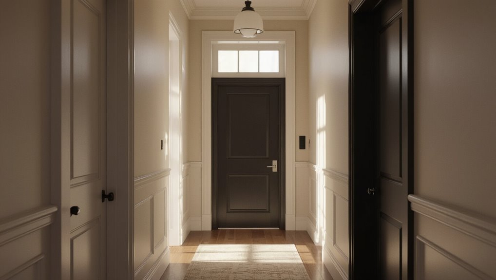
Should you paint doors the same color as the walls? You’ll weigh door color psychology—matching can make spaces feel cohesive and calm, while contrast adds personality and focus.
Use design trend analysis to decide if a monochrome look fits your home’s style or if a bold accent better expresses intent.
Trust mood, traffic, and maintenance when choosing.
Matching Doors and Perceived Room Size
If you liked the calm, cohesive look of matching doors and walls, you’ll notice it also affects how big a room feels: when doors blend with walls they become less visible, so sightlines feel uninterrupted and spaces read larger.
You can use color psychology to enhance perceived spaciousness—lighter, warm neutrals expand visually, while consistent hues reduce visual clutter and promote a seamless flow.
Contrasting Doors: Creating Focal Points and Depth
How do you make a door pull focus and add depth to a room? Choose a contrasting hue to highlight door framing and create a visual anchor.
Use color psychology to evoke mood—bold tones energize, deep shades add drama—while keeping surrounding trim neutral.
Contrast defines boundaries, guides sightlines, and gives a simple, controlled focal point without overwhelming the space.
When to Match Doors in Open-Plan Layouts
A contrasting door can anchor a room, but in open-plan layouts you’ll often want doors to recede rather than compete.
You’ll match doors to walls to preserve open plan harmony, letting sightlines flow and zones read clearly.
Use subtle shifts guided by color psychology—soft tonal matches calm changes, while consistent hues minimize visual clutter and emphasize architectural continuity throughout connected spaces.
When Contrasting Doors Help Small Rooms
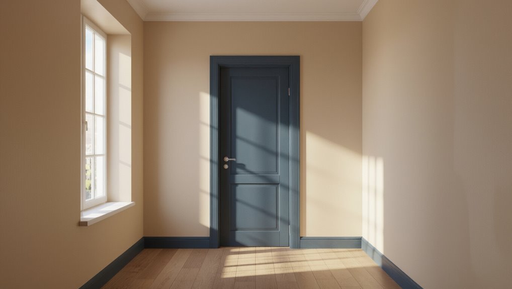
If you want a small room to feel deeper, painting the door a contrasting color can push the wall back visually and create more perceived space.
You can also use contrast to call attention to trim, panels, or other architectural details so they read as intentional features instead of afterthoughts.
Think of the door as a design element that frames the room and highlights its structure.
Enhance Depth Perception
When you paint doors in a contrasting color, they trick the eye into reading distinct planes, which makes a narrow room feel deeper and less boxy.
You can use contrast to enhance depth perception while maintaining color harmony and a convincing depth illusion.
Try these steps:
- Choose a darker door shade.
- Keep walls lighter.
- Use consistent trim.
- Add directional lighting.
Define Architectural Details
Contrast can call attention to moldings, paneling, and hardware, helping your eye register the room’s structure even when space is tight.
You can use a contrasting door to define architectural details, clarifying shifts and emphasizing design elements that reflect architectural styles.
That focused contrast lets you celebrate character without overcrowding the palette, maintaining clarity and a sense of intentional space.
Door Color Strategies by Home Style: Modern to Traditional
Choosing the right door color depends on your home’s architectural style and the mood you want to create; modern homes often benefit from bold, high-contrast doors while traditional houses usually suit more subdued, complementary tones.
Use door color psychology and historical influences to guide picks.
- Modern: matte black
- Midcentury: teal
- Craftsman: deep green
- Colonial: muted red
Natural Light and Door Color Choices
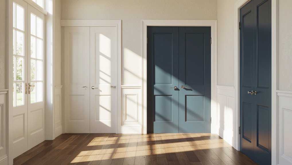
Because light changes how color reads in a room, you’ll want to test door shades at different times of day before committing.
Observe how natural light shifts hue and value on doors versus walls. You’ll notice the color impact varies with morning, noon, and evening light.
Use sample panels, note contrasts, and choose a finish that maintains the effect you prefer throughout the day.
Room Function and Door Color Decisions
When a room serves a specific purpose—like a bedroom, home office, or high-traffic mudroom, you should let that function guide whether doors blend with the walls or stand out.
Practical spaces often benefit from darker, more durable door colors that hide wear, while restful or formal rooms can use matching tones to promote calm and cohesion.
Practical rooms thrive with darker, durable doors; restful or formal spaces favor matching tones for calm cohesion.
- Entry: contrast for impact
- Bedroom: calm matching
- Office: focus via subtle accent
- Mudroom: durable dark hues
Use door color psychology to shape room atmosphere and performance.
Door Color Choices for Resale and Neutrality
When you’re prepping a home for sale, neutral door colors make it easier for buyers to picture their own style.
Keeping doors the same color as the walls simplifies staging and creates a cohesive look throughout the space.
If you want a focal point without scaring off buyers, a single accent door can add interest while keeping the rest neutral.
Neutrality Boosts Buyer Appeal
If you’re planning to sell, choosing neutral door colors helps buyers imagine their own style and makes rooms feel cohesive. Sticking with softened whites, warm greiges, or muted tones minimizes visual friction and broadens appeal.
- Neutral doors shape buyer perceptions.
- They tap color psychology for calm.
- You’ll attract wider interest.
- Minor updates feel low-risk to buyers.
Consistent Color Simplifies Staging
Because buyers scan a space quickly, keeping doors the same color as the walls makes staging feel intentional and uncluttered; you’ll create seamless sightlines that let furniture and finishes take center stage.
That consistent approach enhances color harmony, reduces visual noise, and boosts staging appeal.
When preparing for resale, match doors to walls so rooms read larger, calmer, and more cohesive to prospective buyers.
Accent Doors Add Interest
While matching doors to walls simplifies staging, choosing an accent door can give a home personality without overpowering buyers.
You’ll balance resale neutrality with subtle flair by using accent color psychology and following door color trends.
Consider:
- Soft blues for calm appeal
- Charcoal for modern contrast
- Muted greens for warmth
- Classic black for timelessness
This guides buyers without alienating them.
Choosing a Matching Paint Tone
When you’re matching door paint to wall color, aim for a tone that complements rather than disappears; choose the same hue only if the undertones and sheen align so the door reads intentional, not accidental.
You’ll test samples in different light, compare matching hues on peel-and-stick swatches, and pick a finish that creates tonal harmony while ensuring the door’s edges and hardware remain visually defined and purposeful.
Picking a Contrasting Door Color That Complements Walls
Think about contrast with purpose — you want a door color that makes a statement without clashing with the room.
Use complementary color theory to pick hues that enhance each other, like warm walls with a cool-toned door.
Tie the look together by repeating the door color in small accents so the balance feels intentional.
Contrast With Purpose
If you want a door that stands out without clashing, choose a contrasting color that’s tuned to your wall tone and the room’s mood; bold colors add energy, muted contrasts add depth.
You’ll use color psychology and design harmony to guide choices.
- Accent for focus
- Tone-match undertones
- Finish for texture
- Repeat elsewhere for balance
Complementary Color Theory
Because complementary colors sit opposite each other on the color wheel, you can pick a door color that both contrasts and harmonizes with your walls—giving the room a deliberate focal point without fighting the existing palette. Use complementary hues to create bold contrast while maintaining color harmony. Test saturation and value to avoid overwhelming the space.
| Wall Color | Door Suggestion |
|---|---|
| Blue | Orange |
| Green | Red |
| Yellow | Purple |
| Neutral | Accent-tone |
Balance With Accents
Want to give a room personality without overpowering it? You can pick a contrasting door color that respects color harmony and maintains accent balance.
Consider:
- Match undertones to walls.
- Use a muted shade for subtle contrast.
- Add hardware that echoes the accent.
- Test samples under real light.
These steps help you create cohesive contrast that feels intentional, not jarring.
Matching Doors: Benefits for Minimalist and Modern Interiors
When you paint doors the same color as the walls, they visually disappear, creating a seamless backdrop that emphasizes clean lines and uncluttered spaces—exactly what minimalist and modern interiors aim for.
You’ll reinforce minimalist aesthetics and modern cohesion, letting furniture, textures, and lighting take focus.
This approach simplifies sightlines, reduces visual clutter, and promotes a calm, unified environment that feels intentional and quietly elegant.
Contrasting Doors: Benefits for Traditional and Eclectic Homes
If you pick a contrasting door color, it becomes a clear visual anchor that grounds the room and guides the eye.
You can use that contrast to create accents that highlight moulding, panels, or other architectural details.
In traditional or eclectic homes, those pops of color let you celebrate character without overhauling the space.
Visual Anchor For Rooms
Although you might be tempted to blend everything together, painting doors in a contrasting hue gives a room a clear visual anchor that guides the eye and reinforces the style.
You’ll create visual harmony and tap color psychology to set mood.
Consider these benefits:
- Focal point
- Scale definition
- Traffic flow clarity
- Style cohesion
Accents That Highlight Architecture
A contrasting door turns architectural details into deliberate accents, so you can highlight moldings, transoms, and paneling without altering the structure.
You’ll use door aesthetics to draw the eye, creating clear architectural highlights that celebrate period trim or quirky millwork.
In traditional homes, contrast emphasizes craftsmanship; in eclectic spaces, it adds playful focus—both approaches boost character while keeping walls uninterrupted.
Paint Finishes for Doors: Durability and Appearance
When you pick a paint finish for your doors, you’re balancing how it will stand up to wear with how it will look in the room; semi-gloss and satin finishes are common because they resist scuffs and clean easily while still reflecting light attractively.
Consider paint durability and finish options:
- Satin — subtle sheen, forgiving surface
- Semi-gloss — durable, easy to clean
- Matte — low reflection, hides flaws
- Eggshell — softer sheen, moderate durability
Best Paint Types for High-Traffic Interior Doors
Because doors take constant contact, you’ll want paints that stand up to knocks, scuffs, and frequent cleaning without showing wear. Choose durable acrylic latex for wear resistance and oil-based for smooth sheen levels. Prioritize surface preparation, proper application techniques, and maintenance tips to boost paint longevity. Consider finish types, durability options, aesthetic appeal, and color psychology.
| Matte | Satin | Semi-gloss |
|---|---|---|
| Hides flaws | Balanced shine | Easy cleaning |
| Soft look | Entryways | Trim durability |
How to Test Door and Wall Colors Before Committing
You’ve picked durable finishes and prepped your door for paint, now test colors to make sure the combo actually works in your space.
Try practical checks before committing, keeping color psychology and texture pairing in mind.
- View samples at different times.
- Check lighting direction.
- Photograph with camera white balance.
- Assess tactile contrast between door and wall.
Using Sample Swatches and Painted Door Trials Effectively
Start by taping sample swatches to different wall areas so you can see each color in morning and evening light.
Then paint a small section of the door or a removable board and hang it next to the swatches to judge how the finish and sheen read together.
Compare them over a few days to decide whether matching or contrasting will work best.
Test Swatches On Walls
Curious how a paint color will actually read next to your door?
Test swatches reveal how door color trends interact with wall color psychology in your space.
Try these steps:
- Tape multiple swatches near the door at eye level.
- Observe in morning, midday, and evening light.
- Snap photos for comparison.
- Live with swatches for 48 hours before deciding.
Paint A Door Section
When you paint a door section, focus on a small, representative area—like the lower third or a panel—so you can see how finish, sheen, and brush strokes read up close and from across the room.
Try samples at different times of day, note how color psychology alters mood, confirm hardware and door functionality aren’t compromised, and decide if matching walls or contrasting suits the space.
Dealing With Existing Hardware and Stained Doors
If you’re keeping existing hardware or working with stained wood, plan your paint and prep to protect finishes and preserve grain.
You’ll balance hardware considerations with door aesthetics and decide whether to mask, remove, or change knobs.
Consider these steps:
- Clean surfaces.
- Tape hardware.
- Use stain-friendly primer.
- Test small area for adhesion and look.
Painting Doors to Hide Wear Without Losing Style
If your door has dings and scratches, painting it can mask those flaws quickly and affordably.
You can keep style by choosing a finish and tone that echo the wall color for a cohesive look. Small details like matching trim or a slightly contrasting sheen will help the door blend without disappearing.
Conceal Dings And Scratches
Even a single fresh coat can make door dings and scratches disappear without sacrificing style: choose a slightly darker shade or a semi-gloss finish to mask imperfections and make the surface easier to clean.
Use color durability and maintenance tips to extend results.
- Sand lightly
- Fill gouges
- Prime glossy areas
- Topcoat for resilience
Maintain Visual Cohesion
When you want doors to blend with walls while still hiding wear, pick a paint strategy that keeps rooms feeling unified without erasing architectural interest.
Choose tones that respect color psychology to set mood, then match sheen and trim subtly so doors read as part of the whole.
You’ll maintain design harmony while disguising scuffs, preserving style without visual clutter or contrast that fights the room.
How Trim, Baseboards, and Jambs Affect Door Color
Although door color often grabs attention, the trim, baseboards, and jambs set the rules that determine whether the door blends in or stands out.
Door color draws the eye, but trim, baseboards, and jambs decide if it blends or becomes the focal point
You’ll use trim styles and paint selection to guide color psychology and door finishes for architectural harmony.
Consider these for design cohesion and visual shifts:
- Contrast for focal points
- Match for seamless aesthetic balance
- Accent for depth
- Neutral for space perception and home aesthetics
Coordinating Door Color With Cabinetry and Built-Ins (Related)
Because doors often sit next to cabinetry and built-ins, coordinating their colors creates a unified look that feels intentional rather than accidental.
You’ll match door style to cabinetry harmony, using color synergy and built-in coordination to support aesthetic flow.
Prioritize design continuity and visual coherence, balancing texture interplay so finishes and hardware complement rather than compete, resulting in a polished, integrated space.
Matching Door Colors Across Adjoining Rooms
When rooms flow into each other, matching your door colors can create a seamless shift that feels intentional.
You’ll also want to coordinate the trim and doors so the lines read consistently from one space to the next. Small shifts in shade can work, but keep contrast minimal to preserve the visual continuity.
Seamless Flow Between Rooms
If you want rooms to feel connected, match door colors across adjoining spaces to create a seamless visual flow; consistent doors subtly guide the eye and make shifts feel intentional rather than jarring.
You’ll use door color psychology to influence room atmosphere. Consider:
- Same hue, varied finish
- Neutral anchors
- Accent continuity
- Transitional color schemes
Coordinating Trim And Doors
Although trim and doors often share a room, you can treat them as a coordinated team to anchor sightlines between spaces: matching door colors across adjoining rooms while keeping trim consistent creates a clean, intentional connection that reads as one thoughtful design decision rather than a series of disconnected choices.
You’ll use color harmony techniques to guide selections; consider door color psychology to set mood while maintaining cohesive trim for flow.
Using a Consistent Door Color Scheme Through the House
Choosing a consistent door color scheme ties your home together and makes shifts between rooms feel intentional rather than incidental.
You’ll use door color psychology to set mood and guarantee visual harmony throughout. Consider these steps to implement a unified palette:
- Pick a base color that complements trim.
- Test finishes in different light.
- Repeat across common areas.
- Keep hardware consistent.
When to Vary Door Colors by Zone or Function
Think about using different door colors to signal public versus private zones so guests instinctively know where to go.
You can also use color coding to mark functions—bathrooms, utility rooms, and bedrooms can each have a subtle hue for quick recognition.
Keep shifts smooth so the changes guide movement without breaking the flow between spaces.
Public vs Private Zones
Ever wondered whether door colors should match throughout your home or shift by zone? You’ll balance public zone aesthetics with private zone intimacy by choosing color relationships that guide guests and cocoon residents.
Consider these approaches:
- Match public doors for flow.
- Contrast private doors for retreat.
- Use muted tones in hallways.
- Employ warmer shades for bedrooms.
Functional Color Coding
When you assign door colors by function, they become quick visual cues that simplify navigation and signal purpose—public entries, service rooms, and private retreats can each wear a distinct color to help occupants and visitors orient themselves instantly. You’ll use door functionality and color psychology to codify zones, improving wayfinding and safety.
| Zone | Color | Purpose |
|---|---|---|
| Public | Blue | Welcome |
| Service | Gray | Utility |
| Private | Green | Calm |
Transition And Flow
After assigning colors by function to aid wayfinding, you’ll want to contemplate how those color choices guide movement between zones.
You’ll balance door aesthetics with color psychology to signal changes. Consider:
- Use contrasting hues to mark boundaries.
- Match tones for seamless flow.
- Reserve bold colors for focal doors.
- Repeat accents to reinforce navigation and rhythm.
Accent Door Ideas: Where Bold Colors Work Best
Looking for a quick way to inject personality into your home? Use accent door placement to highlight entryways, mudrooms, and powder rooms where bold color combinations create instant focal points.
Choose hues that complement nearby furnishings and trim, and keep high-traffic or small spaces in mind so the color energizes rather than overwhelms. Confident placement makes bold doors feel intentional and balanced.
Two-Tone Doors and Creative Paint Techniques to Try
Try a half-and-half door to split color and instantly add modern contrast without overwhelming the room.
You can also paint the door one tone and the trim another to highlight architectural lines or tie in other hues.
These simple techniques let you create a custom look without major renovation.
Half-And-Half Doors
When you split a door into two contrasting colors, you instantly add visual interest and define the room’s style without changing anything structural.
You can tailor half-and-half doors to your taste by mixing glossy and matte paint texture to emphasize door style.
Try these approaches:
- Horizontal split
- Vertical split
- Diagonal split
- Offset panels
Two-Tone Trim Accents
If you want to make doors feel bespoke without repainting every wall, two-tone trim accents let you highlight architectural details and tie doors into the room’s palette.
You can use two tone techniques—paint trim in a contrasting or complementary shade while keeping door panels neutral—to create depth.
This approach boosts color harmony, frames entrances, and lets you experiment without committing to full-room changes.
Painting Doors to Work With Textured or Patterned Walls
A few simple choices make doors work with textured or patterned walls without competing for attention: pick a neutral shade that repeats a dominant hue from the wall, match the door’s undertone to the wall’s base, or use a solid color to anchor busy surfaces.
- Echo wall patterns subtly.
- Use door texture to add depth.
- Aim for color blending.
- Balance texture contrast for visual harmony and design cohesion.
Staining vs Painting: When to Keep Natural Wood Doors
You can let a natural wood door be the room’s anchor instead of forcing it to match painted walls—especially when the grain, tone, or age adds character that paint would erase.
Choose stain to showcase wood aesthetics, protect surfaces, and improve door longevity with clear sealers.
Keep trim cohesive, repair dents, and refresh finish rather than painting over patina that defines your home’s style.
How Lighting Fixtures and Hardware Finish Change Door Perception
When lighting casts warm, directional glow or cool, diffuse light, it changes how you read a door’s color and texture. The hardware finish either harmonizes or creates contrast that alters the whole entry’s personality.
Lighting—warm or cool, directional or diffuse—reshapes a door’s color and texture; hardware finishes either harmonize or contrast the entry’s personality.
You’ll notice lighting impact and hardware influence immediately:
- Warm light deepens tones.
- Cool light mutes hues.
- Polished finishes pop.
- Matte finishes blend.
What Matching vs Contrasting Doors Say About a Room
Lighting and hardware set the stage, but whether a door matches or contrasts with the room tells a different story about intent and mood.
You use matching doors to create calm continuity and expand space; contrasting doors signal focal points, playfulness, or authority.
Consider door psychology and color perception: your choice guides movement, suggests formality, and communicates personality without words.
Common Mistakes When Matching Doors to Walls (And How to Avoid Them)
Although matching doors to walls seems simple, people often trip up on a few predictable mistakes—using the wrong finish, ignoring trim contrast, or picking a hue that reads differently in varying light—and you can avoid each by planning for finish, trim, and lighting from the start.
- Test paint in real light.
- Match finish to use.
- Keep trim contrast clear.
- Consider door color psychology and door color trends.
Budget-Friendly Tips for Painting Multiple Doors
Save time and money by batching work: prep several doors at once, buy supplies in bulk, and use consistent colors and finishes so you can roll or spray efficiently.
For door painting, plan a simple timeline, label hardware and hinges, sand and prime in batches, and reuse drop cloths.
These budget strategies cut labor and material costs while keeping results uniform and professional.
When to Hire a Pro: Complex Doors and Restoration Needs
When doors have intricate profiles, historic details, or damaged joinery, hire a pro—otherwise you risk losing original character or causing costly mistakes.
You’ll want specialists for delicate door restoration and professional painting. Consider:
- Structural joinery repair
- Matching historic finishes
- Stripping lead paint safely
- Recreating moulding profiles
You save time and preserve value by hiring qualified craftsmen.
Quick Decision Checklist: Match or Contrast for Your Room
If you’ve decided a pro isn’t necessary, here’s a quick checklist to help you choose whether to match your doors to the walls or make them stand out.
Assess room size, light, trim style, and existing color harmony. Match for calm continuity; contrast for focal points and door accents.
Consider hardware finish, flow between rooms, and maintenance before committing.
Real-Life Before-and-After Examples to Inspire Choices
Curious how a simple color choice can transform a room?
Curious how a simple color choice can transform a room—see real before-and-afters that spark confident design choices.
You’ll see real-life before-and-after photos that show door color psychology in action and highlight design trend influences.
Try these examples:
- Same color for seamless flow.
- Contrasting bold door for focal point.
- Two-tone trims for subtle depth.
- Accented hardware with muted door.
Use these to visualize choices and decide confidently.
Fixing Color Regrets After Painting
Not happy with your door color? You can fix it without panic: test swatches in different lighting, consider color psychology to match mood, and try a trim accent or hardware swap to lessen the emotional impact.
If repainting’s needed, prime first and pick a sample size. Take time—small changes often restore harmony and stop regret before it spreads.
Frequently Asked Questions
Can Interior Door Color Affect Indoor Temperature or Energy Efficiency?
Yes — you can notice slight effects: darker door color absorption increases heat gain, while lighter hues reflect it. You’ll influence thermal regulation marginally indoors, but insulation and HVAC play far bigger roles in overall energy efficiency.
Should Closet Doors Always Match Bedroom Walls?
About 60% of homeowners prefer subtle palettes, so you don’t have to always match closet doors to bedroom walls; you’ll balance closet aesthetics, color harmony and design cohesion to control visual impact, choosing contrast or blending as you like.
How Do Door Colors Influence Pet Hair and Dirt Visibility?
Darker door colors hide pet hair and dirt better, so you’ll need less door maintenance; lighter hues show debris but feel airy. Use color psychology to balance cleanliness perception and mood when choosing practical, inviting finishes.
Are There Fire-Safety or Code Considerations for Painted Doors?
Picture a glowing exit sign above your door; yes, you need to take into account fire code compliance. You’ll check door material factors, coatings’ flammability, and local regs to guarantee painted doors don’t violate safety standards.
Will Changing Door Color Affect Home Insurance or Appraisals?
Changing door color rarely affects your insurance; insurers focus on structure and risk, not cosmetic door color impact. Appraisal value could shift slightly if door color boosts curb appeal, but major appraisal changes are unlikely.
