
How to Pick an Exterior Paint Color You Won’t Regret
Start by matching your home’s style and fixed materials, then narrow to three colors that echo roof, brick, and landscaping. Test large swatches on siding, view them at different times and from 10–20 feet, and note undertones. Coordinate trim and accents for balance, check neighborhood and HOA rules, and pick finishes suited to surfaces. Live with samples for days before committing. Keep a simple maintenance plan, and if you stick around you’ll find step‑by‑step guidance next.
Quick Decision Path: Pick an Exterior Color in Six Steps
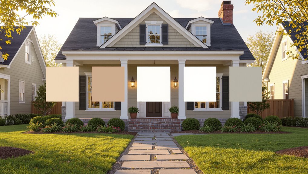
Pick a color confidently by following six clear steps that guide you from inspiration to final coat.
You’ll gather photos, note neighborhood context, test swatches in sunlight, compare color trends and seasonal palettes, narrow to three options, and sample full-size panels.
Then live with samples several days, evaluate finishes, and choose the hue that balances curb appeal, durability, and personal taste.
Start With Your Home’s Architectural Style and Era
Because your house’s architectural style and era set the visual rules, start there: let the proportions, trim details, and historical palette guide your color choices so the paint enhances character rather than fights it.
Consider historical significance and prevailing architectural trends when selecting hues; they’ll tether choices to authenticity.
You’ll respect original intent, avoid trendy mismatches, and pick a palette that reads as natural, balanced, and era-appropriate.
Match Colors to Exterior Materials
Look at the undertones in your siding, brick, or stone so your paint won’t clash with the material’s natural hues.
Use those undertones to pick a main color, then coordinate trim and accents to highlight architectural details.
Doing this keeps the overall palette cohesive and balanced.
Consider Material Undertones
Undertones in brick, stone, stucco, and wood strongly affect how paint will read on your home, so match your chosen color to those underlying hues.
Test swatches near each material to verify material compatibility and achieve color harmony.
Note warm or cool casts—reddish mortar, greenish slate, golden wood—and pick paints that complement rather than clash with those base tones.
Coordinate Trim And Accents
When you pick trim and accent colors, tie them to the home’s existing materials so paint feels intentional rather than tacked on.
You’ll achieve color harmony and use accent psychology to guide mood.
Consider these steps:
- Match trim to mortar, stone, or siding undertones.
- Use accents from natural hues for contrast.
- Test small areas in varied light before committing.
Consider Neighborhood Character and HOA Rules
Look at the homes around you and pick a palette that fits the neighborhood aesthetic so your house feels like it belongs.
Check your HOA’s paint guidelines before you buy any swatches, since some associations restrict colors or require approval.
If you need changes, plan for the approval process so your timeline and choices line up.
Match Neighborhood Aesthetic
Because your house sits within a visible community, you’ll want to pick colors that fit the neighborhood’s character and any HOA rules so your choice won’t stand out for the wrong reasons.
You should observe neighborhood trends and aim for aesthetic cohesion.
Consider:
- Dominant palettes nearby
- Accent choices that complement
- Texture and trim contrasts that respect streetscape
Check HOA Paint Guidelines
Although you want your home to reflect your taste, you still need to follow your HOA’s paint rules—so check their written guidelines and any approved color palettes before buying samples.
You’ll avoid violations by confirming HOA color restrictions, application deadlines, and maintenance obligations.
Ask neighbors about informal neighborhood guidelines, submit proposed swatches to the board, and keep records of approvals to prevent costly repaint orders.
Account for Local Climate and How Light Changes Color
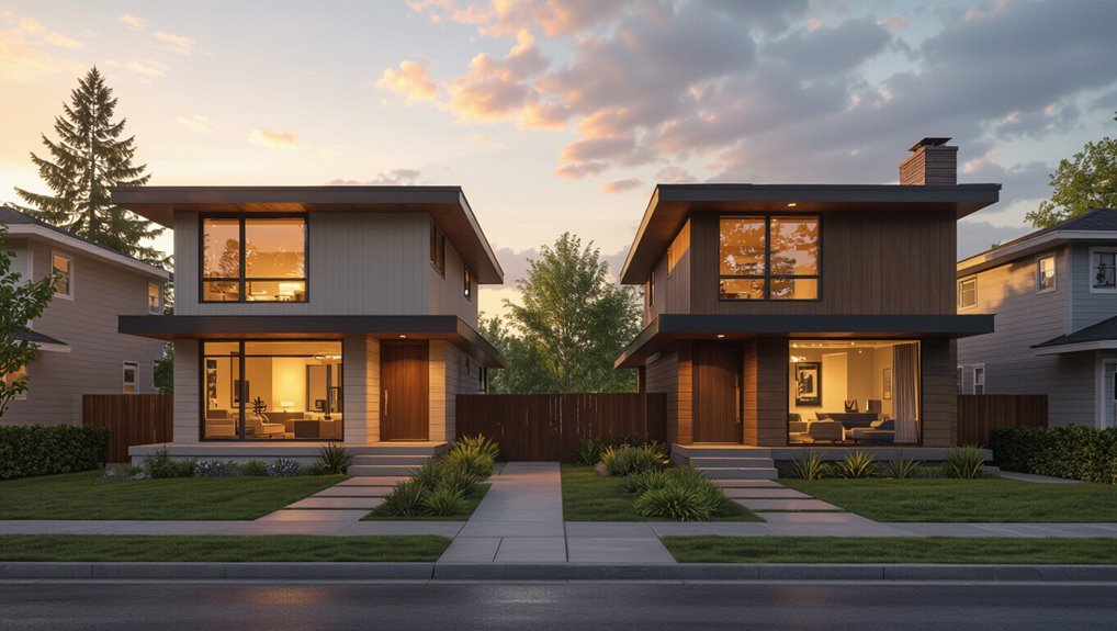
When you pick an exterior paint color, think about how your local climate and changing light will alter its appearance throughout the day and seasons.
When choosing exterior paint, consider how local climate and shifting light will change its look through day and seasons.
Consider climate considerations and light effects before buying samples. Test swatches at different times.
- Morning cool tones
- Midday true hue
- Evening warm glow
Match finishes to durability needs.
Use Color Psychology to Set Mood and Curb Appeal
Think about how color affects feelings—warm hues feel welcoming while cool tones can seem calm or sophisticated.
You’ll also want to match the neighborhood’s overall vibe so your home fits in rather than clashes.
Use accent and trim colors to highlight architectural features and reinforce the mood you’re aiming for.
Color’s Emotional Impact
Mood shapes how people experience your home, and color is one of the quickest ways to control that feeling from the curb.
You’ll use emotional associations and color symbolism to guide choices. Consider:
- Blue — calm, trustworthy.
- Yellow — cheerful, attention-grabbing.
- Gray — modern, neutral.
Pick tones that match the mood you want visitors and buyers to feel instantly.
Neighborhood Harmony Match
Although you want your home to stand out, you also need it to fit the neighborhood’s visual rhythm; matching nearby palettes and architectural styles helps your house look intentional rather than out of place.
You’ll study neighborhood color trends, pick hues that reinforce the area’s mood, and balance personal taste with likely community approval so your curb appeal feels both confident and considerate.
Accent And Trim Psychology
Anyone can tweak a home’s personality dramatically by choosing the right accent and trim colors, because those smaller elements guide how people perceive your house at a glance.
You should use Accent Color Trends and Trim Design Influence to set mood and curb appeal.
Consider:
- Bold contrast for energy.
- Muted tones for calm.
- Natural hues for warmth and lasting appeal.
Assess Fixed Elements Before Choosing Paint
Before you pick a color, take a close look at the fixed elements that’ll stay no matter what paint you choose: roof shingles, brick or stone accents, trim, doors, and neighboring homes.
Note fixed features like masonry tones and metal finishes. Match undertones to create color harmony, test swatches in different light, and eliminate options that clash with permanent elements before committing.
Pick a Primary Color and Why Focus Matters
Once you’ve ruled out colors that clash with fixed elements, it’s time to pick a primary color—the shade that will cover most of the exterior and set the home’s personality.
You’ll use primary color symbolism and focus color psychology to guide choices. Consider:
- mood you want
- neighborhood context
- long-term resale impact
Choose deliberately to anchor your design.
Choose Complementary Trim and Accent Colors
Now pick trim and accent colors that support your primary shade and sharpen the house’s look. You’ll use complementary color schemes to balance warmth, coolness, and contrast.
Test small swatches by doors, windows, and eaves. Follow accent placement tips: highlight focal points like entryways and architectural details, keep contrasts moderate, and guarantee durability under sun and weather for long‑lasting curb appeal.
Decide Between Monochrome, Two‑Tone, or Multi‑Tone Schemes
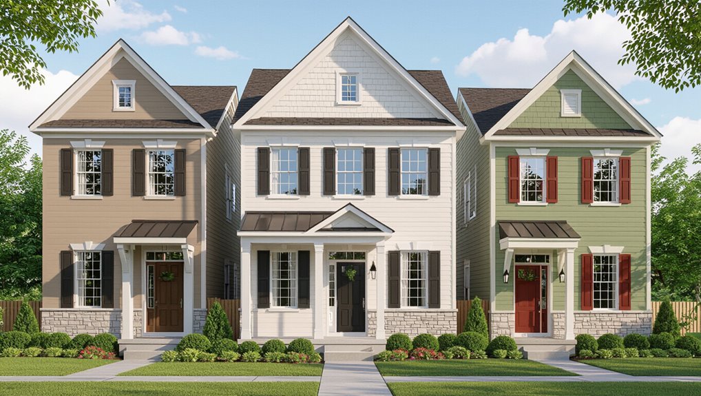
Think about your home’s architectural style to decide whether a single color, two-tone, or multi-tone approach will feel authentic.
Balance your choice with trim and accent colors so details pop without competing.
Also consider how the palette will coordinate with your landscaping and surrounding environment.
Evaluate Architectural Style
Start by looking closely at your home’s architectural style—its lines, proportions, and detailing will tell you whether a monochrome, two‑tone, or multi‑tone scheme will feel natural.
Use historical influences and aim for architectural harmony.
Consider:
- Simplicity for clean lines.
- Contrast to highlight massing.
- Accent hues for ornamentation.
You’ll choose a scheme that respects form and era.
Balance With Trim
Having settled on a scheme that honors your home’s proportions and era, turn to how the trim will balance the overall look—monochrome keeps things unified, two‑tone separates planes and emphasizes shape, while multi‑tone lets you pick out ornamentation and focal points.
Choose trim styles that support color harmony; test combos on different elevations, consider material, and pick a dominant, secondary, and accent color to guide decisions.
Coordinate With Landscape
When you pick a palette, let the yard and surrounding vistas guide whether you go monochrome, two‑tone, or multi‑tone: a single hue can let lush plantings pop, two tones clarify massing against garden beds, and multi‑tone lets you echo flowers, stone, or hardscape for a cohesive, intentional look.
You’ll balance curb appeal, landscape harmony, and seasonal adaptability:
- Monochrome: subtle backdrop
- Two‑tone: defined structure
- Multi‑tone: layered interest
Test Swatches at Different Times: Large Panels, Distance, and Seasons
Because paint looks different under real conditions, test large swatches on your siding and observe them at several distances and times of day, including over multiple seasons if possible.
Pay attention to swatch placement—shade, sun, and reflected colors change perception.
Walk away to view overall effect, photograph at noon and dusk, and note seasonal lighting shifts so your final choice holds up year-round.
Apply Large Sample Panels, Not Chips
Don’t just stick tiny chips on the trim—apply large panels of the paint to a full wall so you can see how it reads from different distances.
Walk past the panels at various times of day to watch how light and shadows change the color.
That simple test will help you make a confident choice.
Test Full Wall Panels
Start by painting several large sample panels on different sides of your house and view them at various times of day. Full wall panels show how light, texture, and surrounding elements will actually affect the color, while chips can’t.
Use proper test panel materials for accurate color testing. Apply panels where they’ll be seen, then:
- Compare scale
- Check texture effects
- Note surrounding contrast
Observe At Different Times
Want to see how a color will actually read on your house? Apply large sample panels to exterior walls, not tiny chips.
Walk around at dawn, noon, dusk and under artificial light to judge color perception across time variations. Note how shadows, reflections and neighboring surfaces shift tone.
Record favorites and eliminate options that look inconsistent before committing.
Evaluate Samples From 10–20 Feet Away and Across the Street
Stand about 10–20 feet from your house and squint slightly to see how the paint reads at a normal viewing distance; colors that look great up close can flatten, shift, or lose warmth when you step back.
Use sample evaluation and note color distance. Try these checks:
- View from the driveway.
- View across the street.
- View from the sidewalk.
Watch How Seasonal Light Alters Color Perception
After you’ve checked how samples read from key vantage points, consider how shifting seasons will change that appearance—what looks warm and lively in summer sun can feel flat or cool in winter overcast.
You’ll want to observe samples across months to note seasonal shifts and subtle light effects. Track morning, midday and evening views; photograph them so you’ll remember true variations before deciding.
Balance Warm Versus Cool Tones for Your Setting
Because warm and cool tones change how you perceive size, mood, and harmony, pick hues that complement your home’s architecture and surroundings.
Because warm and cool tones alter perceived size and mood, choose hues that complement your home’s style and setting.
You’ll achieve color harmony and tone balance by testing swatches in different light.
Consider:
- Warm accents to cozy large facades.
- Cool trims to recede and slim.
- Neutral anchors to unify contrasts and context.
Use Undertones to Avoid Unexpected Hues on Large Surfaces
Now that you’ve balanced warm and cool tones, pay attention to undertones before you commit to a full exterior.
Test large swatches at different times of day to reveal hidden hues. Undertones shift with color temperature and nearby materials, so sample against trim and landscaping.
Small cans help you experiment with subtle color mixing, preventing surprises when a whole wall reflects an unexpected cast.
Select Finishes: Flat, Eggshell, Satin, and Gloss Where Appropriate
Pick a finish that suits each surface: flat hides imperfections on broad siding.
Eggshell or satin works well for stucco and fiber cement.
Gloss or semi-gloss is best for trim and doors.
You’ll want a tougher, shinier finish where you need durability and easy cleaning, and a lower sheen where texture or flaws shouldn’t stand out.
Match finish to surface and function to get the look and longevity you want.
Best Finish For Trim
When you choose a finish for exterior trim, think about durability, maintenance, and the look you want—flat and eggshell hide imperfections, satin offers a subtle sheen and easier cleaning, and gloss gives a crisp, durable edge that stands up to weather.
Consider the best trim options and ideal trim finishes:
- Satin: balance of durability and wipeability.
- Gloss: high durability, sharp definition.
- Eggshell/flat: camouflages flaws, lower maintenance.
Match Finish To Surface
After choosing the right trim finish, match each paint sheen to the surface you’ll cover to get the best look and longevity.
Use flat for rough siding to hide flaws, eggshell for stucco, satin for high-traffic areas for paint durability, and gloss for doors and trim.
Prioritize surface preparation to guarantee adhesion and lasting performance.
Coordinate Paint With Roofing and Gutter Colors
Because your roof and gutters frame the house, their colors should guide your exterior palette so everything reads as a unified composition.
Since roof and gutter hues frame the home, let them steer your exterior palette for a cohesive look.
You’ll pick paint that complements roofing color and respects gutter style.
Consider:
- Match undertones for cohesion.
- Use contrast to highlight architectural details.
- Test samples near eaves and downspouts to confirm harmony before committing.
Factor in Landscaping and Plant Colors Year‑Round
Think about how your plants change through the seasons so your paint still works in winter, spring, summer, and fall.
Note whether you have mostly evergreens or deciduous trees, since constant green or seasonal bare branches affect how colors read.
Also consider how hardscapes and foliage contrast with your siding so the overall palette feels balanced year‑round.
Seasonal Plant Color Changes
When you pick an exterior paint color, account for how your landscaping shifts through the seasons so the house always feels integrated with its setting.
You’ll use seasonal palettes and judge plant compatibility to choose hues that work from spring blooms to winter tones.
Consider:
- Spring: fresh, light accents.
- Summer: bold, saturated complements.
- Fall/winter: warm neutrals or deep contrasts.
Evergreen Versus Deciduous
Decide whether your landscape will read as mostly evergreen or deciduous, because that choice shapes the house’s year‑round backdrop and how colors age through seasons.
If you lean into evergreen advantages, pick hues that harmonize with consistent greens.
If you expect deciduous changes, account for shifting tones and deciduous challenges like bare branches and autumn drama so paint still reads balanced across seasons.
Hardscape And Foliage Contrast
Your landscape’s evergreen or deciduous character sets the backdrop, but hardscaping and plant colors determine how your paint actually pops day to day.
You should seek hardscape harmony and foliage integration to balance tones through seasons.
Consider:
- Contrast stone paths with trim for year‑round punch.
- Match mulch and siding undertones.
- Use seasonal flowering for temporary accents that guide color choices.
Integrate Hardscape Colors Like Driveways and Walkways
Because hardscapes frame your home, you should treat driveways and walkways as key color partners rather than afterthoughts, matching or contrasting them to reinforce the house’s style.
Use hardscape integration to coordinate tones—stone, concrete, pavers—with siding and trim. Aim for color harmony: pick a dominant exterior hue, then choose hardscape accents that support contrast, pathway flow, and curb appeal without competing for attention.
Choose Exterior Paint to Hide or Highlight Architectural Flaws
When you want to minimize or emphasize specific features, paint becomes a strategic tool that alters perception—light, cool tones can make setbacks recede while darker, warmer hues bring elements forward.
You’ll use architectural highlights and flaw concealers deliberately. Pick tones to balance proportions and unify materials.
- Mask uneven siding
- Accentuate roofline subtly
- Soften porch bulk
Use Contrast to Emphasize Desirable Architectural Features
Use contrasting light and dark colors to make your home’s best features pop.
You can highlight trim, shutters, and architectural details with a bold accent that frames windows and doors.
When you pair a lighter body color with darker accents—or vice versa—you’ll draw the eye to the elements you want noticed.
Accent Trim And Details
Accent trim and small details are your opportunity to create contrast that draws the eye to the home’s best features—cornices, window casings, and entryways—and you should pick a hue that complements the main color while standing out enough to be noticed.
Consider accent color trends and trim material options:
- Highlight focal points.
- Balance scale and proportion.
- Test samples in daylight.
Light And Dark Pairings
1 clear pairing of light and dark can instantly define your home’s lines and make its best features pop.
You’ll use light contrast on larger surfaces to open spaces and draw the eye, while applying a dark balance to trim, shutters, or entryways to anchor proportions.
Test swatches at different times and from the street to verify the contrast flatters your architecture.
Classic Paint Palettes That Age Well for Resale
When you’re choosing exterior colors with resale in mind, pick timeless palettes that appeal to a broad range of buyers and stand up to changing trends.
Choose classic exterior palettes that appeal widely and remain stylish over time, boosting resale potential.
You’ll want classic paint choices that boost resale value and offer timeless combinations. Consider these practical pairs:
- Soft gray body + white trim
- Navy body + cream trim
- Beige body + charcoal accents
When to Choose Trendy Colors and How to Do It Safely
If you want to make a bold statement without turning off future buyers, pick trendy exterior colors selectively and use them as accents or on limited surfaces; this keeps your home contemporary while protecting broad appeal.
Choose trendy palettes sparingly—doors, shutters, trim—so updates are reversible.
Factor in seasonal variations for lighting and curb appeal, test samples outdoors, and keep overall contrast restrained.
Pick Neutrals That Still Have Character and Depth
Although neutrals might seem safe, you can choose shades that bring real character and depth to your exterior by focusing on undertones, finish, and contrast.
You’ll use neutral undertones and textured finishes to add warmth and interest.
Try this approach:
- Test undertones in morning and evening light.
- Layer textured finishes on trim or shutters.
- Balance depth with subtle contrast.
Select Bold Accent Colors Without Overdoing It
If you want to add a bold accent, start with small areas like the front door or shutters so you can change it without committing the whole house.
Balance that pop with neutral surrounding colors to keep the look grounded.
Always test your chosen paint in sunlight to see how the hue reads at different times of day.
Start With Small Areas
When you want to introduce a bold color without overwhelming the whole house, start with small areas like shutters, the front door, trim, or a porch ceiling.
These spots let you test intensity and see how the hue reads in different light. Use color testing and thoughtful sample placement.
- Paint a single shutter
- Try a door panel
- Swatch trim sections
Balance With Neutrals
Because bold colors draw the eye, pair them with a neutral palette to keep your home’s overall look grounded and cohesive. Use trims, siding, or larger surfaces in soft grays, creams, or muted tans so a vibrant door, shutters, or an accent wall feels intentional rather than overpowering.
You’ll explore neutral color combinations and timeless neutral palettes to balance impact, guide focal points, and maintain curb appeal.
Test Paint In Sunlight
Although a swatch can look thrilling on the chip, sunlight will reveal how a bold accent truly behaves on your home.
So test samples on several exterior spots at different times of day to see shifts in tone and intensity. You’ll judge sunlight reflection and color saturation, then decide.
- Morning
- Noon
- Evening
Test Trim and Door Colors Together With the Main Color
If you want a cohesive look, test your trim and door colors together with the main color before committing—seeing them side by side reveals how contrasts, undertones, and finish sheens interact on your home’s actual surfaces.
Swipe samples across trim and the door, evaluate color combinations in different light, and compare gloss levels.
This helps you pick door finishes that balance durability and curb appeal.
Use LRV (Light Reflectance) to Control Brightness
Pay attention to a color’s LRV (Light Reflectance Value) because it tells you how much light the paint will reflect and how bright the surface will read.
Match higher LRVs to shaded or small areas to brighten them, and choose lower LRVs for sunny spots or to add depth.
Checking LRV helps you balance brightness across trim, doors, and the main façade.
Understanding Light Reflectance
Light reflectance, measured as LRV (Light Reflectance Value), tells you how much visible light a paint color returns and is the simplest way to control a home’s perceived brightness.
You’ll use LRV to predict light intensity and guide color perception.
Consider how LRV affects mood:
- Higher LRV = brighter feel
- Lower LRV = richer depth
- Mid LRV = balanced contrast
Matching LRV To Space
When you’re choosing exterior paint, match the LRV to each side of the house so brightness feels intentional rather than accidental.
Consider how sun, shade, and landscaping change perceived light; use lrv comparisons between walls, trim, and accents to balance contrast.
You’ll control curb appeal by picking LRVs that create consistent lrv effects, avoiding washed-out or overly dark façades.
Match Exterior Paint to Interior Sightlines
Because your home’s interior and exterior meet at windows, doors, and porches, you’ll want the outside color to complement the views from inside; pick hues that read well through those sightlines so rooms feel connected rather than disjointed.
Use sightline considerations and aim for visual harmony:
- Match undertones between inside and out.
- Test colors from key interior vantage points.
- Keep trims neutral to bridge palettes.
Sample Photos Versus Real‑Life Testing: Pros and Cons
Photos can give you a quick preview, but they often misrepresent color due to lighting, screen settings, and scale.
Testing paint samples on your actual siding shows how a shade reads in your yard throughout the day.
You’ll get a far more reliable sense of hue and finish by observing real-life swatches before committing.
Sample Photos Limitations
How well will a paint sample photo predict the look of your home’s siding in real life? You should question sample photo quality and whether it offers realistic color representation.
Photos can mislead; consider:
- Lighting shifts alter hue.
- Screen calibration skews saturation.
- Context (materials, trim) changes perception.
Don’t assume a photo equals the final, on-site appearance; test further.
Real-Life Testing Benefits
When you want to know exactly how a color will read on your house, nothing beats testing paint in real life: small painted patches show true undertones, reflectivity, and interaction with neighboring materials under your specific light.
You’ll see how color trends look on your façade, how finishes perform, and how different testing environments alter perception, so you can choose confidently rather than rely on photos.
Use Digital Tools and Apps the Right Way, Not as the Final Say
While digital tools make it easy to visualize colors on your house, don’t treat their previews as the final verdict; lighting, texture, and screen settings can all distort how a shade will actually look in real life.
Use digital color tools and online color palettes, but remember app limitations and simulation accuracy.
Try virtual reality previews, augmented reality features, and digital swatch libraries.
- Compare.
- Test.
- Decide.
Budget: Paint Quality Versus Labor Costs
Because choosing paint means balancing upfront material quality with installation expenses, you’ll want to weigh where your money does the most work: premium paints often cover better and last longer, but skilled labor guarantees proper preparation and application.
Prioritize paint durability for long-term savings, get multiple labor estimates, and compare total costs so you can decide whether higher-quality paint or careful workmanship yields the best return.
When to Hire a Color Consultant or Exterior Painter
Deciding whether to hire a color consultant or an exterior painter often comes after you’ve balanced paint quality and labor costs — you’ll want help if the choice affects resale value, curb appeal, or complex surfaces.
Hire help when you need clear color consultant benefits or dependable painter selection tips:
- You want cohesive curb appeal.
- Surfaces are tricky.
- Time or confidence is limited.
Prepare for Color Changes Over Time and Maintenance Needs
As paint weathers, you’ll notice shifts in hue, gloss, and uniformity. So plan for how sunlight, moisture, and pollutants will alter your color choices and maintenance schedule.
Assess fading factors like UV exposure and airborne grit. Set realistic maintenance frequency and consider weather effects regionally.
Choose finishes and recoat intervals that maximize color longevity while keeping future touchups predictable and affordable.
Read Paint Labels: Pigments, Binders, and What They Mean
When you read a paint label, focus on the pigments and binders first since they determine colorfastness, coverage, and durability; pigments give color and hide, while binders glue the film to the surface and control resistance to weather and wear.
Check pigment properties and binder types to match performance to exposure.
- Pigment quality
- Binder types
- VOCs and finish
Avoid Common Color Selection Mistakes Homeowners Make
Ever wondered why a color that looked great in the paint chip can look flat or garish on your house?
Don’t rely solely on fleeting color trends or tiny swatches. Test full-size samples in different light, consider surrounding materials, and note how hues trigger emotional responses.
Avoid matching to a photograph or impulse buys; assess paint at multiple times before committing.
Manage Risk With Reversible Choices for Trim and Accents
Because trim and accents are easier to change than siding, pick bold or trendy hues there so you can update the look without a major overhaul; you’ll practice smart risk management with reversible choices.
Choose bold trim and accents—easier to change than siding—so you can update looks without a full overhaul.
Try these quick steps:
- Test swatches on trim.
- Pick a neutral siding partner.
- Keep paint samples for touch-ups.
Swap accents easily if trends change.
Coordinate Secondary Structures: Garage, Fence, and Sheds
Think of your garage, fence, and sheds as supporting actors that should complement, not compete with, your home’s main color.
Choose tones that reinforce color harmony—muted versions or subtle contrasts—to avoid visual clutter.
Match trim or pick a unifying accent across structures to tie everything together.
That simple strategy guarantees exterior cohesiveness and boosts curb appeal without overwhelming your primary facade.
Paint Choices for Historic Homes and Preservation Rules
Just as your garage and fence should support the home’s look, paint choices for historic properties must respect original materials and documented color palettes.
You’ll follow preservation guidelines, research historic color palettes, and select breathable, appropriate finishes.
Do:
- Match documented hues.
- Use compatible, breathable paints.
- Consult local preservation guidelines.
You’ll protect authenticity while updating curb appeal.
How to Get Neighbor Buy‑In When Colors Affect the Block
1 simple step to smooth the process is to involve your neighbors early: share swatches, explain why you picked the colors, and invite feedback so they feel heard and informed. Seek color consensus through open chats and neighborhood feedback. Use a simple visual table to illustrate options and tones:
| Swatch | Tone | Impact |
|---|---|---|
| Soft gray | Neutral | Blends |
| Sage | Warm | Calming |
| Brick red | Bold | Statement |
| Cream | Bright | Lifts |
Legal and HOA Steps Before Finalizing an Exterior Color
After you’ve looped in neighbors and narrowed choices, check the legal and HOA rules that may limit your options before you buy paint.
You’ll need to secure legal approvals and follow HOA regulations; skip surprises by confirming requirements.
- Submit sample and form
- Await written approval timelines
- Keep records of correspondence and permits
Decision Checklist to Finalize Your Color Choice
When you’re ready to commit, run through a short checklist to make certain your chosen color works in practice: verify samples at different times and lighting, compare against landscaping and neighboring homes, confirm compatibility with trim and accents, check durable finishes, and weigh color trends against your personal preferences.
Ascertain maintenance, resale impact, and HOA approvals are acceptable before you paint.
Timeline: Planning, Sampling, Painting, and Curing Phases
If you want the job to go smoothly, map out a clear timeline that covers planning, sampling, painting, and curing so each phase flows into the next; you’ll avoid delays and mismatched expectations.
Use a timeline overview to guide phase coordination:
- Plan: schedule weather windows and materials.
- Sample: test colors on-site and adjust.
- Paint & cure: follow manufacturer drying times and inspect progress.
Post‑Paint Inspection: What to Confirm Before Signing Off
Wondering what to check before you sign off on the job? You’ll inspect color consistency across elevations, verify finish selection matches your contract, and confirm edges, trim, and flashings are clean. Note any touchups, gloss level, or uneven coverage. Use this checklist:
| Item | Status |
|---|---|
| Color consistency | |
| Finish selection | |
| Touchups/edges |
Maintenance Plan to Keep Your Chosen Color Looking Fresh
Plan on a simple, regular maintenance routine to keep your exterior color looking fresh and protect the paint investment.
You’ll extend paint longevity with quick checks and timely touchups. Follow these maintenance tips:
- Wash surfaces seasonally to remove dirt and mildew.
- Inspect for cracks, peeling, or caulk failures monthly.
- Touch up or repaint high‑exposure areas every 3–7 years.
Frequently Asked Questions
Will New Siding or Additions Force a Complete Color Overhaul?
Not necessarily — you can often blend new siding or additions without a full repaint by matching siding color trends and prioritizing addition color harmony; you’ll coordinate trim, accents, and shifts so the whole exterior feels intentional and cohesive.
How Do Paint Warranties Handle Color Fading or Mismatch Claims?
Like a clock slowly losing its tick, warranties vary: you’ll get explicit warranty coverage for color longevity only if it’s specified; otherwise manufacturers usually cover film failure, not fading or minor mismatch, so check terms closely.
Can Exterior Paint Color Affect Home Insurance Rates or Inspections?
Generally no, but insurers won’t judge color psychology or curb appeal directly; you’ll influence resale value and inspections indirectly by choosing colors that signal maintenance and neighborhood fit, which can affect perceived risk and buyer interest.
Are There Environmental or VOC Restrictions Influencing Available Colors?
Yes — you’ll find some gentle limits: VOC rules and eco friendly options narrow choices, nudging you toward safer finishes and popular color palette trends; you’ll still enjoy lively selections, just with a greener, regulated twist.
How to Document Chosen Color Specs for Future Matching and Repairs?
You’ll record brand, formula, sheen, and batch number, keep a sealed color swatch preservation packet, photograph walls under consistent light, save digital color matching files and supplier contacts, and store everything in a waterproof file for repairs.
