
What Color Should You Paint Staircase Walls? Ideas That Actually Work
Pick a color that fits your light, scale, and materials: neutrals keep flow and are easy to match, while bolds create focal drama on tall landings or at the bottom. Use light-reflective pale hues or satin finishes to open narrow runs, and richer tones or semi-gloss where you need durability and contrast with wood or metal. Test samples at different times and try temporary panels first—scroll on to get specific combos, patterns, and practical tips.
Quick Guide: Pick a Staircase Wall Color in 5 Steps
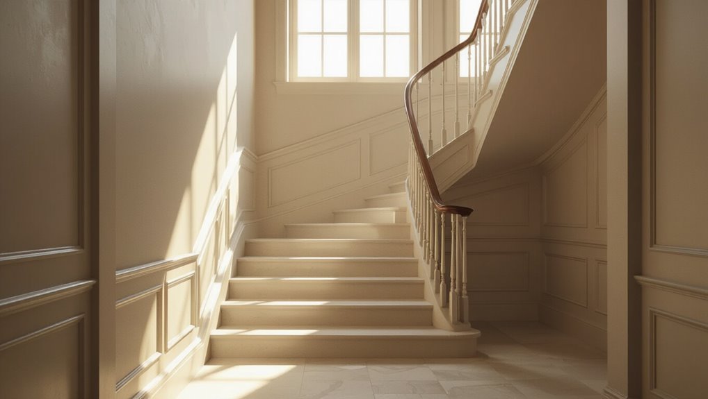
Before you grab a swatch, follow five clear steps to choose a staircase wall color that fits your space and style.
Assess light, traffic, and architecture.
Study staircase trends for scale and accent ideas.
Test samples at different times.
Consider color psychology to set mood and flow between levels.
Pick a finish that’s durable and easy to clean.
Choose a Base Staircase Wall Color: Neutrals vs. Bolds
Now that you’ve narrowed down light, traffic, and finishes, it’s time to pick a base color for the staircase walls — the anchor that sets tone and flow between floors.
Choose a neutral palette if you want timeless continuity and easy decor matching. Opt for a bold statement to highlight architectural detail or create contrast.
Balance with trim, lighting, and adjoining rooms.
Bright Colors That Open Narrow Stairways
If your stairway feels cramped, choose light-reflective hues like soft whites, pale yellows, or icy blues to bounce more daylight down the steps.
You can also add pale accent stripes on one wall to create a stretched, airy illusion without overwhelming the space.
These simple choices make narrow stairs feel wider and brighter almost instantly.
Light Reflective Hues
1 simple change—choosing a light-reflective hue—can instantly make a narrow stairway feel wider and brighter.
You’ll want pastel shades and calming tones that bounce natural and artificial light, reducing shadows and visual clutter.
Opt for satin or eggshell finishes to amplify glow without glare.
Pair with crisp trim to define edges, creating depth while keeping the space airy and welcoming.
Pale Accent Stripes
A few pale accent stripes in bright, airy colors can visually widen a narrow stairway by drawing the eye along the vertical plane and breaking up monotony; keep the bands thin and evenly spaced so they add rhythm without overwhelming the space. You’ll love pale stripe combinations and simple accent stripe techniques that brighten, guide, and calm your ascent.
| Mood | Color | Effect |
|---|---|---|
| Fresh | Mint | Expands |
| Soft | Blush | Warms |
| Airy | Sky | Elevates |
Dramatic Staircase Wall Color Ideas for Tall Stairwells
When you’re dealing with a tall stairwell, bold wall color can turn soaring vertical space into a dramatic focal point that draws the eye upward and defines the home’s character.
Choose deep jewel tones or inky hues to create bold contrasts against trim and railings.
Use dramatic accents like an oversized mural or vertical color blocking to emphasize height without cluttering the space.
Match Paint to Wood, Metal, Carpet, and Tile

When you’re choosing wall paint, think about how it will coordinate with wood tones to either warm up or cool down the space.
Pick shades that complement metal finishes—soft neutrals for brushed nickel, richer hues for brass.
Also match or contrast carpet and tile wisely so the stairs feel unified rather than fragmented.
Coordinate With Wood Tones
Start by noting the dominant wood tones in your staircase—whether warm honey, deep walnut, or cool gray—and pick paint that either complements or contrasts them deliberately.
You’ll aim for color harmony or bold wood contrasts: warm woods pair with muted greens or creamy neutrals, cool grays suit soft blues or charcoal, and deep walnut pops against warm taupes or crisp white for balanced, intentional shifts.
Complement Metal, Carpet, Tile
After you’ve matched paint to the wood tones, broaden your view to include metals, carpet, and tile so every material feels intentional together.
Pick wall hues that echo metallic finishes like brushed brass or matte black and complement carpet tones without clashing.
Use paint to unify contrasting textured surfaces, choosing neutrals for balance or a bold accent to tie disparate materials into a cohesive staircase scheme.
Coordinate Paint With Trim, Balustrades, and Railings
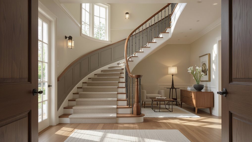
Pick one dominant element—walls, trim, or balustrade—to guide your palette, and let the others play supporting roles so your staircase reads as a cohesive whole. Focus on trim selection, railing styles, and finish contrast to balance weight and light.
| Element | Finish | Effect |
|---|---|---|
| Walls | Matte | Soften space |
| Trim | Semi-gloss | Define edges |
| Railings | Satin/metal | Add rhythm and depth |
Paint Sightlines: Top vs. Bottom Floor Color Rules
As you plan staircase sightlines, decide whether the top floor’s dominant hue will set the tone for the whole stairwell or the bottom floor will anchor it with contrast.
Use the bottom floor contrast rule to create a visual stop or let a continuous color flow tie both levels together. Your choice should guide trim and lighting decisions so the shift feels intentional.
Top Floor Dominant Hue
When you look up the staircase, the dominant hue from the top floor usually sets the tone for the whole vertical sightline.
So choose a color that complements both the landing and the lower-level views. You’ll want top floor vibes that flow; use color psychology to pick warmth for coziness or cool tones for calm.
Keep trim neutral and finishes consistent for cohesion.
Bottom Floor Contrast Rule
Anyone walking up the stairs will notice how the bottom floor color anchors the view, so choose a shade that contrasts enough with the top-floor hue to create depth without clashing.
You’ll balance staircase safety and visual flow by using contrast to define edges.
Consider:
- Slightly darker base
- Warm vs cool pairing
- Matte finish for glare control
- Accent trim for step definition
- Test samples at dusk
Continuous Color Flow
1 simple rule will help you keep sightlines calm: let colors flow upward by choosing hues that shift subtly rather than stop abruptly between floors.
You’ll guide the eye and reinforce staircase aesthetics by using graded tones or adjacent shades.
Consider color psychology to set mood changes—cooler upstairs for calm, warmer downstairs for energy—while maintaining cohesion and smooth visual movement.
Where to Place an Accent Wall or Color Block on Stairs
Wondering where an accent wall will have the most impact on your staircase?
You’ll use accent wall placement and color blocking techniques to guide sightlines and define landings.
Choose focal points, contrast risers, highlight stair runs, anchor a gallery, or wrap a banister.
- Focal landing
- Full wall behind stairs
- Alternating risers
- Lower half wrap
- Narrow vertical band
How Light Changes Your Stair Color Choice
You’ll want to contemplate how natural light intensity brightens or mutes paint tones on your stairwell.
Think about directional light too—sun from one side can create warm highlights and cool shadows that change how colors read.
Also check your artificial lighting color temperature, since warm or cool bulbs can make the same paint look totally different at night.
Natural Light Intensity
Because light changes throughout the day and across seasons, natural light intensity is one of the biggest factors that should guide your stair color choice.
You’ll use color psychology and light reading to pick hues that stay flattering. Consider these quick rules:
- Test swatches at different times
- Choose warmer tones for dim spaces
- Use cool tones in bright areas
- Favor mid-tones for balance
- Reassess seasonally
Directional Light Effects
Light direction dramatically shifts how paint reads on staircase walls, so pay attention to where sunlight and artificial fixtures hit each surface. You’ll use light diffusion to soften contrasts and consider color temperature’s subtle influence on perceived hue. Test samples at different times, watching shadows and glare so you choose a tone that stays consistent and inviting.
| Situation | Effect |
|---|---|
| Direct sun | Intensifies hue |
| Diffused light | Softens contrasts |
| North-facing | Cools colors |
| East/West | Warms mornings/evenings |
Artificial Lighting Colortemperature
1 simple thing to remember: the color temperature of your fixtures will shift how paint reads on stair walls, so match bulbs to the mood you want.
You’ll want to test samples under various artificial lighting to check color perception.
- Warm (2700K) cozy
- Neutral (3500K) true
- Cool (4000K+) crisp
- Dimmers soften tones
- Mixed light complicates choices
Best Paint Sheens for Scuffs and Wear on Stair Walls
When choosing a paint sheen for stair walls, pick a finish that balances durability and appearance so you don’t constantly touch up scuffs and marks.
Use satin or eggshell in high-traffic zones for durable finishes and subtle sheen; semi-gloss works where you need extra wall protection and frequent cleaning.
Flat hides imperfections but chips easily, so reserve it for low-traffic sections.
How to Test Swatches and Sample Zones on Staircases
Before you commit to a full paint job, test swatches and sample zones on your staircase so you can see how colors read in different light and from varied angles.
Place swatches at eye level and low on risers to check swatch placement and color layering.
Position swatches at eye level and low on risers to evaluate placement and how colors layer.
Try these checks:
- Morning light
- Evening light
- Side views
- Top-down view
- Touch for finish feel
Blend Color With Niches, Wainscot, and Moldings
Although niches, wainscot, and moldings are often painted separately, you can create a cohesive staircase look by deliberately blending their colors with the wall hue.
Choose subtle niche accents that echo the main tone, or pick a deeper shade for wainscot contrast to ground the space.
Paint moldings either matching or slightly lighter to unify without losing architectural definition.
Staircase Color Rules for Foyers, Landings, and Half-Stairs
Because foyers, landings, and half-stairs each serve different visual and functional roles, you’ll want a simple set of color rules that respect scale, sightlines, and traffic patterns.
Use foyer accents and landing contrasts to guide choices.
Use foyer accents and landing contrasts to steer color decisions and create cohesive, flowing transitions throughout your entry spaces.
- Anchor foyers with durable, welcoming tones
- Highlight railings subtly
- Use lighter hues on narrow half-stairs
- Repeat a trim color for cohesion
- Prioritize flow between zones
Use Scale and Pattern: Stripes, Ombré, and Wallpaper Alternatives
Once you’ve settled foyer, landing, and half-stair colors, think about how scale and pattern can add personality without overwhelming the space. You can use bold stripes patterns, subtle ombré effects, or textured papers to guide the eye up the stairs. Choose proportionate bands and muted gradients for narrow runs; larger repeats suit wide walls.
| Option | Scale | Effect |
|---|---|---|
| Narrow stripes | Thin | Elongates |
| Wide stripes | Thick | Anchors |
| Ombré | Gradual | Soft lift |
| Textured paper | Varied | Depth |
Low-Commitment Fixes: Removable Panels and Temporary Paint Treatments
If you want to experiment without a long-term commitment, removable panels and temporary paint treatments let you change your staircase look in hours instead of days.
You can test color, texture, and pattern risk-free using removable wallpaper, peelable paint, magnetic panels, temporary decals, fabric wraps, or adhesive films.
- Quick install
- Easy removal
- Low cost
- Damage-free testing
- Swap seasonally
Common Staircase Color Mistakes and How to Avoid Them
When you pick a staircase color, a few small mistakes can make the whole space look off—too dark, too busy, or oddly proportioned—so knowing what to avoid saves time and money.
Don’t chase fleeting staircase trends without testing samples. Avoid high-contrast stripes that overwhelm narrow runs.
Respect color psychology: consider mood, lighting, and flow. Test swatches at different times before committing.
Quick Decision Checklist to Pick a Color With Confidence
You’ve learned the pitfalls to avoid, so now use a simple checklist to pick a staircase color with confidence.
Trust color psychology, current color trends, and practical factors to guide you.
Let color psychology, trends, and practical needs steer your staircase color choices with confidence and clarity.
- Measure light and space
- Match existing finishes
- Test paint samples at different times
- Consider mood and function
- Pick a long-term trend or neutral base
Frequently Asked Questions
How Do I Paint Stairs With Kids or Pets Living in the House?
You’ll schedule painting when kids and pets are out, use non toxic choices, seal edges, pick kid friendly options like low-VOC paints, and create pet proof solutions with gates, drying time, ventilation, and easy-clean finishes for safety.
Can I Use Chalkboard or Magnetic Paint on Stair Walls?
Yes — you can use chalkboard benefits on stair walls for creativity, and magnetic paint for functionality; you’ll enjoy erasable art and magnetized notes, but prime, apply thin coats, and seal for durability with kids or pets around.
What Paint Prep Is Needed for Smoky or Stained Walls?
Studies show sealers block 90% of stains, so you’ll prime smoky or stained walls first. You’ll use stain-blocking primer, appropriate paint types, and smooth or sand textured wall textures before topcoating to guarantee lasting coverage and adhesion.
How Long Before I Can Walk on Painted Stair Treads?
You can usually walk on painted stair treads after 24 hours, but wait 48–72 hours for full stair tread safety and curing. Drying time varies by paint type, humidity, and traffic—avoid heavy use until fully cured.
Are There Voc-Free Paints Suitable for Enclosed Stairwells?
Yes — you can use VOC-free paints in enclosed stairwells; you’ll find eco friendly options that reduce fumes, but you should still consider ventilation and safety concerns like slip resistance, odor sensitivity, and curing time before heavy use.
