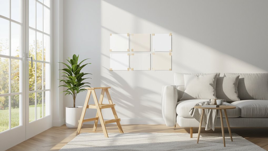
The Best White Paint for Walls and Ceilings That Designers Actually Use
Designers reach for whites like Benjamin Moore Simply White, Chantilly Lace, Farrow & Ball All White, and Sherwin-Williams Alabaster because they’re versatile, flattering, and work in both walls and ceilings. You’ll want brighter, cleaner whites or ultra-light tints on ceilings to boost light, while warmer or cooler wall whites should match your furnishings and lighting. Test large swatches in different light, pick your sheen for durability, and if you keep going you’ll find specific picks and pairing tips.
Quick Answer The Best White Paints Designers Actually Use
You’ll get a quick list of the top 5 designer-approved whites with one-line summaries so you can compare them at a glance.
I’ll also tell you which white works best for walls and which you should pick for ceilings.
Read on and you’ll have a clear, usable recommendation for both surfaces.
Top 5 designer-approved whites (one-line summary for each)
When you want a reliable, designer-approved white, these top five picks give distinct undertones and finish options so you can match mood and light without guessing.
If you’ve asked what’s the best white paint for walls and ceilings, try these:
- Benjamin Moore Simply White — clean, warm, versatile.
- Farrow & Ball All White — crisp, pure, elegant.
- Sherwin-Williams Alabaster — soft, creamy, timeless.
Best white for walls vs best white for ceilings (short directive)
Those three designer favorites work well across rooms, but walls and ceilings often need different whites to read right in a space.
For walls, pick a white with a touch of warmth or coolness to complement furnishings and light.
For ceilings, choose a brighter, cleaner white or an ultra-light tint to reflect light and make the room feel taller and more open.
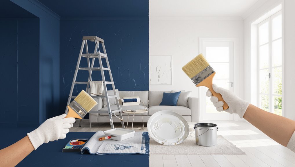
Why Choosing the Right White Matters
You’ll notice that undertones, sheen, and natural or artificial light all change how a white paint reads in your space.
Don’t assume “pure white” is neutral—many whites carry subtle warm, cool, or creamy casts that can clash with finishes and furnishings.
Knowing those variables helps you pick a white that actually looks right in your room.
How undertones, sheen, and light affect perception of white
Pick the right white and a room can feel crisp, warm, or cavernous; pick the wrong one and fixtures, flooring, and mood will fight each other.
Consider undertones—blue, yellow, or pink will shift warmth.
Match sheen to use: flat hides flaws, satin cleans easily, gloss highlights trim.
Watch light: north, south, artificial sources change perceived color throughout the day.
Common misconceptions about “pure white”
Because “pure white” sounds simple, many homeowners assume it’s a single, neutral option—but that’s rarely true.
You’ll find dozens of whites with subtle undertones—warm, cool, green, or pink—that shift with light and furnishings.
Picking “pure” white without sampling can clash with trim, fabrics, or natural light.
Test swatches in different spots before committing to avoid costly mistakes.
How Designers Choose White Paint Step-by-Step Guide
Start by looking at how natural and artificial light hits the room. Then think about the room’s function and the mood you want to create.
Match your white to trim, flooring, and furniture, and test samples in several spots at different times of day.
Once the shade feels right, pick the appropriate sheen for walls and a flatter finish for ceilings.
Step 1 Assess natural and artificial lighting

When you assess a room’s lighting, note both the direction and quality of natural light and the type and placement of artificial fixtures so you can choose a white that reads true at all hours.
Observe morning versus evening sun, north or south exposure, and how fixtures cast warm or cool tones.
Test paint swatches in multiple spots and times before deciding.
Step 2 Evaluate room function and desired mood
As you decide on a white, think about how you’ll use the room and the mood you want to create—calm and cozy for bedrooms, bright and energetic for kitchens or home offices, or crisp and formal for entryways.
Choose warmer whites for relaxation, cooler whites for focus and clarity, and balanced neutrals for versatile spaces.
Prioritize durability and cleanability where function demands it.
Step 3 Consider trim, flooring, and furniture colors
Because your walls don’t exist in isolation, match your white to the surrounding trim, floors, and furnishings before you commit—those elements can make the same white read warm, cool, or flat.
Compare undertones: wood warms, cool gray tiles chill, metal and chrome reflect.
Coordinate contrast level with trim—sharp or soft—and guarantee furniture fabrics harmonize so the room feels intentional and unified.
Step 4 Test samples in multiple spots and times of day
Want to be sure your white actually reads the way you expect?
Paint several 12×12-inch samples on different walls—north- and south-facing, near windows, and in interior hallways.
Observe them morning, midday, and evening under natural and artificial light.
Note shifts in warmth, coolness, and contrast with trim and flooring before committing to a full coat.
Step 5 Finalize sheen and finish for walls vs ceilings
Once your samples look right in different light, pick the right sheen for each surface—walls and ceilings do different jobs and need different finishes.
Use flat or matte on ceilings to hide imperfections and reduce glare.
Choose eggshell or satin for most walls for washability and subtle reflection.
Reserve semi-gloss for trim, high-traffic areas, or moisture-prone rooms.
Top White Paint Picks with Use Cases
Now you’ll see specific white paints matched to real rooms and needs so you can pick the right one fast.
I’ll cover the best overall designer white, a warm option for cozy spaces, a cool white for modern or minimal looks, a bright white for ceilings and trim, and a low‑VOC eco‑friendly choice.
Use these picks as starting points and adjust based on your light and furnishings.
Best overall designer white
When you want a safe, versatile white that flatters any room, a designer “best overall” white is the smart pick—you’ll get balanced warmth and brightness without leaning too cool or yellow. It reads clean, reflects light, and pairs with most palettes. Choose a quality finish for durability and easy touch-ups.
| Use | Finish | Tip |
|---|---|---|
| Walls | Eggshell | Test in daylight |
| Ceilings | Flat | Use same brand |
| Trim | Semi-gloss | Clean with mild soap |
Best warm white for cozy spaces
If you want a room that feels inviting without tipping into yellow, warm whites with subtle cream or beige undertones are the way to go; they soften harsh light and make textiles and wood tones pop. Pick a soft warm white for living rooms, a deeper creamy white for libraries, and a neutral warm for kitchens.
| Use | Paint |
|---|---|
| Living room | Soft warm |
| Library | Creamy warm |
| Kitchen | Neutral warm |
Best cool white for modern/minimal spaces
Because cool whites strip away warmth, they’ll give your space a crisp, airy feel that suits modern and minimal interiors—think clean lines, high-contrast accents, and plenty of negative space. Choose near-neutral cools with slight blue or green undertones to keep rooms feeling expansive and sharp. Test samples under daylight and artificial light before committing.
| Paint | Use |
|---|---|
| Benjamin Moore Chantilly Lace | Living rooms, galleries |
| Farrow & Ball All White | Kitchens, studios |
| Sherwin-Williams Extra White | Hallways, offices |
Best bright white for ceilings and trim
Ceilings and trim demand bright whites that reflect light cleanly and hold up to touch-ups, so you’ll want paints with true, crisp undertones and durable finishes. Pick a high-hide, satin or semi-gloss for trim and flat or matte for ceilings. Match temperature to walls to avoid clash.
| Use | Paint |
|---|---|
| Ceiling | Flat bright white |
| Trim | Semi-gloss bright white |
| High-traffic | Satin bright white |
Best low-VOC/eco-friendly white
When you want clean, reliable whites without the chemical smell, low‑VOC and eco‑friendly paints give you strong coverage and safer indoor air; they’re especially smart for nurseries, bedrooms, and recently renovated spaces. You’ll pick paints with durable finish and subtle undertones that read true white in soft light.
| Paint | Best use |
|---|---|
| Benjamin Moore Natura | Bedrooms, nurseries |
| Clare Paint Zero | Living rooms, hallways |
Budget-friendly white options designers recommend
1 smart pick can keep your room bright without blowing your budget: designers often recommend tested, affordable whites that hide imperfections, cover well in fewer coats, and hold up over time. You’ll get crisp, versatile results without splurging. Consider these popular choices and uses:
| Paint | Best Use |
|---|---|
| Behr Ultra Pure White | Trim, ceilings |
| Benjamin Moore Chantilly Lace | Walls, modern spaces |
| Sherwin Classic White | Warm, traditional rooms |
Side-by-Side Comparison: Popular Whites and Their Undertones
You’ll notice how a white’s undertone shifts adjoining colors and changes the room’s mood. Use the table below to compare common whites and see recommended pairings for walls, trim, and cabinetry. Try samples next to your finishes to confirm the match.
| White Name | Dominant Undertone | Recommended Pairings |
|---|---|---|
| Benjamin Moore Simply White | Warm (slight yellow) | Soft wood floors, warm beige trim, cream cabinetry |
| Sherwin-Williams Pure White | Neutral-warm | Crisp white trim, muted greys, light oak cabinetry |
| Farrow & Ball All White | Cool-neutral | Bright trim, cool greys, white lacquer cabinetry |
How undertone affects adjoining colors

Because undertones subtly shift how colors interact, choosing the right white changes the look of every adjacent surface.
You’ll notice warm whites make neighboring woods and beiges appear richer, while cool whites sharpen blues and grays.
Green- or yellow-leaning whites can mute jewel tones or brighten botanicals.
Test samples beside key materials and lighting so adjoining colors read as you intend.
Recommended pairings (walls, trim, cabinetry)
Pairing whites well means thinking about undertone harmony: pick a slightly warmer white for walls if your trim and cabinetry lean yellow or wood-tones.
Choose a cooler white for trim when walls or cabinets carry blue or gray undertones, and balance a neutral white when you want everything to read crisp without shifting color relationships.
Match finishes—eggshell walls, semi-gloss trim—and test samples together under real light.
Mistakes to Avoid When Picking White Paint
Don’t pick a white just from a tiny swatch or an online photo—you’ll often get surprised once it’s on your walls.
Pay attention to undertones and how your room’s lighting changes their look at different times of day.
And don’t assume one white will work for trim, ceilings, and walls without testing each surface first.
Choosing based only on swatches or online images
If you rely solely on tiny swatches or online photos, you’ll probably be surprised by how different a white paint looks once it’s on your walls and ceiling.
Don’t pick from a phone image or pocket-sized chip. Test full-size samples on multiple walls, observe them at different times and angles, and live with each sample for a few days before committing.
Ignoring undertones and room lighting
When you overlook a white paint’s undertones or how light hits a room, the color can read cold, yellow, gray, or washed out once it’s on your walls.
Don’t assume one white suits every orientation: test large swatches at different times, observe under artificial and natural light, and note reflections from floors and furnishings before committing to a full paint job.
Using the same white for all surfaces without testing
Although a single white might seem like a simple solution, using the same shade on walls, trim, cabinets, and ceilings often falls flat without testing first.
You’ll discover finishes reflect light differently and reveal undertones that clash. Test large swatches in each location, view them at different times, and assess sheen interactions.
Don’t assume one sample proves all—confirm before you commit.
Best Practices and Pro Tips from Designers
You’ll learn how to create contrast with whites by pairing trim, furniture, and textiles to make walls pop.
Know when to choose warm versus cool whites based on light and the mood you want to set.
For high-traffic walls and ceilings, use durable finishes and sealants plus simple maintenance routines to keep them looking fresh.
How to create contrast with whites
Pair bright whites with deeper tones, textured finishes, or sharp trims to make each shade pop without overwhelming the room.
Use matte white walls against satin or semi-gloss trim for subtle shine contrast.
Anchor spaces with darker furniture or painted accent walls.
Introduce natural materials—wood, stone, woven textiles—to add depth.
Test samples under real light before committing.
When to use warm vs cool whites
When deciding between warm and cool whites, think about the mood you want to set and the light your room gets: warm whites (with yellow, peach, or beige undertones) cozy up north-facing rooms and complement wood tones, while cool whites (with blue, green, or gray hints) brighten sunlit spaces and lend a crisp, modern feel.
Use warm whites to soften, cool whites to sharpen; test samples.
Sealing and maintenance tips for high-traffic walls and ceilings
Choosing the right white sets the tone, but high-traffic walls and ceilings demand more than color — they need protection and easy upkeep.
Seal with a durable, washable finish—eggshell for walls, satin for trim, matte with stain-resistant additives for ceilings.
Use high-quality primer, apply thin even coats, and keep a touch-up kit.
Clean gently with mild detergent and a soft sponge to preserve finish.
Paint Finishes and Technical Considerations
Choose the right sheen—flat or matte for low-traffic ceilings, eggshell or satin for living areas, and semi-gloss for trim and high-moisture zones—to balance look and durability.
Check coverage and VOC levels on the label so you get even results and a healthier indoor environment.
For smooth ceilings and streak-free walls, use proper prep, the recommended roller nap, and consistent brushing and rolling techniques.
Sheen guide: Flat, matte, eggshell, satin, semi-gloss (when to use each)
Because sheen affects both appearance and durability, picking the right finish matters as much as picking the color; you’ll want flatter sheens where you need to hide imperfections and higher sheens where you need washability and moisture resistance.
Use flat/matte for low-traffic ceilings and textured walls, eggshell for living rooms, satin for kitchens and bathrooms, and semi-gloss for trim, doors, and high-moisture areas.
Coverage, VOCs, and durability factors
While sheen influences look and cleanability, you’ll also want to weigh coverage, VOCs, and durability—three technical factors that affect cost, health, and how long your paint job lasts.
Choose high-hide formulas to reduce coats, low-VOC or zero-VOC options for better indoor air quality, and durable, washable finishes for high-traffic areas.
Balance budget with longevity to minimize repainting.
Application tips for smooth ceilings and even walls
Getting a smooth ceiling and even walls starts with the prep work: patch holes, sand gloss, and clean surfaces so paint adheres uniformly, and use primer on repaired or high-contrast areas to hide stains and improve coverage.
Use a nap-appropriate roller, maintain a wet edge, apply thin even coats, sand lightly between coats if needed, and finish ceilings first, then walls for consistent results.
Practical Shopping and Testing Checklist
When you head to the paint store, bring a few key tools so you can pick the right white for your space.
Labeling and side-by-side comparison will keep samples straight, and a short testing timeline helps you avoid rushed decisions. Follow a simple checklist so you’re confident before you commit.
- Bring: photos of the room, a trim/cabinet sample, and a notepad for notes.
- Label: tape each swatch with brand, color name/code, finish, and date.
- Test timeline: apply samples, observe in morning and evening light for 48–72 hours, then decide.
What to bring to the paint store
Heading to the paint store? Bring true-color references: a photo of the room, a crisp fabric swatch, and a small trimmed piece of existing trim or flooring.
Carry a notebook, tape measure, and smartphone for photos under different light. Pack painter’s tape and a sample board if you have one.
Wear clothes you don’t mind smudging and jot down brand, sheen, and formula notes.
How to label and compare samples
Before you start taping samples to the wall, label each swatch clearly so you can compare them later without guessing.
Use a permanent marker on the back or painter’s tape with brand, color name, and formula (e.g., eggshell, flat).
Number them and keep a simple chart noting room, light direction, and time of day for accurate side-by-side evaluation.
Timeline for testing and decision-making
Once you’ve got labeled swatches up, give yourself a simple timeline for testing so you don’t rush or second-guess your choice: plan to observe samples over at least three days—morning, midday, and evening—and revisit them after a week of natural light and artificial lighting to see how shifting conditions affect the color and sheen.
Then narrow to two favorites, live with each for 48 hours, and decide.
FAQ Common Questions Designers Get About White Paint
You’ll want clear answers to common white-paint questions like identifying warm vs. cool undertones and whether the same white works for walls and trim.
I’ll cover which whites suit north-facing rooms, how many tester pots to try, and whether white will hide imperfections.
These quick FAQs will help you choose the right white with confidence.
How do I know if a white has a warm or cool undertone?
How can you tell if a white paint leans warm or cool?
Hold a large swatch against natural light and compare nearby whites: warm whites pick up yellow, cream, or peach tones; cool whites show blue, green, or gray hints.
View at different times of day, against your flooring and furnishings, and test a painted patch to confirm how undertones interact with your room’s light.
Can I use the same white on walls and trim?
Noticing a room’s undertones helps when deciding whether to use the same white on walls and trim. You can, but test it first: trim in a gloss or semi-gloss reflects more light and appears brighter than matte walls.
If undertones clash, pick a slightly warmer or cooler trim to harmonize. Consistent sheen and small samples guarantee cohesive, intentional results.
What white looks best in north-facing rooms?
Because north-facing rooms get cooler, bluer light, choose whites with a touch of warmth or a neutral base so walls don’t read icy or greenish.
Look for off-whites with slight yellow, beige, or pink undertones, or clean neutrals with low blue.
Test swatches on different walls at different times—you’ll see how undertones shift and which white feels inviting without warming the space too artificially.
How many tester pots do I need before committing?
Wondering how many tester pots to buy? Buy at least three: your top choice plus two close alternatives—one warmer, one cooler.
Paint 1–2 large swatches on different walls and observe at multiple times of day and under artificial light.
If rooms connect, test in each space.
Add more pots only if lighting or finishes vary considerably.
Will white paint hide imperfections on ceilings and walls?
Will white paint hide scuffs and bumps, or will it make them more obvious? You’ll find that finish matters more than shade: flat or matte hides minor flaws, while satin or semi-gloss highlights texture and repairs.
Prep—cleaning, filling cracks, sanding—makes the biggest difference. Use a primer for stains and uneven patches, then choose finish based on desired durability and concealment level.